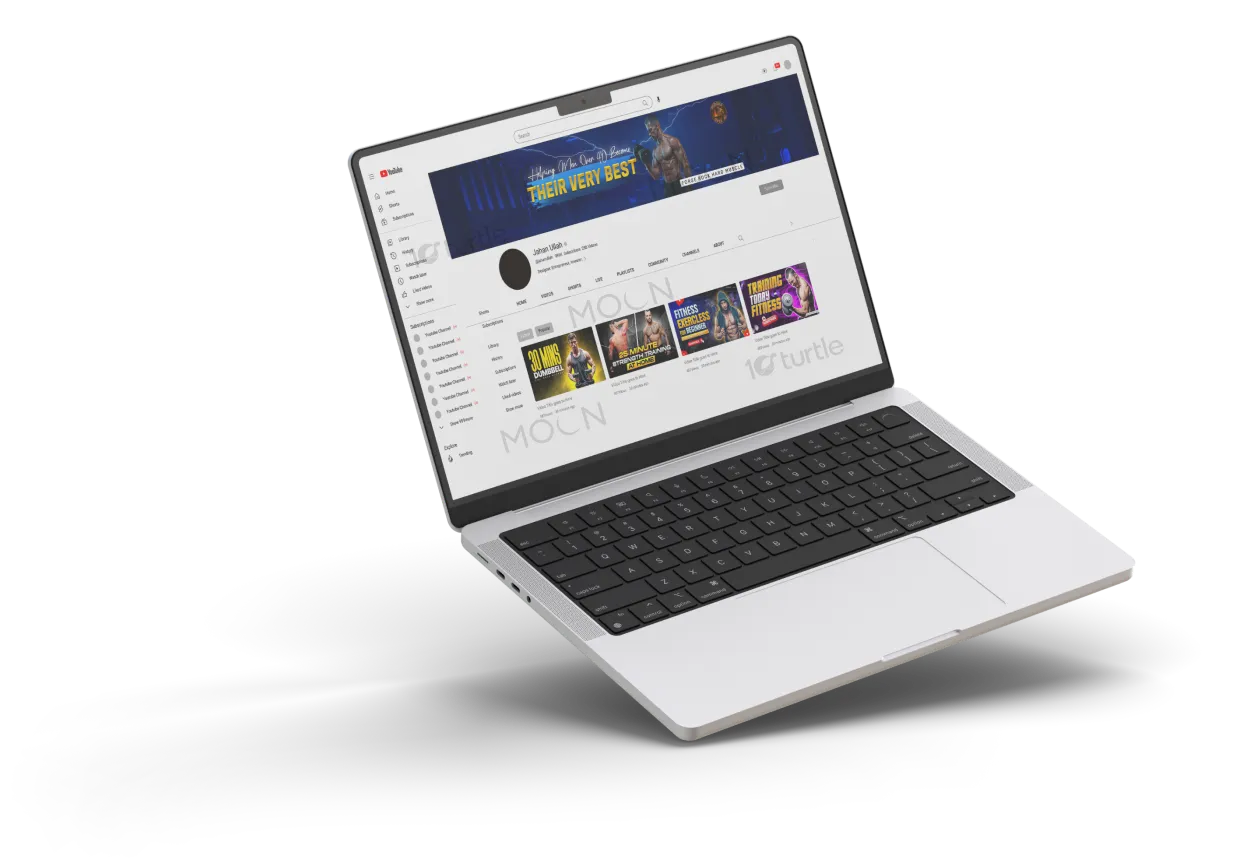
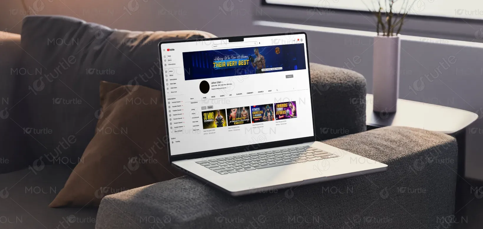
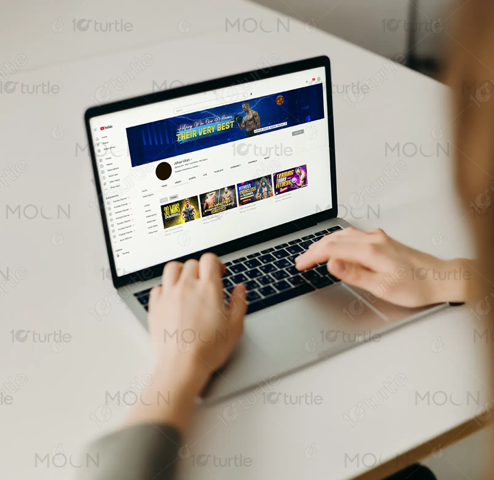
The design employs a bold, high-energy aesthetic to resonate with men over 40 pursuing peak fitness. A muscular figure holding dumbbells conveys strength and discipline, while electric blue tones and lightning effects create intensity and motivation. Contrasting yellow text emphasizes the core message: “Their Very Best.” The clean, modern typography balances inspiration with clarity. A circular emblem reinforces branding, while the sleek layout ensures visibility across devices. This concept merges power, professionalism, and approachability, inspiring viewers to commit to transformation.
Youtube Banner Design
Graphic Design
Industry
Healthcare & Wellness
Tools we used
Project Completion
2025
Key Market
Global
This YouTube banner is designed for a fitness brand targeting men over 40, focusing on strength, resilience, and peak performance. The visual communicates determination and progress, reflecting the brand’s mission to help men forge rock-hard muscle and become their best selves. Unique selling points include a clear age-specific focus, motivational design language, and bold imagery that immediately connects with the audience. Its appeal lies in blending aspirational fitness visuals with a professional digital presence tailored for today’s online health and wellness market.
Industry
Healthcare & WellnessWhat we did
Youtube Banner DesignGraphic DesignPlatform
-A common challenge in fitness branding is creating content that resonates with a specific demographic—here, men over 40—without alienating them with overly youthful or generic imagery. Many designs in the fitness space focus on younger audiences, overlooking the motivational needs and aesthetic preferences of older men. This results in a lack of relatability, leading to reduced engagement and missed opportunities. The gap lies in balancing aspirational strength with accessibility, ensuring the design inspires while remaining relevant and attainable for the target audience.
This banner solves the problem by combining aspirational visuals with age-appropriate branding. Featuring a fit, mature male figure signals relatability while maintaining aspirational appeal. The tagline “Helping Men Over 40 Become Their Very Best” directly addresses the target demographic, eliminating ambiguity. Bold, motivational typography and lightning accents add energy and empowerment, motivating viewers while ensuring the design remains distinct from generic fitness channels. The cohesive blend of imagery, message, and brand elements establishes trust, relevance, and inspiration for the audience.
The long-term vision is to position the brand as a trusted fitness authority for men over 40, extending beyond a YouTube channel to broader digital and community platforms. By consistently reinforcing empowerment, strength, and progress, the design aims to create a recognizable identity that motivates long-term loyalty. The aspiration is to evolve into a movement—helping men redefine aging, embrace fitness, and inspire future generations—cementing the brand’s place as both a guide and motivator in the health and wellness industry.
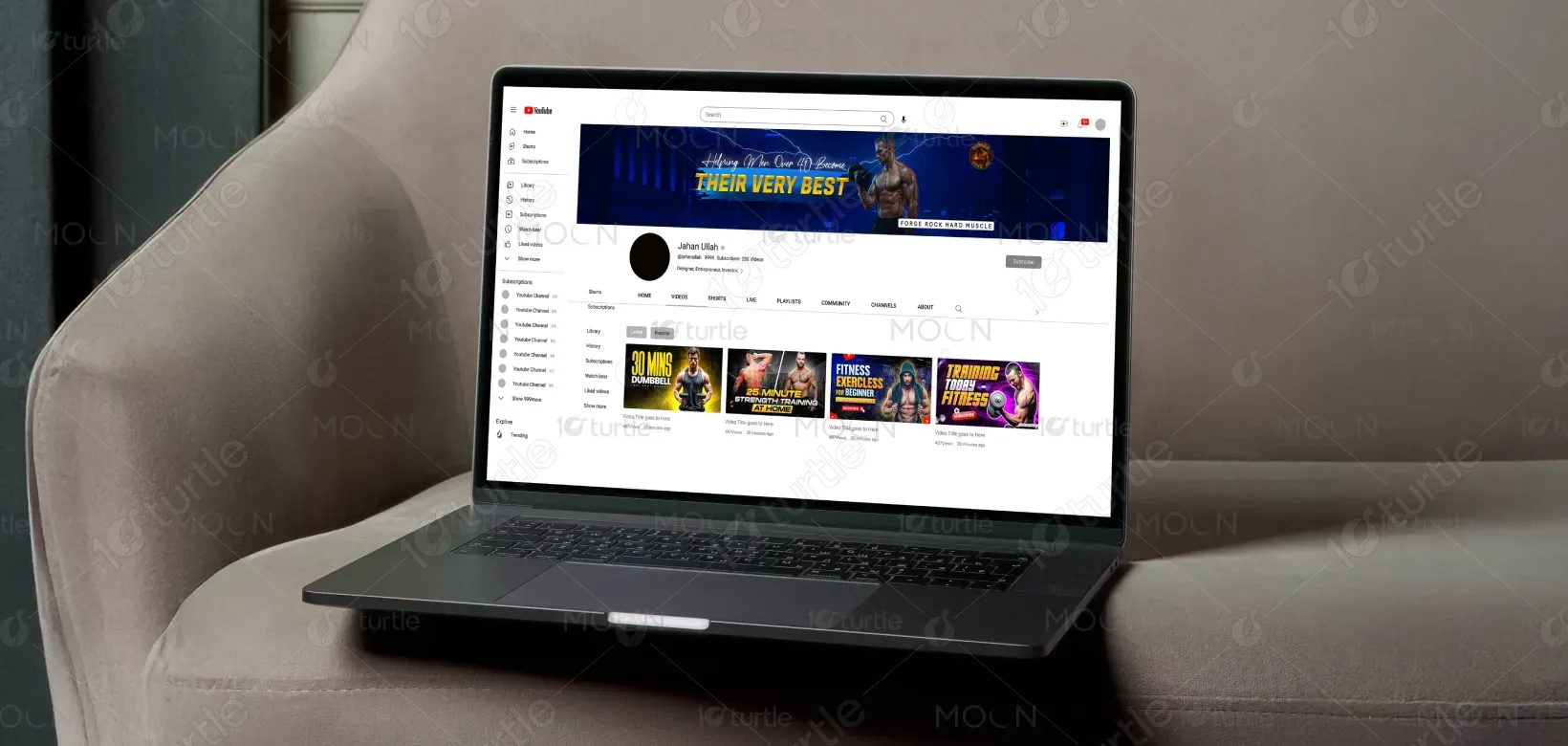
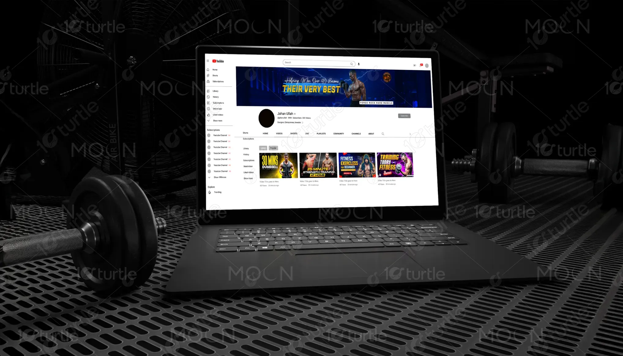
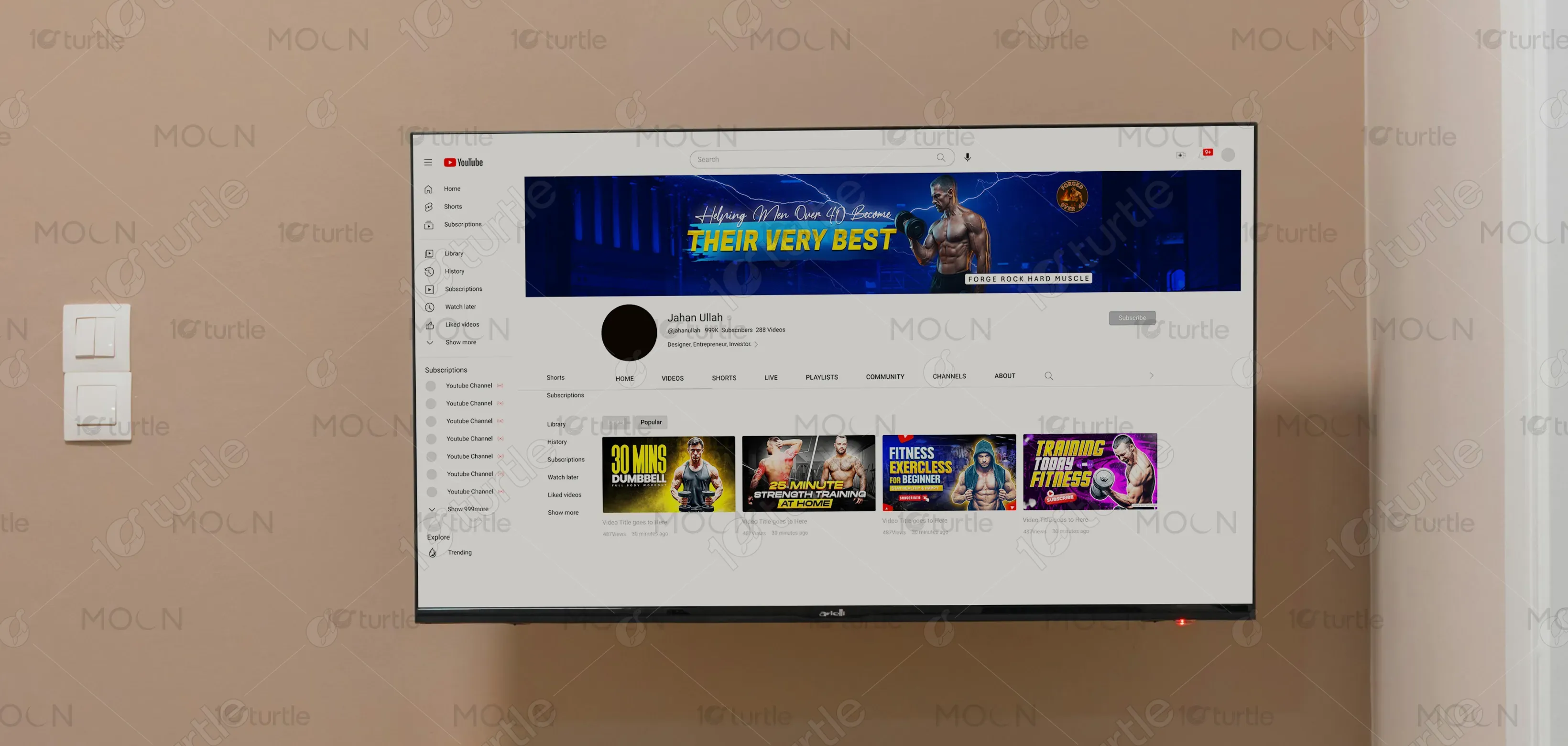
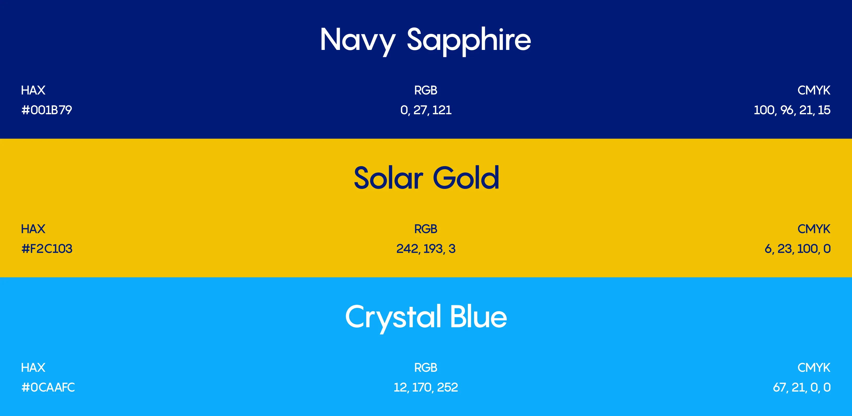
The color scheme features electric blue, vibrant yellow, and deep blacks. Blue conveys strength, stability, and trust—key traits valued by the target demographic. Yellow injects energy, optimism, and a sense of action, drawing attention to the brand’s motivational message. Black provides contrast, sophistication, and intensity, grounding the overall design. Together, these colors evoke determination and empowerment, aligning with the brand’s identity while ensuring the banner feels bold, modern, and inspiring. The palette reinforces the fitness journey as both powerful and achievable.