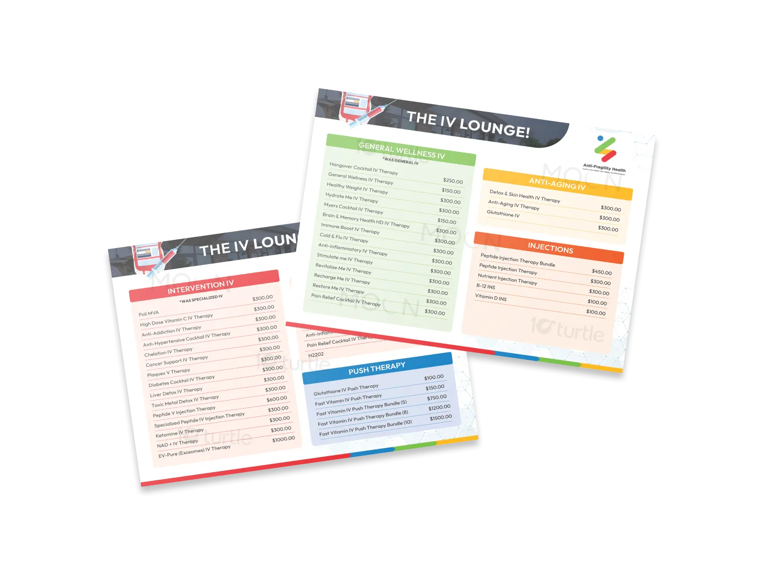
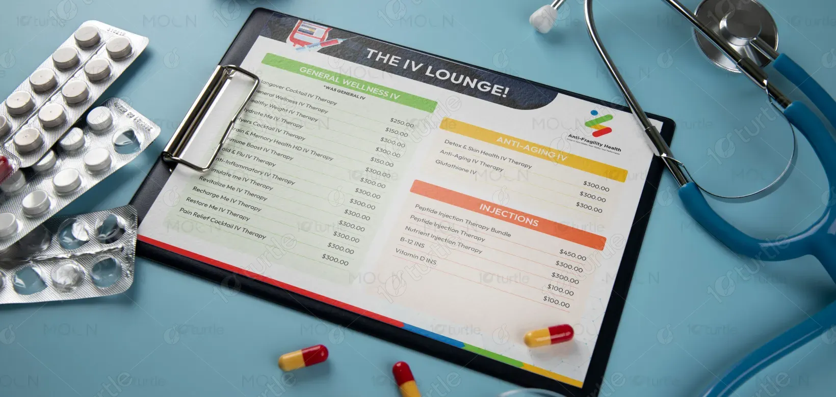
The flyer design embodies a clean, professional, and wellness-focused aesthetic. Bright, health-associated colors like green, orange, and blue categorize different therapy types, ensuring clarity and quick recognition. A modern, clinical style emphasizes trust and reliability while maintaining an approachable tone. The layout uses strong sectioning with bold headers and pricing transparency, creating an easy-to-navigate design. The use of icons, vibrant accent colors, and balanced typography reflects vitality and innovation, while the overall visual identity reinforces the brand’s positioning as a premium wellness service provider.
Flyer Design
Graphic Design
Industry
Healthcare & Wellness
Tools we used
Project Completion
2025
Key Market
Global
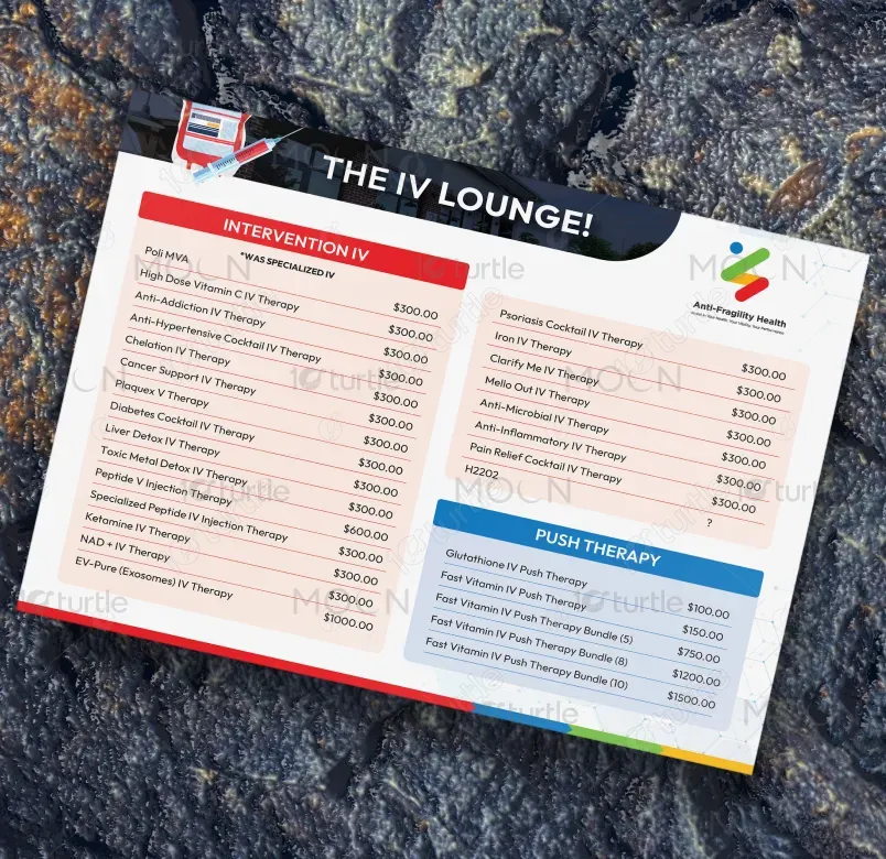
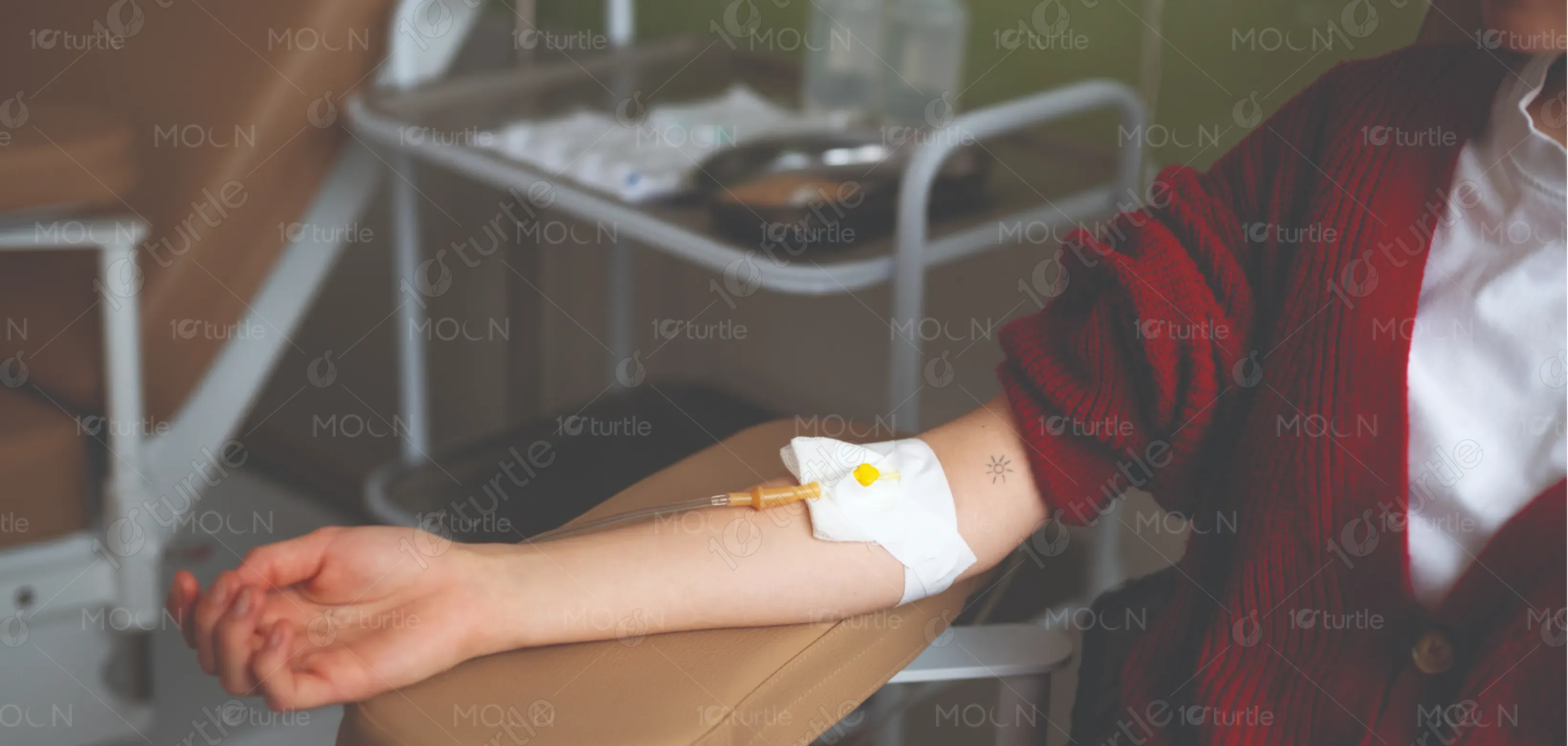
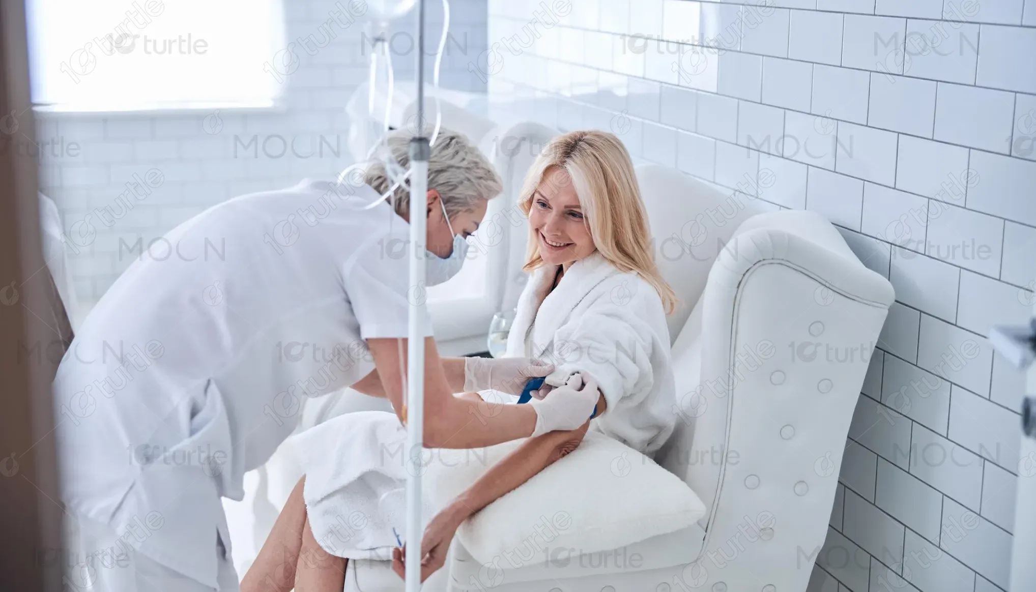
This flyer promotes The IV Lounge, a wellness service offering specialized IV therapies, injections, and push therapies. Designed to restore balance, enhance vitality, and support overall health, it presents a wide range of customizable wellness solutions. With clear categories such as General Wellness, Anti-Aging, Intervention IV, and Push Therapy, the flyer communicates both variety and specialization. The transparency in pricing and simplified design make it user-friendly while reinforcing credibility. Its unique selling point is a comprehensive menu of therapies tailored to modern health needs.

Industry
Healthcare & WellnessWhat we did
Flyer DesignGraphic DesignPlatform
-Many wellness and IV therapy providers fail to communicate their services in a clear, structured, and visually appealing way. Clients often face cluttered menus, unclear pricing, and an overwhelming choice of treatments, which reduces engagement. Without a professional presentation, potential clients may hesitate due to uncertainty about what each therapy offers and how much it costs. This gap limits customer trust and prevents wellness services from effectively reaching a broader audience seeking clarity and confidence in their healthcare choices.
This flyer addresses the issue by presenting a structured, color-coded menu system that makes therapies easy to navigate. Each therapy category is highlighted with distinct colors, making it instantly recognizable. Clear typography, straightforward pricing, and minimalistic layout remove confusion and build client trust. The use of clean design elements reflects professionalism and reliability, while the bold branding at the top ensures strong recall. By balancing aesthetics and function, the flyer creates an engaging, trustworthy communication tool that encourages customer decision-making.
The IV Lounge aims to become a leading name in modern wellness by making IV therapies accessible, transparent, and trusted. The brand’s vision is to redefine preventive and restorative healthcare through user-friendly services that combine science with lifestyle enhancement. Long-term, it seeks to expand into multiple locations, introduce personalized wellness plans, and integrate digital platforms for appointment booking and customer education. The goal is to position the brand as a premium yet approachable choice for holistic health and vitality.
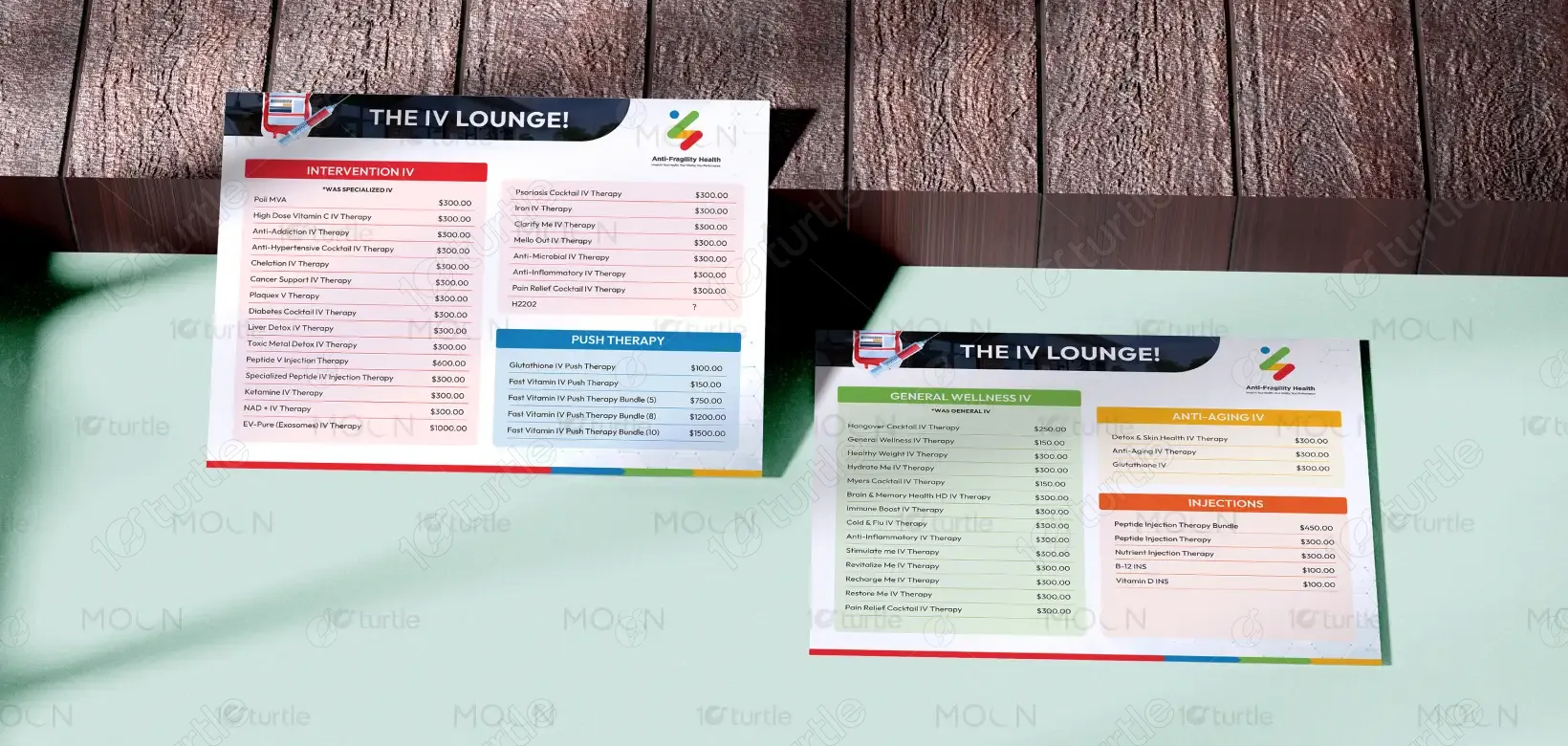
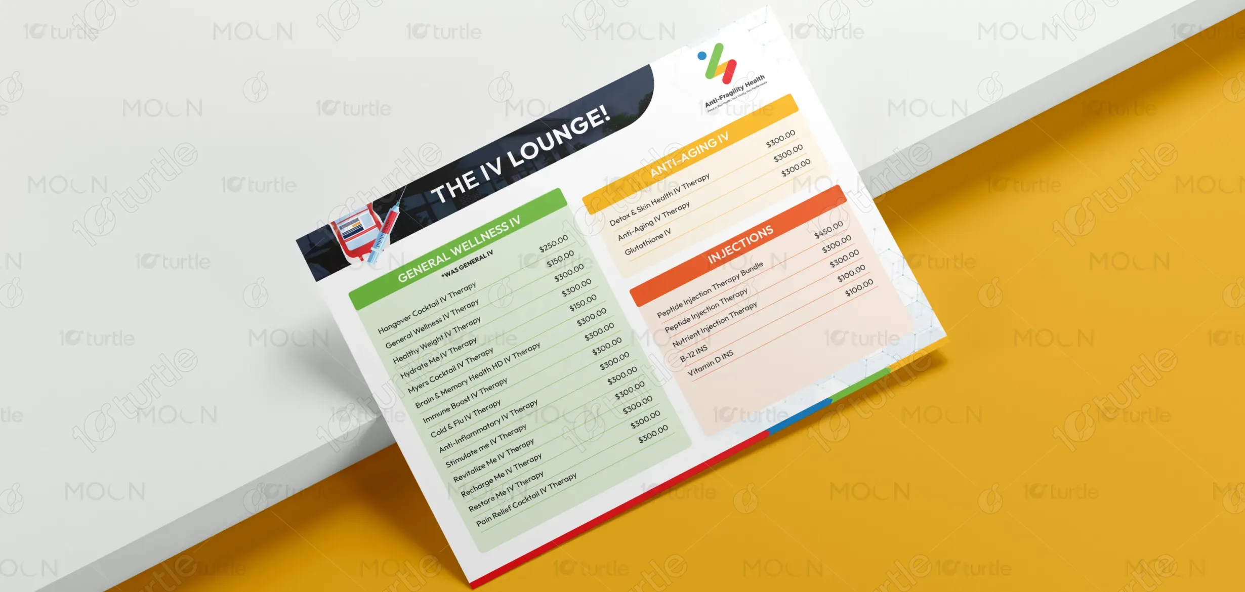
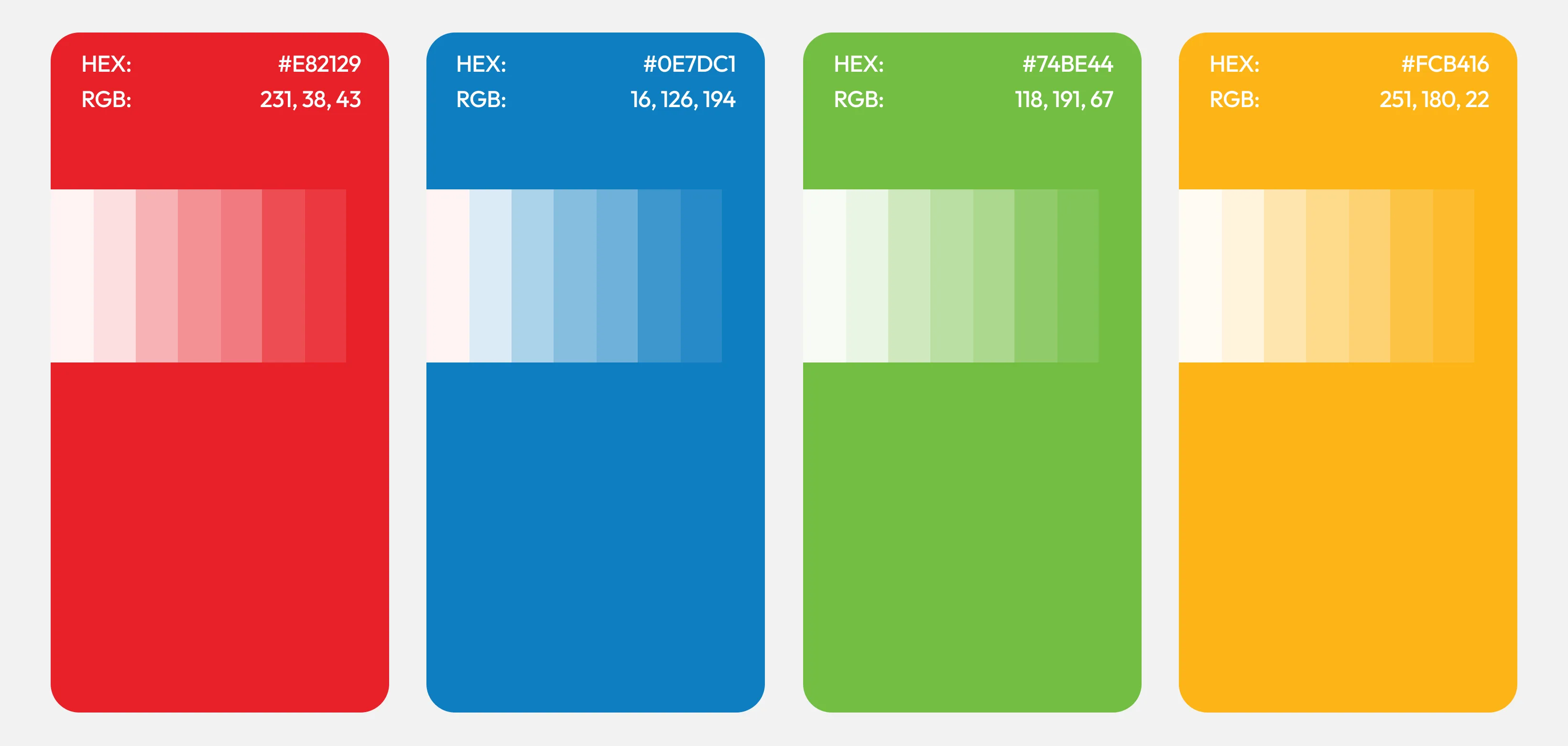
The flyer’s color palette combines green, orange, red, blue, and white to create a clear, wellness-driven identity. Green symbolizes health, rejuvenation, and vitality, making it ideal for general wellness services. Orange conveys energy and renewal, aligning with anti-aging treatments. Red represents strength, urgency, and medical reliability, perfect for intervention therapies. Blue reflects trust, calmness, and healing, supporting the push therapy section. Balanced with a white background for cleanliness and professionalism, the palette ensures clarity, emotional resonance, and strong visual hierarchy.