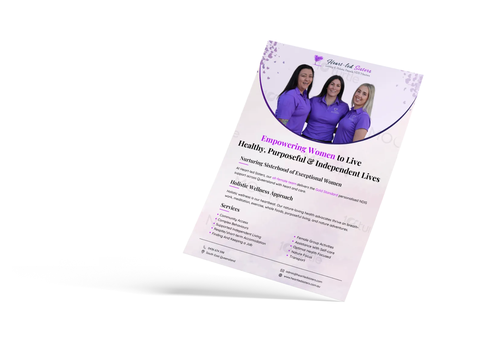
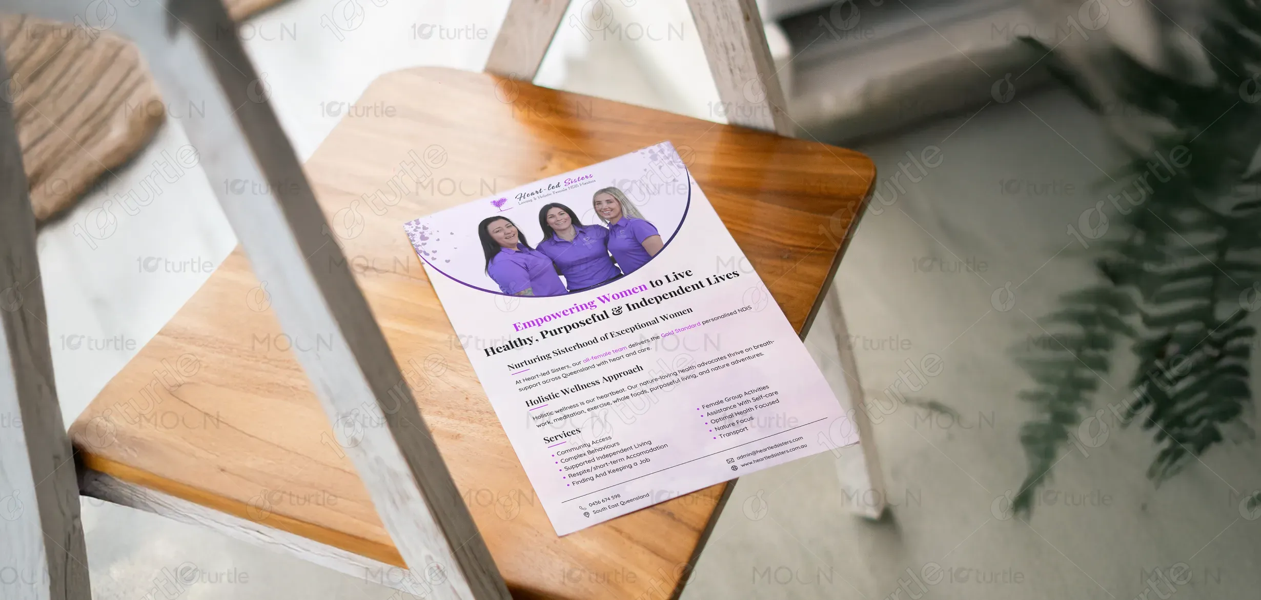
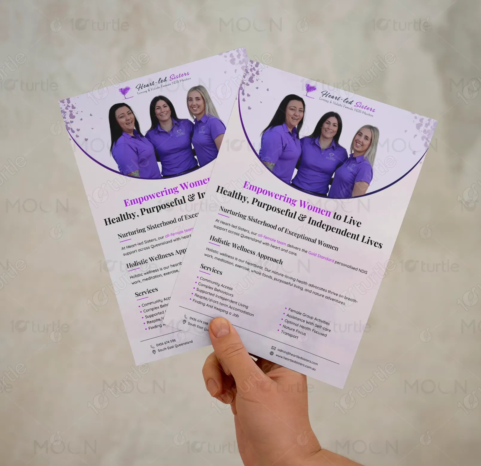
This flyer design embraces a clean, feminine, and uplifting aesthetic that reflects the brand’s commitment to empowering women. Soft gradients, gentle purples, and curved shapes create a nurturing and holistic feel, while the professional team photo adds authenticity and trust. The structured layout enhances readability, balancing visual appeal with clear communication. Icons and subtle decorative elements reinforce the wellness theme, resulting in a polished, approachable, and purposeful design that speaks directly to women seeking compassionate NDIS support.
Flyer Design
Graphic Design
Industry
Healthcare & Wellness
Tools we used


Project Completion
2025
Key Market
Global
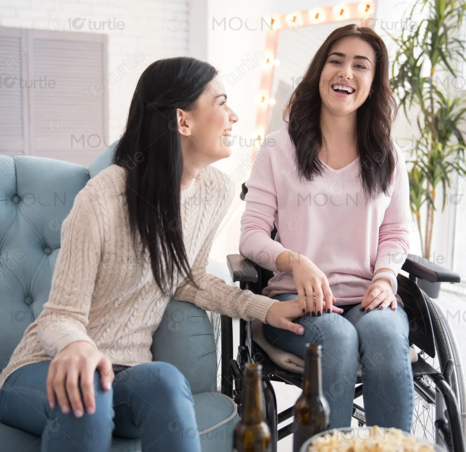
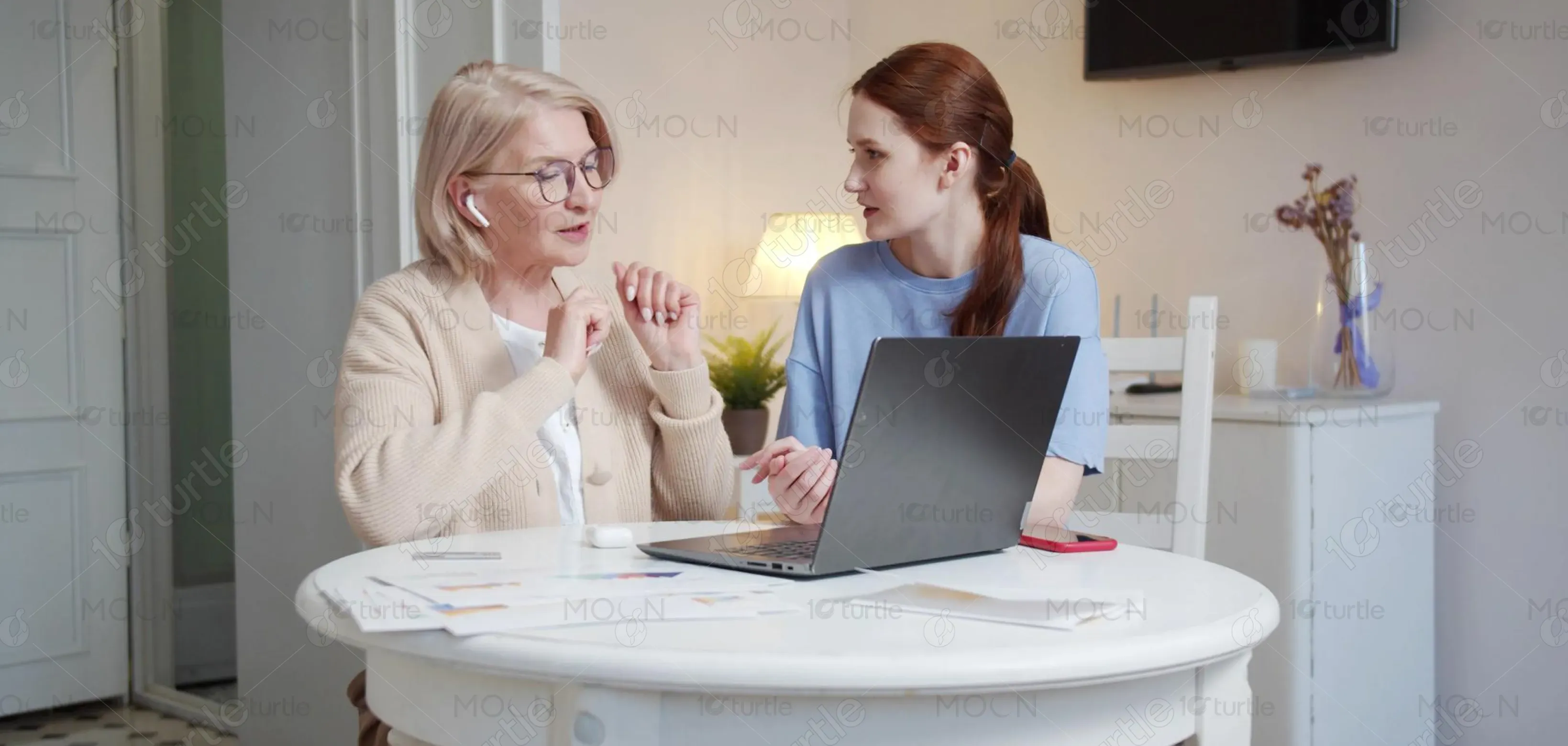
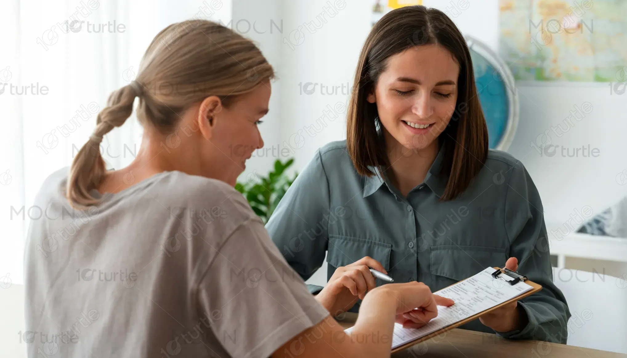
This flyer introduces Heart-led Sisters, a women-focused NDIS service dedicated to providing holistic, personalised support across Queensland. The flyer highlights the brand’s unique approach—delivered by an all-female team—offering wellness-centred services that help women live healthy, purposeful, and independent lives. It blends professionalism with warmth, positioning the organisation as a trusted and empathetic provider in the disability support market. Its clear messaging and visually soothing design make it appealing and easy for potential clients to understand the services offered.
Industry
Healthcare & WellnessWhat we did
Flyer DesignGraphic DesignPlatform
-The primary design challenge was presenting a wide range of NDIS services without overwhelming the reader. Many disability service flyers tend to look overly clinical, cluttered, or impersonal, which can alienate women seeking emotional connection and holistic care. Additionally, representing trust, safety, and femininity while maintaining professionalism required a careful balance. Another challenge was differentiating the brand from generic competitors who use similar layouts or colours, ensuring Heart-led Sisters stands out through tone, clarity, and visual warmth.
The design solves these challenges by using a soft, soothing colour palette and a clear hierarchical structure that guides the reader naturally through the content. Curved sections, ample spacing, and bullet-point lists improve readability. Featuring the team prominently establishes trust and relatability. Subtle graphic elements reinforce the feminine and wellness-focused brand identity. The overall layout communicates professionalism while still feeling warm, nurturing, and personal—aligning perfectly with a women-led, holistic NDIS service provider.
The long-term vision for this design is to create a recognisable and emotionally resonant brand presence that communicates empowerment, wellness, and sisterhood. This flyer aims to set the foundation for consistent future branding across digital and print platforms. By maintaining a clean, holistic aesthetic, the design supports the organisation’s mission to inspire confidence and trust among women seeking support. Over time, this visual direction will strengthen brand recall, expand community reach, and position Heart-led Sisters as a leading wellness-based NDIS provider.
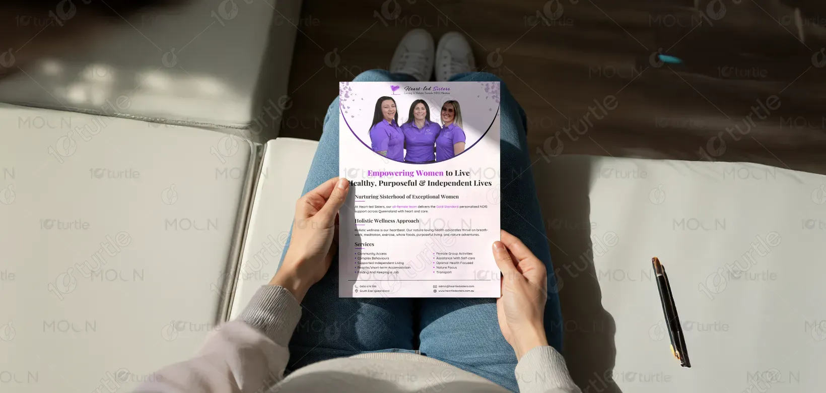
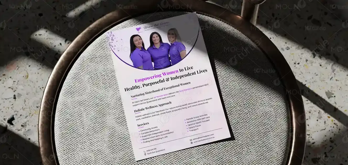
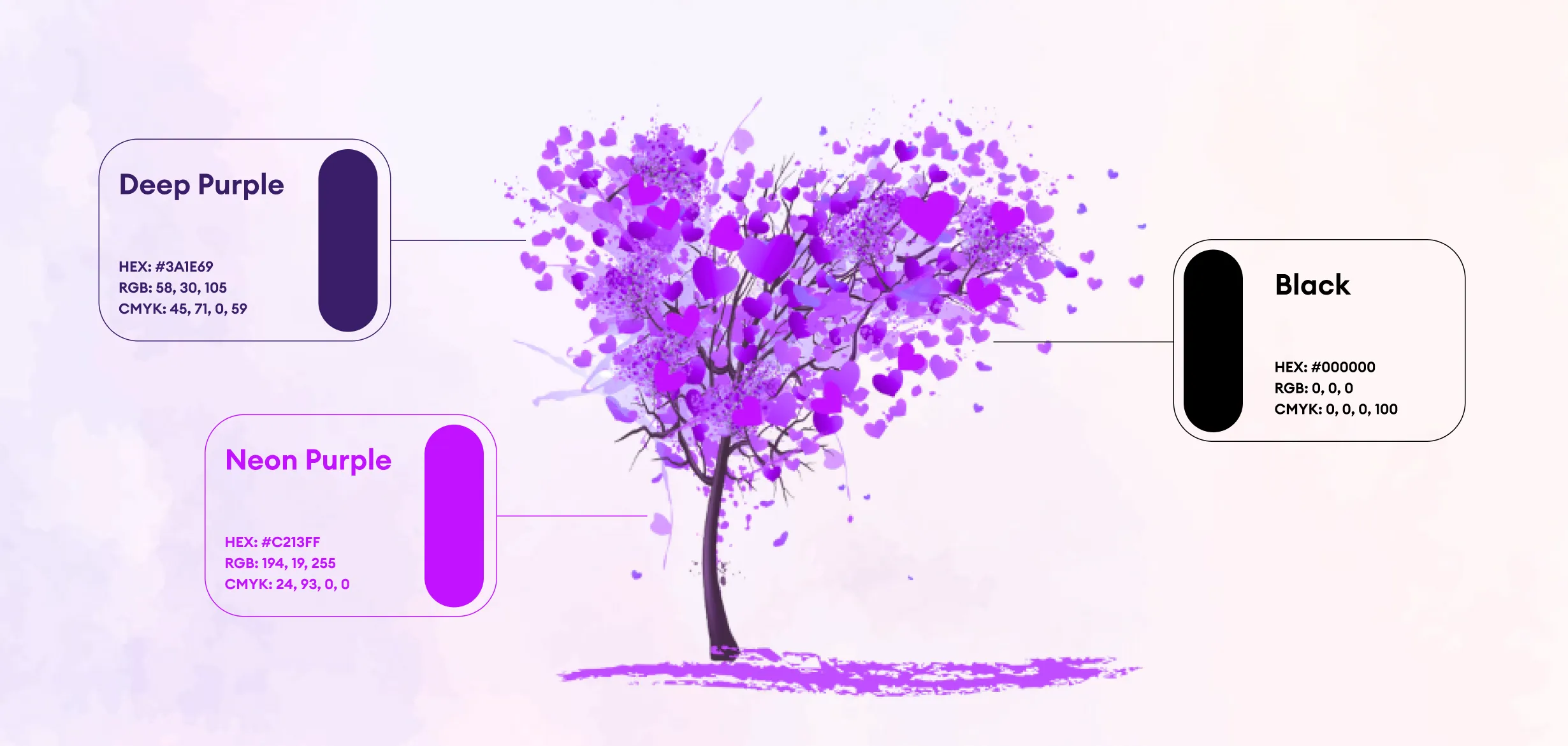
The flyer uses shades of purple, lavender, and soft pink tones—colours traditionally associated with femininity, wellness, and compassion. Purple conveys wisdom, empowerment, and calmness, aligning with the brand’s mission to support women holistically. The gradients and soft hues add serenity and warmth, enhancing emotional connection. Light neutrals balance the design, ensuring clarity and professionalism. This palette not only reflects the brand identity but also helps create a soothing and supportive atmosphere for the target audience.