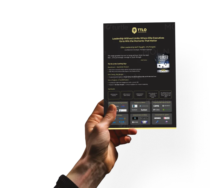
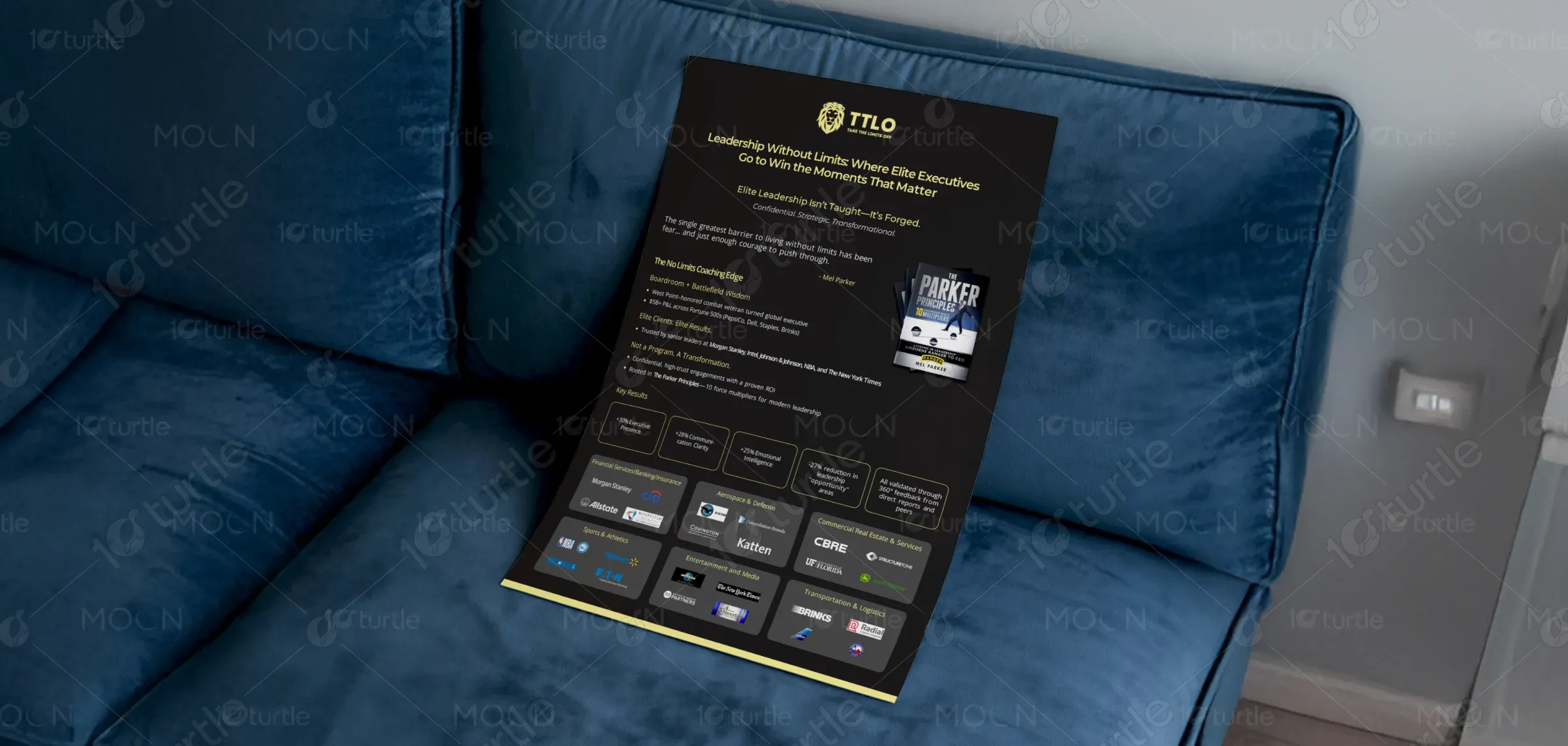
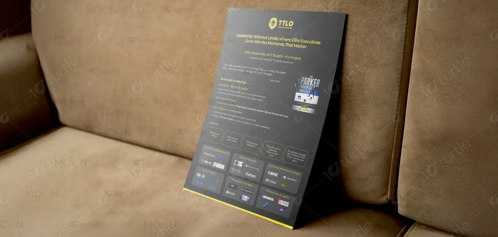
The flyer design embodies a bold and authoritative aesthetic, balancing professionalism with motivational energy. Clean typography, strategic use of white space, and dynamic layouts emphasize clarity and confidence, mirroring the brand’s high-performance ethos. Sharp lines, impactful highlights, and strong hierarchy guide the reader through key offerings and results. The creative direction reflects transformation, resilience, and credibility—capturing both the discipline of military leadership and the sophistication of executive influence. The design speaks to elite leaders ready for breakthrough growth.
Flyer Design
Graphic Design
Industry
Professional & B2B Services
Tools we used


Project Completion
2025
Key Market
Global
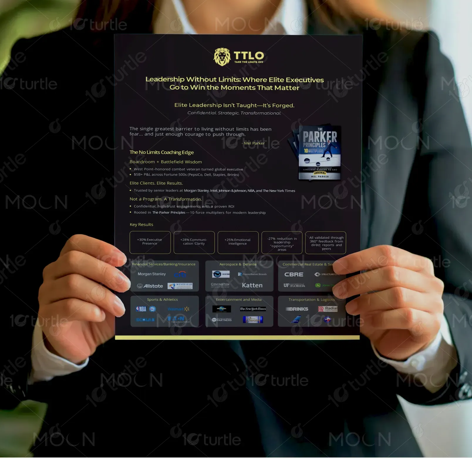
This flyer showcases executive coaching services tailored for Fortune 500 leaders, founders, and senior executives. Its purpose is to communicate the brand’s transformational coaching framework—rooted in The Parker Principles—and demonstrate tangible outcomes like improved executive presence, communication, and emotional intelligence. The design positions the brand as a trusted partner in high-stakes leadership growth. Its unique selling points include measurable ROI, elite clientele, and a fusion of corporate and battlefield leadership wisdom, all wrapped in a premium, high-impact visual identity.
Industry
Professional & B2B ServicesWhat we did
Flyer DesignGraphic DesignPlatform
-The primary challenge was creating a flyer that could speak to C-suite executives without appearing generic or overly promotional. The coaching market is saturated with templated, motivational visuals that lack authenticity and authority. Executives are skeptical of “programs” and seek credibility, results, and confidentiality. The problem was how to convey elite transformation and trust visually—bridging the gap between a coaching service and a high-level strategic partnership—while avoiding clichés commonly seen in leadership development marketing materials.
The design solves this challenge by leveraging a premium, strategic aesthetic that emphasizes trust, transformation, and measurable impact. Strong typography establishes authority, while carefully balanced visuals highlight credibility and results. The structured flow mirrors the client’s proven 10-step coaching framework, guiding readers with clarity and precision. Testimonials and key statistics were prominently placed to validate outcomes, building confidence for skeptical leaders. The overall design positions the brand as exclusive, result-driven, and transformational, rather than just another coaching service.
The long-term vision is to establish a timeless brand identity that reflects authority, transformation, and global influence in executive coaching. This design serves as a foundation for consistent brand storytelling across print and digital channels. By blending motivational energy with executive sophistication, the design aims to create lasting recognition in leadership circles, reinforce trust with Fortune 500 clients, and set a benchmark for high-performance coaching visuals. It aspires to make the brand synonymous with elite executive transformation worldwide.
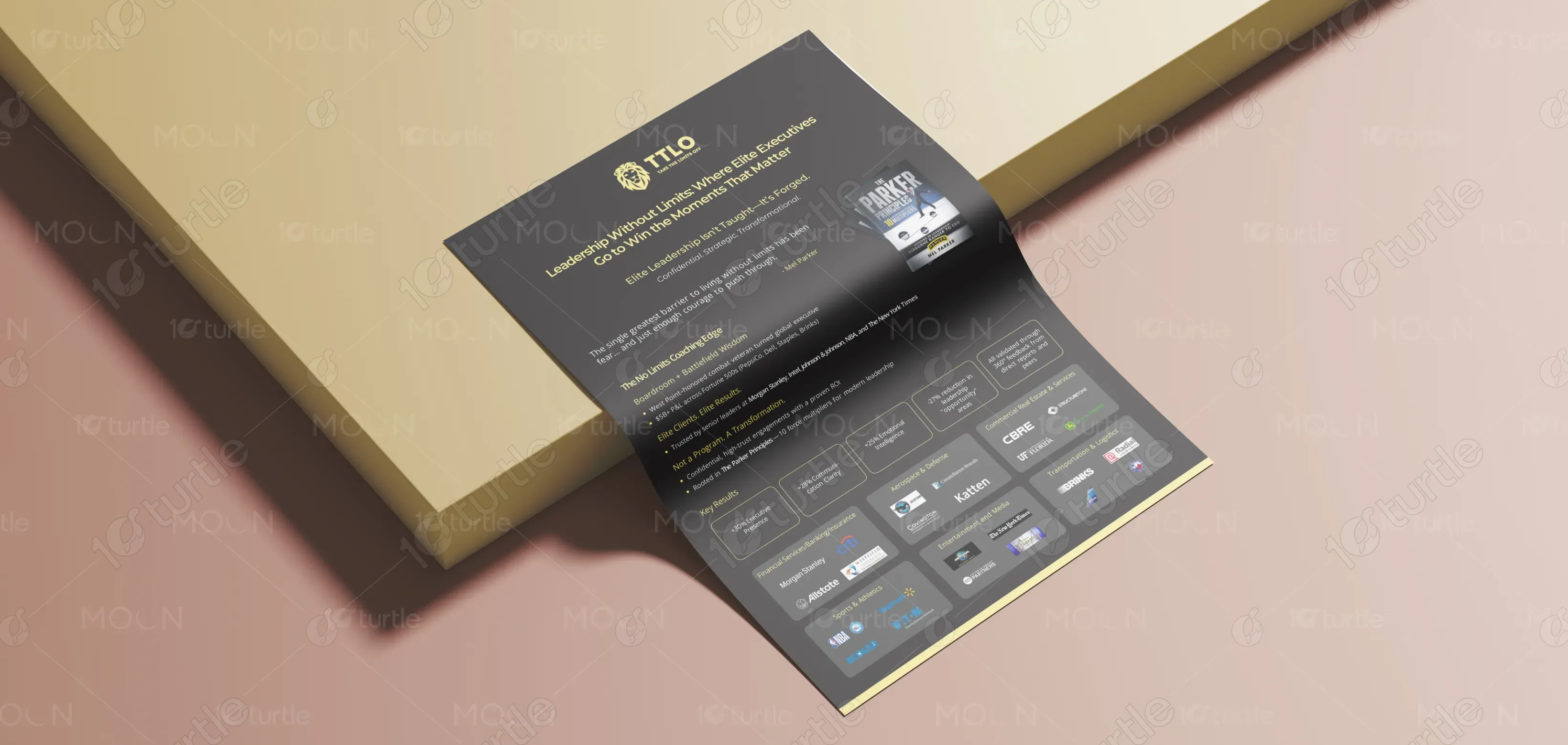

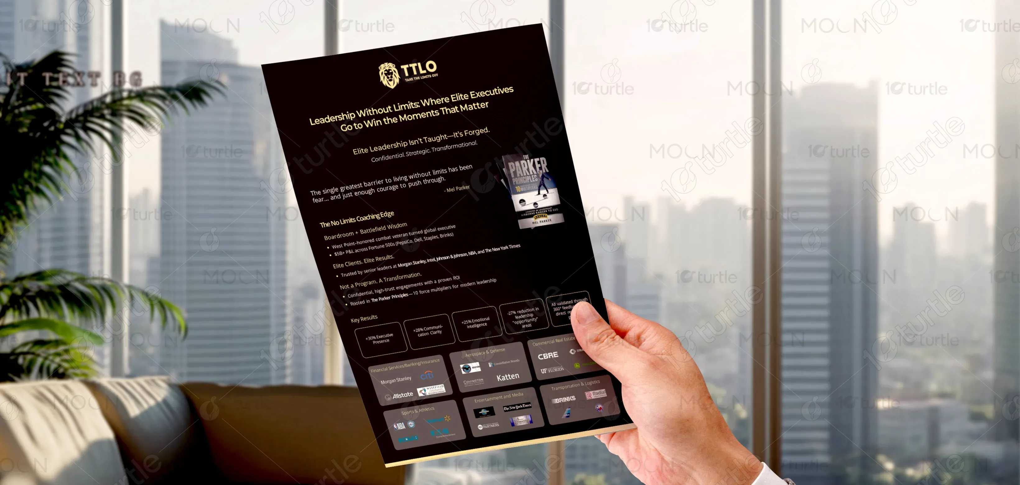
The color palette combines deep navy (symbolizing trust, stability, and professionalism), bold gold accents (evoking prestige, success, and transformation), and white/neutral tones (emphasizing clarity and transparency). Navy connects to corporate authority, while gold highlights the aspirational journey of leaders who aim to excel beyond limits. This scheme aligns with the brand’s premium positioning, balancing executive seriousness with motivational energy. Together, the colors create an aesthetic that resonates with elite clients, while reinforcing the brand’s identity as a trusted, results-driven partner.