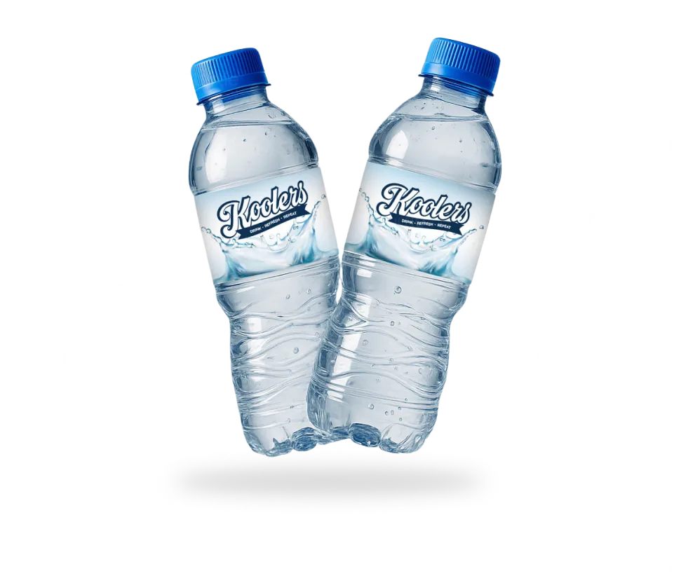
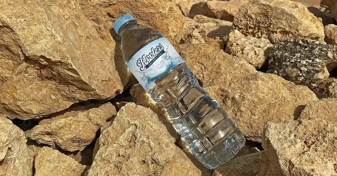
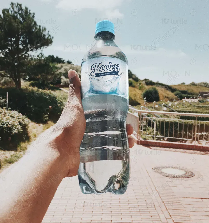
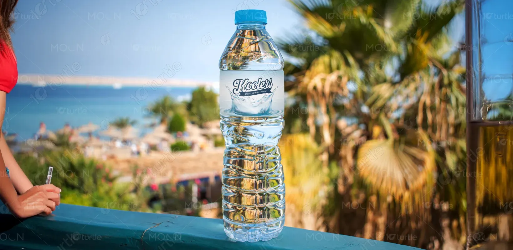
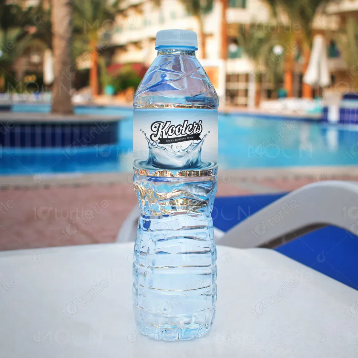
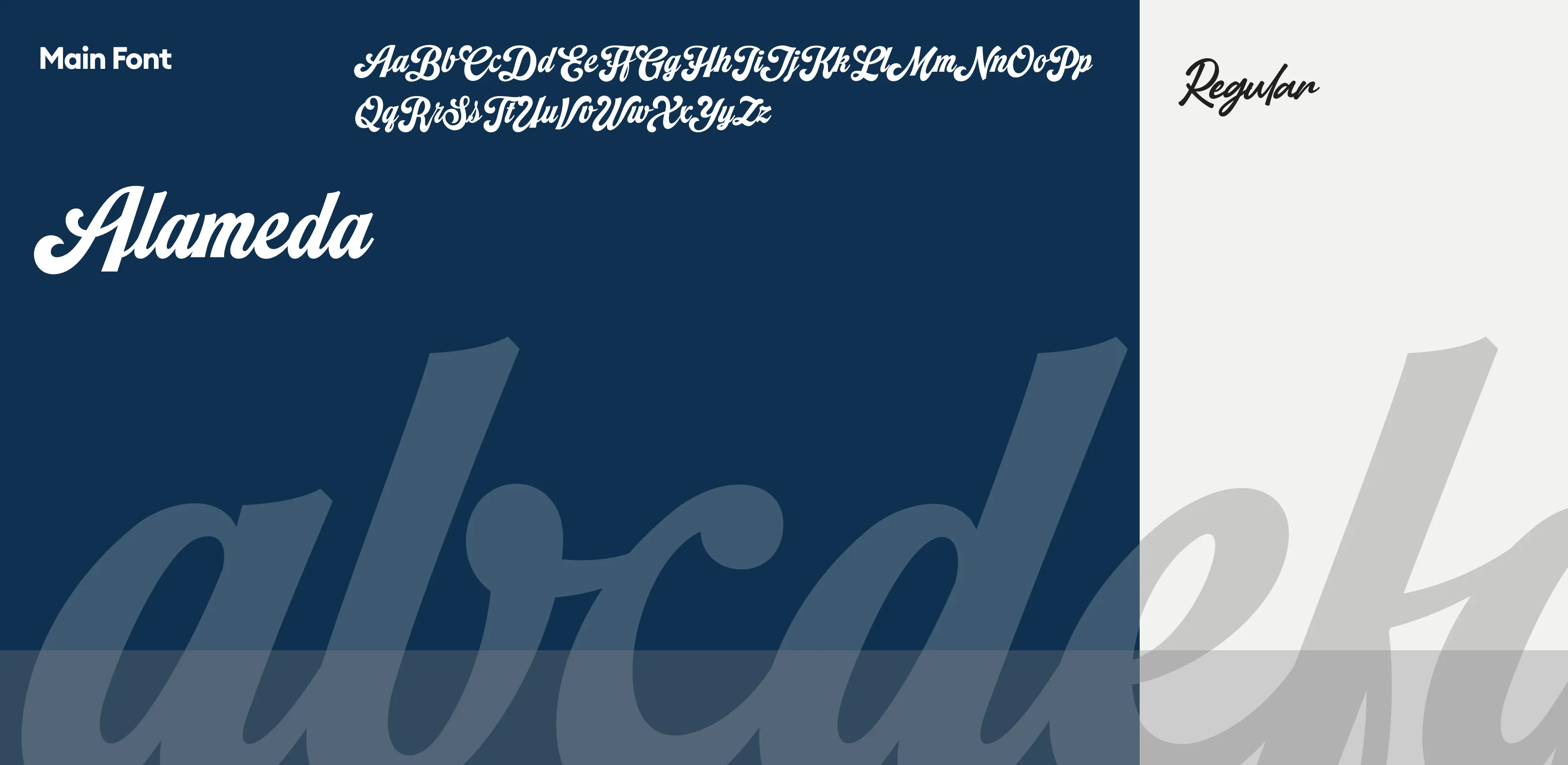
The Koolers label design embraces a clean, refreshing aesthetic, aligning with the purity of natural spring water. A dynamic splash graphic conveys motion and vitality, while the bold, retro-inspired typography offers instant brand recognition. The layout balances modern minimalism with visual energy, ensuring shelf appeal. The blue and white color palette reinforces coolness and clarity, while the wave element connects emotionally with hydration and nature. The design is versatile, suitable for both outdoor and lifestyle-driven branding visuals.
Label Design
Graphic Design
Industry
Food, Beverage & Hospitality
Tools we used


Project Completion
2025
Key Market
Global
Koolers is a premium bottled water brand focused on refreshment, purity, and sustainability. Designed to appeal to active, health-conscious individuals, the product is positioned as a lifestyle essential rather than just a hydration source. Its standout features include a clean, eye-catching label, recyclable PET bottle, and bold brand name with an inviting splash graphic. In a crowded bottled water market, Koolers distinguishes itself through a playful yet premium design that visually communicates energy, purity, and modern wellness.
Industry
Food, Beverage & HospitalityWhat we did
Label DesignGraphic DesignPlatform
-The main challenge was designing a label that stands out in a saturated market while conveying purity without being generic. Many water brands rely heavily on blue and white, making differentiation difficult. Additionally, the design needed to perform well in diverse settings—retail shelves, outdoor use, and lifestyle photography—while maintaining clarity and brand recognition. Balancing minimalism with visual impact was a key obstacle, as overly clean designs risk looking bland, while too much detail can distract from the product’s core message.
The Koolers label solves these challenges by incorporating a dynamic water splash graphic that adds motion and energy, instantly signaling freshness. The bold, curved typography sets the brand apart, giving it a playful identity while remaining legible at a distance. The design works harmoniously with transparent PET bottles, using contrast and white space strategically to keep the branding visible through the water. This visually flexible design supports marketing across digital, outdoor, and lifestyle formats, ensuring brand recall and emotional appeal.
The long-term vision for Koolers is to become a recognizable, aspirational hydration brand synonymous with vitality and outdoor wellness. The design aims to evolve into a versatile identity system—supporting flavored lines, eco-friendly versions, and larger family packs—without losing core brand elements. It seeks to build emotional resonance with eco-conscious and fitness-driven consumers, while becoming a mainstay on shelves, in gyms, and on-the-go. The aesthetic will grow with consumer needs, maintaining clarity and freshness as key pillars.
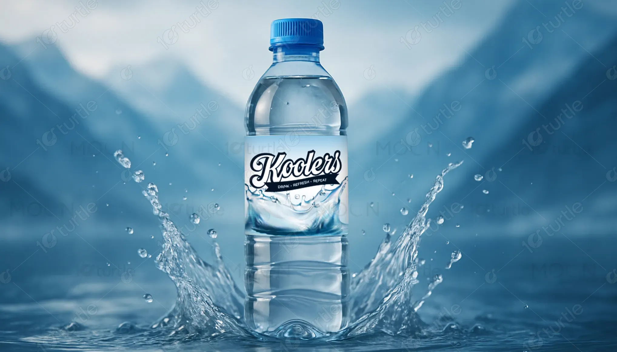

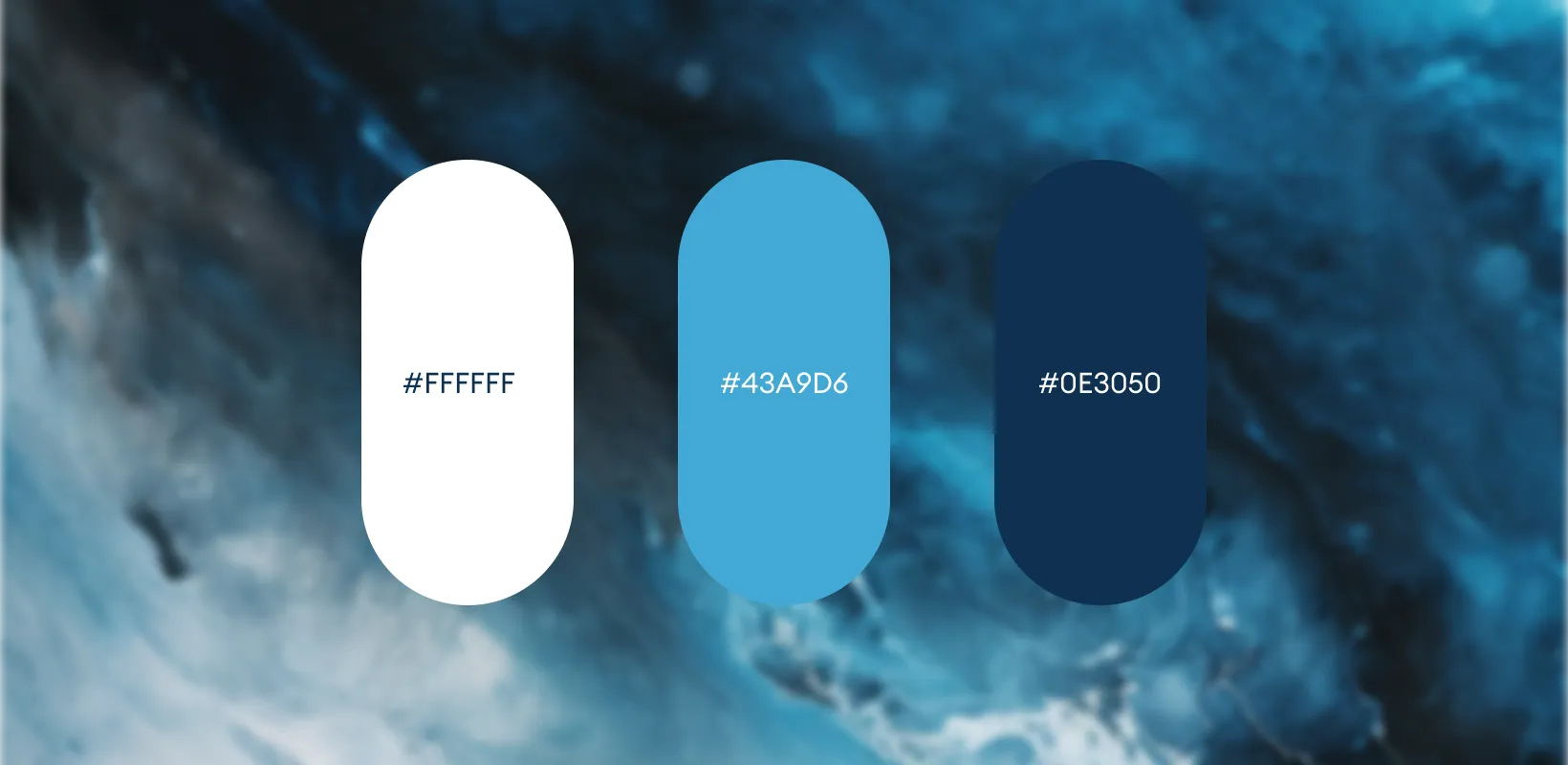
The primary colors are sky blue and crisp white, reflecting water's clarity and cool refreshment. Blue evokes trust, purity, and hydration—core qualities for a water brand. White reinforces minimalism and cleanliness, offering visual balance against the blue splash. The dark blue text adds contrast and readability while aligning with the calming, refreshing tone. This palette not only appeals emotionally but also enhances legibility and brand recognition across various environments and lighting conditions.