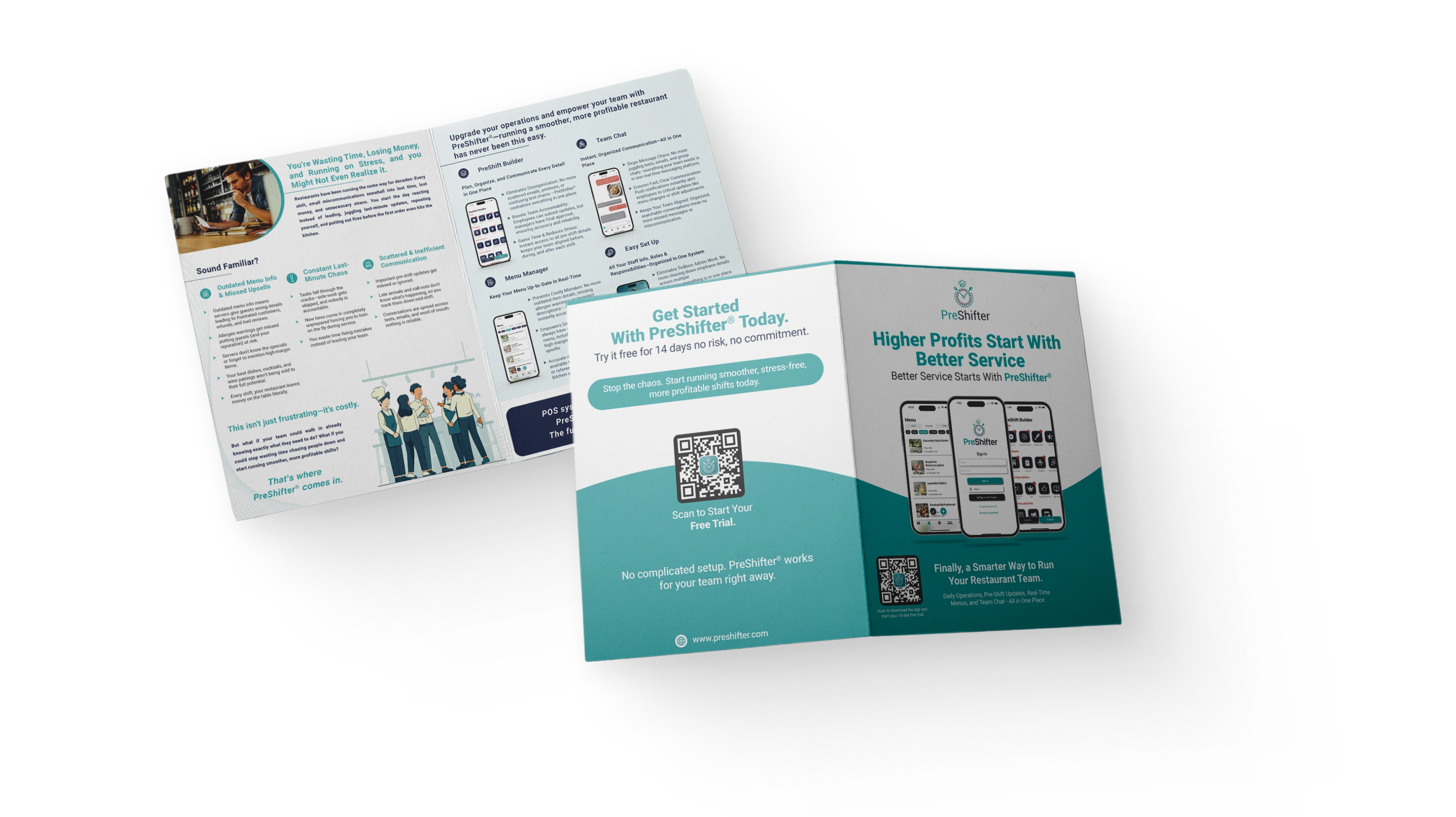
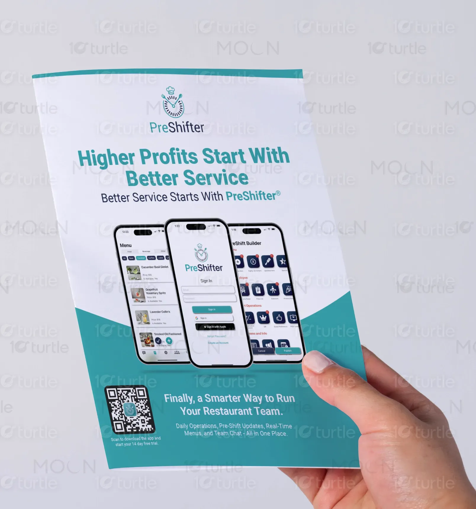
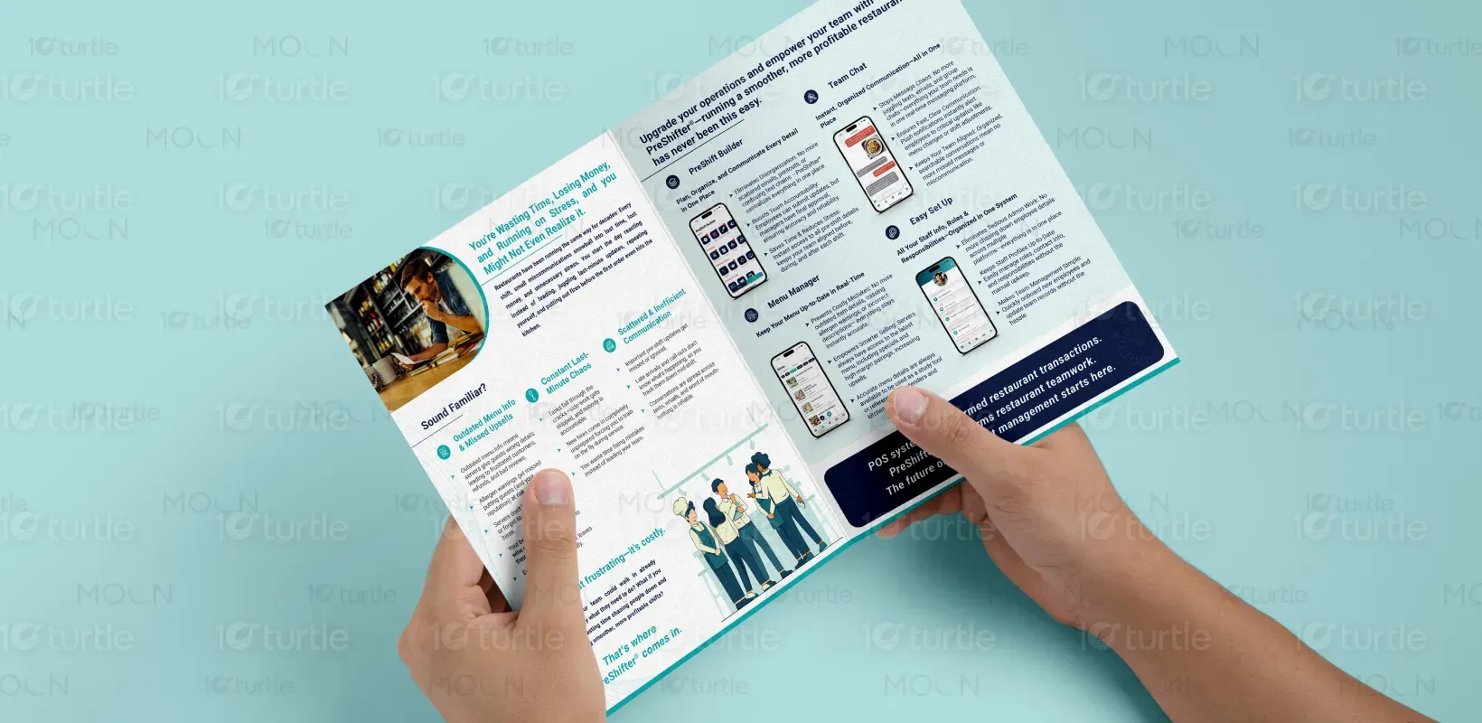
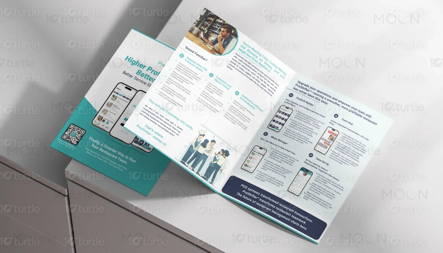
The design for this bifold brochure presents a sleek, modern aesthetic focused on efficiency and clarity. The layout uses clean lines, soft blues, and contrasting dark elements, making it easy to navigate through information. The mobile-focused visuals and app screenshots emphasize the product’s ease of use and tech-forward approach, while illustrations of staff collaboration foster a sense of teamwork. The clear, concise text and visually organized content provide a professional yet approachable tone, perfectly fitting for restaurant management professionals.
Graphic Design
Bi-fold Design
Brochure design

Industry
Technology, SaaS & Startups
Tools we used


Project Completion
2025
Key Market
Global
PreShifter® is a restaurant operations app designed to streamline daily workflows, improve communication, and boost team accountability. It centralizes pre-shift updates, menu management, and team communication in one intuitive platform. By addressing common pain points like outdated menu details, last-minute chaos, and miscommunication, PreShifter® enhances the efficiency of restaurant teams and leads to more profitable, stress-free shifts. The app is a game-changer for restaurants aiming for smoother operations and higher customer satisfaction.

Industry
Technology, SaaS & StartupsWhat we did
Graphic DesignBi-fold DesignBrochure designPlatform
-The restaurant industry struggles with inefficiencies stemming from outdated systems, poor communication, and disorganization. Restaurants typically rely on scattered texts, emails, and manual processes to manage pre-shift details, menu updates, and team coordination, leading to confusion, mistakes, and missed opportunities. These issues result in lost time, reduced profits, and increased stress for both managers and staff. PreShifter® addresses this gap by providing an integrated solution that centralizes communication and operations, reducing chaos and improving workflow.
PreShifter® effectively solves the problem by centralizing key restaurant operations into one platform. With features like the PreShift Builder, Menu Manager, and Team Chat, the app ensures that all necessary information is up-to-date and easily accessible. It helps restaurants prevent costly mistakes, like outdated menu items and missed upsell opportunities, by providing real-time updates. Additionally, the streamlined communication system eliminates the need for multiple platforms, improving efficiency and accountability.
The long-term vision for PreShifter® is to become the leading platform in restaurant management by continuously evolving with the industry’s needs. As the app expands, it will integrate more features like advanced analytics and AI-driven insights, making it a complete solution for operational excellence. By focusing on usability, efficiency, and integration, PreShifter® will change the way restaurants manage their teams, leading to long-term industry-wide improvements and creating a lasting impact on customer satisfaction and profitability.

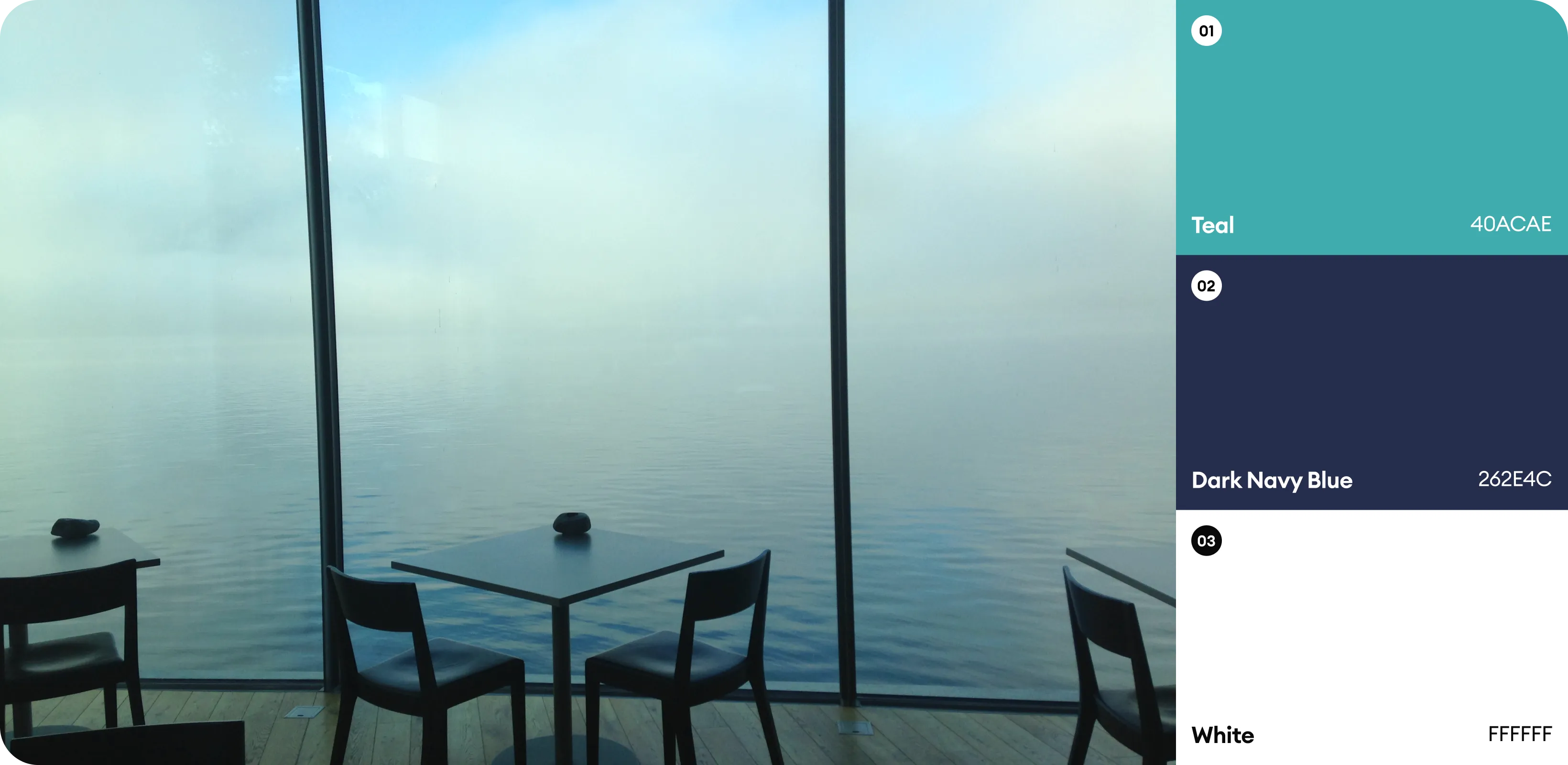
The color palette uses soft blues and dark navy tones, symbolizing trust, professionalism, and reliability—qualities essential for a product that aims to streamline operations. The blue creates a sense of calm and efficiency, while dark navy adds sophistication and stability. White is used for contrast, enhancing readability and giving the design a clean, modern feel. Together, these colors align with the brand’s identity, evoking clarity, confidence, and a professional approach to restaurant management.
