Cuppa is a revolutionary platform designed to unite coffee lovers by helping them discover local coffee shops, earn rewards, and engage with the community. By seamlessly blending technology with the joy of coffee, Cuppa fosters a space where users can explore cafes, connect with local events, and enjoy exclusive perks.
UX Design
Websites Design
UI Design
Industry
Food, Beverage & Hospitality
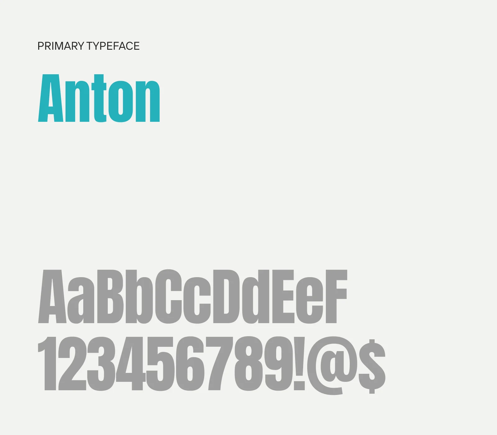
Tools we used


Project Completion
2024
Live Url
https://www.mycuppa.ca/
Cuppa offers a unique approach to coffee culture, promoting small coffee shops and creating a sense of belonging among its users. Through the app, users can earn rewards, discover local events, and enjoy a free cup of coffee every day, making every sip an opportunity to engage with their community.
Industry
Food, Beverage & HospitalityWhat we did
User ResearchUI UX DesigningResponsive ExperiencePlatform
-Many local coffee shops struggle with visibility and customer retention in a market dominated by large chains. Coffee lovers often miss out on unique, high-quality local experiences due to a lack of centralized information and incentives.
Cuppa bridges this gap by providing an all-in-one app that encourages users to explore and support local coffee shops. Features include a location-based directory of cafes, a digital rewards system, curated coffee events, and exclusive deals, ensuring both customers and local businesses benefit.
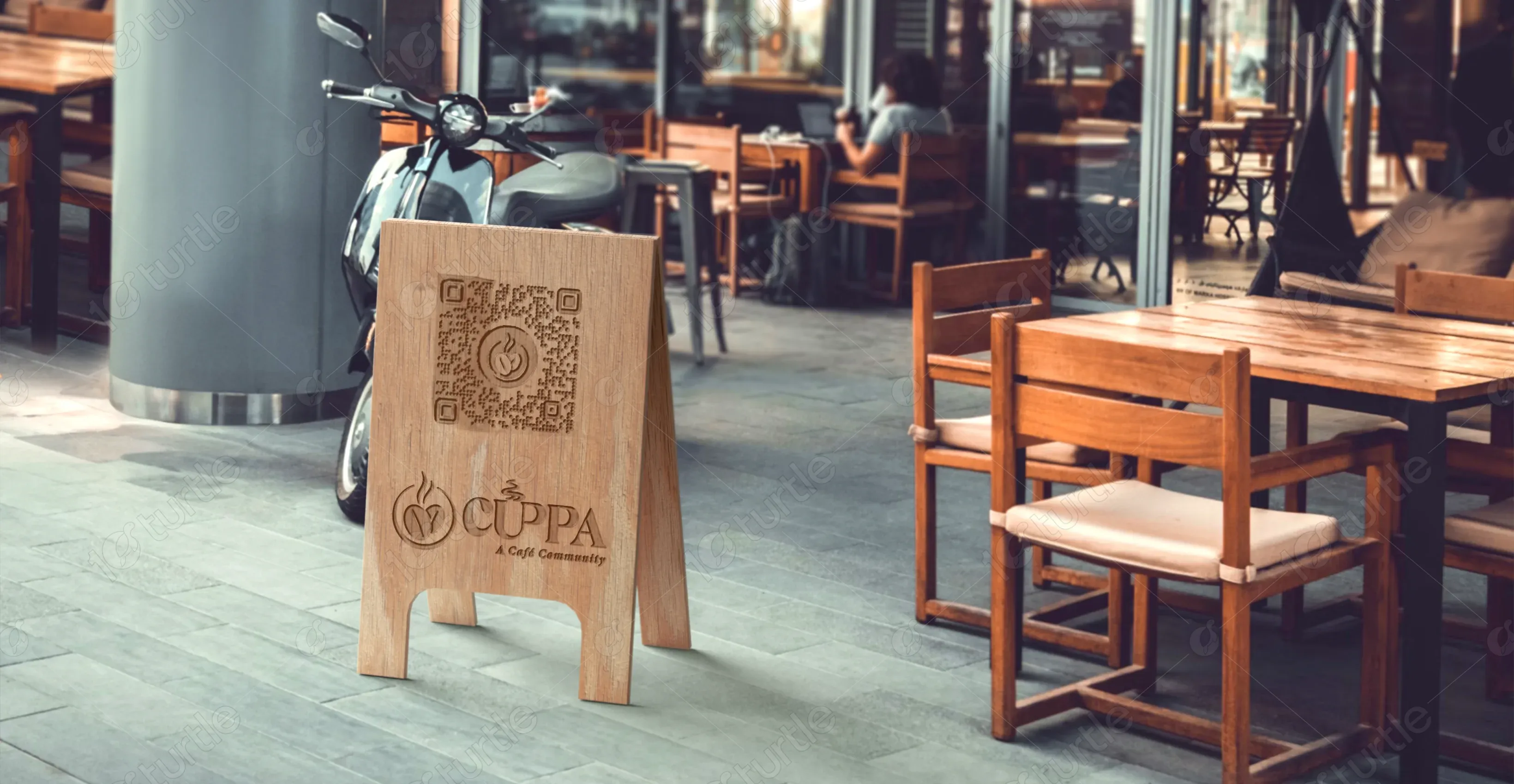
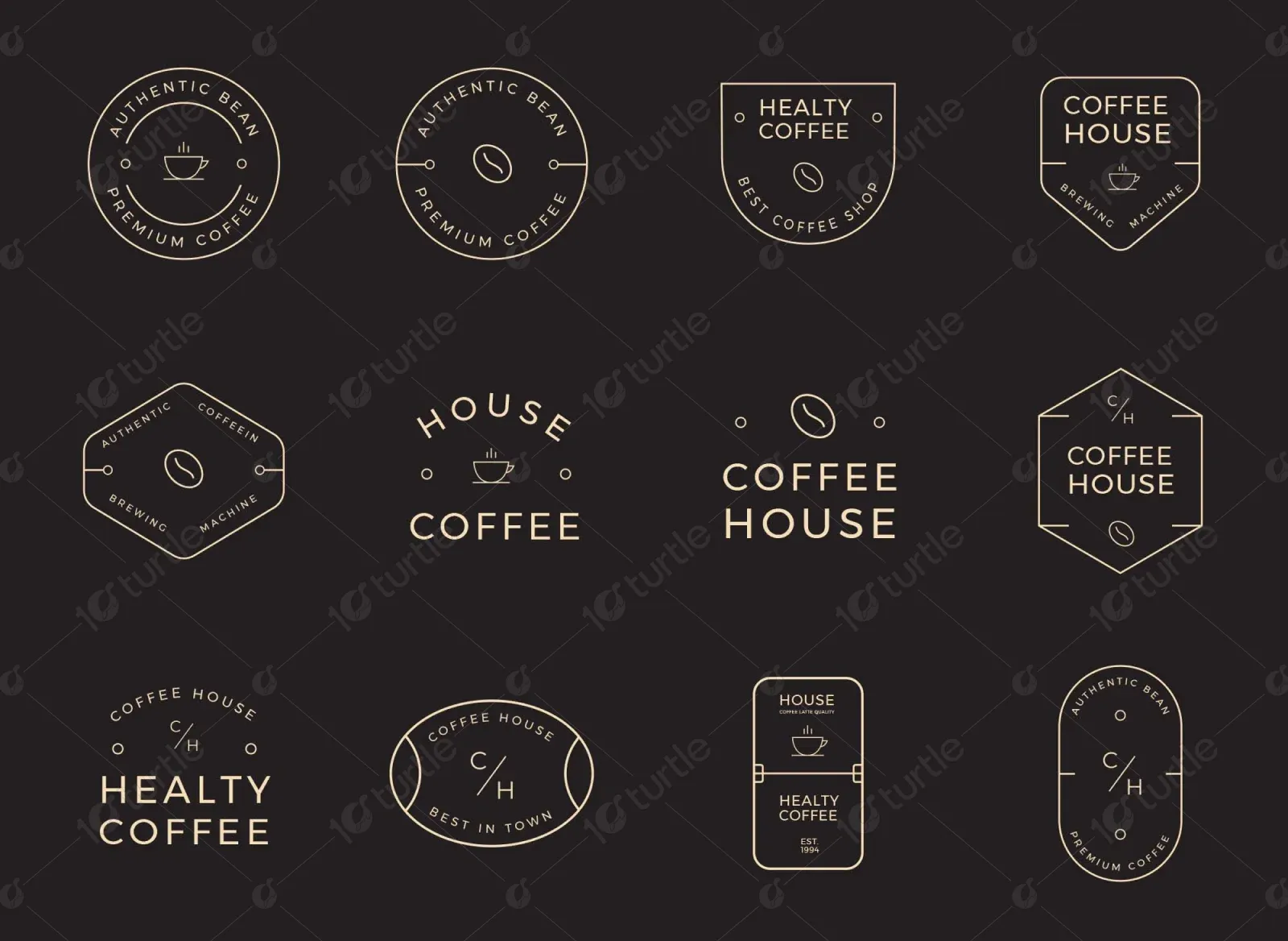
The client envisioned a modern, engaging platform that reflects the warmth and vibrancy of coffee culture. The design emphasizes clean aesthetics, playful typography, and a dynamic user experience with bold call-to-actions and high-quality visuals. The use of coffee beans as design elements reinforces the theme while adding an organic feel.
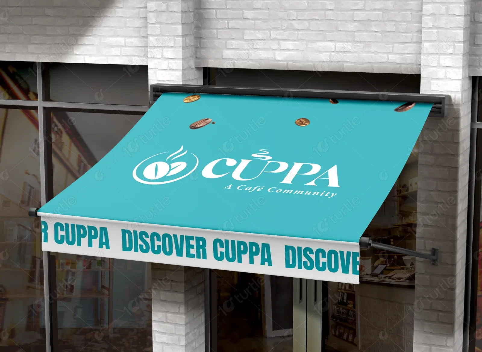
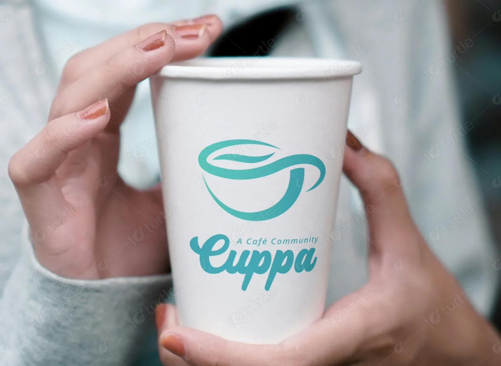
The Cuppa logo features a minimalist coffee cup illustration with fluid, modern typography. The design embodies the brand’s approachable yet sophisticated feel.
The primary brand colors include a fresh and vibrant teal (#41C9EB), which represents innovation and community. Black (#000000) adds a bold and premium feel, while a soft cream shade (#FDF8F1) provides warmth and approachability. Red-orange (#C34405) injects energy into the design, drawing attention to key call-to-actions and interactive elements.
.webp)
The initial wireframes outlined a structured, easy-to-navigate interface, ensuring smooth transitions between discovery, rewards, and engagement sections. The layout was designed with user interaction in mind, prioritizing accessibility and clarity.