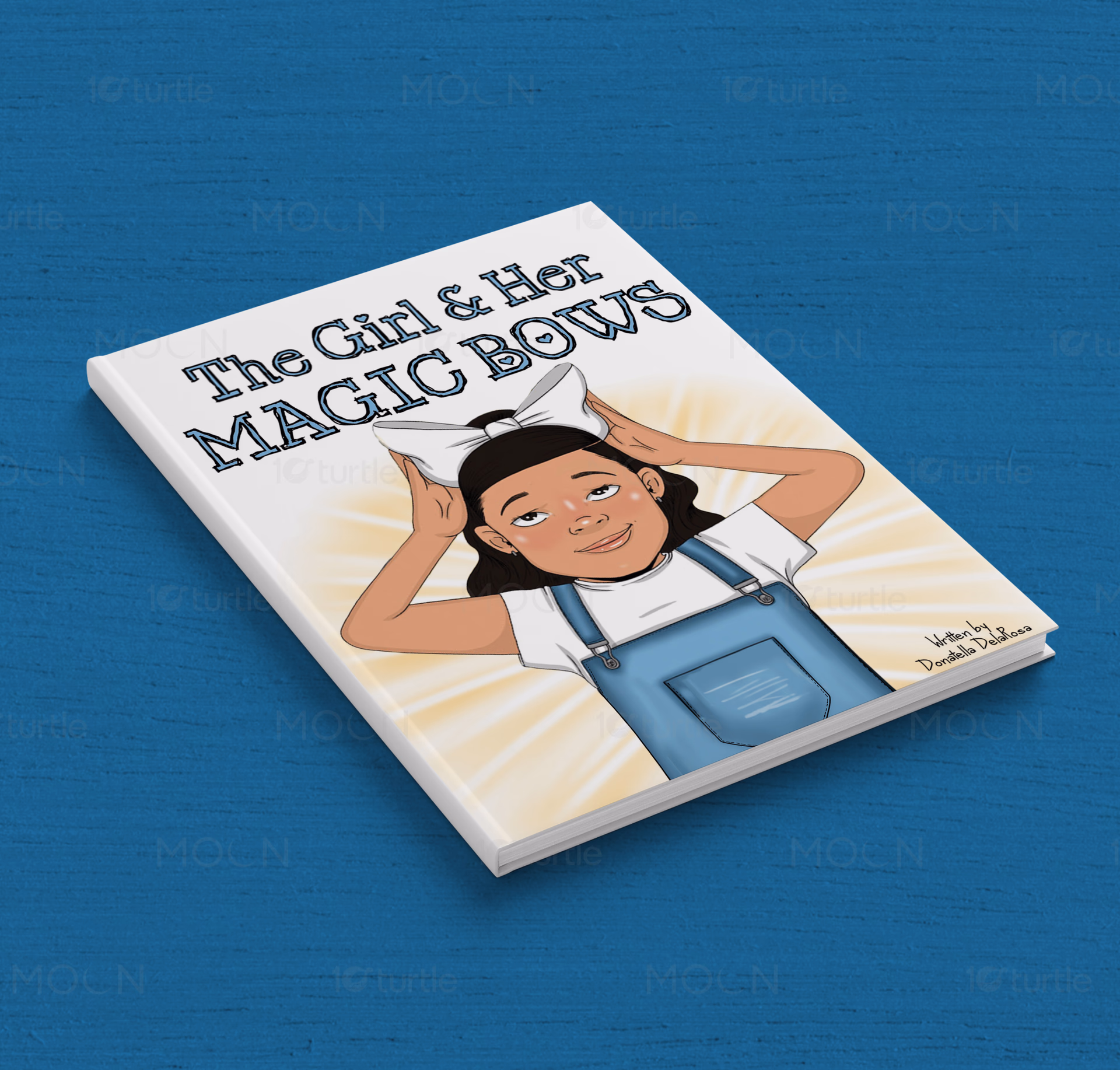
The Girl & Her Magic Bows is a heartwarming children’s book designed around themes of courage, confidence, and personal growth. The visual direction should feel playful, uplifting, and magical, using soft pastel colors, friendly typography, charming illustrations, and clean layouts to create an engaging reading experience. The overall design should inspire young readers while conveying warmth, positivity, imagination, and the message that true confidence comes from within
GraphicDesign
DigitalIdentity
TechAesthetics
Industry
Arts, Culture & Entertainment
Tools we used
Industry
Arts, Culture & EntertainmentWhat we did
Platform
-The primary obstacle was a lack of visual cohesion between the brand’s whimsical name and its technological foundations. The existing identity felt disconnected from the modern tech landscape, making it difficult for the brand to gain traction in digital-first environments. The challenge was to avoid 'childish' tropes often associated with the word 'bows' and instead elevate the concept into a sophisticated, tech-forward symbol. Furthermore, the brand needed a system that was scalable and adaptable. In the fast-moving technology industry, static designs quickly become obsolete. Girl & Her Magic Bows required a dynamic graphic toolkit that could evolve with their product roadmap while maintaining a consistent and professional appearance.
10turtle implemented a design strategy rooted in 'Techno-Whimsy'—a balance of minimalist modernism and creative flair. We moved away from traditional imagery, opting for sleek, vector-based graphics and a vibrant, tech-inspired color palette. By utilizing clean lines and generous white space, we ensured that the 'magic' elements felt deliberate and premium rather than cluttered. The final deliverables included a comprehensive set of digital assets designed for performance. We created custom iconography that serves as a visual bridge between the brand’s narrative and its functional technology features. The typography was selected for its high legibility in digital formats, ensuring the brand remains accessible and modern across all screen sizes and devices.


