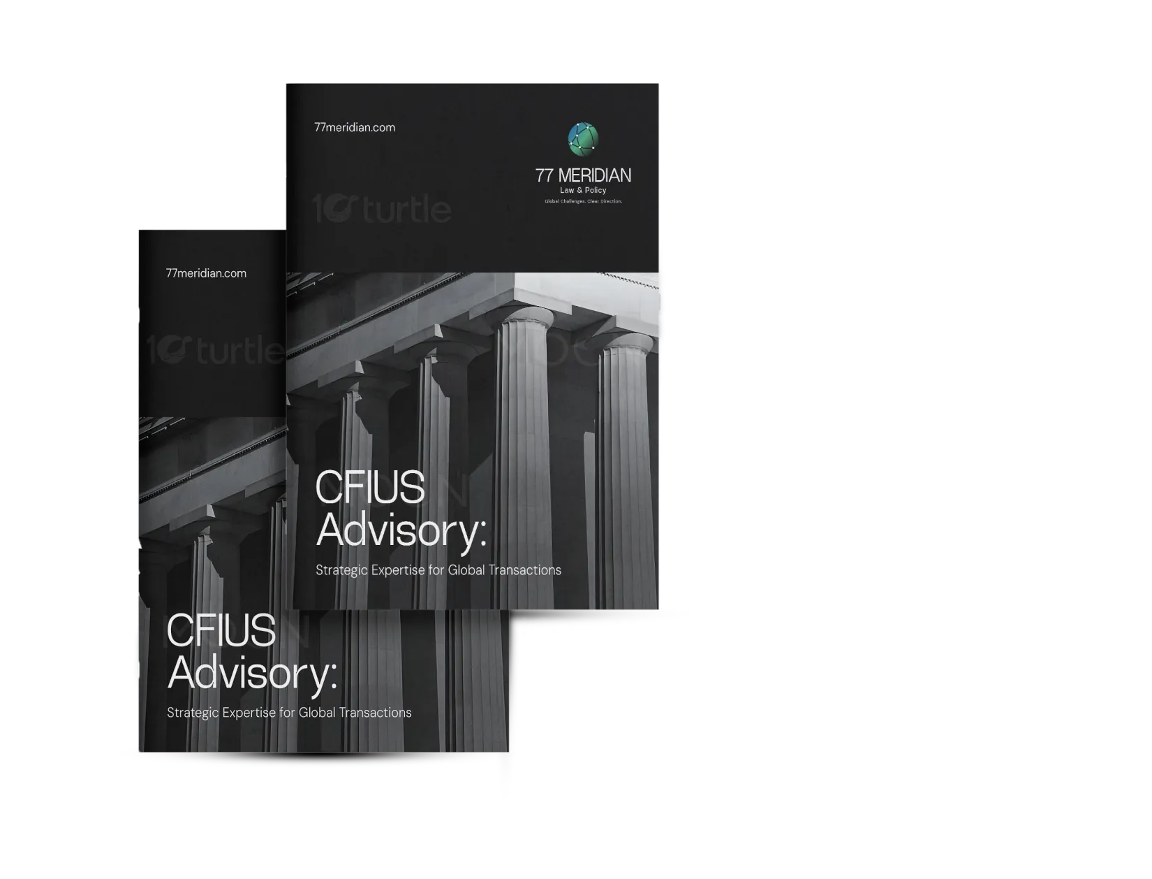
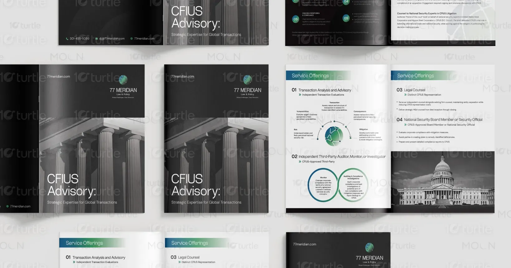
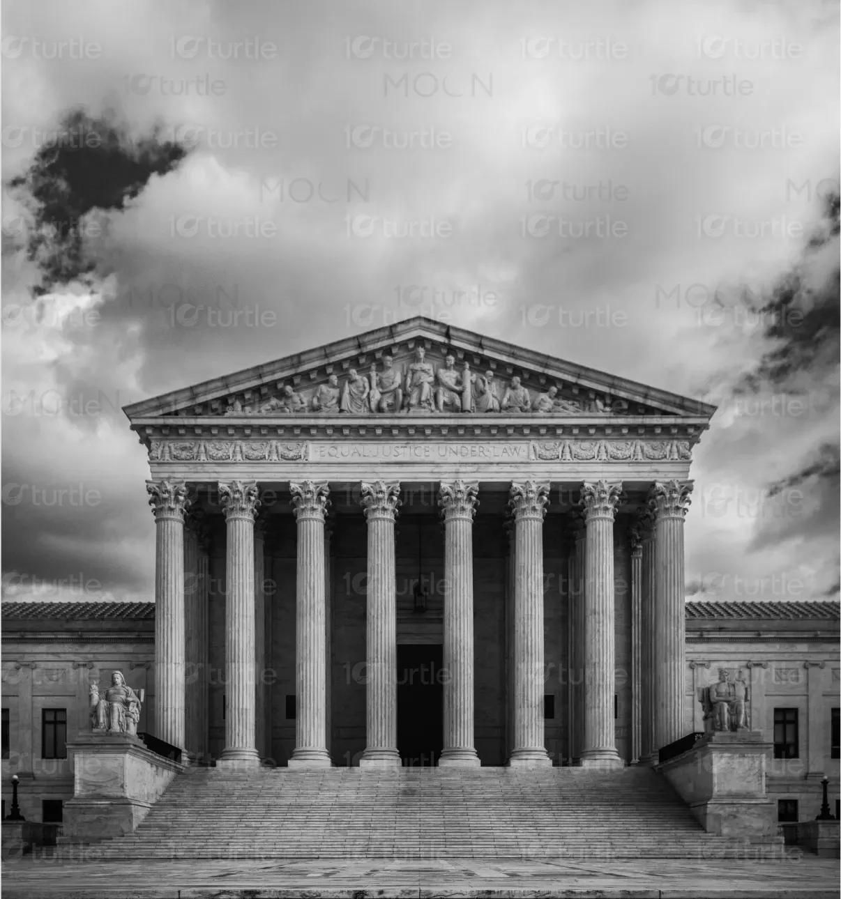
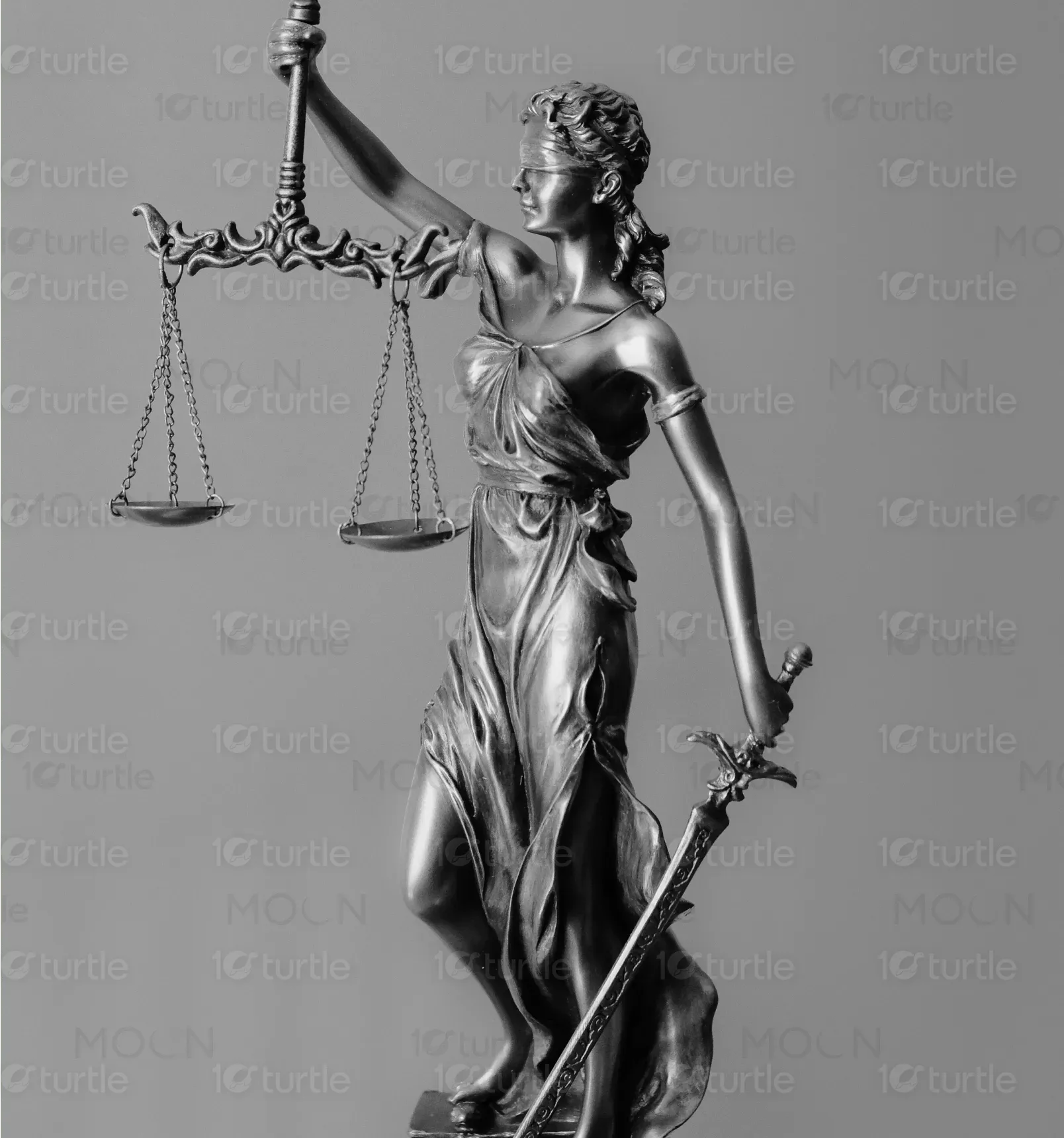
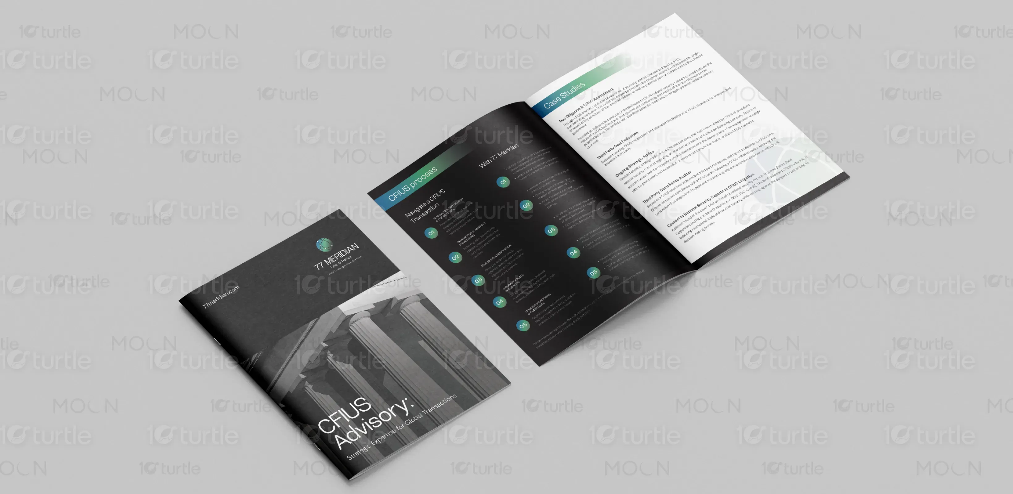
The brochure design exudes a professional and sophisticated aesthetic, using a minimalist approach with bold typography and elegant visuals. The combination of dark shades with vibrant accents creates a sharp contrast, reflecting the modern and expert-level services offered. The imagery, featuring government buildings and professional figures, reinforces trust and authority, perfectly aligning with the advisory services being presented. The layout is clean, ensuring easy readability and a seamless user experience that reflects the high-level consulting nature of the service.
Brochure Design
Graphic Design
Industry
Legal and Regulatory Advisory, Service
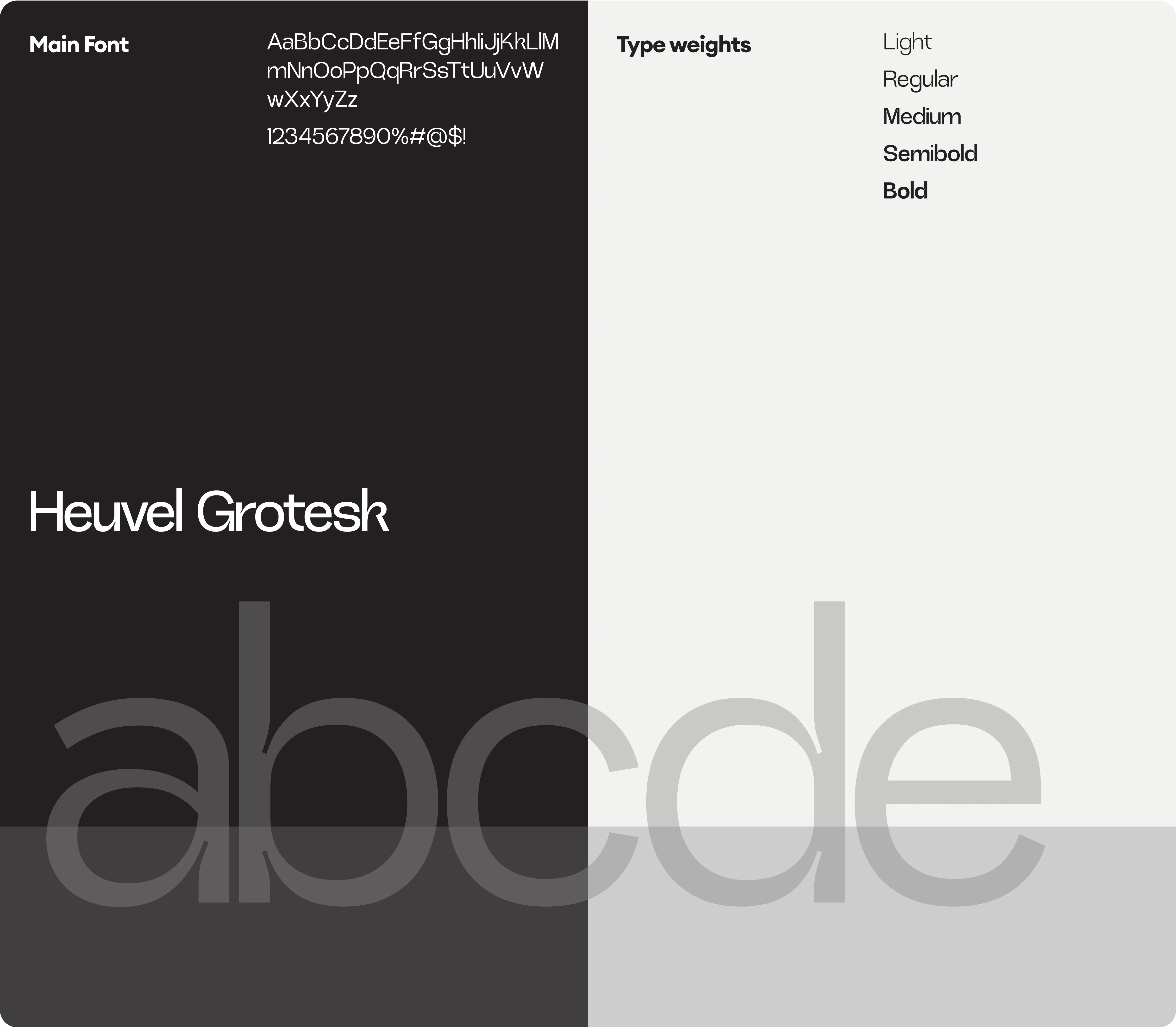
Tools we used


Project Completion
2025
Key Market
Global
The brochure introduces the CFUIS Advisory service, offering strategic expertise for global transactions. It is a professional service designed to guide clients through complex regulatory and compliance challenges involving national security reviews. The unique selling points of the service are its thorough transaction analysis, third-party auditing, and expert legal counsel, backed by highly qualified security officials. The overall aesthetic is corporate, clean, and authoritative, reinforcing the trustworthiness and capability of the brand.
Industry
Legal and Regulatory Advisory, ServiceWhat we did
Brochure design Graphics designPlatform
-A key challenge in designing for this service is presenting complex, highly technical information in a digestible and visually engaging way. Clients seeking CFUIS advisory services are typically high-level corporate executives or legal professionals who need quick, clear access to essential information. The gap lies in the difficulty of making dense, legal, and financial content look both professional and accessible without losing the gravity of the subject. The challenge is to keep the design formal while also making it approachable.
The design uses a clean and structured layout with easy-to-scan sections to present crucial information clearly. The use of icons and infographics to break down the service offerings allows complex content to be visualized simply, aiding in quick understanding. The choice of dark, neutral colors with pops of green gives a sense of professionalism and clarity, aligning with the target audience's expectations while keeping the tone approachable. The balance of visuals and content ensures that the key messages are conveyed effectively.
The long-term goal for 77meridian is to establish itself as the leading provider of strategic advisory services for global transactions and national security concerns. Over time, the brand aims to become synonymous with trust, expertise, and professionalism in the industry. The vision includes expanding the service offerings, incorporating more advanced technological solutions, and fostering a strong, recognizable brand identity that positions the company as the go-to advisor for businesses dealing with high-stakes national security and regulatory matters.

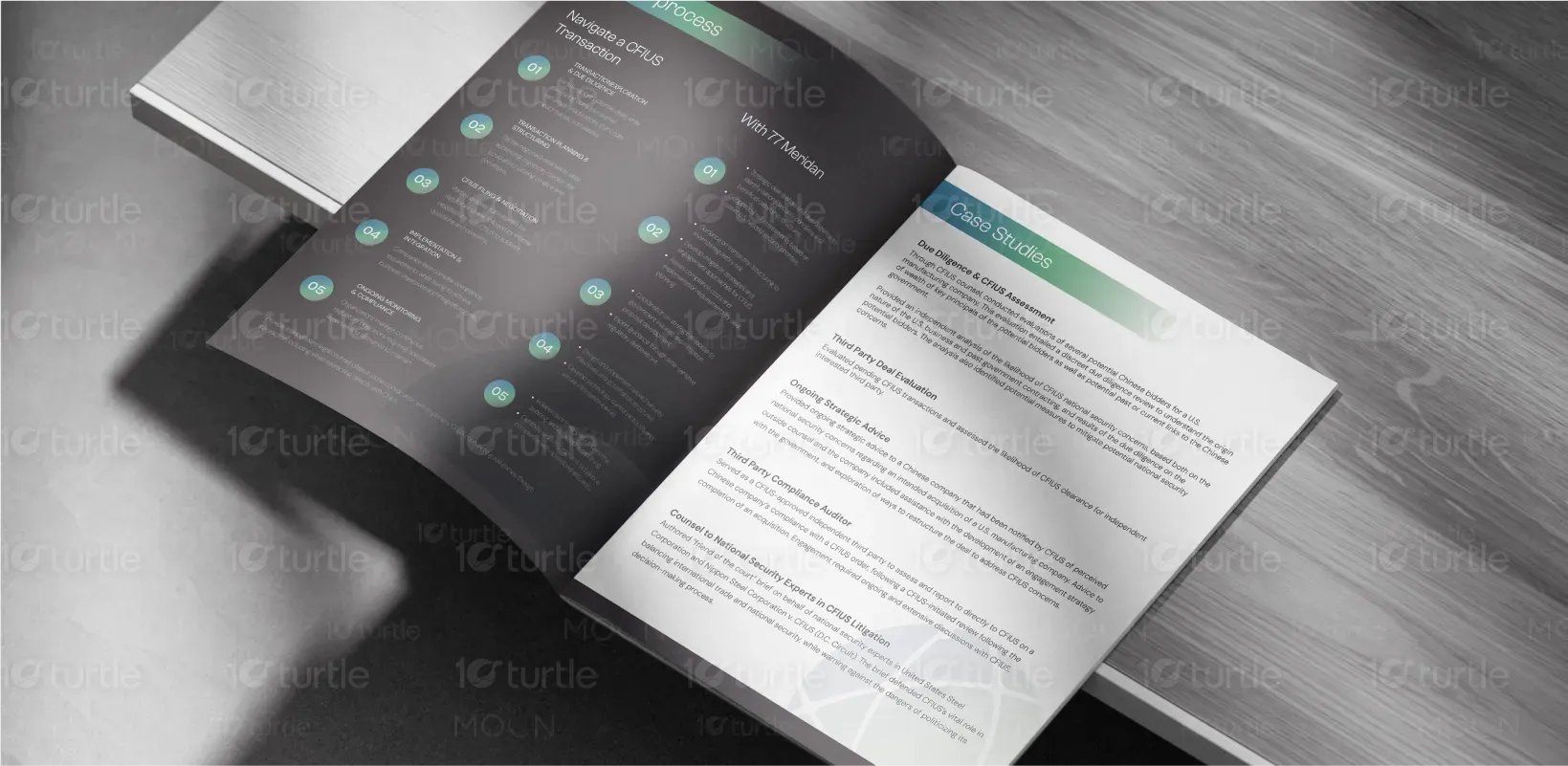
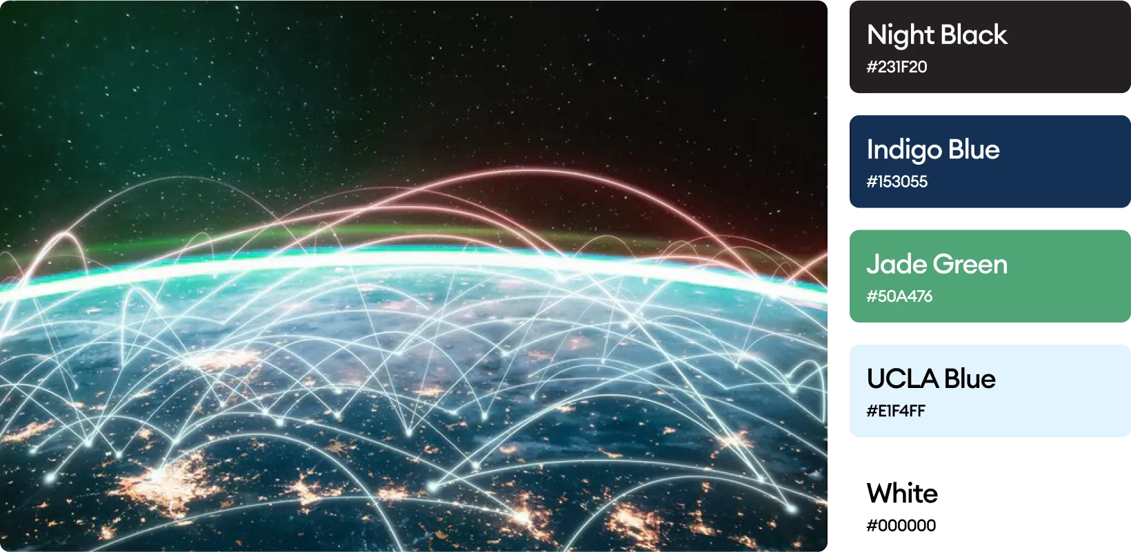
The color palette is a sophisticated blend of dark tones with vibrant green accents, symbolizing professionalism, trust, and growth. The dark background offers a sense of seriousness and authority, aligning with the advisory firm's legal expertise. The green highlights evoke feelings of balance, stability, and security—key traits essential for the target audience. The contrast between the muted grayscale images and the vibrant green enhances readability and ensures a contemporary, professional feel that appeals to clients in the corporate and legal sectors.