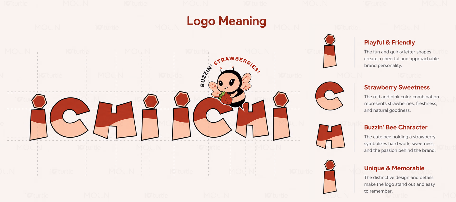
ICHI ICHI is a strawberry-focused beverage brand targeting young consumers seeking refreshing, fruit-based drinks. The identity combines playful mascot illustration, soft pink color palettes, and approachable branding elements. Positioned as a cheerful and memorable beverage concept, it emphasizes freshness, fun, and strong visual recognition across customer touchpoints.
Brand Identity Design • Mascot Illustration • Packaging Design • Beverage Branding
Industry
Food, Beverage & Hospitality
Tools we used
Industry
Food, Beverage & HospitalityWhat we did
Platform
-The beverage market is crowded with brands using generic fruit imagery and minimal differentiation. Many products struggle to create emotional connections beyond flavor claims. Younger consumers increasingly seek brands with personality and shareable visual identities. Without a memorable character or cohesive branding system, customer recall becomes difficult. The challenge was creating a distinctive strawberry beverage identity that feels approachable and instantly recognizable.
The branding introduces a charming bee mascot holding a strawberry, creating an immediate visual association with the product. Soft pink beverage tones reinforce freshness and strawberry flavor cues. Rounded illustration styling and clean logo placement make the identity highly adaptable across cups and packaging. The playful character adds emotional appeal while maintaining strong brand consistency. Together, these elements create a recognizable and engaging customer experience.