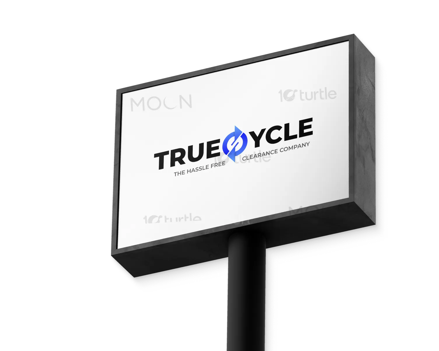
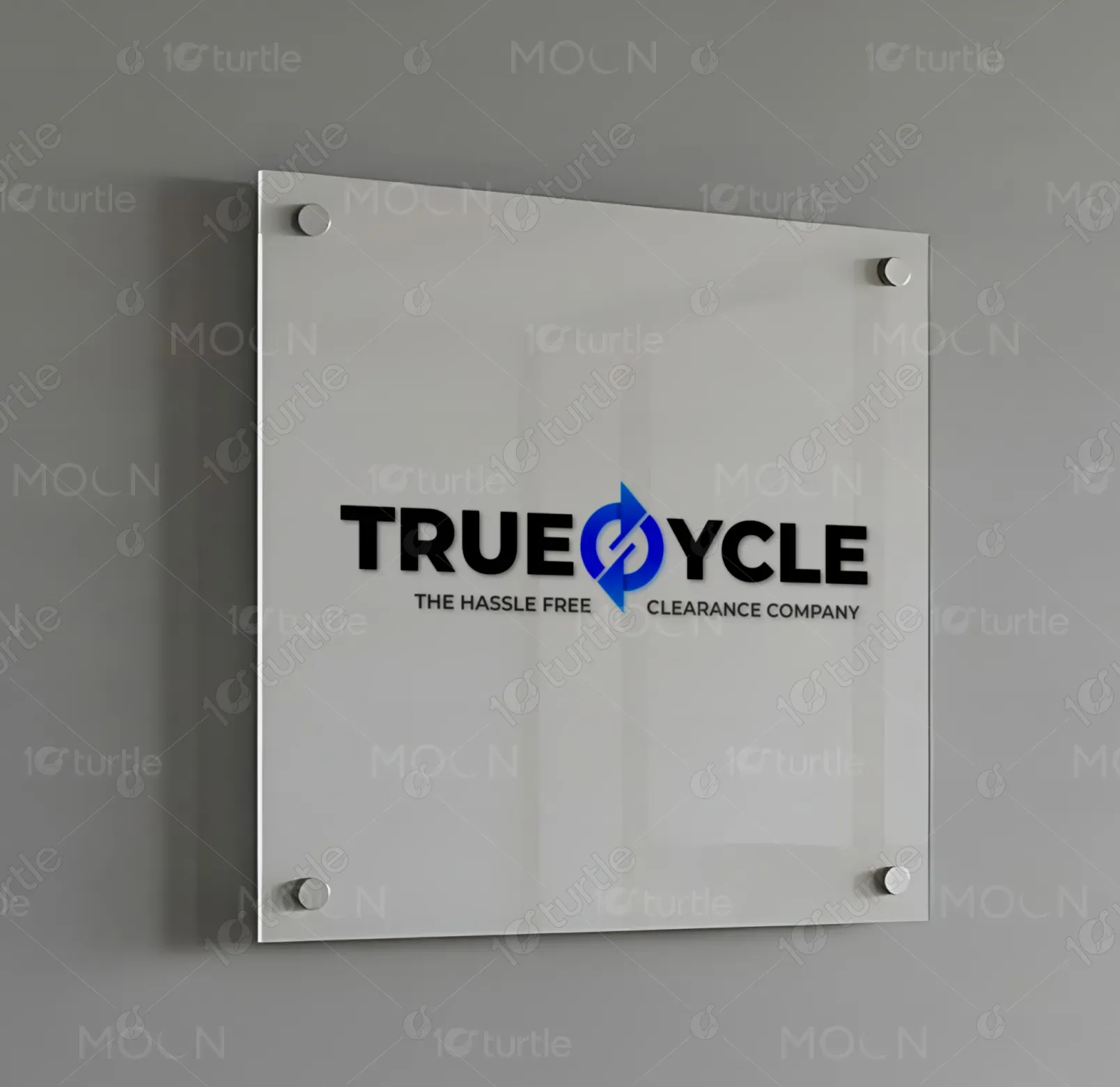
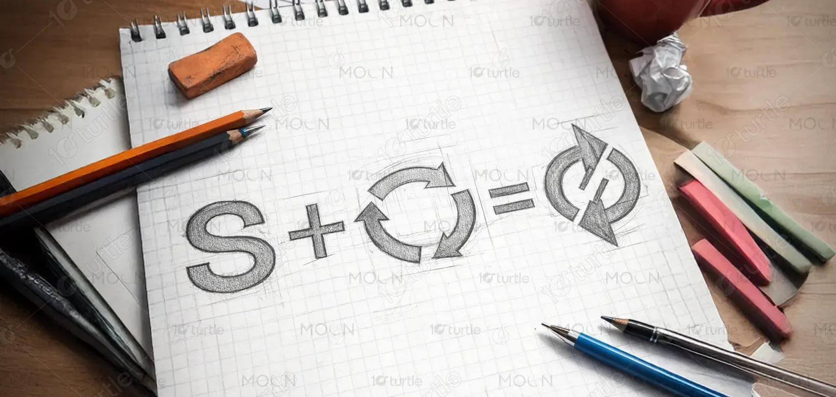
The TrueSycle logo was crafted with a clean and forward-thinking approach, combining bold typography with a recycling-inspired symbol. The design emphasizes circular motion, representing sustainability, renewal, and continuous cycles. A modern blue color palette communicates trust, reliability, and environmental responsibility. The overall creative direction balances simplicity with impact, ensuring the logo works seamlessly across physical and digital applications. It reflects TrueSycle’s mission of innovative recycling while appealing to a broad audience seeking eco-friendly, hassle-free disposal solutions.
Logo Design
Graphic Design
Branding
Industry
Industrial, Manufacturing & Agriculture
Tools we used

Project Completion
2025
Key Market
Global
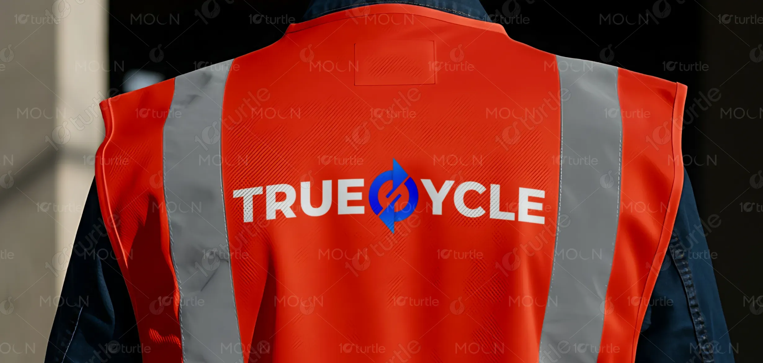
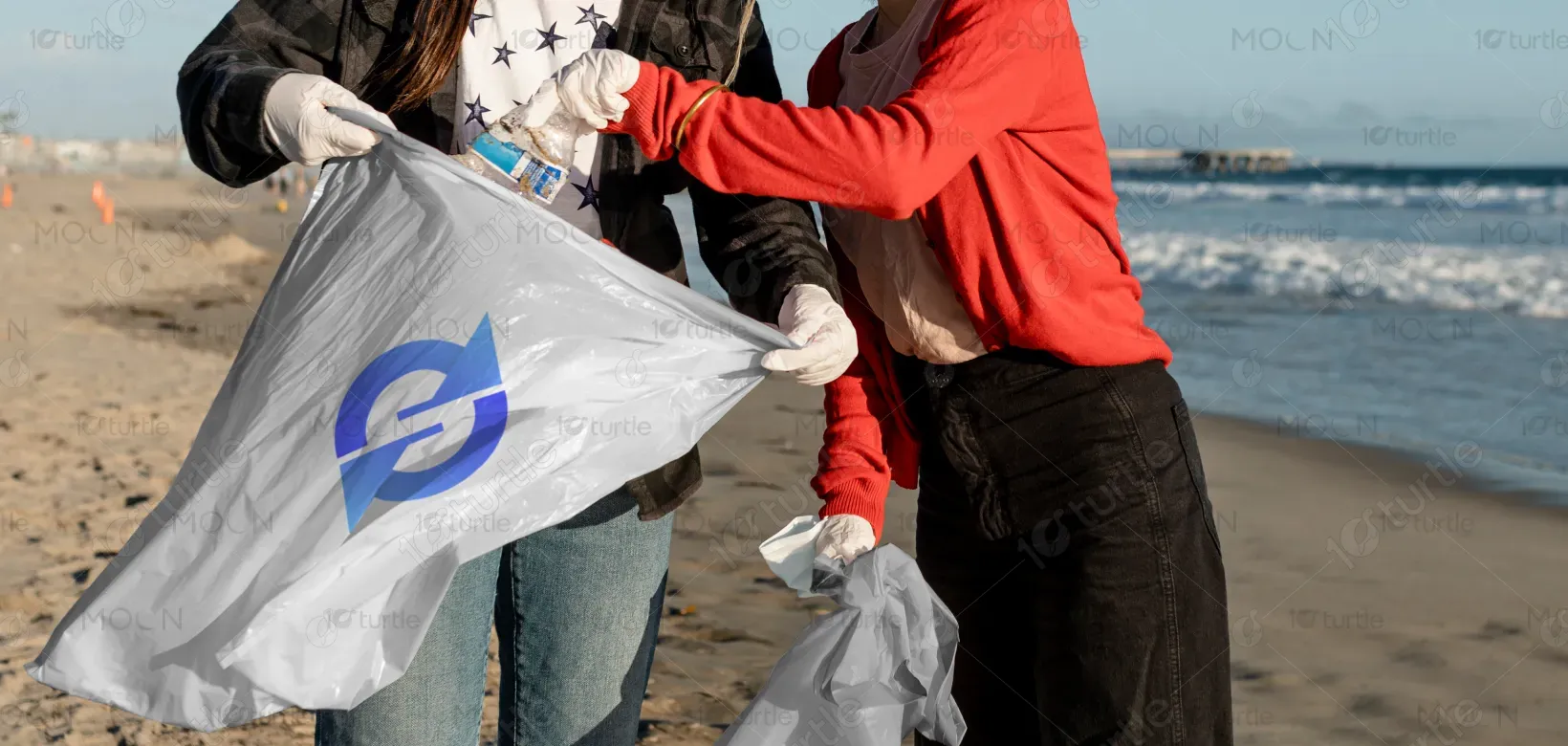
TrueSycle is a recycling service specializing in the collection and clearance of used furniture and electronics at zero cost to consumers. The brand stands out with its strong identity, focusing on innovation and sustainability. By combining convenience with eco-conscious values, TrueSycle creates a positive impact for households and businesses alike. The modern, bold logo represents trust and efficiency, while the design ensures adaptability across vehicles, uniforms, packaging, and digital platforms, giving the brand a professional and recognizable presence.
Industry
Industrial, Manufacturing & AgricultureWhat we did
Logo DesignGraphic DesignBrandingPlatform
-The challenge in designing TrueSycle’s identity was avoiding overused recycling clichés while still clearly communicating the brand’s eco-conscious mission. Many recycling logos rely on generic green arrows or cluttered symbols, which fail to create distinction in a competitive market. Additionally, recycling services often appear outdated or too technical, making them less approachable for everyday users. TrueSycle needed a fresh identity that was modern, inclusive, and versatile—capable of resonating with both residential customers and corporate clients while standing out visually.
The final design introduces a bold, clean logo with a subtle recycling-inspired mark and a blue-forward palette to establish trust and reliability. By modernizing the recycling aesthetic, the design avoids generic visuals while maintaining recognizability. The strong typography enhances visibility on vehicles, signage, and digital platforms, while the simple symbol ensures adaptability across applications. This thoughtful blend of clarity and symbolism provides TrueSycle with a professional yet approachable identity, helping it connect with users and strengthen its position in the recycling industry.
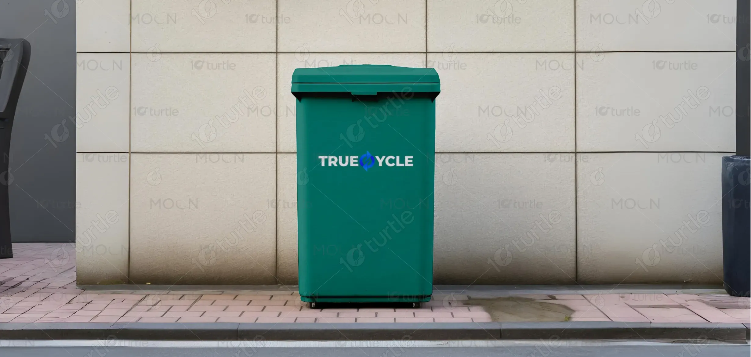
The long-term vision for the TrueSycle brand identity is to establish it as a leading, recognizable name in sustainable disposal solutions. The logo is designed with timeless simplicity, ensuring it grows with the company as services expand into new markets. Beyond visual recognition, the identity aims to foster trust and inspire eco-conscious behavior among communities. By creating a consistent and scalable design, TrueSycle can continue to evolve while leaving a lasting impression of sustainability, innovation, and responsibility in its industry.

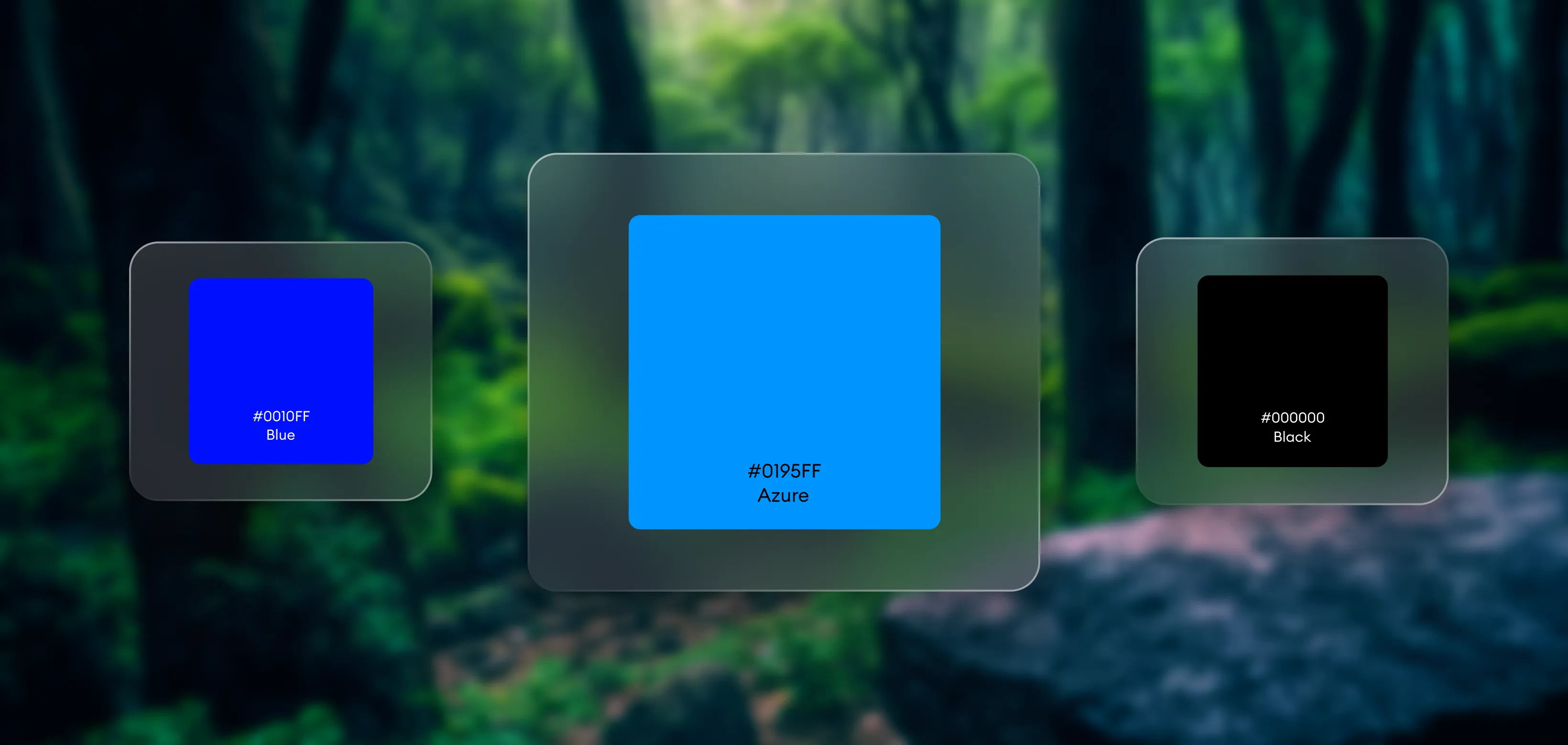
The TrueSycle color palette centers on blue, chosen for its associations with trust, reliability, and environmental consciousness. Blue conveys a sense of cleanliness and professionalism, making it ideal for a brand dealing with clearance and recycling. Supporting shades of white and grey add balance and modernity, ensuring versatility across digital and physical applications. Together, the palette reflects sustainability without relying on stereotypical green tones, positioning TrueSycle as a fresh, future-ready brand that is approachable, credible, and environmentally responsible.
