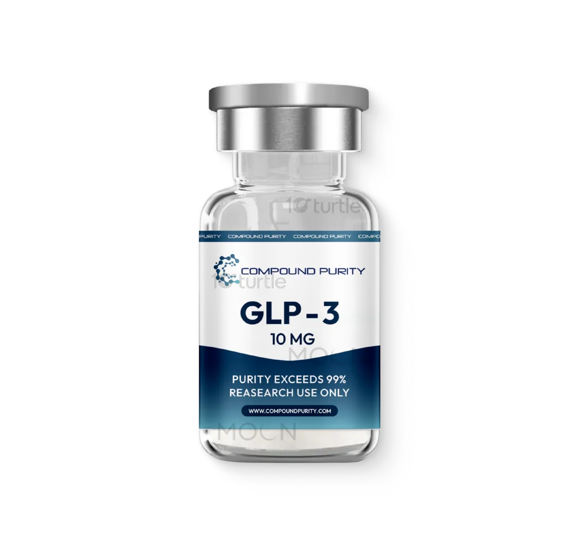
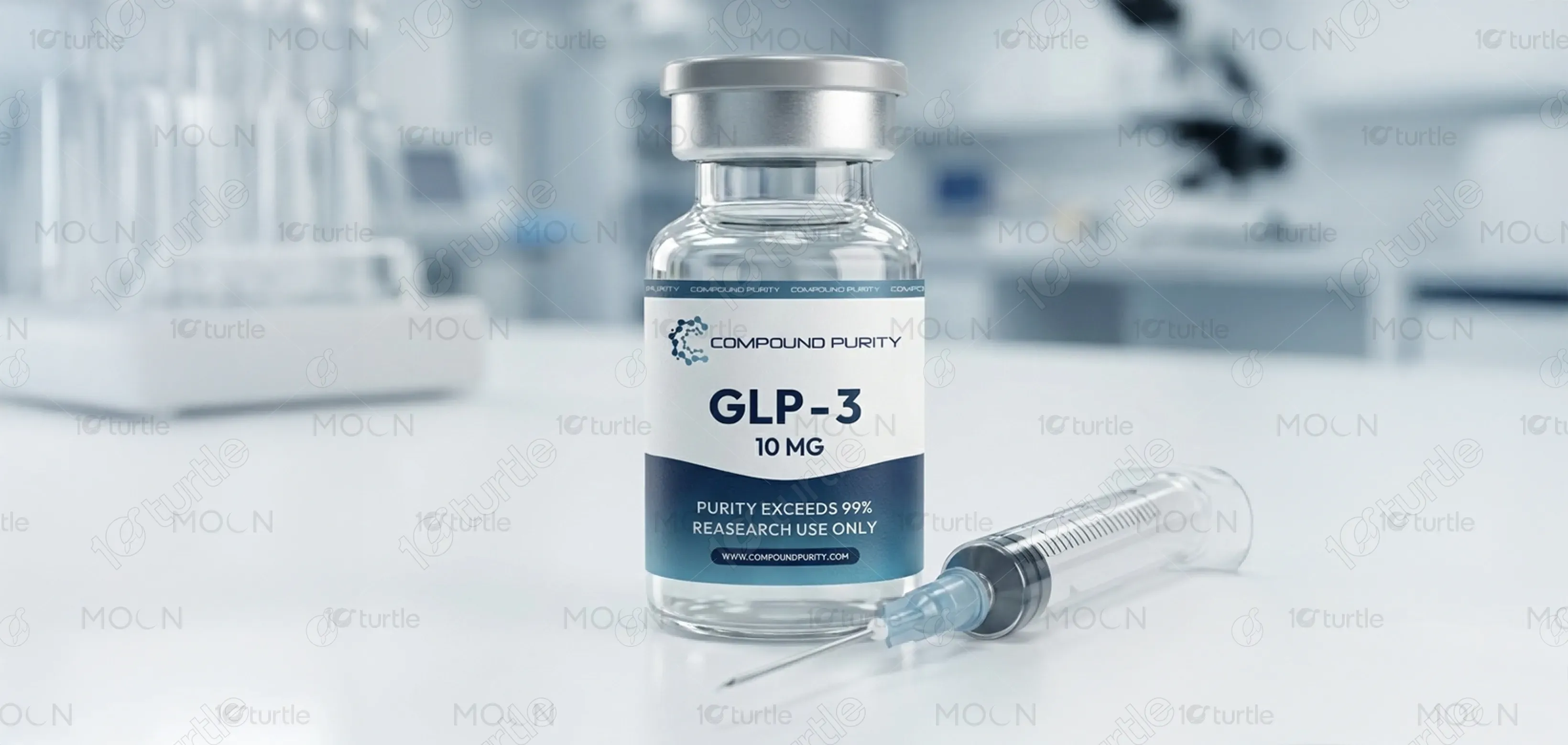
The label design adopts a clean, clinical, and research-driven aesthetic that reflects pharmaceutical precision and trust. Minimal typography, clear hierarchy, and ample white space ensure instant readability, while the cool blue gradient conveys purity, science, and reliability. Subtle molecular graphics reinforce the compound’s scientific foundation without overwhelming the layout. The overall design balances modern branding with regulatory seriousness, positioning the product as a high-quality, laboratory-grade compound intended for professional and research-focused environments.
Label Design
Graphic Design
Industry
Healthcare & Wellness
Tools we used


Project Completion
2025
Key Market
Global
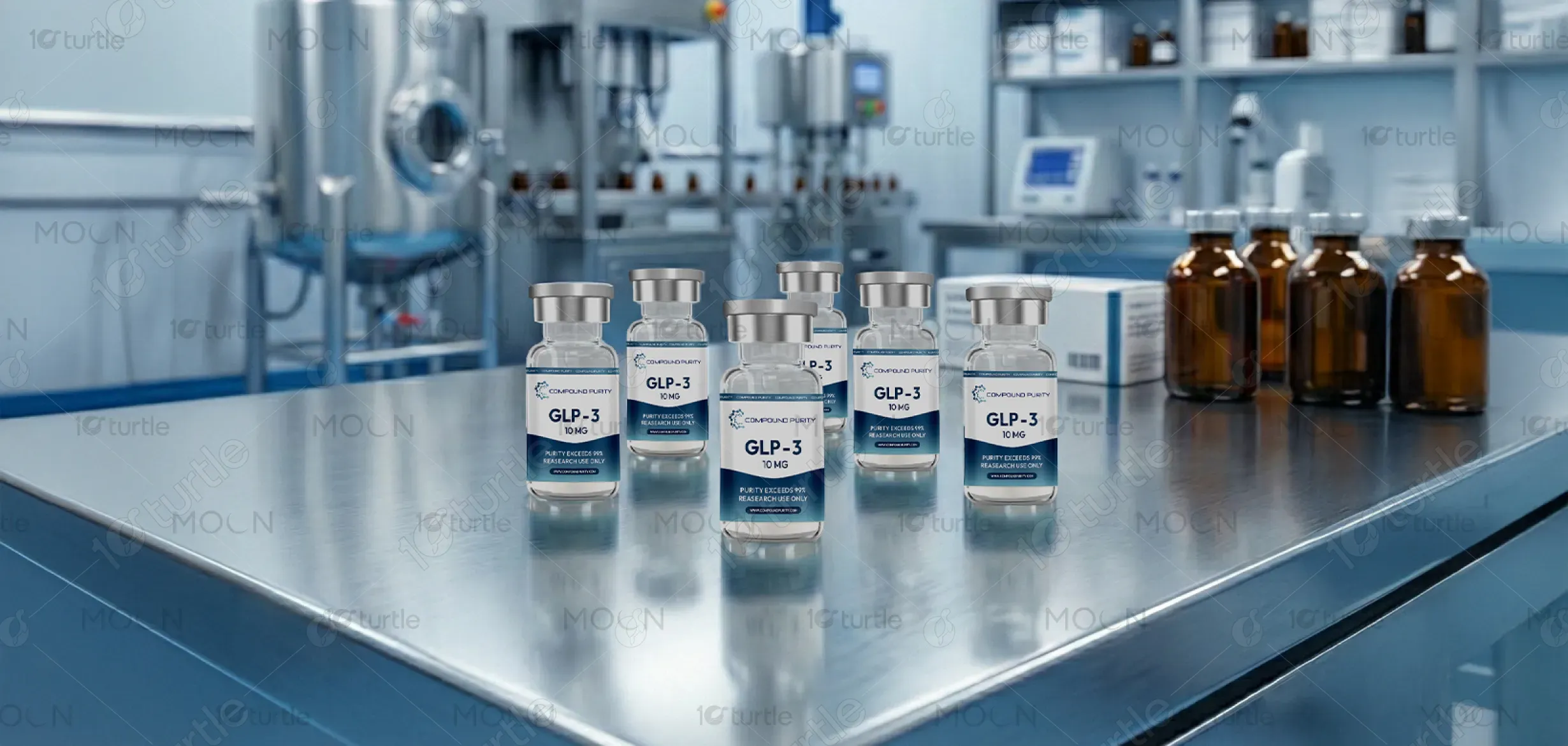
This design represents a research-grade injectable compound presented in a sterile glass vial format. The label clearly communicates dosage, purity standards, and research-only usage, ensuring transparency and compliance. Positioned within the scientific and pharmaceutical research market, the product emphasizes credibility, precision, and safety. Its minimalist aesthetic, combined with clear information architecture, makes it suitable for laboratories, clinics, and distributors seeking professional-grade compounds with a premium, trustworthy appearance.


Industry
Healthcare & WellnessWhat we did
Label DesignGraphic DesignPlatform
-Many research chemical products suffer from unclear labeling, cluttered visuals, or misleading branding that reduces trust and increases risk in professional environments. Inconsistent typography, poor hierarchy, and overly aggressive marketing often make it difficult for researchers to quickly verify dosage, purity, or intended use. This lack of clarity can lead to hesitation, misinterpretation, or regulatory concerns, especially in laboratory and clinical research settings where accuracy and credibility are critical.
The design solves this problem through a structured, information-first layout that prioritizes clarity and compliance. Key data such as compound name, dosage, and usage restrictions are immediately visible. The restrained color palette and clean typography reduce visual noise while reinforcing professionalism. Scientific visual cues subtly support the research context, ensuring the product feels trustworthy, standardized, and suitable for controlled environments where precision and confidence are essential.

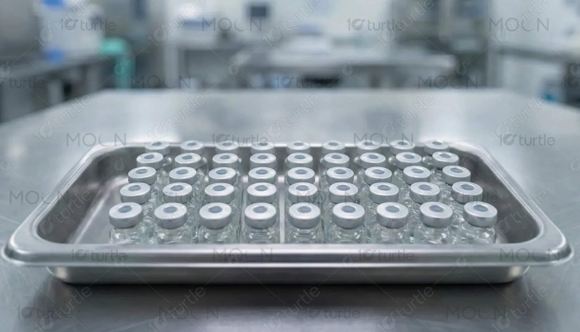
The long-term vision is to establish a consistent visual system for research compounds that becomes instantly recognizable and trusted across the scientific community. The design aims to scale across multiple compounds and dosages while maintaining clarity and brand cohesion. Over time, it seeks to set a benchmark for how research-grade injectables should look—transparent, professional, and ethically positioned—helping elevate industry standards and user confidence.
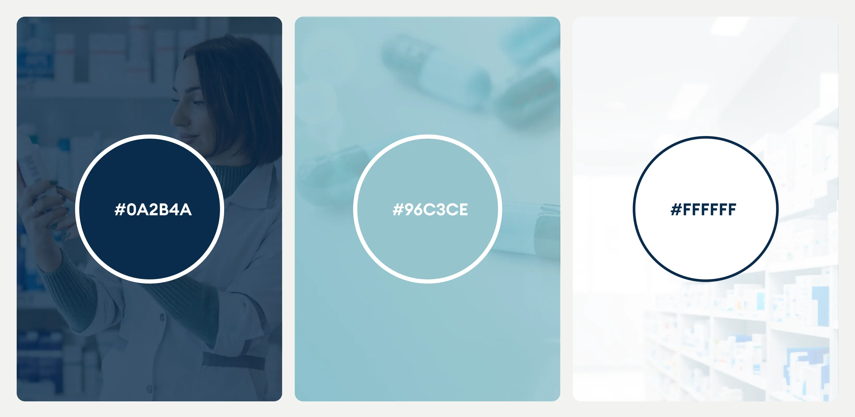
The color palette is built around cool blues, white, and subtle grey tones, symbolizing purity, science, and reliability. Blue conveys trust, precision, and clinical calm, while white space enhances clarity and sterility. The gentle gradient adds depth without distraction, giving the label a modern yet authoritative feel. Together, these colors align with pharmaceutical branding conventions and reinforce the product’s research-grade, high-purity positioning.