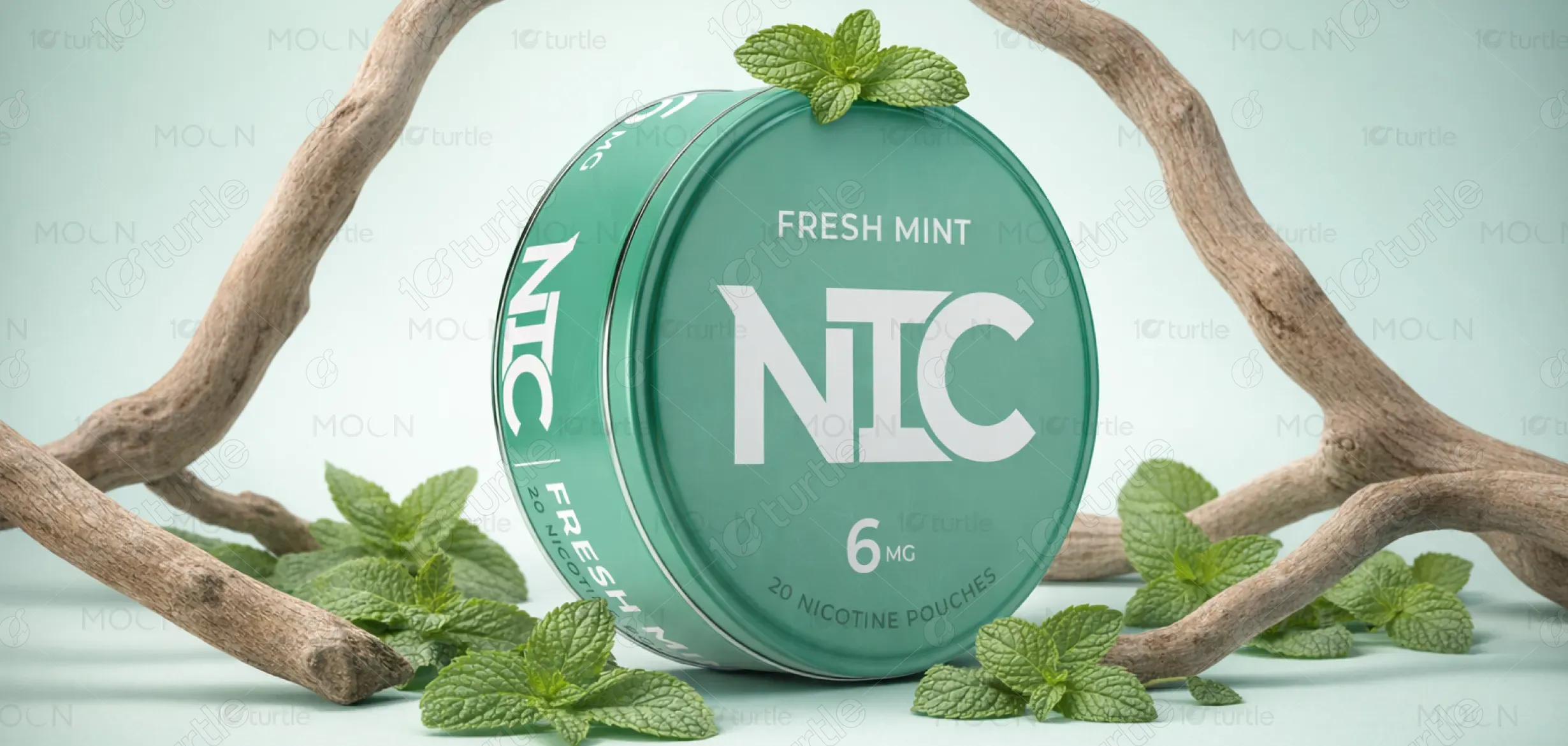
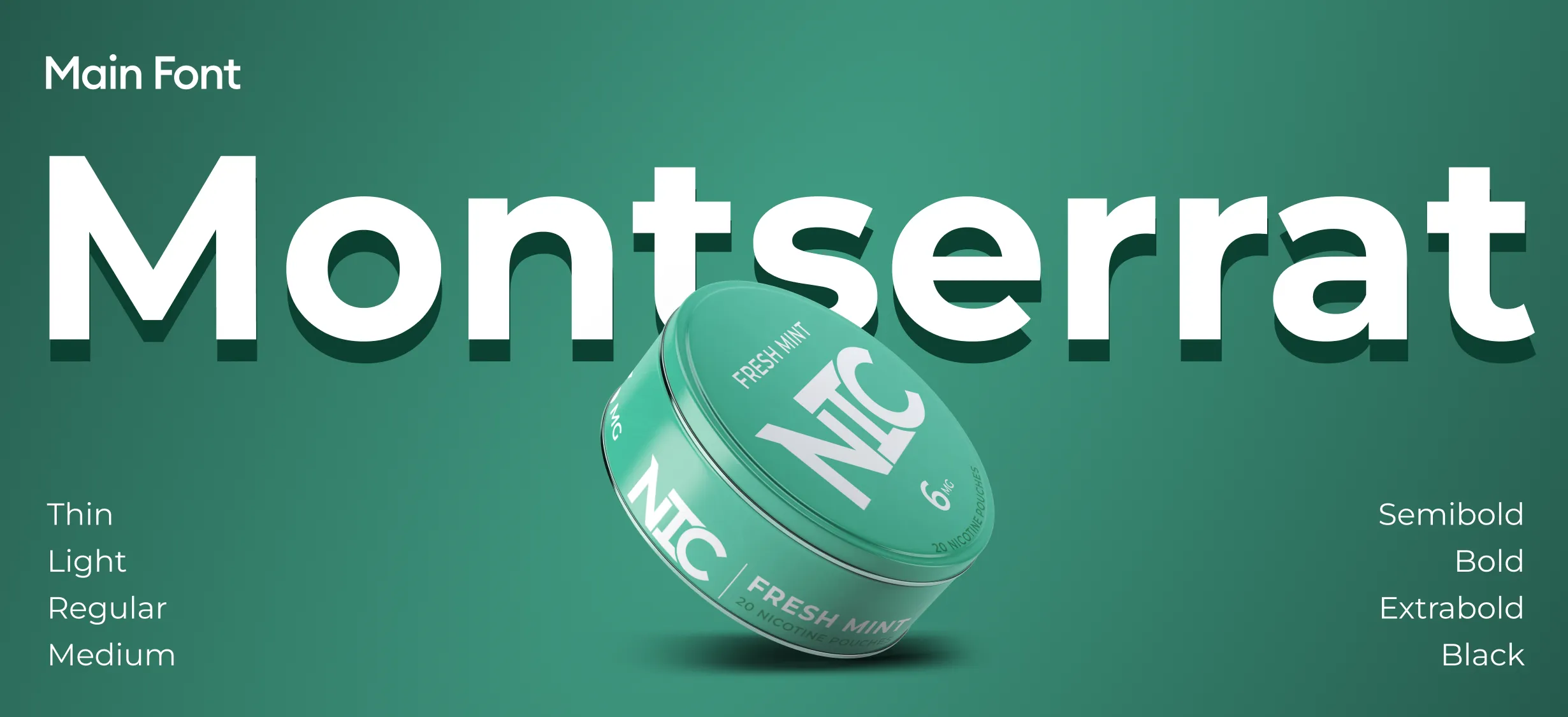
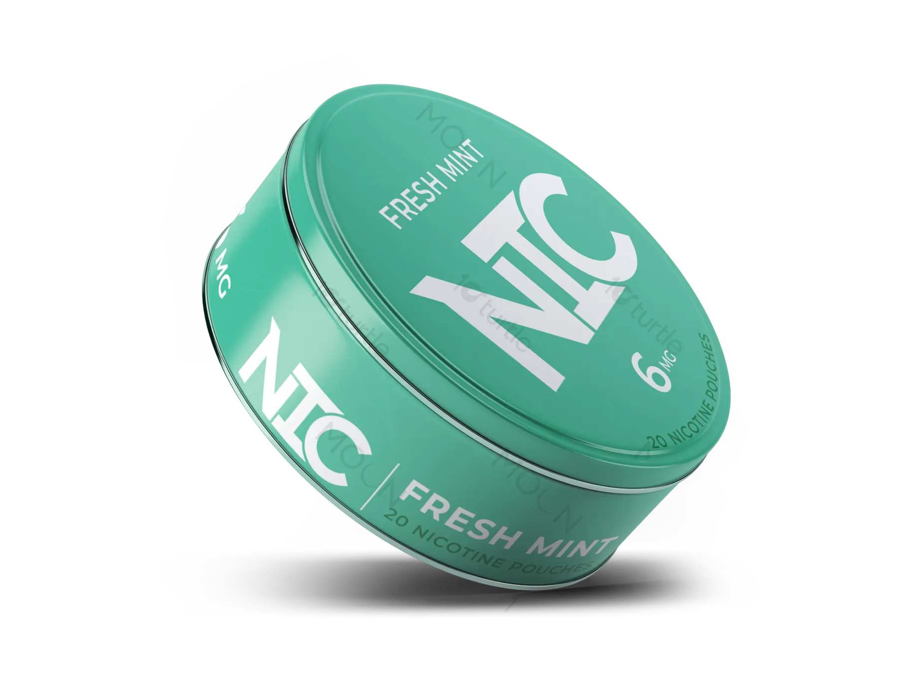
The NIC Fresh Mint label is designed with a minimal, premium-first approach, focusing on clarity, hierarchy, and restraint. Inspired by Scandinavian design principles, the layout emphasizes clean typography, balanced spacing, and subtle mint accents to reflect flavor without overwhelming the composition. A modular grid system ensures consistency across top, side, and bottom labels. The overall direction avoids visual noise, instead creating a controlled, clinical aesthetic that communicates trust, precision, and modern sophistication within the nicotine pouch category.
Label Design
Graphic Design
Industry
Consumer Goods & Retail
Tools we used


Project Completion
2025
Key Market
Global
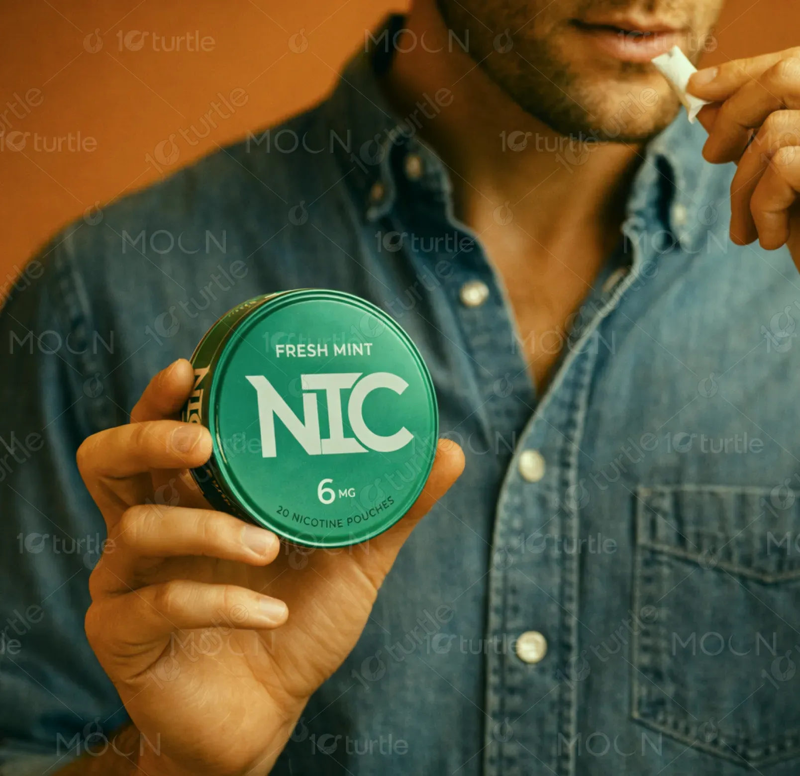
NIC is a modern nicotine pouch brand designed for users seeking a cleaner, more refined alternative to traditional tobacco products. The Fresh Mint 6mg variant delivers a crisp, cooling experience packaged in a compact, portable tin. Positioned within a competitive and saturated market, NIC differentiates itself through a premium, minimal design language and a clear information hierarchy. The label system is built to be scalable across flavors while maintaining strong brand recognition and a consistent visual identity.

Industry
Consumer Goods & RetailWhat we did
Label DesignGraphic DesignPlatform
-Most nicotine pouch brands rely heavily on loud colors, aggressive graphics, or cluttered layouts to grab attention, often compromising readability and perceived quality. This creates a visual environment that feels overwhelming and lacks sophistication, especially for users seeking a more discreet and premium experience. Additionally, regulatory requirements like warning labels often disrupt design harmony, making it difficult to balance compliance with aesthetics in a cohesive and visually appealing way.
The NIC label system addresses these challenges through a refined, typography-led design that prioritizes clarity and structure. A strict grid system organizes content across all label surfaces, ensuring readability while accommodating regulatory elements seamlessly. Minimal use of mint green acts as a subtle flavor cue without overpowering the design. By reducing unnecessary visual elements and focusing on hierarchy, the design achieves a balance between compliance and premium appeal, resulting in a clean, modern, and scalable packaging solution.
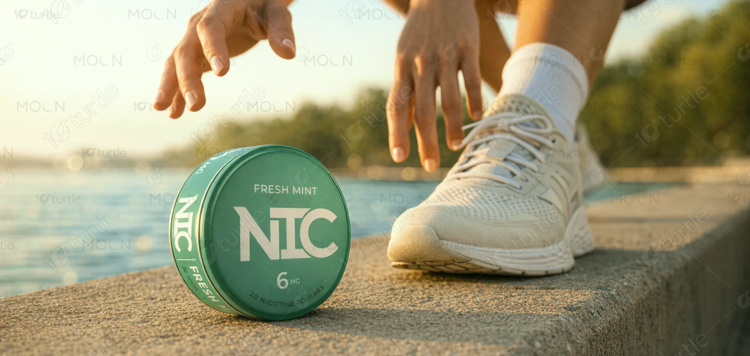
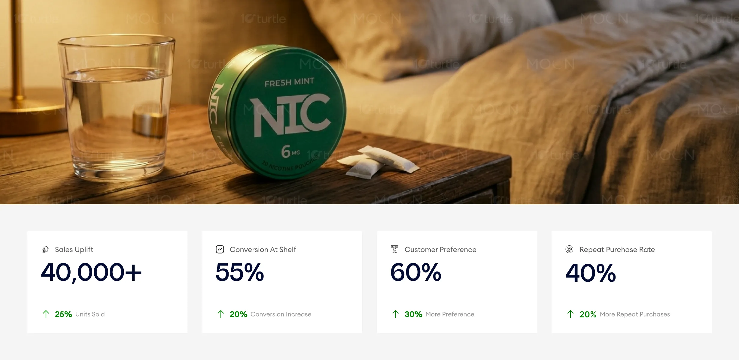
The clean and sophisticated packaging for NIC Fresh Mint effectively appeals to a premium segment of the nicotine pouch market. The minimalistic design with balanced typography and controlled visual elements enhances the perceived value, encouraging both first-time purchases and repeat buying. As a result, metrics such as conversion rates and sales uplift improve significantly due to the product’s enhanced shelf presence and brand trust.
NIC aims to establish itself as a globally recognized nicotine pouch brand defined by precision, simplicity, and elevated design standards. The long-term vision is to build a cohesive product ecosystem where each flavor is distinguished through a refined visual system rather than loud differentiation. By maintaining consistency and evolving thoughtfully, NIC seeks to redefine category expectations—shifting from mass-market aesthetics to a more premium, lifestyle-oriented experience that resonates with modern consumers.
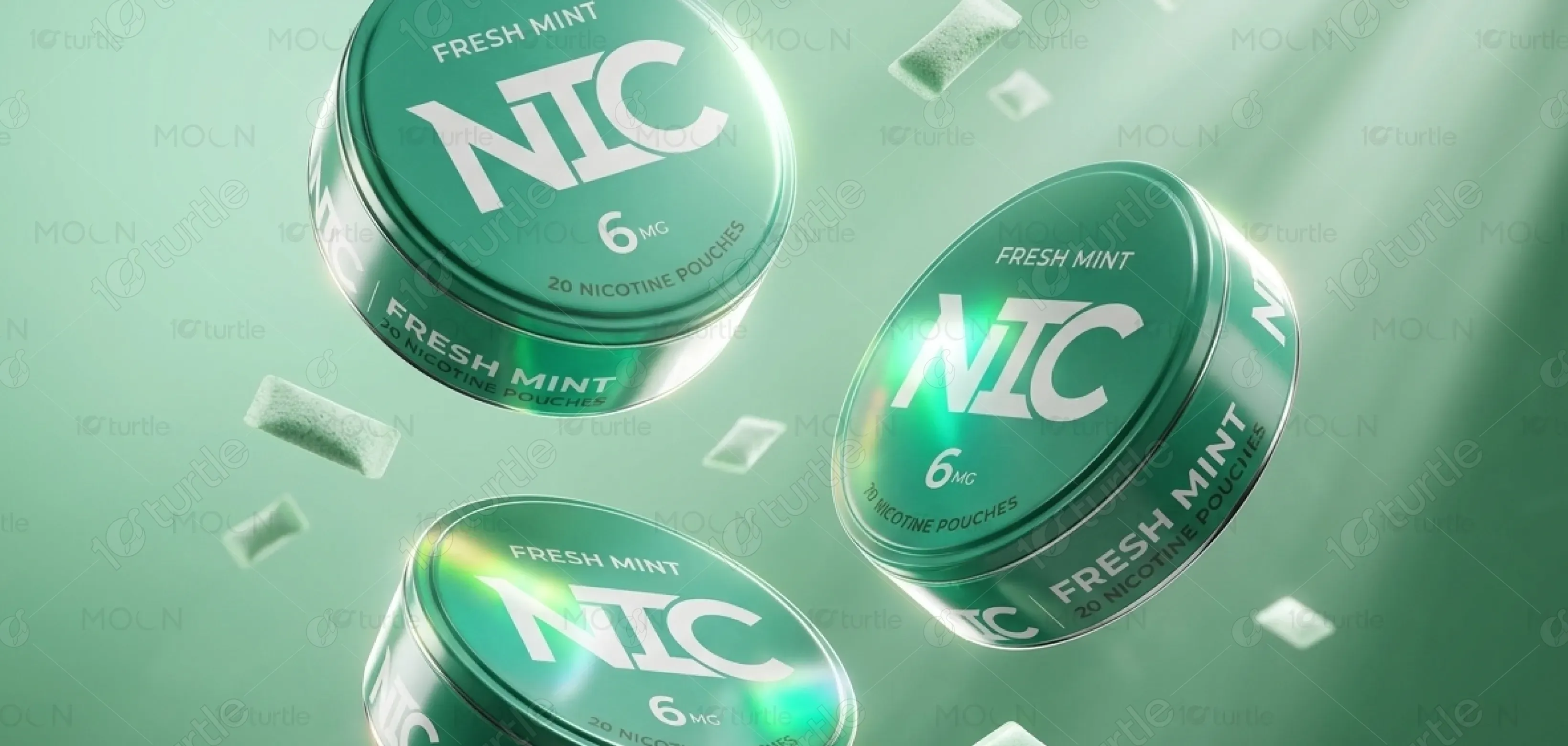

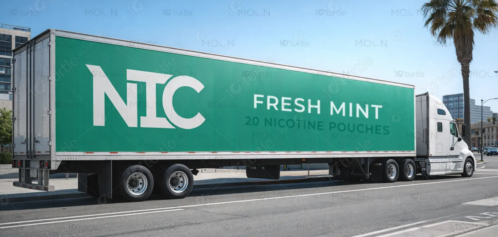
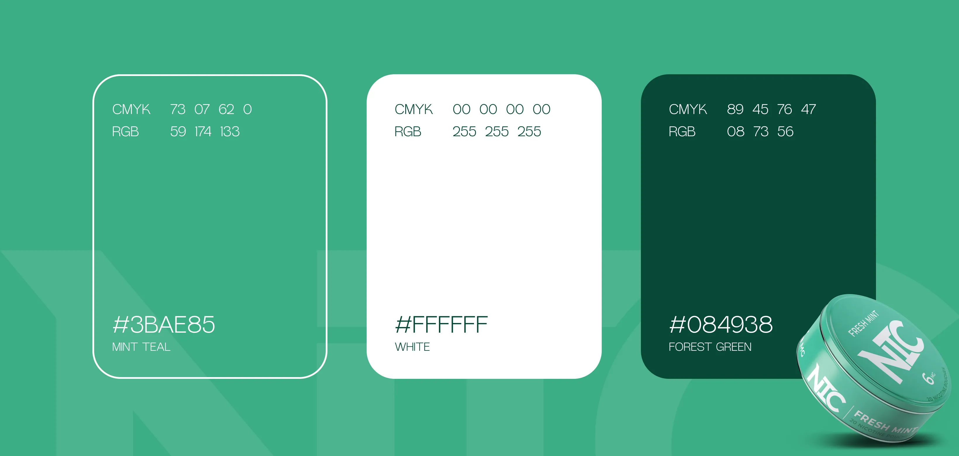
The color palette is centered around a restrained use of mint green, supported by neutral tones such as white, black, and soft greys. The green serves as a direct reference to the Fresh Mint flavor, evoking freshness, coolness, and clarity without becoming visually dominant. Neutral colors reinforce the brand’s premium and minimal identity, creating a clean canvas that enhances readability and focus. This controlled palette ensures consistency across variants while maintaining a sophisticated and timeless aesthetic.


.png)


