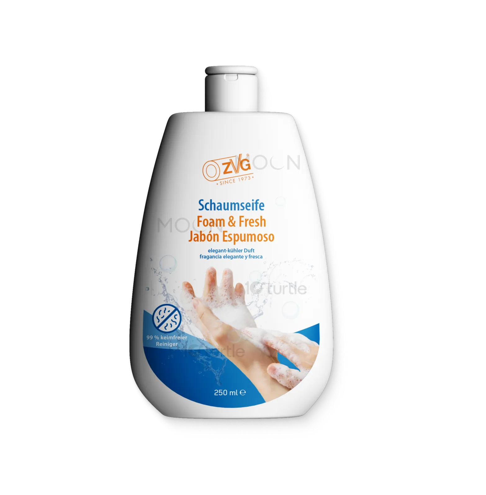
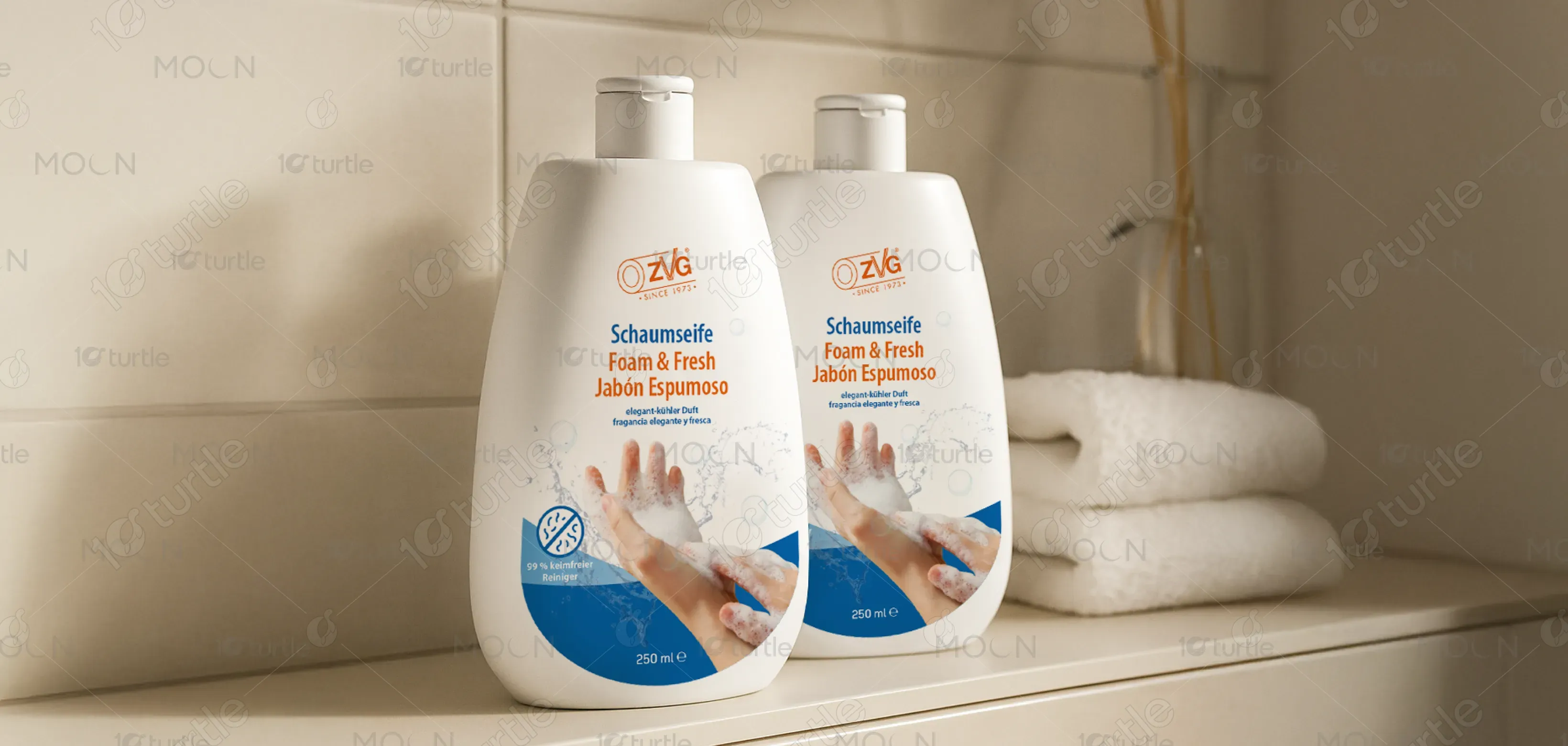
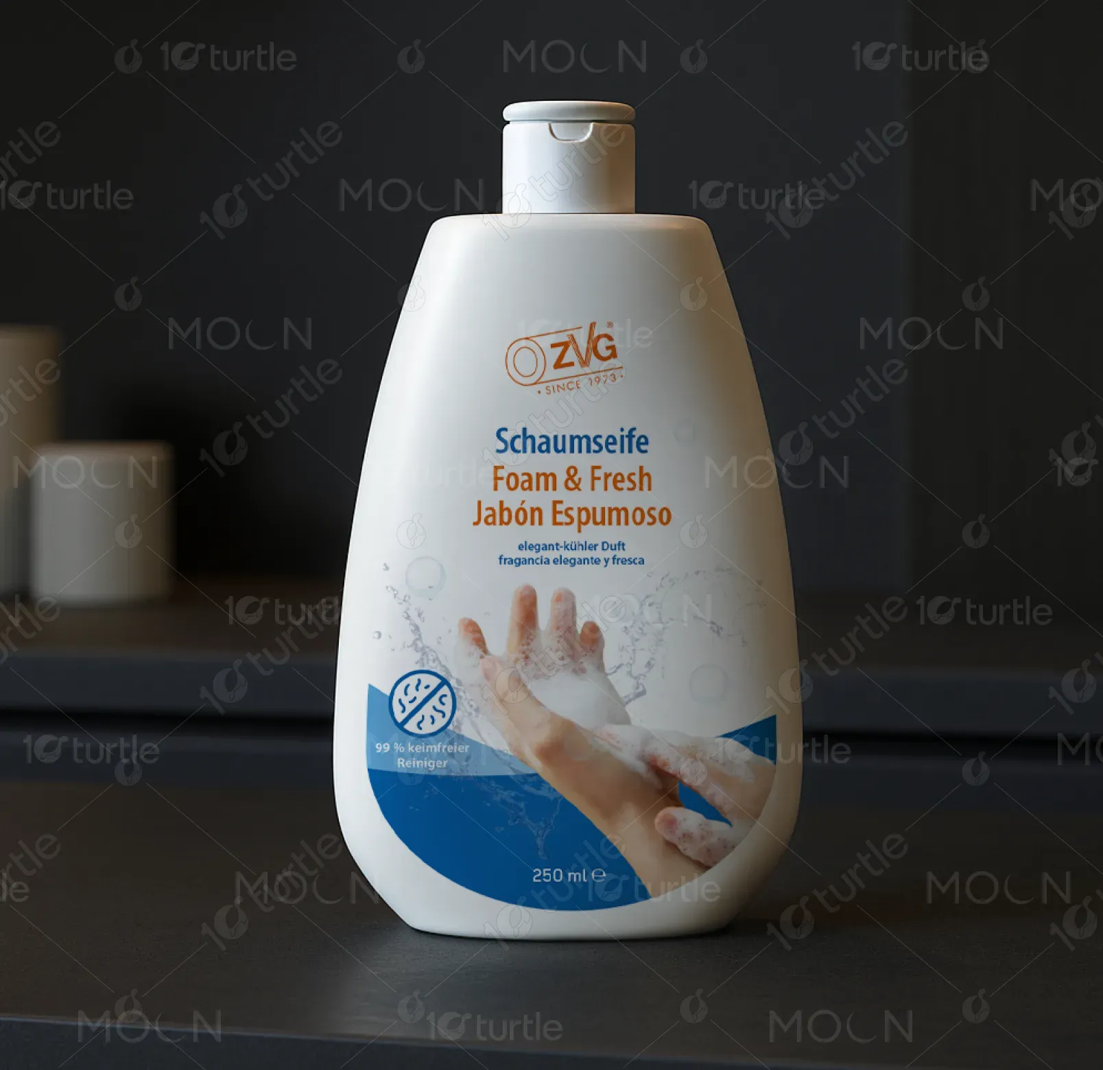
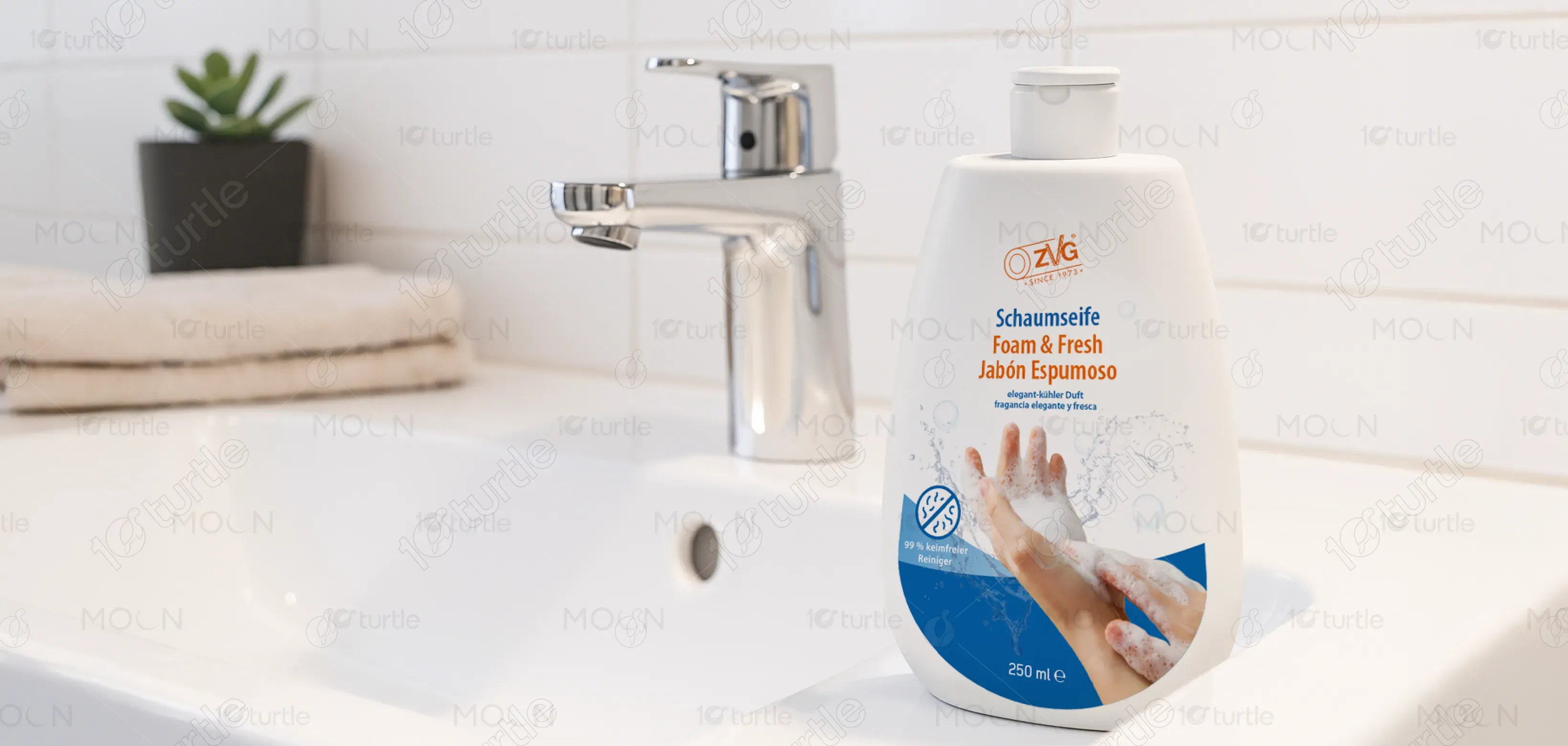
The design for the OZVG Foam & Fresh Hand Soap packaging focuses on cleanliness and freshness. The white and blue color scheme conveys purity and revitalizing qualities, while the large hand and foamy splash graphic emphasize the product's soothing and effective cleansing power. The clean typography and minimalistic layout highlight the product’s functional benefits, with a strong focus on the visual appeal of the soap’s texture, making it both modern and easily recognizable in the personal care market.
Label Design
Graphic Design
Industry
Healthcare & Wellness
Tools we used


Project Completion
2025
Key Market
Global
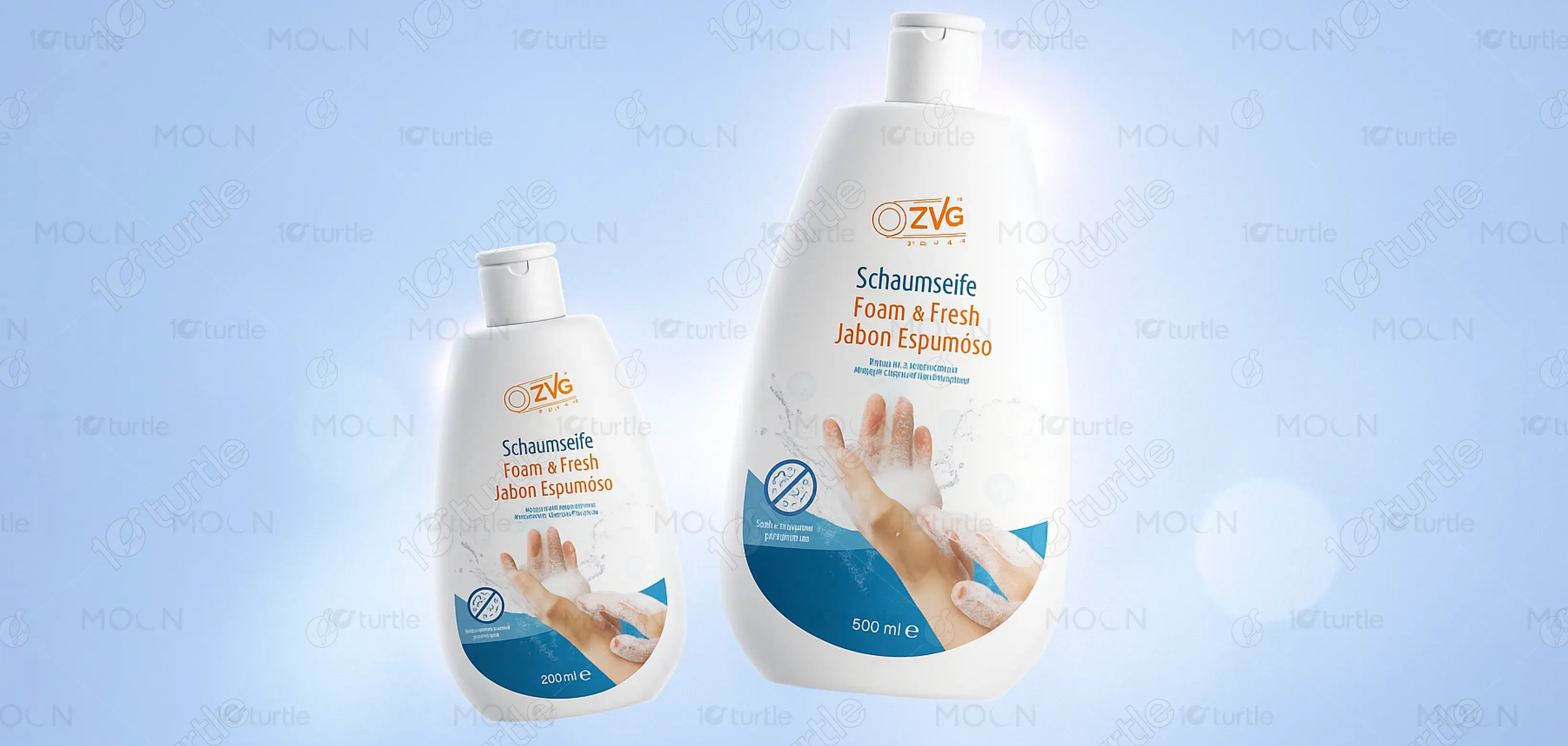
OZVG Foam & Fresh Hand Soap is a high-quality hand soap designed to provide a refreshing and clean experience. With a focus on hygiene and gentle cleansing, the product is ideal for daily use, offering effective sanitation while being soft on the skin. The 250 ml bottle features a modern, sleek design that emphasizes freshness through its clean aesthetic. Its market appeal lies in its combination of gentle yet efficient ingredients and an inviting, easy-to-use format.

Industry
Healthcare & WellnessWhat we did
Label DesignGraphic DesignPlatform
-One of the challenges in designing hand soap packaging is conveying both the product’s functional and emotional qualities. With so many similar products on the market, it’s easy for a design to get lost in the clutter. Consumers want products that not only cleanse effectively but also provide a pleasant, refreshing experience. The challenge lies in balancing the utilitarian nature of a hand soap with its ability to stand out on the shelf while appealing to the consumer’s desire for freshness and cleanliness.
This design solves the issue by focusing on a clean, modern aesthetic that communicates freshness and purity. The use of white and blue, along with the dynamic image of a foamy hand, connects the product with its primary function—cleanliness—while creating an emotional connection. The streamlined, minimalistic design is eye-catching yet uncomplicated, ensuring that the product grabs attention without overwhelming the consumer, making it easy to identify and trust.

The long-term goal for this design is to establish OZVG as a leading brand in the hand soap market, known for both its functionality and aesthetic appeal. The design aims to evolve by incorporating eco-friendly materials and further enhancing the user experience. By keeping the packaging modern and aligned with current design trends, the product will continue to resonate with consumers, creating a lasting presence on store shelves and fostering brand loyalty.

The color scheme features a combination of white and blue tones. White signifies purity, cleanliness, and simplicity, reinforcing the product’s fresh, effective cleansing properties. Blue is often associated with trust, calmness, and freshness, making it a natural choice for a product focused on hygiene. The palette is designed to evoke a sense of serenity and reliability, while maintaining a clean and contemporary feel that aligns with the overall brand identity.