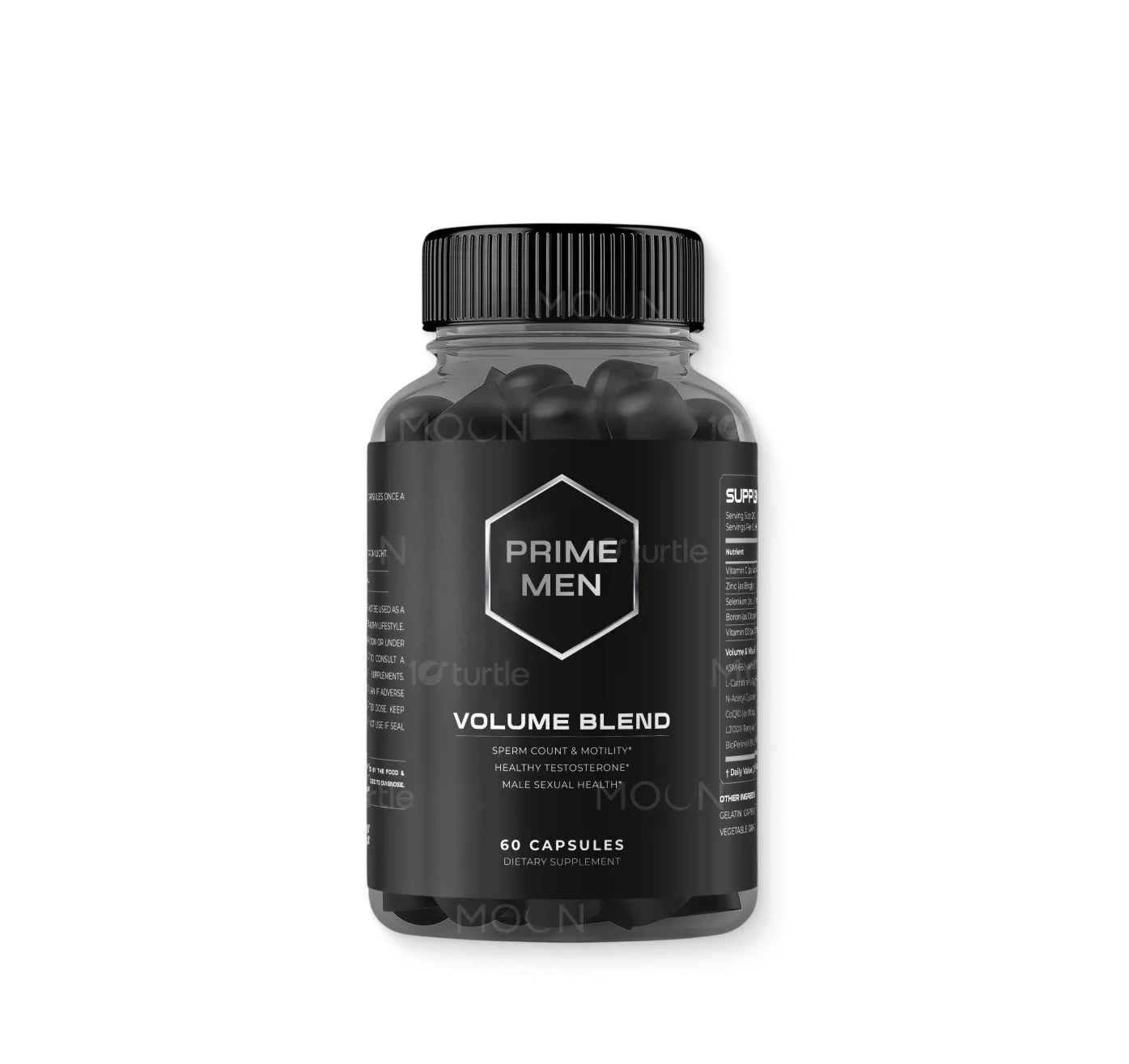
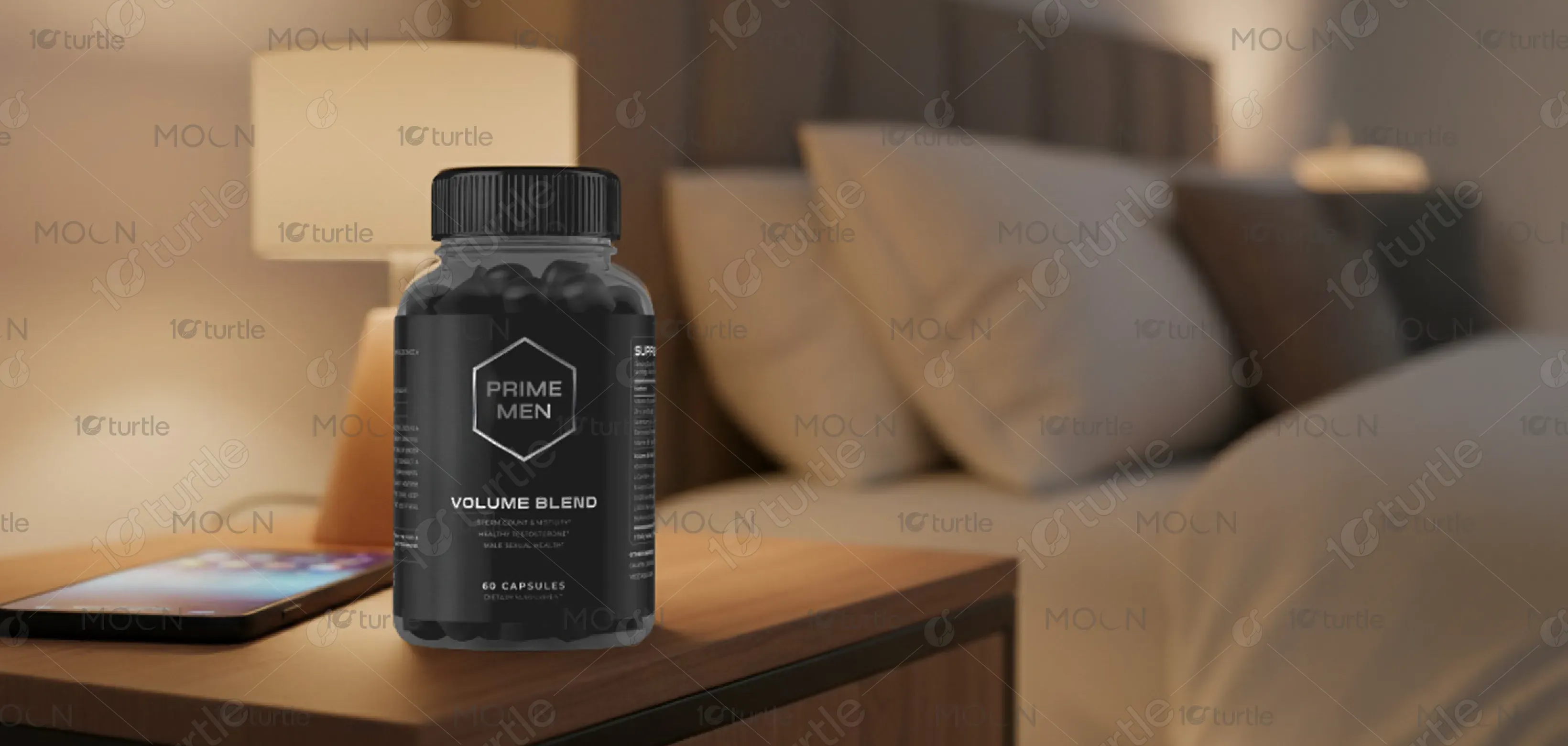
The label design embraces a modern, clean, and authoritative aesthetic that reflects trust, wellness, and vitality. The use of structured typography, bold highlights, and a balanced layout ensures that the supplement’s benefits—such as sperm count, testosterone support, and male vitality—are communicated with clarity. Subtle color contrasts and professional styling give it a premium yet approachable feel. This design direction merges scientific credibility with consumer appeal, ensuring the product stands out on shelves while resonating with health-conscious male consumers.
Label Design
Graphic Design

Industry
Healthcare & Wellness
Tools we used


Project Completion
2025
Key Market
Global
This is a male sexual health dietary supplement designed to support sperm count, motility, healthy testosterone levels, and overall vitality. Developed with clinically backed ingredients like KSM-66® Ashwagandha, Tongkat Ali, and CoQ10, it promotes energy, reproductive health, and hormone balance. Packaged in a premium 60-capsule bottle, it targets men seeking natural, science-driven solutions for wellness. Its unique selling points are its high-quality formulation, FDA-registered bottling, and evidence-based ingredients, aligning with modern consumer demand for safe, effective supplements.

Industry
Healthcare & WellnessWhat we did
Label DesignGraphic DesignPlatform
-The primary challenge in designing supplements in this category lies in balancing credibility with consumer trust. The male health segment is saturated with flashy, often exaggerated claims, leading to skepticism among consumers. Many designs overemphasize masculinity or boldness, which can alienate buyers looking for a professional, health-focused product. Additionally, strict compliance with FDA guidelines requires clear, accurate labeling without misleading promises, creating tension between marketing appeal and regulatory responsibility. This gap often leaves consumers confused or doubtful about effectiveness.
This design bridges the gap by combining scientific authority with modern aesthetics. Clear benefit callouts (“Sperm Count & Motility,” “Healthy Testosterone,” “Male Sexual Health”) are supported with transparent supplement facts and clinically researched ingredients. The professional design avoids gimmicks, instead projecting reliability and quality. By highlighting certifications (FDA-registered facility, Made in USA) and listing trusted components like Ashwagandha and NAC, the label reinforces authenticity. The clean structure ensures both compliance and clarity, empowering consumers to make confident, informed choices.

The long-term vision is to establish this supplement line as a trusted leader in men’s health and vitality, expanding into broader wellness categories. The design aims to build a recognizable identity associated with transparency, clinical backing, and premium quality. As the product grows, the branding can evolve into a family of supplements with consistent yet adaptable visual language. Ultimately, the goal is to normalize men’s wellness conversations, foster consumer trust, and leave a lasting impact in the nutraceutical market.
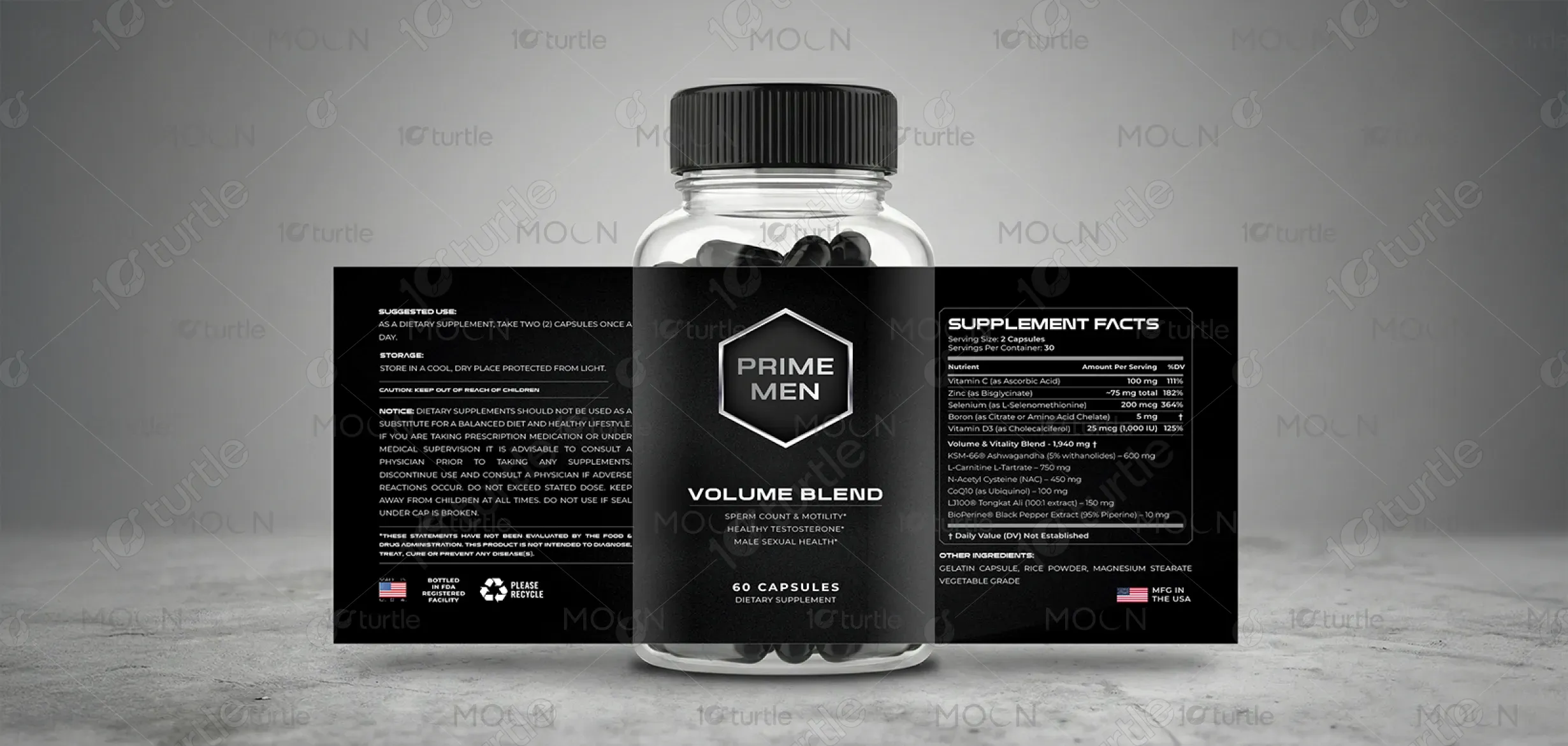

The chosen palette uses deep, masculine tones paired with professional neutrals to reflect strength, vitality, and reliability. Rich blues or blacks suggest authority and stability, while subtle metallic or accent hues convey premium quality. Contrasting highlight colors, such as gold or white, enhance legibility and draw attention to key health claims. This color scheme not only aligns with the product’s identity but also evokes feelings of trust, energy, and balance—perfectly reinforcing the supplement’s promise of male vitality and wellness.