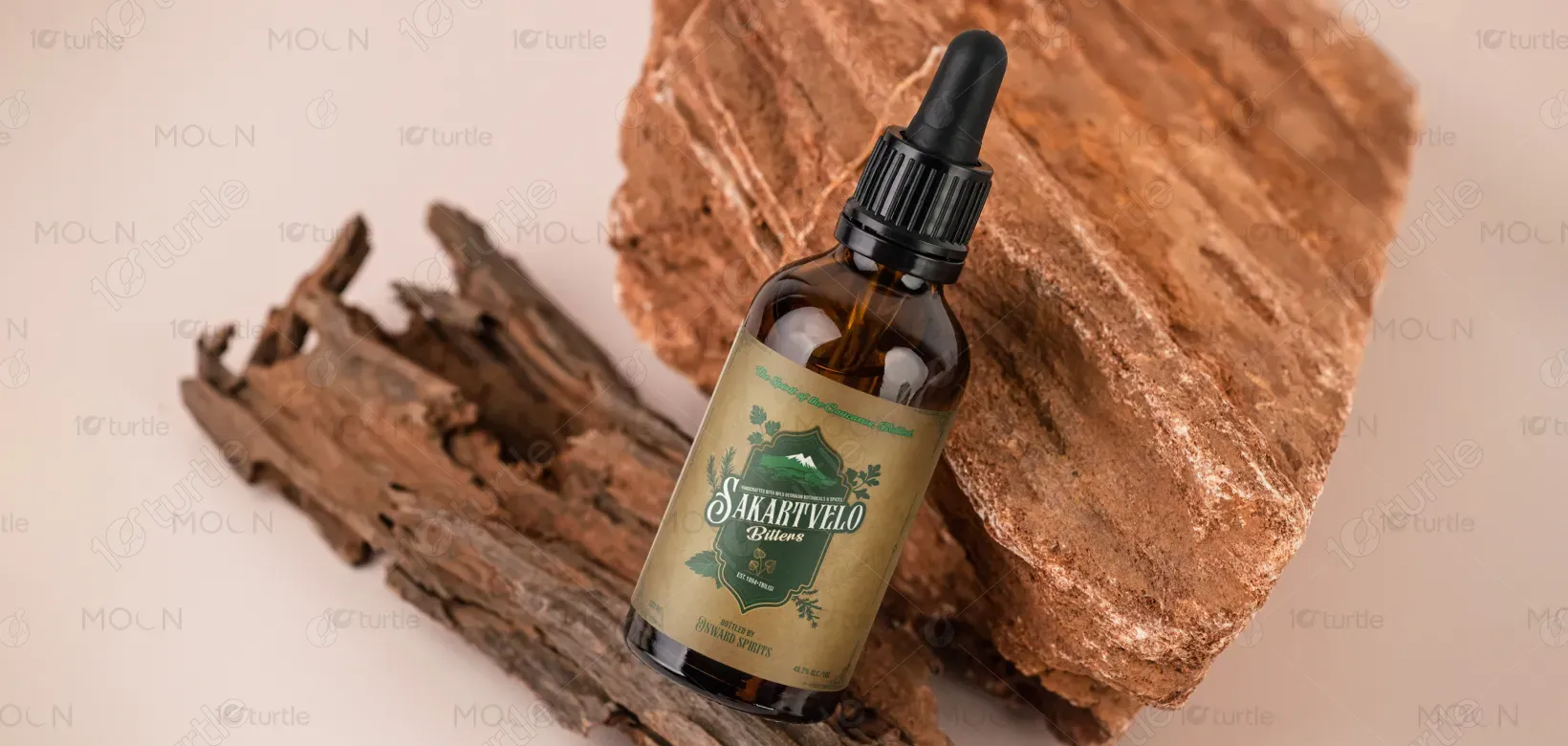
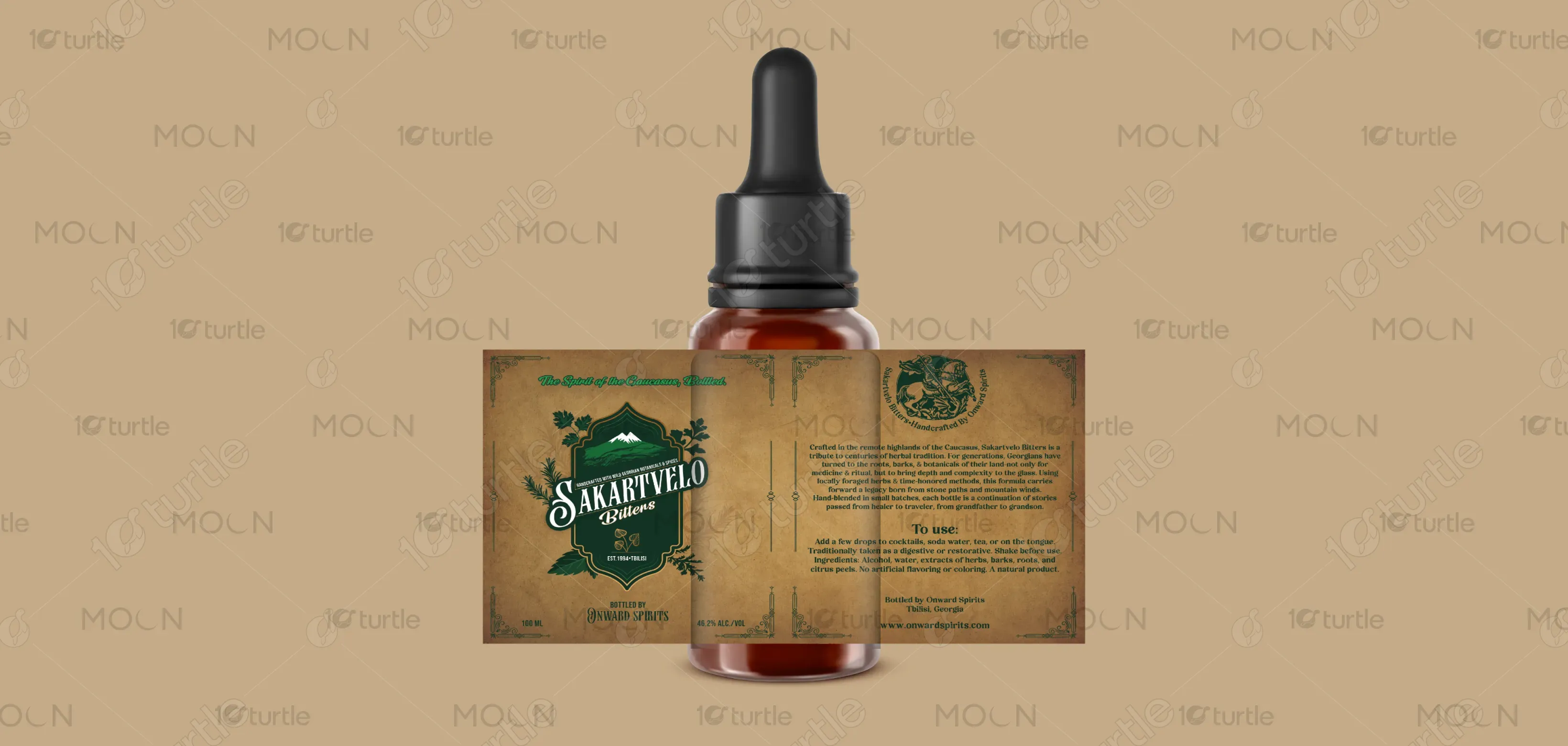
The design of Sakartvelo Bitters reflects authenticity, heritage, and nature’s raw beauty. Inspired by the Caucasus Mountains, the label combines earthy tones, traditional fonts, and botanical illustrations to emphasize its handcrafted roots. The rustic background texture evokes vintage apothecary aesthetics, while clean typography ensures modern readability. Decorative flourishes add cultural depth, balancing old-world tradition with contemporary elegance. The overall creative direction conveys a sense of craftsmanship, purity, and connection to Georgia’s wild botanicals, making it both premium and approachable to consumers.
Label Design
Graphic Design
Industry
Food, Beverage & Hospitality
Tools we used


Project Completion
2025
Key Market
Global
Sakartvelo Bitters is a handcrafted Georgian spirit infused with wild botanicals and spices. Rooted in centuries of herbal tradition, it brings depth and complexity to cocktails, sodas, and teas while also serving as a natural digestive aid. Unlike mass-produced bitters, Sakartvelo highlights authentic, foraged ingredients from the Caucasus. Its premium, heritage-inspired design and artisanal production set it apart in a crowded market, appealing to consumers seeking authenticity, craftsmanship, and a sensory connection to culture and nature.


Industry
Food, Beverage & HospitalityWhat we did
Label DesignGraphic DesignPlatform
-The global bitters market is saturated with generic, mass-produced products that often lack cultural identity and authenticity. Many designs fail to communicate heritage or the natural origins of their ingredients, leading to a disconnect with today’s consumers who value authenticity and craft. Additionally, visual clutter and over-modernized aesthetics can alienate customers seeking tradition and purity. This gap leaves discerning drinkers—cocktail enthusiasts, health-conscious consumers, and heritage seekers—without products that balance authenticity, function, and storytelling.
Sakartvelo Bitters solves this gap by blending authentic Georgian heritage with premium design. Its label communicates tradition through mountain imagery, handcrafted typography, and rustic textures, while maintaining clarity and elegance. The product itself uses wild-foraged botanicals and age-old techniques, ensuring genuine quality over mass production. By combining a visually distinct design with cultural storytelling, it appeals to both cocktail enthusiasts and wellness seekers, offering a product that is not just a bitter but an experience rooted in tradition and nature.

The long-term vision for Sakartvelo Bitters is to become a globally recognized ambassador of Georgian heritage and craftsmanship. Beyond enhancing cocktails, the brand aims to revive and preserve traditional herbal knowledge while promoting sustainable foraging practices. Future growth includes expanding into a diverse range of botanically inspired spirits and wellness products, all rooted in authenticity. By bridging ancient traditions with modern lifestyles, Sakartvelo aspires to leave a lasting cultural and sensory impact, making every drop a celebration of heritage and nature.


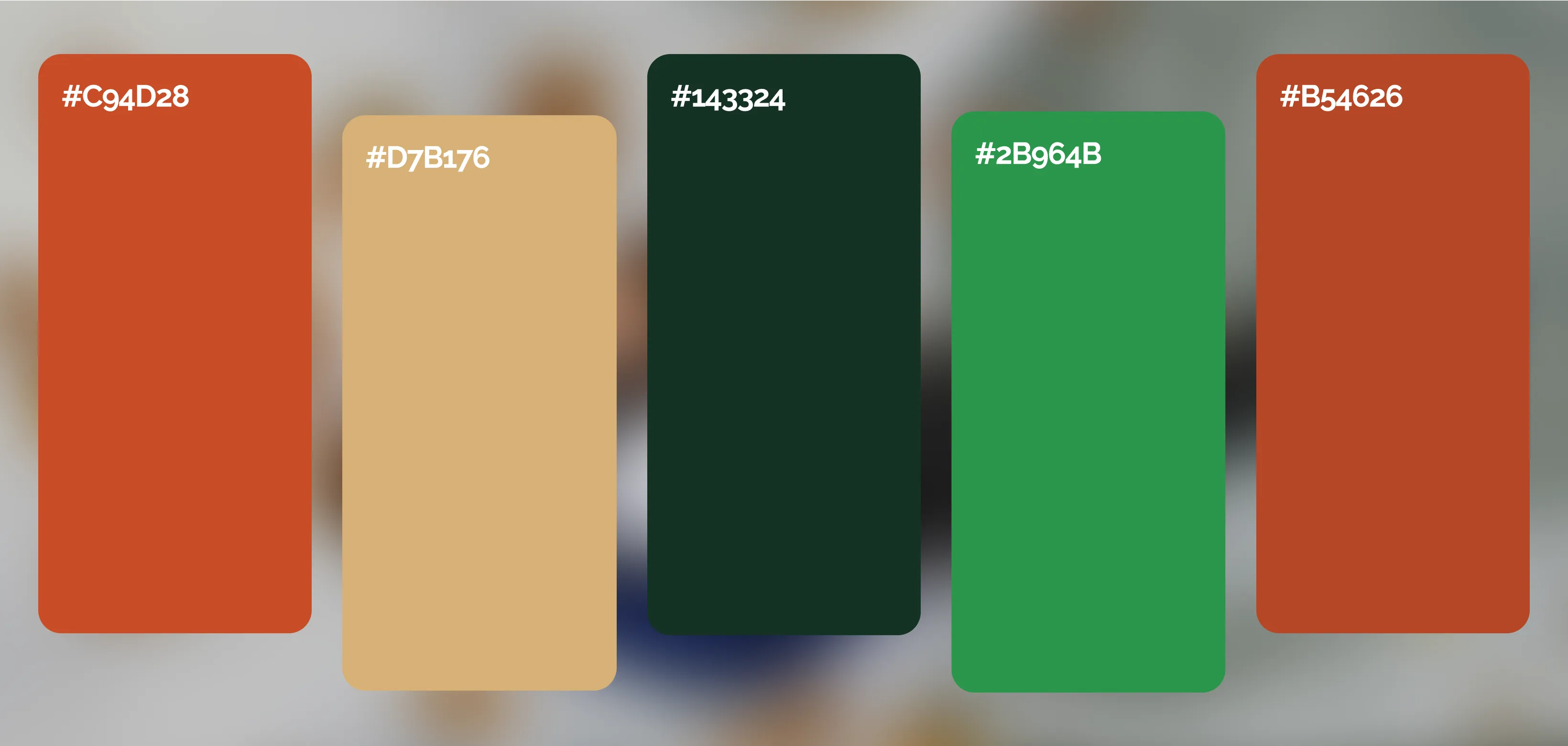
The palette includes electric teals, royal blues, magentas, burnt oranges, and metallic golds—each chosen to evoke vibrancy, luxury, and a sense of the fantastical. These colors mirror the iridescence of tropical bird plumage while complementing both neutral and bold furnishings. Gold accents add opulence and warmth, while the contrast between dark backgrounds and vivid forms ensures visual clarity. This palette not only aligns with modern décor trends but also elevates brand identity by signaling creativity, boldness, and uniqueness.