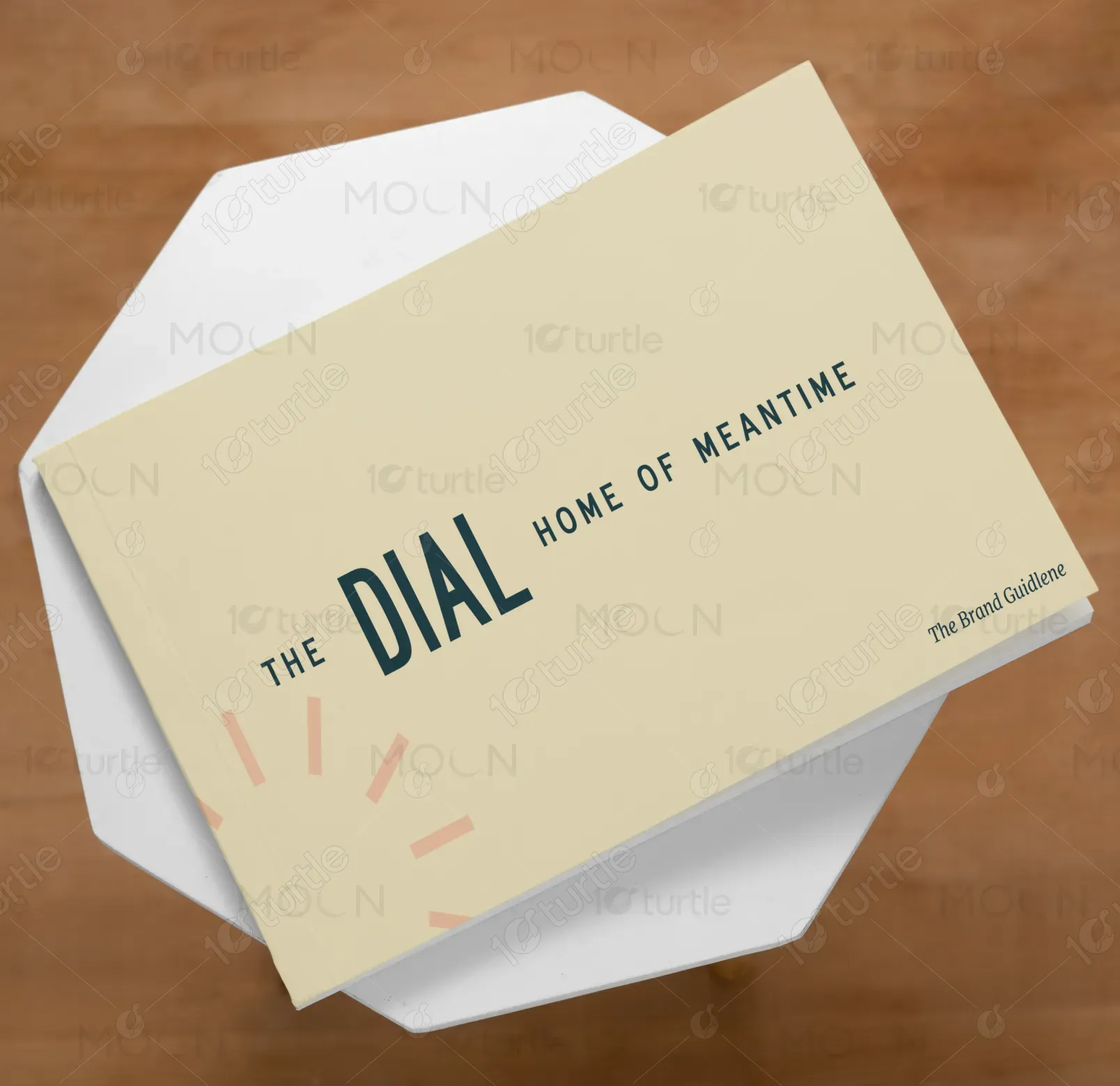
The design adopts a minimalist approach with a neutral, soft color palette that reflects tranquility and elegance. The use of earthy tones and clean typography aims to evoke warmth and sophistication. Visuals feature a harmonious blend of imagery and iconography that reflects the brand’s welcoming atmosphere. The overall aesthetic focuses on modern simplicity while creating a balanced, welcoming environment. The layout is clean, making content accessible while highlighting key brand values—comfort, connection, and style.
Brochure Design
Graphic Design
Landscape Brochure
Industry
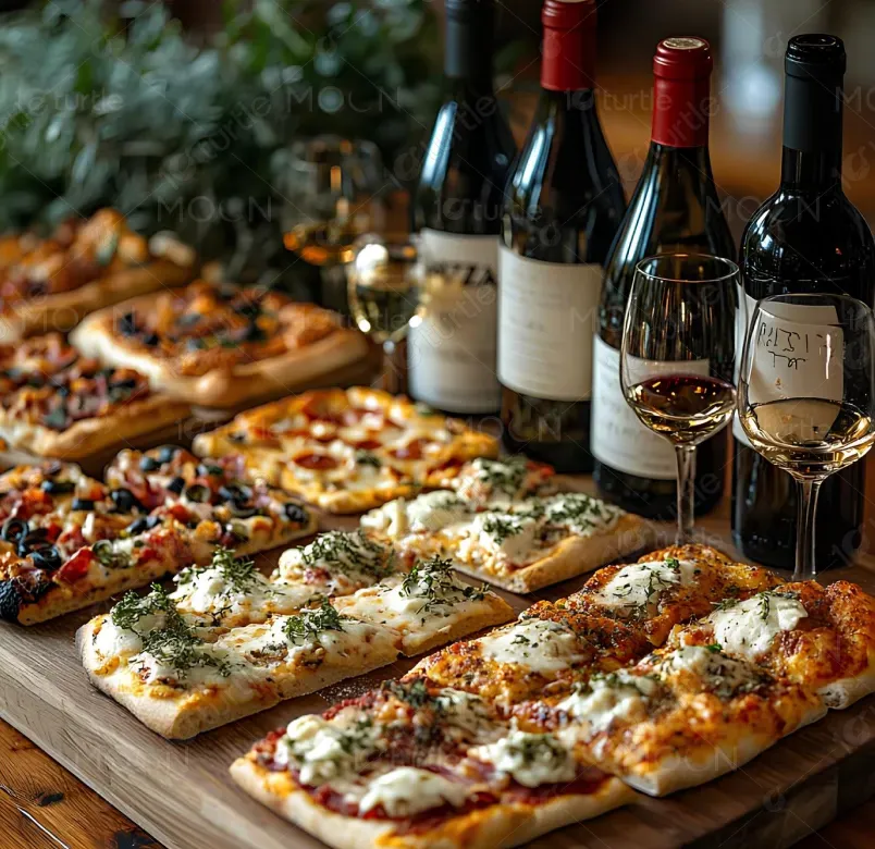
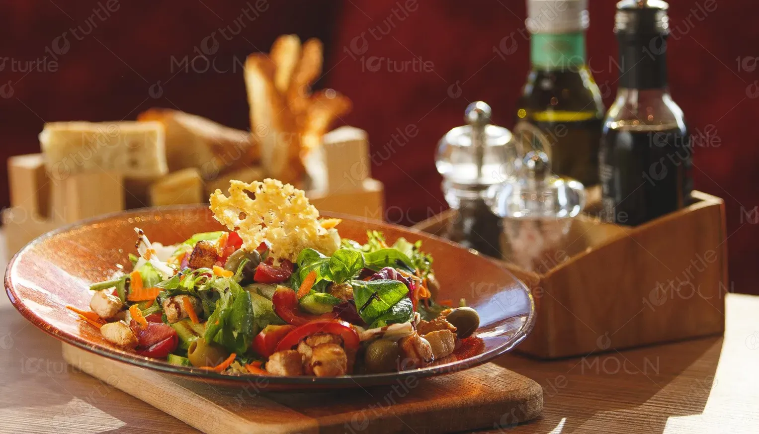
Food, Beverage & Hospitality
Tools we used


Project Completion
2025
Key Market
Global
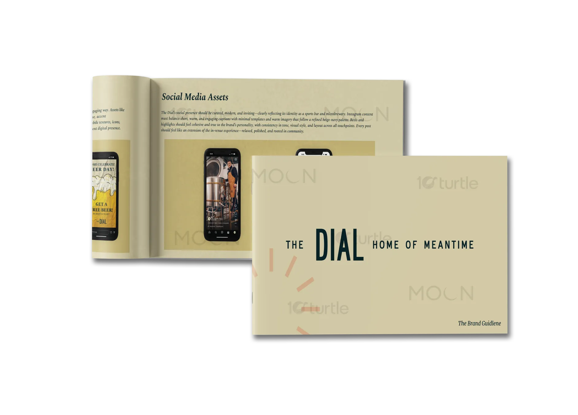
The Dial is a brand designed to bring people together in a modern yet inviting space. Aimed at the hospitality industry, it blends contemporary design with a warm atmosphere, offering both physical and emotional connections. The brand focuses on creating a space where time can be appreciated and savored. Its unique selling points include a design that encourages relaxation and interaction, featuring calming colors, functional spaces, and a thoughtfully designed environment that appeals to modern sensibilities.
Industry
Food, Beverage & HospitalityWhat we did
Brochure DesignGraphic DesignLandscape BrochurePlatform
-The challenge in today’s hospitality industry is creating spaces that foster genuine connection in a digitally dominated world. Many venues fail to offer environments that feel both modern and comfortable, leaving customers feeling disconnected. The lack of a cohesive, inviting space can lead to disengagement, reducing customer satisfaction and loyalty. Furthermore, many hospitality spaces overlook the need for designs that can adapt to different moods and experiences, which is critical for fostering long-term customer relationships.
The Dial addresses these gaps by offering a design that blends functionality with emotional appeal. The brand’s approach creates an atmosphere that is not only stylish but also conducive to connection, relaxation, and enjoyment. Thoughtful touches like warm colors, intuitive layout, and interactive elements enhance the user experience. The design incorporates spaces that are adaptable to different activities, providing both tranquility and vibrancy depending on the time of day or event, fostering a sense of belonging.

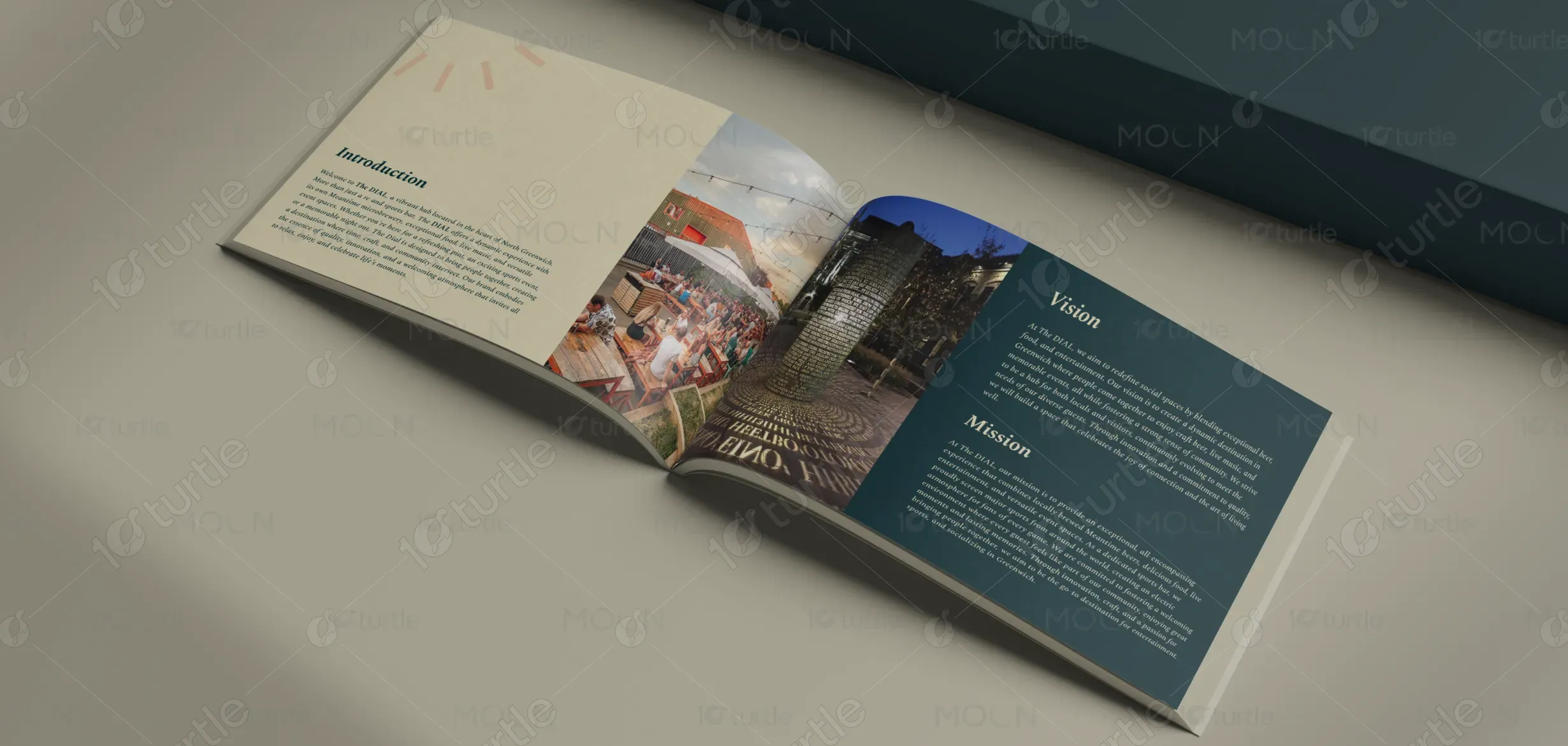
The long-term vision for The Dial is to evolve into a leader in hospitality design, known for creating spaces that balance modern aesthetics with emotional comfort. The brand seeks to become synonymous with places where people can escape the rush of daily life, engage meaningfully with others, and enjoy their time fully. By focusing on timeless design and human connection, The Dial aims to redefine the hospitality industry, becoming a go-to choice for creating memorable experiences that leave a lasting impact.
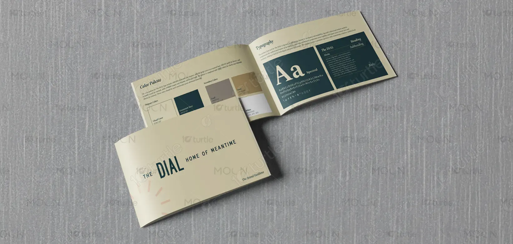
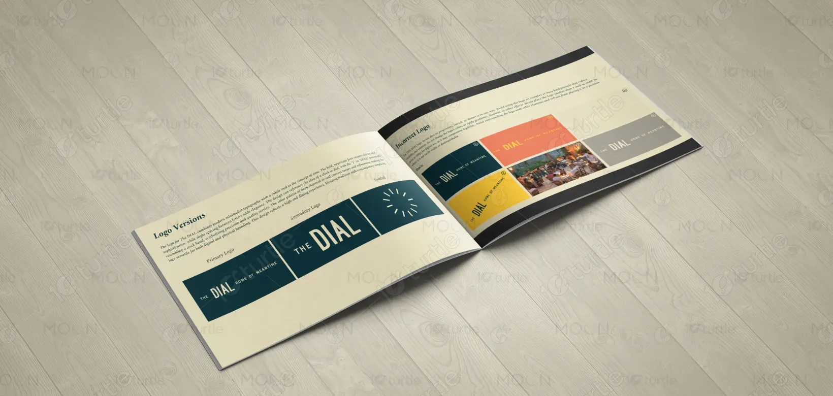
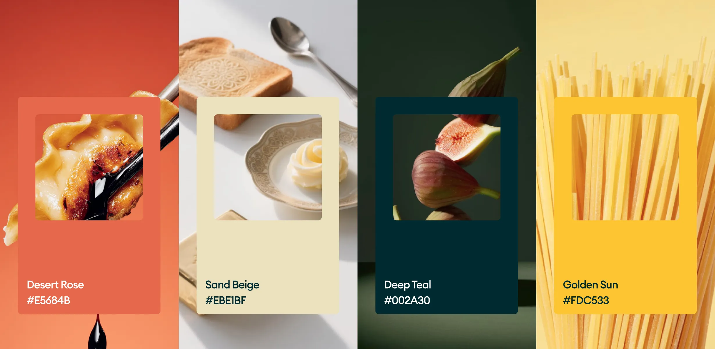
The color palette chosen for The Dial blends soft, neutral tones like beige and muted greens with deeper, more elegant shades of navy and teal. This combination evokes feelings of calm, sophistication, and warmth. The lighter tones help create a welcoming, serene environment, while the deeper hues add depth and contrast, aligning with the brand's desire to offer both relaxation and vibrancy. This palette is chosen to reflect the brand’s core values of comfort, luxury, and timelessness.