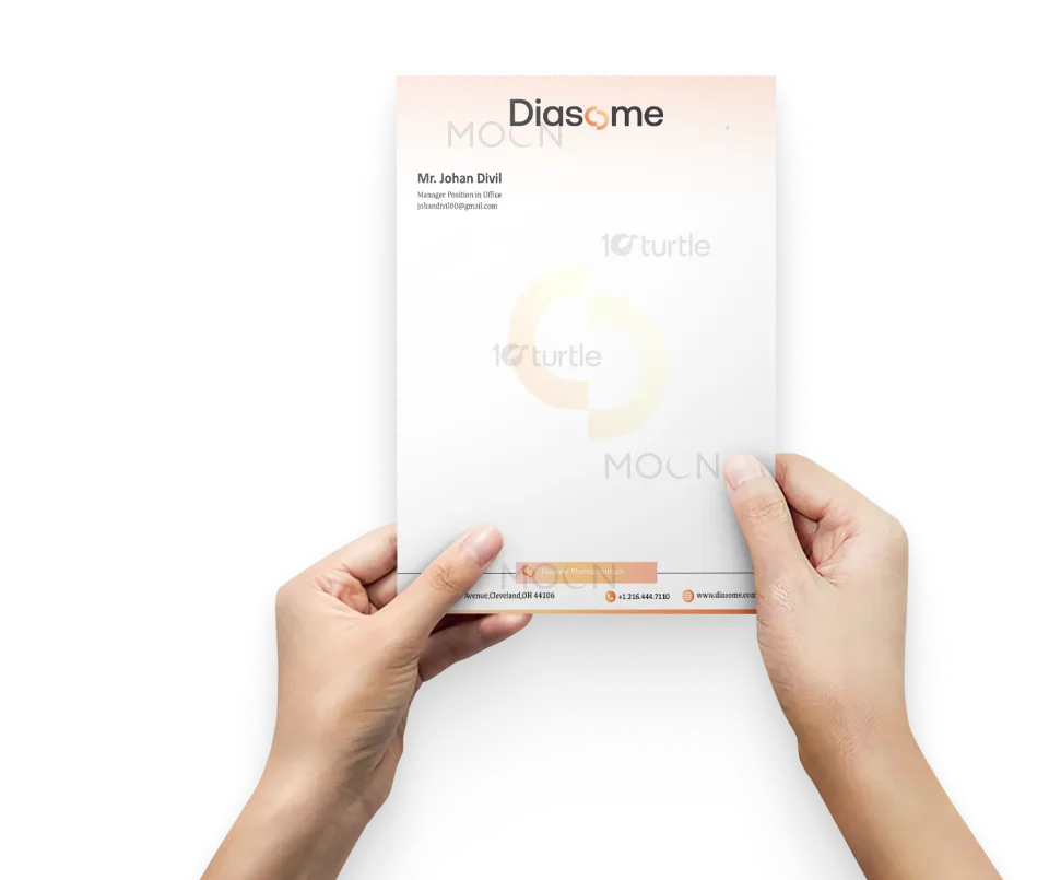
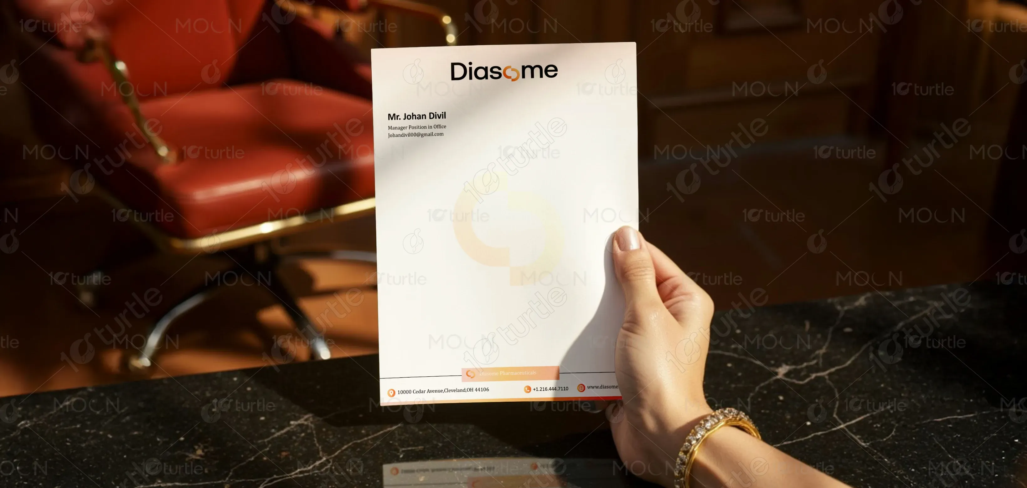
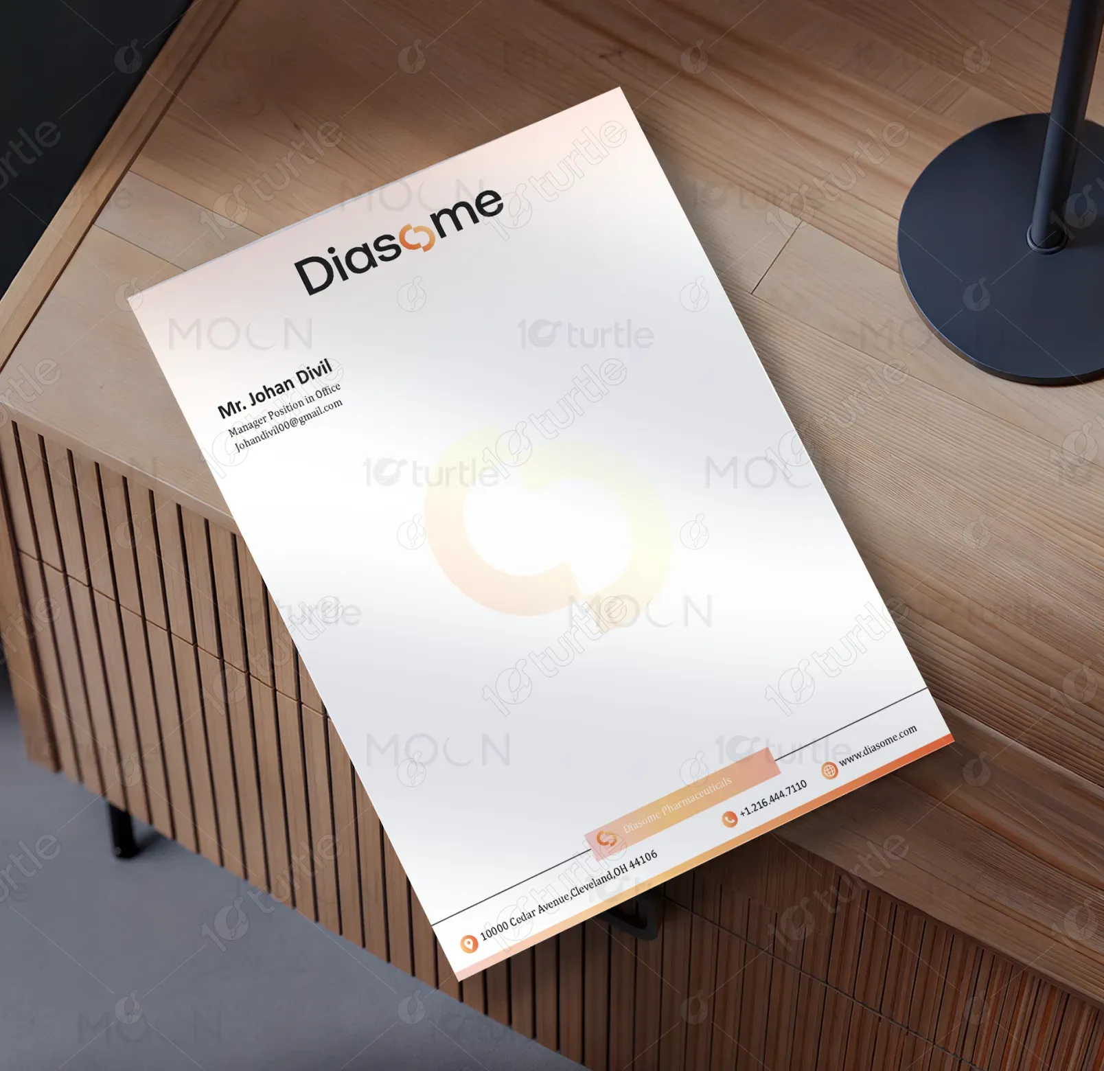
The Diasome letterhead design embraces a clean, modern, and professional aesthetic with a focus on clarity and brand identity. The minimalist layout ensures that key information is highlighted without overwhelming the page. The strategic use of white space reflects transparency and trust, while the bold yet refined logo placement strengthens brand recall. Subtle gradient elements and a soft watermark add depth and sophistication, balancing professionalism with creativity. The design achieves an elegant harmony between functionality and corporate appeal.
Letterhead Design
Graphic Design
Industry
Healthcare & Wellness
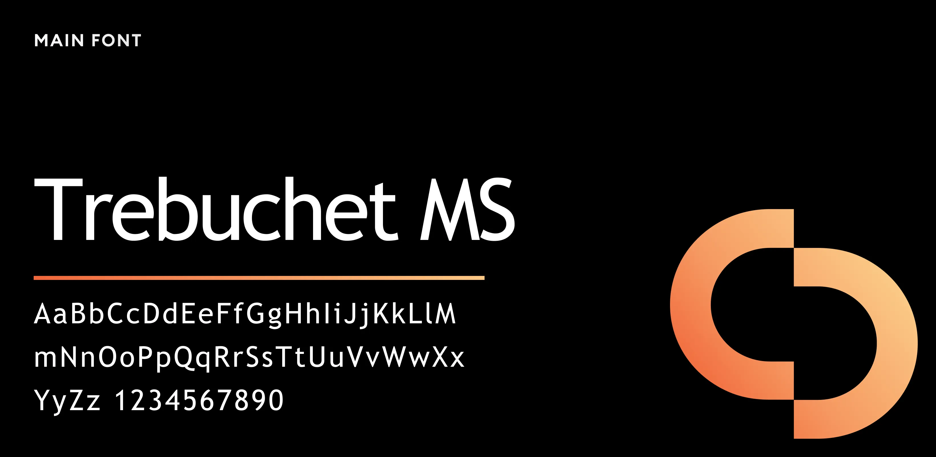
Tools we used


Project Completion
2025
Key Market
Global
This letterhead design represents Diasome Pharmaceuticals, a company dedicated to innovation in healthcare solutions. The purpose of the letterhead is to communicate professionalism, trust, and brand strength in every official correspondence. With a clean structure and subtle branding details, it creates a polished first impression. The unique selling points are its minimal yet modern layout, strategic use of branding elements, and balanced readability. The aesthetic appeal makes it versatile for both corporate and client-facing communication, reinforcing brand authority.

Industry
Healthcare & WellnessWhat we did
Letterhead DesignGraphic DesignPlatform
-The key challenge in designing pharmaceutical letterheads lies in balancing professionalism with brand recognition. Many corporate letterheads risk appearing too generic, lacking distinction and personality. In industries like healthcare, this issue is critical—an uninspired design can weaken trust, while overly complex visuals can distract from important communication. Diasome needed a design that would stand out in a saturated market yet remain subtle enough to maintain credibility. The gap was a professional design that resonates with authority and innovation.
The Diasome letterhead design resolves this challenge by integrating modern minimalism with subtle brand cues. The bold logo placement ensures brand visibility, while the use of soft gradients and a faint watermark adds a distinctive touch without overpowering the content. Clear typography and structured layouts enhance readability, ensuring professionalism is never compromised. By merging simplicity with sophistication, the design strengthens Diasome’s corporate identity and sets it apart from generic templates often used in the pharmaceutical industry.
The long-term vision for the Diasome letterhead design is to establish a consistent, recognizable brand identity across all communications. Beyond serving as stationery, it aims to reinforce trust, innovation, and professionalism in the pharmaceutical industry. As the company evolves, the design can adapt into digital letterheads, email templates, and other corporate assets, maintaining visual consistency across platforms. The aspiration is to create a timeless, impactful identity that leaves a lasting impression on partners, clients, and stakeholders.
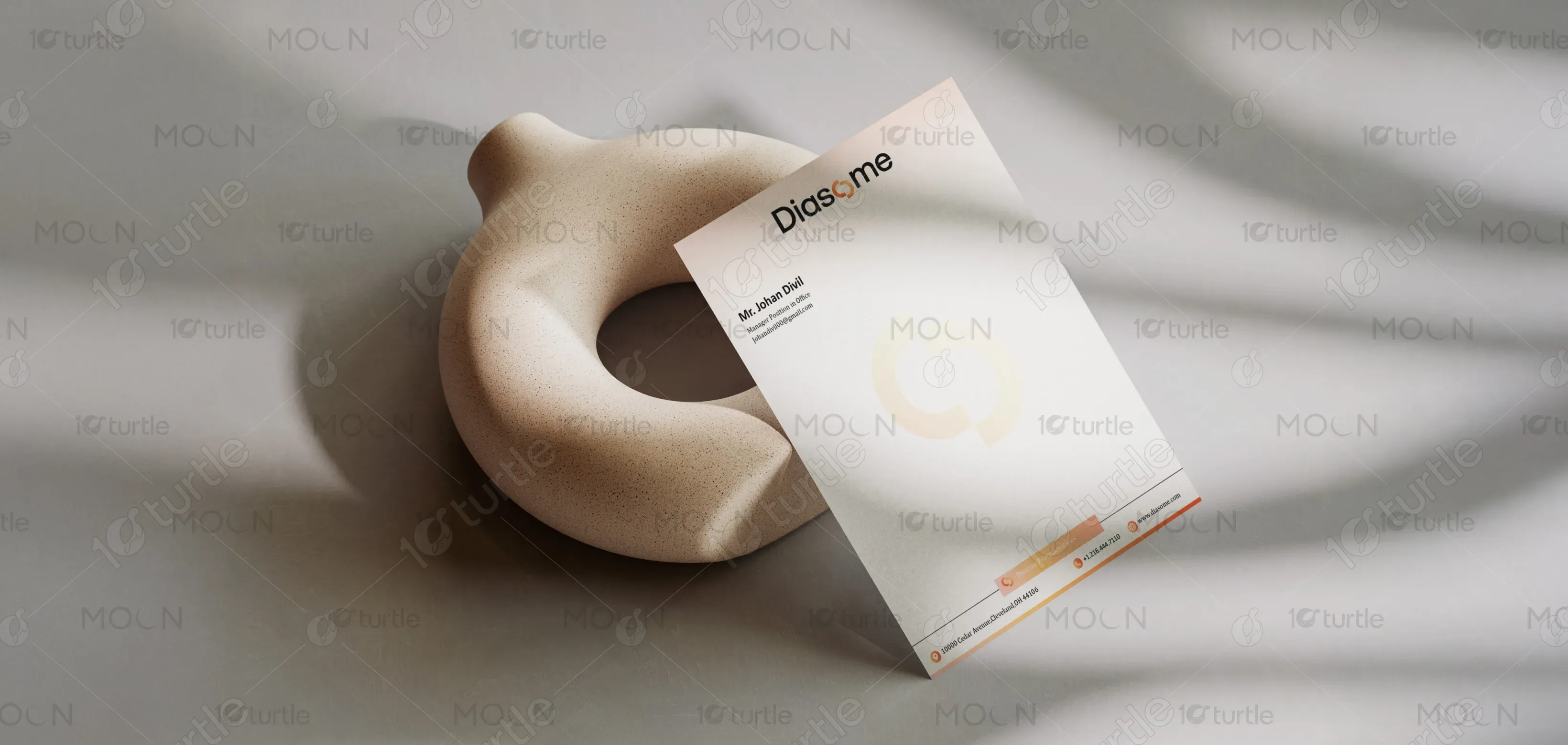

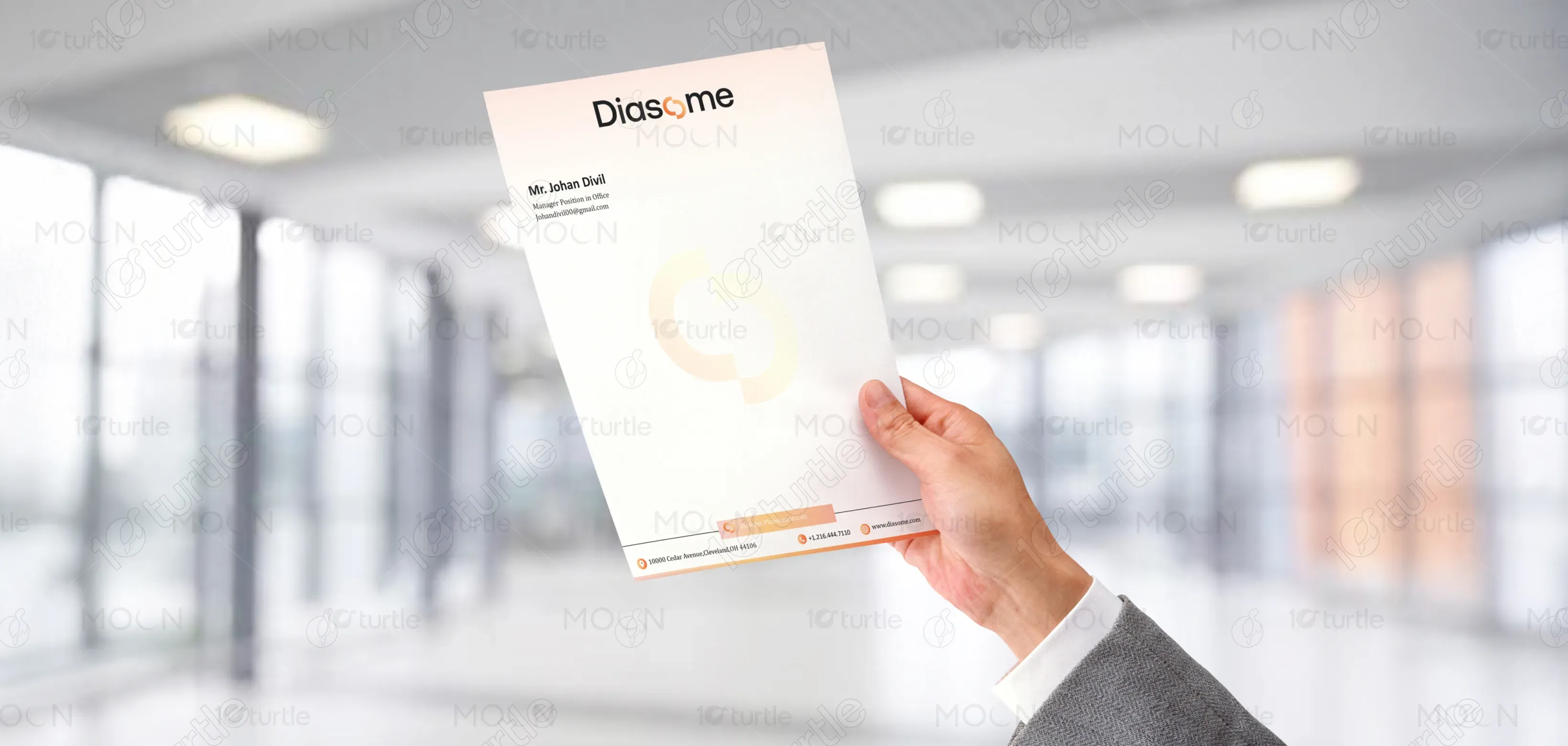
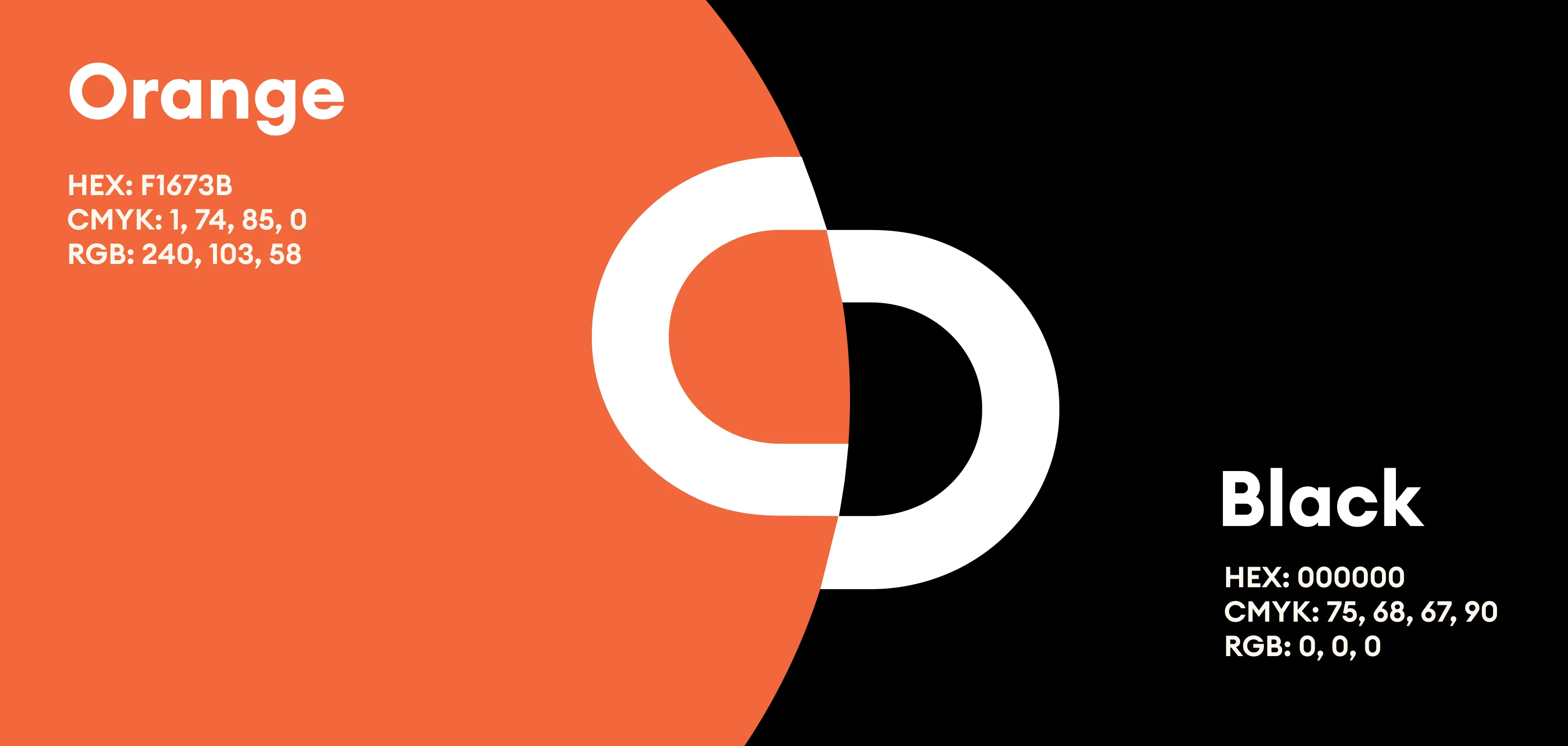
The design uses a sophisticated combination of black, white, and warm orange accents. Black signifies authority, reliability, and professionalism. White embodies clarity, simplicity, and transparency—crucial values in healthcare communication. The orange accent introduces energy, innovation, and approachability, ensuring the brand feels both credible and forward-looking. The soft gradient watermark complements the palette with subtlety, reinforcing elegance without distraction. This balanced color scheme reflects Diasome’s commitment to trust, innovation, and patient-focused care, making the design both appealing and functional.