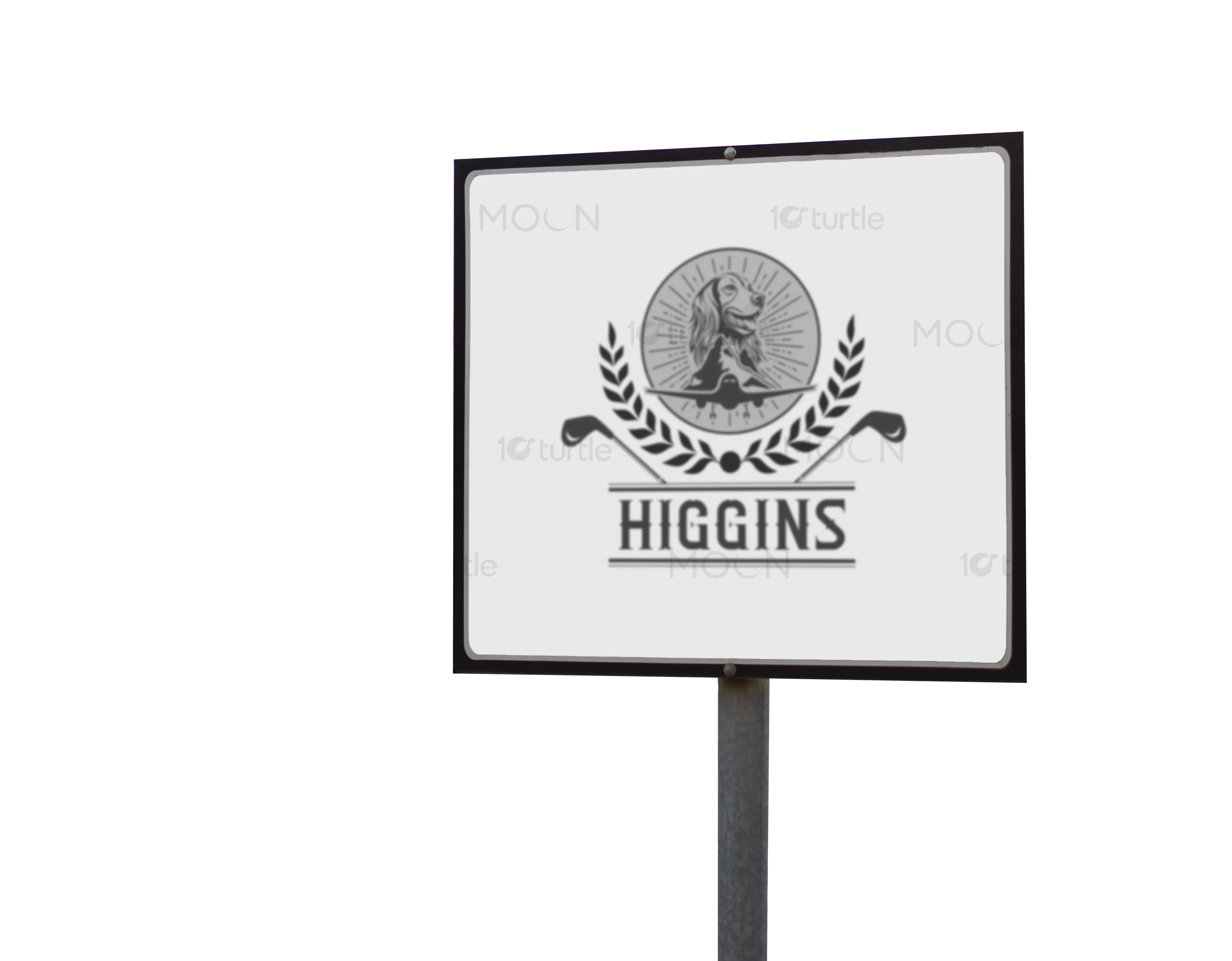
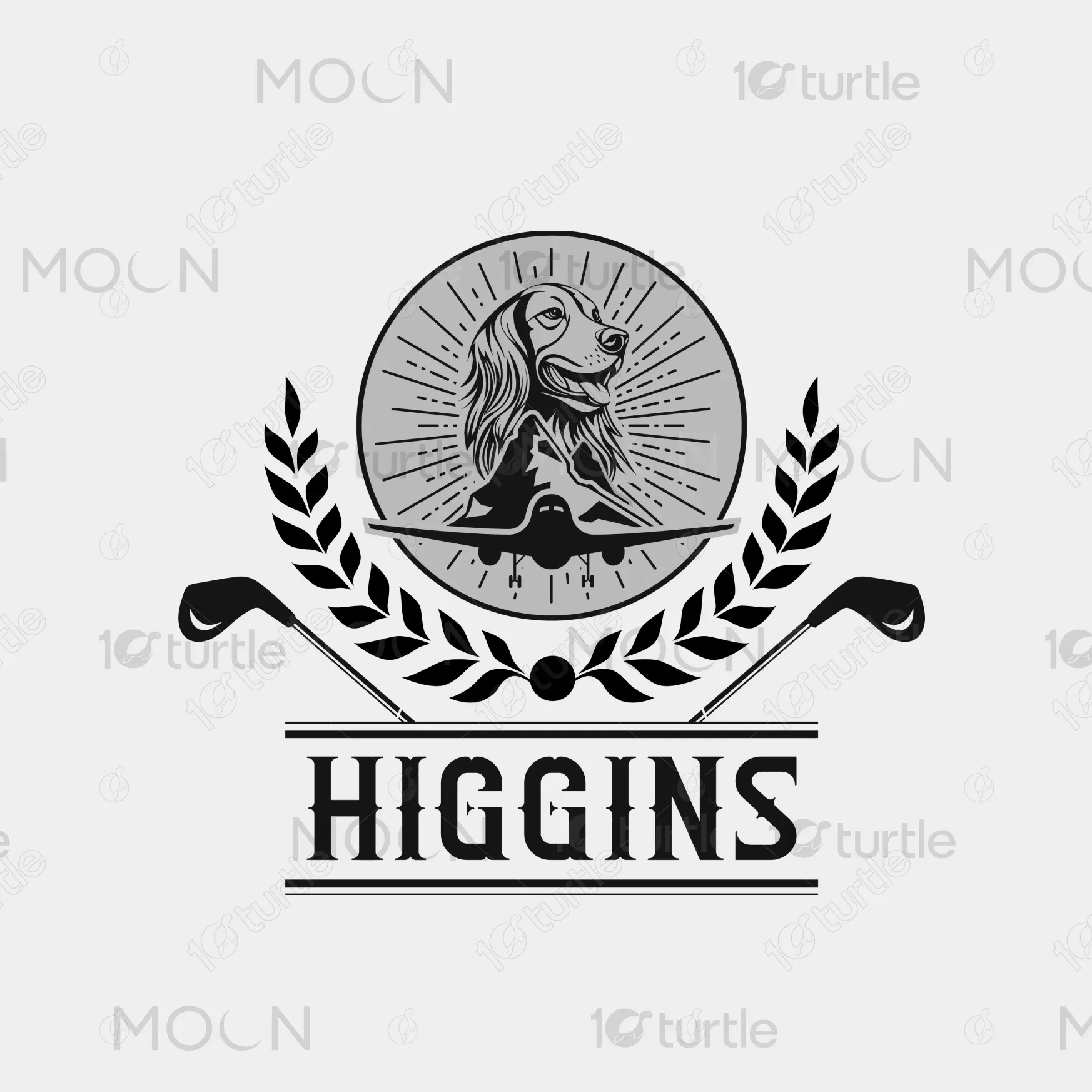
The Higgins logo merges tradition, prestige, and adventure into a unified emblem. At its core, a detailed dog illustration symbolizes loyalty and companionship, while the mountain and airplane signify exploration, precision, and elevated performance. Framed with laurel leaves for heritage and golf clubs for context, the design balances elegance and strength. The monochrome palette emphasizes sophistication, while bold typography grounds the brand identity. Overall, the concept creates a timeless and versatile logo that captures both lifestyle and sporting excellence.
Logo Design
Graphic Design
Branding
Industry
Fashion, Beauty & Lifestyle
Tools we used


Project Completion
2025
Key Market
Global
HIGGINS is a premium golf brand that combines sport, travel, and heritage into a lifestyle identity. Its logo reflects a multidimensional story — from the companionship of the dog, to the ambition of flight, to the tradition of golf. The brand is not just about performance on the course, but also about belonging to a community that values precision, loyalty, and prestige. Its unique blend of aviation, golf, and heritage iconography sets it apart in a competitive sports market.

Industry
Fashion, Beauty & LifestyleWhat we did
Logo DesignGraphic DesignBrandingPlatform
-The challenge in designing the HIGGINS identity was balancing multiple brand values — aviation, lifestyle, and golf — without overwhelming the logo. Golf brands often fall into cliché design traps, such as generic golf balls or crossed clubs, losing originality. Additionally, premium sports markets demand designs that are both versatile for merchandise and recognizable at a glance. The gap lay in creating a logo that feels unique yet timeless, suitable for apparel, signage, and digital platforms, without diluting the brand story.
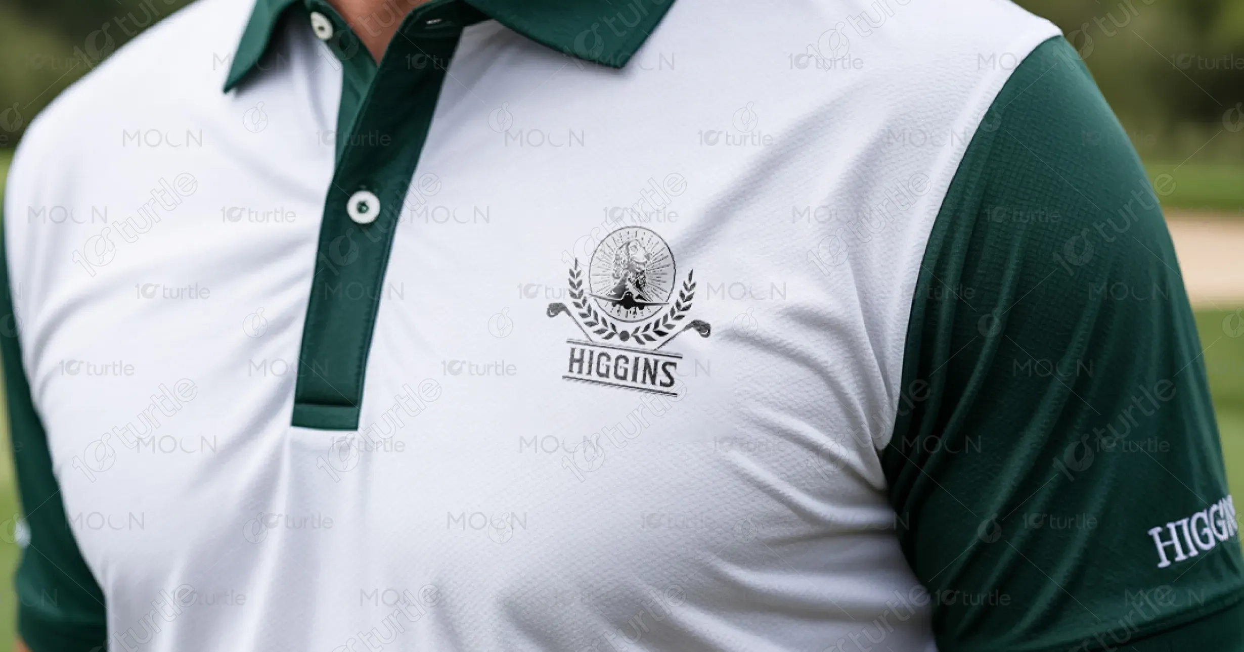
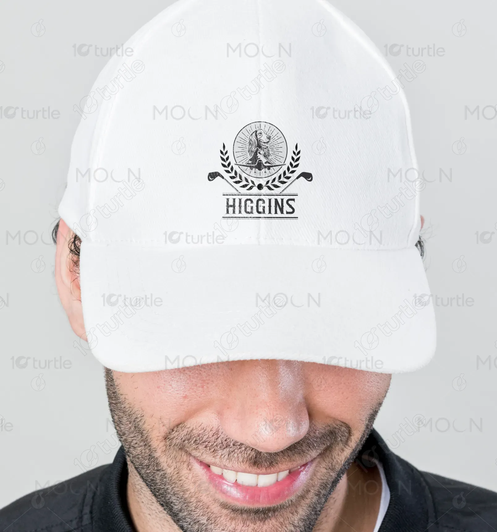
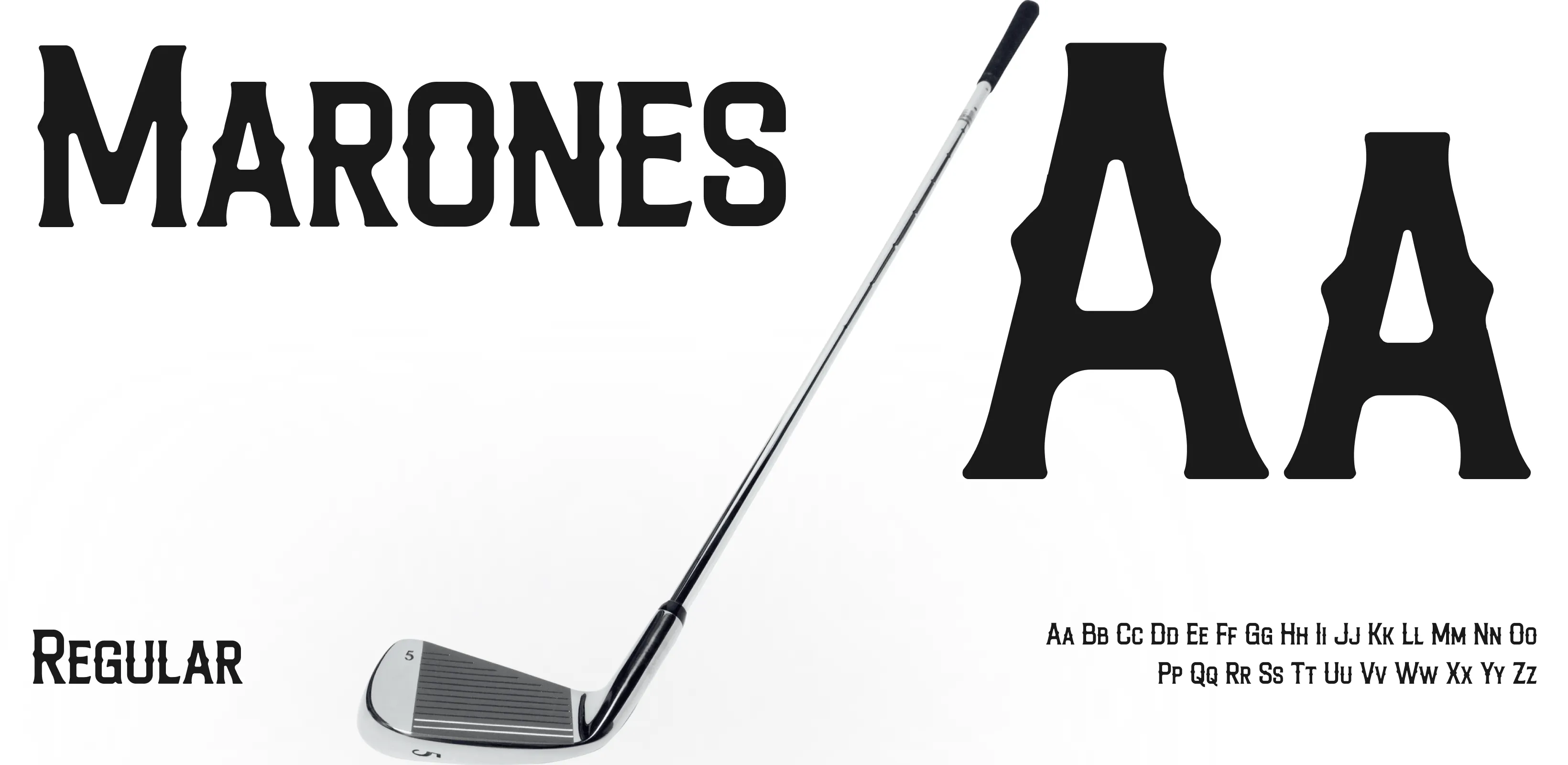
The final logo integrates symbolism in a structured yet creative way. The loyal dog creates emotional resonance, the airplane and mountains convey ambition and travel, while golf clubs and laurels ensure sport-specific relevance. Instead of using predictable golf iconography, the design layers multiple narratives, giving depth to the brand. The bold typography strengthens brand recognition, while the monochrome palette ensures scalability across embroidery, digital, and print. The outcome is a versatile, premium emblem that elevates the brand identity and differentiates it from competitors.
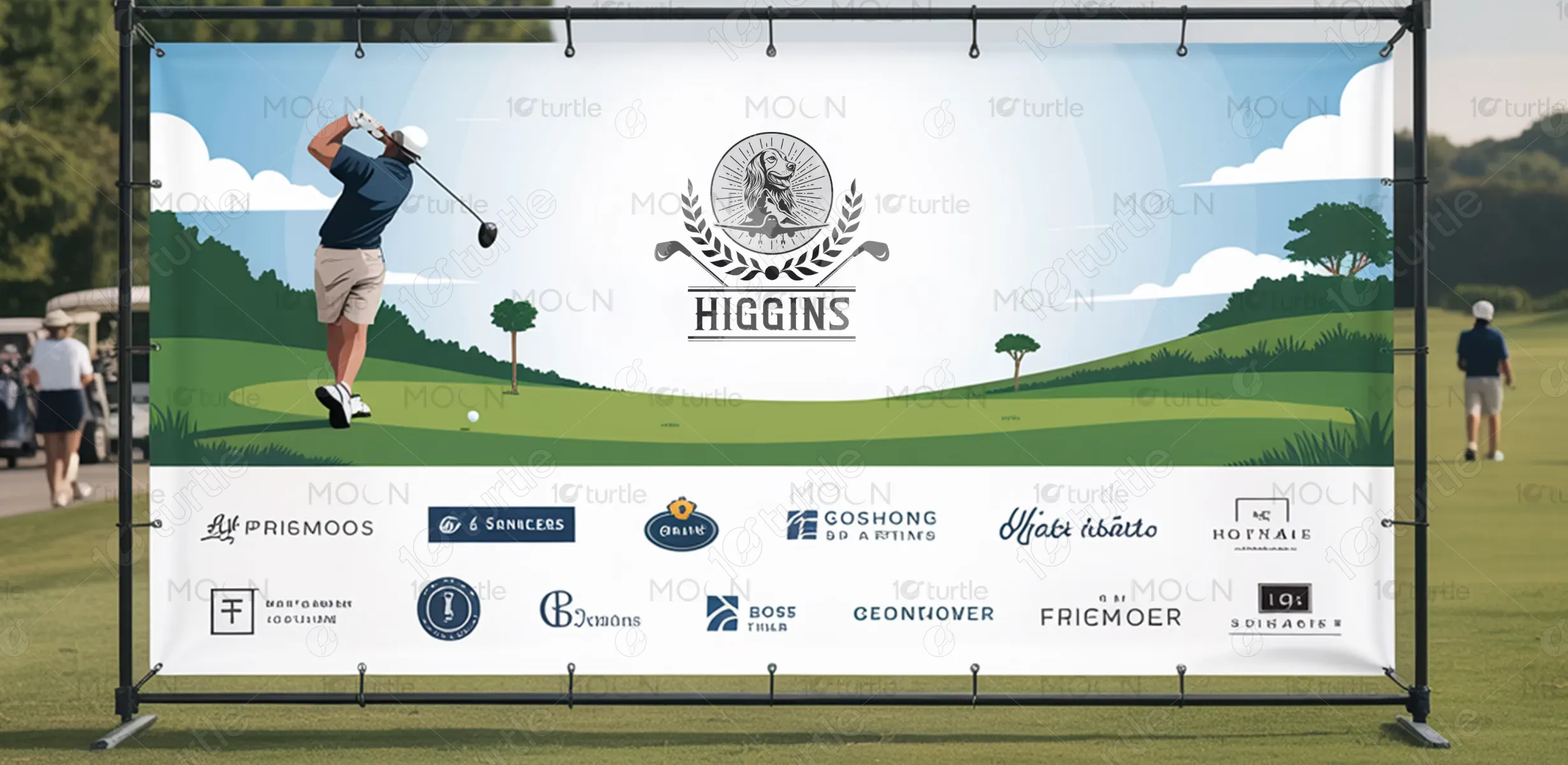
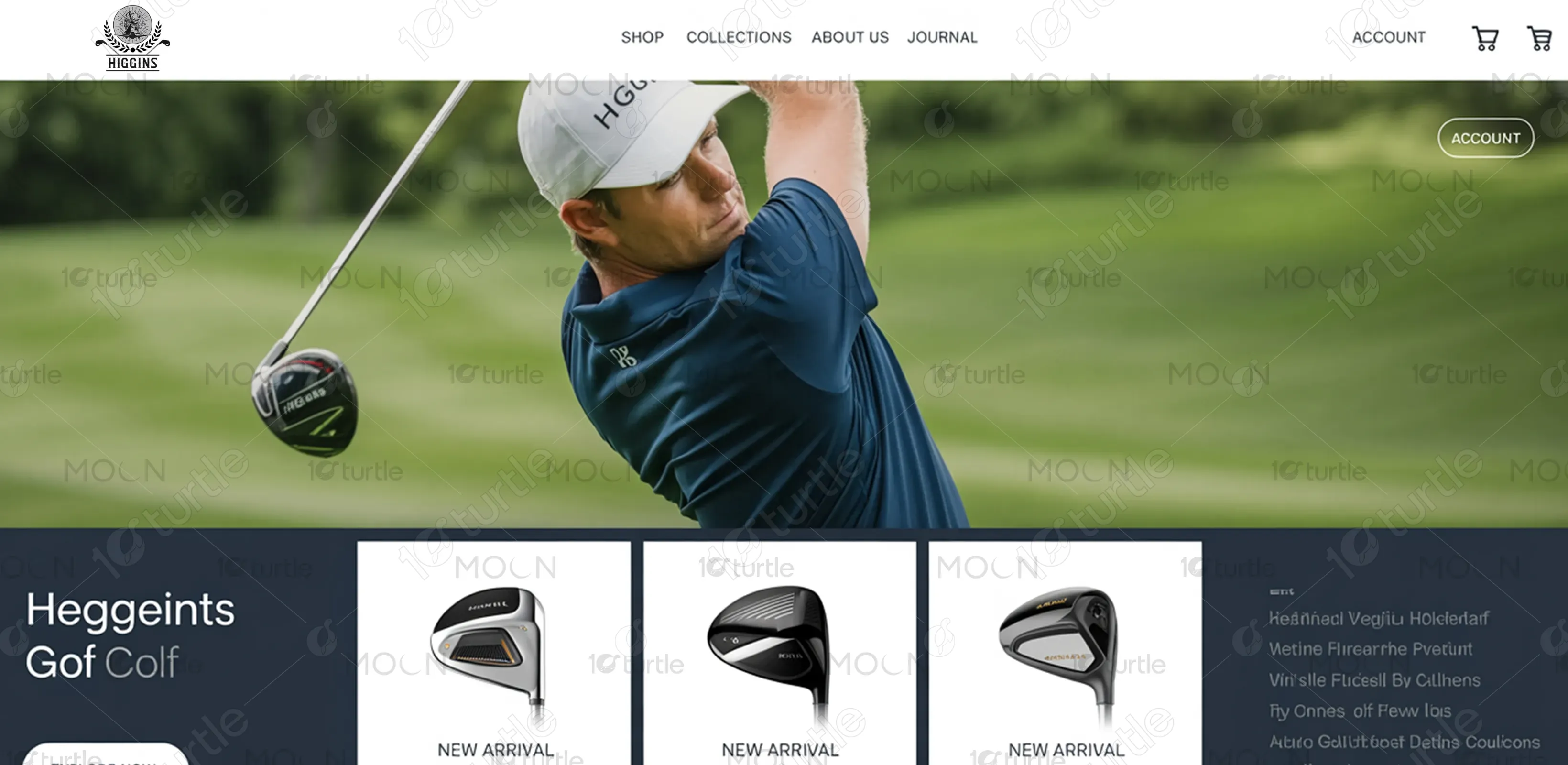
The vision for the HIGGINS design is to position the brand as more than a golf equipment supplier — it aspires to become a lifestyle statement. Over time, the logo will represent excellence, loyalty, and prestige both on and off the course. Its adaptability ensures longevity as the brand expands into apparel, tournaments, and global sponsorships. The design seeks to build an emotional connection with consumers, leaving a lasting impression as a heritage-driven yet modern golf brand.


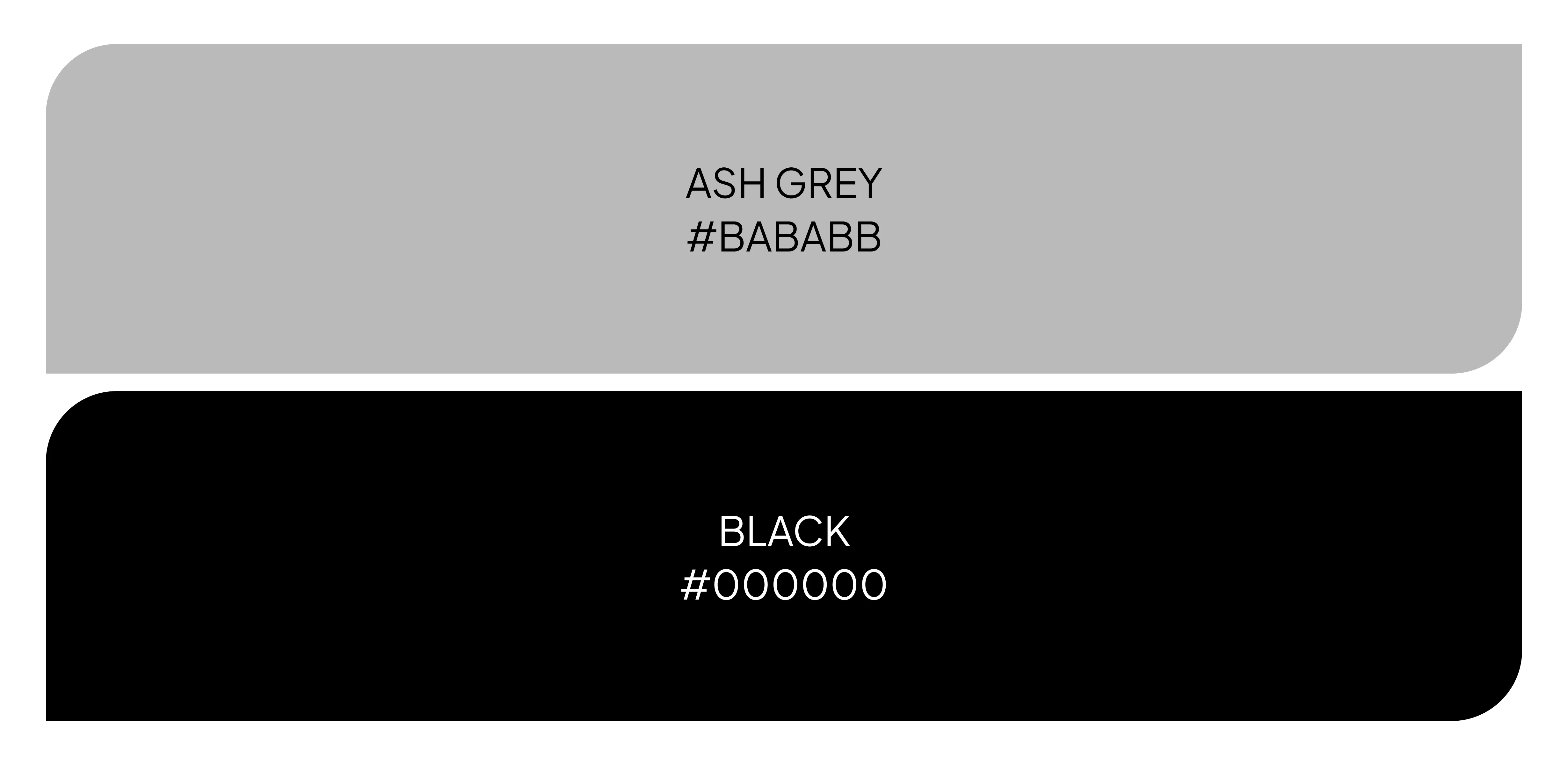
The primary use of black, white, and gray conveys elegance, timelessness, and versatility. Black reflects strength and authority, white symbolizes precision and clarity, while gray adds balance and neutrality. This monochrome palette aligns with the premium positioning of the brand, ensuring the logo feels modern and sophisticated across products and marketing. The restrained color scheme also allows seamless adaptation into embroidery, merchandise, and signage, while leaving room for seasonal accent colors (like green or gold) in extended brand applications.
