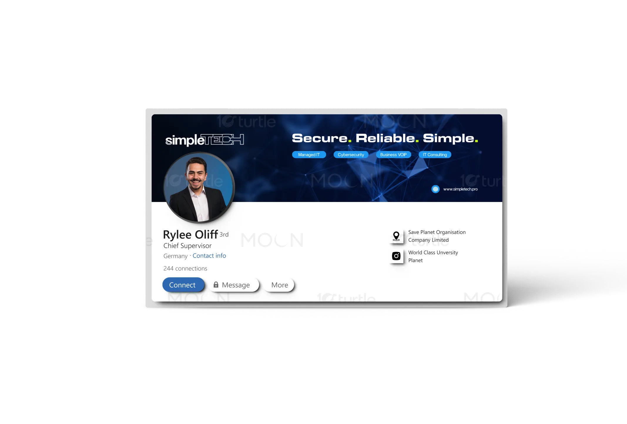
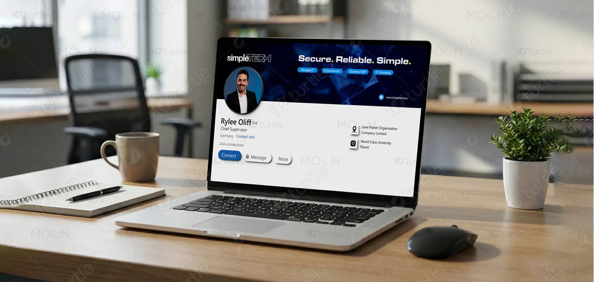
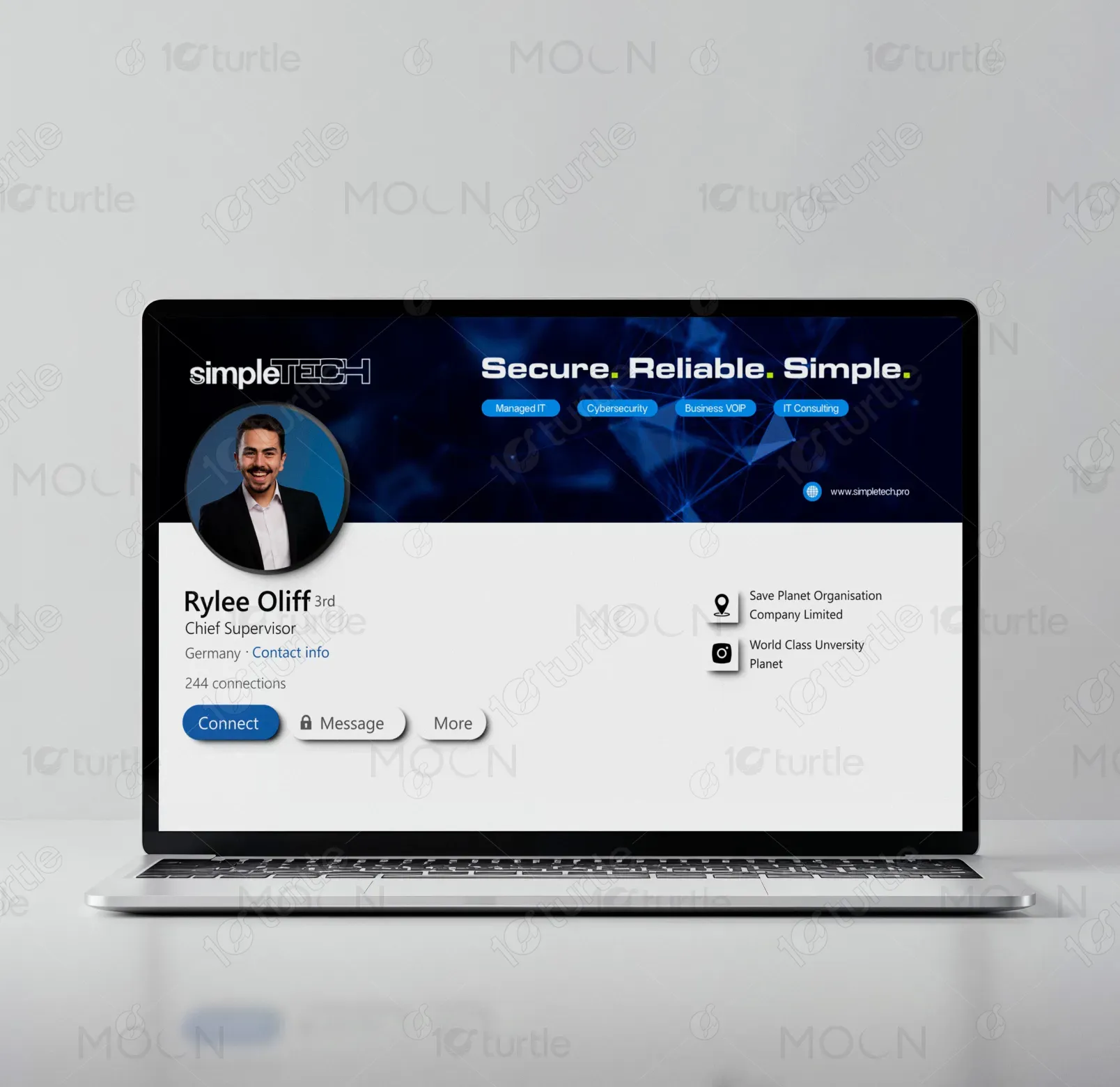
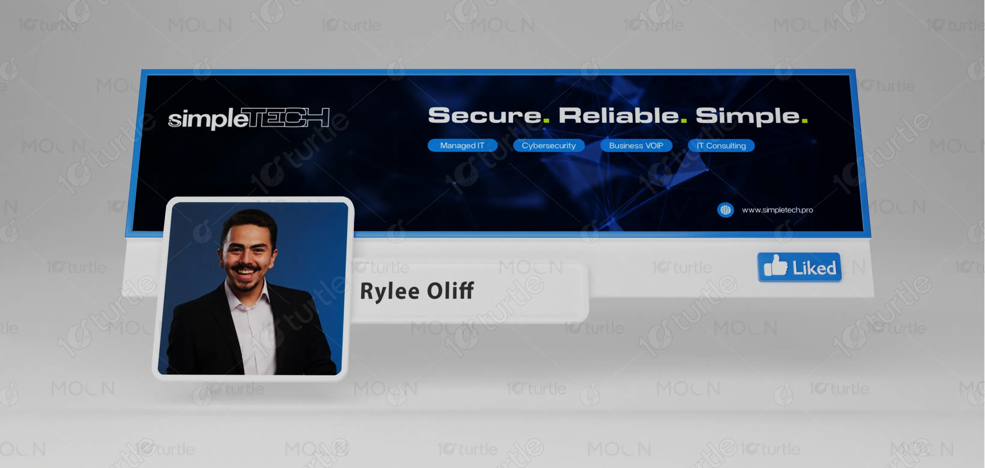
The LinkedIn banner design focuses on creating a modern, trustworthy, and technology-driven visual identity for SimpleTech. A clean layout, bold typography, and structured spacing ensure clarity and professionalism. Abstract network graphics subtly represent connectivity, cybersecurity, and digital infrastructure. The hierarchy highlights the brand promise first, followed by key services, ensuring instant comprehension. The design balances corporate credibility with a contemporary aesthetic, making it ideal for LinkedIn’s professional environment while reinforcing SimpleTech’s position as a reliable and approachable IT solutions provider.
LinkedIn Banner Design
Graphic Design
Industry
Technology, SaaS & Startups
Tools we used
Project Completion
2025
Key Market
Global
This LinkedIn banner is designed to strengthen SimpleTech’s professional presence on a key business networking platform. Its purpose is to instantly communicate the brand’s core values—security, reliability, and simplicity—while showcasing its primary IT services. Positioned for B2B audiences, the design emphasizes clarity, trust, and expertise. The minimal yet tech-forward aesthetic helps SimpleTech stand out in a crowded IT services market, reinforcing brand recall and credibility at first glance.

Industry
Technology, SaaS & StartupsWhat we did
LinkedIn Banner DesignGraphic DesignPlatform
-Many IT service providers struggle with cluttered, generic LinkedIn banners that fail to communicate their value proposition quickly. Overuse of technical jargon, inconsistent branding, and weak visual hierarchy often leave viewers confused or disengaged. In a fast-scrolling professional environment like LinkedIn, this results in missed opportunities, reduced trust, and poor brand differentiation, especially for managed IT and cybersecurity firms competing for attention.
This design solves the problem through a clear visual hierarchy and focused messaging. The bold headline delivers the brand promise instantly, while service tags provide quick context without overwhelming the viewer. A consistent color scheme, modern typography, and abstract tech visuals enhance clarity and professionalism. The layout is optimized for LinkedIn’s dimensions, ensuring readability across devices and creating a strong, memorable first impression.
The long-term vision for SimpleTech is to be recognized as a dependable, forward-thinking IT partner that simplifies complex technology for businesses. The brand aims to evolve alongside emerging technologies while maintaining a human, accessible approach. This visual identity supports that vision by establishing a consistent, scalable design language that builds trust, reinforces expertise, and positions SimpleTech as a leader in managed IT and cybersecurity solutions.
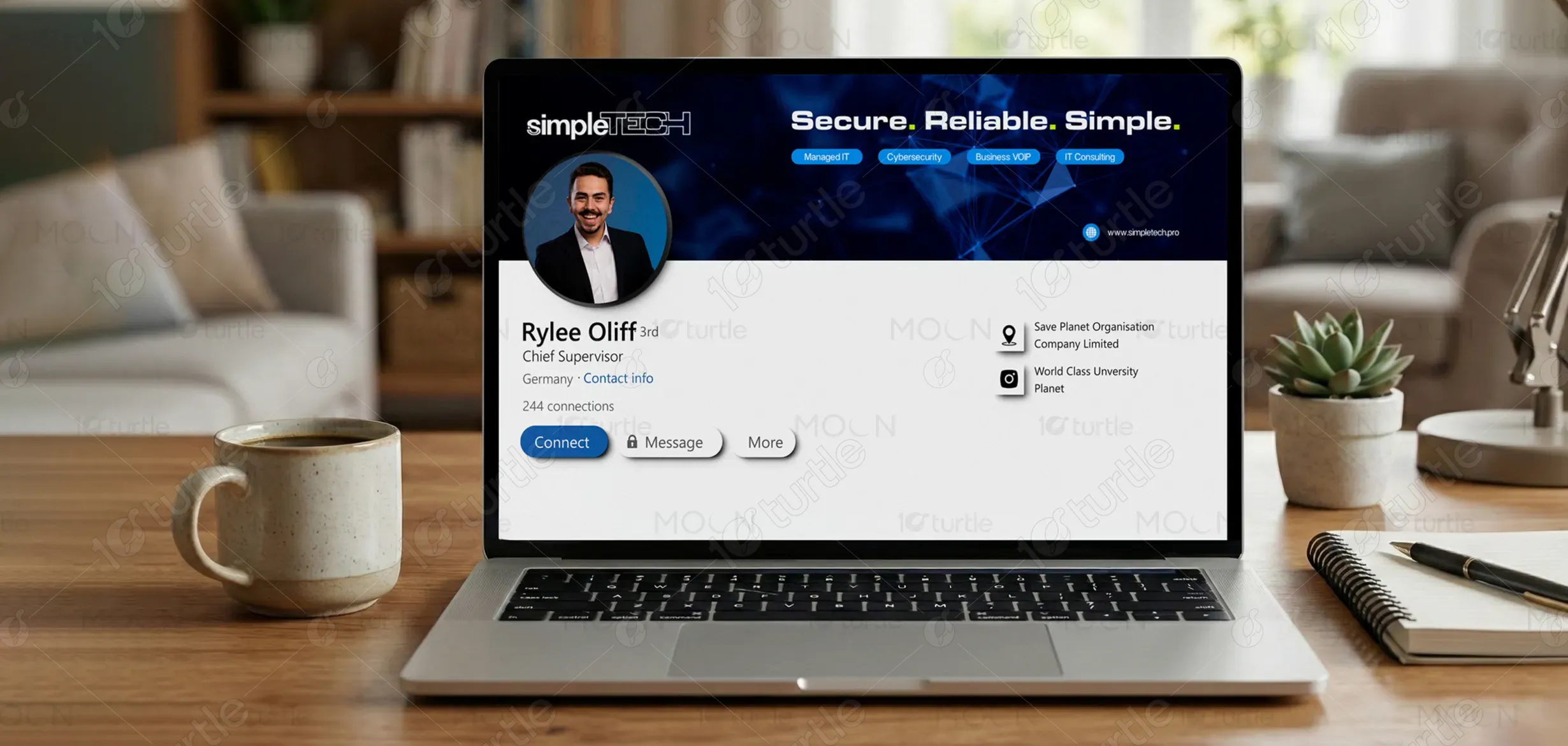

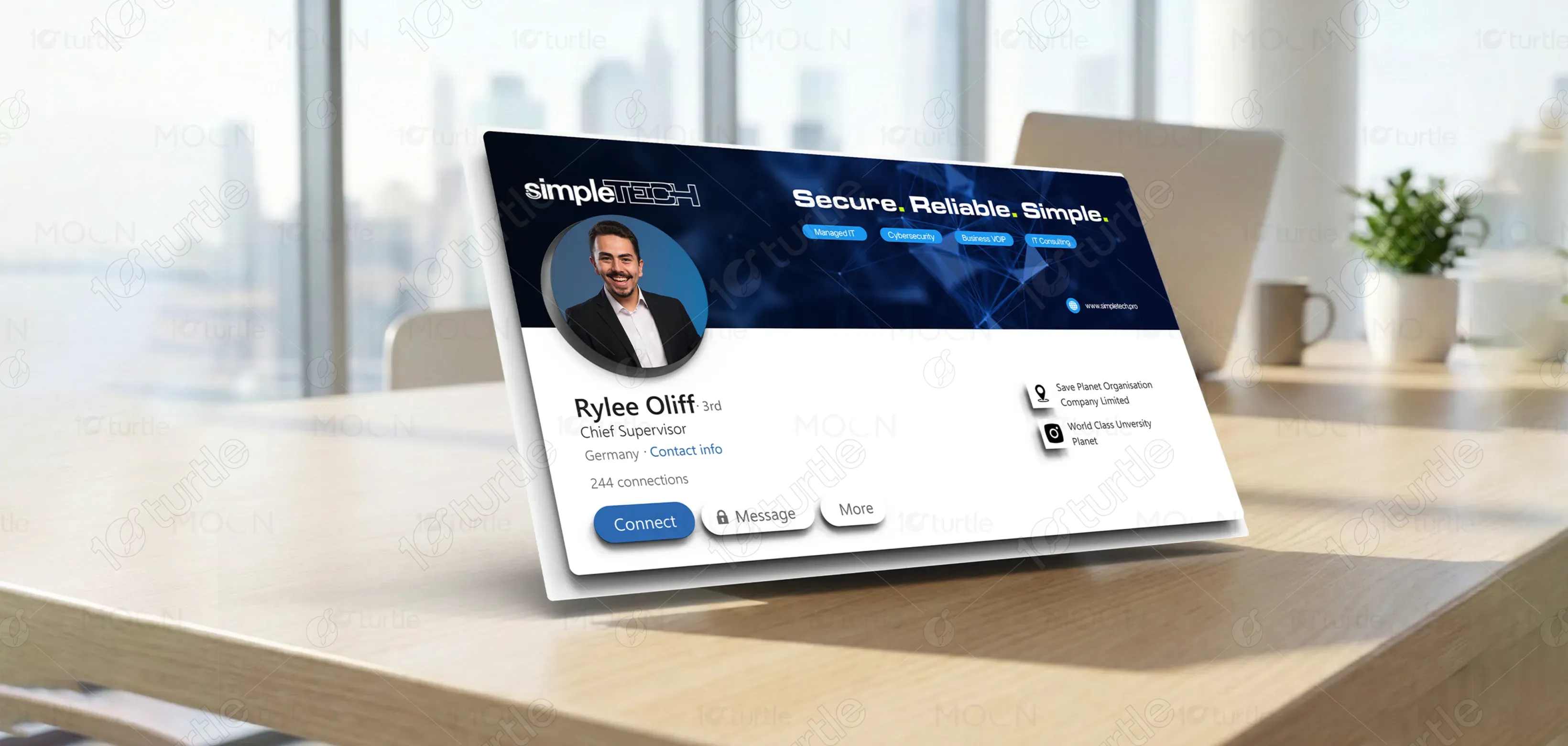
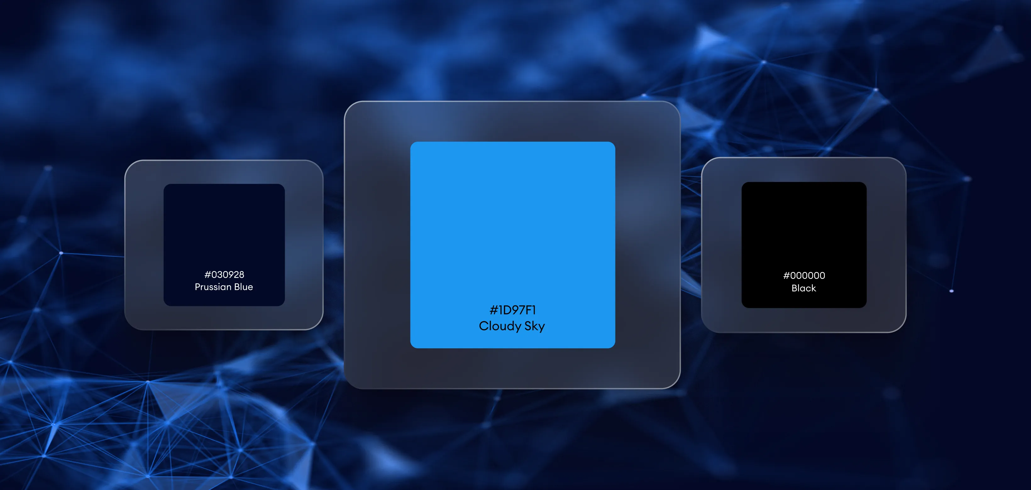
The design uses a deep blue-dominant palette complemented by white and subtle accent tones. Blue conveys trust, security, and technological expertise—key attributes for an IT brand. White enhances readability and balance, creating a clean, professional look. The subtle accent highlights add visual interest without distraction, ensuring the overall palette feels modern, calm, and aligned with SimpleTech’s promise of secure and reliable technology solutions.