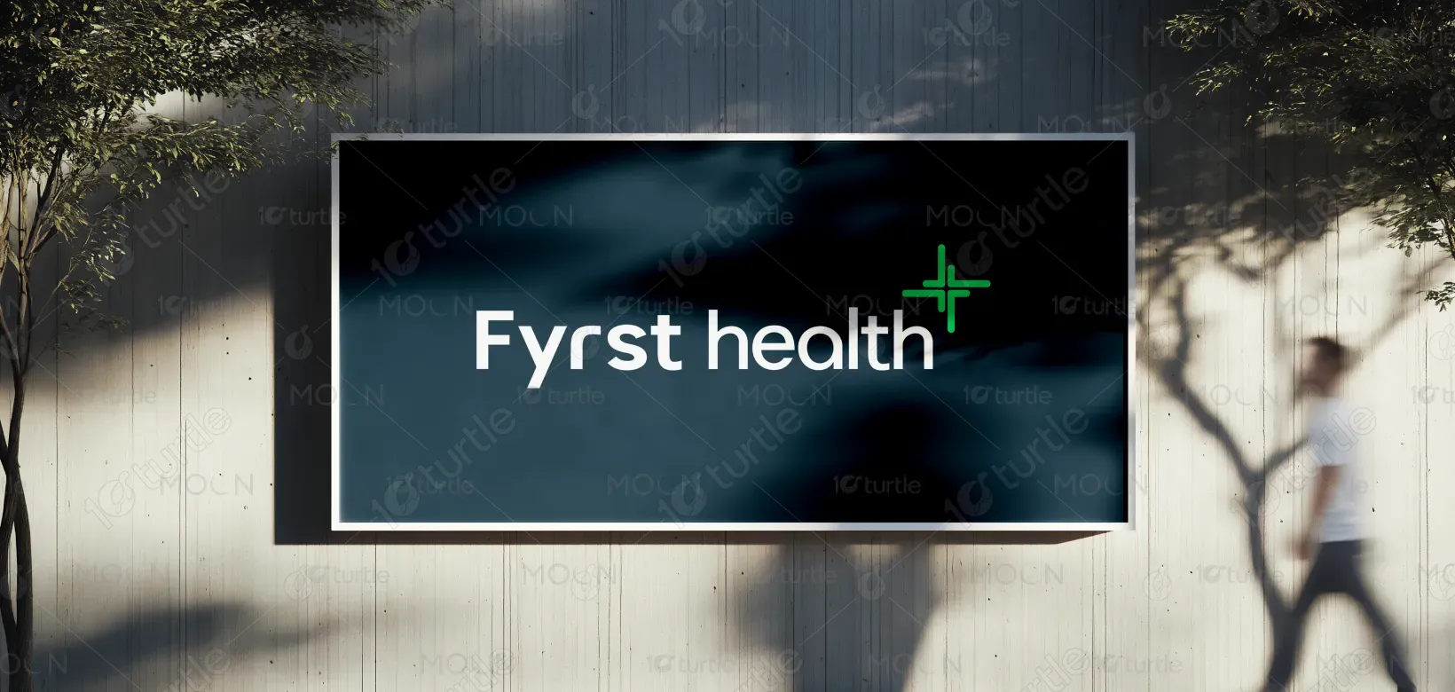
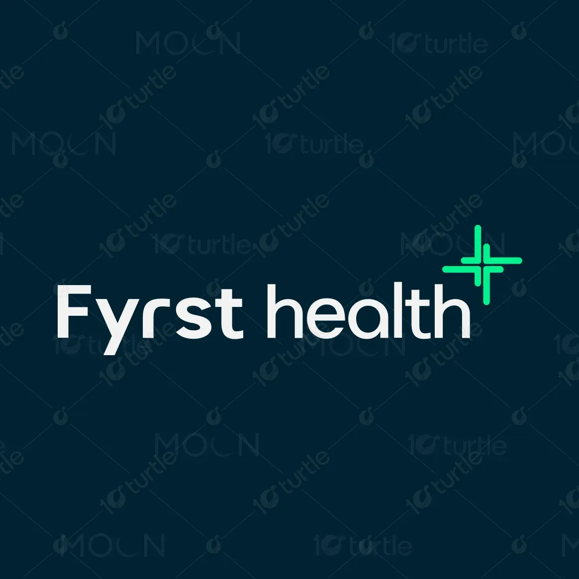
The Fyrst Health logo embodies modern simplicity with a clean, sans-serif typeface and a bright, uplifting symbol. The design combines professionalism and warmth—reflecting trust, care, and innovation in healthcare. The minimal wordmark ensures clarity and legibility, while the glowing turquoise cross adds a sense of vitality and digital advancement. Its balanced structure and fresh color tone communicate reliability and forward-thinking wellness, perfectly aligning with a contemporary health-focused brand identity.
Logo Design
Graphic Design
Industry
Healthcare & Wellness
Tools we used


Project Completion
2025
Key Market
Global
Fyrst Health is a modern healthcare brand built on accessibility, innovation, and personalized care. The design represents a brand that bridges technology and human touch in health services. Its clean, digital aesthetic appeals to tech-driven users while maintaining the comforting elements of healthcare. The logo’s distinctive cross mark highlights its core values—trust, precision, and proactive care—setting Fyrst Health apart in a crowded wellness market as a symbol of clarity and connection.

Industry
Healthcare & WellnessWhat we did
Logo DesignGraphic DesignPlatform
-The main challenge was crafting a healthcare identity that feels both trustworthy and modern—without appearing cold or overly clinical. Many health brands rely on conventional symbols like red crosses or blue palettes, leading to visual monotony. Fyrst Health needed a look that would stand out in digital spaces while maintaining a reassuring sense of professionalism and care. The goal was to merge tech-inspired clarity with emotional resonance, appealing to both patients and providers.
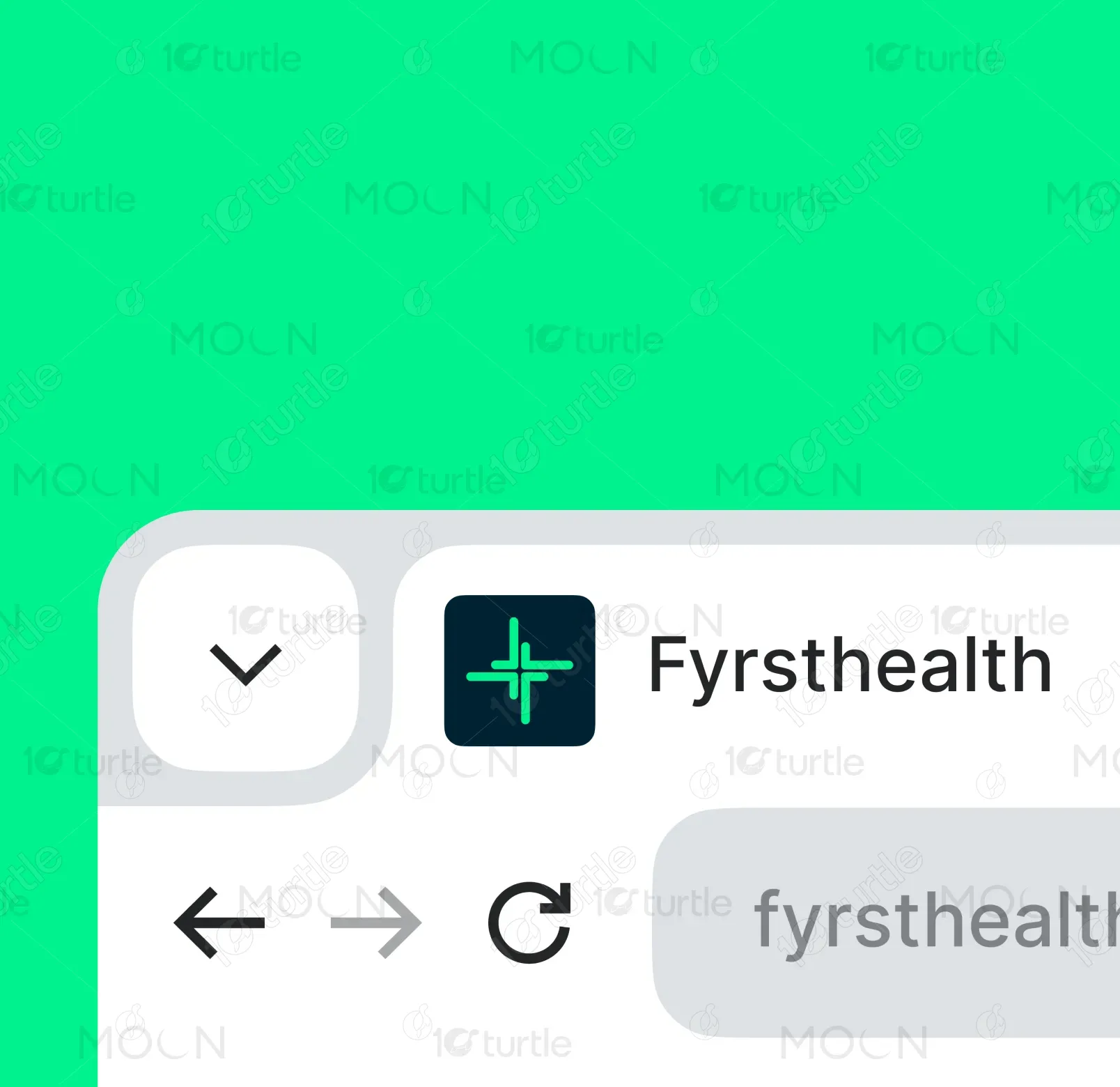
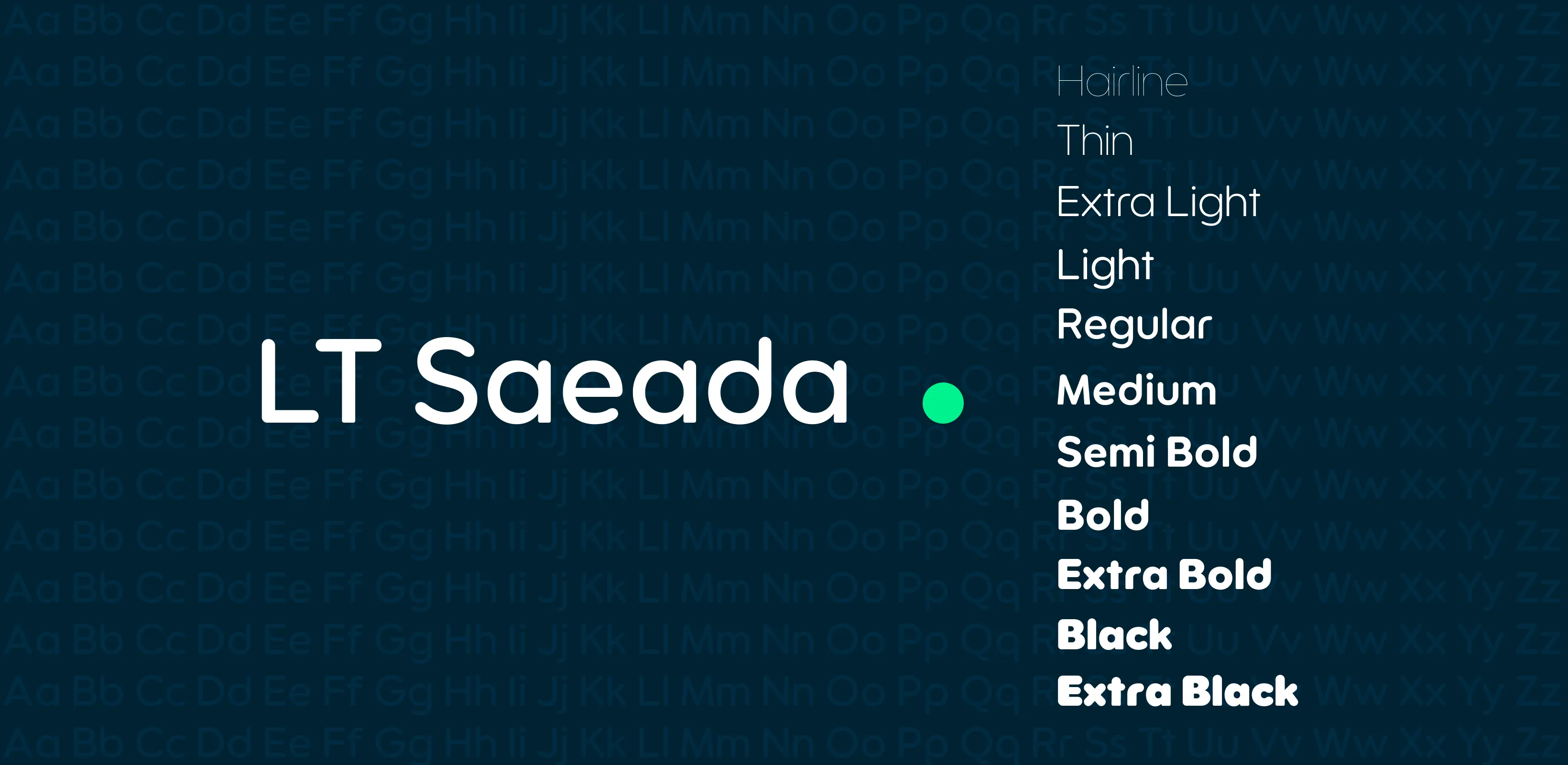
The solution was a balanced design that fuses minimalism with approachability. The sleek typography projects modern innovation, while rounded letterforms soften the look, creating a sense of comfort. The glowing green cross signifies health, renewal, and technology-driven care. By integrating this fresh symbol into a contemporary type system, the design communicates trust, innovation, and accessibility, positioning Fyrst Health as a next-generation healthcare provider.
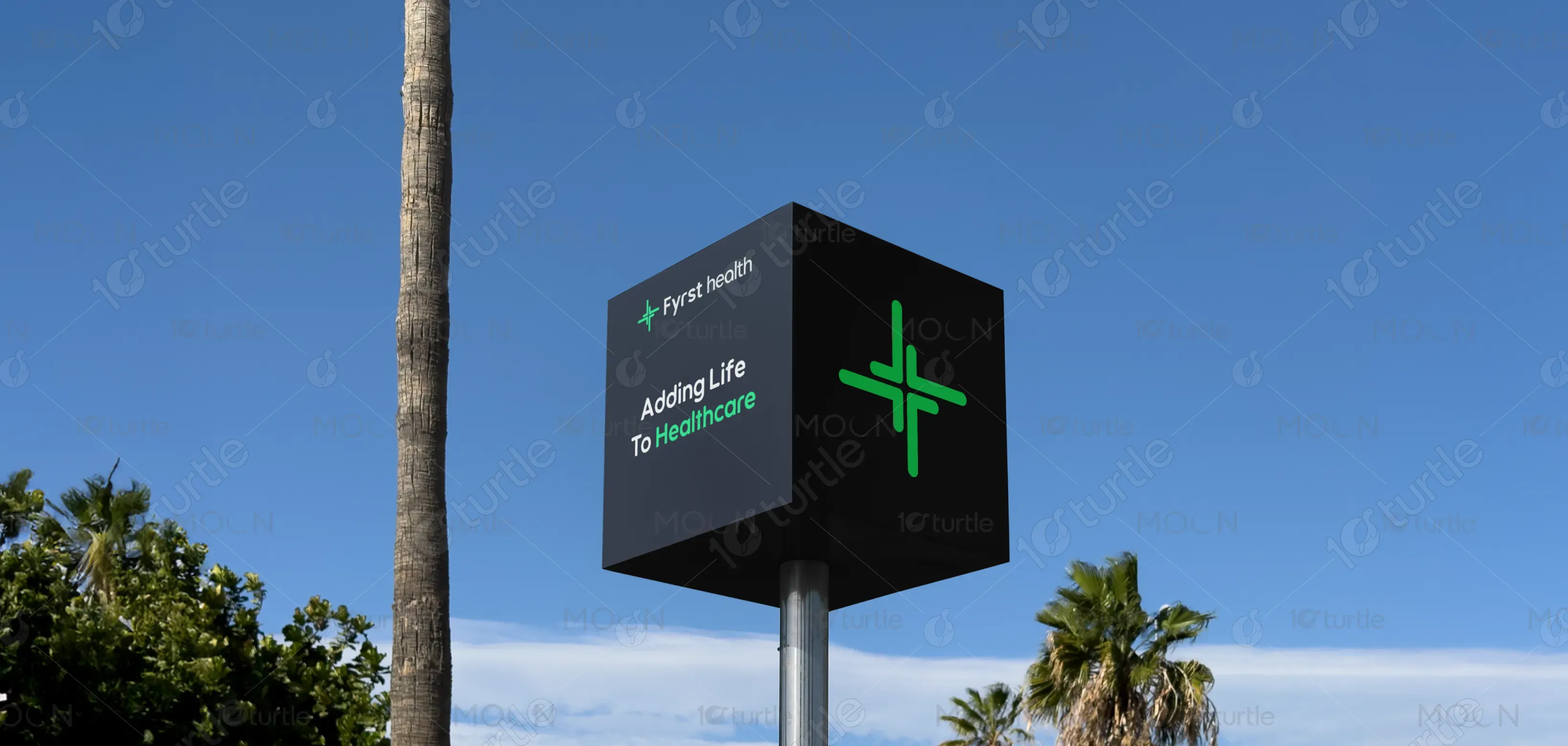
The long-term vision for Fyrst Health’s design is to build a recognizable symbol of next-generation healthcare one that grows with digital transformation while retaining human warmth. It aims to inspire confidence in users, promote preventive health awareness, and become a benchmark for clean, tech-savvy medical branding. Over time, the logo should stand as a universal emblem for smart, accessible, and compassionate care.
.webp)
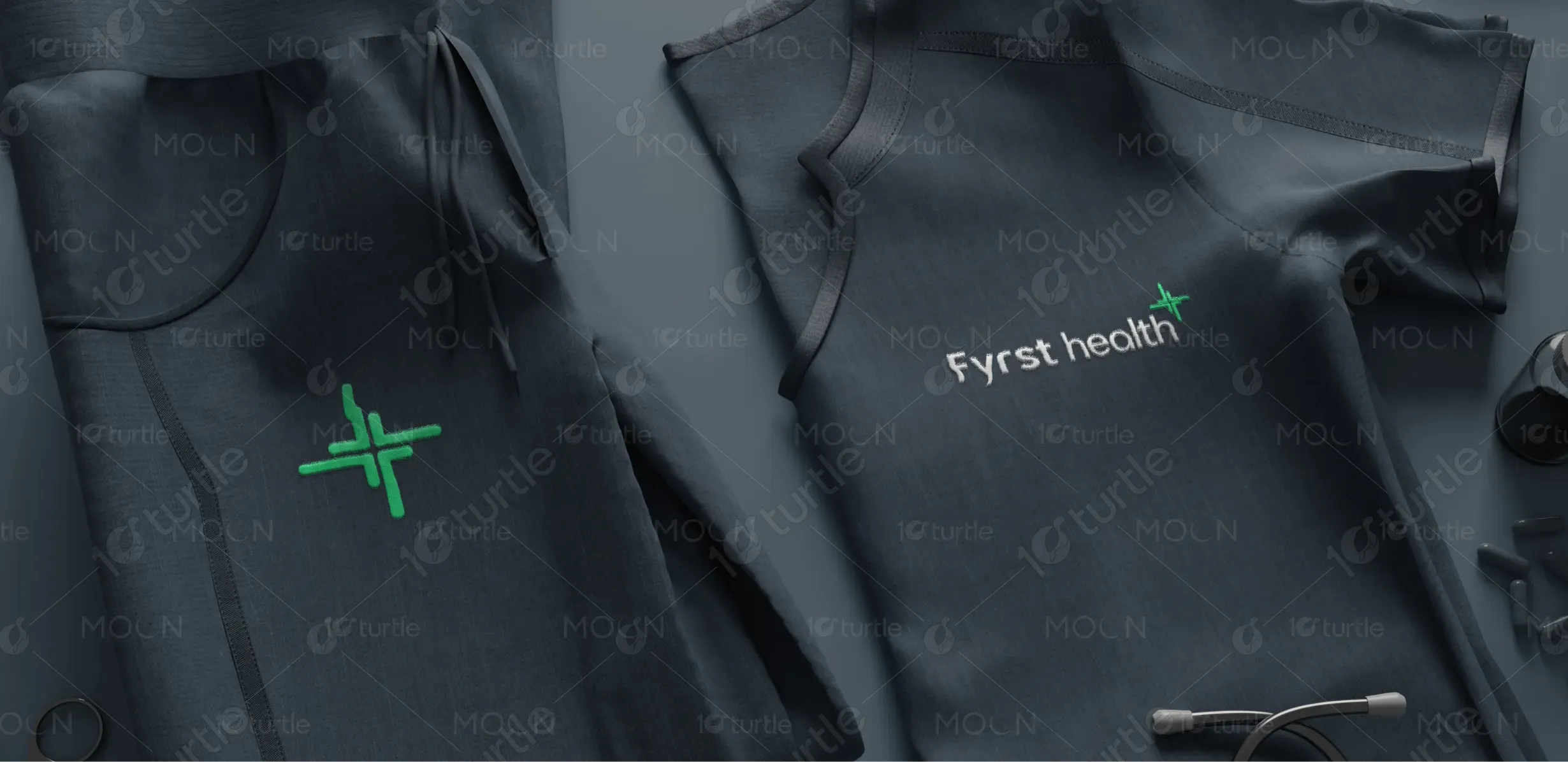
Fyrst health A modern identity representing innovation, trust, and care in healthcare. The distinct lowercase typography emphasizes approachability, while the glowing cross reinforces medical expertise and vitality.

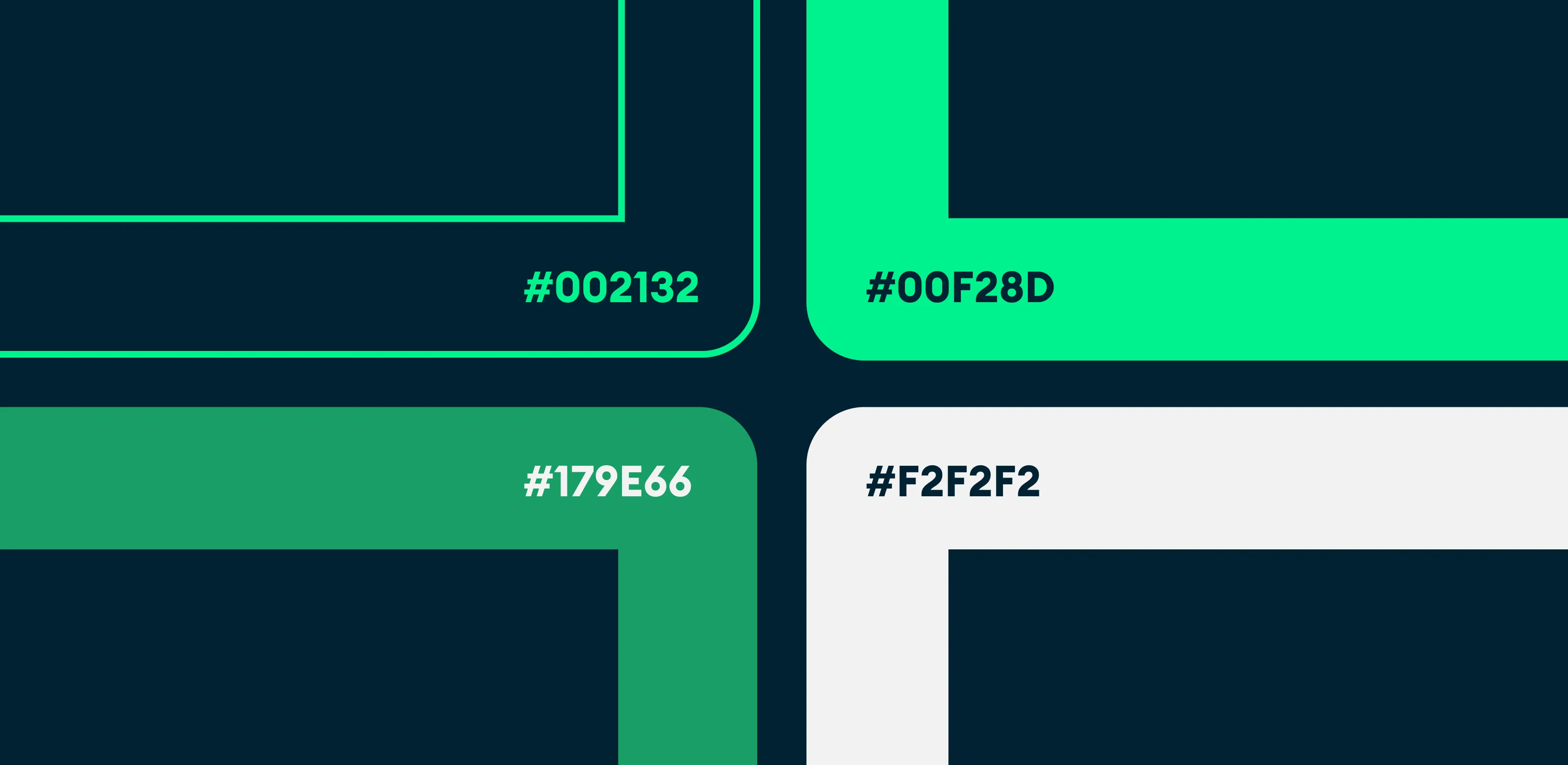
The Fyrst Health color palette blends deep navy and vibrant teal-green, creating a balance between professionalism and innovation. The deep navy background symbolizes trust, stability, and confidence—qualities essential in the healthcare industry. It provides a strong foundation that communicates authority and reliability. In contrast, the teal-green accent adds freshness, energy, and a sense of modern vitality, representing health, renewal, and technological progress. Together, these colors create a visually calming yet dynamic identity that reflects Fyrst Health’s commitment to compassionate, forward-thinking healthcare solutions.
