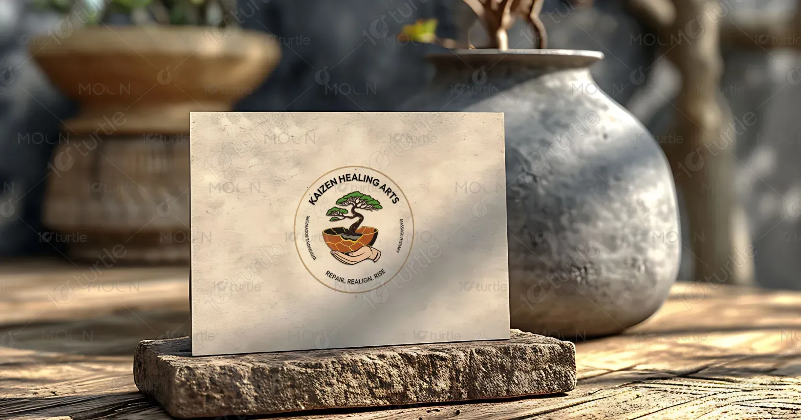
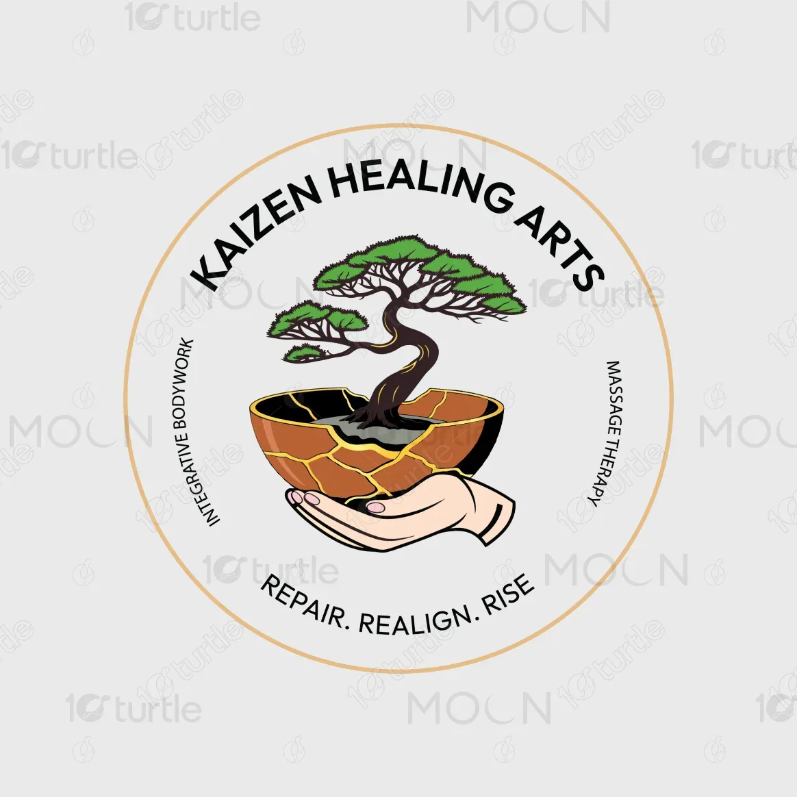
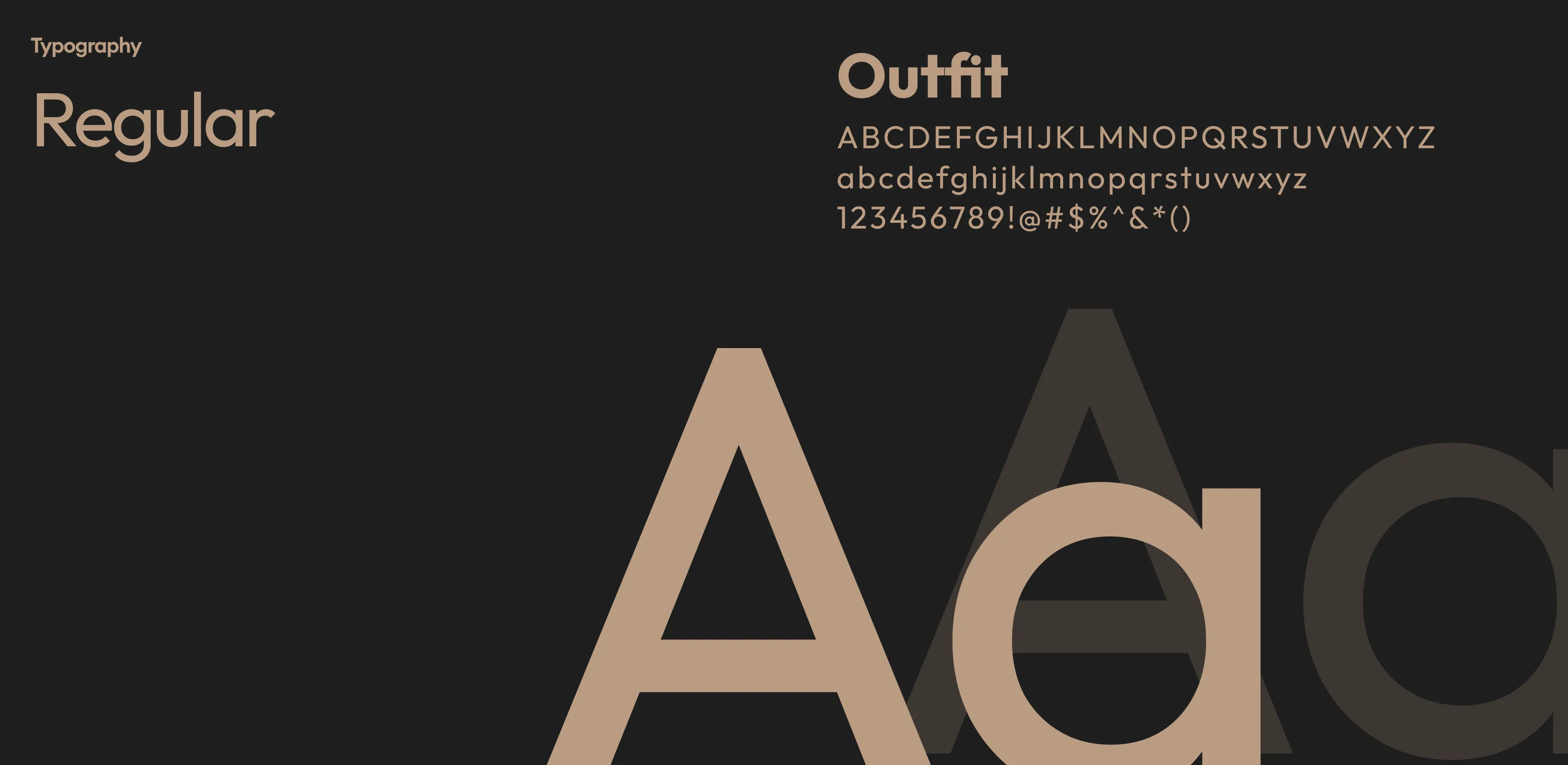
The design embraces a harmonious blend of nature, craftsmanship, and care. The bonsai tree, rooted in a kintsugi-repaired vessel, reflects the Japanese philosophy of finding beauty in imperfection. The warm hand cradling the bowl represents compassionate, hands-on healing. Surrounding typography is clean, modern, and easy to read, reinforcing professionalism. The muted teal background conveys calmness, while gold accents add a sense of refinement. Together, these elements create a serene yet empowering visual identity that aligns perfectly with the brand’s mission.
Logo Design
Graphic Design
Industry
Healthcare & Wellness
Tools we used


Project Completion
2025
Key Market
Global
Kaizen Healing Arts provides integrative bodywork and massage therapy aimed at restoring physical and emotional well-being. The brand’s approach blends ancient healing traditions with modern therapeutic practices. Its USP lies in a holistic philosophy—addressing not just physical tension but also mental and emotional balance. The clean, nature-inspired aesthetic of the logo and promotional materials visually conveys trust, relaxation, and transformation, making it stand out in the wellness market.


Industry
Healthcare & WellnessWhat we did
Logo DesignGraphic DesignPlatform
-The wellness and massage therapy industry is often saturated with generic imagery—lotus flowers, stones, and abstract waves—that fail to convey deeper meaning. This visual repetitiveness makes it challenging for brands to communicate authenticity and differentiate themselves. Many designs lack a strong symbolic representation of the healing journey, leaving them emotionally disconnected from the target audience seeking transformation, not just temporary relief.
Kaizen Healing Arts solves this by incorporating kintsugi and bonsai imagery—both rich in cultural and philosophical meaning. The design tells a visual story of repair, balance, and growth, connecting directly with clients’ emotional and physical healing journeys. The caring hand reinforces a personal, human-centered approach. This symbolic and aesthetic depth ensures the brand stands out while resonating deeply with its audience.

The long-term vision for Kaizen Healing Arts is to become a recognized leader in holistic wellness, known for transformative healing experiences that combine physical therapy with emotional renewal. The brand aims to expand its services, create educational content, and inspire a lifestyle of mindful living. By maintaining its symbolic, storytelling-driven design, it seeks to create a lasting emotional connection and remain relevant as wellness needs evolve.



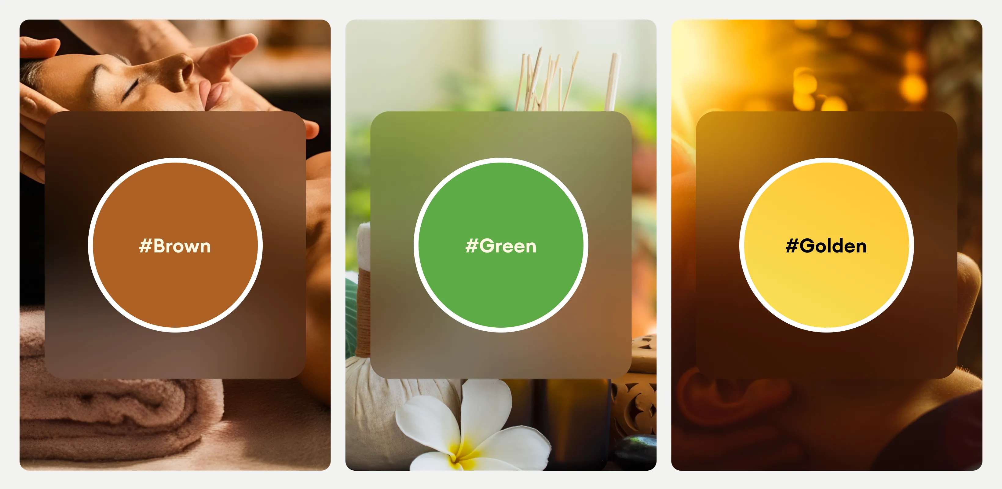
The color palette combines muted teal for calmness and grounding, gold for wisdom and transformation inspired by kintsugi repair lines, earthy brown for stability and nurturing, and natural green for growth and renewal. Together, these hues evoke trust, relaxation, and optimism, aligning perfectly with the brand’s philosophy of healing and transformation while creating a serene yet empowering visual identity.
