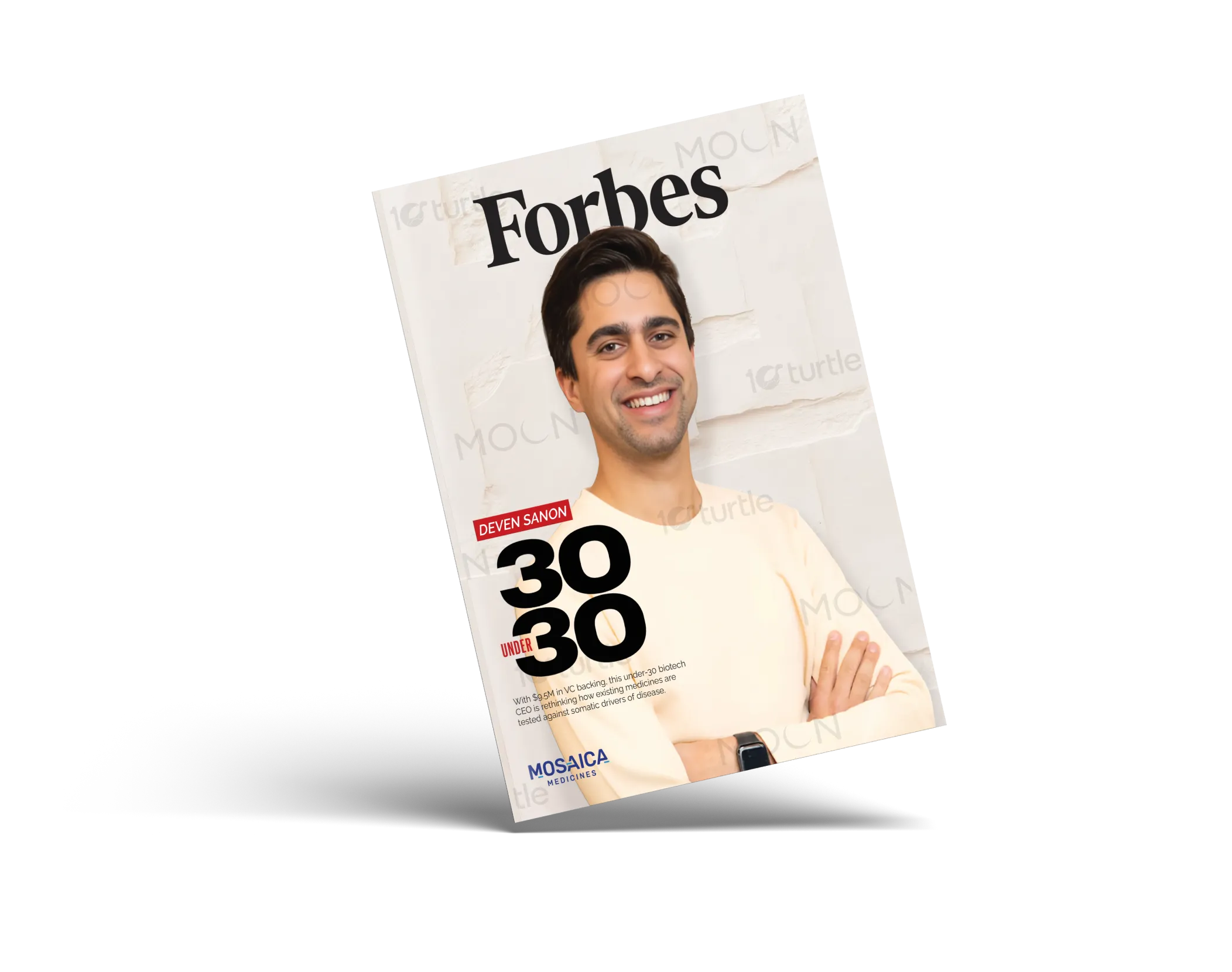
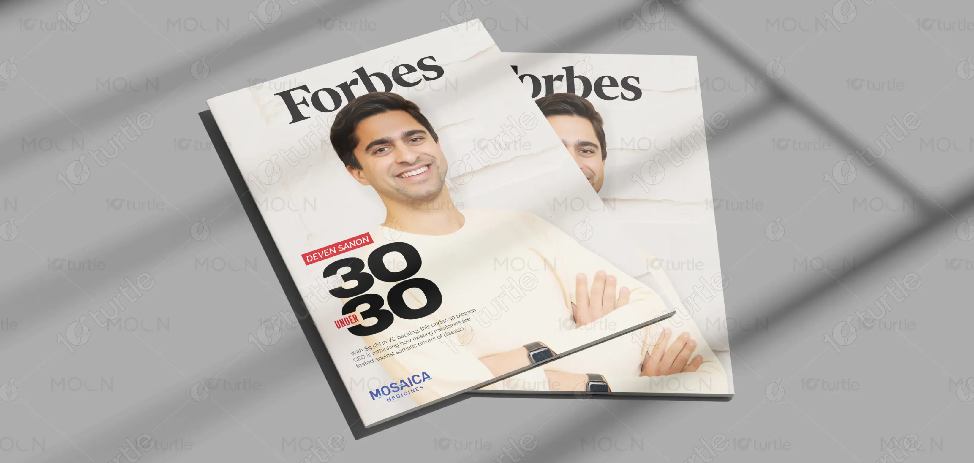
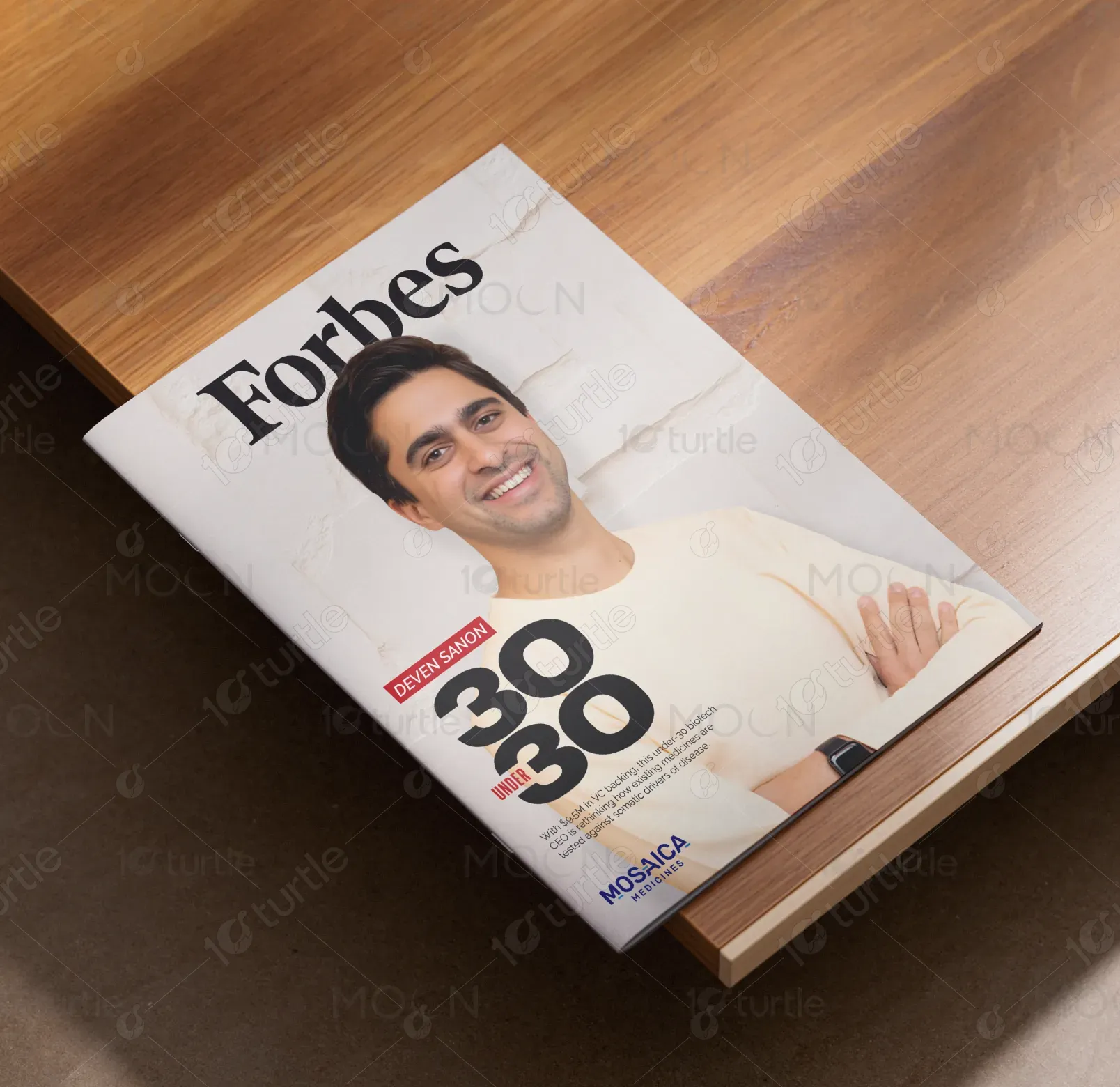
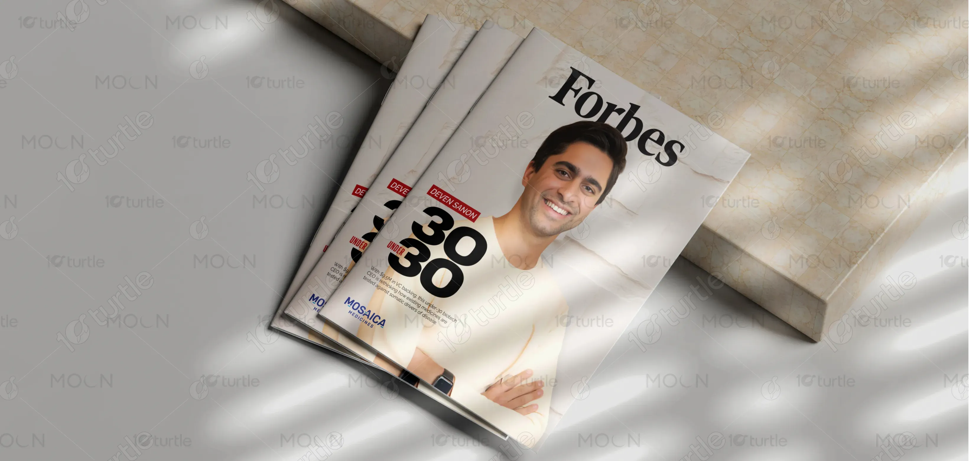
The design embraces a clean, editorial aesthetic inspired by premium business magazines. A minimalist layout, balanced white space, and sharp typography highlight the subject’s credibility and modern leadership. The portrait is positioned confidently, creating a sense of approachability while maintaining authority. Subtle textures and soft lighting add depth without overpowering the overall composition. The hierarchy of text focuses attention on the “30 Under 30” achievement, ensuring the story and personality remain the central visual anchor.
Magazine Cover Design
Graphic Design
Industry
Technology, SaaS & Startups
Tools we used


Project Completion
2025
Key Market
Global
This magazine cover spotlights a rising biotech leader in the prestigious “30 Under 30” feature. Designed to merge storytelling with editorial sophistication, it presents innovation, youth leadership, and scientific impact in a visually compelling way. The layout aligns with industry standards while maintaining a fresh and modern appeal. By combining strategic framing, refined typography, and crisp visual balance, this cover positions the subject as a trusted, forward-thinking figure within the rapidly evolving biotech market.

Industry
Technology, SaaS & StartupsWhat we did
Magazine Cover DesignGraphic DesignPlatform
-Modern magazine covers often struggle with overcrowded layouts, distracting elements, and inconsistent text hierarchy. This leads to visual noise, diluted messaging, and reduced reader engagement. Especially in industries like biotech, complex information can overshadow the human element, making covers feel clinical or uninspired. The challenge was creating a design that communicates professionalism and innovation without overwhelming the viewer, all while ensuring the subject’s personal story remains clear and emotionally resonant.
The solution was a minimalist editorial approach that elevates clarity and storytelling. The design uses strong typographic hierarchy, allowing the “30 Under 30” title to dominate while supporting text remains refined and unobtrusive. A clean portrait background ensures focus stays on the subject’s expression and presence. Strategic spacing and restrained color use eliminate clutter, offering a high-end, contemporary look. Combined with subtle texture, the design achieves a perfect blend of personality and professionalism.
The long-term vision is to create a recognizable editorial identity that consistently highlights trailblazers shaping the future. The brand aims to celebrate global innovation through clean, impactful visuals that retain premium magazine standards. By spotlighting diverse leaders across industries, the publication seeks to inspire aspiring entrepreneurs and position itself as the authoritative voice of modern business success. Each edition is meant to be collectible, timeless, and culturally relevant.
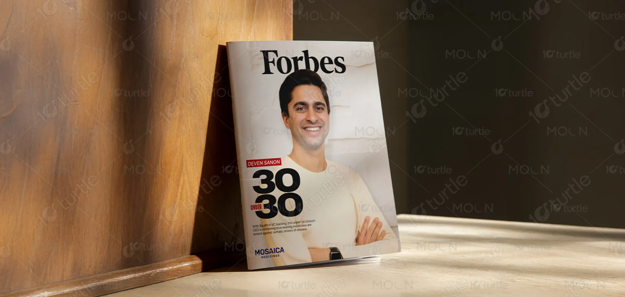
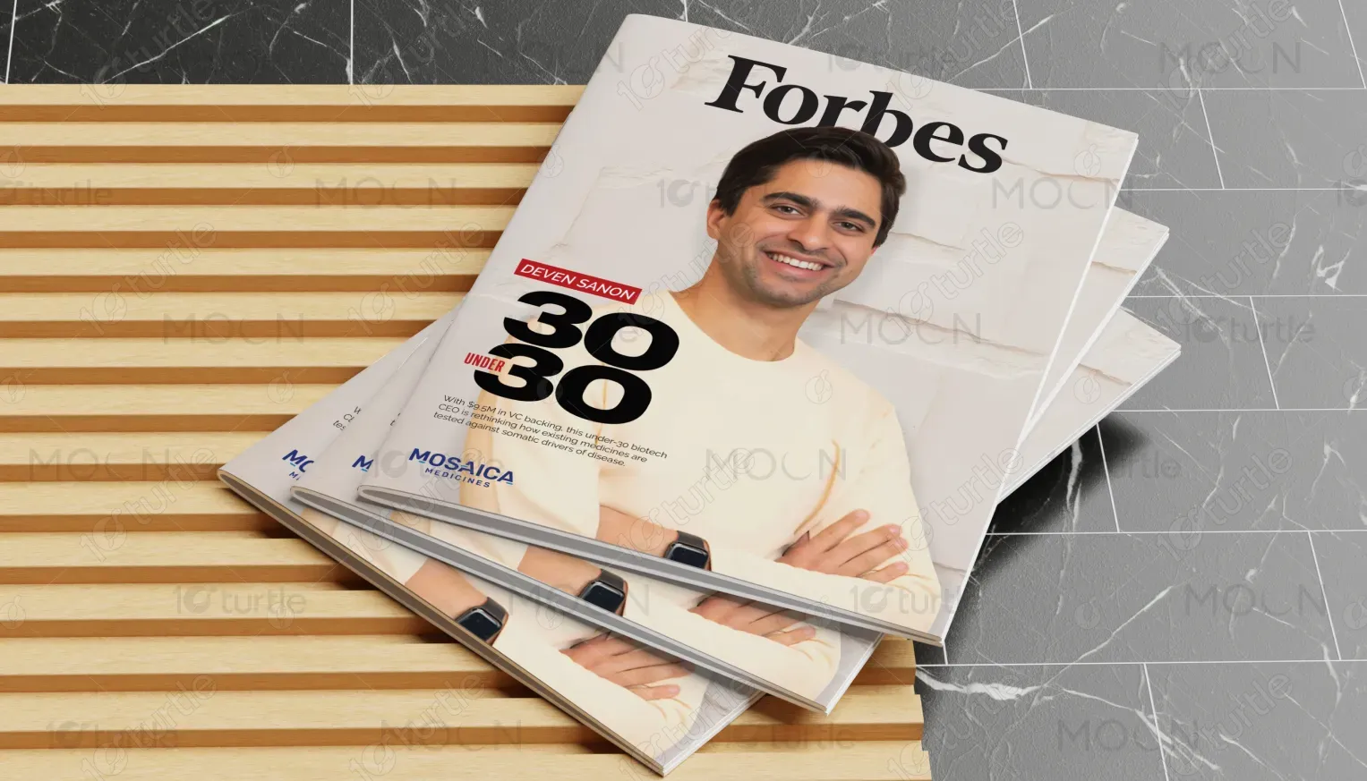
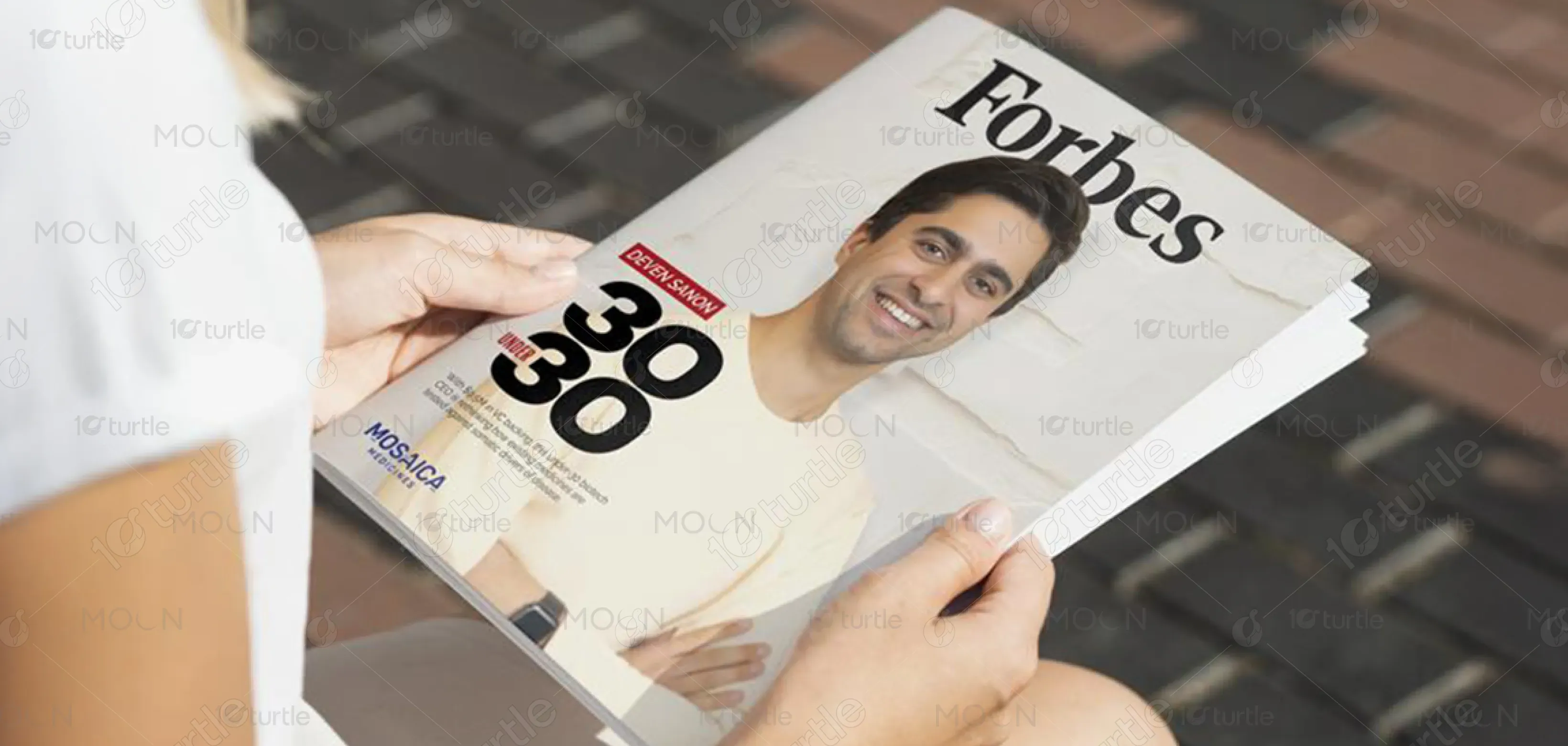
The color palette features soft neutrals, white, and understated blacks, chosen for their editorial elegance and clarity. These tones evoke trust, sophistication, and modernity—key traits of influential business journalism. The minimal use of accent colors (such as red for highlights) draws attention to important elements like the name and feature category without disrupting the visual harmony. This palette ensures the cover feels premium, clean, and aligned with high-end magazine identity standards.