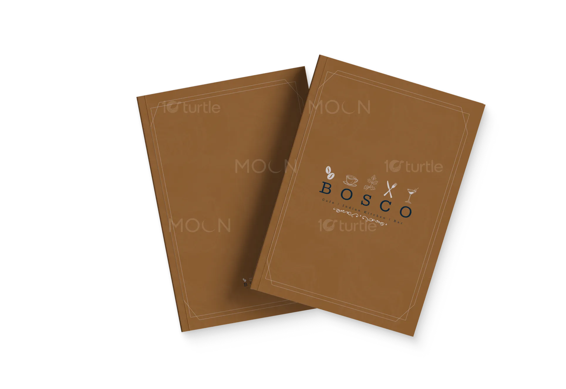
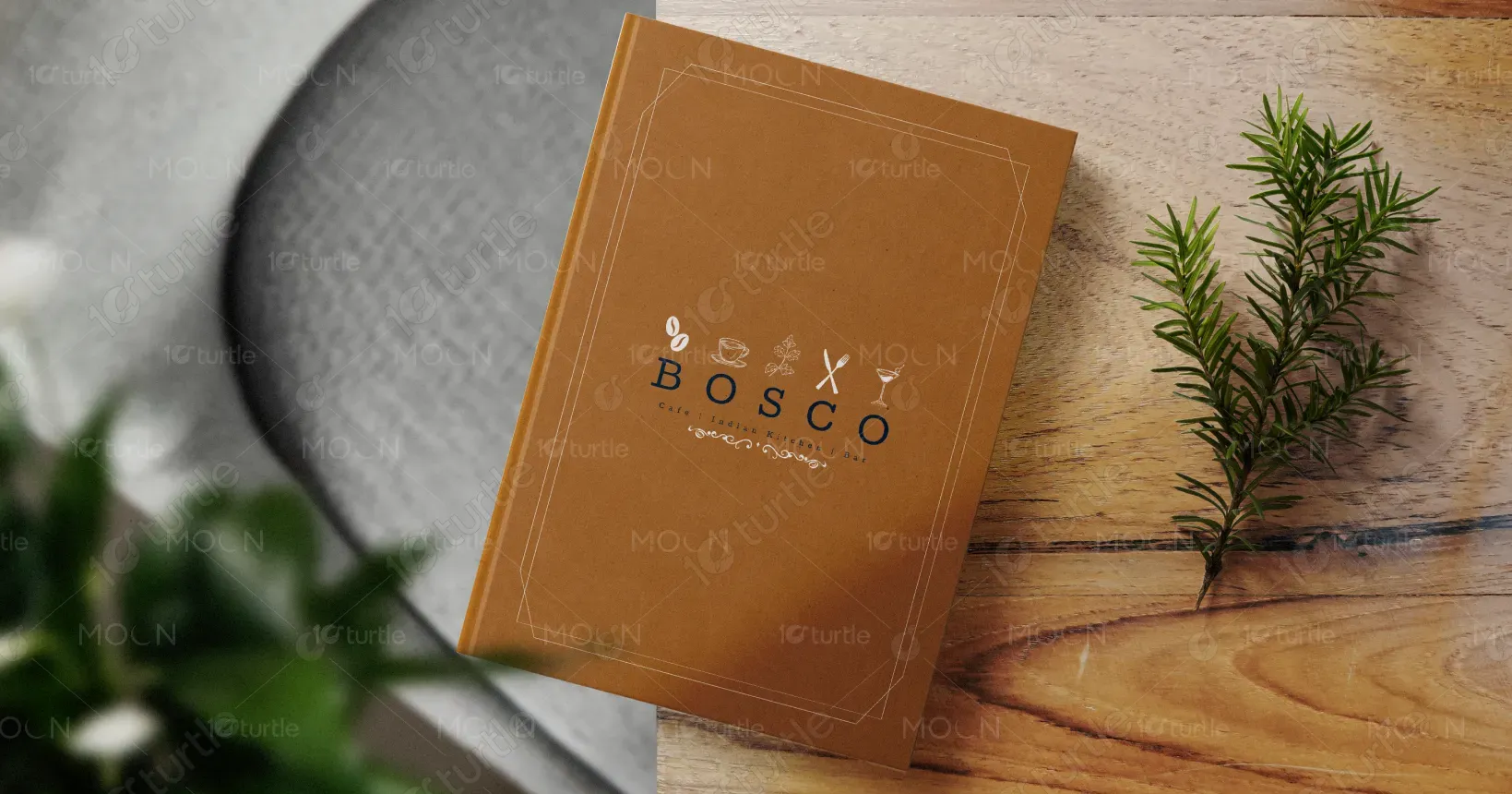
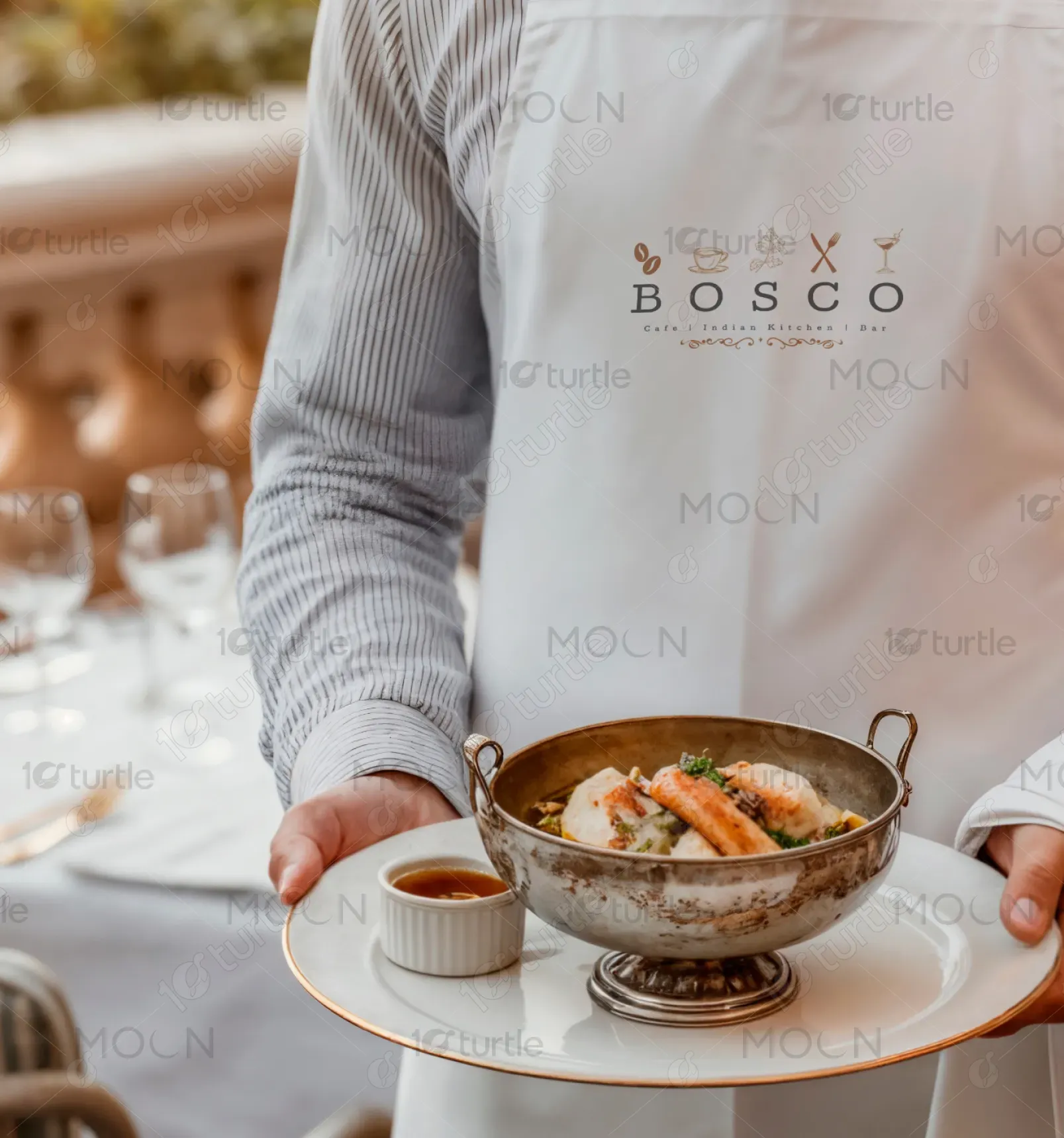
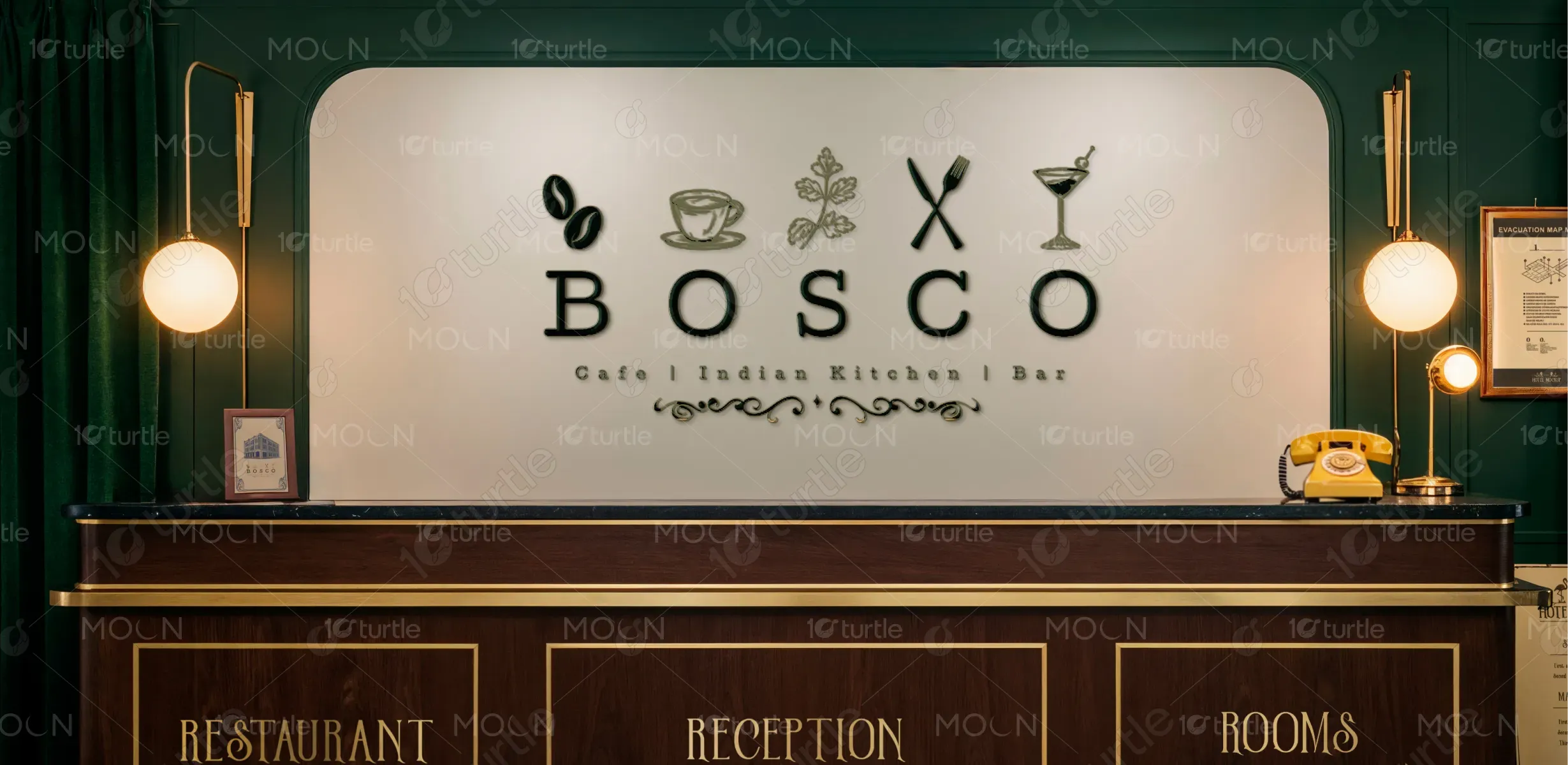
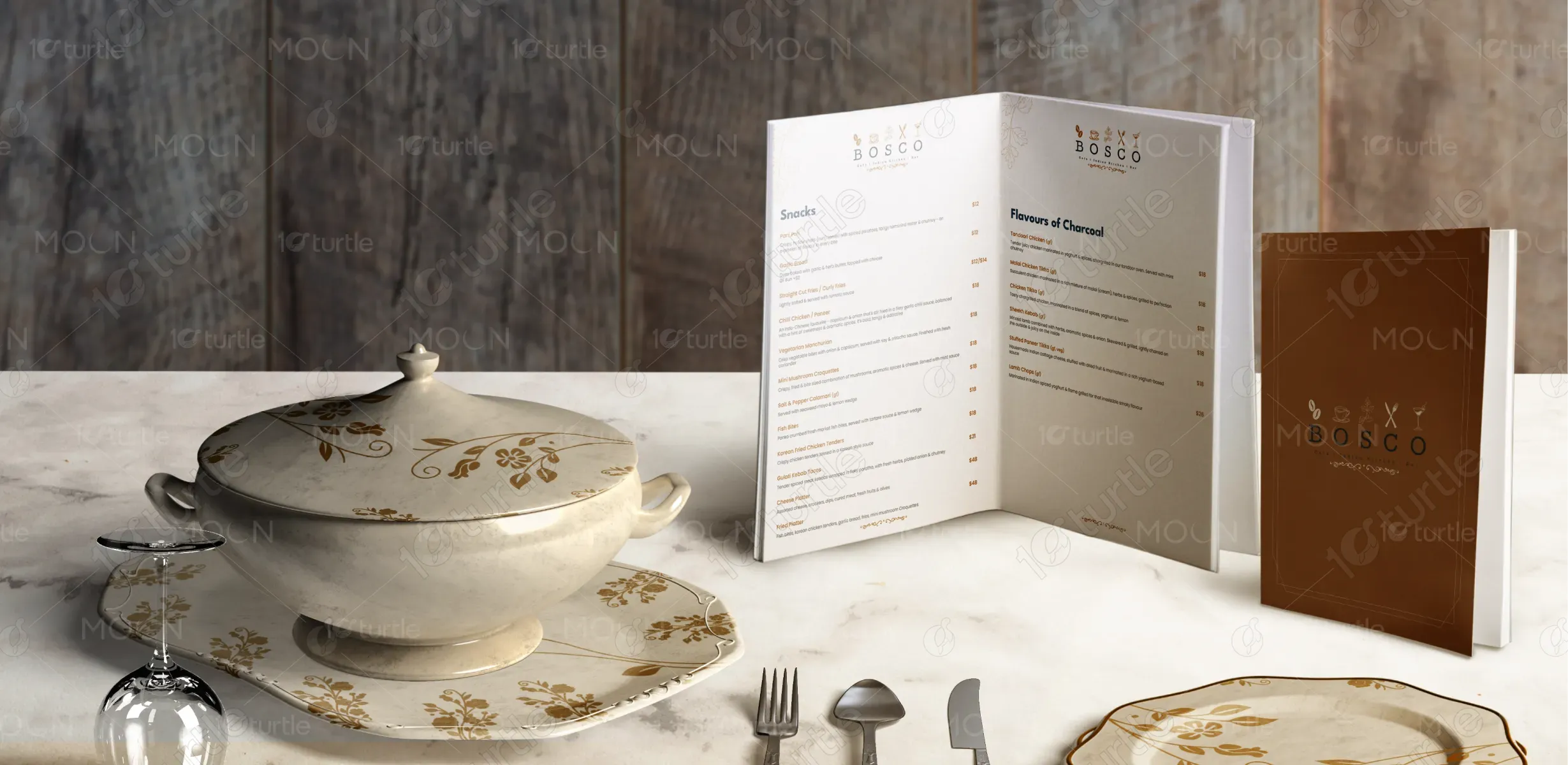
The BOSCO menu and branding embrace a refined, modern design that blends minimalism with warmth. Using clean typography, ample spacing, and subtle accents, the design ensures readability while reflecting the brand’s upscale yet approachable character. Earthy tones with hints of navy and gold convey elegance and trust, while the uncluttered layout emphasizes sophistication. The aprons and serving style extend this concept visually, reinforcing a cohesive dining experience where aesthetics, functionality, and brand storytelling meet seamlessly.
Menu Design
Graphic Design
Industry
Food, Beverage & Hospitality
Tools we used


Project Completion
2025
Key Market
Global
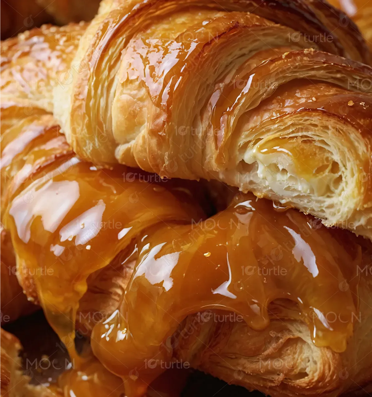
BOSCO is a café, lounge, kitchen, and bar concept designed to offer an elevated dining experience. The menu highlights a mix of classic and contemporary dishes, curated for both casual gatherings and fine dining. With a focus on refined presentation and culinary craftsmanship, BOSCO positions itself as a lifestyle brand in the competitive F&B market. Its unique selling points lie in its curated flavors, modern yet warm atmosphere, and branding consistency that elevates customer perception.
Industry
Food, Beverage & HospitalityWhat we did
Menu DesignGraphic DesignPlatform
-In today’s crowded restaurant industry, many dining establishments fail to balance functionality with brand storytelling. Menus often appear cluttered, hard to read, or disconnected from the restaurant’s ambiance, creating a disjointed customer experience. This issue confuses diners and weakens brand recall. For premium lounges and bars especially, inconsistency between menu design, staff presentation, and dining aesthetics can erode the perception of quality, making it harder to stand out in a competitive, experience-driven market.
BOSCO addresses this by crafting a visually cohesive brand experience. The menu design is minimalist yet elegant, ensuring clarity while reinforcing luxury. Staff aprons featuring the same branding create uniformity, strengthening identity and professionalism. The use of consistent colors, clean typography, and structured layout ensures customers feel the same sophistication across touchpoints—from reading the menu to dining at the table. This integrated approach enhances customer trust, improves usability, and positions BOSCO as a premium lifestyle dining choice.
BOSCO envisions becoming a lifestyle-driven culinary brand known for elegance, authenticity, and memorable dining. Its long-term goal is to expand beyond being just a restaurant into an experience—where food, ambiance, and service together define luxury dining. By maintaining design consistency, fostering innovation in flavors, and creating emotional connections with customers, BOSCO aims to set benchmarks in the hospitality industry and build a loyal community that associates its name with sophistication and comfort.
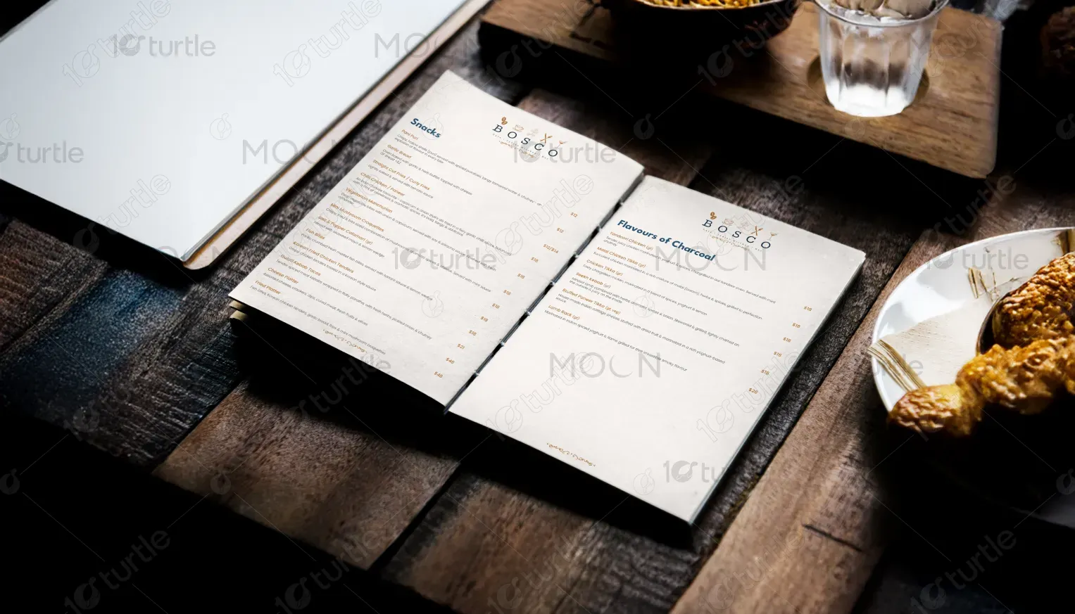
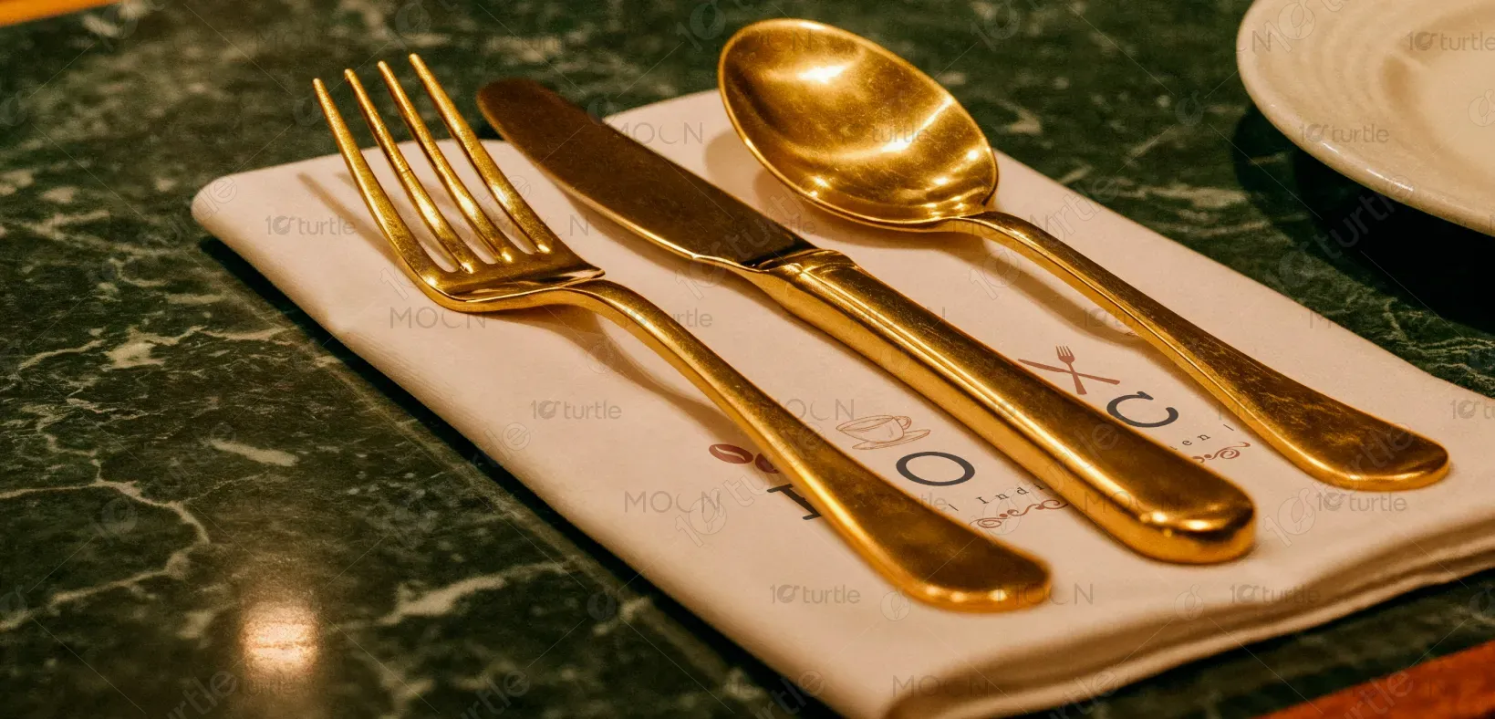
The color scheme features warm beige, deep navy, and muted gold accents. Beige reflects warmth and comfort, making the brand approachable. Navy symbolizes sophistication, trust, and stability—aligning with its premium lounge vibe. Gold accents introduce a sense of luxury and exclusivity. Together, the palette evokes elegance while maintaining readability and calmness. This combination ensures the menu, uniforms, and interiors feel cohesive, creating an environment that is both inviting and aspirational.