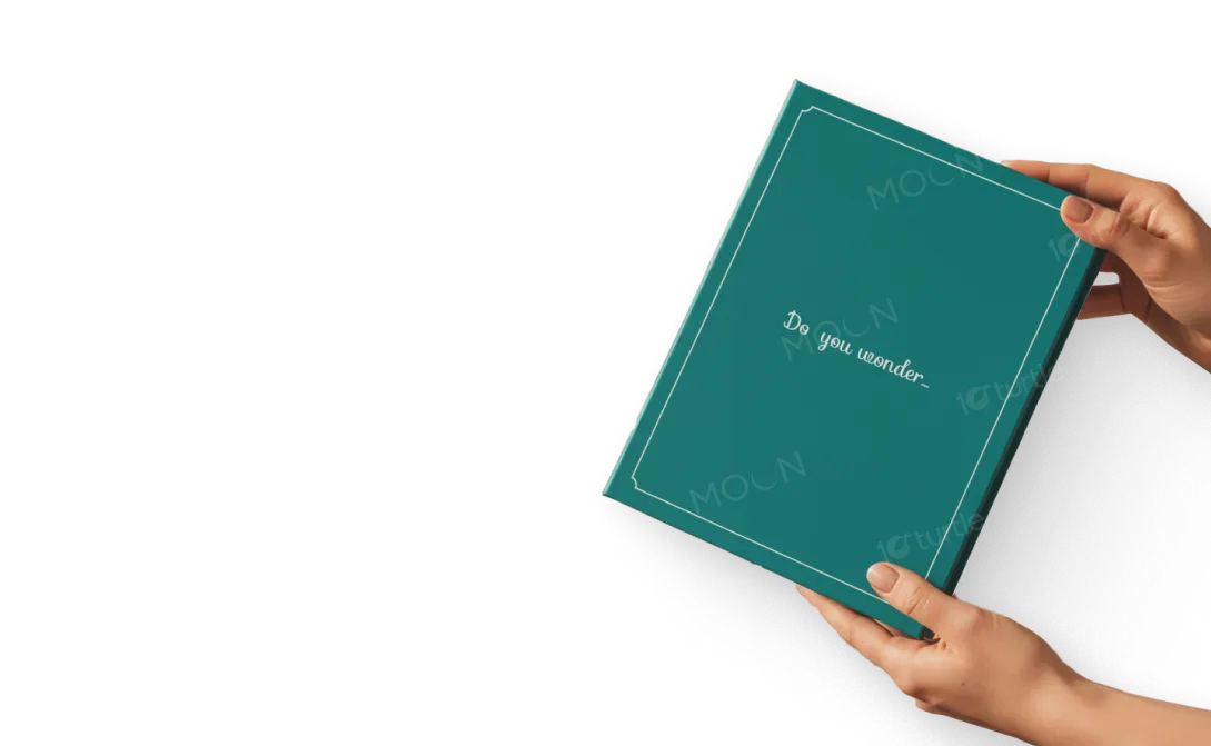
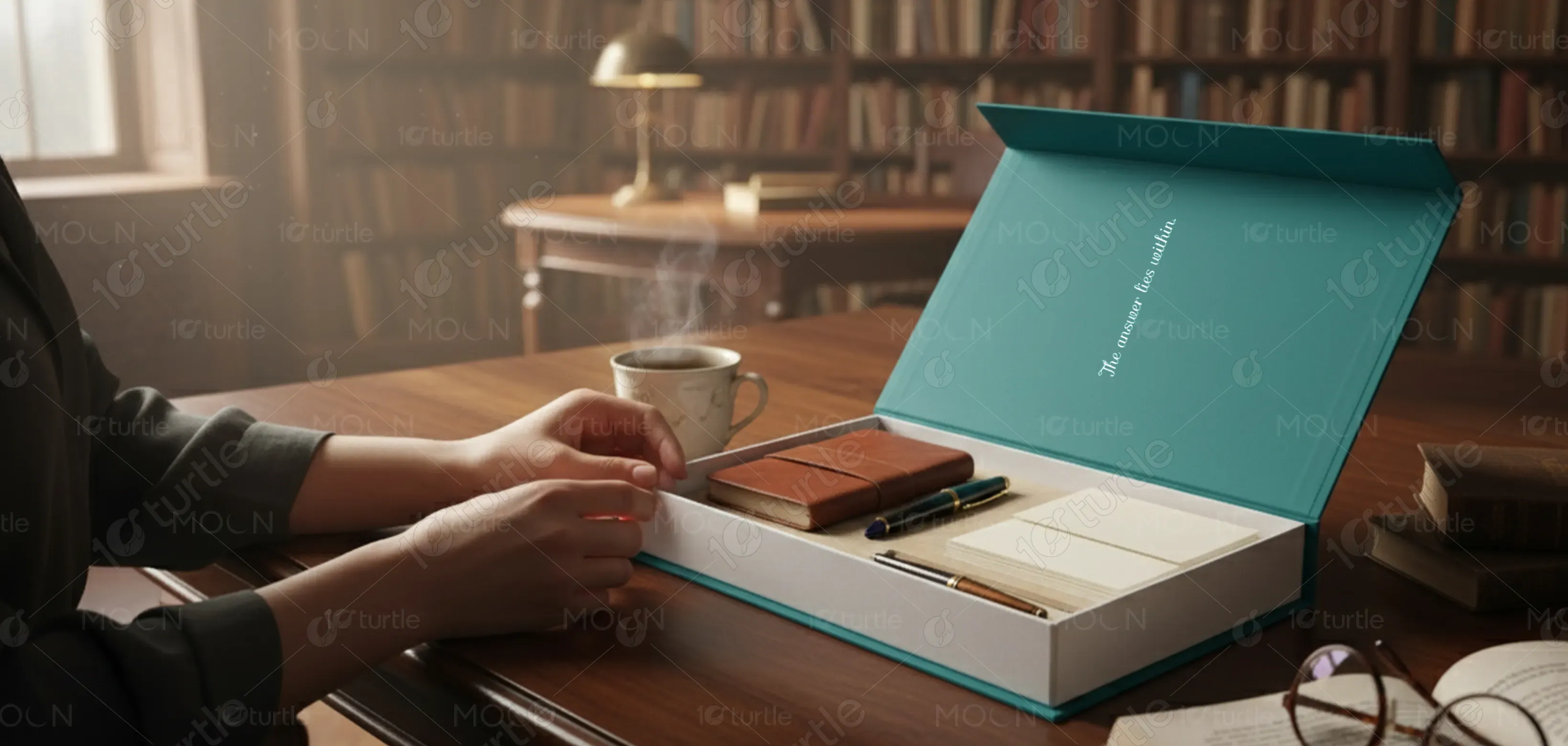
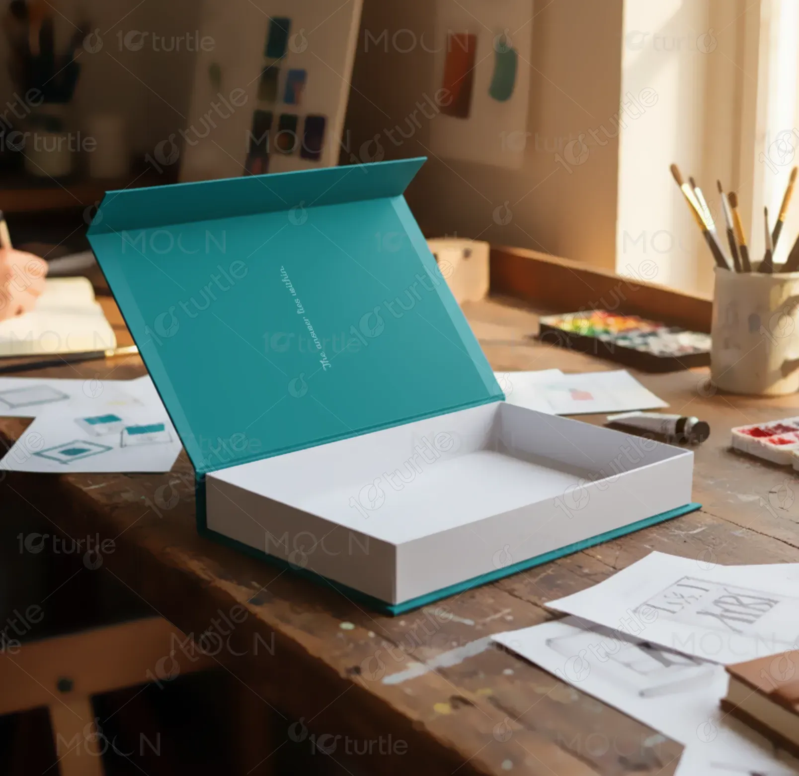
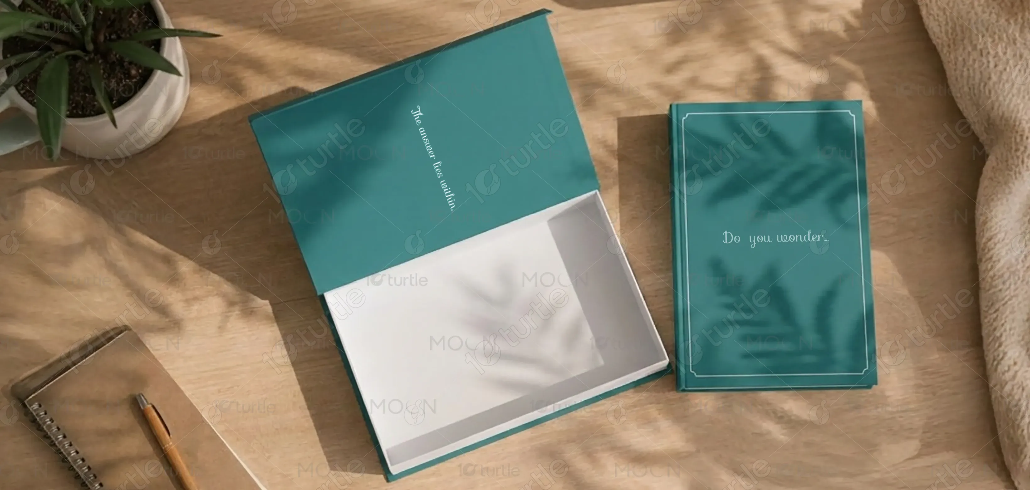
The packaging design blends modern minimalism with functional elegance to create a strong visual identity. Clean lines, balanced typography, and a refined layout reflect the product’s premium quality. The use of vibrant accent tones adds energy and attention, while structured spacing ensures clarity and sophistication. Every detail—from material selection to visual hierarchy—was crafted to communicate trust, innovation, and brand authenticity, resulting in a design that feels both contemporary and purpose-driven.
Packaging Design
Graphic Design
Industry
Consumer Goods & Retail
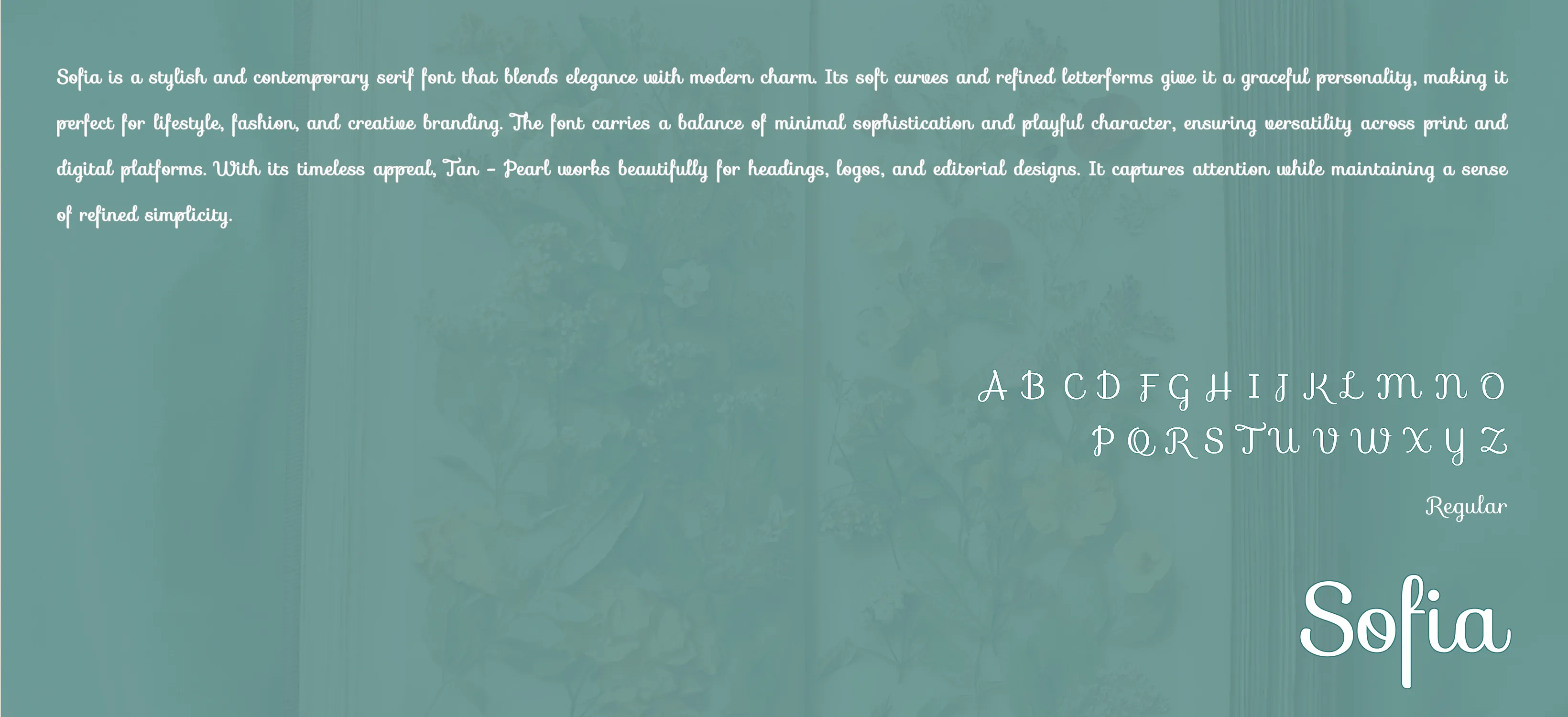
Tools we used


Project Completion
2025
Key Market
Global
This packaging design was created to enhance product visibility and elevate its market presence. Designed for a modern, quality-conscious audience, it emphasizes both aesthetics and usability. The design aims to make the unboxing experience memorable, while protecting and presenting the product effectively. Unique selling points include a strong brand recall, clear communication of benefits, and a sleek visual language that positions the product as both desirable and trustworthy in its category.

Industry
Consumer Goods & RetailWhat we did
Packaging DesignGraphic DesignPlatform
-The key challenge was standing out in a saturated market where packaging often looks repetitive and lacks emotional engagement. Many brands focus solely on bold visuals without considering user experience or sustainability. Additionally, cluttered designs often overwhelm consumers, reducing product appeal on shelves. The gap lay in creating packaging that balances visual attraction, functional structure, and brand storytelling — offering something visually distinctive yet simple and premium.
To address these challenges, the design incorporates a clean, modern layout that prioritizes hierarchy and readability. Strategic use of color and space draws focus to essential product information. Sustainable materials and a minimal print approach reflect eco-conscious values, while premium finishing (like matte coating or embossing) enhances tactile appeal. This thoughtful balance between design aesthetics and usability ensures the product connects emotionally with consumers while maintaining a professional, high-end look.

The long-term vision is to establish a consistent, recognizable brand language across all packaging formats. It aims to redefine visual standards in its market by promoting sustainability, clarity, and premium presentation. The design aspires to become a benchmark for modern, minimal packaging that speaks directly to contemporary consumer values - authenticity, simplicity, and environmental awareness. Ultimately, it seeks to build enduring trust and elevate the brand’s reputation globally.
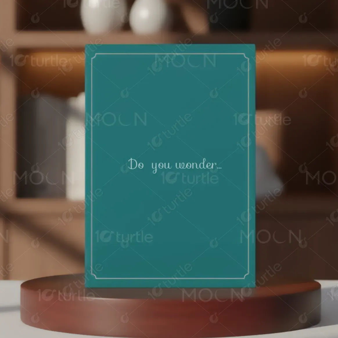

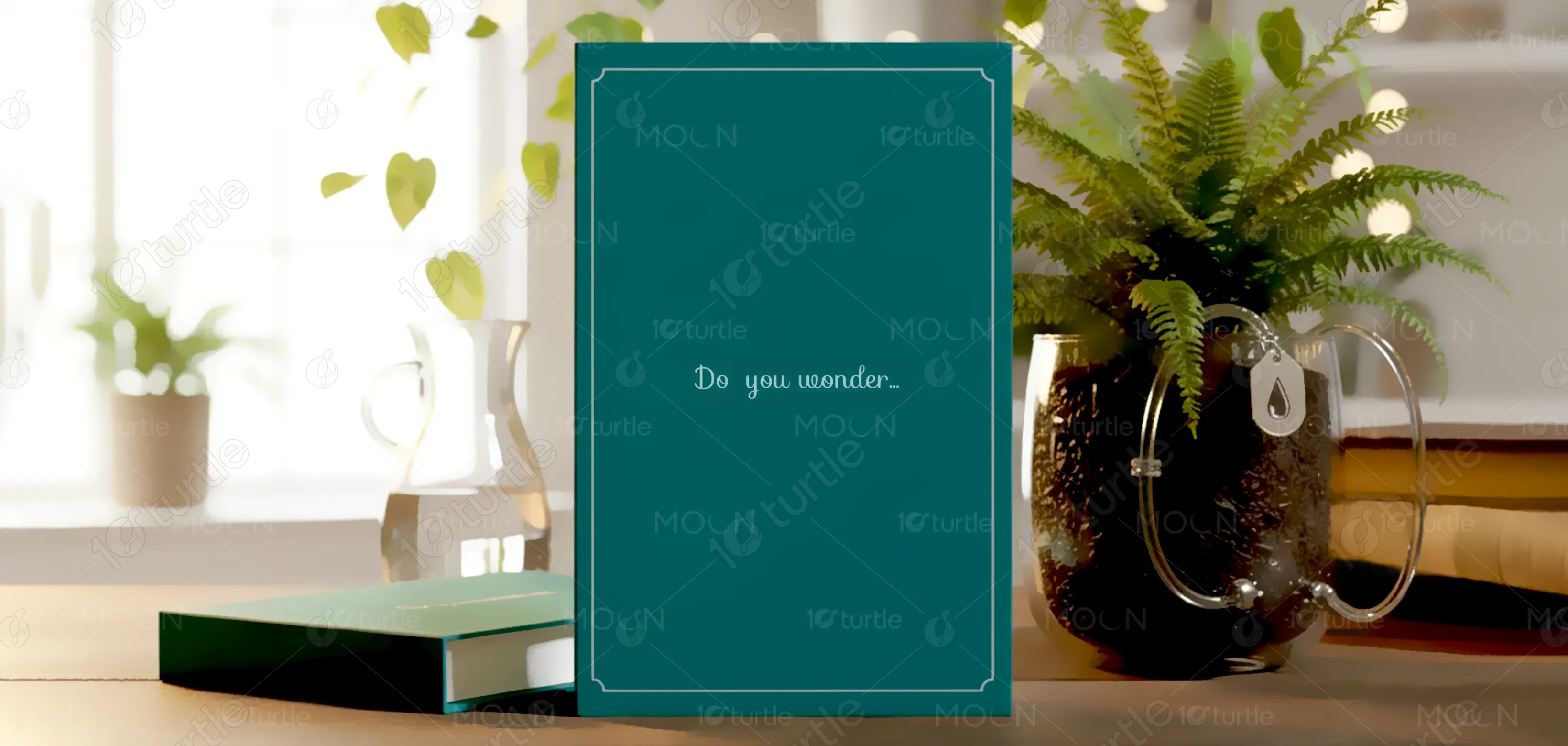
The color palette blends [insert your brand’s main color, e.g., sunny yellow (#FFC800)] with neutral tones to achieve balance and harmony. The primary color symbolizes optimism, energy, and creativity, making the product instantly recognizable. Supporting hues in white, gray, or black add sophistication and contrast, ensuring a professional appearance. This palette reinforces the brand’s personality — vibrant yet refined — while guiding visual focus and evoking positive emotional connection with the consumer.