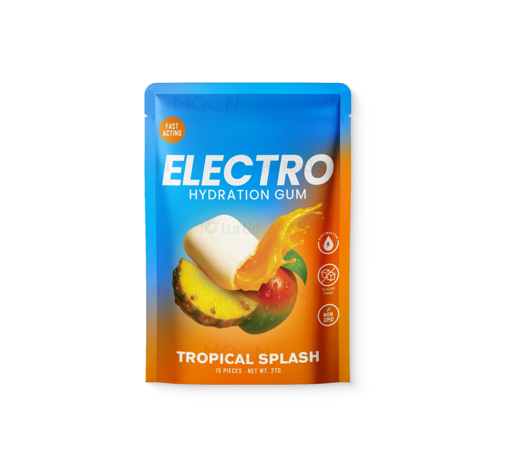
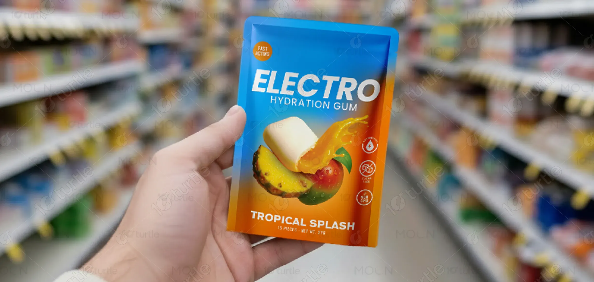
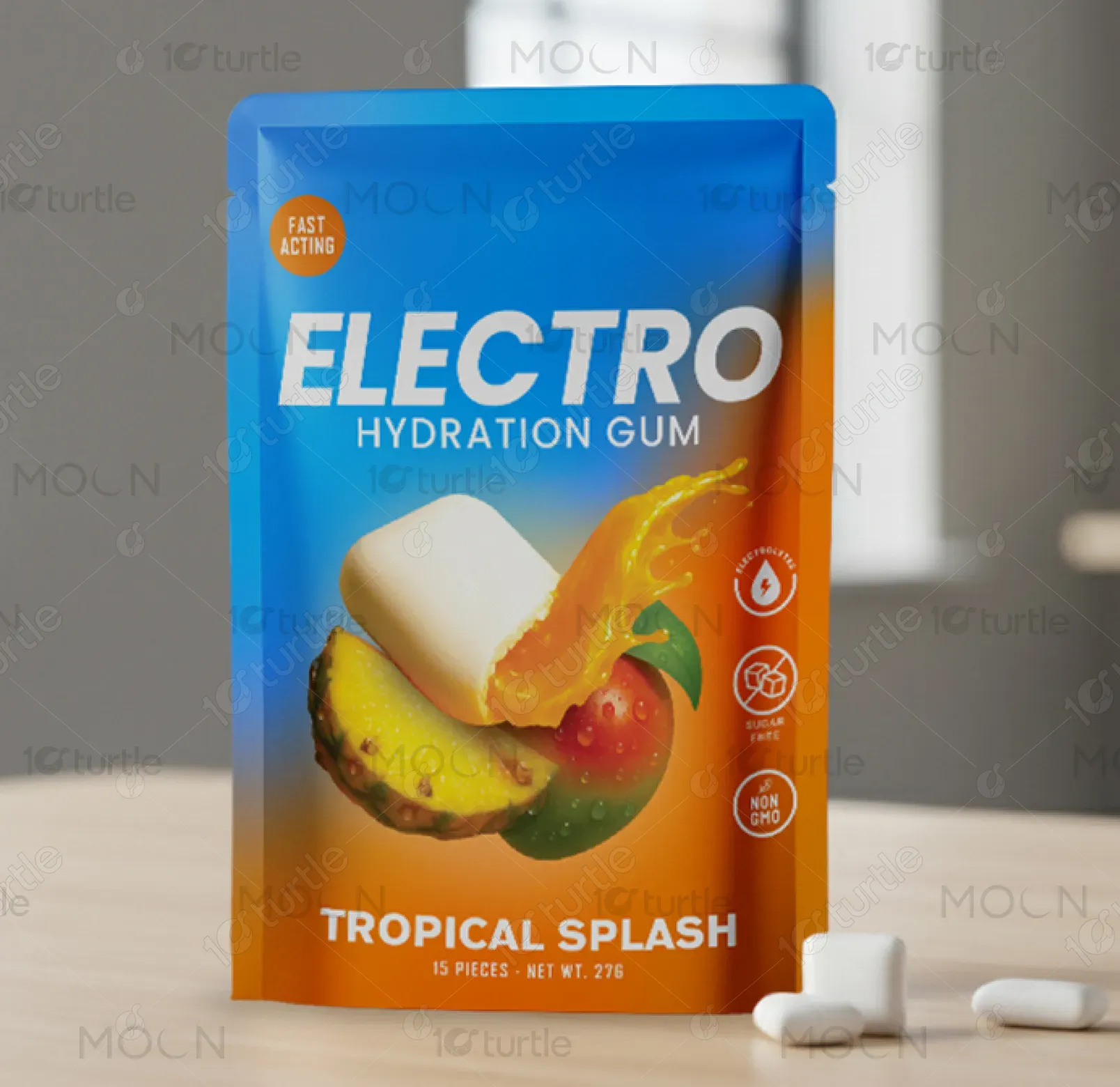
The ELECTRO Hydration Gum packaging embraces a bold, futuristic aesthetic reflecting innovation and performance. Vibrant tropical gradients and dynamic typography capture the brand’s energetic, on-the-go spirit. The layout balances scientific precision with lifestyle appeal, ensuring both athletes and everyday consumers connect instantly. Key callouts like “Fast Acting” and “Hydration Gum” are prominently displayed for clarity and impact, while the clean, minimal background highlights the modern, functional character of the brand.
Packaging Design
Graphic Design
Industry
Food, Beverage & Hospitality
Tools we used


Project Completion
2025
Key Market
Global
ELECTRO Hydration Gum is a sugar-free, performance-boosting chewing gum infused with electrolytes for quick hydration and mental focus. Designed for active individuals, travelers, and professionals, it provides a convenient alternative to energy drinks or sports beverages. Its unique selling point lies in its portability, fast absorption, and refreshing flavor experience. The packaging communicates innovation, energy, and efficiency—bridging the gap between functional wellness and modern lifestyle convenience.

Industry
Food, Beverage & HospitalityWhat we did
Packaging DesignGraphic DesignPlatform
-Traditional hydration and energy products rely heavily on drinks or powders, which can be inconvenient, messy, and slow to absorb. Consumers seeking instant hydration without liquid intake often face limited options. Additionally, packaging in this category tends to feel clinical or overly sporty, alienating everyday users. The challenge was to design a compact, visually appealing format that communicates high performance and lifestyle balance simultaneously, appealing to both fitness enthusiasts and busy professionals.
The ELECTRO Hydration Gum design solves these issues by blending function and appeal in a pocket-friendly, chewable form. The bright tropical color palette and sleek typography convey freshness and innovation. Clear labeling emphasizes “Hydration,” “Sugar-Free,” and “Fast Acting,” helping consumers instantly understand its purpose. The compact design promotes portability, while the futuristic tagline—“Chew. Hydrate. Go.”—summarizes its user-centric benefit: effortless hydration anywhere, anytime.
The long-term vision is to redefine how hydration is perceived—transforming it from a routine necessity to a lifestyle experience. ELECTRO aims to lead the market in functional gum innovation, expanding into new flavors and wellness-based formulations. The packaging design sets a precedent for a new category of performance consumables—sleek, minimal, and science-driven—establishing ELECTRO as the future of hydration.
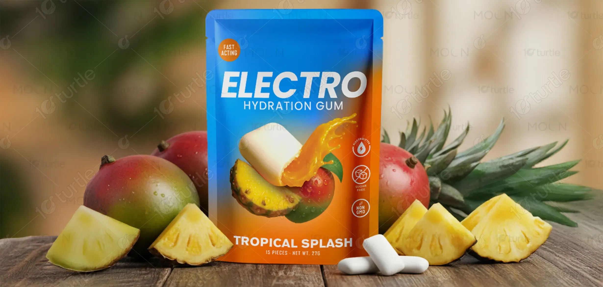

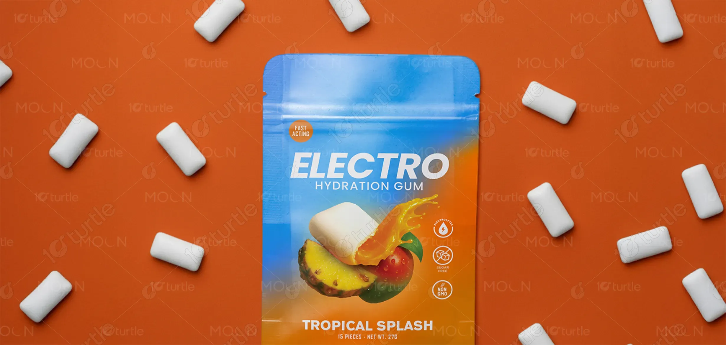
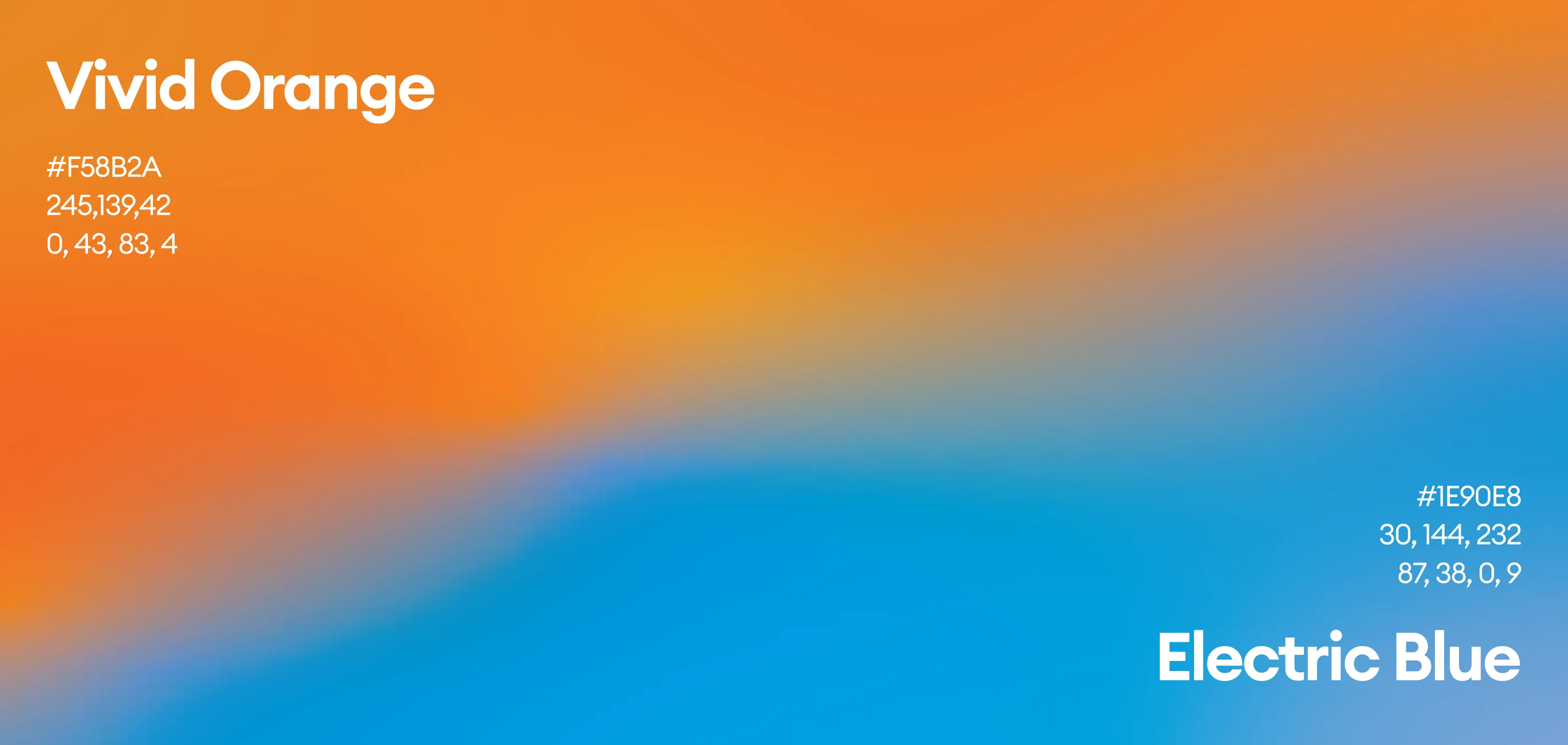
The palette features bright tropical hues—turquoise blue, sunset orange, and vibrant yellow—symbolizing energy, freshness, and vitality. The contrast between cool and warm tones evokes balance between hydration and performance. White typography ensures legibility and purity, aligning with the sugar-free and clean-energy message. Overall, the colors create a strong shelf presence while visually communicating refreshment, focus, and motion—perfectly mirroring ELECTRO’s dynamic identity.