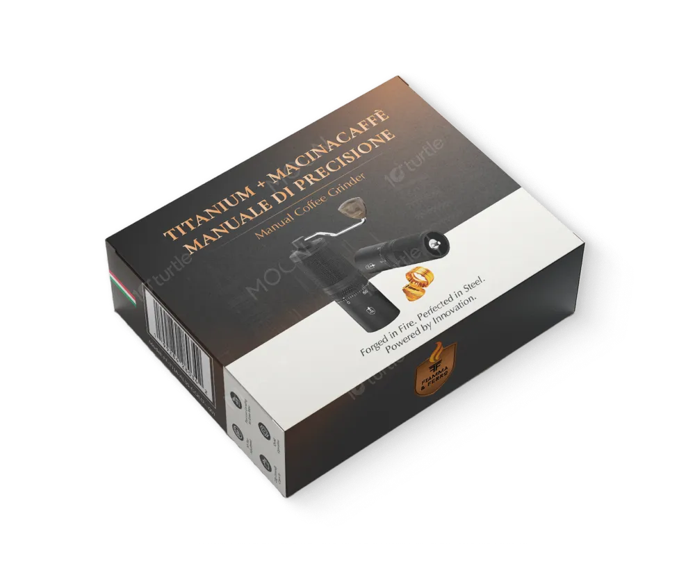
The packaging design embodies precision, craftsmanship, and Italian heritage through a refined balance of dark matte tones and warm metallic accents. A minimal, structured layout highlights the product as the hero while maintaining a premium, professional aesthetic. Elegant typography paired with realistic product imagery communicates durability and performance at a glance. Subtle gradients and restrained iconography enhance clarity without visual clutter, resulting in a sophisticated, timeless design that reflects innovation, reliability, and artisanal quality.
Packaging Design
Graphic Design
Industry
Consumer Goods & Retail
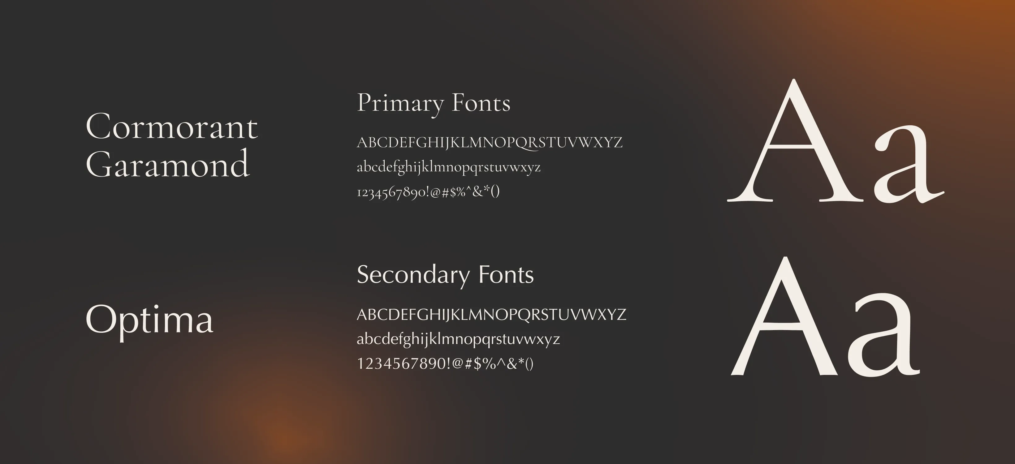
Tools we used


Project Completion
2025
Key Market
Global
This packaging represents a premium manual coffee grinder crafted for coffee enthusiasts who value control, consistency, and craftsmanship. Designed to house a titanium precision grinder, it positions the product firmly within the high-end specialty coffee market. The packaging emphasizes durability, accuracy, and Italian-inspired design, appealing to users who seek both performance and aesthetics. Its clean structure and premium finishes communicate trust, quality, and long-lasting value.
Industry
Consumer Goods & RetailWhat we did
Packaging DesignGraphic DesignPlatform
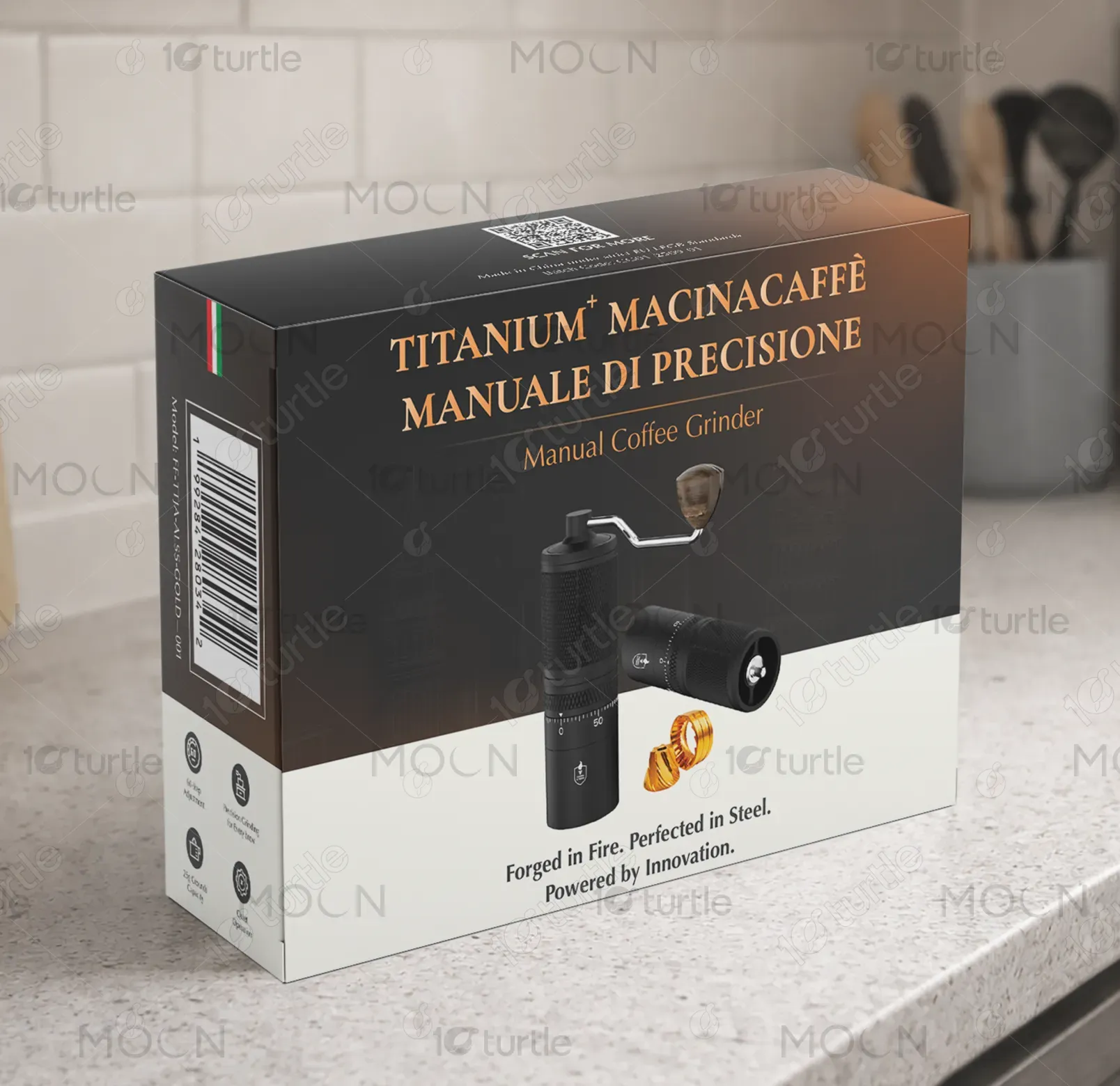
-Many manual coffee grinders in the market suffer from generic packaging that fails to communicate product quality, leading to poor shelf differentiation. Consumers often struggle to assess durability, precision, and authenticity at first glance. This disconnect creates hesitation, especially in premium segments where trust and perceived value are crucial. Without clear visual cues, even well-engineered products risk being overlooked in competitive retail environments.
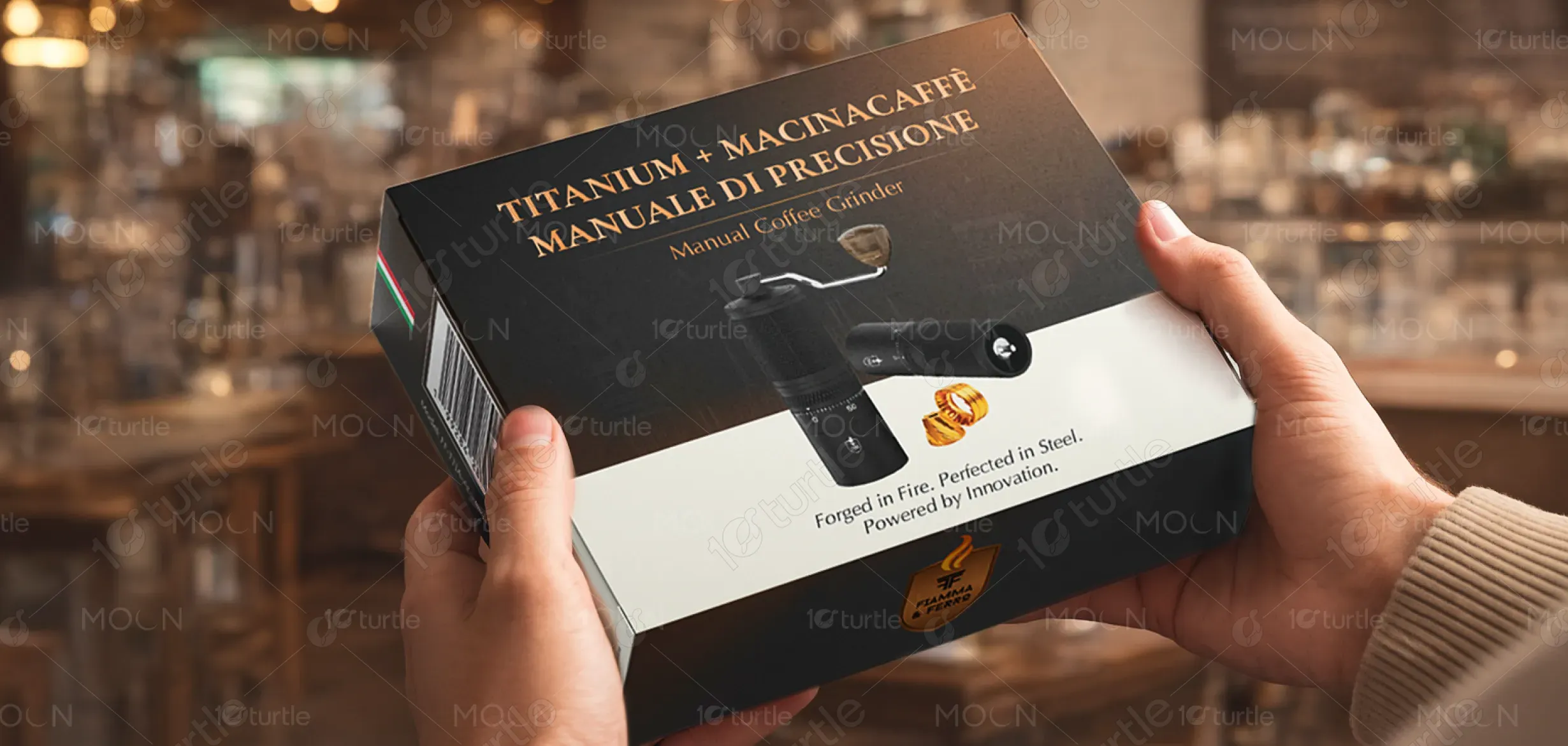
The design addresses this challenge by clearly showcasing the grinder, its materials, and its precision-focused purpose. Strategic typography hierarchy ensures instant readability, while icons convey key features quickly. The premium color palette and metallic highlights reinforce quality and craftsmanship. By blending visual clarity with emotional appeal, the packaging builds confidence, enhances shelf presence, and communicates value without overwhelming the consumer.

The long-term vision is to establish a recognizable, premium packaging language that evolves with future products while maintaining consistency and trust. The design aims to elevate manual coffee tools into lifestyle objects, bridging function and aesthetics. Over time, it seeks to build a strong visual identity associated with precision, durability, and refined taste, leaving a lasting impression in the specialty coffee industry.
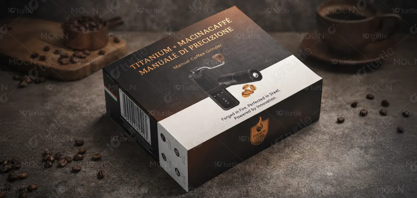
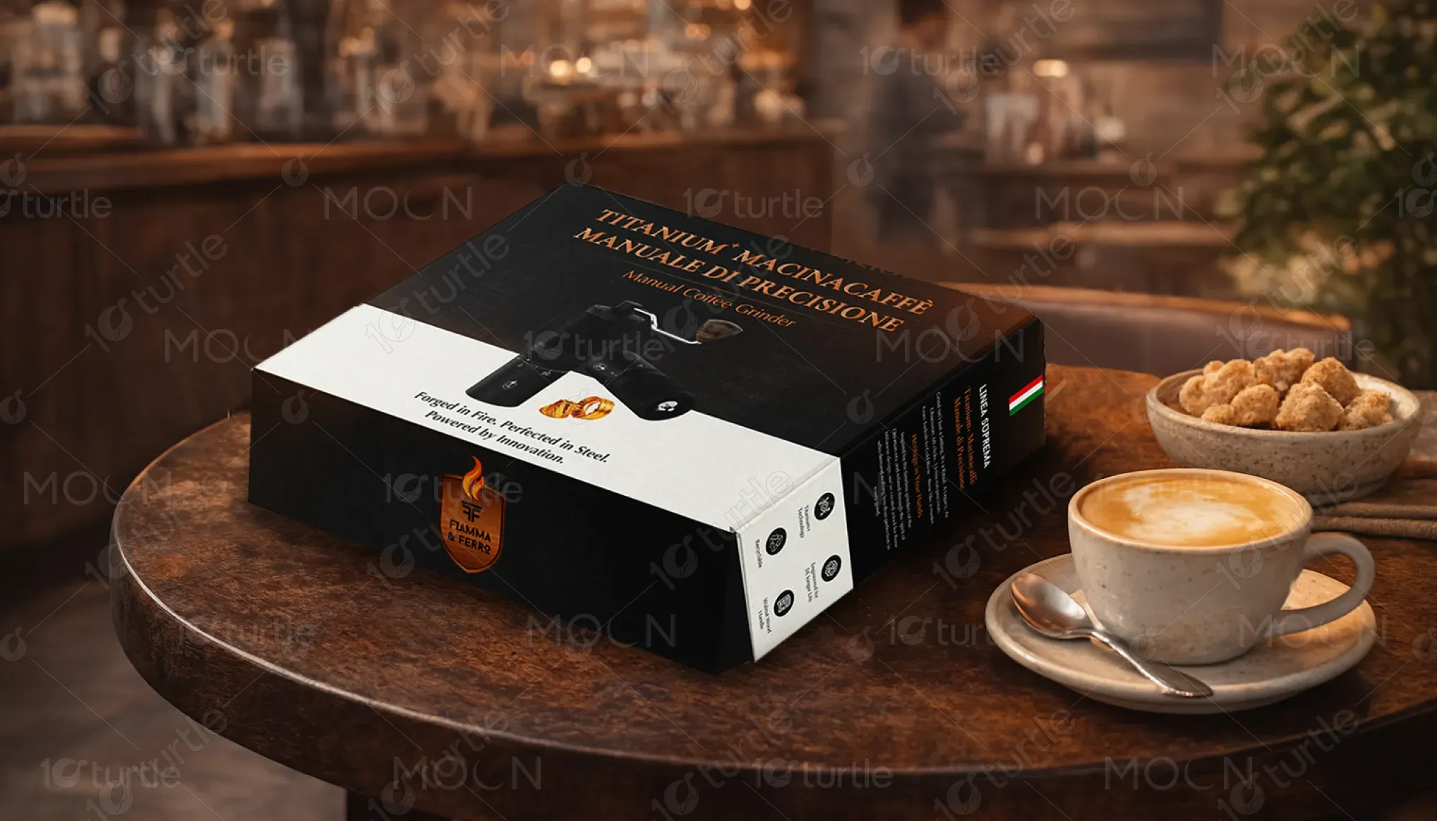
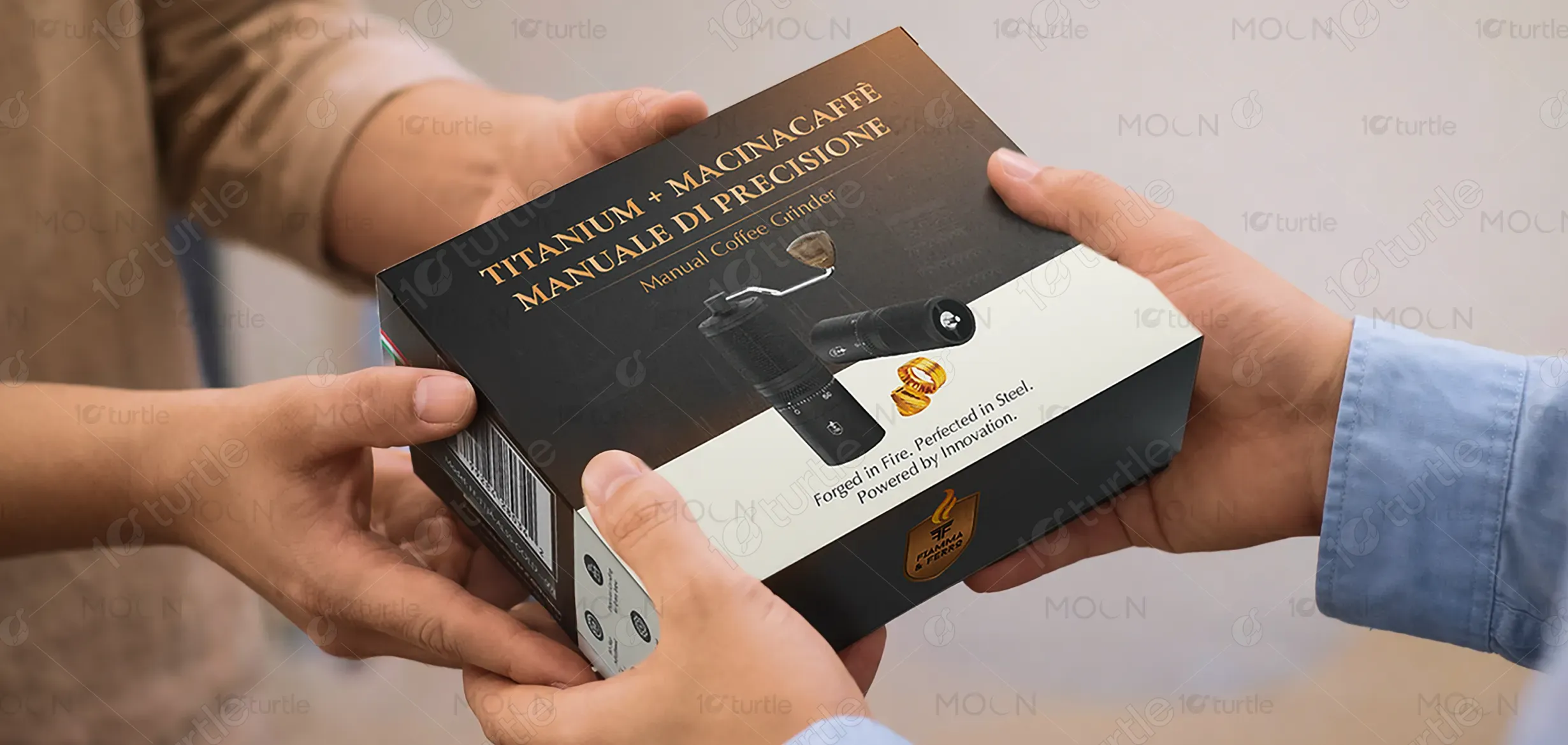
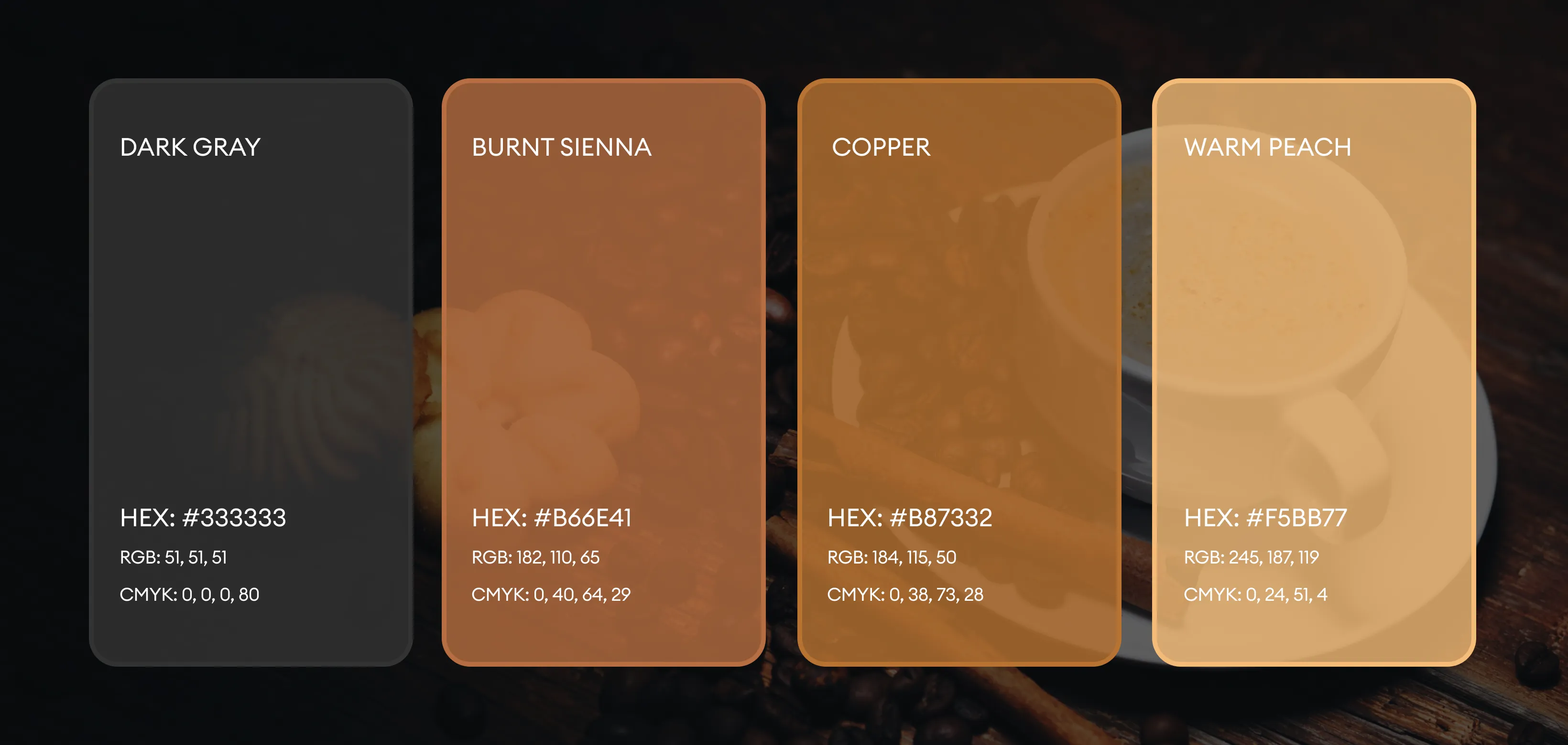
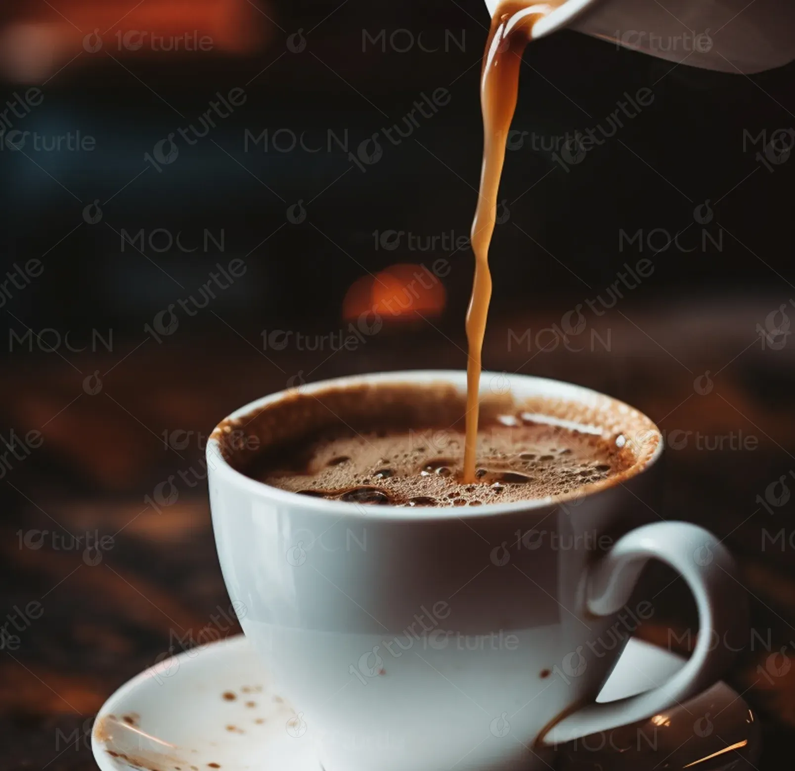
The palette combines deep charcoal and black tones with warm copper and gold accents, symbolizing strength, precision, and craftsmanship. White elements provide contrast and improve readability, ensuring balance and visual clarity. This combination evokes sophistication and warmth while aligning with premium coffee culture. The colors reinforce the brand’s identity as refined, professional, and performance-driven, enhancing shelf appeal and perceived product value.