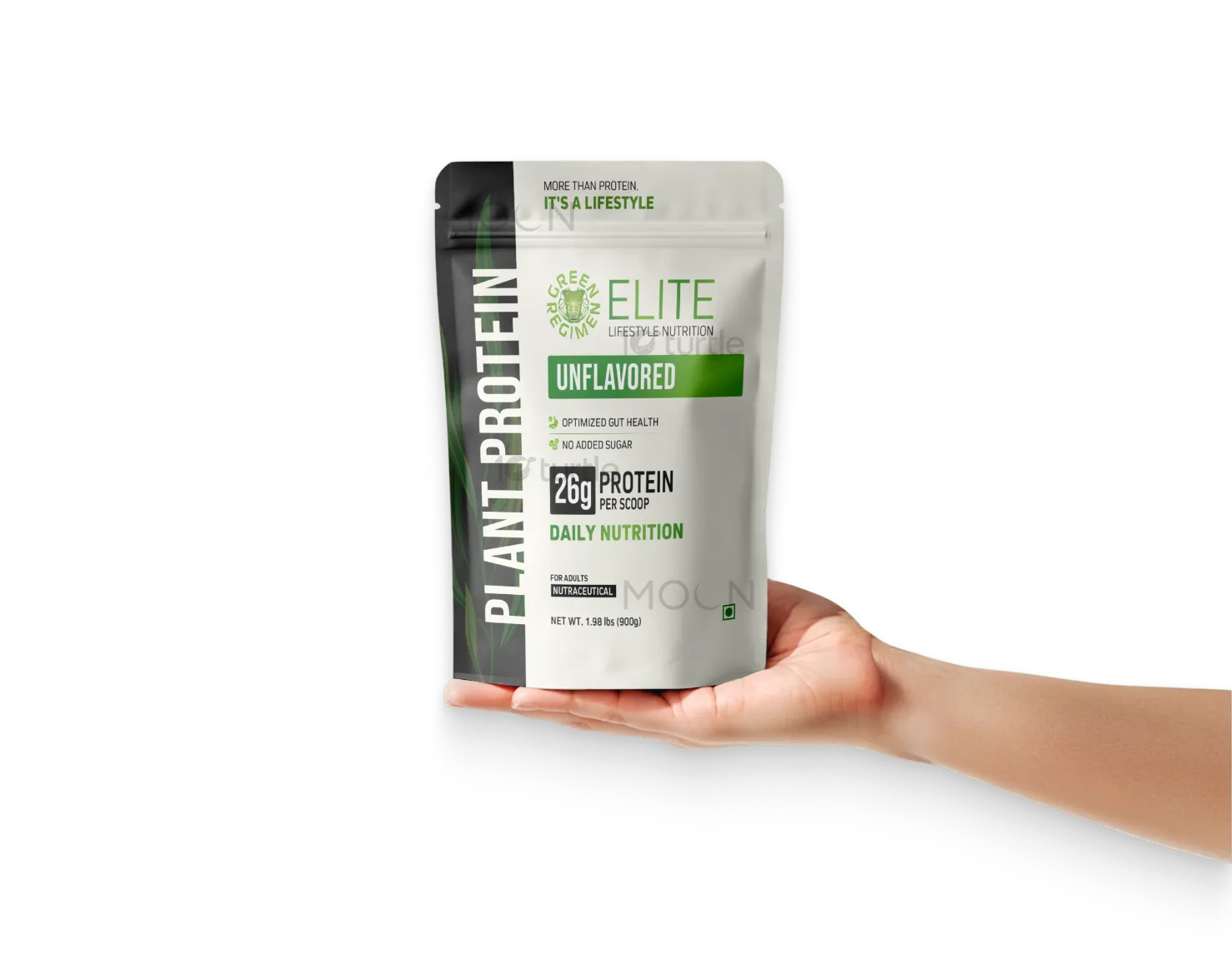
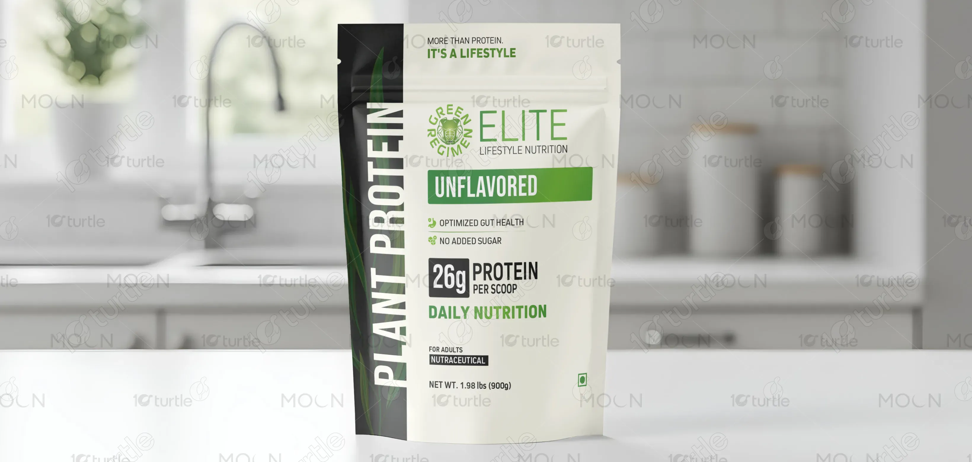
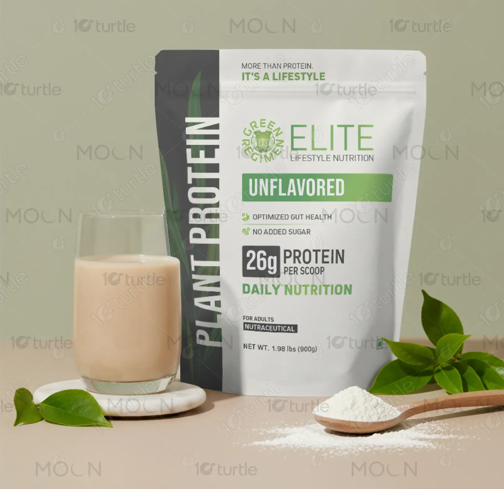
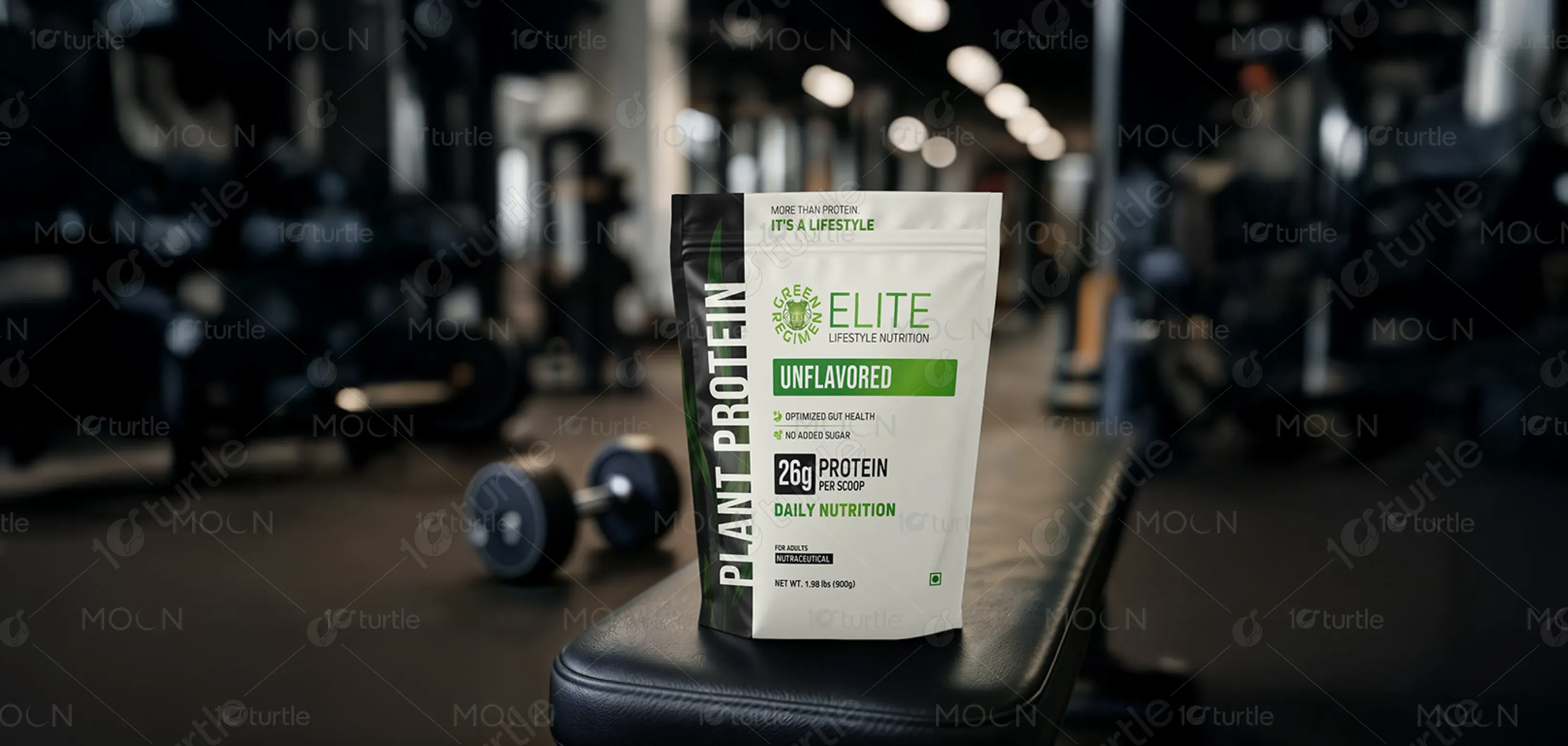
The packaging embodies a premium, lifestyle-driven aesthetic, balancing minimal clarity with modern appeal. Clean typography, strategic whitespace, and bold protein callouts ensure instant legibility, both on shelf and online thumbnails. The vertical plant protein lockup adds a contemporary twist, while trust signals such as “Optimized Gut Health” and “No Added Sugar” communicate transparency. Flavor cues remain understated for sophistication, with the overall creative direction reinforcing Green Regimen’s mission: more than just protein, it’s a movement toward holistic, science-backed wellness.
Packaging Design
Graphic Design
Industry
Healthcare & Wellness
Tools we used


Project Completion
2025
Key Market
Global
This design presents Green Regimen’s India-first Plant Protein — a clean-label, nutraceutical solution tailored for modern adults. With 26g protein per scoop, optimized gut health, and no added sugar, the product positions itself beyond traditional supplements. The packaging reinforces its unique value: a trustworthy, performance-driven protein powder that seamlessly blends into everyday lifestyles. Its clean yet bold aesthetic differentiates it from clutter-heavy competitors, making it both aspirational and approachable for health-conscious consumers across urban and emerging Indian markets.

Industry
Healthcare & WellnessWhat we did
Packaging DesignGraphic DesignPlatform
-Most protein supplements in India struggle with cluttered design, overhyped claims, or generic Western copy-paste aesthetics. Consumers are skeptical — powders feel “processed,” lack cultural relevance, and compete against entrenched dairy-based perceptions (paneer, whey as strength symbols). On digital shelves, messy visuals fail to capture attention at thumbnail size, while trust gaps remain unaddressed. The challenge: how to create packaging that feels premium, science-backed, and culturally resonant, while overcoming suspicion around plant proteins being “weak” or “foreign fads.”
This packaging solves those challenges by integrating trust-first storytelling and minimal design hierarchy. The front highlights functional proof — 26g protein, gut health support, and clean-label claims — instantly visible even at small sizes. The vertical “Plant Protein” lockup adds memorability without clutter, while strategic space allows each benefit to stand out. Cultural cues remain subtle yet reassuring, with a lifestyle-centric tagline (“More than protein. It’s a lifestyle”) reframing perception. The design directly addresses skepticism by merging credibility with aspiration.

The long-term vision is to establish Green Regimen India as the gold standard for plant-based wellness packaging: premium, transparent, and timeless. Beyond immediate market entry, the design system scales seamlessly across flavors, formats, and future innovations. It aims to redefine consumer expectations, making plant protein not a niche trend but an everyday essential. By anchoring the brand in trust and lifestyle relevance, this design aspires to leave a lasting impression and set new benchmarks in India’s growing nutrition space.

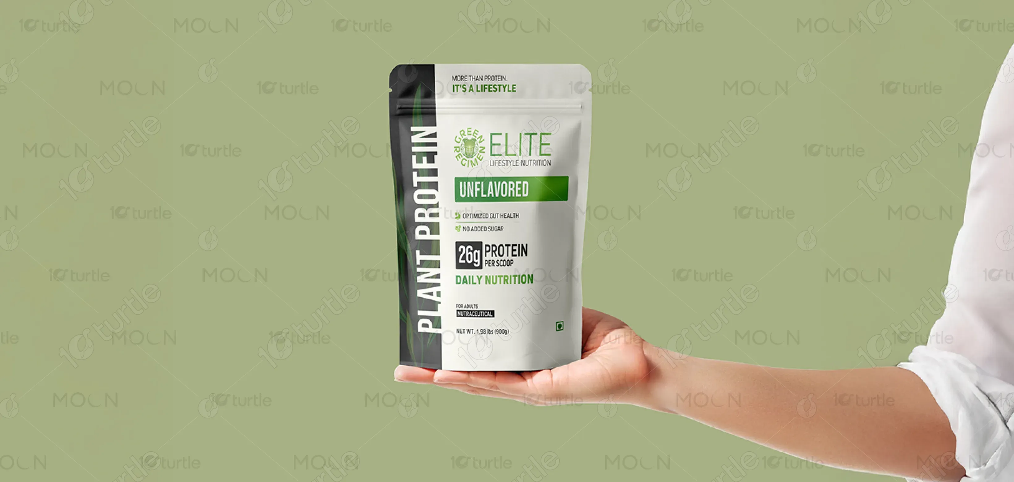
The palette is intentionally minimal, led by clean white for purity and transparency, paired with bold black typography for clarity and authority. Subtle accents (neutral grays, understated flavor markers) provide contrast without noise. This restrained scheme elevates the product’s premium appeal, reinforcing credibility over hype. The white canvas symbolizes honesty and scientific integrity, while the high-contrast elements ensure digital readability. Together, the palette evokes sophistication and trust, aligning with Green Regimen’s identity as a modern, culturally attuned wellness brand.