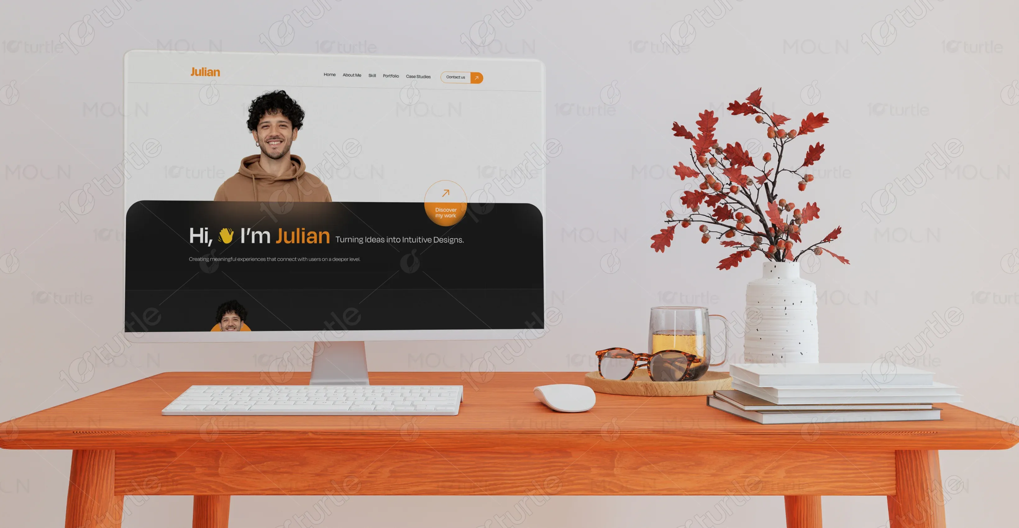
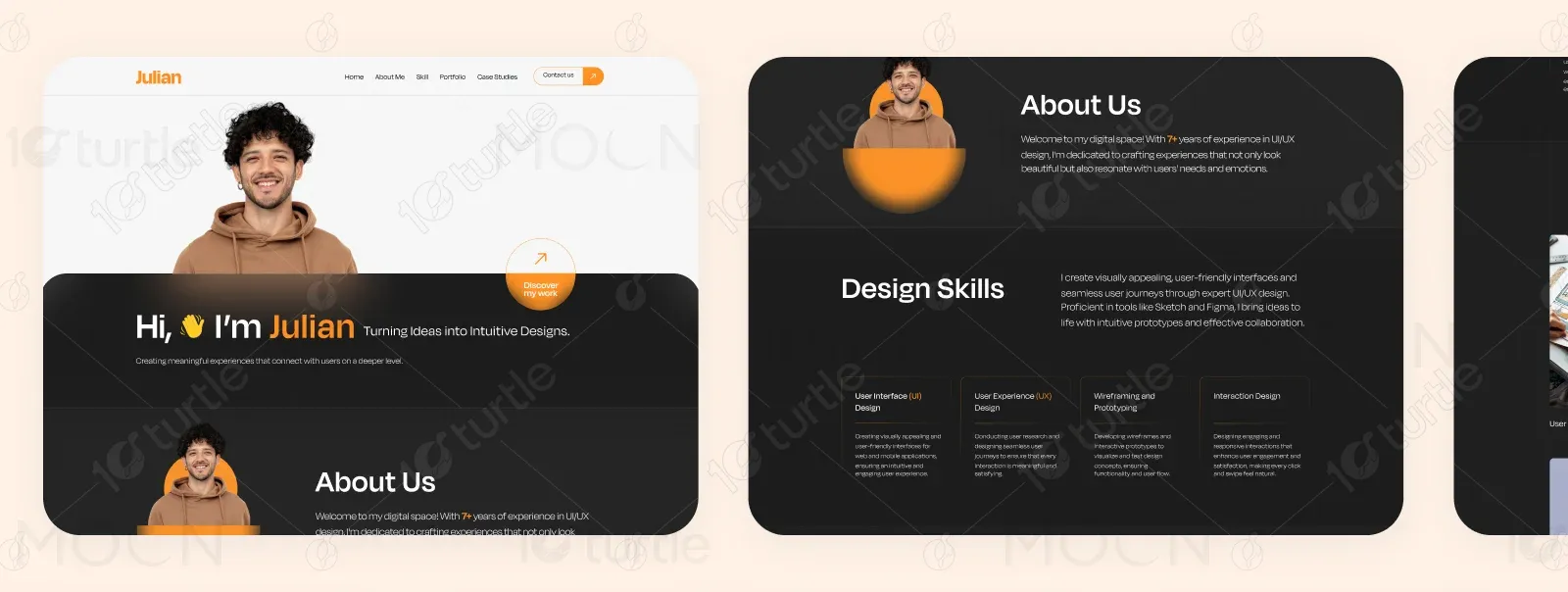
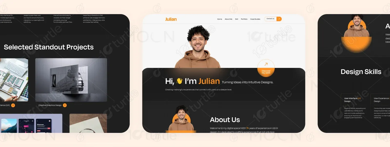
Julian’s portfolio website is a thoughtfully designed digital space that highlights professional experience, core skills, and a curated selection of design projects. The site serves as both a personal branding tool and a client-facing showcase, emphasizing user-centered design, intuitive navigation, and visually appealing layouts.
UX Design
UI Design
Research
Websites Design
Industry
Design & Creative Services
Tools we used

Project Completion
2024
The goal of this project was to create a clean, modern, and engaging personal portfolio that effectively communicates Julian’s skills, design philosophy, and previous work. The challenge was to balance professionalism with creativity, ensuring that the design both reflects the designer’s personality and meets the expectations of potential clients in the competitive creative industry.
Industry
Design & Creative ServicesWhat we did
Platform
-Julian needed an online presence that stood out from generic portfolios while clearly communicating his expertise and style. The lack of a visually appealing, strategically structured portfolio made it harder to attract the right clients and present his work in a way that demonstrated his design thinking and problem-solving approach.
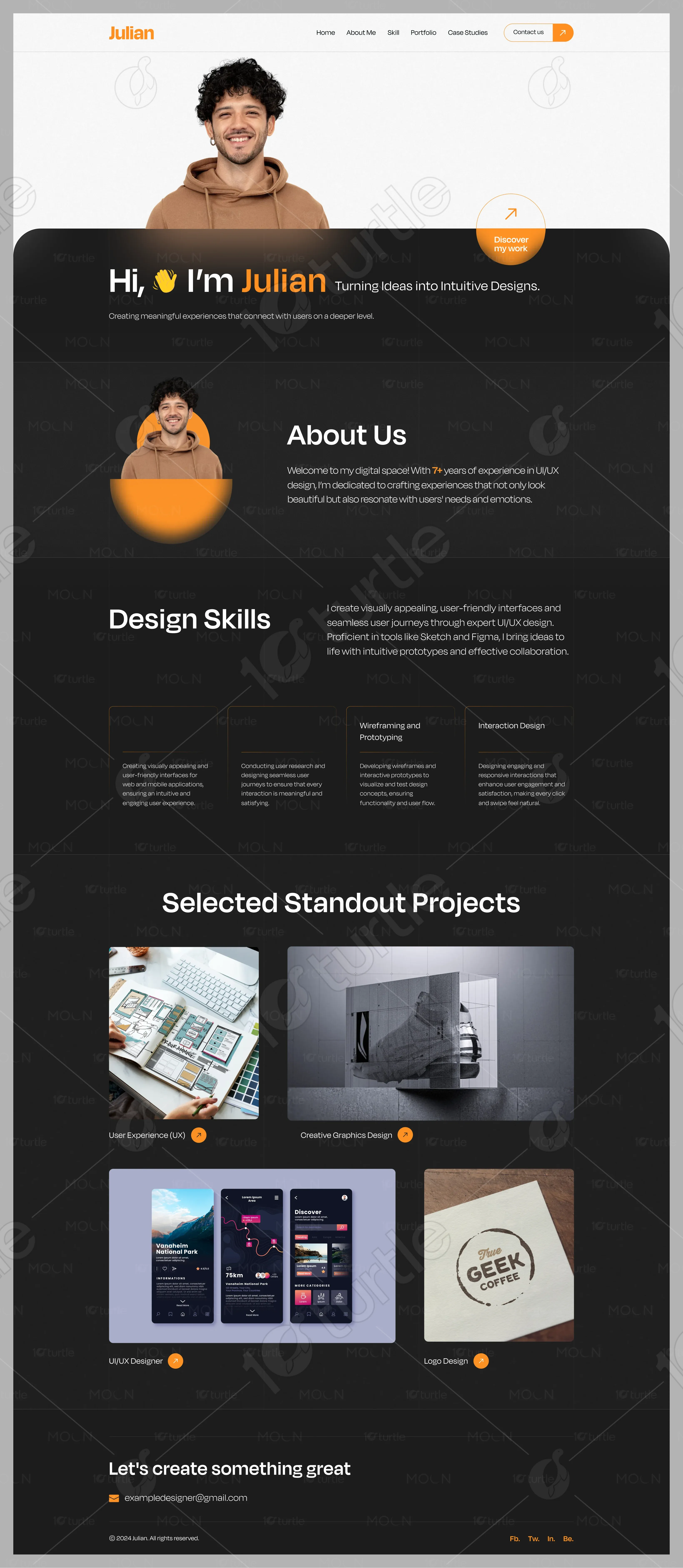
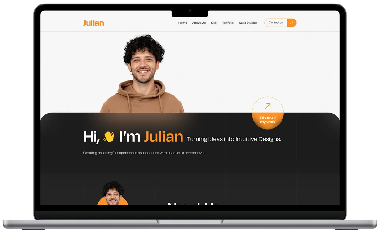
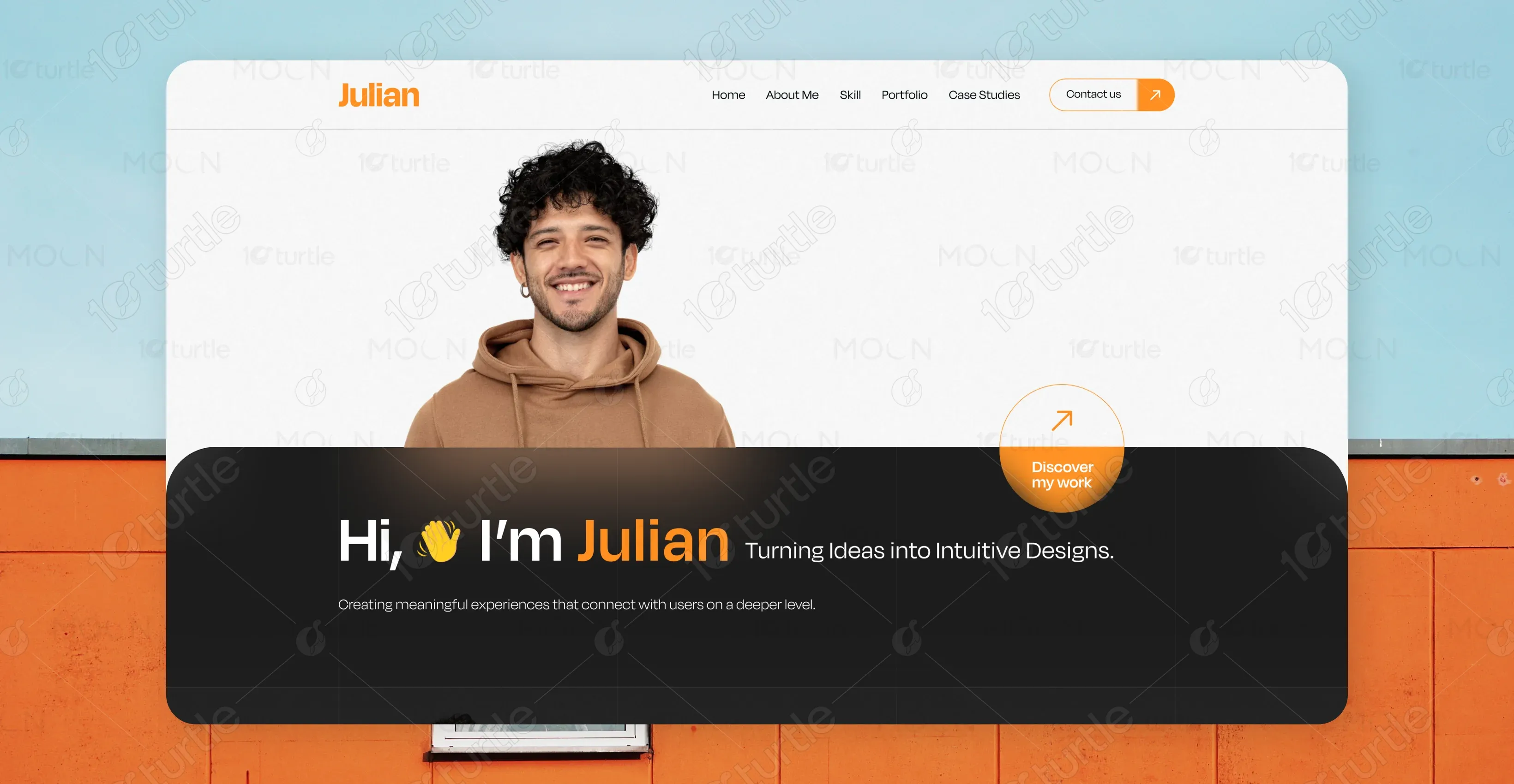
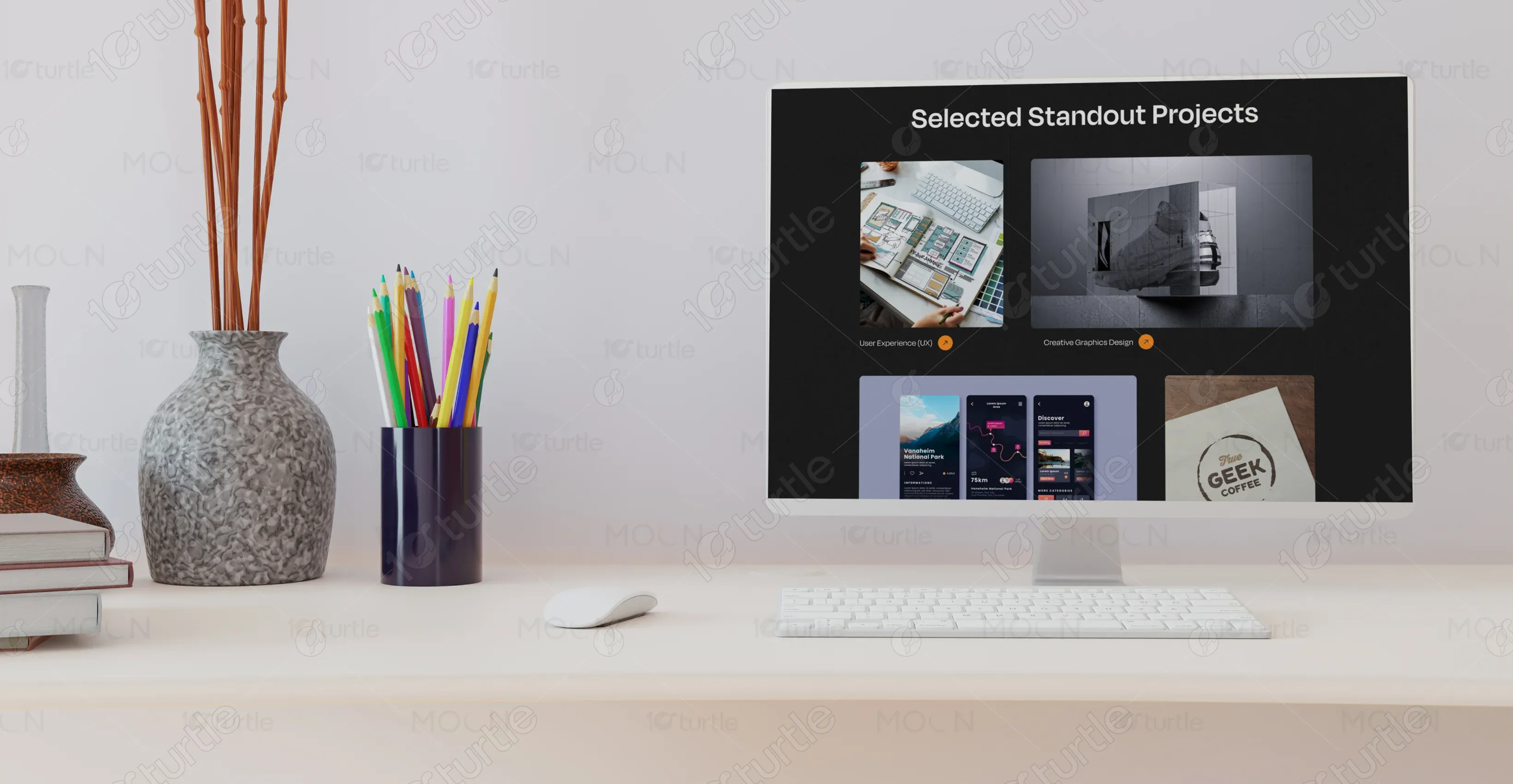
The website was designed with a dark-mode theme combined with vibrant accent colors, creating a sleek yet approachable feel. Strategic content sections—such as About, Skills, and Selected Projects—were introduced to guide visitors seamlessly through the portfolio. High-quality visuals, interactive CTAs, and consistent typography enhance engagement while making navigation intuitive and visually satisfying.
The vision was to merge a modern, minimal aesthetic with vibrant accents to keep the design lively and memorable. The client wanted a bold personal introduction, visually appealing project displays, and a layout that reflects a deep understanding of UI/UX principles. Inspiration came from clean, portfolio-centric design trends with emphasis on storytelling and user flow.
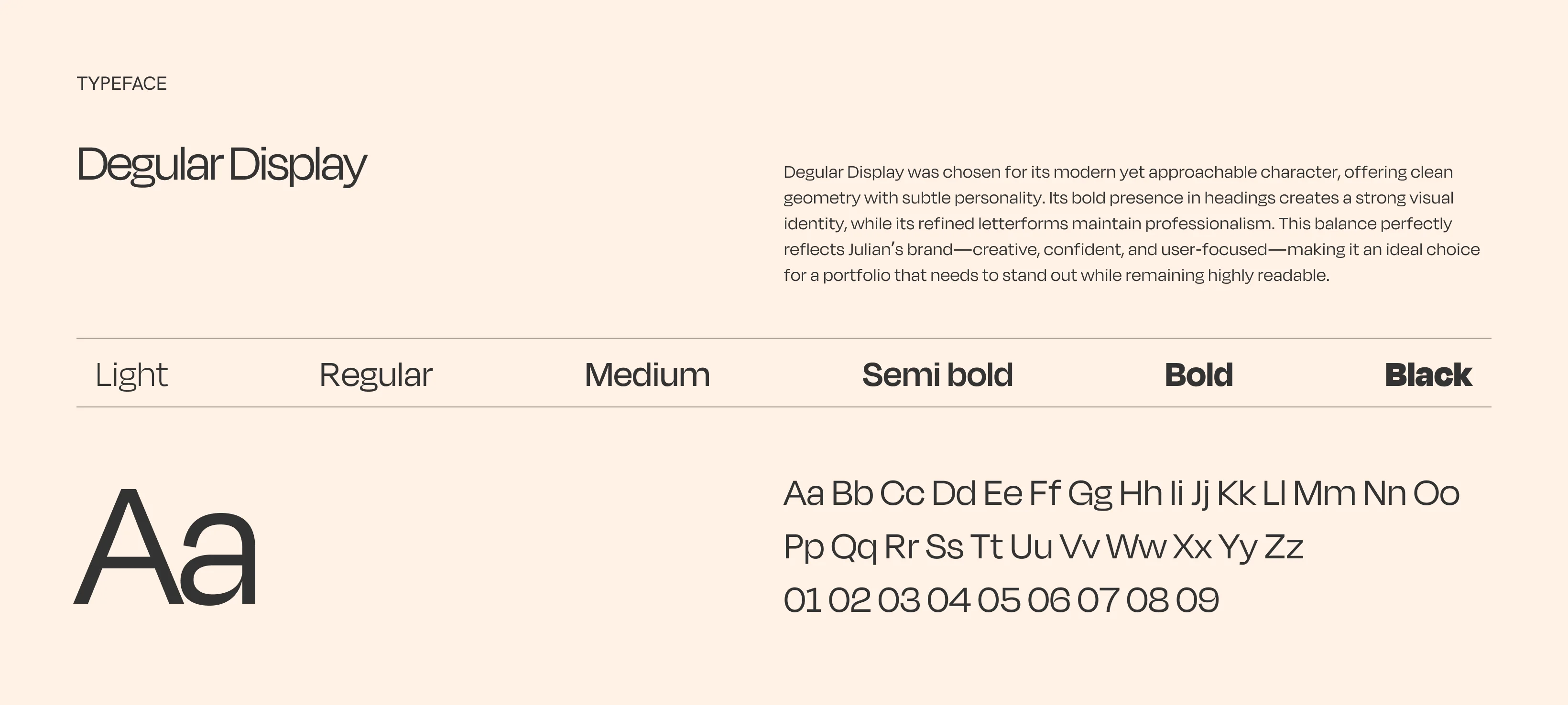
The “Julian” logo is simple, typographic, and brand-focused, with the first name in a bold orange hue. The simplicity ensures it remains versatile and professional, aligning with the clean design language of the portfolio.
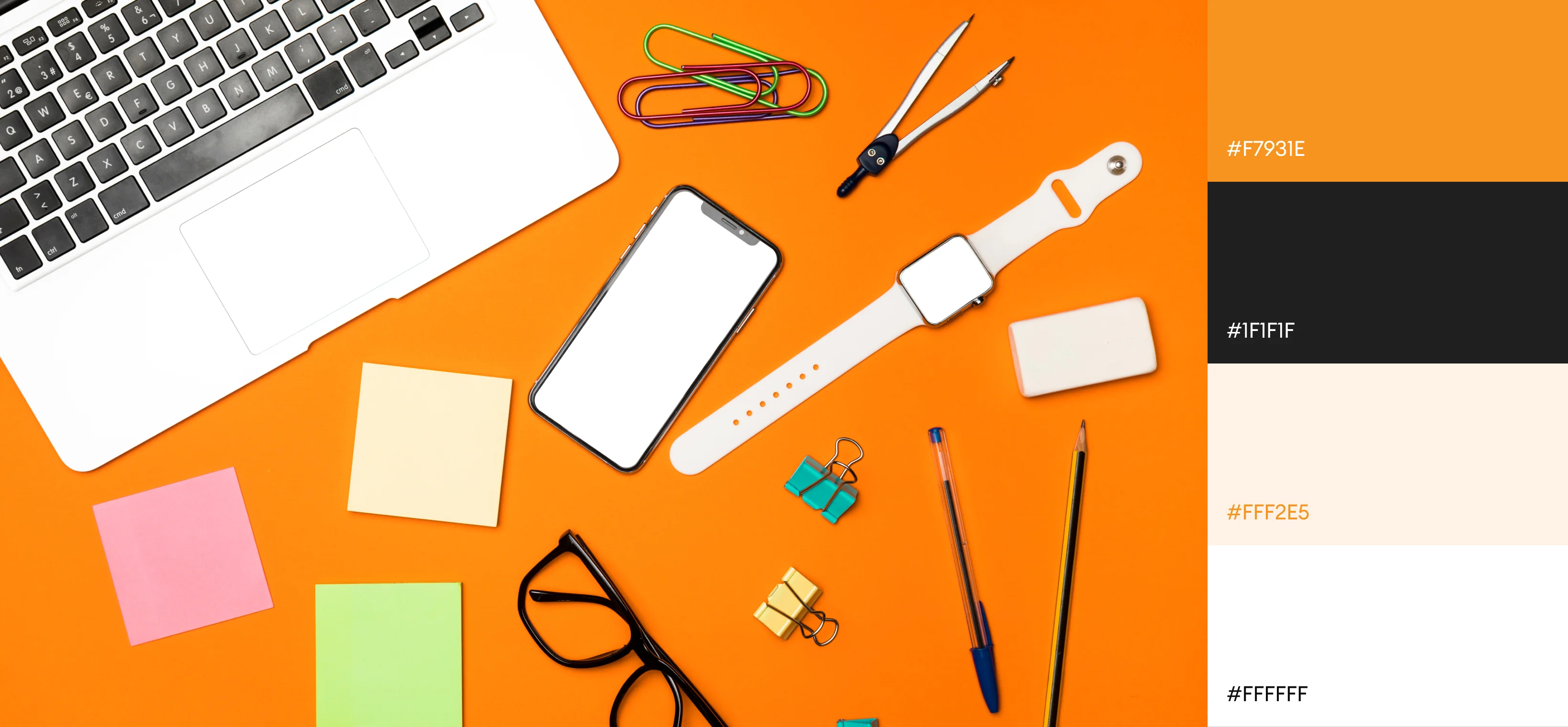
Primary: Vibrant Orange (#F7931E) – conveys creativity, enthusiasm, and warmth. Secondary: Black / Dark Gray – gives a sleek, modern, and professional look. White / Light Gray accents – provide contrast, readability, and a clean aesthetic. This combination communicates creativity with professionalism while making key elements stand out.
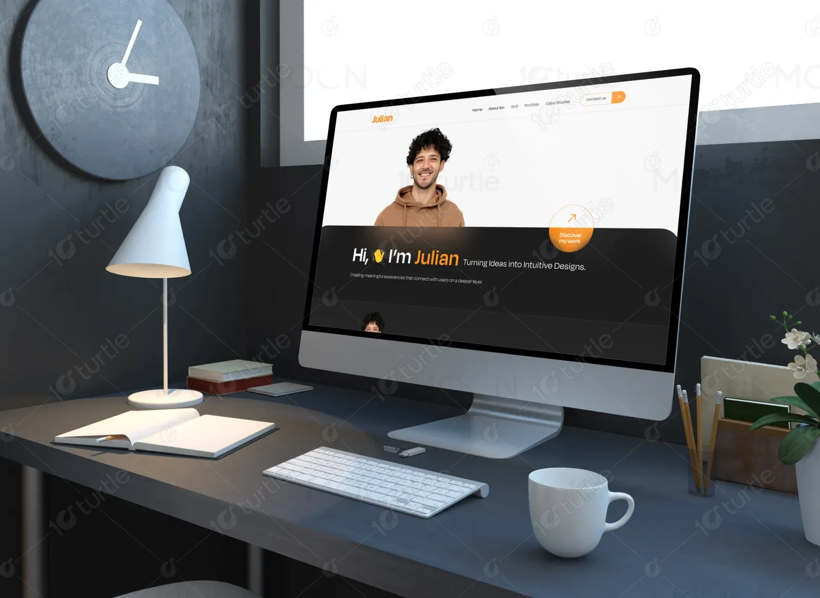
The initial wireframe focused on a single-scroll landing page that flows naturally from introduction to projects. The structure emphasized minimal clutter, prominent visuals, and well-defined sections to guide users without overwhelming them.