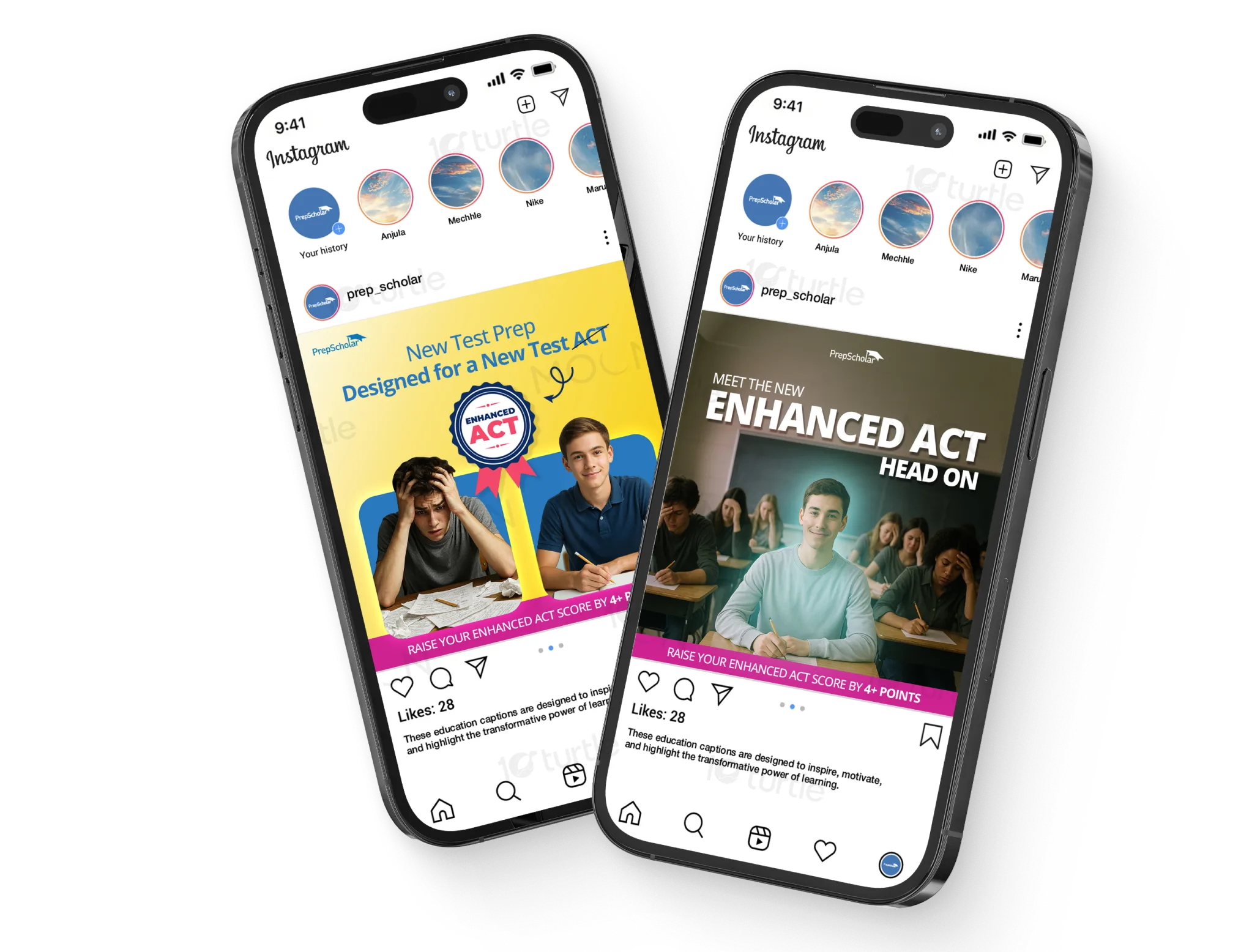
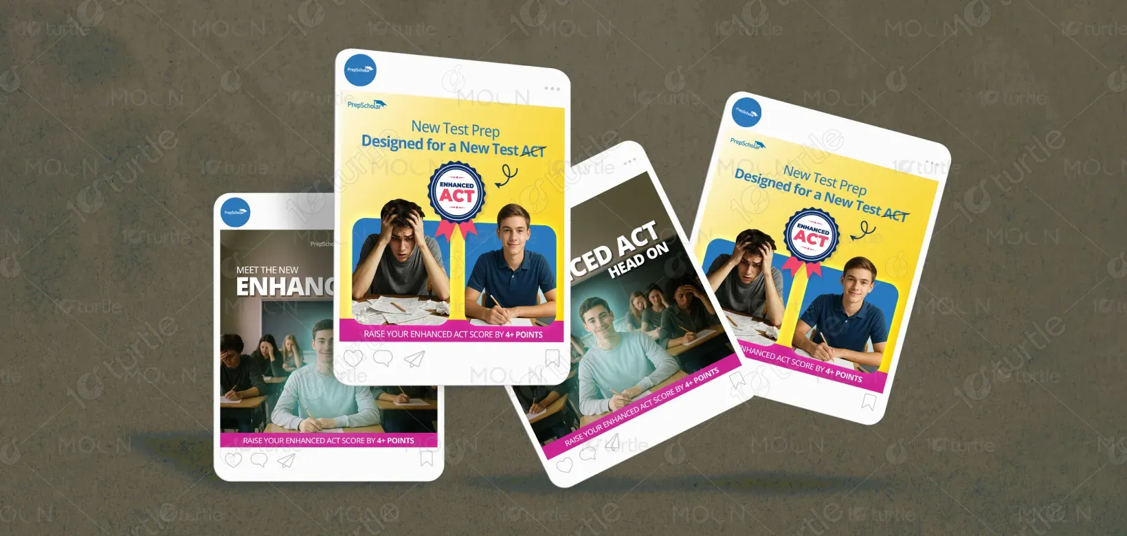
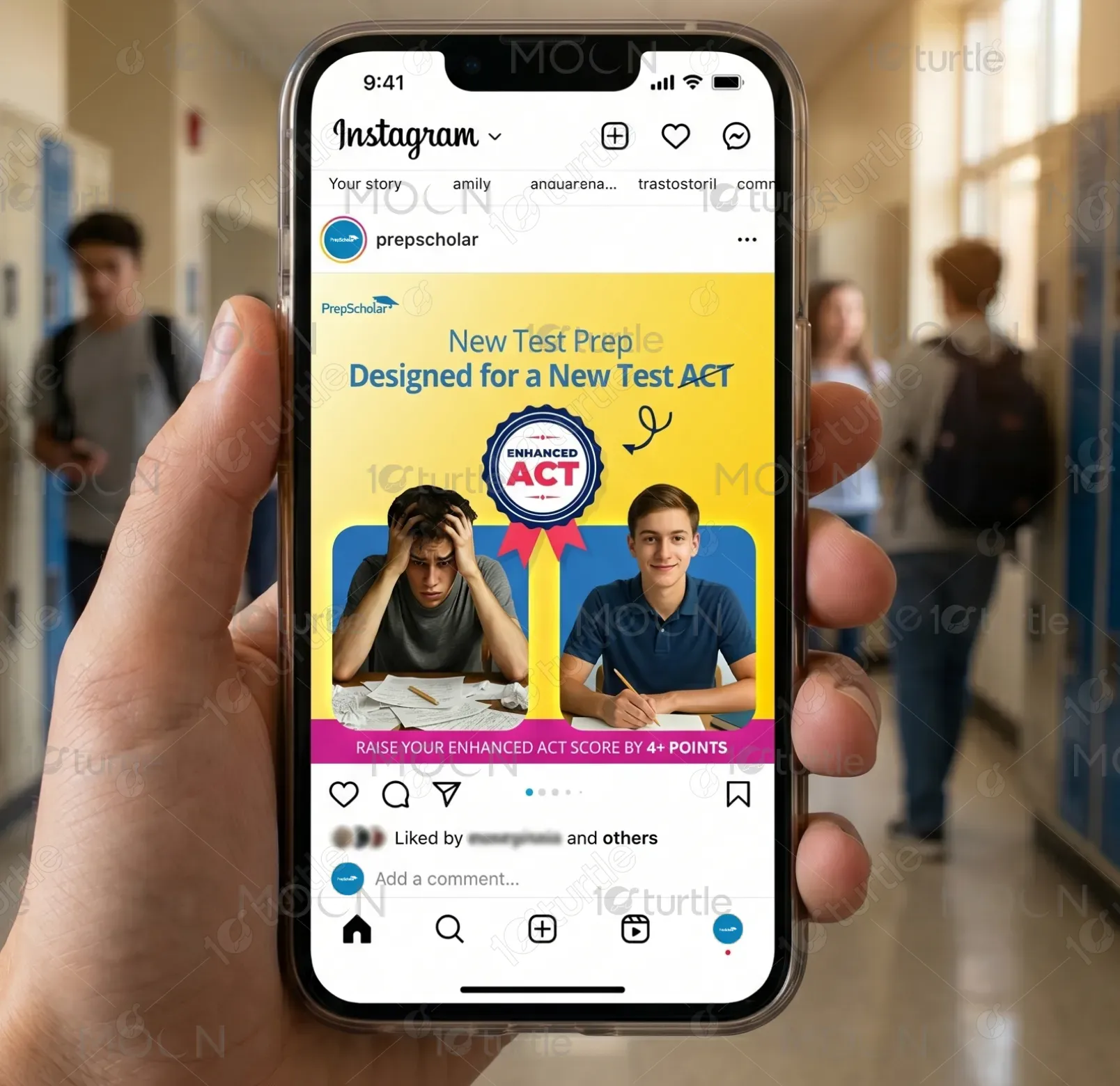
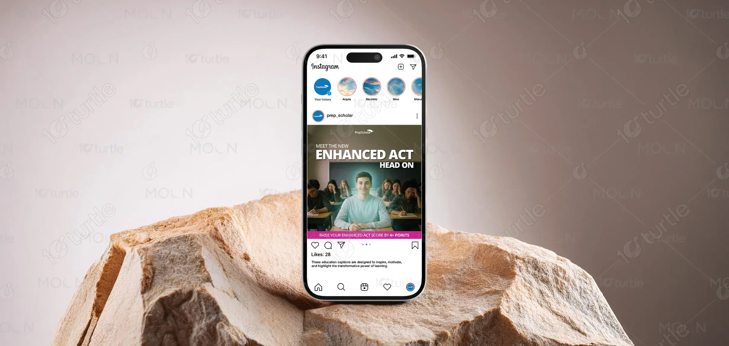
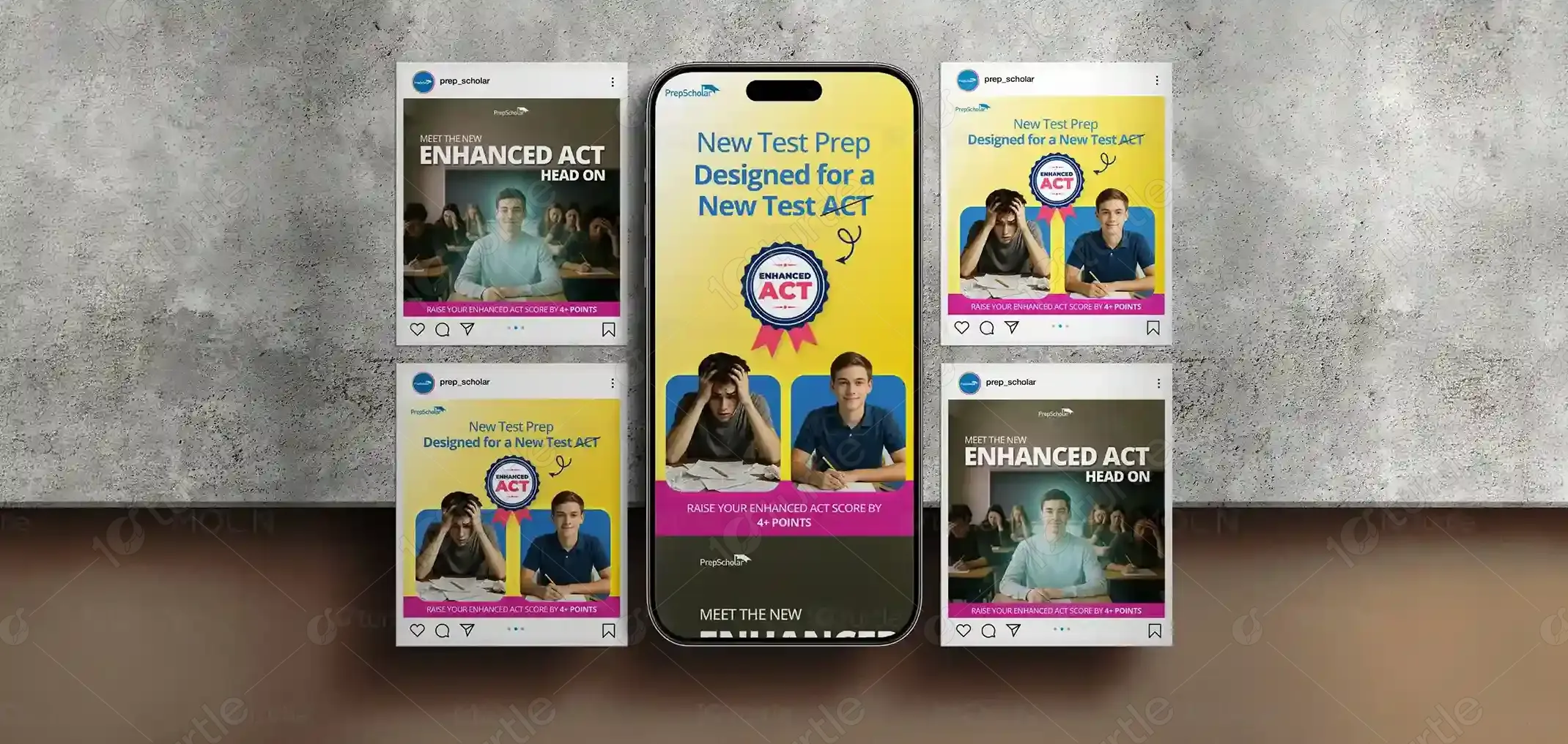
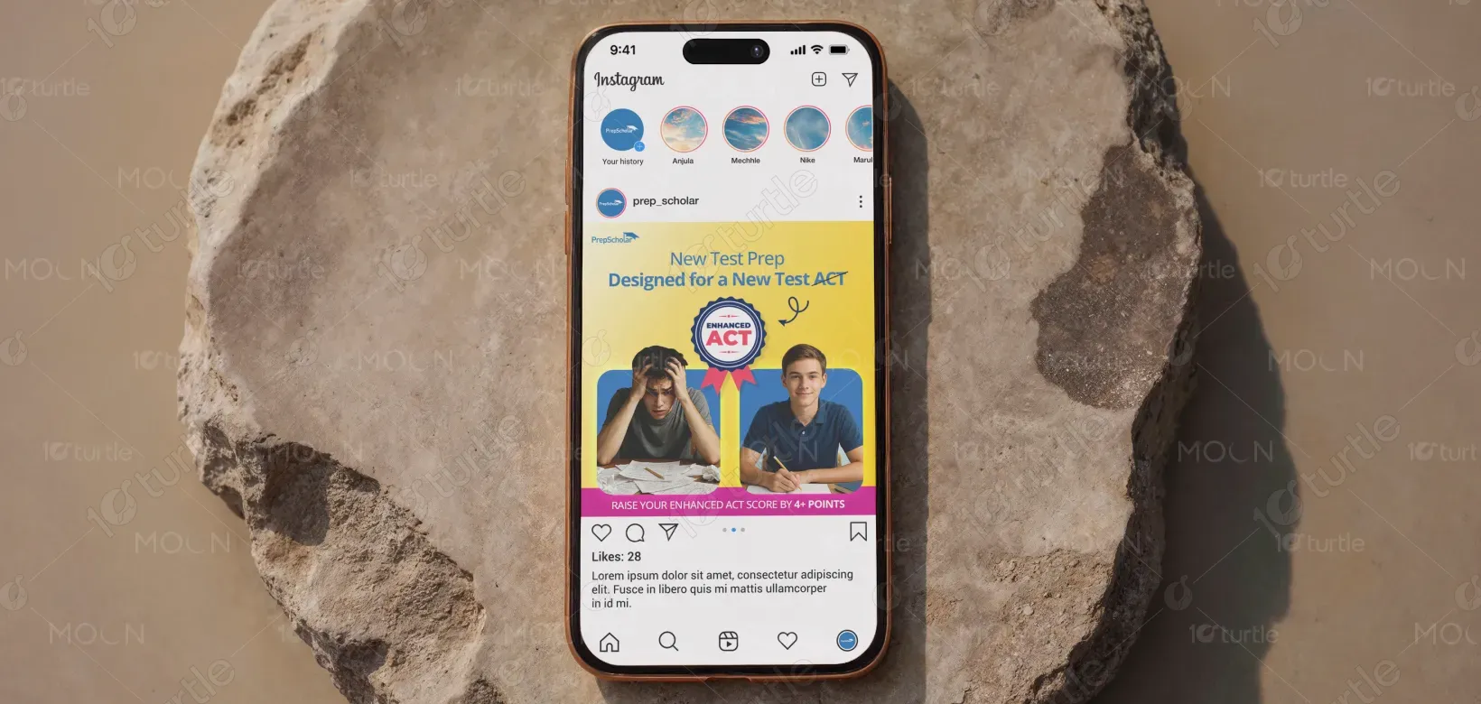
The design concept focuses on creating a bold, aspirational, and student-centered visual identity for PrepScholar’s Enhanced ACT campaign. The layout uses a clear before-and-after storytelling approach, contrasting exam stress with confidence and success. Strong typography emphasizes the “Enhanced ACT” message, while bright brand colors like yellow, blue, pink, and white create energy and trust. Clean composition, engaging student imagery, and badge-style highlights reinforce credibility, making the design visually impactful, modern, and highly relatable for students preparing for competitive exams.
Post Design
Graphic Design
Industry
Education & Training
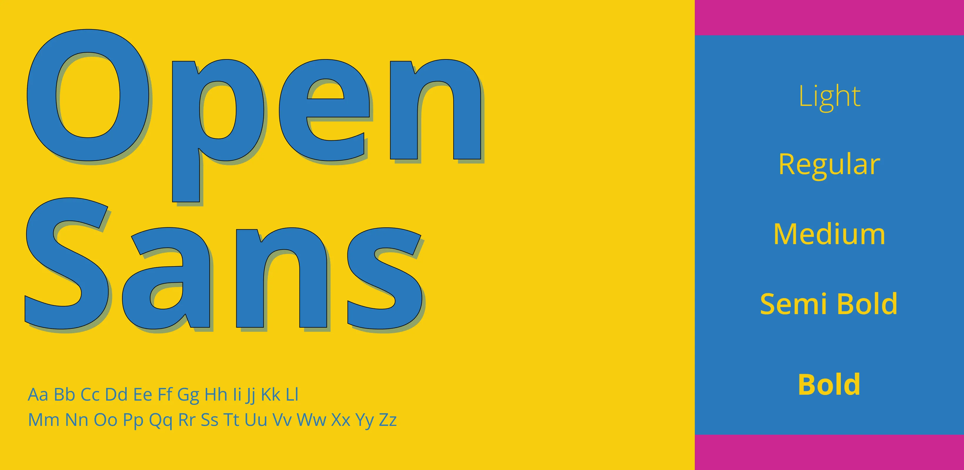
Tools we used


Project Completion
2025
Key Market
Global
This design promotes PrepScholar’s Enhanced ACT preparation program, created to help students confidently adapt to the new ACT exam format. The purpose of the campaign is to communicate trust, academic success, and score improvement in a visually engaging way. It fits strongly within the education and test-preparation market by addressing student anxiety around changing exam patterns.

Industry
Education & TrainingWhat we did
Post DesignGraphic DesignPlatform
-One of the major challenges in test-preparation marketing is communicating trust and results quickly in a crowded digital space. Students and parents are often overwhelmed by multiple coaching options, making it difficult for educational brands to stand out. With the introduction of the Enhanced ACT, confusion and anxiety increased because students were unsure how the new format would impact their preparation strategies.
The design solves this challenge by combining emotional storytelling with clear performance messaging. Instead of only promoting the product, it visually represents the student journey—from stress and confusion to confidence and success. This makes the message instantly relatable and memorable.
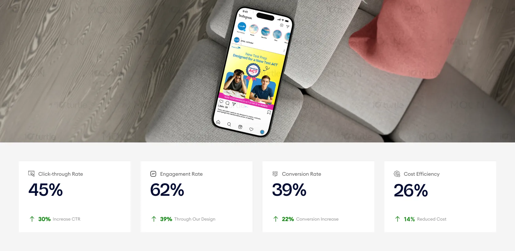
The design effectively communicates the message of academic success through a clean, visually dynamic approach, which resonates strongly with the target audience of students. The use of bright colors, confident student imagery, and structured storytelling results in a marked increase in click-through and engagement rates. These metrics reflect the design’s ability to attract attention and drive conversions, which contributes to improved cost efficiency for the campaign.
The long-term vision for this design is to establish PrepScholar as the most trusted and modern solution for Enhanced ACT preparation. The goal is not just to promote a course, but to create a strong educational brand identity that students immediately associate with confidence, results, and academic success. As the education market becomes more digital and competitive, the design aims to evolve into a scalable campaign system across social media, landing pages, advertisements, and student success stories.

The color palette uses Yellow, Blue, Pink, White, and Dark Neutral tones to create a vibrant yet trustworthy brand experience. Yellow represents energy, optimism, and attention-grabbing visibility, making it ideal for student-focused campaigns. Blue builds trust, professionalism, and academic credibility, aligning strongly with the education sector.