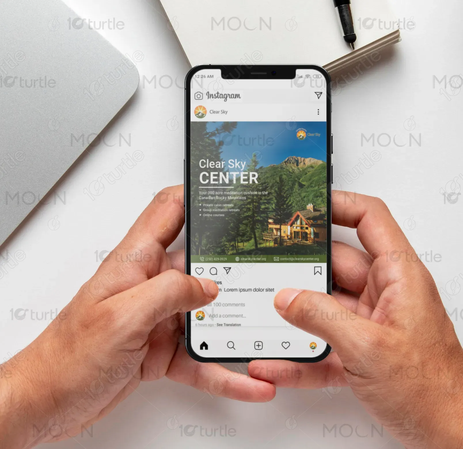
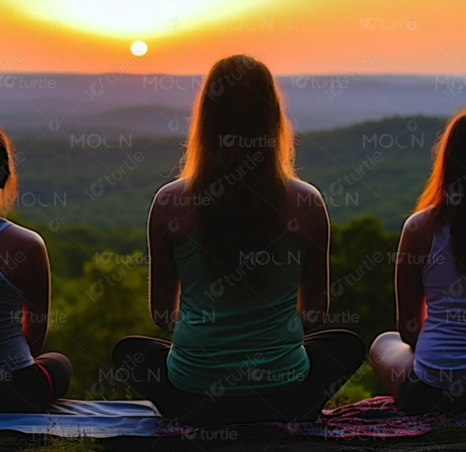
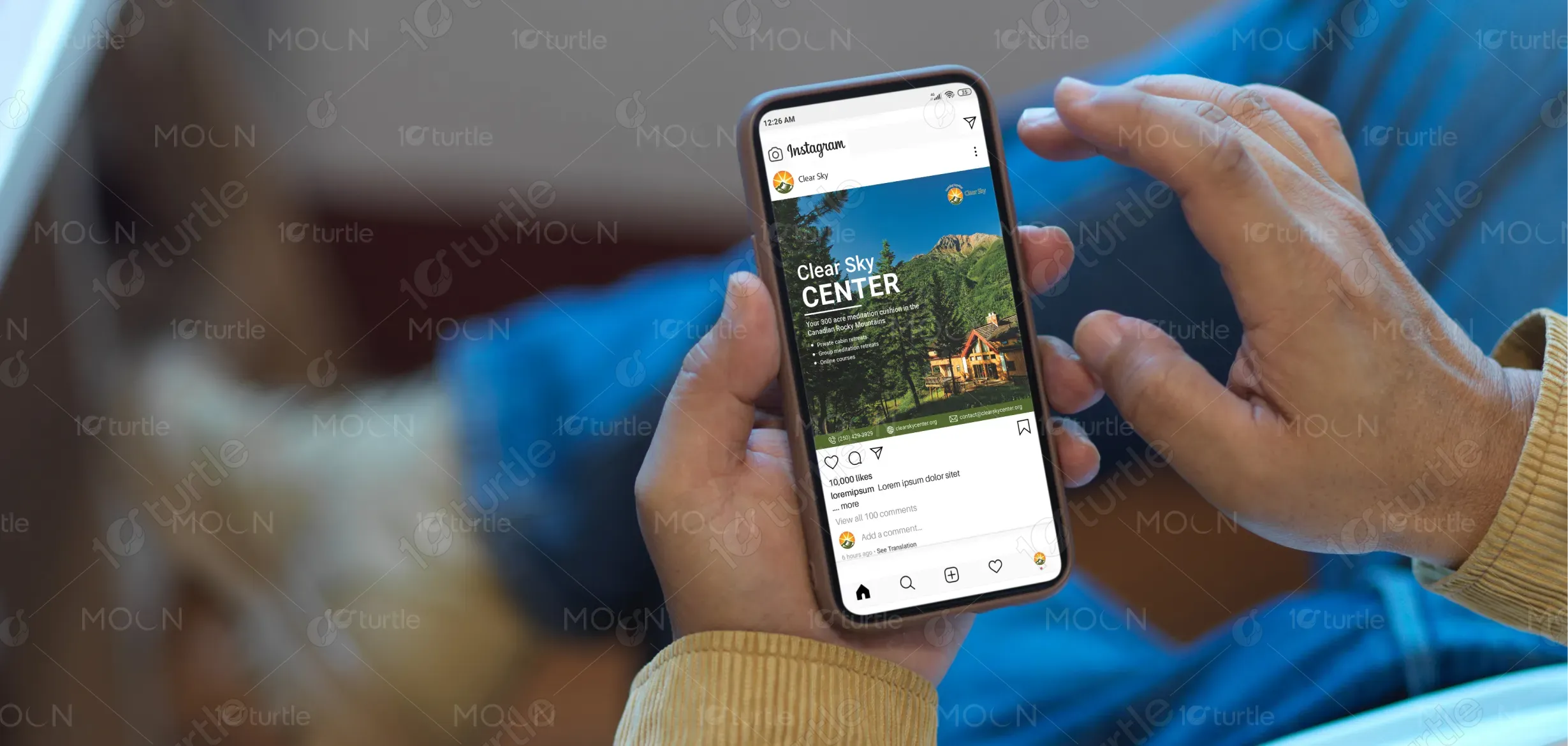
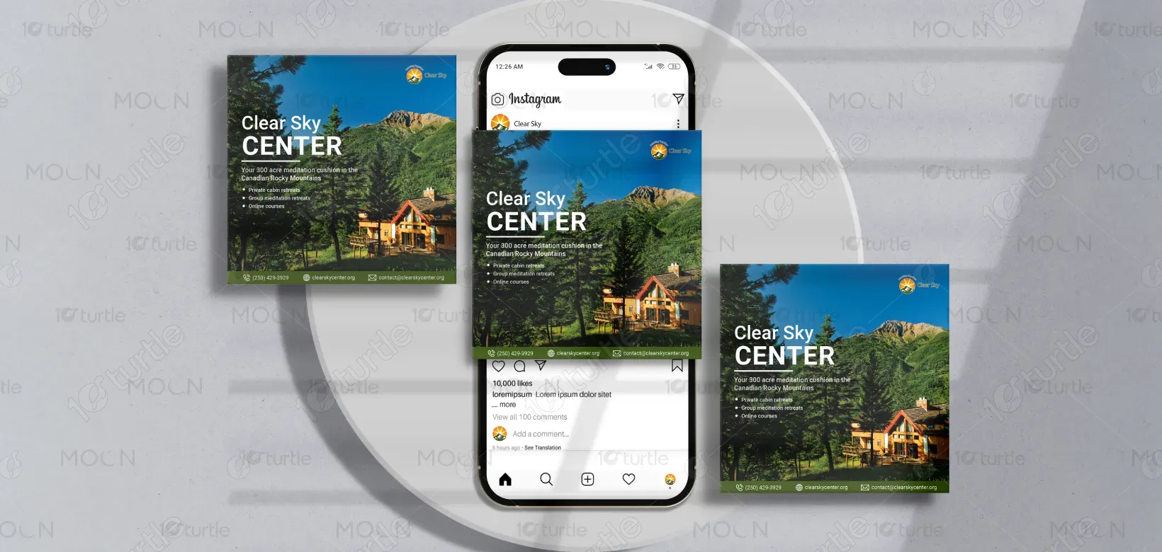
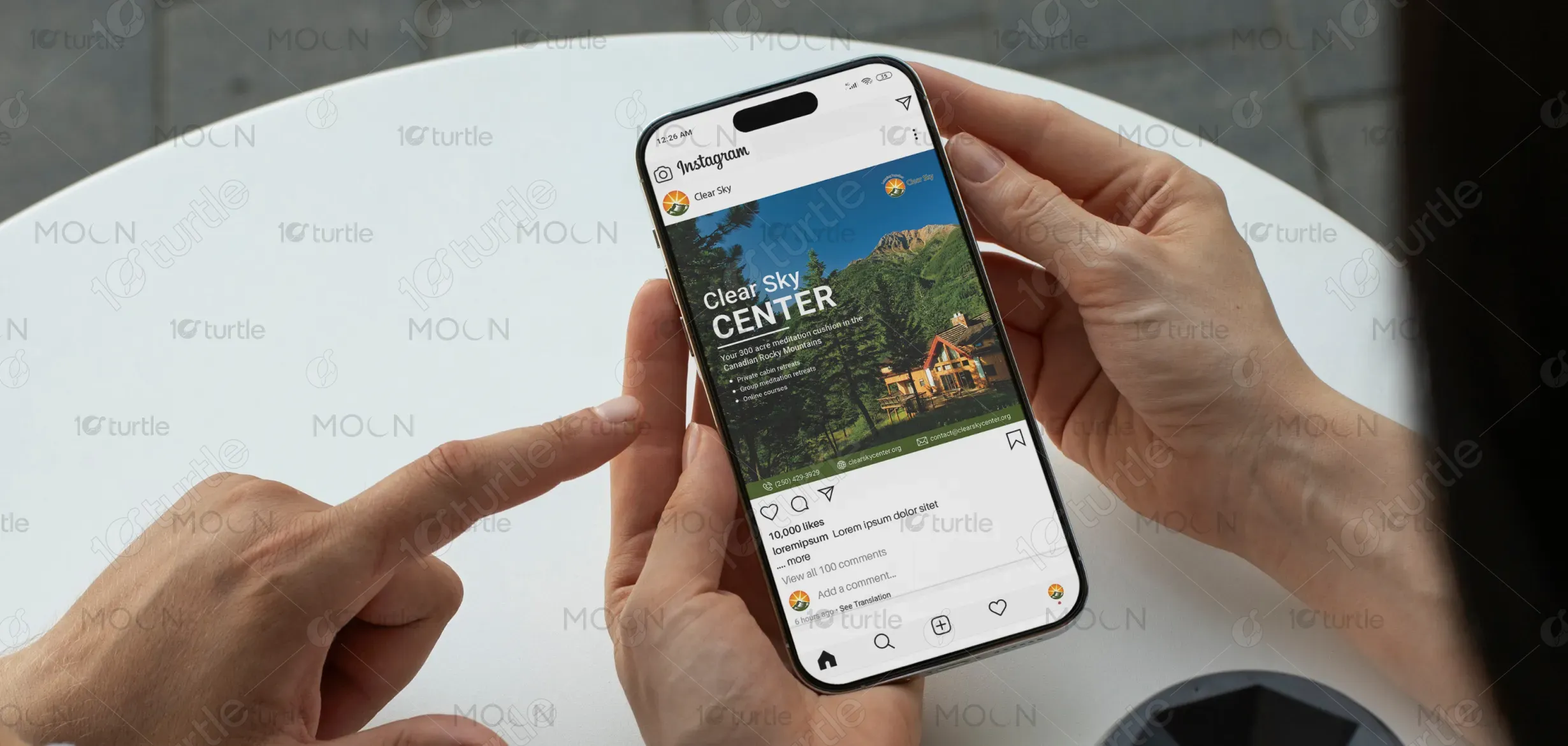
The design embraces a serene, minimalist aesthetic that reflects the essence of mindfulness and spiritual clarity. Soft, nature-inspired tones and clean typography create a harmonious balance between modern visual appeal and traditional wisdom. The layout emphasizes openness and space, evoking calm and focus—mirroring the center’s commitment to meditation and sustainable living. Every visual choice, from color to imagery, is intentional in guiding the viewer toward peace, reflection, and a deeper connection with the Clear Sky brand identity.
Post Design
Graphic Design

Industry
Healthcare & Wellness
Tools we used


Project Completion
2025
Key Market
Global
This design concept represents Clear Sky Center, a spiritual retreat and meditation hub that integrates mindfulness, community, and sustainability. Its purpose is to visually communicate the center’s holistic approach to well-being while appealing to individuals seeking meaningful experiences. Unique selling points include its role as a modern monastery, its eco-conscious practices, and its blend of ancient wisdom with contemporary design. The aesthetic combines calm visuals with approachable modernity, ensuring relevance in both spiritual and lifestyle markets.
Industry
Healthcare & WellnessWhat we did
Post DesignGraphic DesignPlatform
-The main challenge lies in differentiating spiritual and meditation-focused businesses in a crowded wellness industry. Many brands use generic imagery (e.g., lotus flowers, Buddha icons, or overused “zen” visuals), which lack uniqueness and dilute authenticity. For a brand like Clear Sky, it’s crucial to communicate both its spiritual depth and modern, sustainable ethos. The gap exists because audiences often associate meditation centers with outdated or overly niche visuals, making it harder to resonate with younger, conscious seekers.
This design avoids clichés by focusing on a clean, contemporary visual system rooted in nature and mindfulness. Instead of traditional symbols, it highlights open spaces, sustainable color palettes, and storytelling imagery that capture the essence of community, environment, and awakening. Typography is bold yet elegant, offering readability with personality. The design integrates spiritual warmth with modern professionalism, appealing to both new practitioners and experienced seekers. It effectively builds trust while reinforcing Clear Sky’s unique positioning as a modern monastery.
The long-term vision is to establish Clear Sky as a globally recognized brand for mindful living, spiritual retreat, and sustainable community models. The design aspires to create a timeless identity that can evolve into digital platforms, event branding, merchandise, and educational materials. By visually aligning with peace, clarity, and innovation, the brand seeks to inspire individuals worldwide to embrace spiritual growth, environmental stewardship, and conscious living—leaving a lasting impression across industries like wellness, sustainability, and spiritual education.
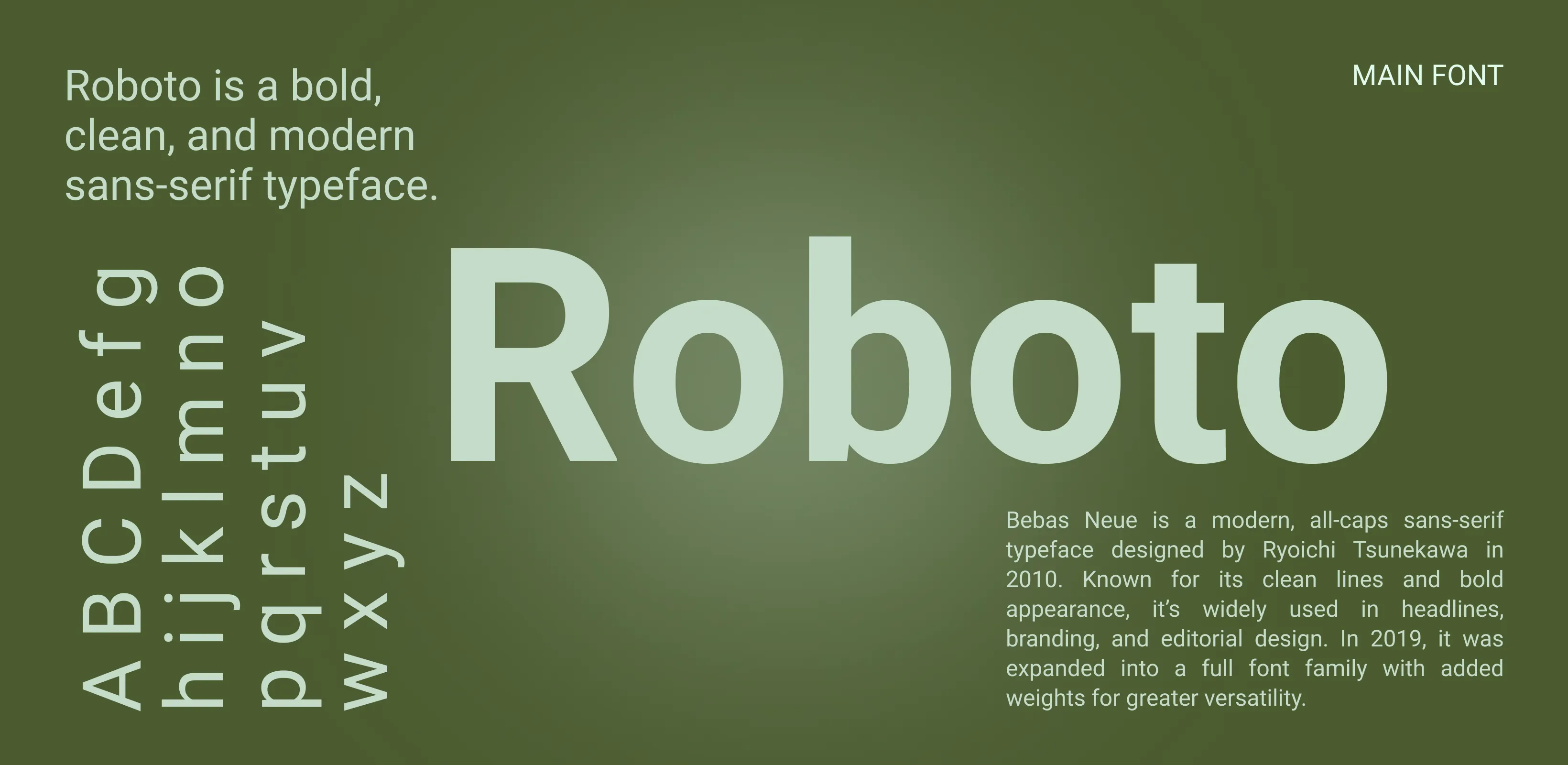
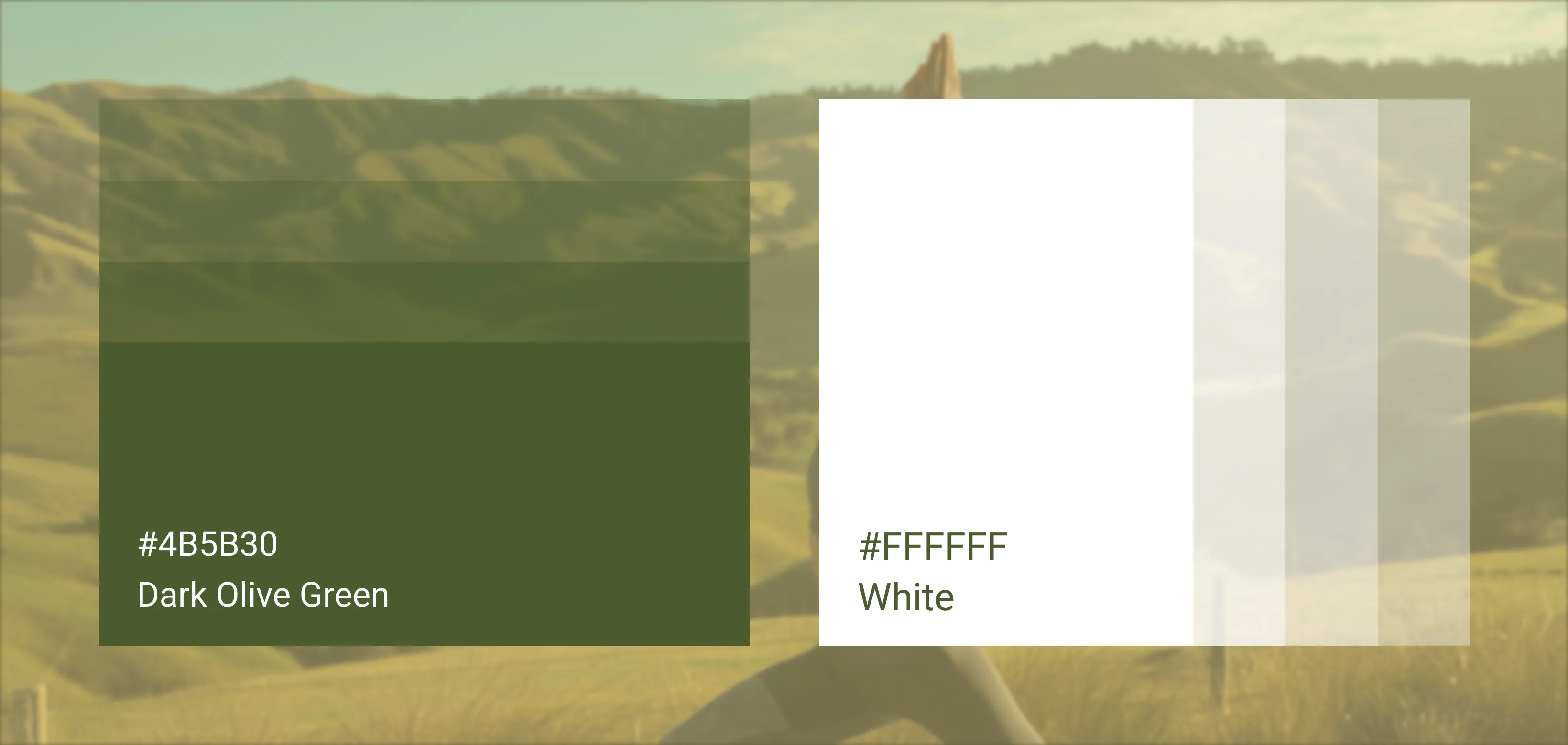
The palette draws inspiration from natural elements—earthy greens, calming blues, soft neutrals, and warm golden accents. Green reflects growth and harmony with nature, blue conveys peace and trust, neutrals embody simplicity and mindfulness, while gold symbolizes enlightenment and spiritual aspiration. This color scheme aligns with Clear Sky’s identity as a sustainable, awakening-centered community. Together, the hues evoke tranquility, encourage reflection, and create a cohesive aesthetic that is both soothing and professional, ensuring a strong emotional and visual connection with the audience.