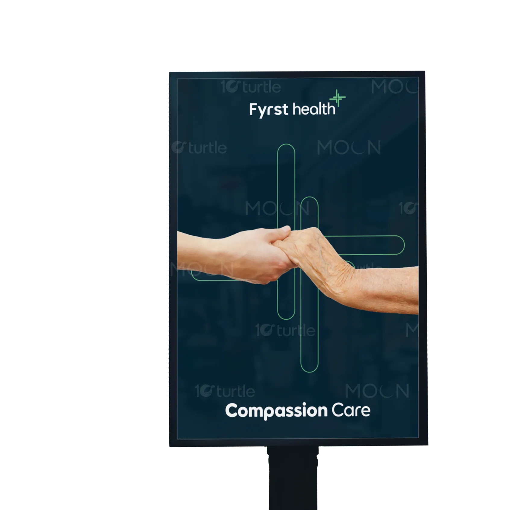
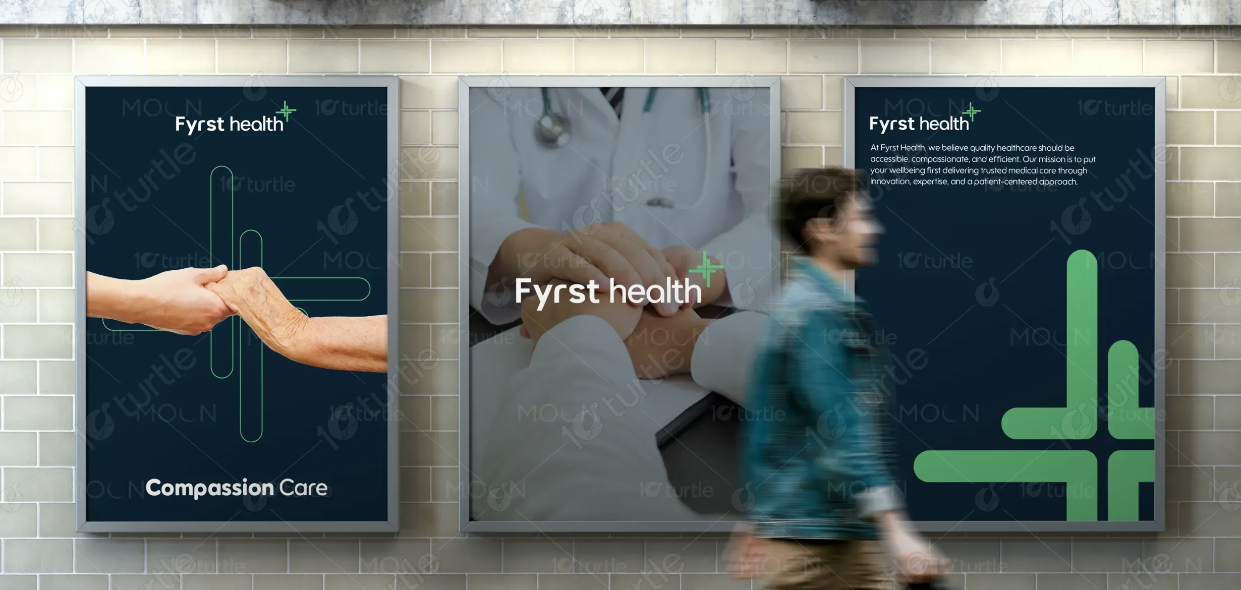
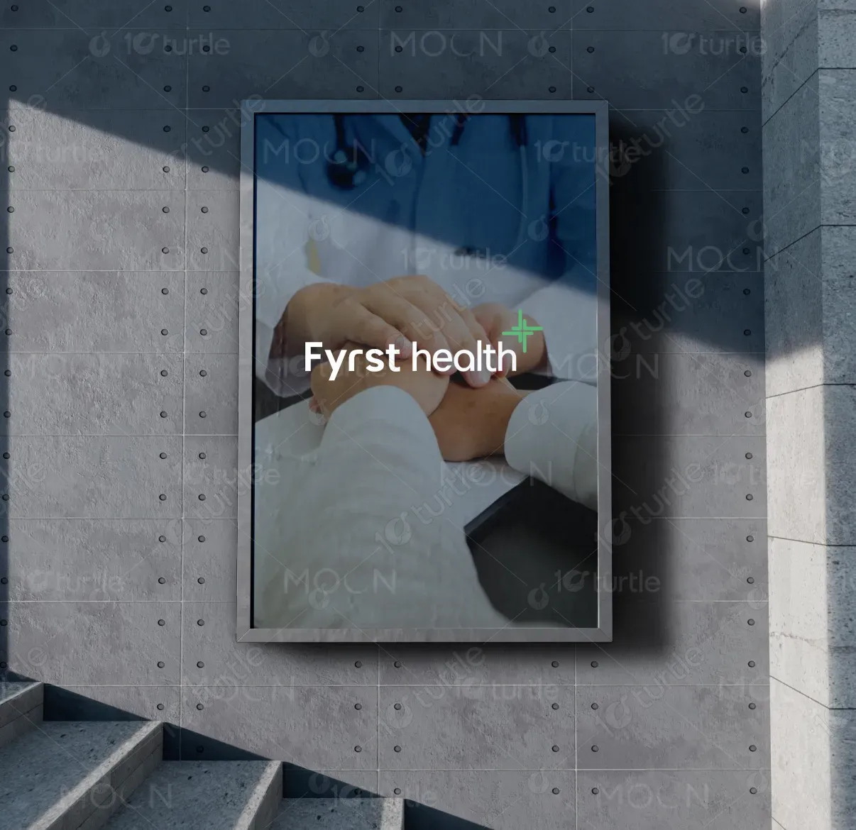
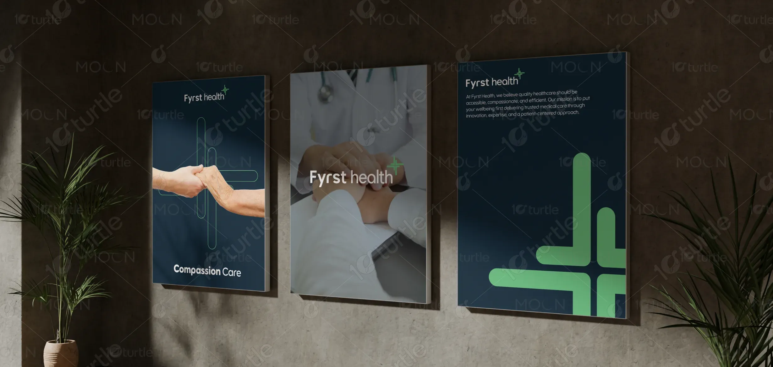
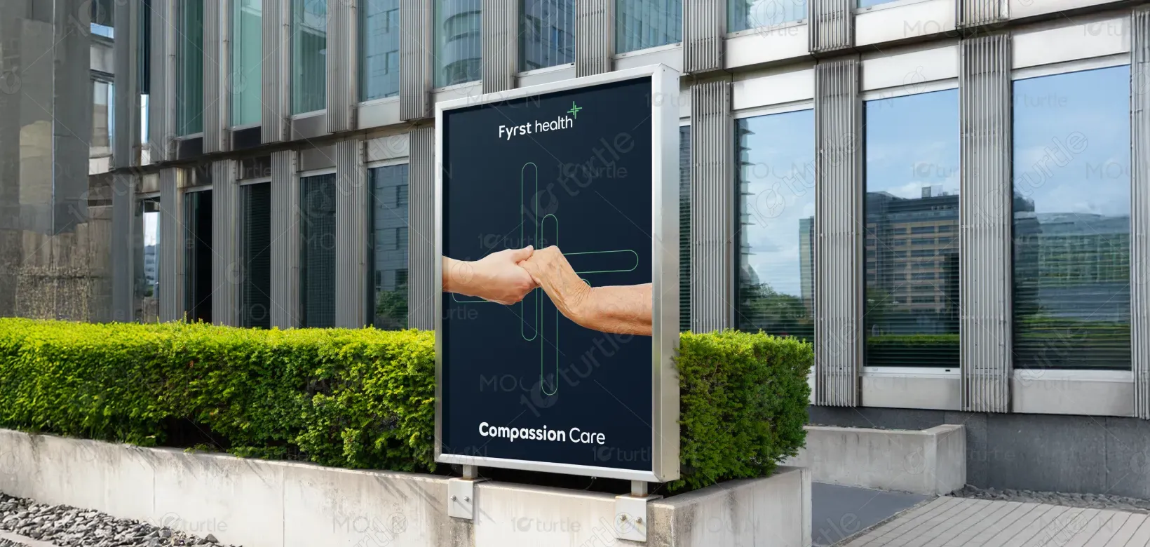
The poster design follows a clean, modern healthcare aesthetic that balances professionalism with warmth. A deep navy background establishes trust and credibility, while the soft green cross-inspired graphic elements symbolize care, healing, and medical precision. The layout uses a structured three-panel composition to create visual rhythm and clarity. Strong typography ensures readability from a distance, while high-quality imagery of patient-doctor interaction reinforces compassion and human connection. The visual hierarchy prioritizes brand recognition, emotional engagement, and message clarity, making the design effective in high-traffic public environments.
Poster Design
Graphic Design
Industry
Healthcare & Wellness
Tools we used


Project Completion
2026
Key Market
Global
This design represents Fyrst Health’s commitment to compassionate, accessible, and patient-centered healthcare. Its primary purpose is to build brand awareness while visually communicating trust, care, and professionalism. Positioned within the healthcare industry, the design highlights key brand values: empathy, innovation, and reliability. The poster functions as both a branding tool and a reassurance message to patients, reinforcing that Fyrst Health prioritizes both medical excellence and human connection.

Industry
Healthcare & WellnessWhat we did
Poster Design Graphic DesignPlatform
-Healthcare brands often struggle with appearing either too clinical and impersonal or overly generic and indistinct. Poor visual differentiation and unclear messaging can reduce patient trust and brand recall. In high-traffic environments such as transit areas or public corridors, designs must quickly communicate credibility and emotional reassurance. Without clear hierarchy and strong branding, healthcare communication risks being overlooked or misunderstood.
The design addresses these challenges through a strategic combination of emotional imagery and structured branding. The compassionate hand-holding visual humanizes the service, while consistent logo placement strengthens brand recognition. The minimal typography ensures clarity at a distance, and the bold cross-inspired graphic elements create a distinctive, scalable brand motif. The clean layout enhances accessibility, ensuring the message is easily understood within seconds. This user-centric design approach improves engagement, trust, and memorability.

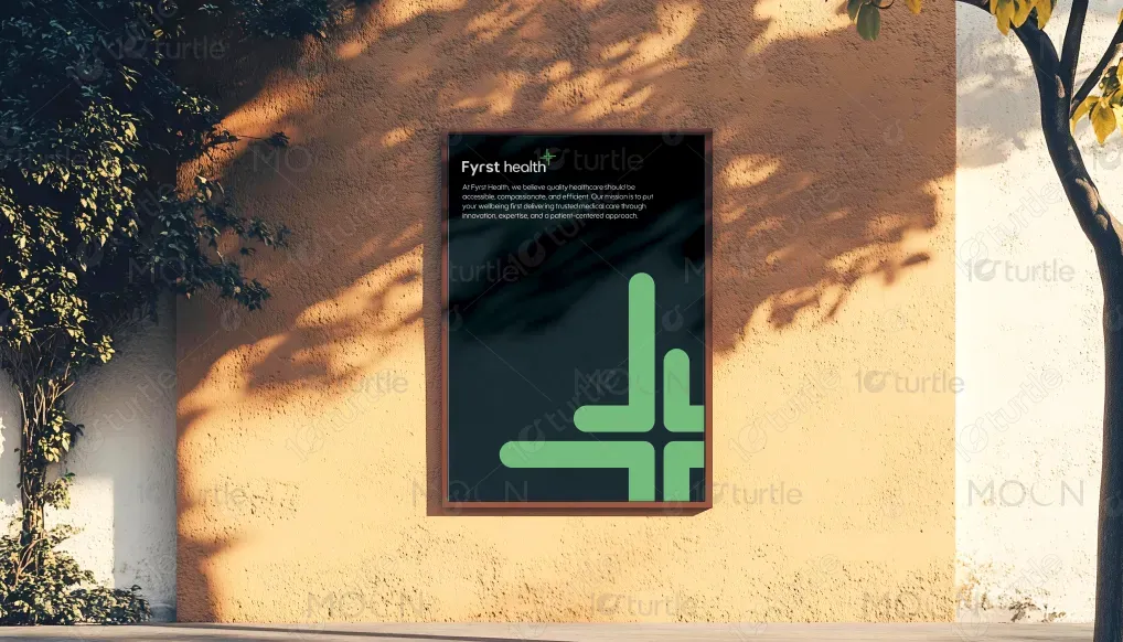
The design supports Fyrst Health’s long-term vision of becoming a recognizable and trusted healthcare provider. Its visual system—anchored by the cross graphic and consistent color palette—can extend seamlessly across digital platforms, clinic interiors, marketing materials, and outdoor advertising. By building a cohesive visual identity, the brand positions itself as modern, compassionate, and forward-thinking within the healthcare industry. Over time, this consistency strengthens brand equity and patient loyalty.
The color palette is soft, neutral, and understated, allowing photography to remain the focal point. Muted grays, warm earth tones, and natural highlights create a calm, elegant atmosphere that feels timeless rather than trend-driven. Supporting visual elements—such as clean typography, subtle contrasts, and consistent margins—enhance readability and recognition while reinforcing a refined, modern visual language suitable across print and digital environments.