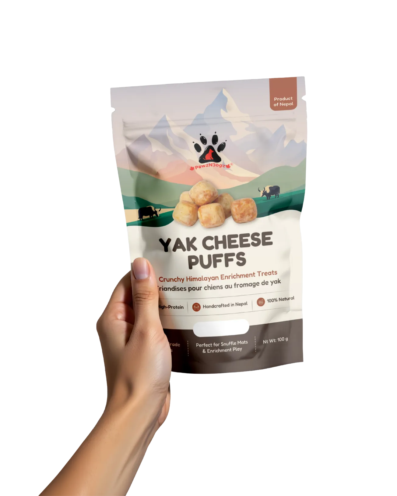
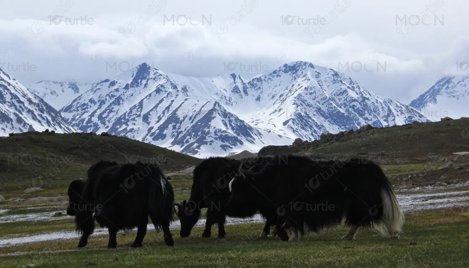
The pouch design follows a clean, heritage-inspired direction rooted in its Himalayan origin. Mountain landscapes and grazing yaks highlight authenticity and source transparency, while the bold, centered “Yak Cheese Puffs” ensures strong shelf visibility. Key claims like High-Protein, Handcrafted in Nepal, and 100% Natural are presented as icons for quick scanning. Warm earthy tones reinforce natural sourcing, and the structured layout keeps nutritional details clear and easy to read—balancing storytelling with functionality.
Pouch Design
Graphic Design
Industry
Consumer Goods & Retail
Tools we used


Project Completion
2025
Key Market
Global
This design represents a premium dog treat product made from Himalayan yak cheese, positioned within the natural and high-protein pet nutrition market. The primary purpose of the packaging is to communicate product purity, origin, and health benefits while ensuring strong shelf presence in retail environments. With features such as “Human Grade Treats,” “Perfect for Snuffle Mats & Enrichment Play,” and clear nutritional breakdowns, the packaging supports both emotional appeal (natural origin) and functional reassurance (nutrition transparency). It aligns with the growing pet-parent demand for clean-label, ethically sourced, and protein-rich treats.
Industry
Consumer Goods & RetailWhat we did
Pouch DesignGraphic DesignPlatform
-The pet treat industry is saturated with generic packaging, unclear ingredient sourcing, and artificial positioning. Many products fail to differentiate themselves or communicate trust effectively. Consumers increasingly seek transparency regarding ingredients, origin, and nutritional value, but packaging often lacks hierarchy and clarity. This leads to confusion, reduced shelf impact, and hesitation in purchase decisions. Without a strong visual narrative and structured information, premium products risk blending into a crowded marketplace.
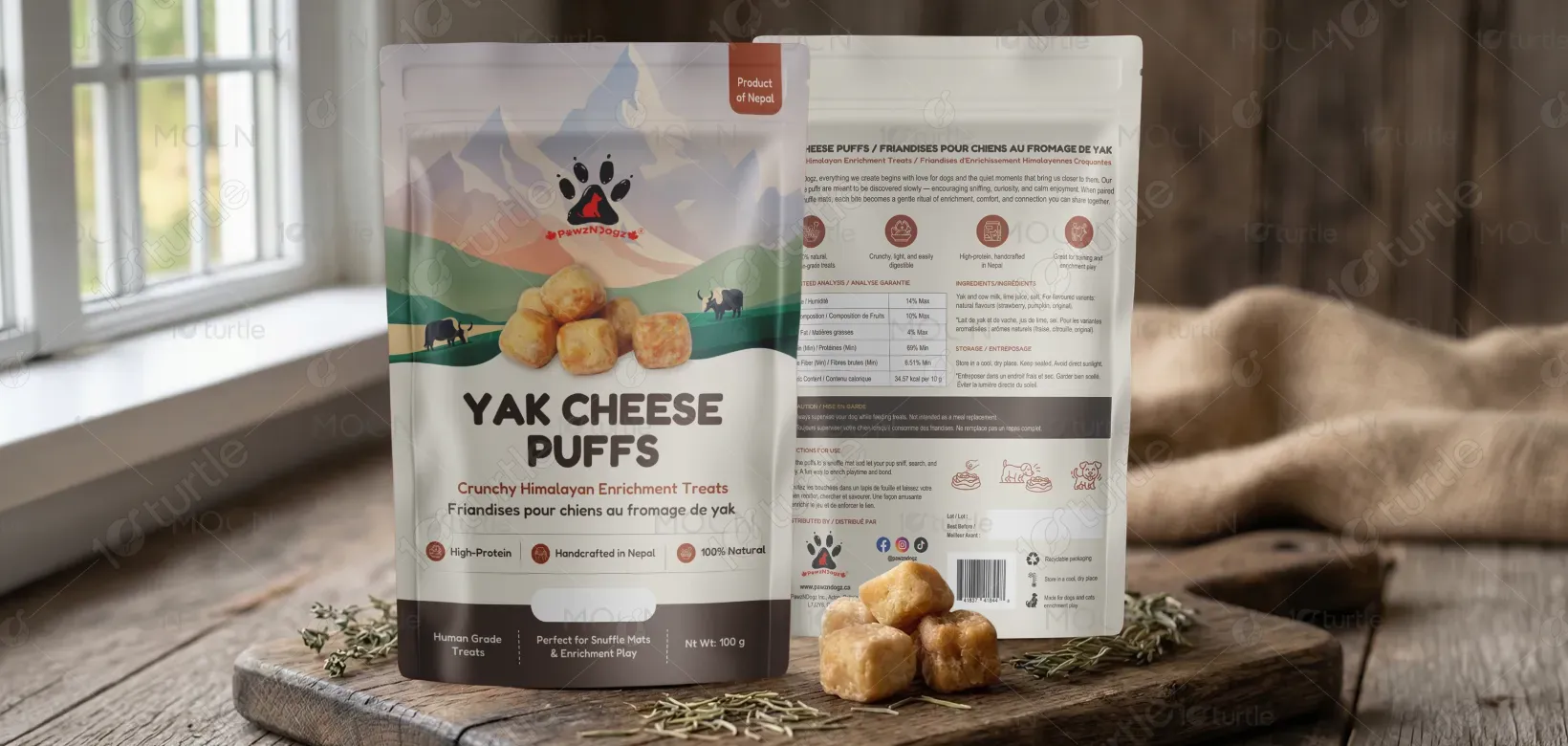
The design addresses these challenges through a combination of visual storytelling and structured communication. The Himalayan mountain illustration and “Product of Nepal” badge immediately establish authenticity. Clear typographic hierarchy ensures the product name is dominant, followed by benefit-driven descriptors. Icons simplify key selling points, allowing customers to absorb information quickly. Nutritional tables and ingredient information are presented in a clean, organized grid to enhance readability and trust. The earthy tones and natural visuals reinforce purity and quality, positioning the product as both premium and wholesome.

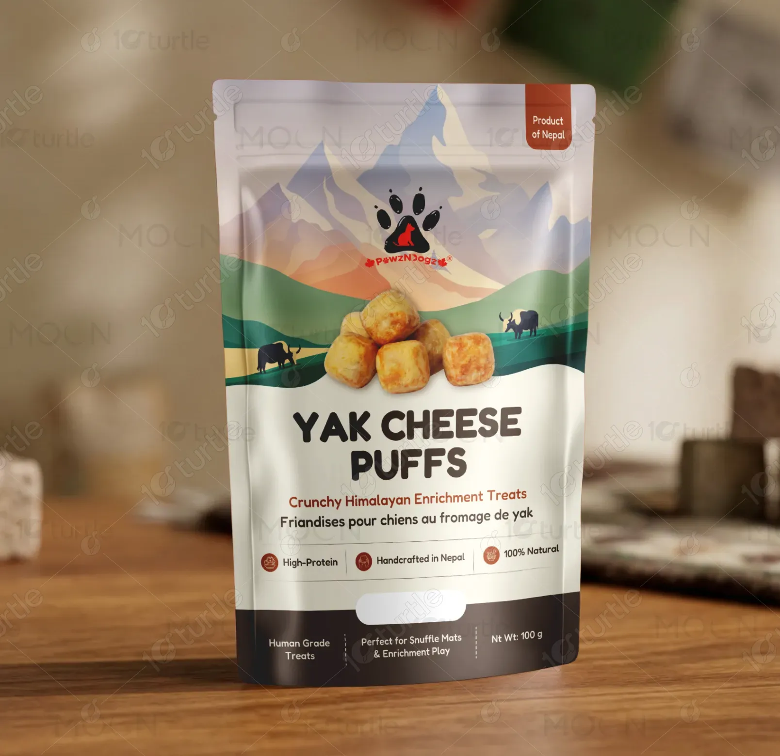
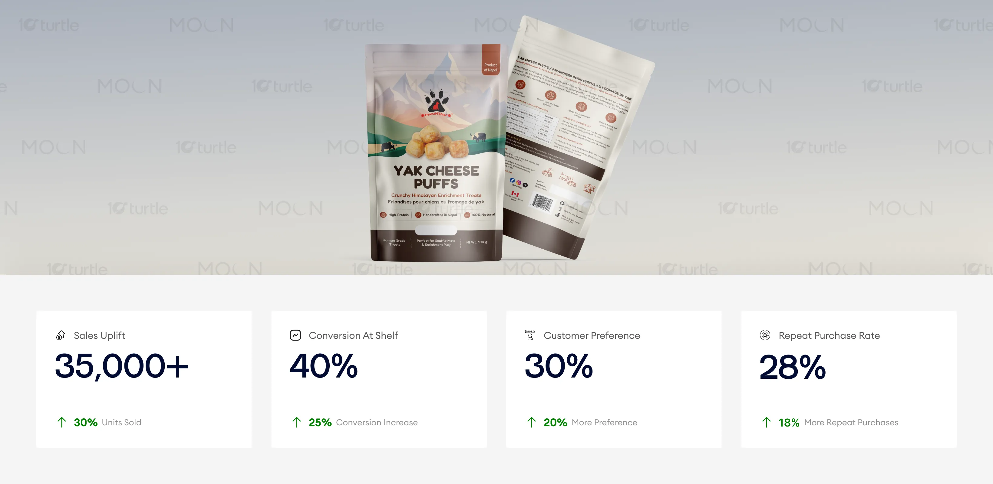
The packaging design plays a pivotal role in establishing brand identity and consumer trust, effectively conveying the product’s authentic and natural qualities. The design enhances the product’s shelf presence and accessibility through clear claims, functional layout, and visual storytelling. These elements, combined with strong shelf visibility and natural sourcing claims, contributed significantly to higher sales, repeat purchases, and overall consumer engagement.
The long-term vision is to establish the brand as a trusted Himalayan-origin pet nutrition specialist. The design system is scalable, allowing for future flavor extensions or product variants while maintaining visual consistency. The strong origin story and natural positioning create a foundation for brand storytelling across e-commerce, retail shelves, and digital marketing. Over time, this cohesive identity supports brand recognition, customer loyalty, and expansion into broader natural pet care categories.
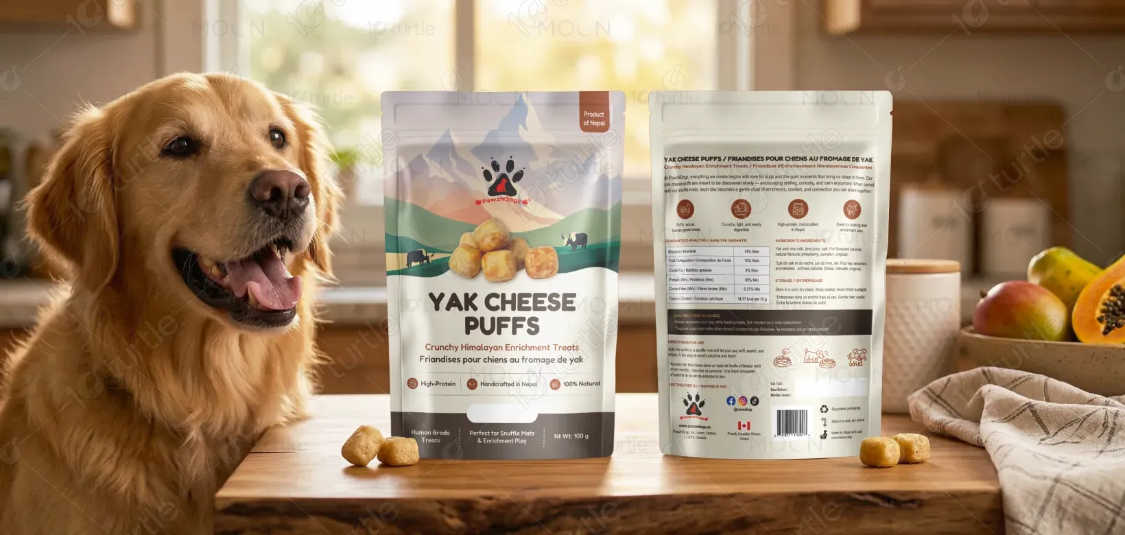
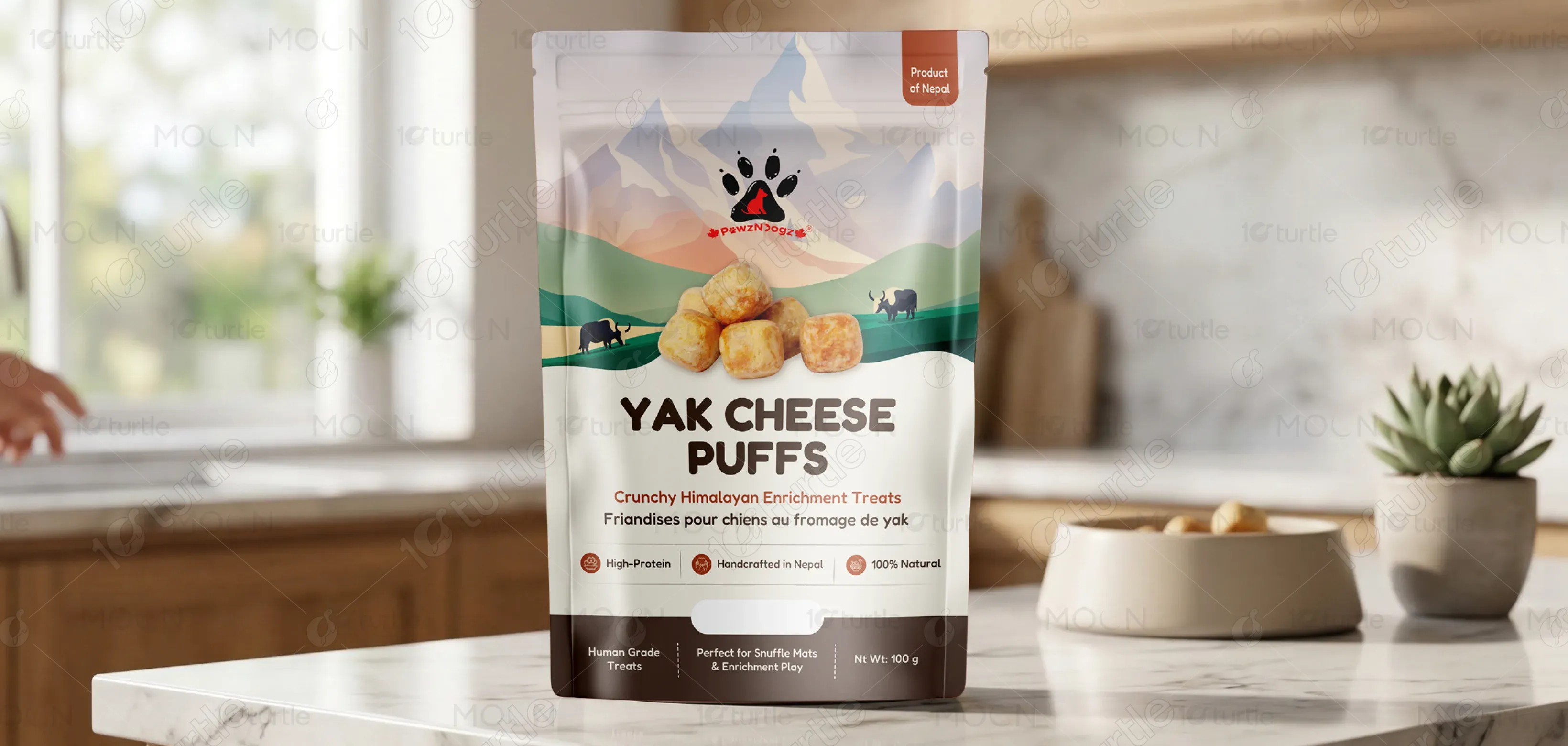
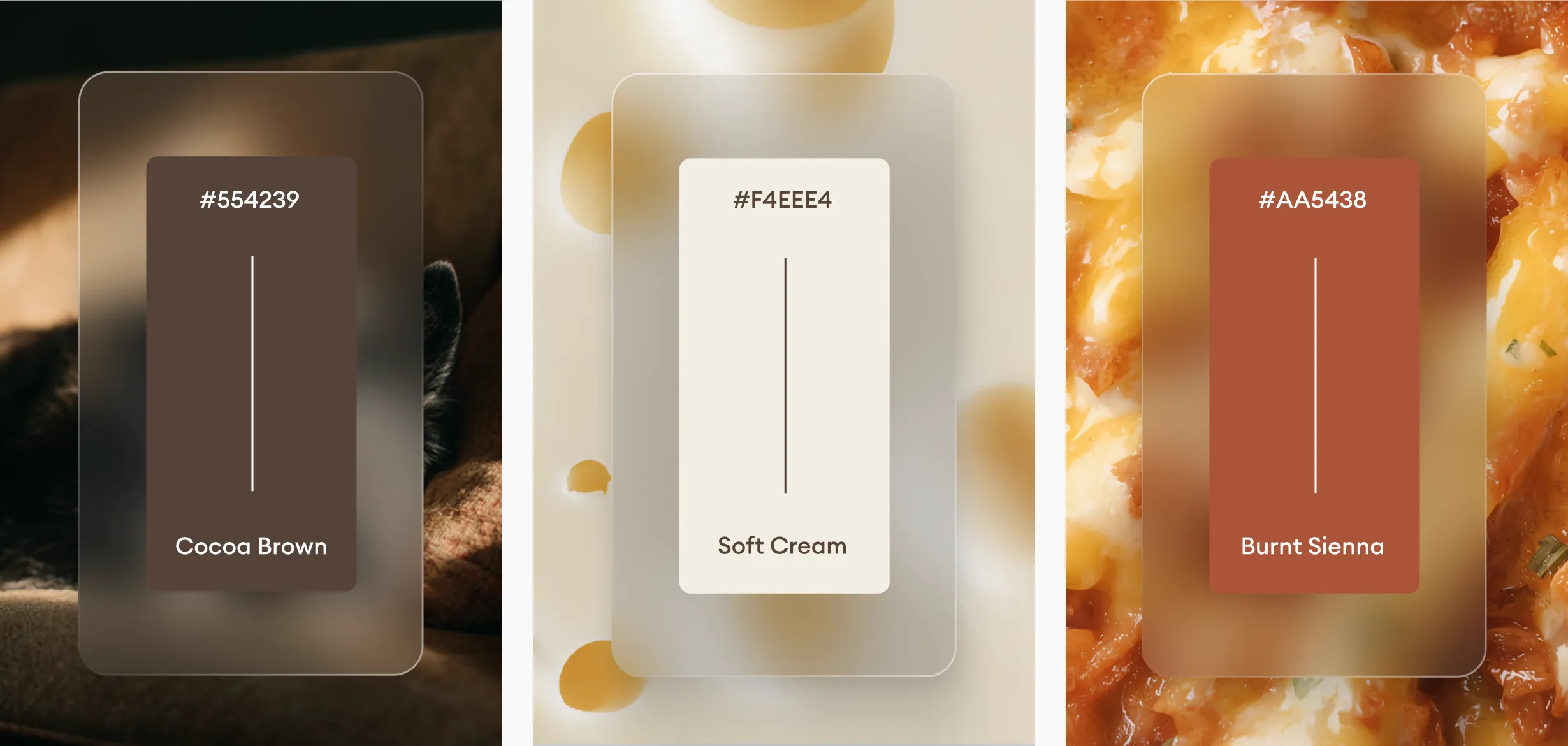
The color palette consists of warm earthy browns, soft Himalayan beige tones, muted greens, and natural cream backgrounds. These colors evoke authenticity, purity, and organic sourcing. The brown base conveys strength and protein richness, while the lighter mountain hues suggest freshness and altitude-origin quality. Supporting icons and badges use minimal contrast accents to maintain visual consistency without overwhelming the layout. The overall visual language blends rustic authenticity with modern clarity, ensuring strong recognition across print, retail shelving, and digital displays.