The design adopts a bold and modern approach, using a vibrant color palette of pink to emphasize the brand's dynamic and professional image. The layout prioritizes clarity with large, easy-to-read typography, and a structured, grid-based layout that guides the viewer through key sections. Imagery and icons are strategically placed to ensure seamless flow and readability. The consistent use of visual hierarchy and alignment ensures that each slide serves its function, whether to inform or engage.
PPT Design
Graphic Design
Industry
Property, Construction & Real Estate
Tools we used


Project Completion
2025
Key Market
Global
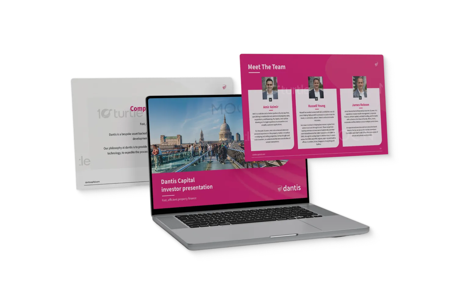
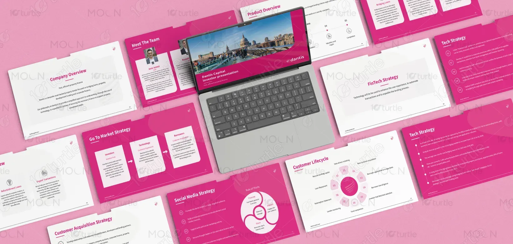
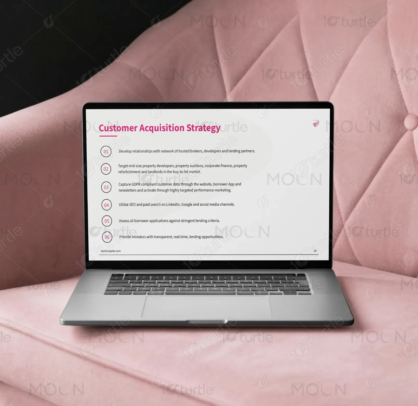
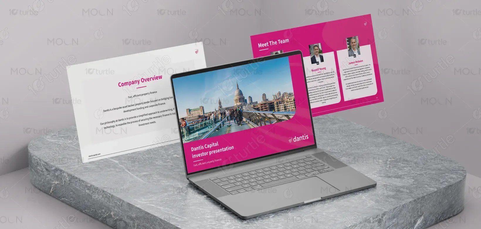
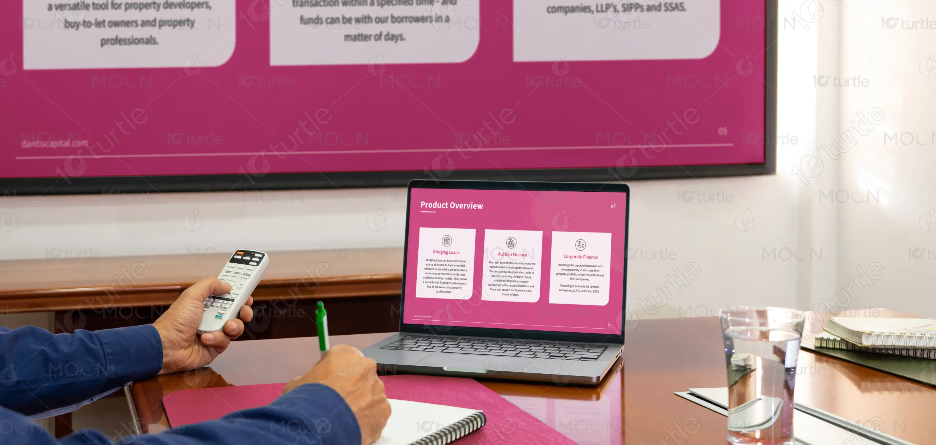
The design represents Dantis Capital’s investor presentations, highlighting their unique value propositions in property finance. It presents their services in Bridging Loans, Auction Finance, and Corporate Finance, while also offering insights into their customer acquisition strategies. This approach helps position Dantis Capital as an efficient and trustworthy partner in the property finance industry, with a focus on fast, reliable, and tailored solutions.

Industry
Property, Construction & Real EstateWhat we did
PPT DesignGraphic DesignPlatform
-Many potential clients in the property finance industry struggle with understanding the complex processes and options available. This lack of clarity often leads to missed opportunities and lower engagement. The industry’s visual communication often fails to reflect the speed and reliability that clients require. Dantis Capital's design aims to address these issues by simplifying information flow, offering clear visual communication, and ensuring that their services stand out in a crowded market.
The design takes a user-centric approach by providing concise information and intuitive navigation through visual hierarchy. Each slide follows a logical progression, ensuring that the audience can easily absorb the information. Strategic use of imagery, icons, and typography makes the complex financial concepts more digestible. The clean, minimal layout allows for a consistent visual experience that supports easy comprehension, thus enhancing engagement.

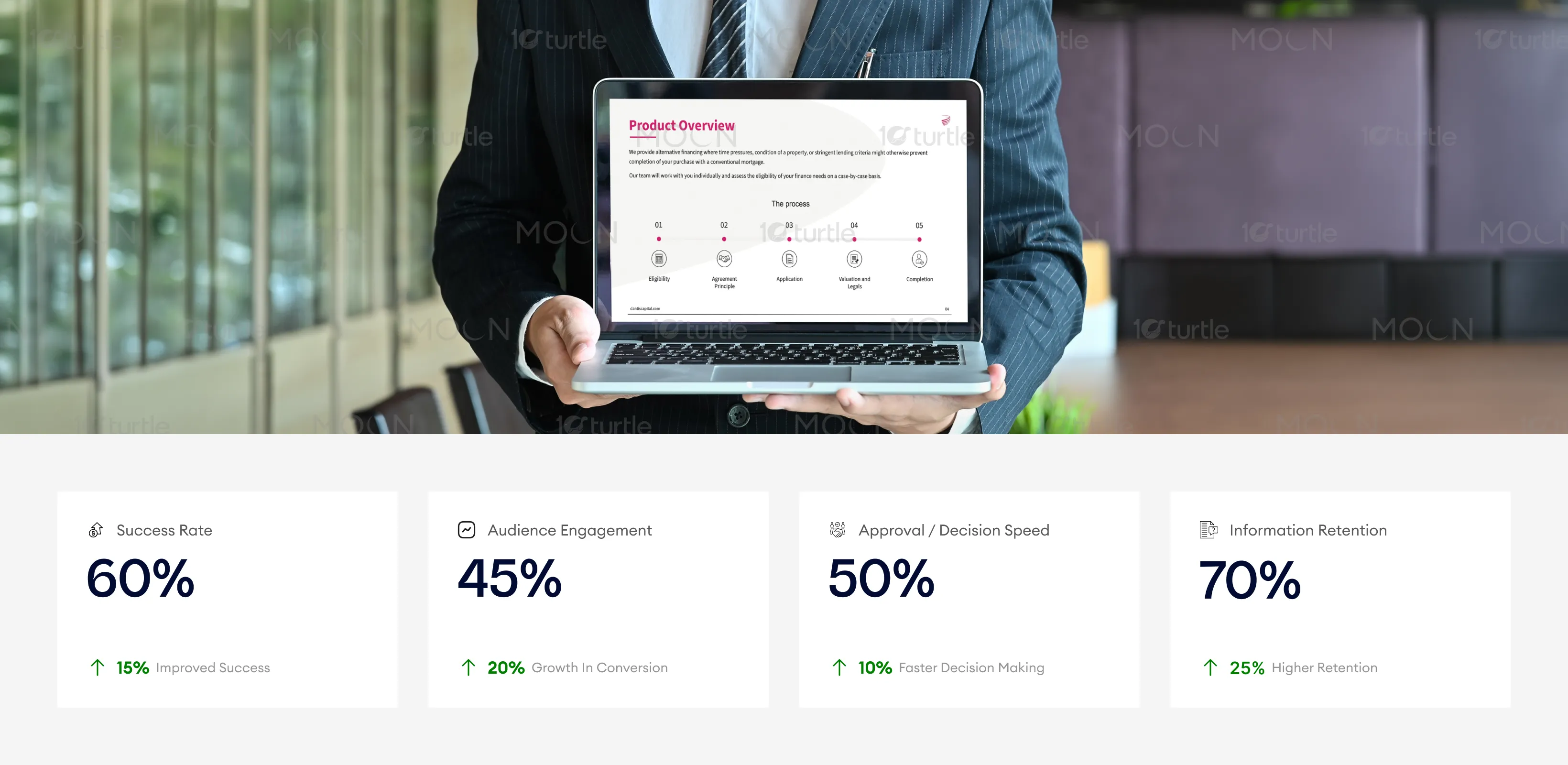
The design optimizes for clarity and engagement, offering a strong visual hierarchy and intuitive structure that appeals to decision-makers. By using a bold color palette and emphasizing key information, the design successfully improves conversion rates, engagement, and decision-making speed. Further improvements could be made by adding interactive elements to increase viewer interaction and expanding on detailed use cases to ensure higher retention.
The design is built with long-term growth and brand consistency in mind. It supports Dantis Capital’s goal of becoming a leading player in the property finance space by positioning the brand as efficient, accessible, and professional. The visual elements are adaptable across various touchpoints, ensuring that Dantis Capital can maintain a unified and impactful presence across both digital and print platforms. This design will evolve with the brand as it expands its product offerings and reaches new audiences.

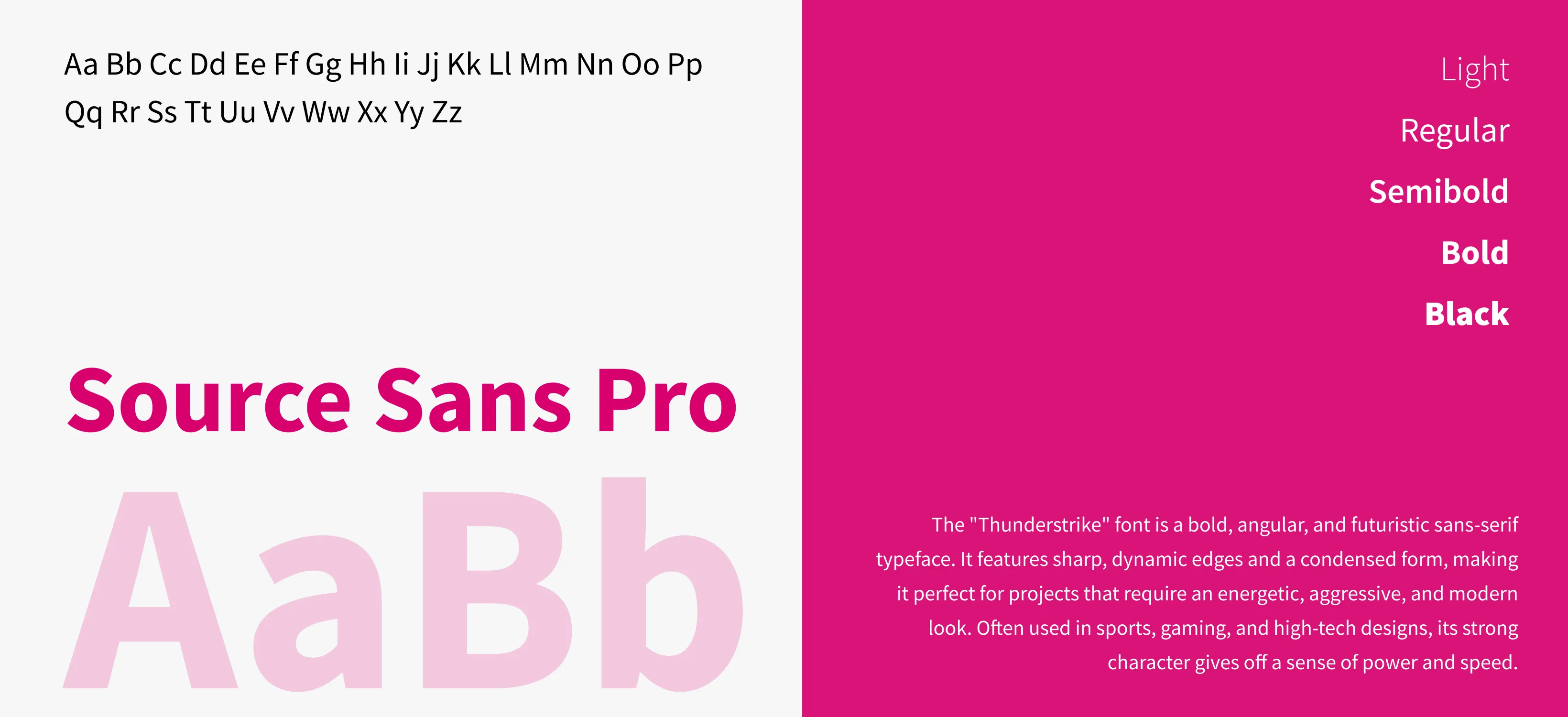
The primary color palette consists of bold, energetic pink, complemented by soft whites and grays. The pink reflects the brand's dynamic nature and reliability, while the lighter tones ensure balance and clarity. Visual elements like icons and typography are carefully selected to enhance readability and provide visual contrast. The overall style uses simple yet striking visuals that support the brand’s goals of clarity, trustworthiness, and professionalism.