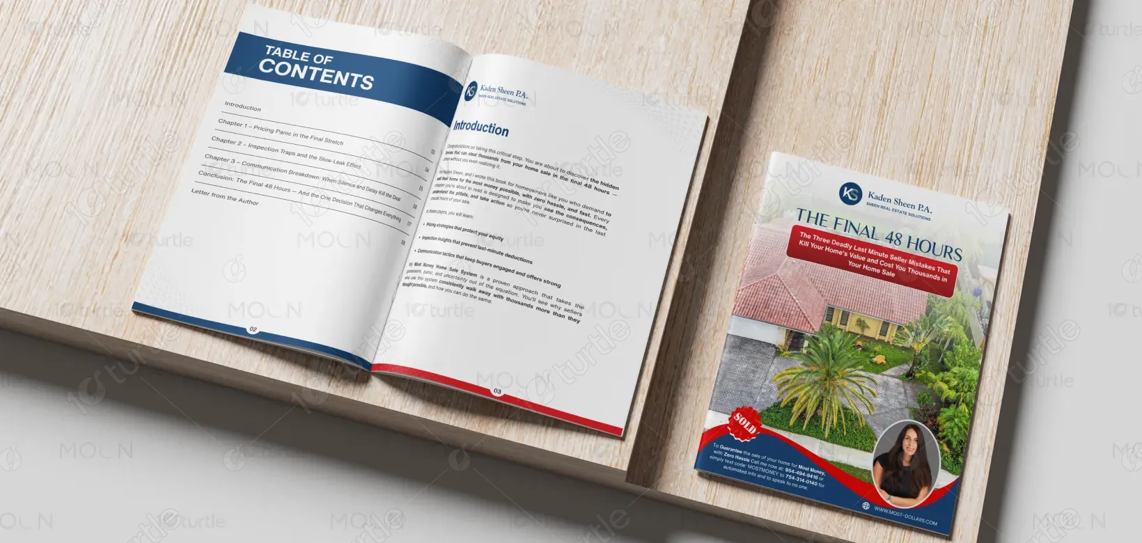
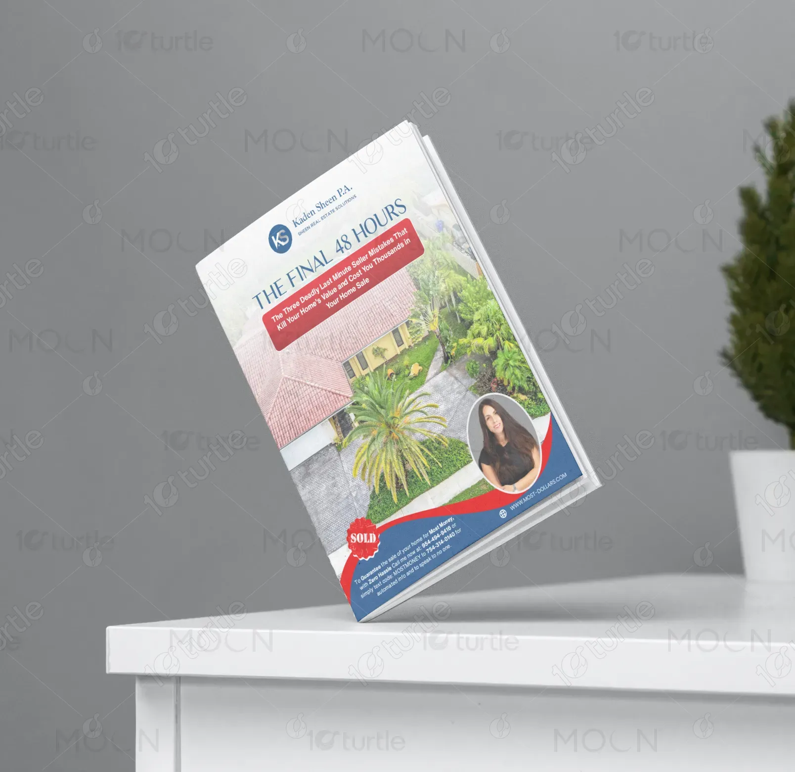
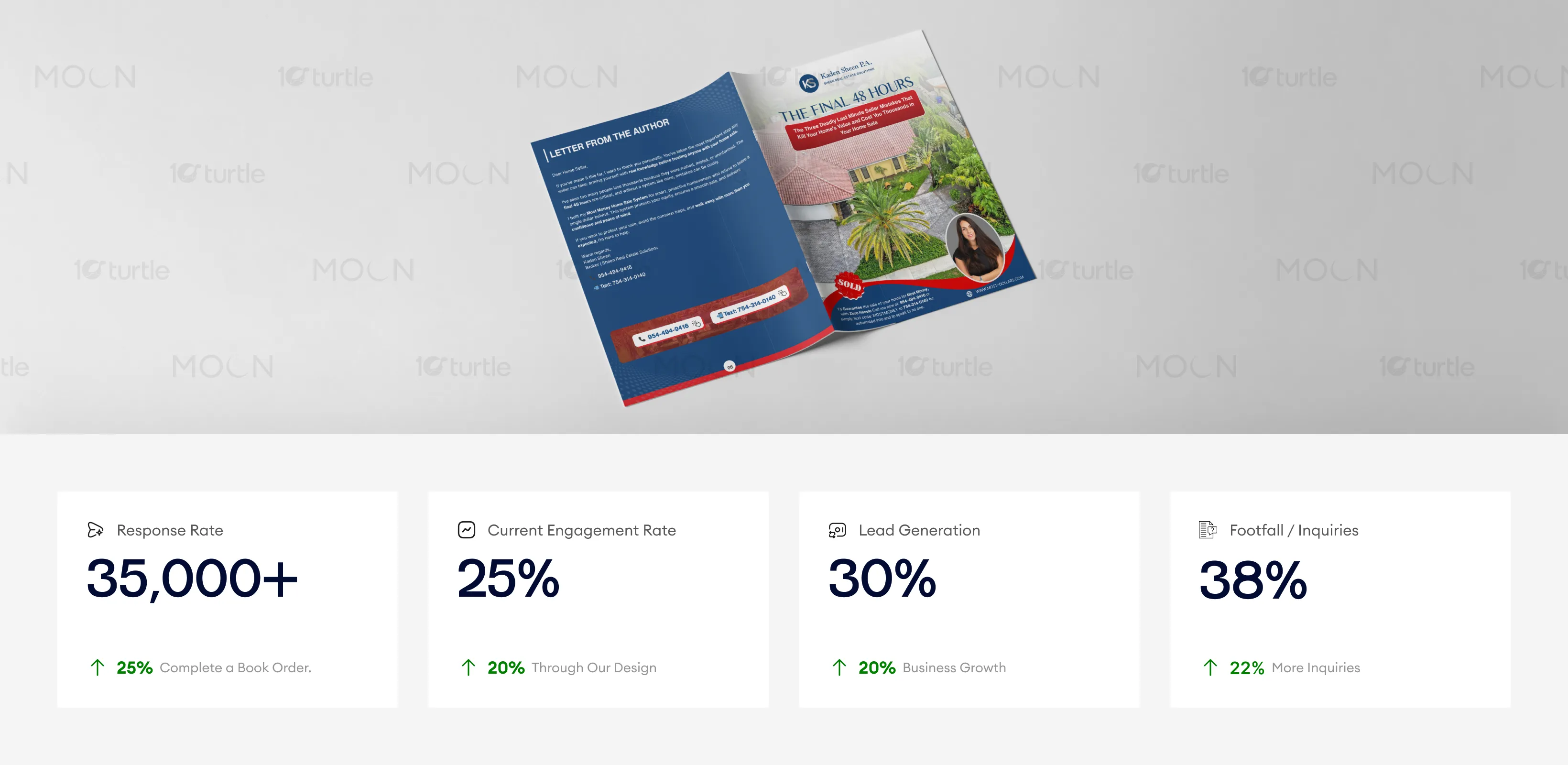
The brochure follows an authority-based educational marketing approach designed to position the agent as a trusted advisor rather than simply a salesperson. A strong headline establishes urgency, while supporting sections clearly explain the risks homeowners face during negotiation and closing. Structured content blocks and consistent formatting make the information easy to navigate, and clean typography enhances readability in both print and digital formats. Property imagery reflects real-world results, while the professional portrait builds personal trust. The blue palette conveys reliability and professionalism, and red accents emphasize key actions, creating clarity, credibility, and strong engagement.
Brochure Design
Graphic Design
Industry
Property, Construction & Real Estate
Tools we used


Project Completion
2025
Key Market
Global
This brochure serves as a concise, high-impact educational resource for homeowners preparing to sell their property, with a specific focus on avoiding costly mistakes during the final stages of a real estate transaction. While many sellers prioritize staging and listing preparation, they often underestimate the financial risks that arise during negotiations and closing. The brochure clearly outlines pricing strategy, inspection readiness, communication timing, and buyer psychology in a structured, easy-to-digest format. It also introduces a defined selling system that reinforces professional expertise, builds credibility, and positions the brand as a trusted advisor committed to protecting seller equity and maximizing results.

Industry
Property, Construction & Real EstateWhat we did
Brochure DesignGraphic DesignPlatform
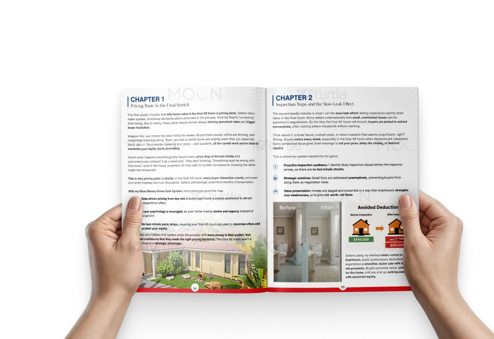
-Many homeowners believe the hardest part of selling is over once an offer is accepted, but the final stage carries the greatest financial risk. Emotional pricing decisions, slow responses, and unprepared reactions to inspections reduce buyer confidence and negotiating strength. Even small communication delays can trigger concessions or price reductions. The main issue is lack of professional guidance during the most critical phase, where timing and perception directly impact the final sale price.
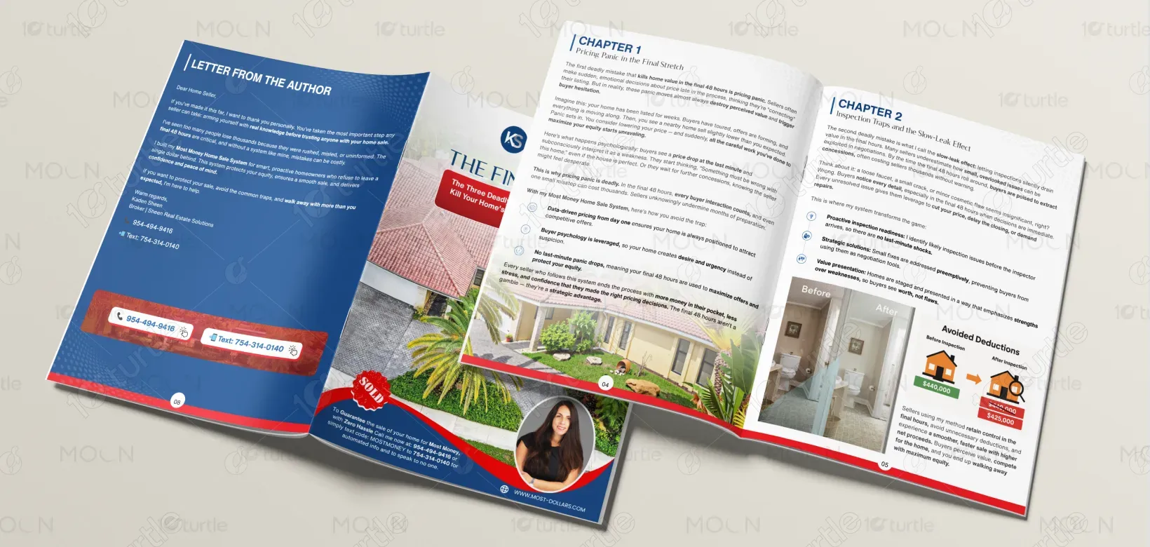
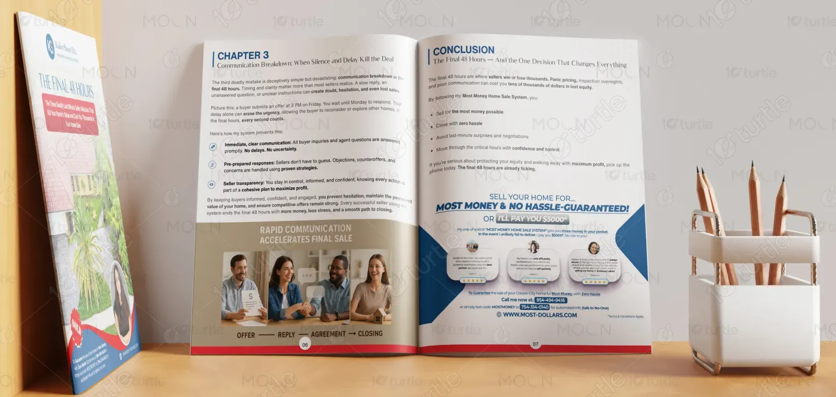
The design delivers a structured, preventative solution that replaces reactive decisions with a planned strategy. It highlights preparation before listing, data-driven pricing, inspection readiness, and prompt communication with buyers and agents. Each chapter addresses a specific risk and shows how professional guidance helps avoid costly mistakes, making the process easy to understand. Clear headings and organized sections simplify complex real estate concepts and improve usability. By presenting practical information in a calm, accessible format, the ebook builds confidence, supports informed decisions, and strengthens negotiation outcomes while increasing engagement and trust.

This brochure stands out by combining authority-based messaging with clear, structured content, helping build trust with homeowners. The strong visual design and relatable property imagery create a powerful emotional connection, while the persuasive content emphasizes the agent’s expertise. These elements help drive conversions, boost lead generation, and increase footfall or inquiries, making the brochure an effective marketing tool for property agents.
The brochure is designed to position the brand as a trusted real estate authority rather than just a transactional service provider. By educating homeowners before they list their property, it builds credibility and familiarity ahead of the first consultation. The brochure supports consistent messaging across presentations and marketing channels, reinforcing professionalism and strategy. Over time, the brand becomes associated with seller advocacy and equity protection, encouraging referrals and fostering long-term relationships beyond a single home sale.

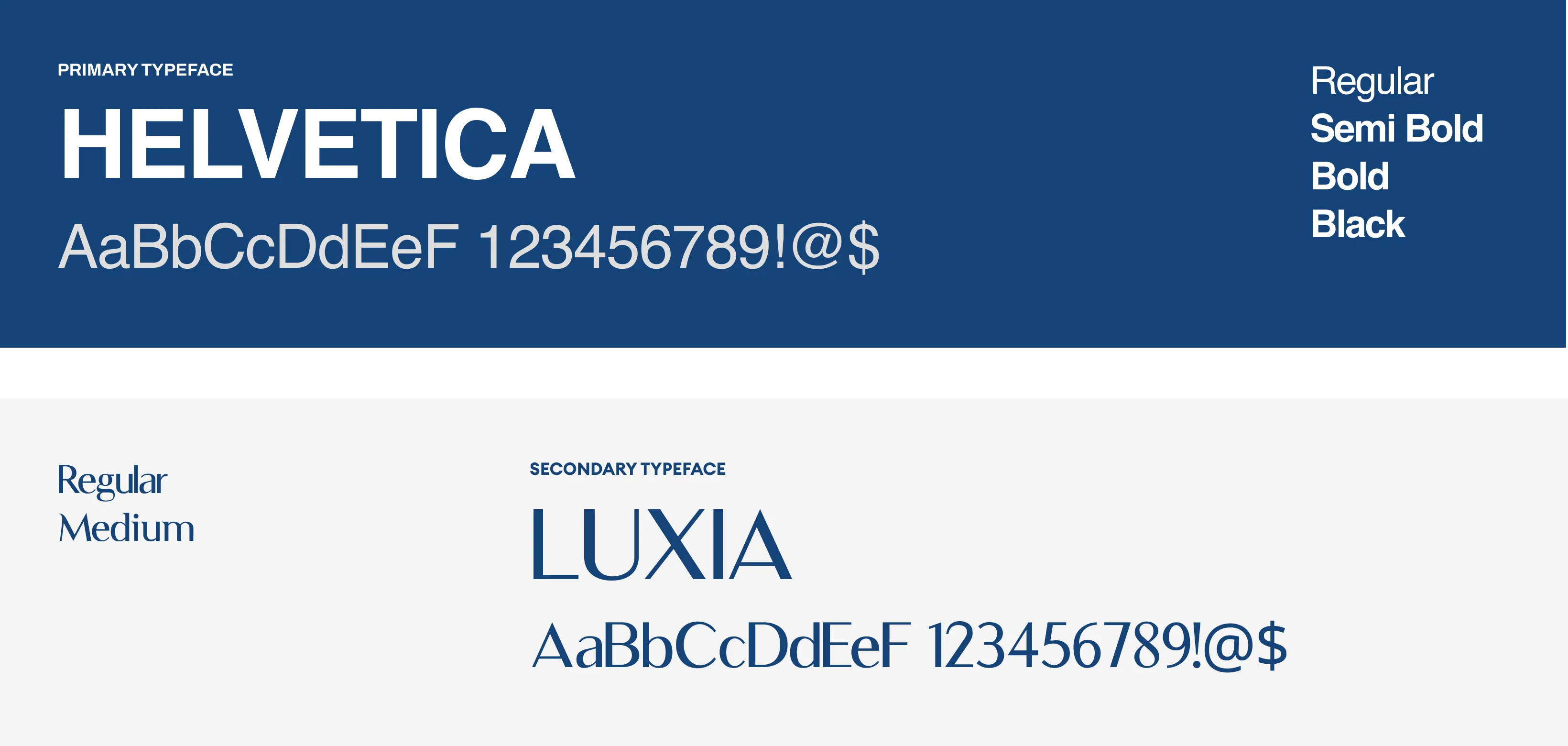
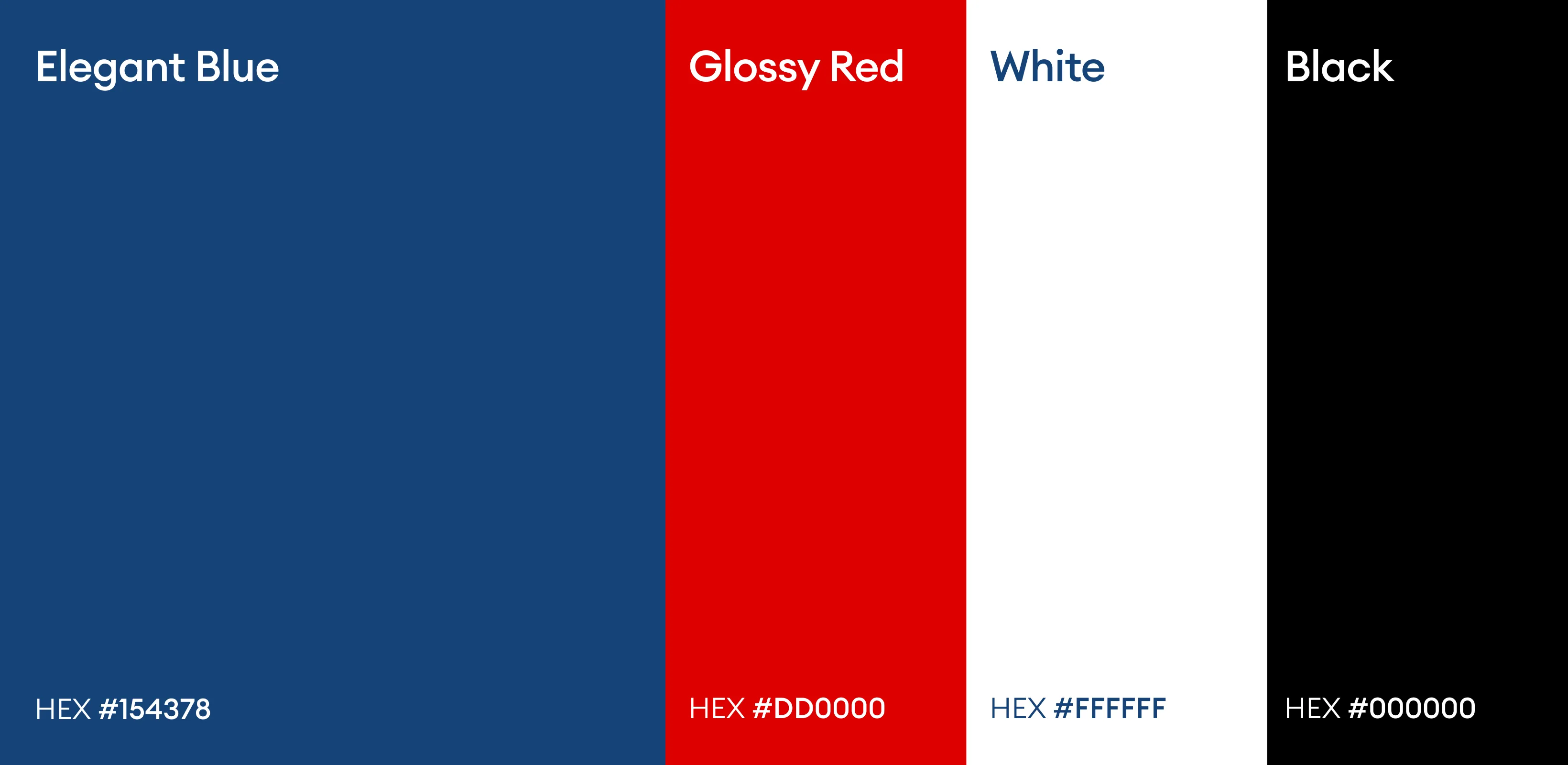
This color palette reinforces authority, urgency, and clarity. Elegant blue conveys trust, professionalism, and stability, which are essential in real estate decisions. Glossy red highlights urgency and financial impact, drawing attention to guarantees and calls to action. Full white ensures readability and visual balance, while black adds contrast, strength, and sophistication, supporting a premium and confident brand presence.