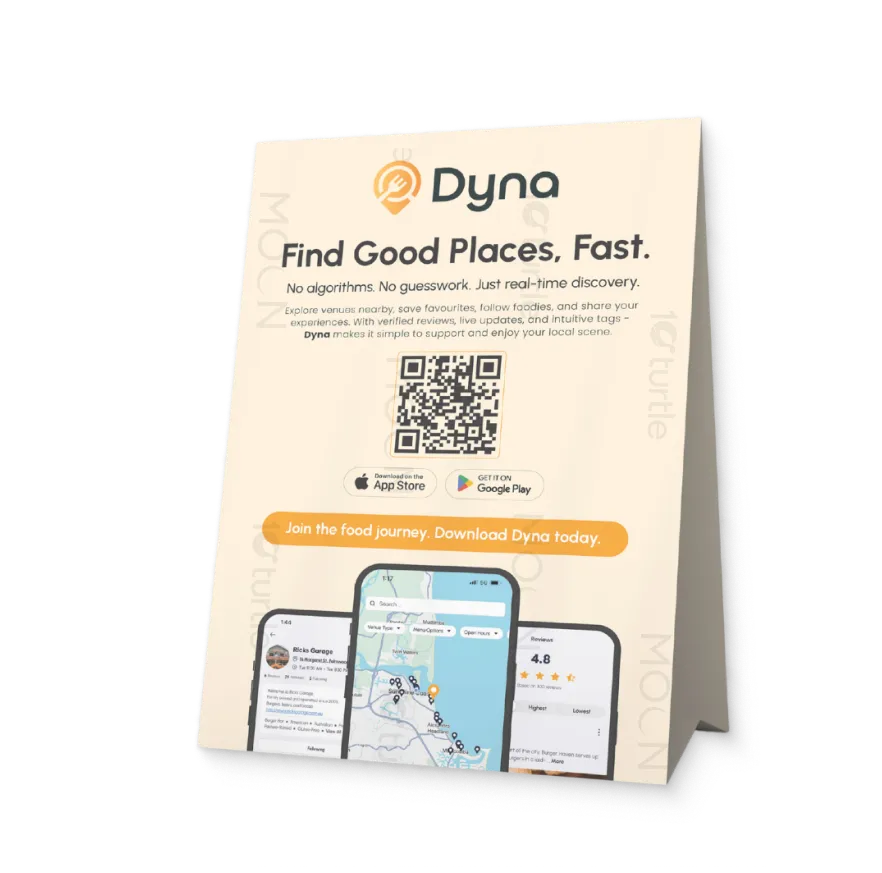
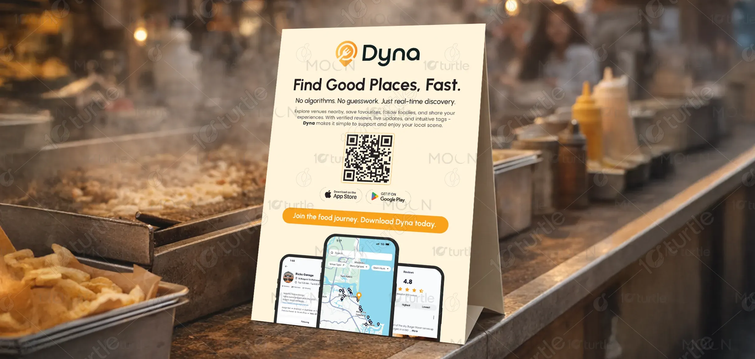
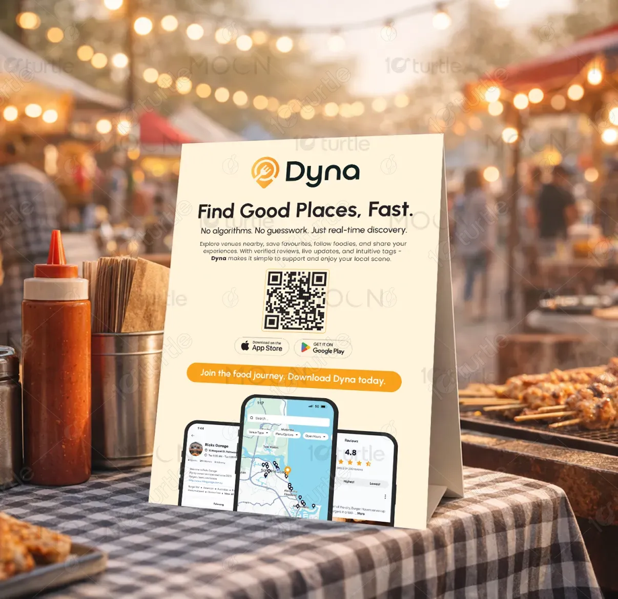
The Dyna strut card design embraces a clean, modern, and approachable aesthetic that reflects simplicity and trust. A soft neutral background paired with warm accent tones creates a welcoming visual experience, while clear typography ensures instant readability. The layout is vertically structured to guide attention—from brand message to QR code and app preview—making the card functional and promotional. The minimal design avoids clutter, allowing the product experience and call-to-action to remain the hero.
Strut Card Design
Graphic Design
Industry
Technology, SaaS & Startups
Tools we used


Project Completion
2025
Key Market
Global
Dyna is a location discovery app designed to help users find great places quickly and confidently. It focuses on real-time updates, verified reviews, and community-driven recommendations instead of algorithm-heavy suggestions. Positioned within the food, lifestyle, and local discovery market, Dyna stands out by prioritizing authenticity and speed. The strut card acts as an offline-to-online touchpoint, encouraging quick app downloads through QR scanning.

Industry
Technology, SaaS & StartupsWhat we did
Strut Card DesignGraphic DesignPlatform
-Most discovery platforms overwhelm users with algorithm-driven results, sponsored listings, and outdated reviews. This often leads to poor decisions, wasted time, and mistrust in recommendations. Users struggle to identify genuinely good places, especially when traveling or exploring new neighborhoods. Businesses that rely on authenticity also get buried under paid promotions, creating a disconnect between real experiences and digital discovery.
Dyna solves this problem by focusing on real-time discovery powered by community input rather than opaque algorithms. Live updates, verified reviews, intuitive filters, and local insights help users make faster, more confident decisions. The strut card design reinforces this solution by offering instant access via QR code, reducing friction and seamlessly connecting physical spaces with the digital product experience.

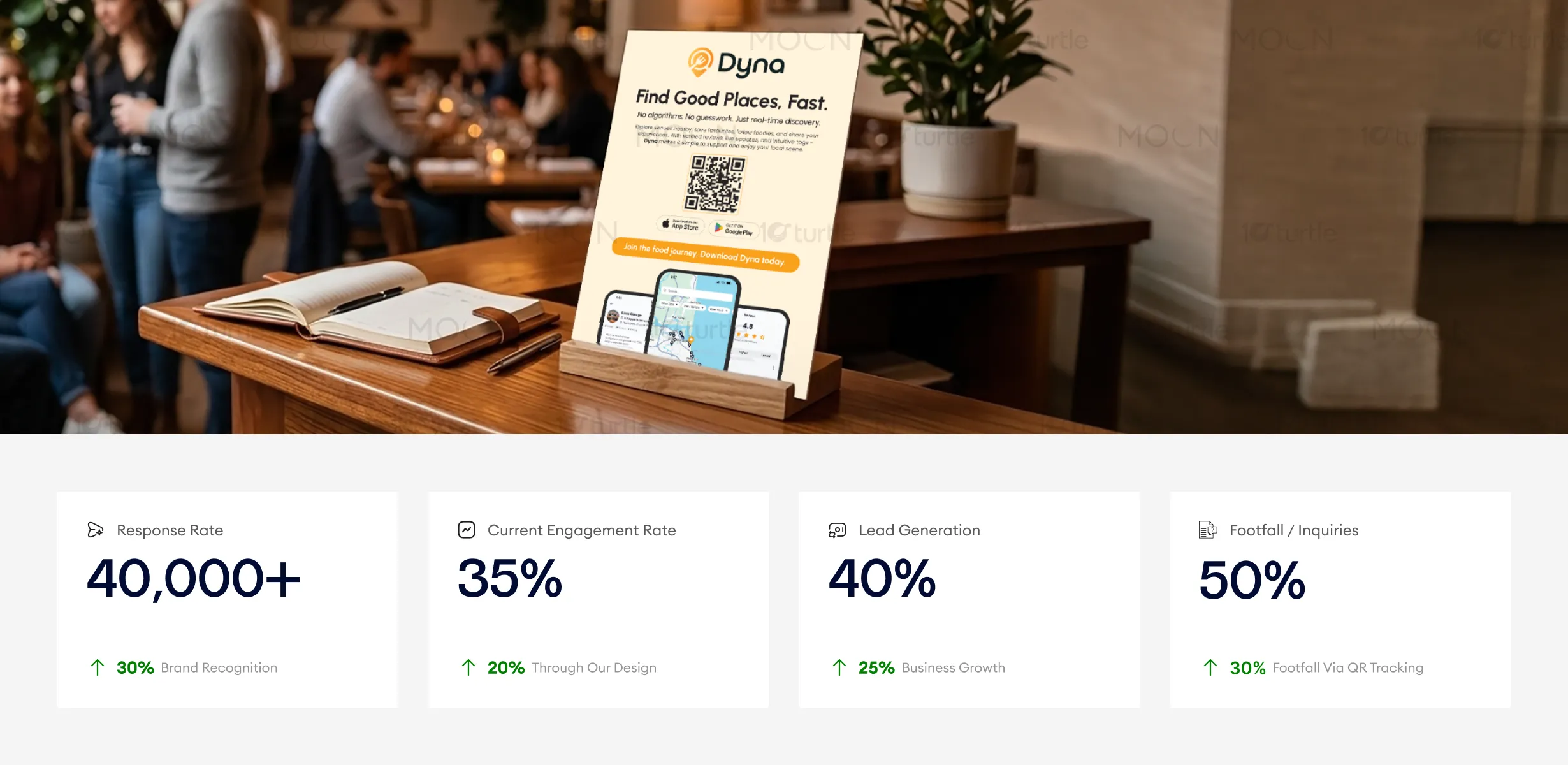
This strut card design effectively captures attention through its minimal and welcoming visual style, making it easy for customers to engage and take action. The functional layout, combined with a prominent QR code, drives higher response rates and inquiries. To further enhance these metrics, promoting the card in high-traffic areas and ensuring targeted distribution can lead to more footfall and higher lead generation.
Dyna aims to become a trusted global platform for discovering local experiences with authenticity at its core. The long-term vision is to build a people-powered ecosystem that supports local businesses, food creators, and communities. By continuously evolving its features and expanding into new cities, Dyna strives to redefine how people explore, connect, and support their local scenes.
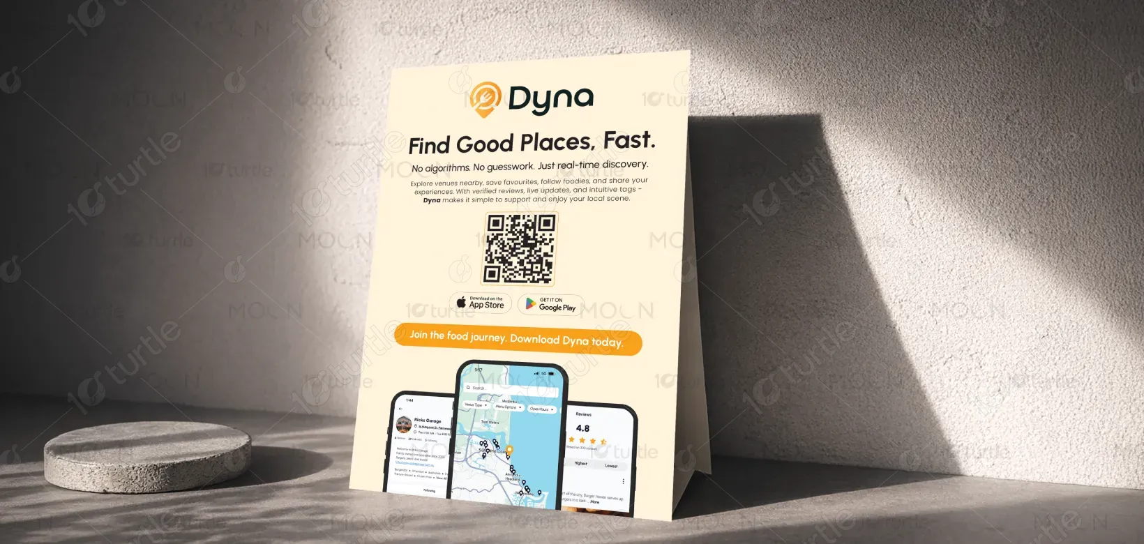
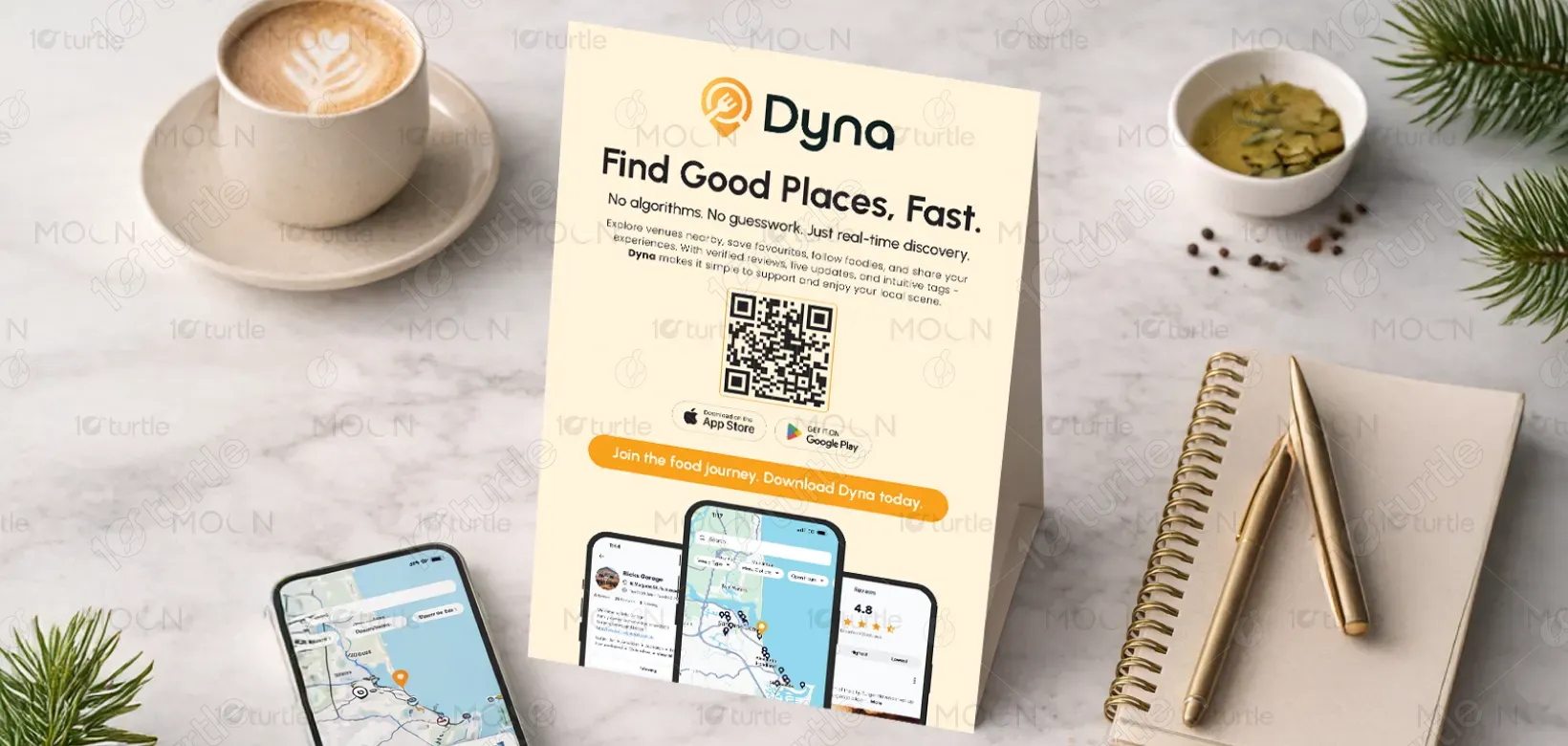
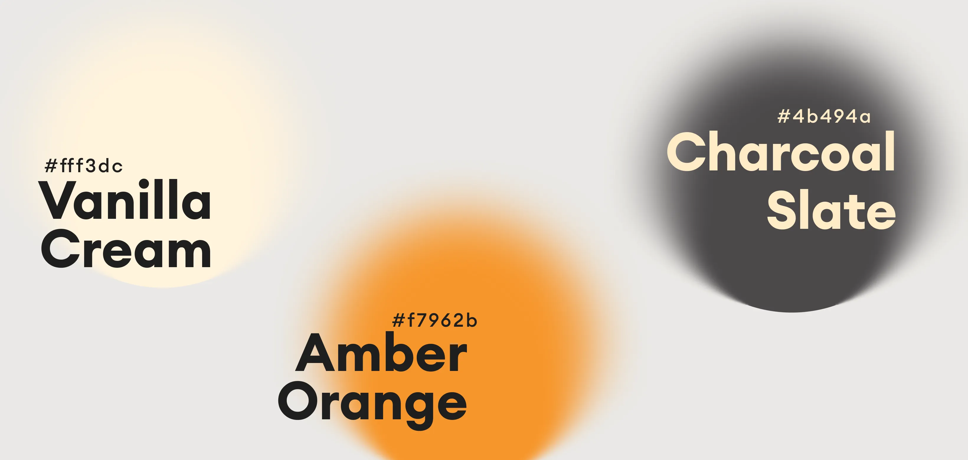
The color palette features soft cream neutrals paired with warm golden-orange accents and dark charcoal typography. The neutral base ensures clarity and elegance, while the warm accent evokes friendliness, curiosity, and appetite—ideal for a food and lifestyle discovery app. This combination balances trust and energy, making the brand feel modern, accessible, and emotionally engaging without being overwhelming.