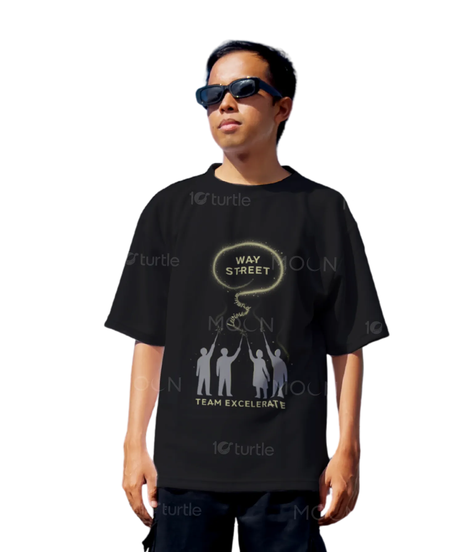
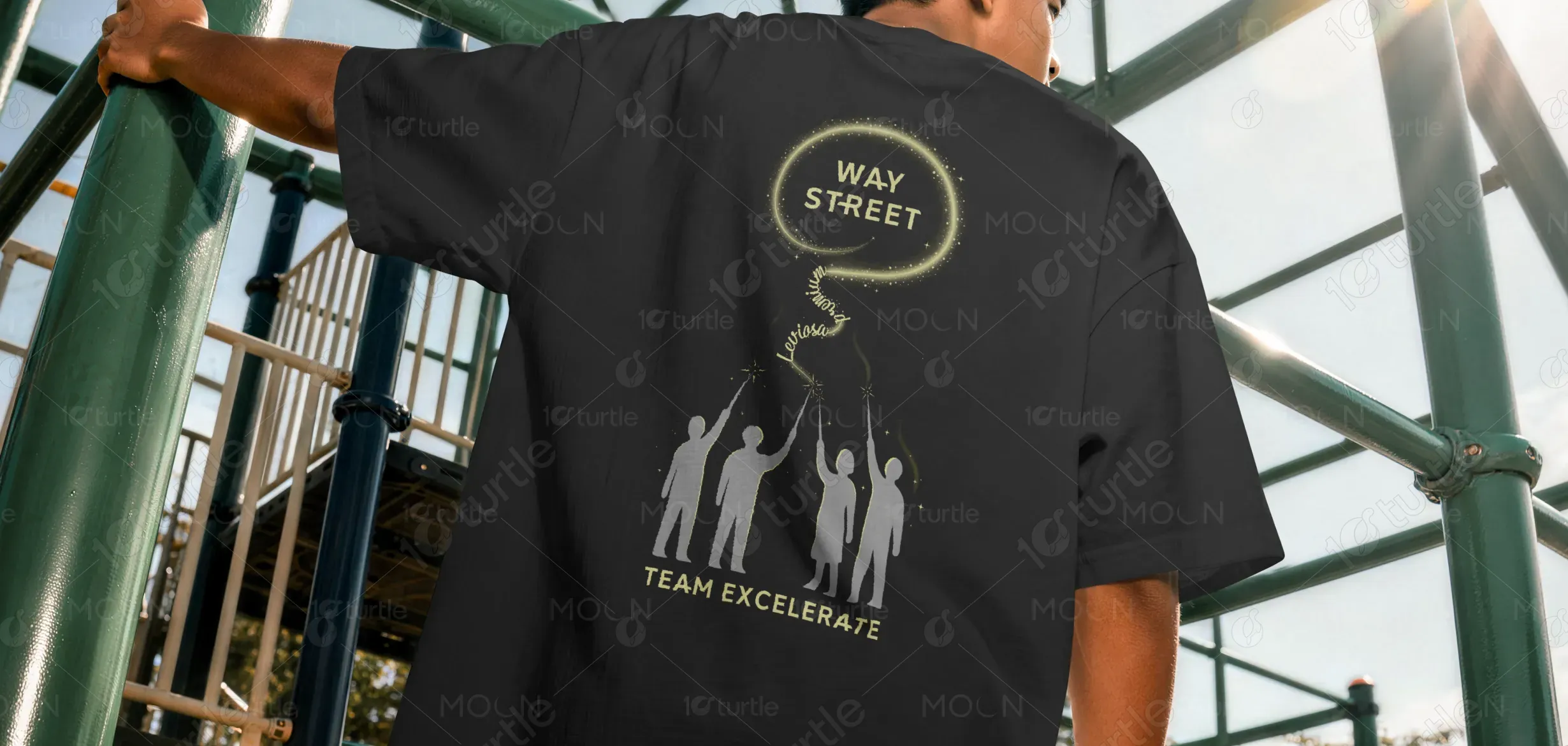
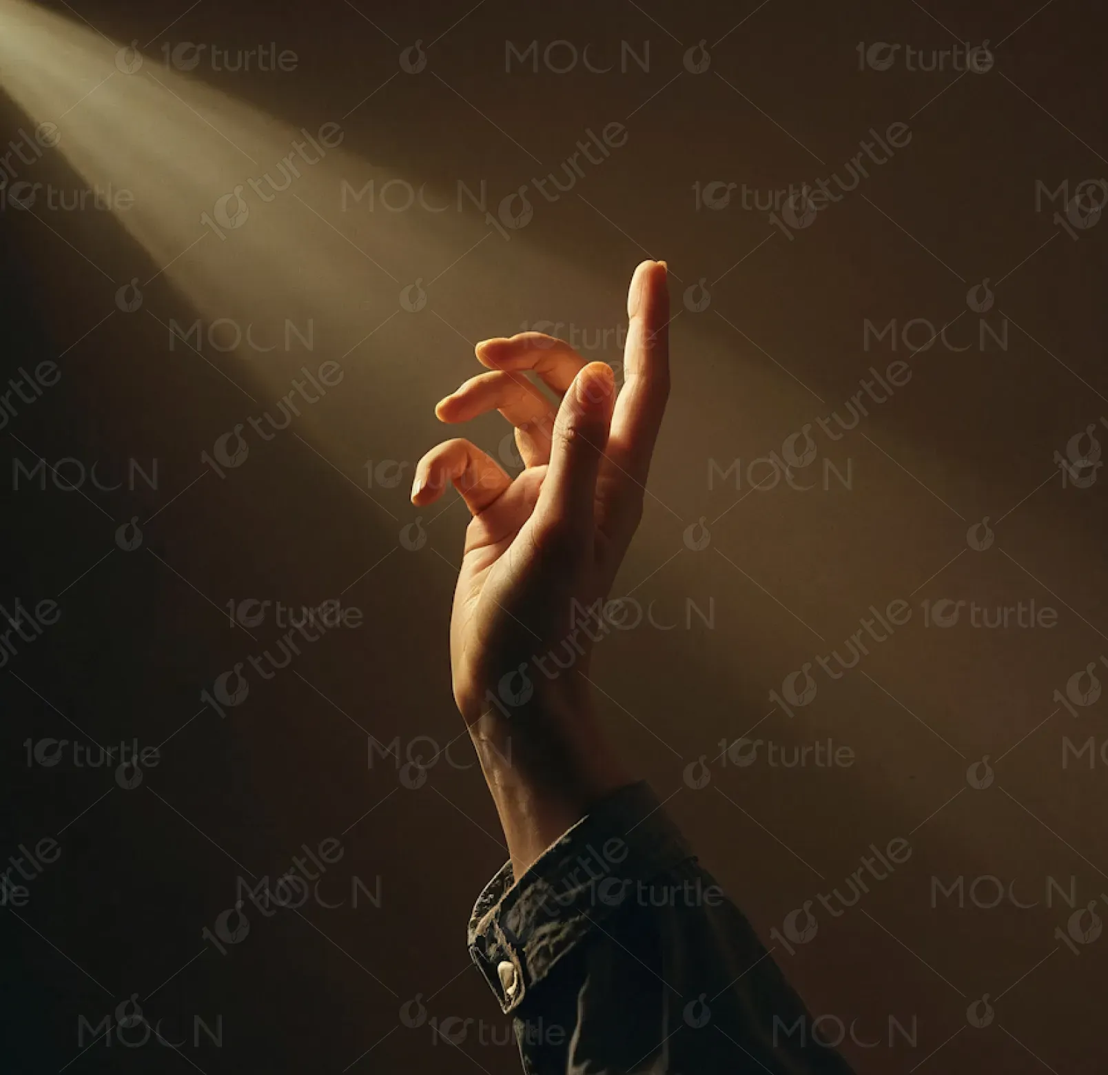
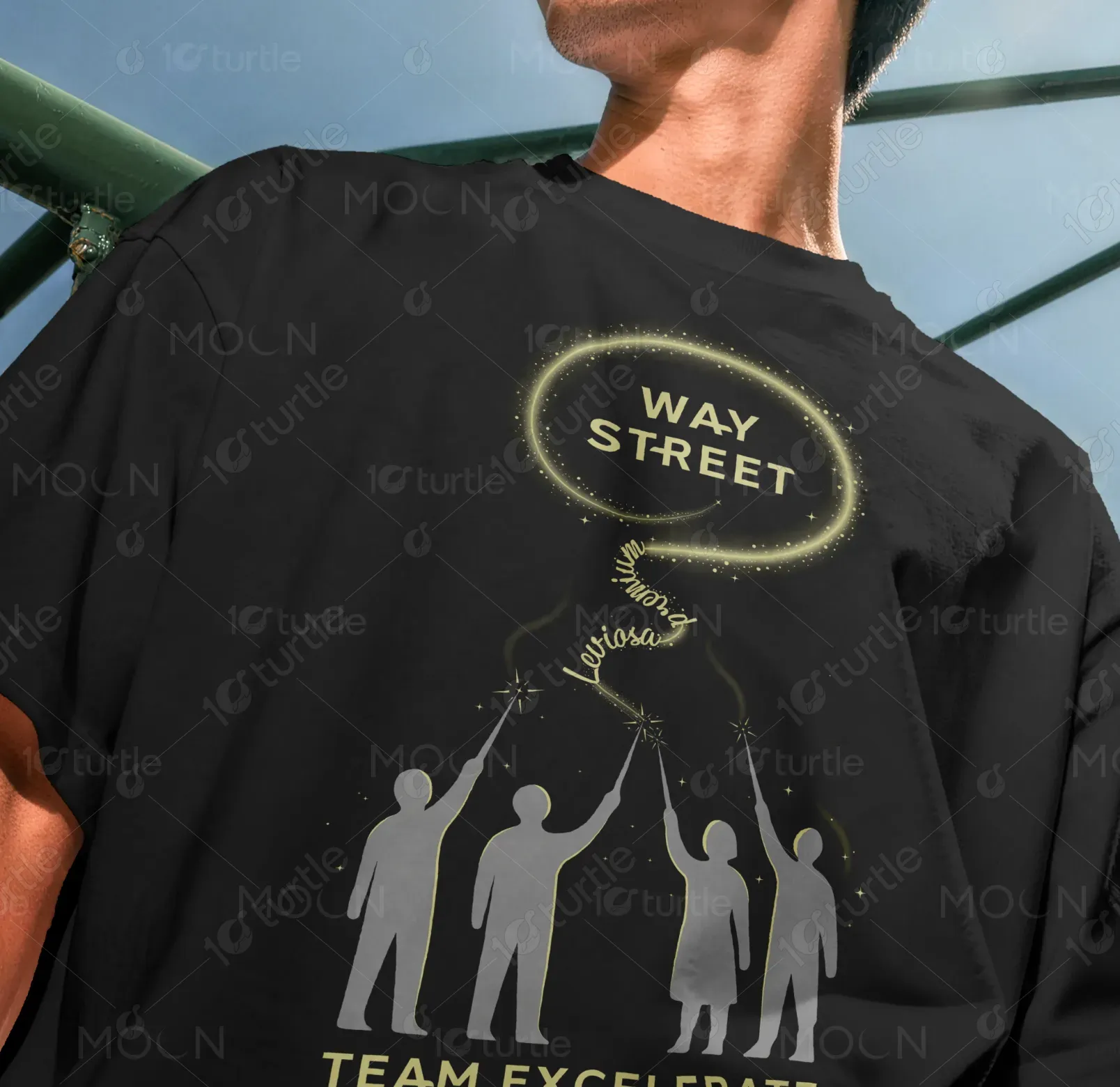
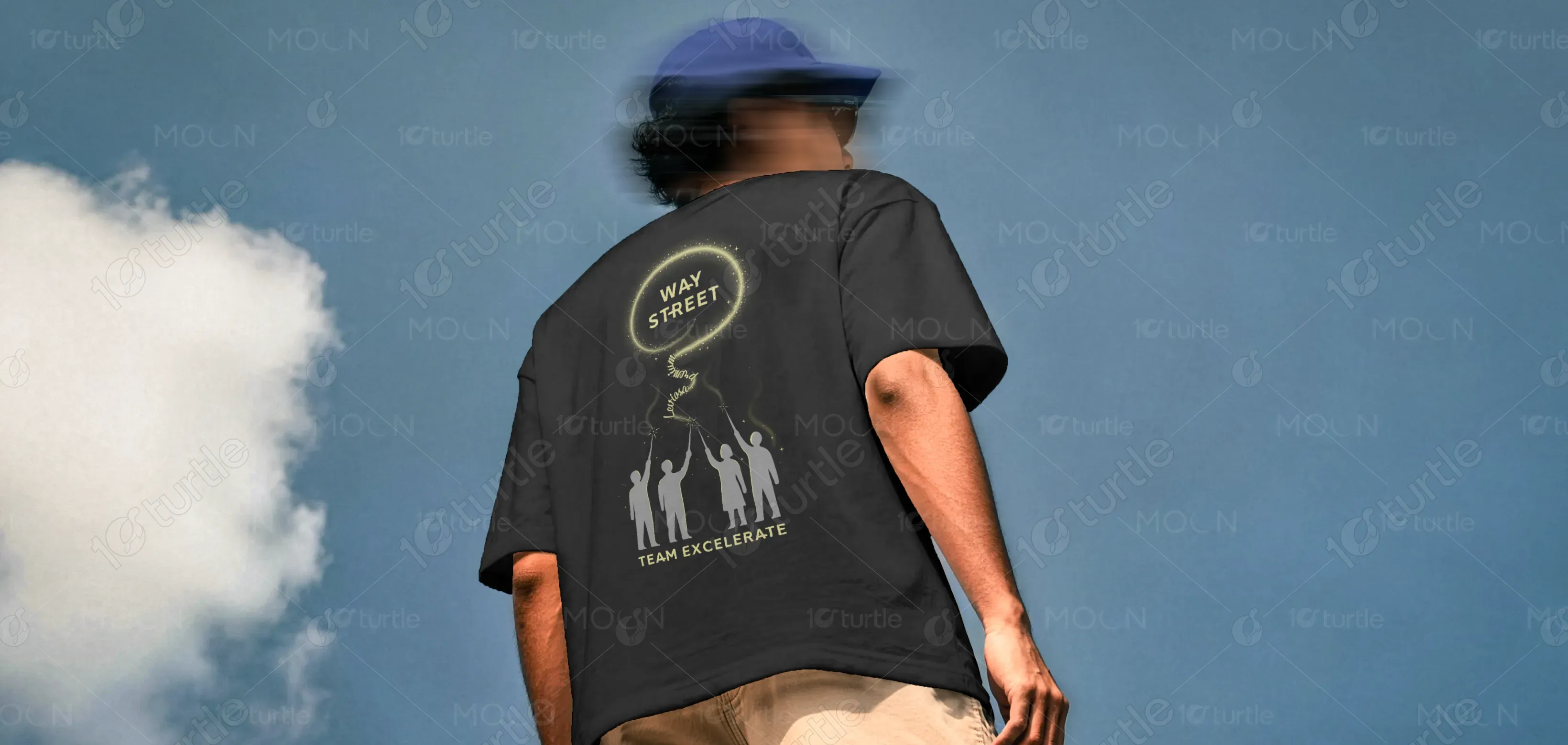
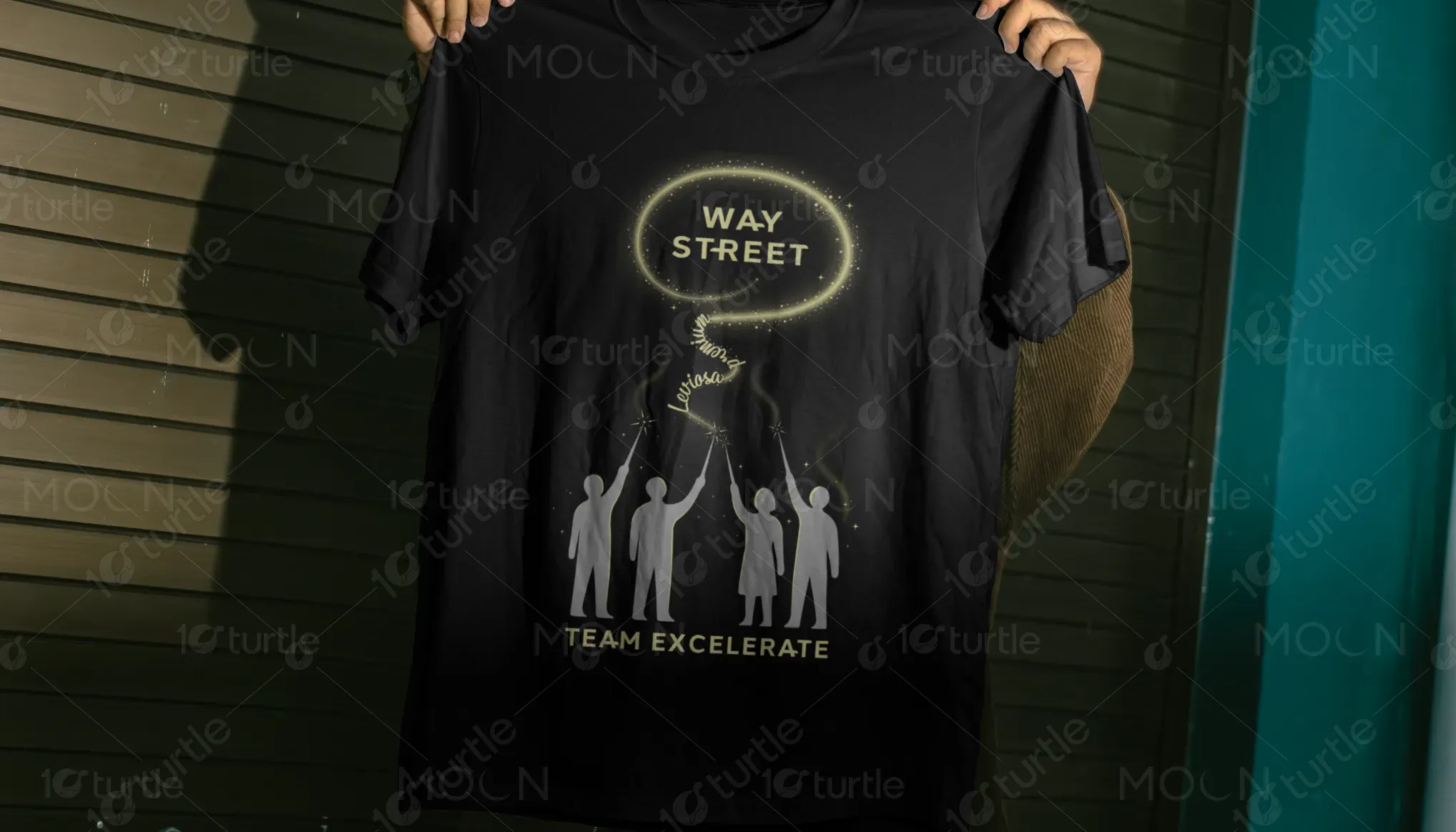
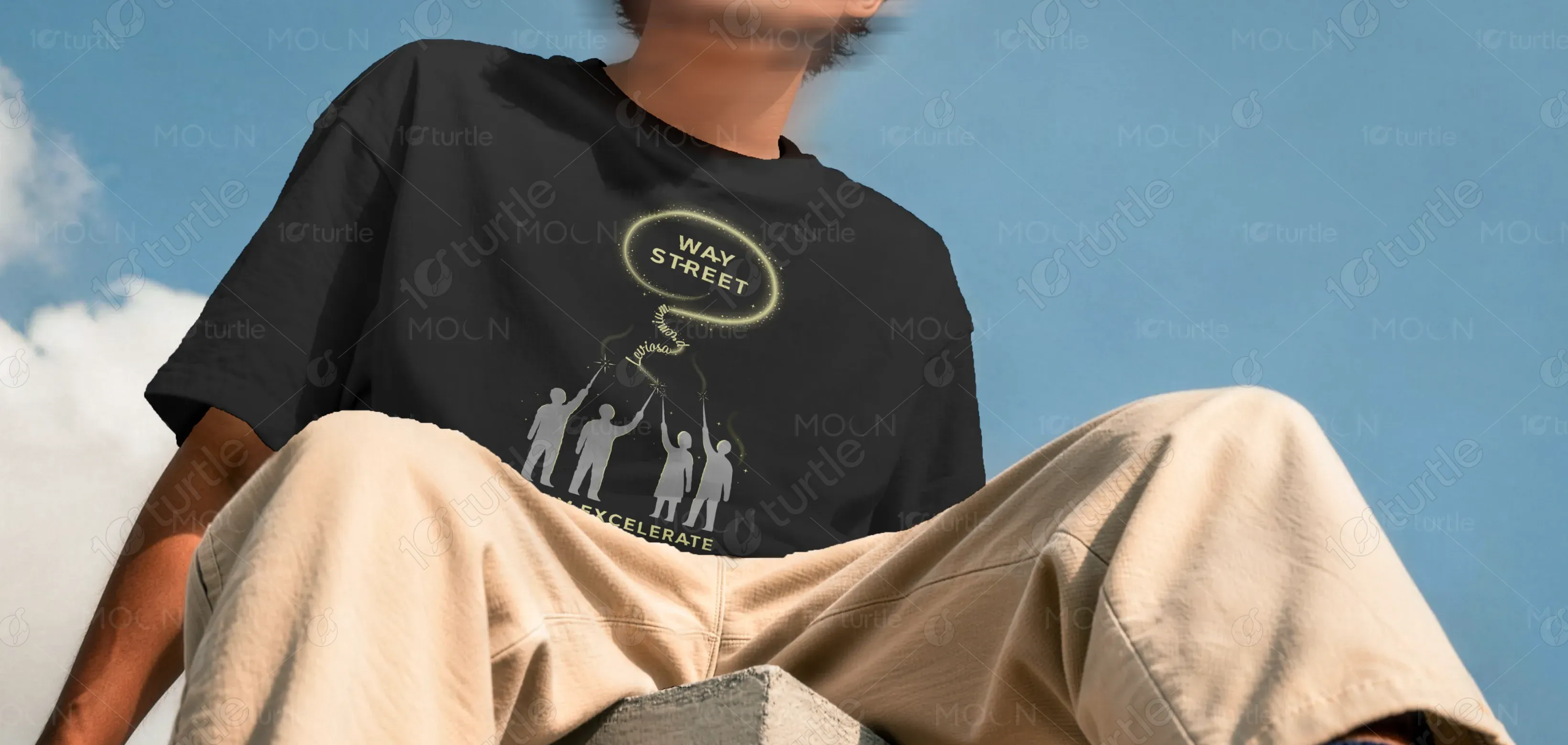
The design follows a minimal yet symbolic visual approach, combining human silhouettes, glowing motion elements, and a central halo-like highlight to represent unity, direction, and aspiration. The composition is vertically structured, leading the viewer’s eye from the grounded team figures upward to the illuminated “Way Street” focal point. The typography is clean and modern, ensuring readability while maintaining a premium aesthetic. The use of subtle glow effects and negative space enhances contrast on the black fabric, creating a strong visual hierarchy that feels both contemporary and meaningful.
T-shirt Design
Graphic Design
Industry
Fashion, Beauty & Lifestyle
Tools we used


Project Completion
2025
Key Market
Global
This T-shirt design represents a team-driven mindset focused on growth, direction, and collective success. It serves as both a wearable identity piece and a visual statement for a brand or group that values collaboration and forward thinking. Positioned within lifestyle and streetwear culture, the design blends conceptual storytelling with minimal aesthetics, making it suitable for both casual wear and brand representation. Its purpose is to communicate unity and ambition in a subtle yet visually engaging way.
Industry
Fashion, Beauty & LifestyleWhat we did
T-shirt DesignGraphic DesignPlatform
-Many apparel designs struggle with generic visuals, lack of storytelling, and weak brand identity, leading to low emotional connection and forgettable impressions. In competitive streetwear and branded merchandise markets, designs often fail to balance clarity, uniqueness, and meaning, resulting in poor engagement and limited recall. This creates a gap where users want something purpose-driven and visually distinctive, rather than purely decorative graphics.
This design addresses the problem through a clear narrative-driven composition. The upward motion created by light trails and the positioning of the figures establishes a sense of progress and unity. A strong visual hierarchy ensures the brand name remains the focal point, while supporting elements reinforce the message without clutter. The use of minimal color contrast on a black base improves visibility and scalability across different environments. Overall, the design prioritizes clarity, symbolism, and emotional connection, making it both aesthetically pleasing and meaningful.

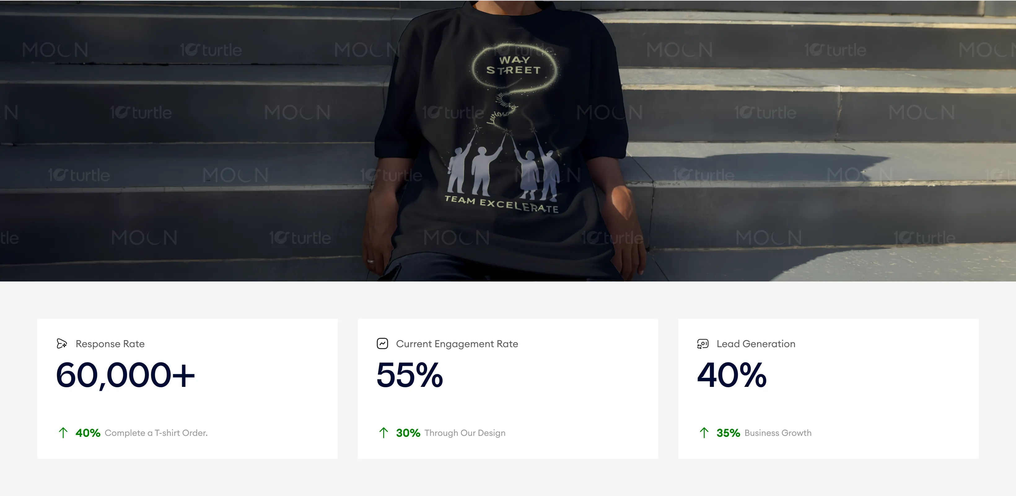
The design creates a meaningful, visually impactful narrative that resonates with the target audience, driving both engagement and awareness. With its minimalist yet powerful symbolism, the brand has experienced measurable increases in product orders, business growth, and consumer inquiries. The balance of aesthetic appeal and emotional resonance is key to generating interest and building loyalty.
The design primarily uses a deep black base, complemented by soft gold and warm light tones for the graphic elements. This combination creates a premium, elegant, and slightly futuristic feel, while maintaining strong readability. The glowing accents introduce a sense of movement and energy, reinforcing the theme of progress. The overall visual language is minimal, clean, and symbolic, ensuring consistency across different applications while maintaining a strong and recognizable identity.

The design uses a soft red and white color palette, supported by neutral tones and natural imagery. Red acts as a focal color, symbolizing love, energy, and action, while also drawing attention to key elements like the brand name and CTA. The white background ensures clarity, readability, and a premium feel, especially in outdoor environments. The overall visual language is minimal, modern, and human-centric, using rounded shapes and soft gradients to create warmth and approachability while maintaining a clean and scalable design system.