The Functional MDs provides comprehensive, evidence-based healthcare focused on long-term healing and prevention. By combining advanced diagnostics, lifestyle medicine, and personalized treatment plans, the brand helps patients regain control of their health and achieve sustainable well-being.
UX Design
UI Design
Research
website
Industry
Healthcare, Functional Medicine & Integrative Wellness
Tools we used


Project Completion
2025
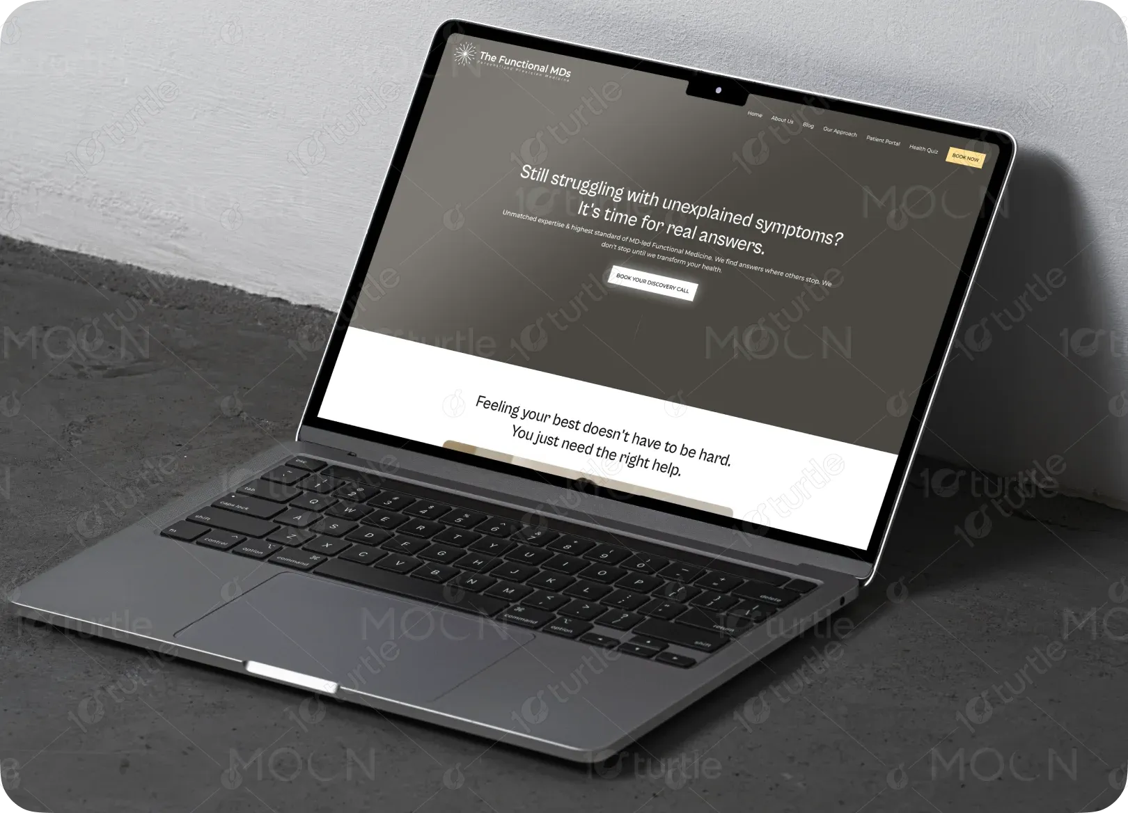
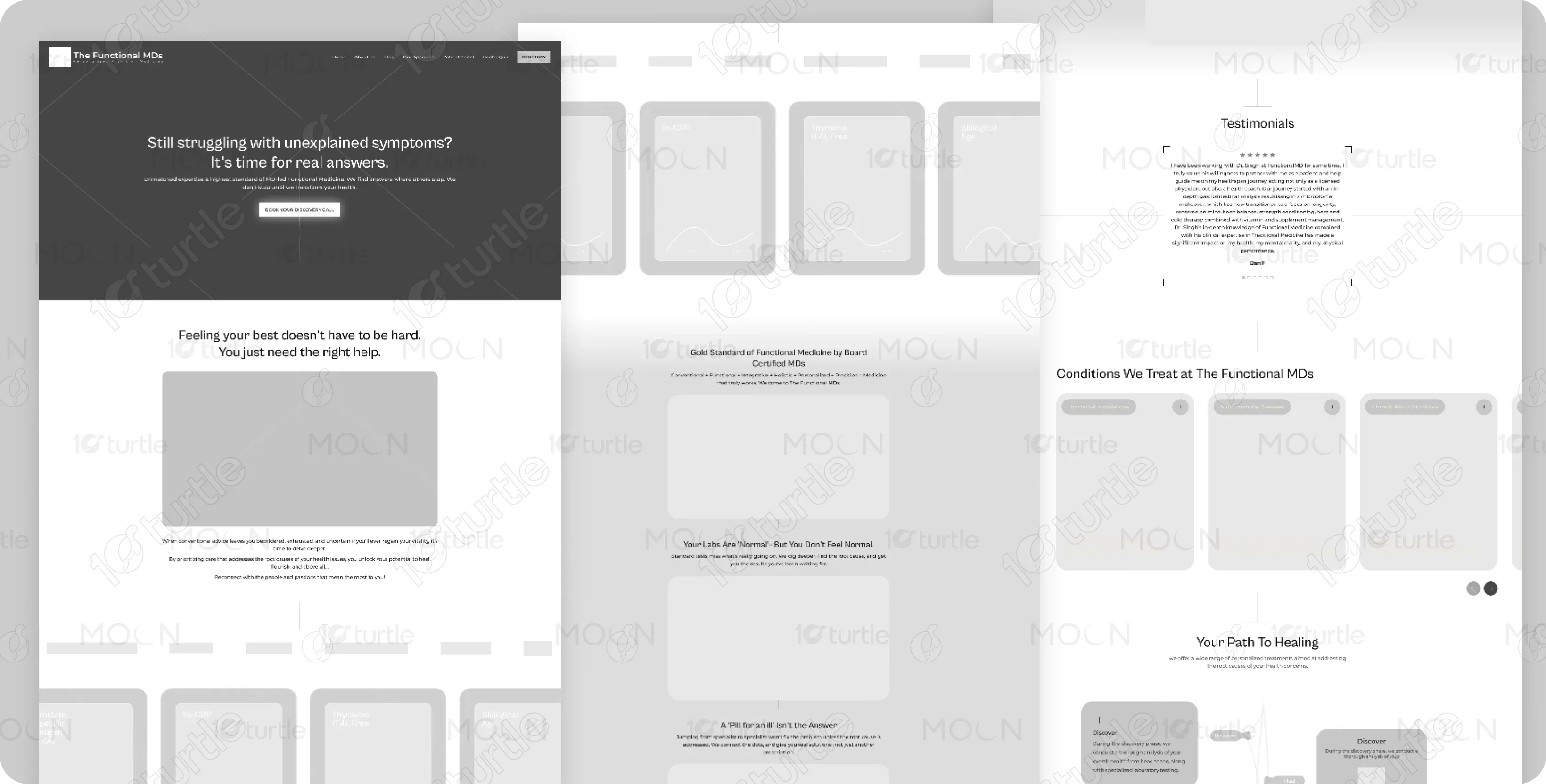
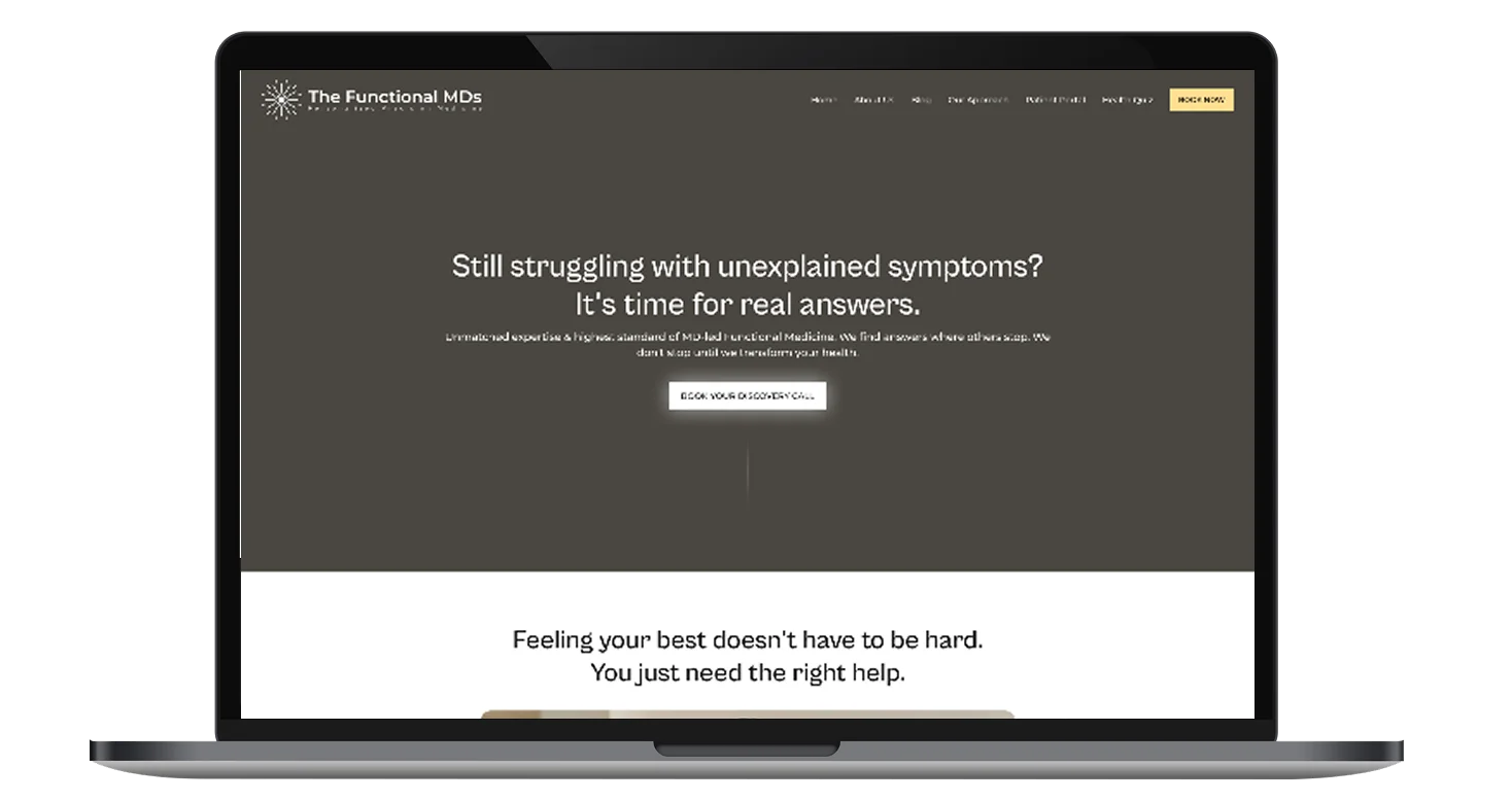
The goal of this project was to design a clear, trust-building homepage that communicates medical credibility while remaining approachable and human. The client wanted to educate visitors, establish authority, and guide patients toward consultation bookings. The scope included content hierarchy, patient journeys, condition coverage, testimonials, and conversion-focused CTAs.
Industry
Healthcare, Functional Medicine & Integrative WellnessWhat we did
User ResearchUI UX DesigningResponsive ExperiencePlatform
-Many patients visiting the site feel overwhelmed, unheard, or frustrated by unresolved health symptoms. The challenge was presenting complex medical information in a way that felt reassuring rather than intimidating. The existing digital presence lacked clarity in guiding users toward understanding functional medicine and taking the next step.
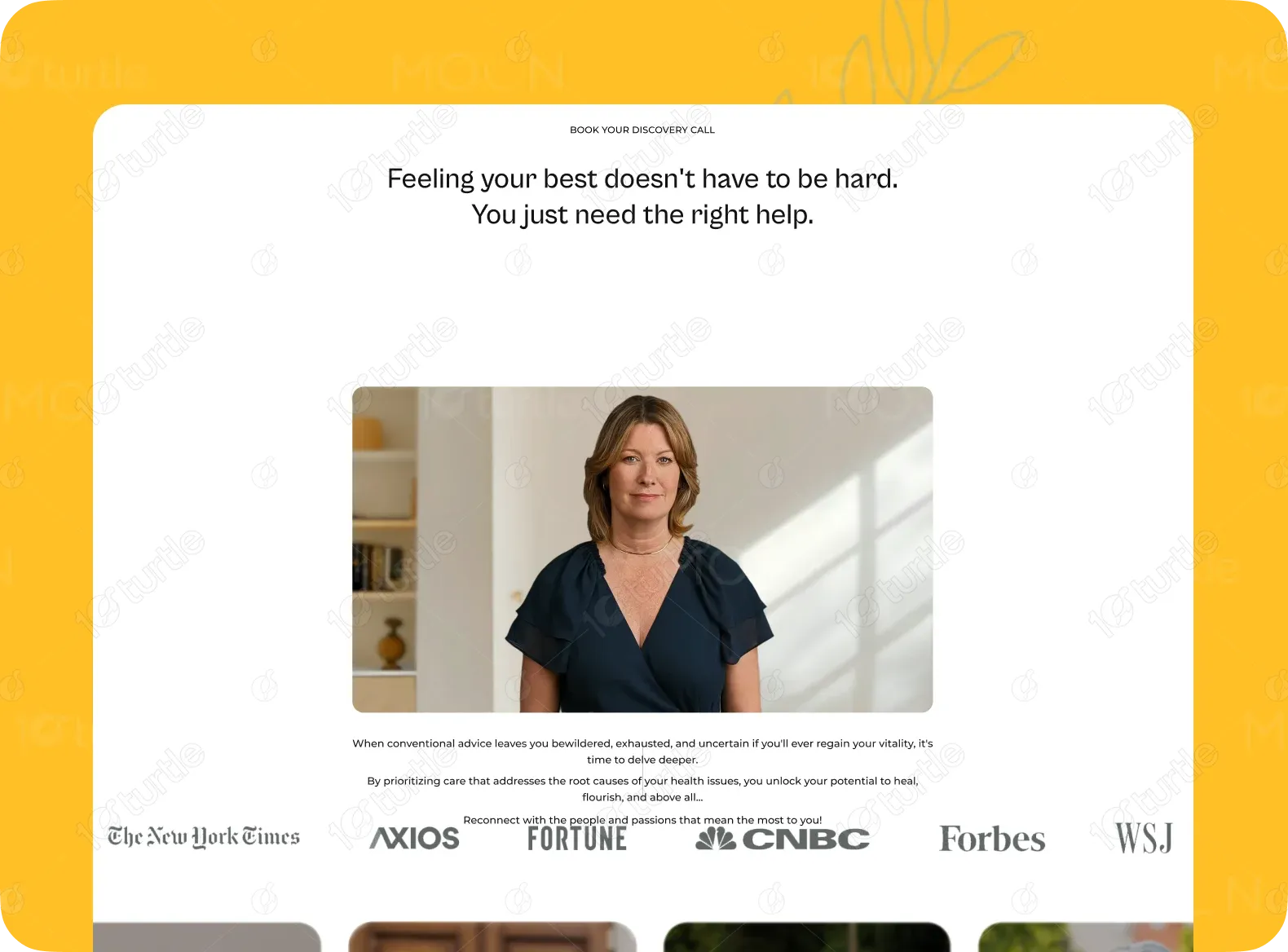
The solution focused on simplifying medical complexity through structured storytelling and calm visual design. Clear sectioning, supportive messaging, and progressive disclosure of information help users feel informed without overload. Trust signals such as media mentions, testimonials, and doctor-led visuals reinforce credibility and confidence.
The client envisioned a clean, calming, and authoritative design inspired by leading healthcare and wellness platforms. They requested a balance between medical professionalism and emotional warmth, using real patient imagery, soft color transitions, and clear educational content. The experience needed to feel safe, credible, and empowering.


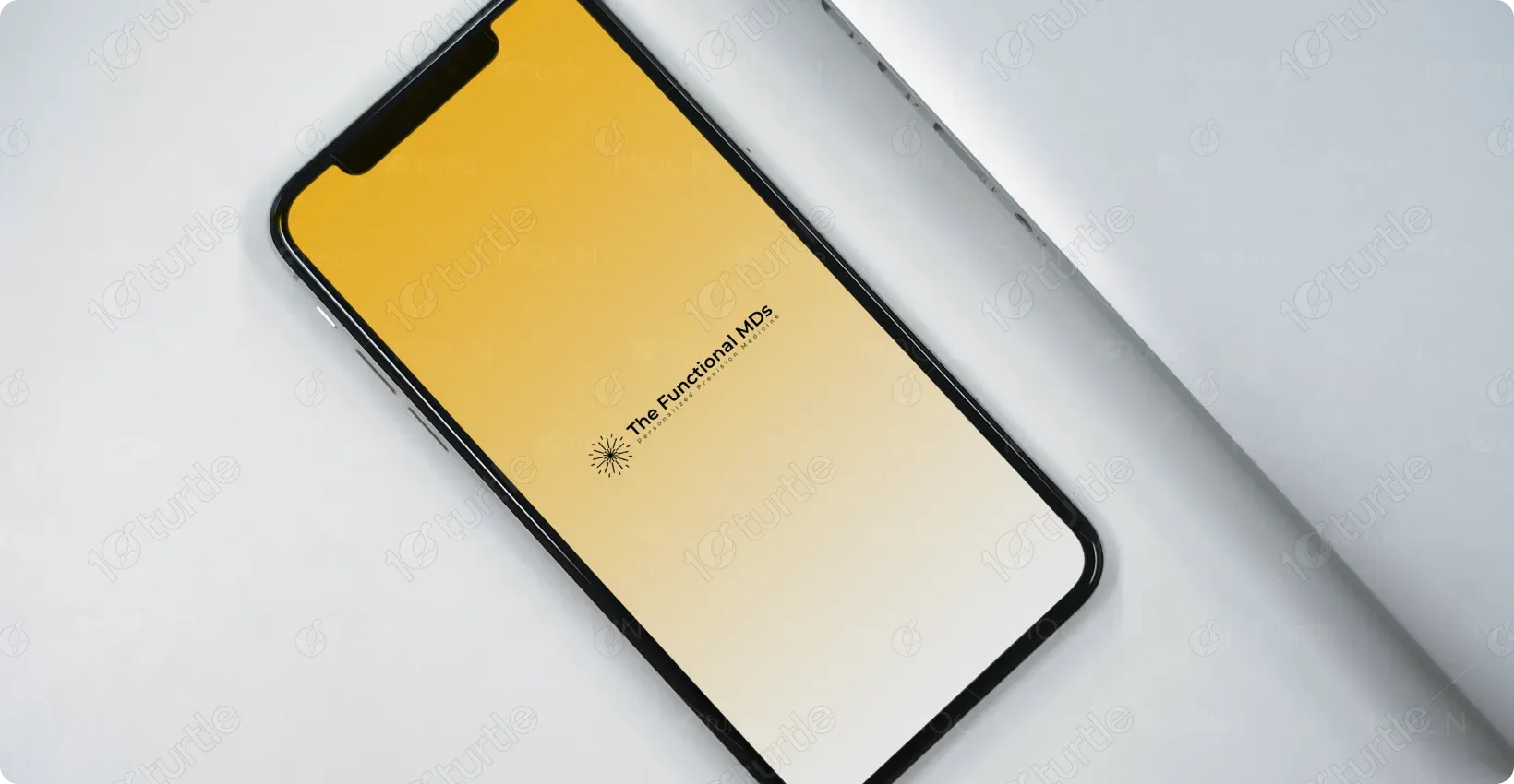
The Functional MDs logo uses refined typography and minimal symbolism to convey trust, stability, and professionalism. Its understated design aligns with medical authority while remaining modern and approachable, reinforcing the brand’s evidence-based philosophy.
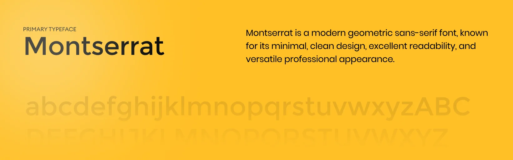
The color palette features warm neutrals (#F5D98C, #FFF4D6), deep charcoal tones (#2E2E2E), and soft whites (#FFFFFF). Warm yellows convey hope and healing, dark tones establish authority and trust, and white space enhances clarity and calmness throughout the experience.

Initial wireframes prioritized a top-down educational flow, starting with emotional validation and moving into scientific explanation. Sections were spaced generously to avoid cognitive overload, and CTAs were placed naturally after moments of clarity. This structure supports comprehension and decision-making.


.webp)
 Ask Shelly
