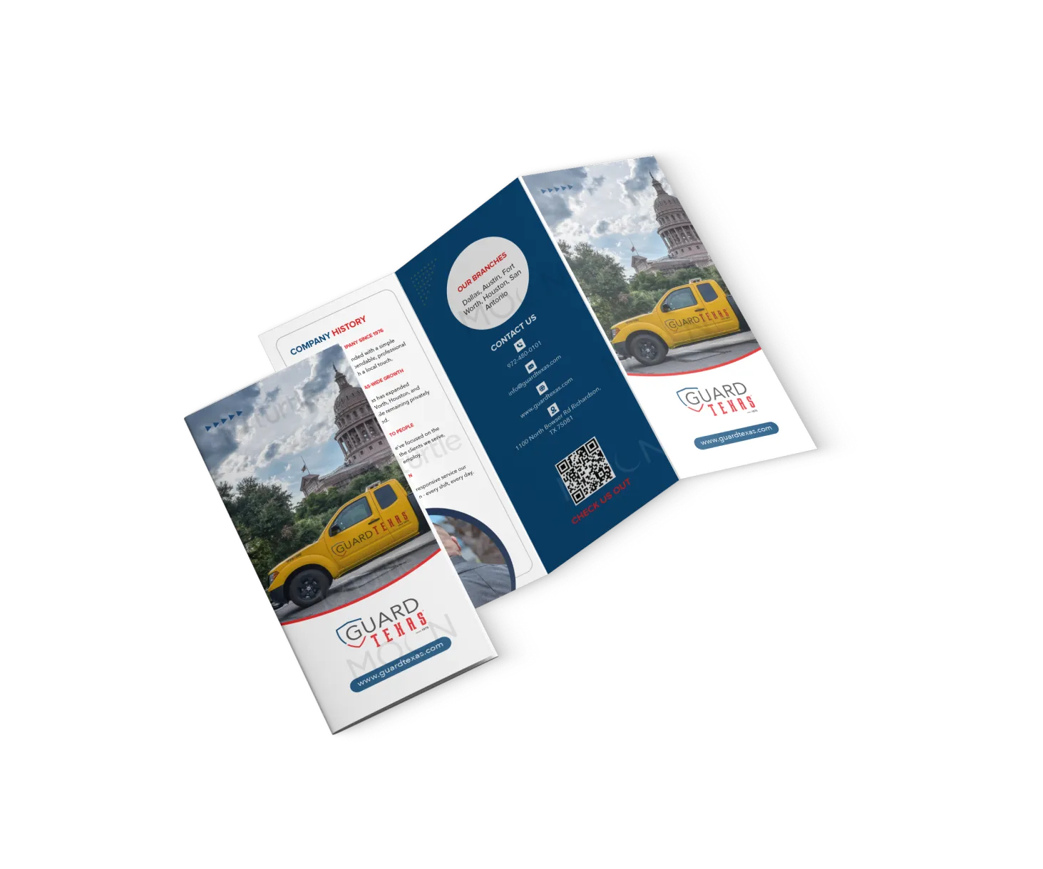
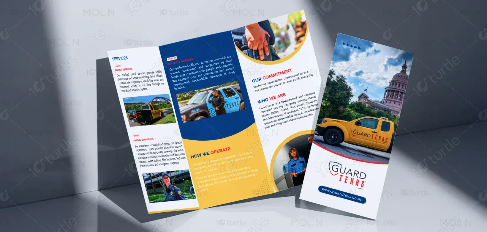
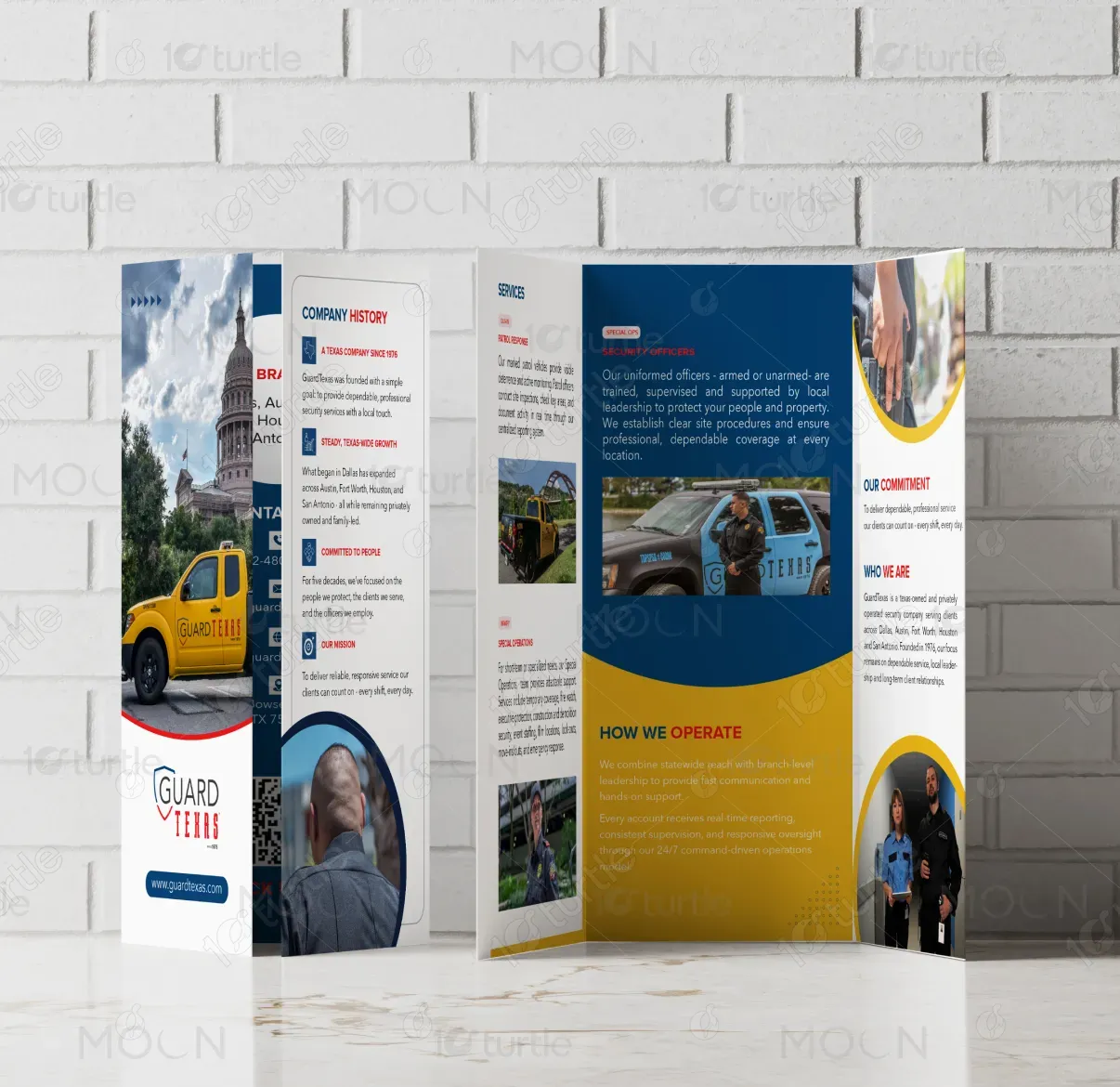
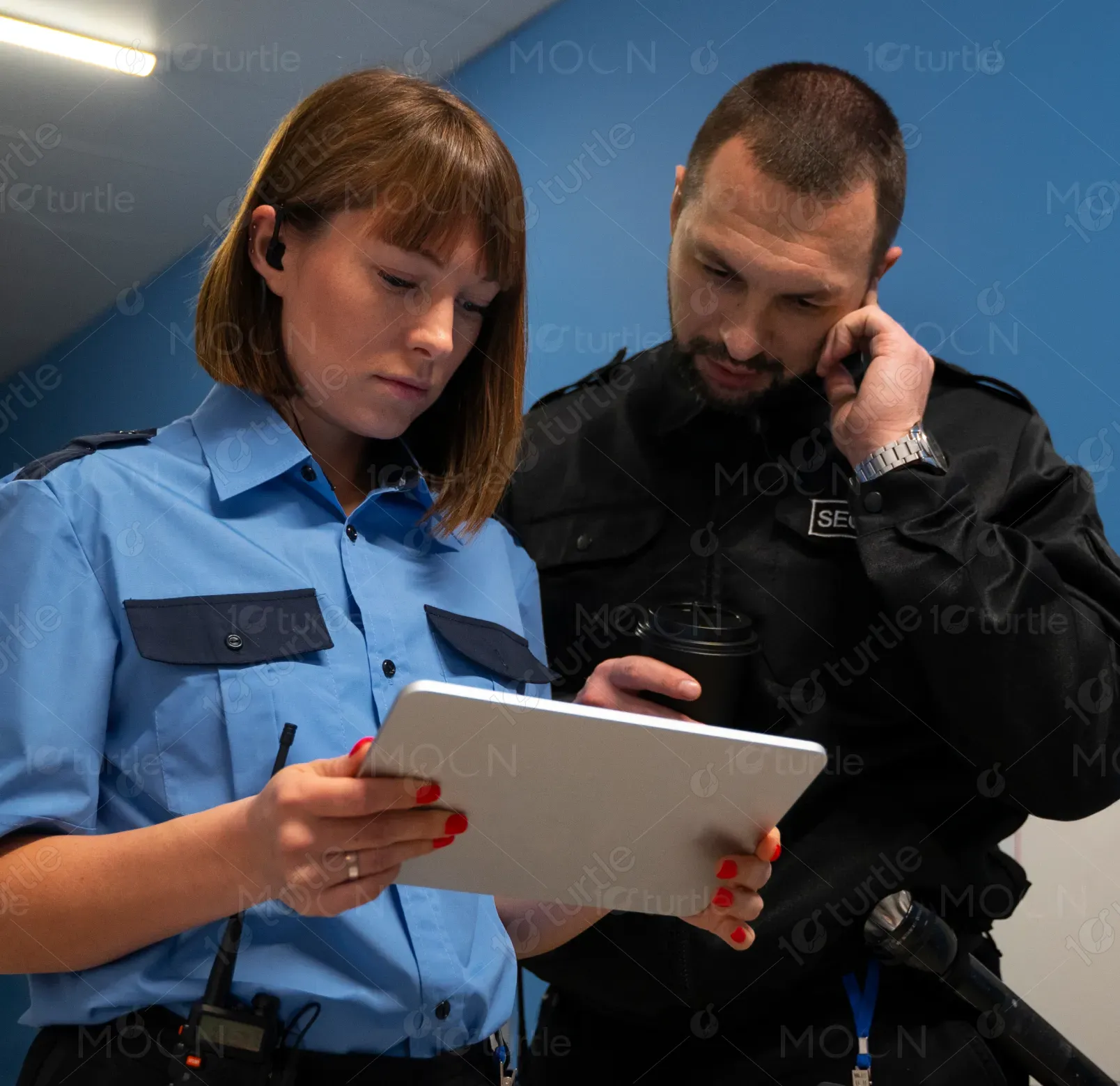
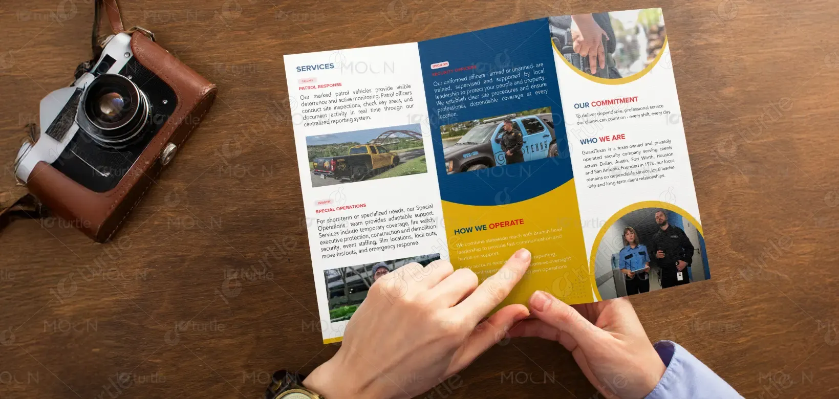
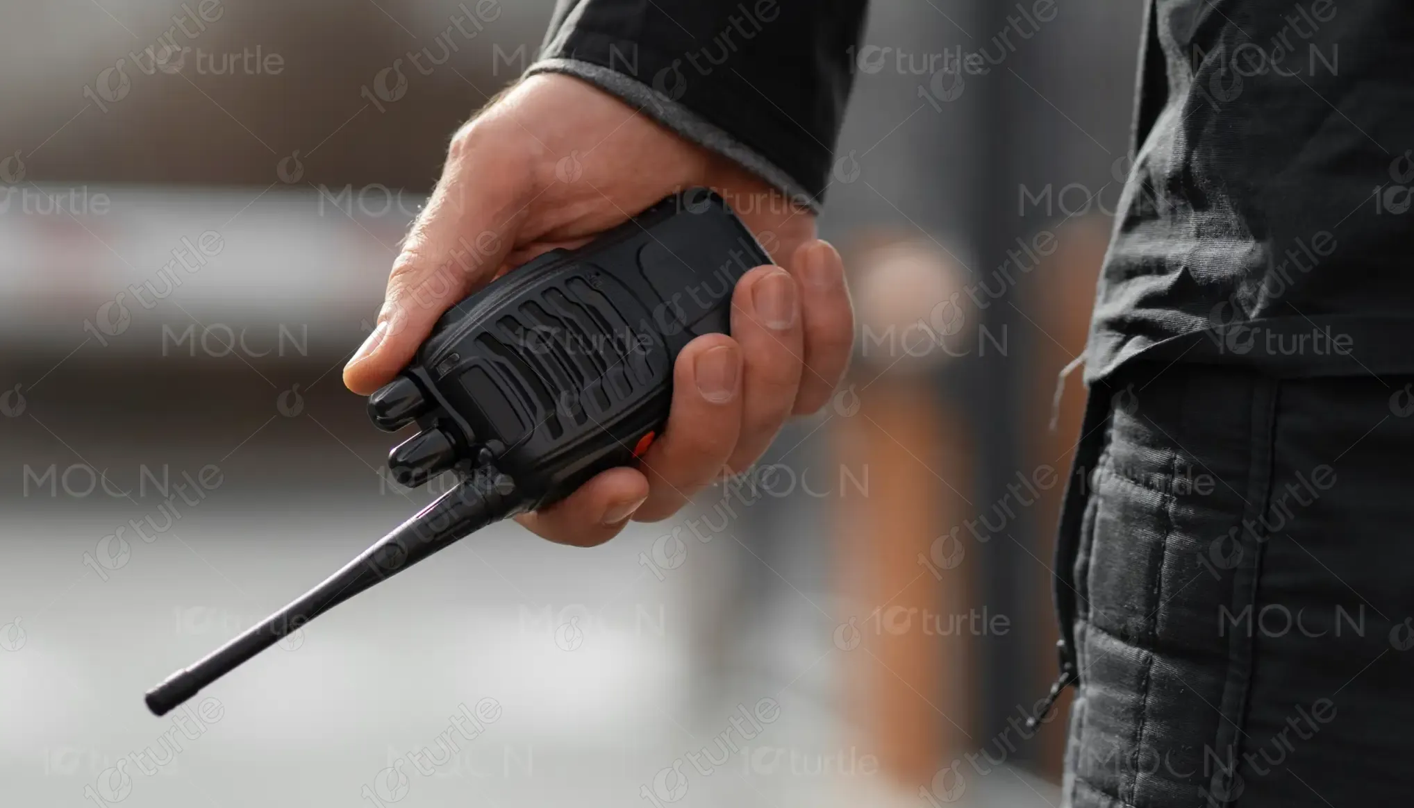
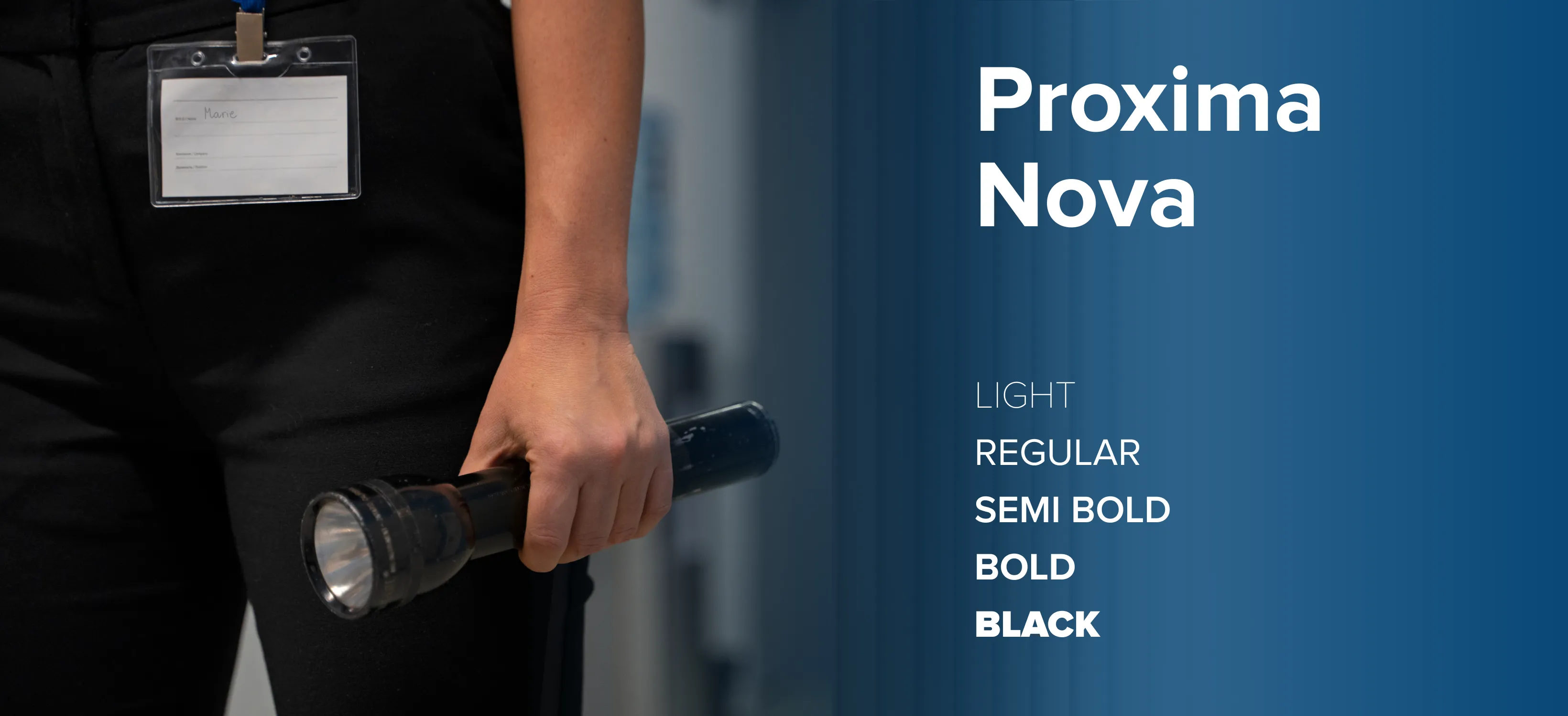
The trifold design follows a structured, authority-driven visual approach built for clarity and trust. A disciplined grid system ensures information is easy to scan, while bold section headers guide readers through services, values, and operations without overload. Typography balances professionalism and legibility, pairing strong headlines with clean body text for quick comprehension. High-contrast brand colors create visual separation between sections, while real-world imagery of officers and patrol vehicles reinforces authenticity and reliability. The overall hierarchy prioritizes key messages first, supporting confident decision-making in fast-paced environments.
Trifold Design
Graphic Design
Industry
Professional & B2B Services
Tools we used


Project Completion
2026
Key Market
Global
This trifold brochure represents GuardTexas, a Texas-owned private security company operating statewide since 1976. Its primary purpose is to clearly communicate the company’s services, operating model, and commitment to professionalism to potential clients.Designed for in-person distribution and client meetings, the brochure positions GuardTexas as a trusted, experienced, and locally led security provider, offering patrol response, uniformed officers, and specialized operations across multiple Texas cities.
Industry
Professional & B2B ServicesWhat we did
Trifold DesignGraphic DesignPlatform
-In the private security industry, clients often face unclear service offerings, inconsistent branding, and a lack of trust due to generic or overcrowded marketing materials. Many brochures fail to communicate operational credibility or differentiate one provider from another. This lack of clarity can result in hesitation, reduced engagement, and difficulty understanding how a security company actually operates day-to-day.
The design solves these challenges by introducing a clear information hierarchy and a service-first layout. Each panel focuses on a single purpose—services, operations, company background, or contact—reducing cognitive load.Strategic use of color blocks separates content logically, while real photography humanizes the brand and reinforces trust. The trifold format allows GuardTexas to present detailed information without overwhelming the reader, making the brochure effective in both quick reviews and deeper discussions.
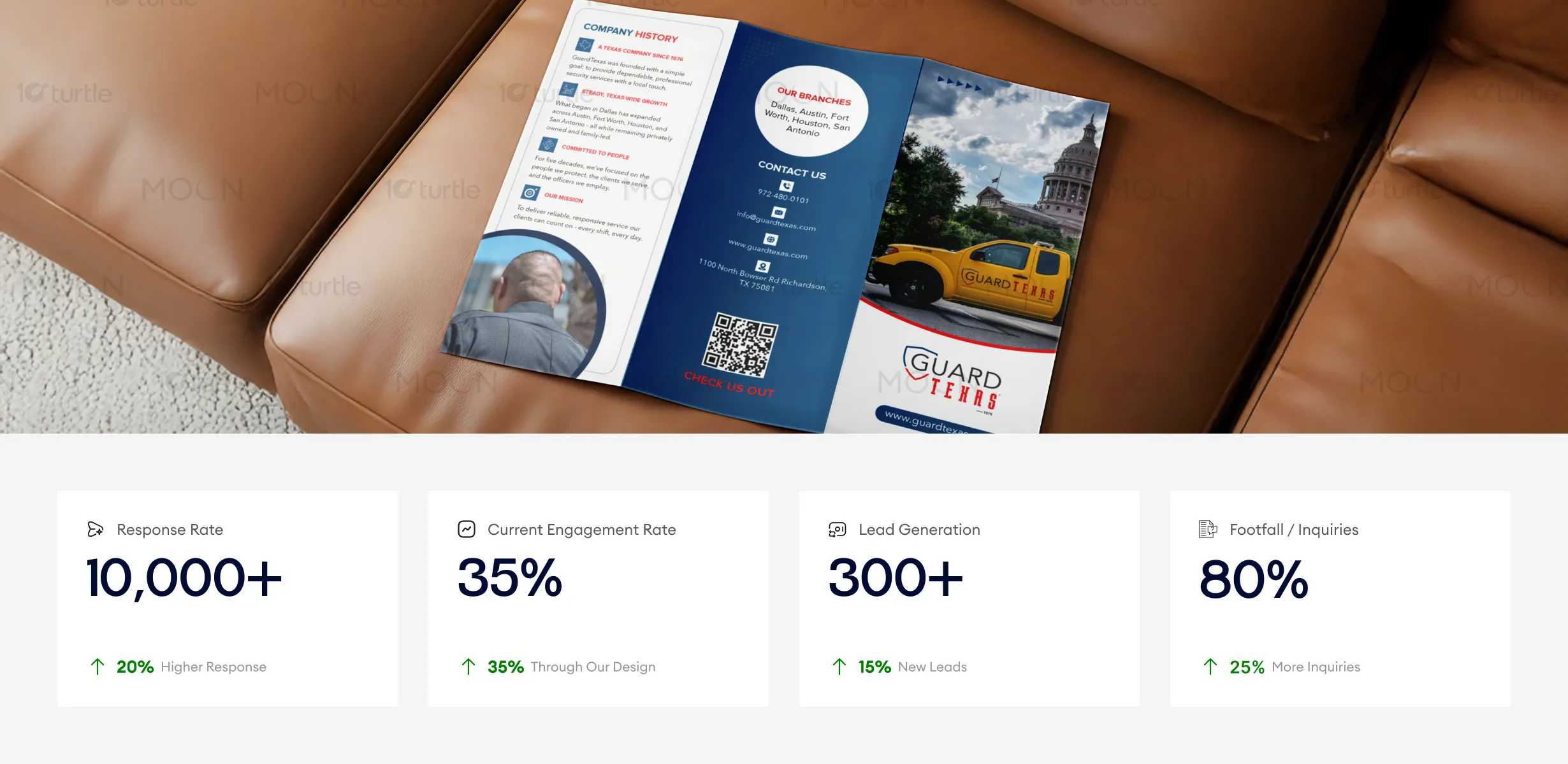
The trifold design is optimized for clear, quick decision-making, balancing professional aesthetics with easy-to-digest content. The high-impact design improves customer response rates and engagement, while the strong call-to-action elements such as the QR code drive measurable footfall and inquiries. The clear service description and trustworthy imagery contribute to increased lead generation and business growth. Key business metrics like response rate and lead generation could be further enhanced with targeted follow-up strategies post-engagement.
The design supports GuardTexas’s long-term vision of being recognized as a reliable, people-focused security partner rather than just a service provider. Its modular structure allows the content to scale across future marketing materials such as flyers, presentations, and digital assets.By emphasizing consistency, local leadership, and operational transparency, the design helps position GuardTexas as a stable, long-standing brand in a competitive security landscape.
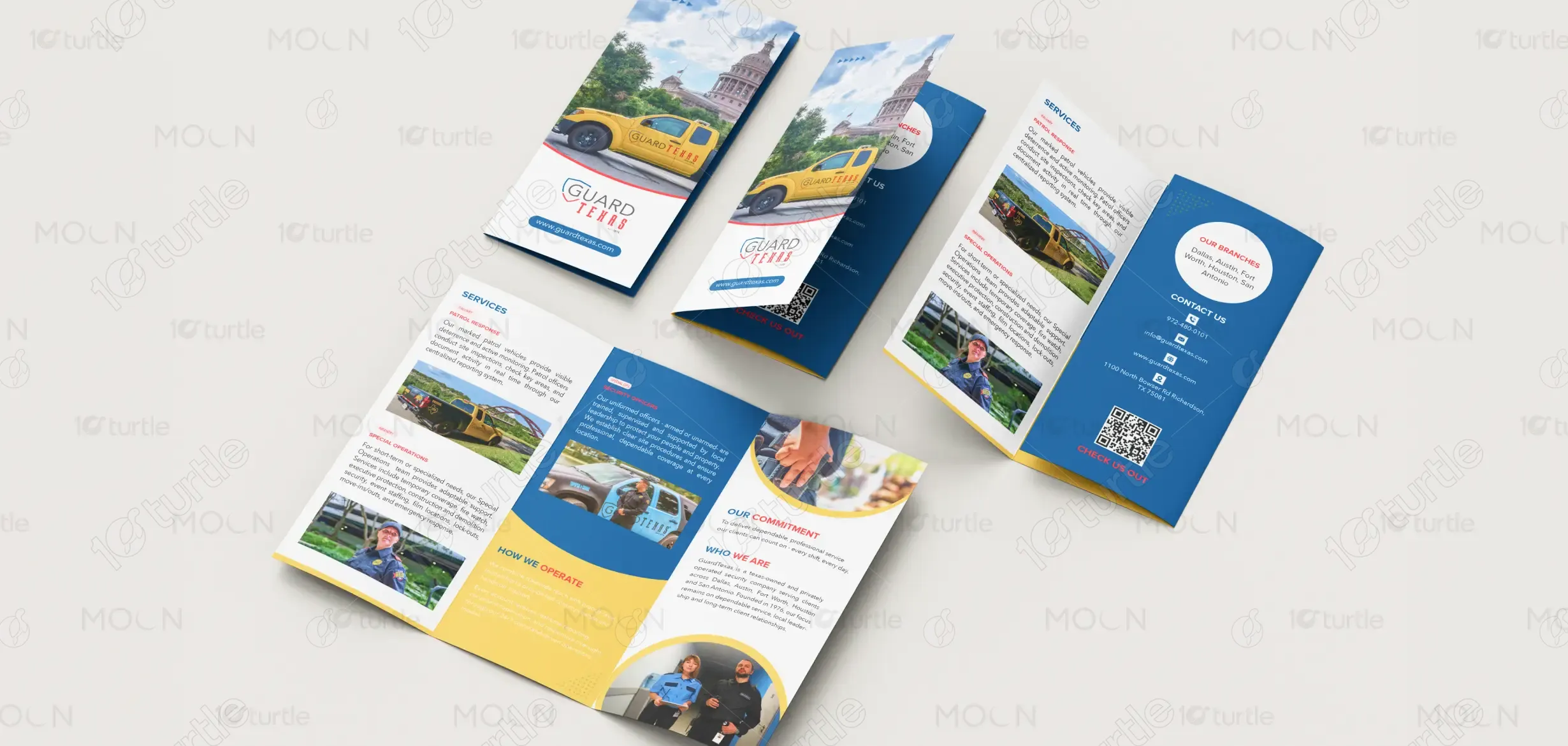
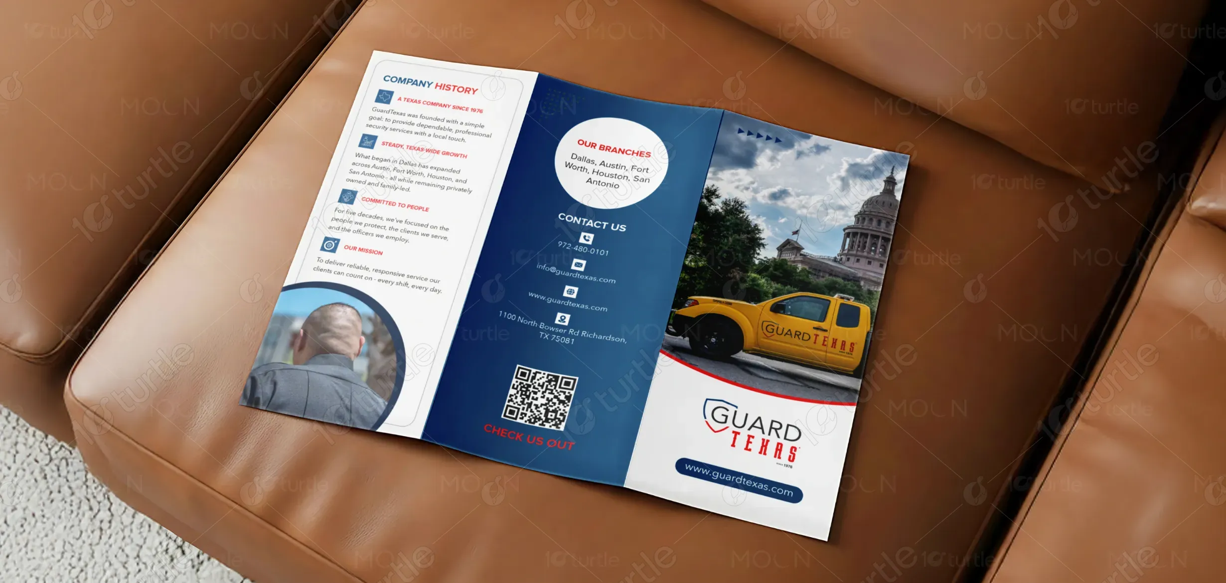
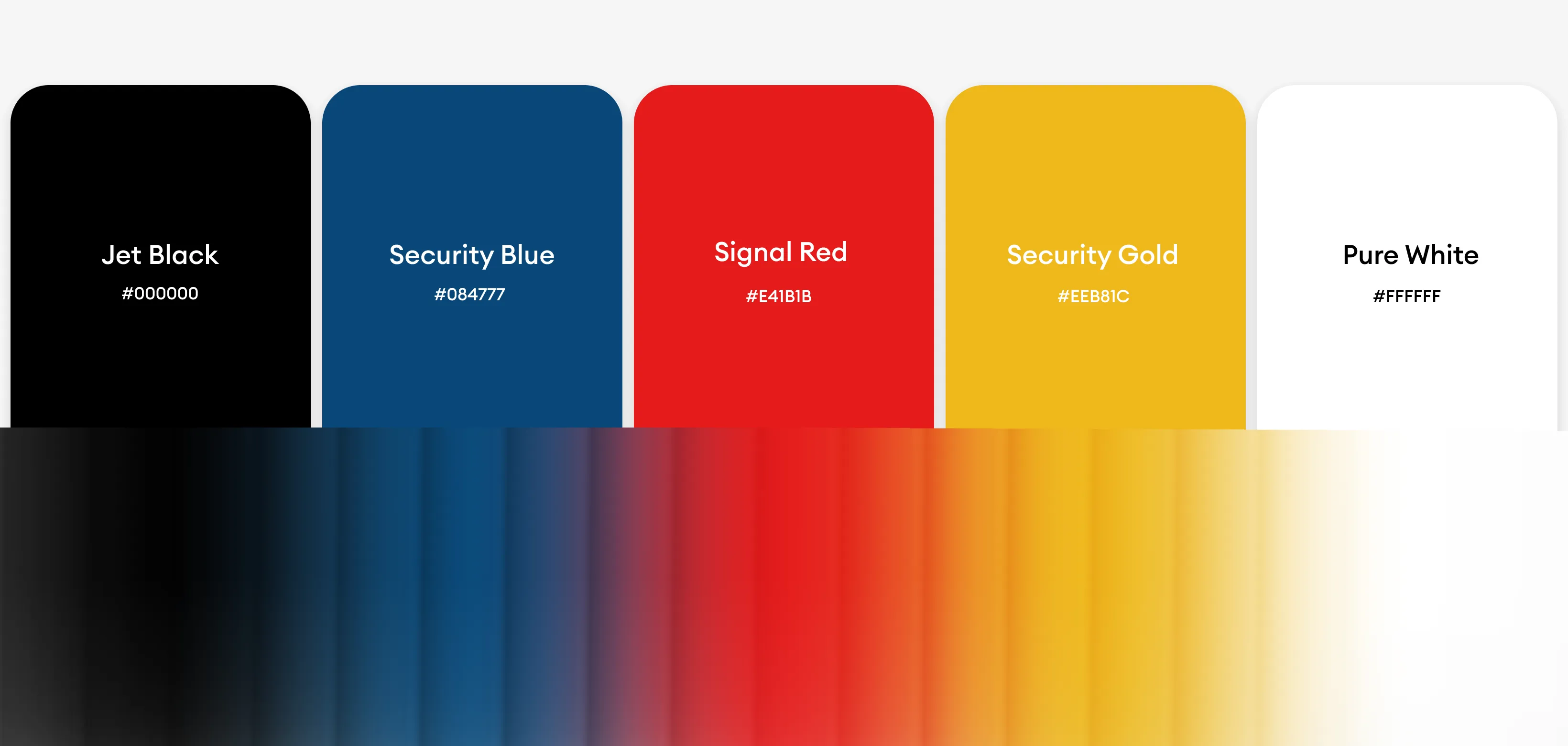
The color palette combines deep blue, white, and safety yellow, reflecting trust, professionalism, and visibility—key qualities in the security industry. Blue conveys authority and dependability, white enhances clarity and readability, and yellow acts as a strategic accent for emphasis and guidance. Rounded shapes, structured sections, and real-life imagery create a visual language that feels approachable yet disciplined, ensuring the design performs effectively across print environments while maintaining strong brand recognition.