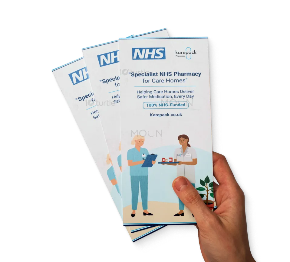
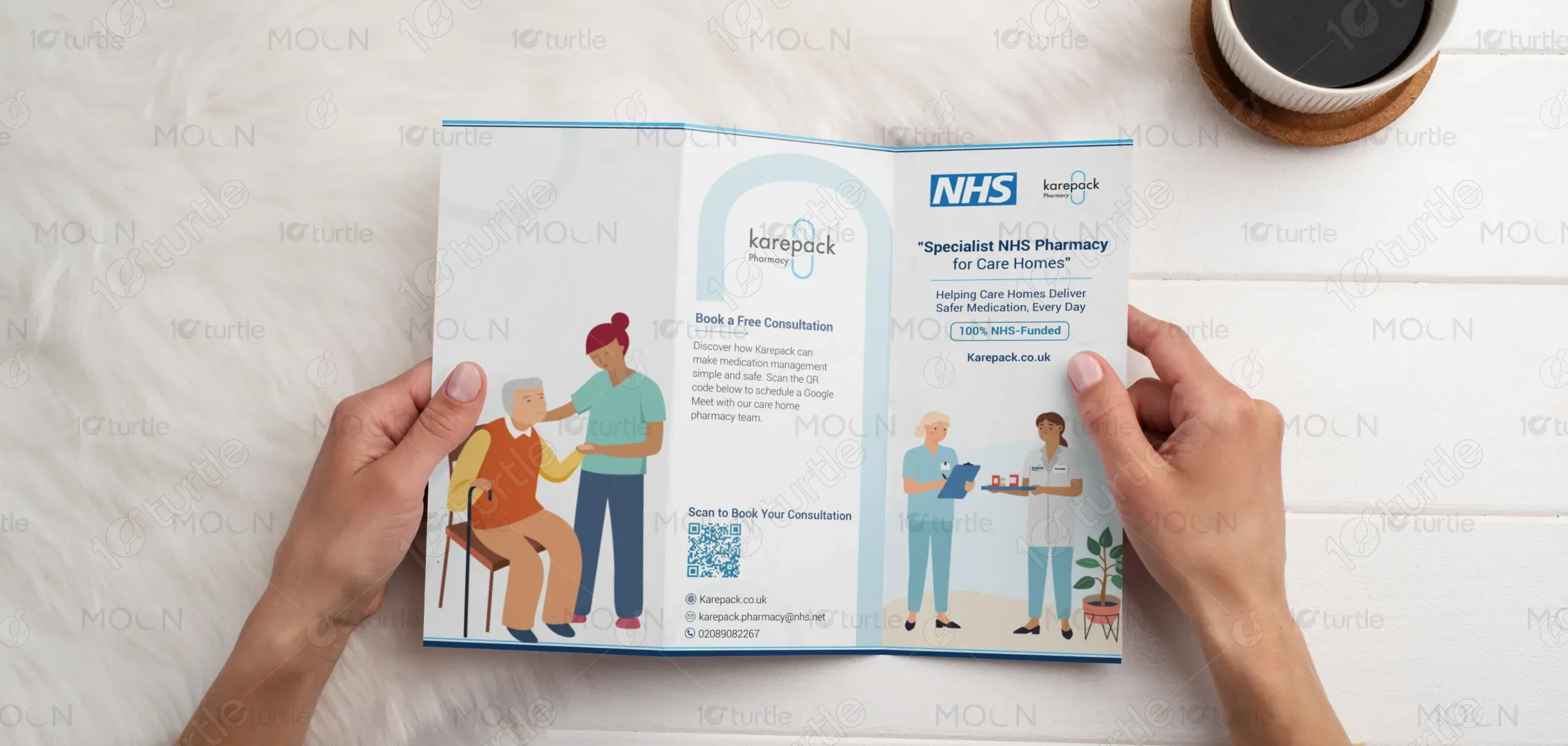
The tri-fold brochure follows a clean, professional, and approachable design approach, blending NHS trustworthiness with Karepack’s compassionate care message. Soft blues and whites establish a calming healthcare aesthetic, while illustrations humanize the service, showcasing staff and residents in warm, supportive interactions. The layout emphasizes clarity and accessibility, with bold headers, icons, and structured sections guiding readers smoothly. A balance between informative content and visual storytelling ensures that care home managers instantly connect with Karepack’s promise of reliability, partnership, and simplicity.
Tri-Fold Design
Graphic Design
Industry
Healthcare & Wellness
Tools we used


Project Completion
2025
Key Market
Global
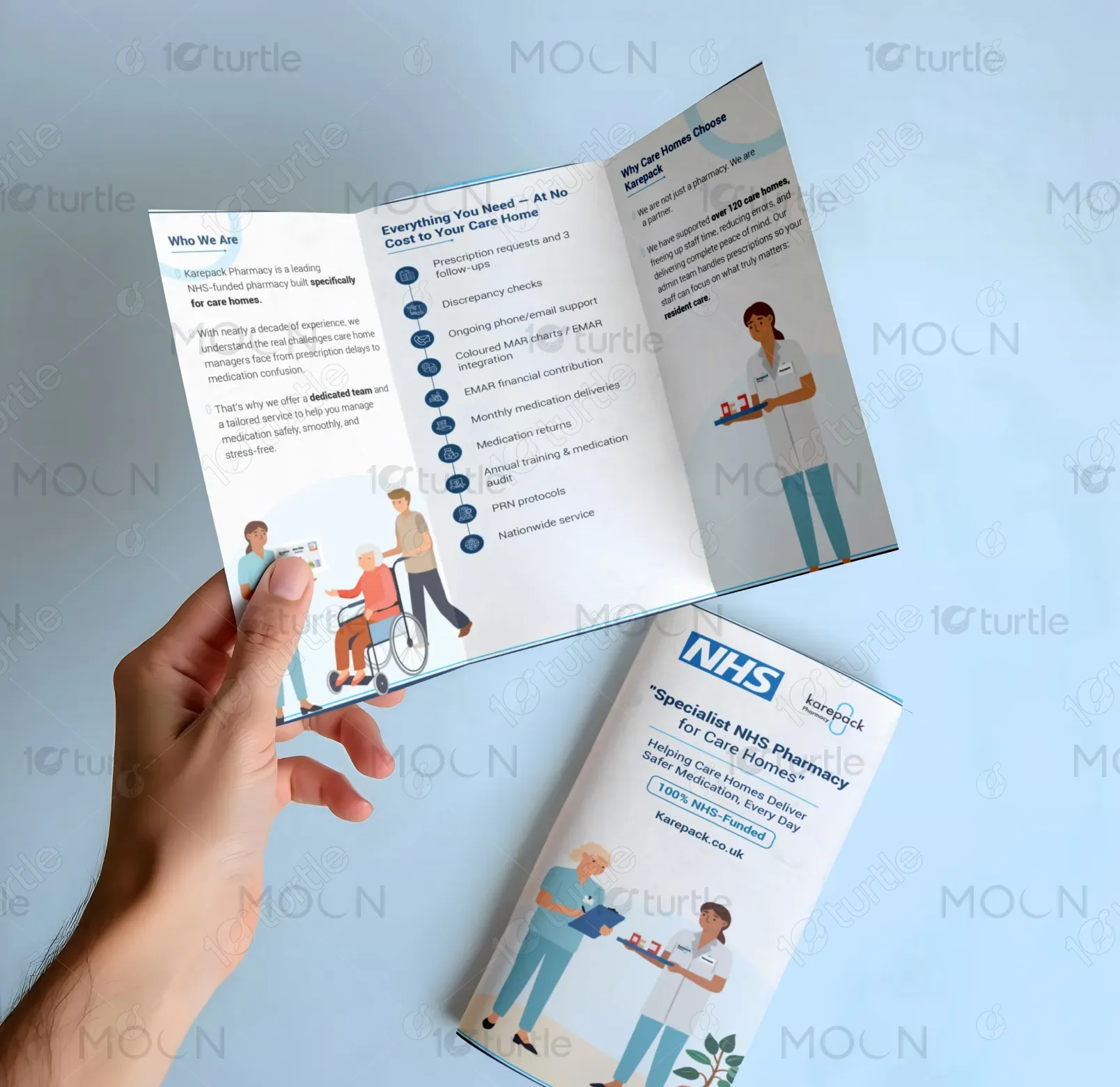
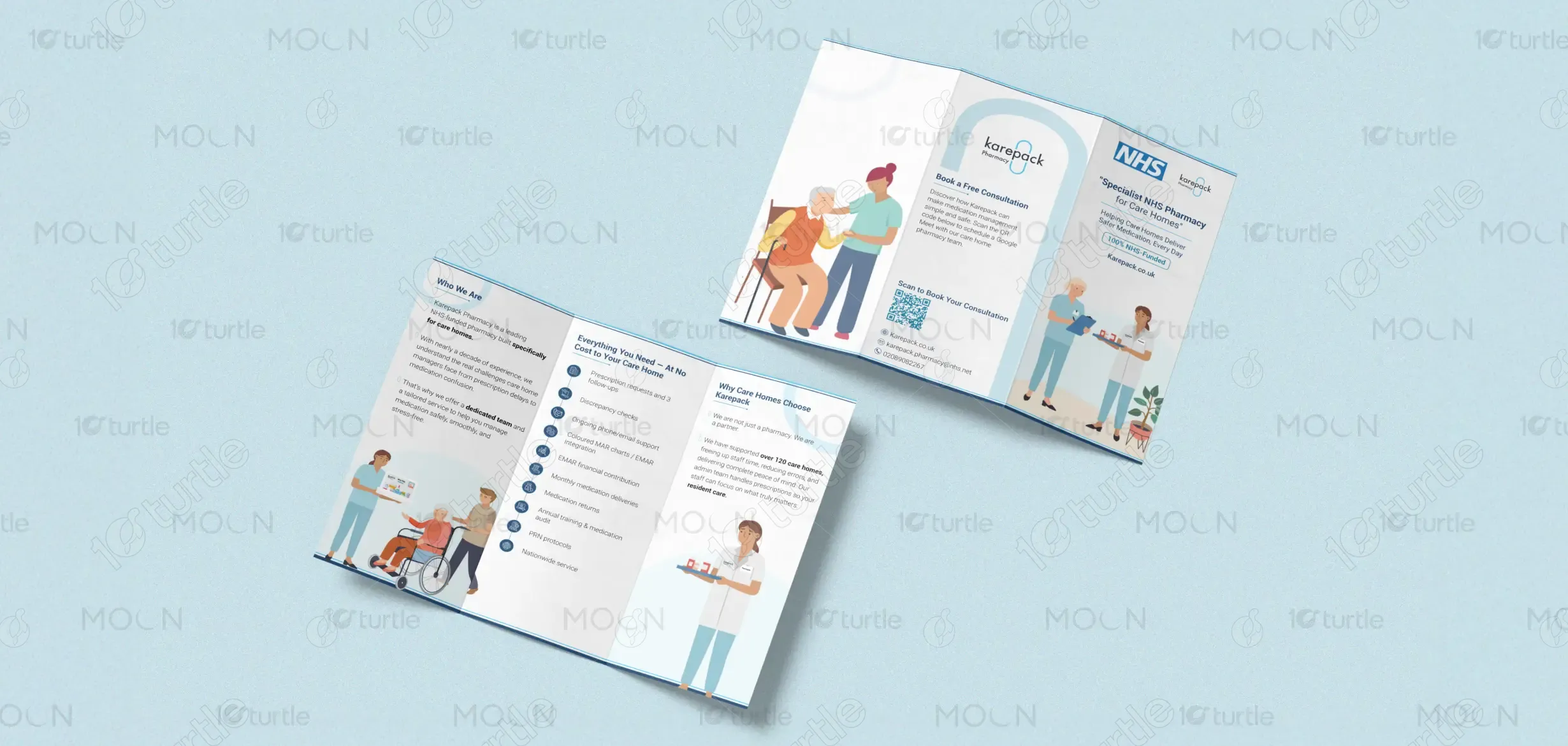
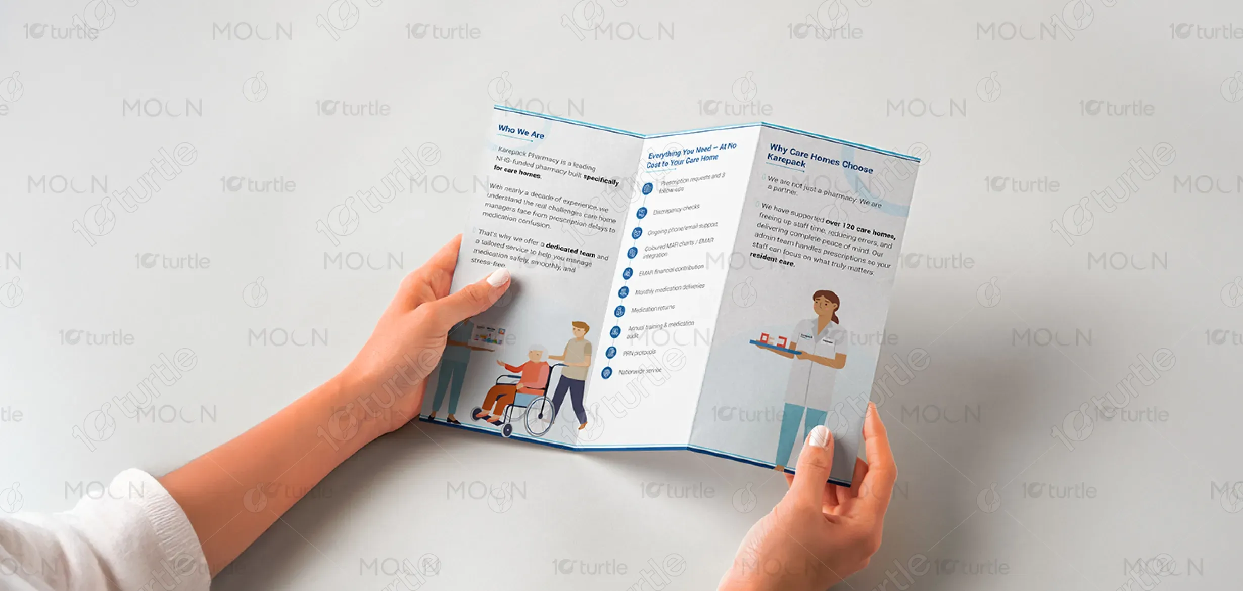
This tri-fold brochure presents Karepack Pharmacy, a specialist NHS-funded pharmacy for care homes. It highlights Karepack’s role in making medication management simple, safe, and stress-free for care home staff and residents. The design introduces key services, unique advantages, and seamless nationwide support. Its purpose is to inform and engage care home decision-makers, positioning Karepack as a trusted partner rather than just a supplier. By blending clear content with caring visuals, the brochure communicates credibility, partnership, and peace of mind.

Industry
Healthcare & WellnessWhat we did
Tri-Fold DesignGraphic DesignPlatform
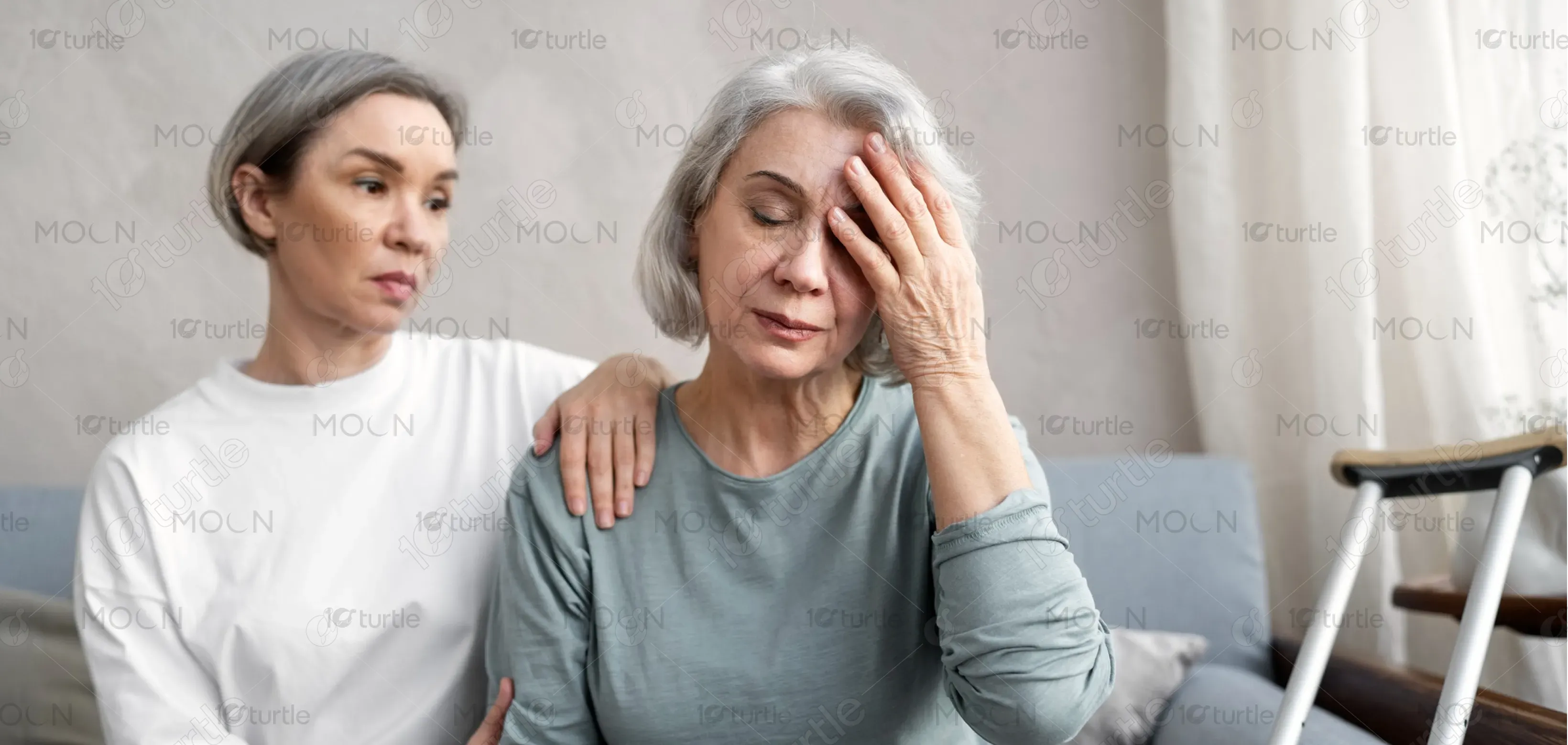
-Care homes often face challenges with medication management, including prescription errors, administrative overload, and inconsistent communication with pharmacies. These issues result in staff burnout, reduced time for resident care, and potential risks to patient safety. Traditional pharmacy services lack tailored support for care homes, leading to inefficiencies and stress for staff. The absence of specialized, streamlined services means managers spend excessive time handling medication processes rather than focusing on what matters most—quality resident care.
Karepack addresses these challenges by offering a dedicated, NHS-funded pharmacy service exclusively designed for care homes. Their solutions include prescription management, medication audits, EMAR integration, training, and round-the-clock support—all at no additional cost. By handling administrative burdens, Karepack frees staff to focus on residents. The user-centric approach combines healthcare professionalism with practical tools, reducing errors and ensuring compliance. This holistic solution simplifies complex processes, enhances safety, and delivers peace of mind to both staff and families.
Karepack envisions becoming the most trusted pharmacy partner for care homes across the UK. Its long-term goal is to revolutionize medication management, setting new standards of safety, efficiency, and compassion in the sector. By continuously innovating with digital tools, training, and integrated services, Karepack aims to empower care homes to provide exceptional resident care. The brand aspires to create a lasting impact by being recognized not just as a pharmacy, but as a true healthcare partner.

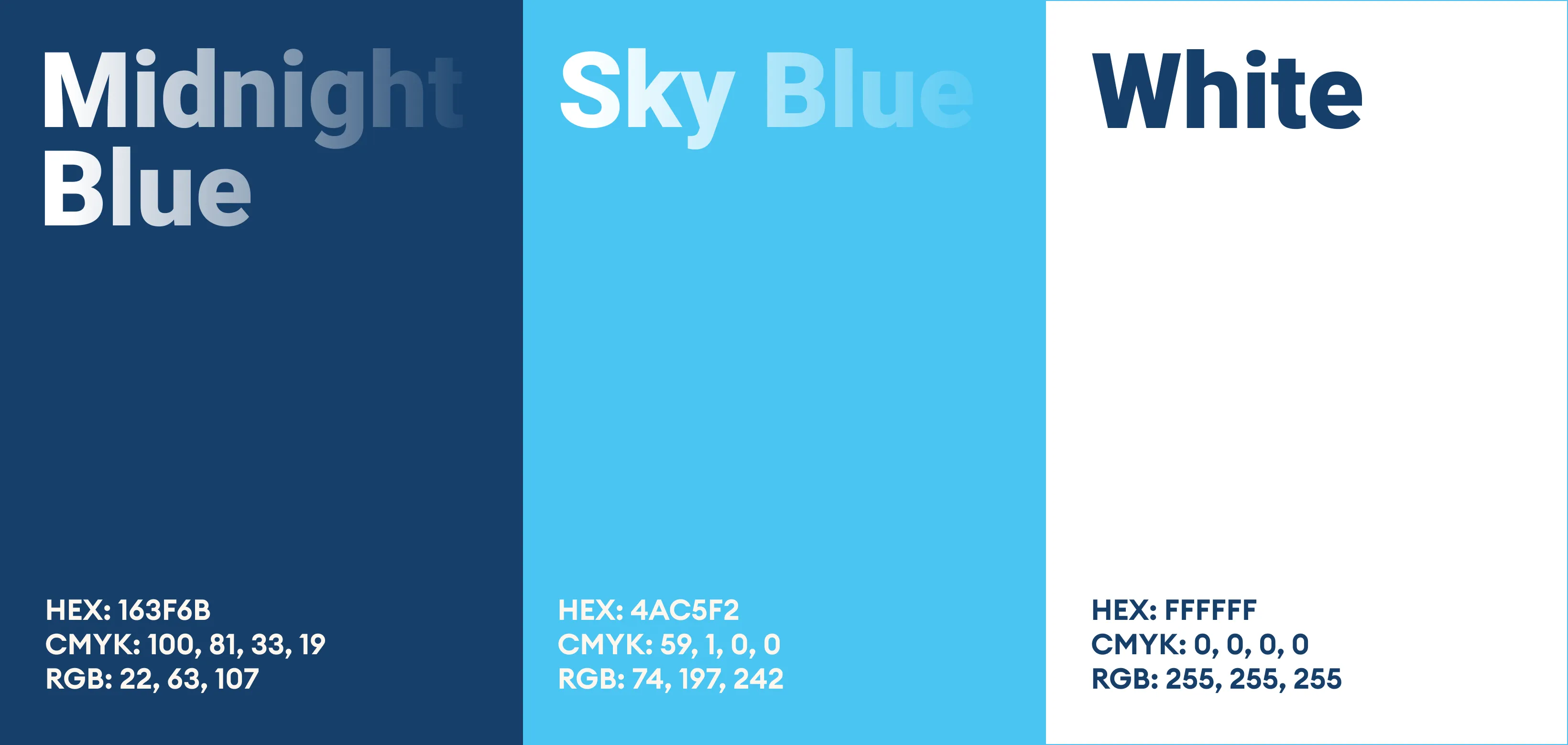
The color scheme primarily uses shades of blue, white, and soft neutrals. Blue conveys trust, professionalism, and reliability, aligning with the NHS identity and reassuring care providers. White emphasizes cleanliness, safety, and transparency, reflecting the clinical precision of pharmacy services. Subtle warm tones in illustrations add a human touch, symbolizing care and compassion. Together, the palette balances professionalism with empathy, making the design approachable while reinforcing Karepack’s commitment to safe and reliable healthcare support.