Where Spaces Shine with Style. Glass Glow is a premium window tinting company dedicated to enhancing comfort, privacy, and aesthetics through expert tinting solutions. The website highlights their mastery in installing high-quality films for homes, offices, and vehicles, blending functionality with elegance. From heat reduction to UV protection, they deliver tailored solutions that improve energy efficiency, preserve interiors, and create visually stunning spaces.
UX Design
UI Design
Research
Websites Design
Industry
Professional & B2B Services
Tools we used


Project Completion
2024
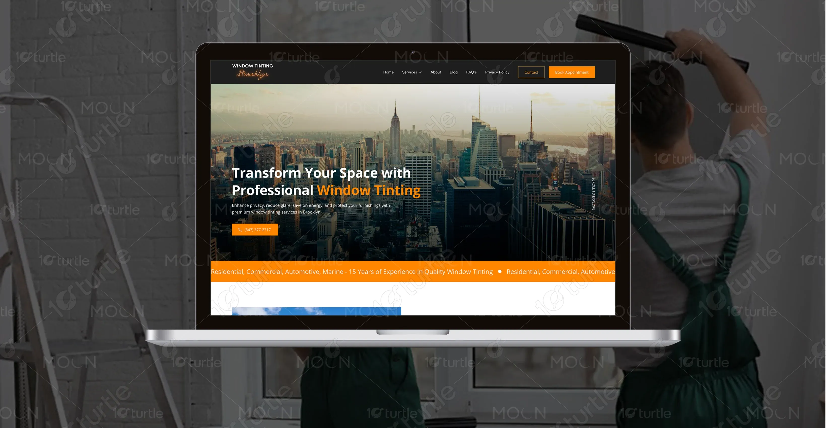
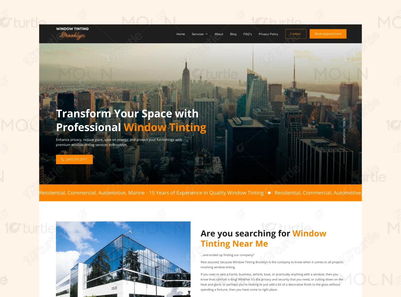
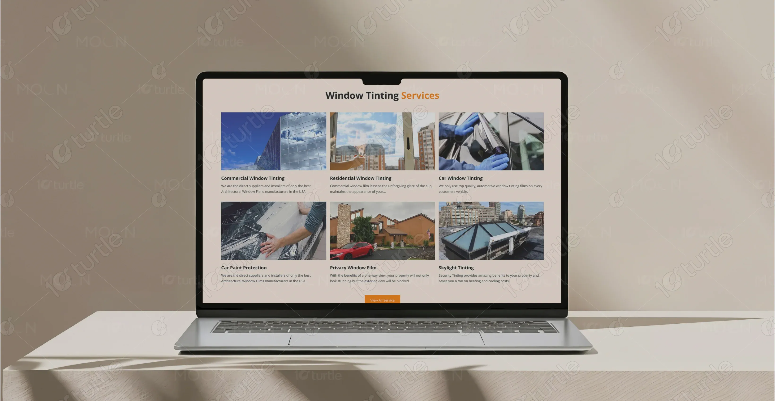
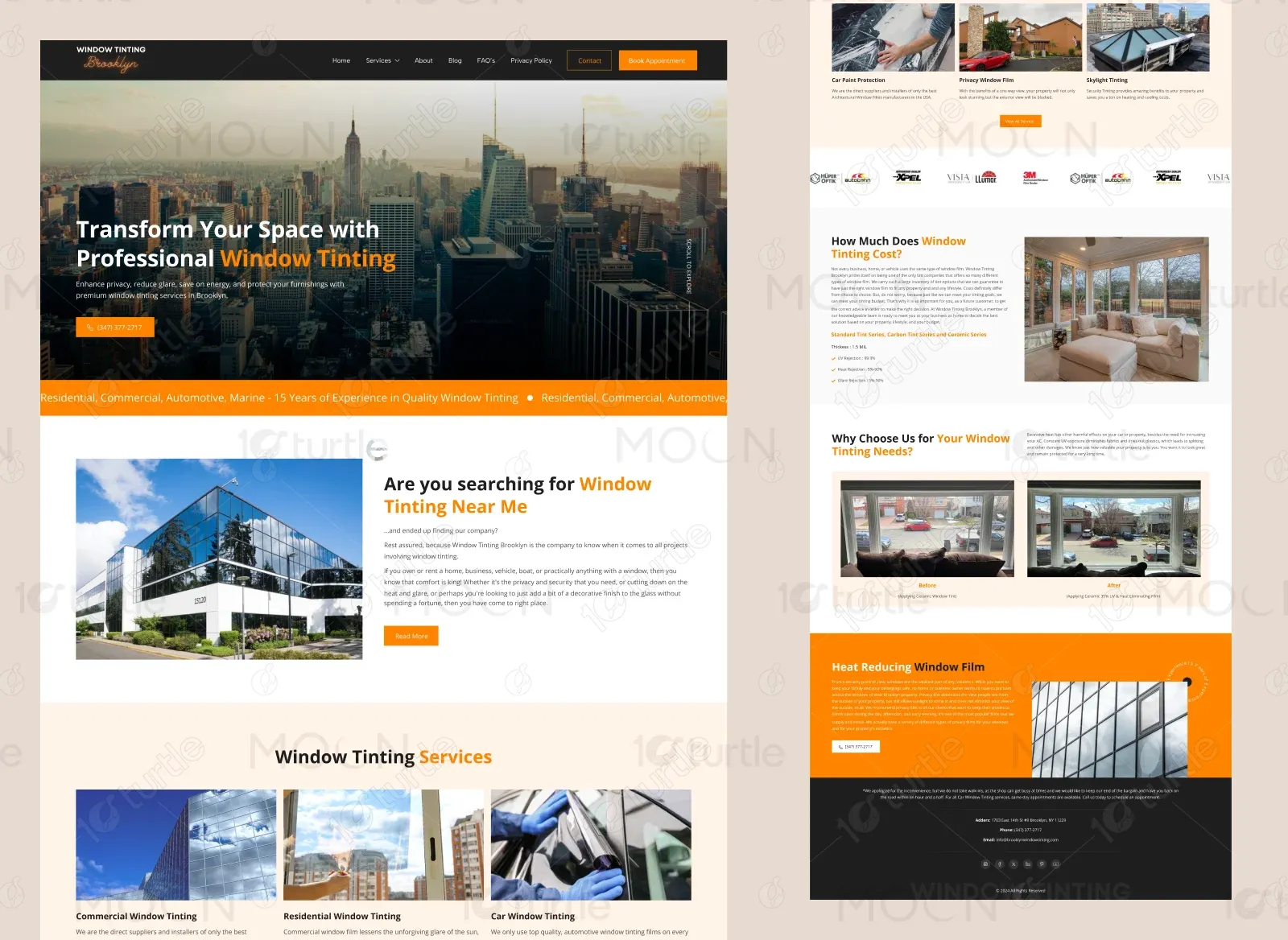
The project aimed to design a sleek and professional website that would effectively showcase the expertise of Brooklyn Window Tinting’s services. The client’s main objectives were to create a strong online presence, highlight a portfolio of completed tinting projects, and provide a seamless process for quotes and appointments. An important aspect of the scope was to build trust and credibility by emphasizing client reviews, service benefits, and examples of high-quality installations.
Industry
Professional & B2B ServicesWhat we did
User ResearchUI UX DesigningResponsive ExperiencePlatform
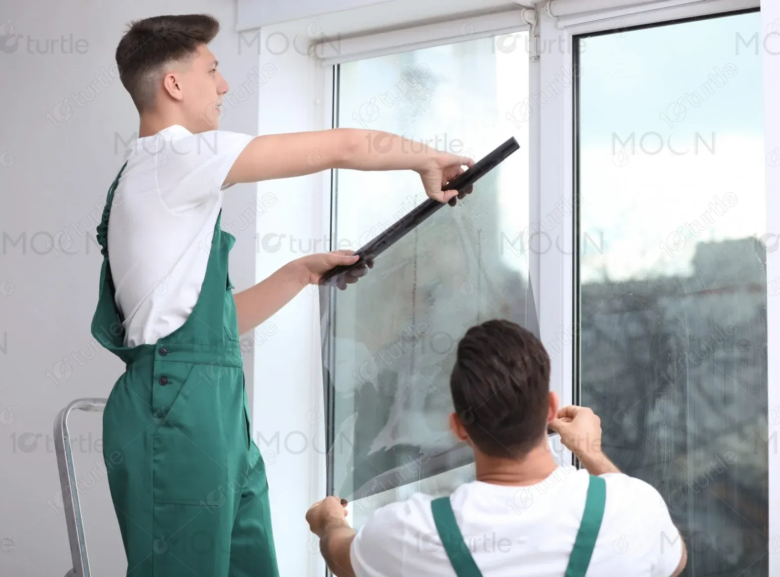
-Before this project, Brooklyn Window Tinting lacked a modern online platform that reflected the professionalism and quality of their services. The absence of a visually engaging portfolio and streamlined service descriptions made it difficult for potential customers to explore options or understand the benefits. Inconsistent branding and limited appointment booking functionality further impacted customer trust and reduced inquiries.
To address these challenges, the design approach prioritized clarity, professionalism, and ease of use. The website takes visitors through an engaging visual experience, starting with a bold hero section and transitioning into service showcases, benefits, and a simple booking system. High-quality project images, clean modern typography, and intuitive navigation combine to deliver a polished platform that inspires confidence and encourages conversions.
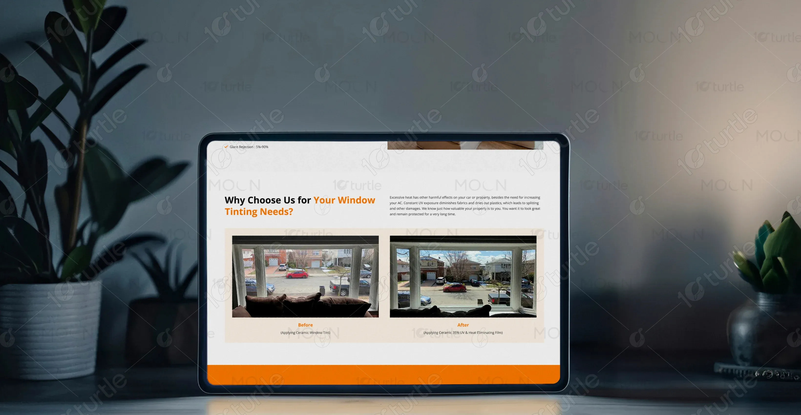
The client envisioned a website that would feel sleek, professional, and inviting while reflecting the high-quality nature of their work. They were inspired by modern service-based brands and lifestyle sites that balanced minimal design with impactful visuals. Specific requests included a clean service showcase, high-resolution before-and-after galleries, an emphasis on customer testimonials, and a refined color palette to convey trust, sophistication, and warmth.
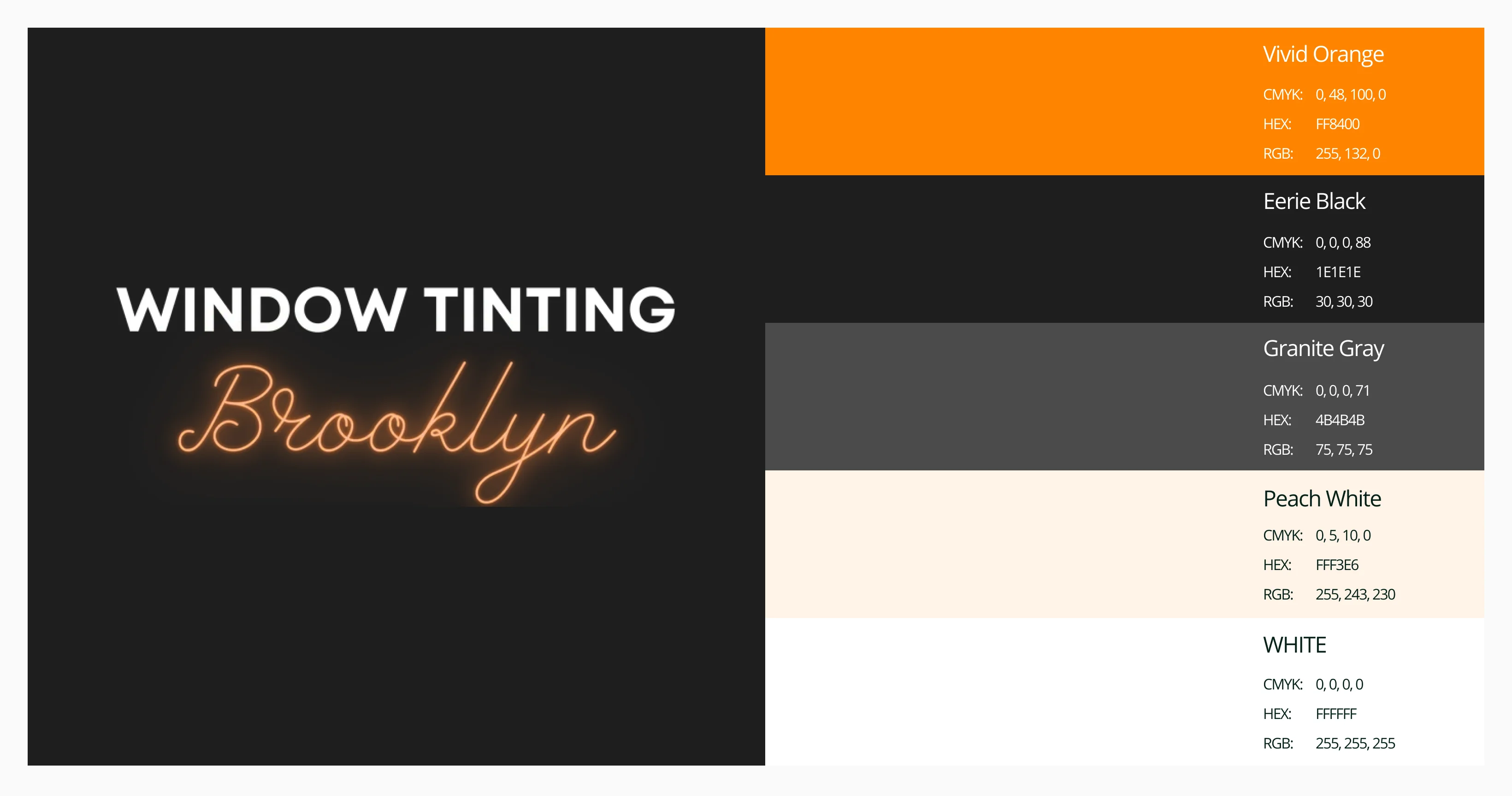
The Brooklyn Window Tinting logo features a bold, modern wordmark paired with an elegant script accent for the location name. The clean typography and contrasting styles create a professional yet approachable identity, reflecting both precision and personal service. The warm, glowing color palette conveys trust and expertise, while the balanced composition emphasizes quality craftsmanship without overpowering the overall brand aesthetic.
The primary colors include soft beige, warm blush, and muted browns. These hues convey feelings of warmth, intimacy, and understated luxury. Secondary colors, such as cream and dusty pink, add depth and variety while maintaining visual harmony. Together, the palette reinforces the brand’s emphasis on creating inviting, memorable experiences.
Initial wireframes outlined a clear, vertically structured layout with defined content blocks: a hero banner, gallery grid, service sections, testimonials, and a contact area. This approach ensured a logical content flow, guiding users naturally through discovery, trust-building, and conversion. Wireframes were also used to test visual hierarchy and spacing before high-fidelity design began.