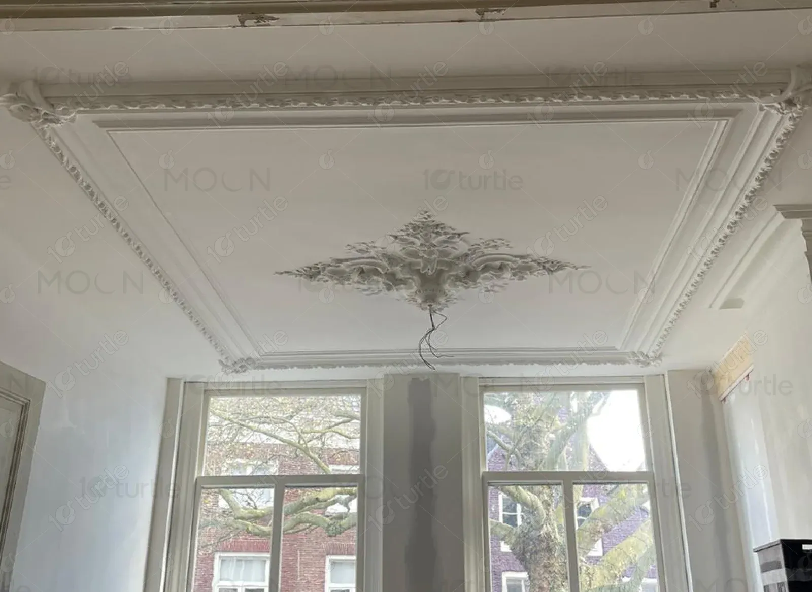
Kiaschaar Landing brings master-level plastering to architectural spaces, blending traditional craftsmanship with modern refinement. From ornamental ceilings to intricate finishes, every detail is tailored to elevate environments with sophistication and style.
UX Design
UI Design
Research
Websites Design
Industry
Property, Construction and Real Estate
Tools we used

Project Completion
2024
Kiaschaar Landing is dedicated to delivering refined plastering solutions that bring luxury, character, and sophistication to architectural spaces. Blending heritage techniques with contemporary execution, the studio transforms ceilings and walls into artistic centerpieces. Every project reflects a deep commitment to quality, craftsmanship, and timeless beauty-making Kiaschaar Landing a trusted partner in creating elevated environments.
Industry
Property, Construction and Real EstateWhat we did
User ResearchUI UX DesigningPlatform
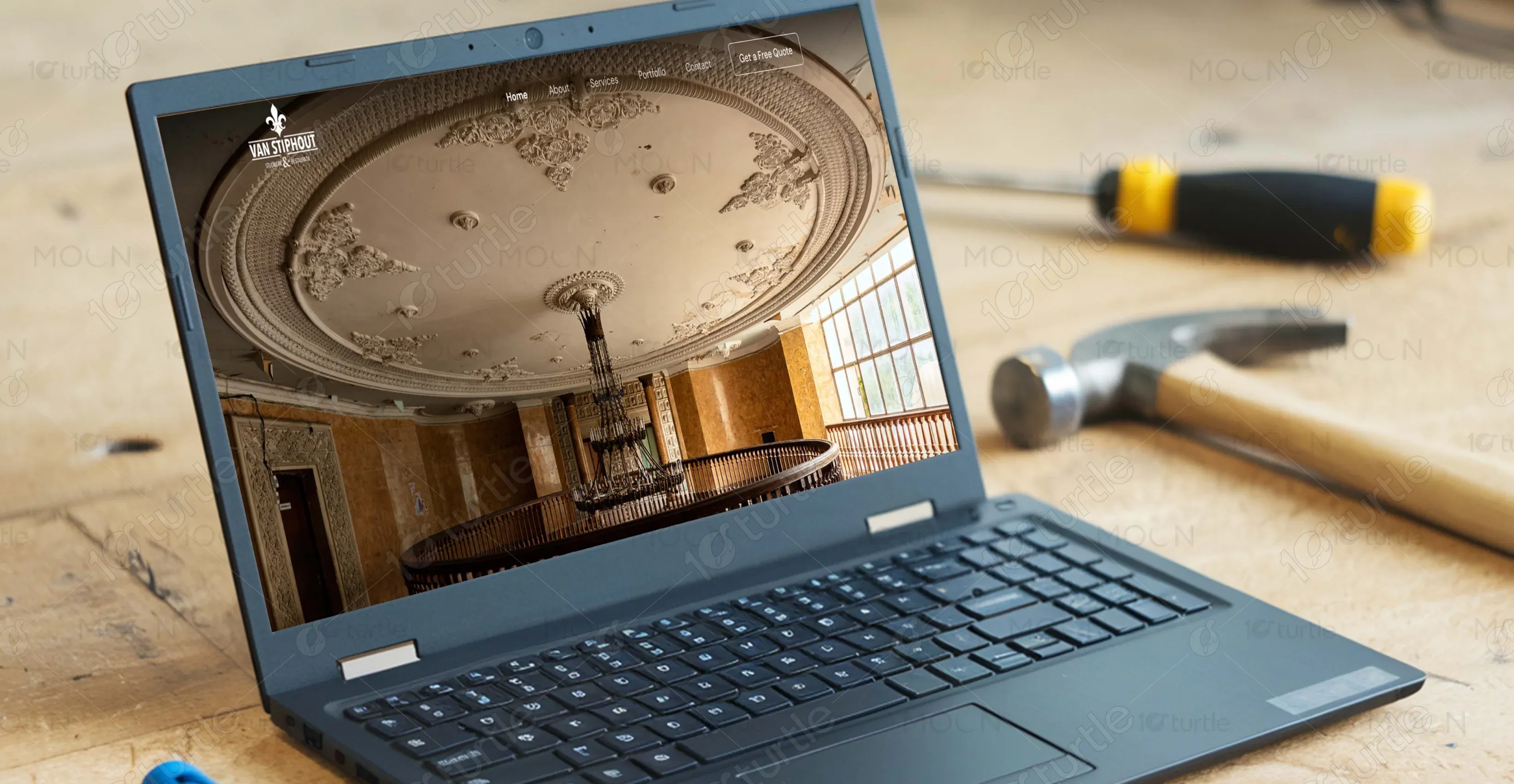
-Before the redesign, Kiaschaar Landing’s digital presence did not reflect the sophistication or luxury of its plastering services. The layout was outdated, lacked visual hierarchy, and failed to convey the premium quality of the craftsmanship. Visitors found it difficult to navigate the site or understand the uniqueness of the offerings.
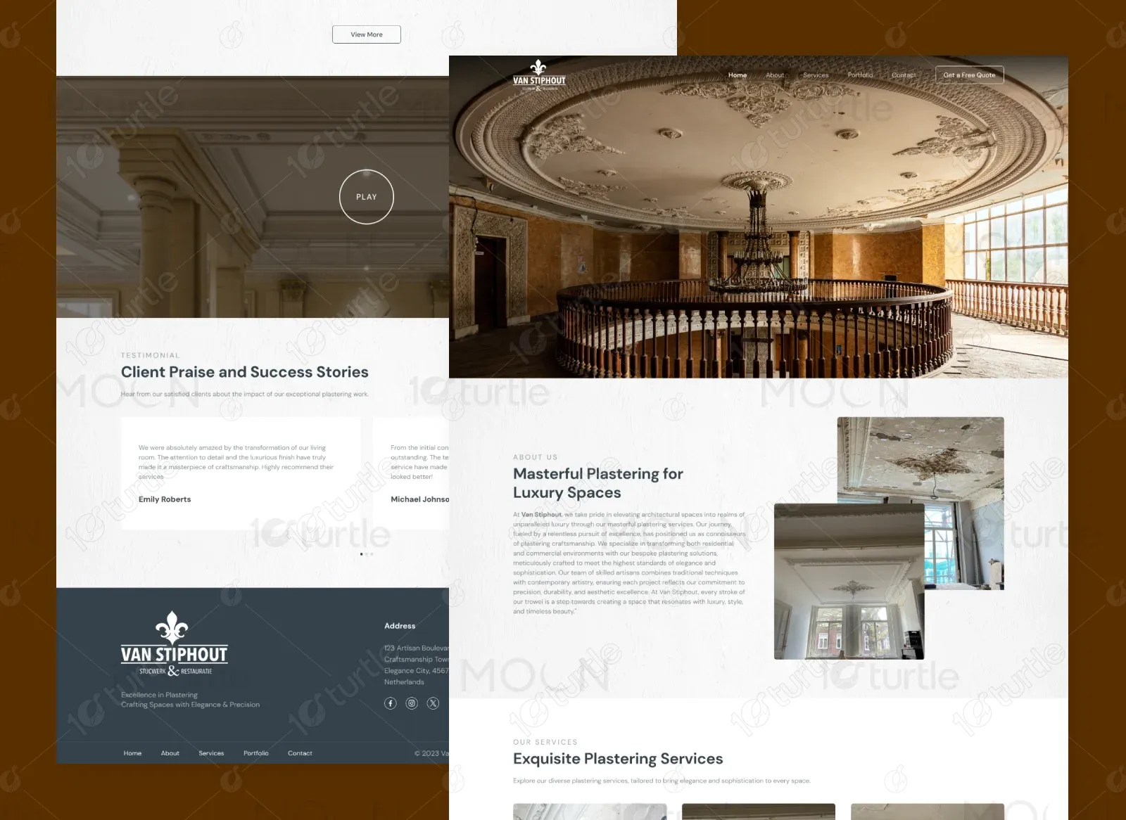
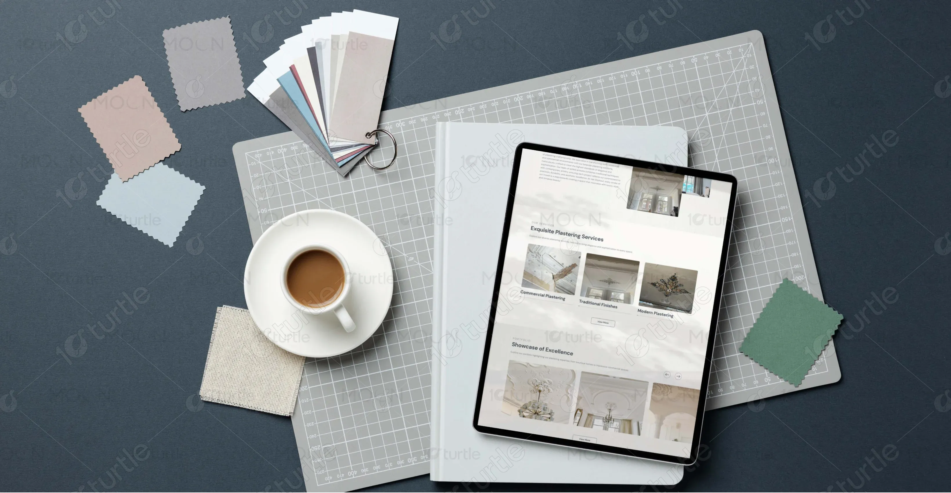
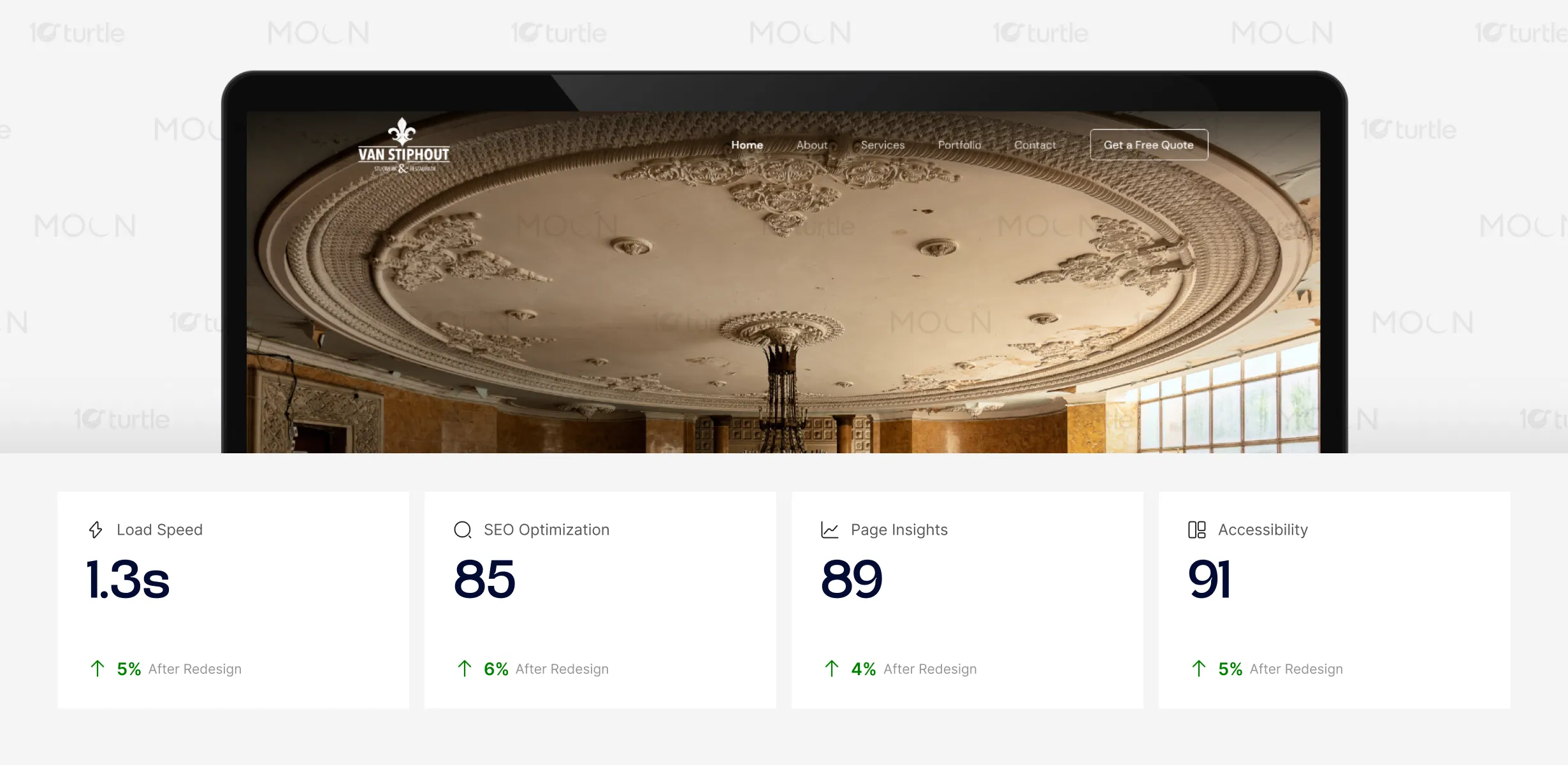
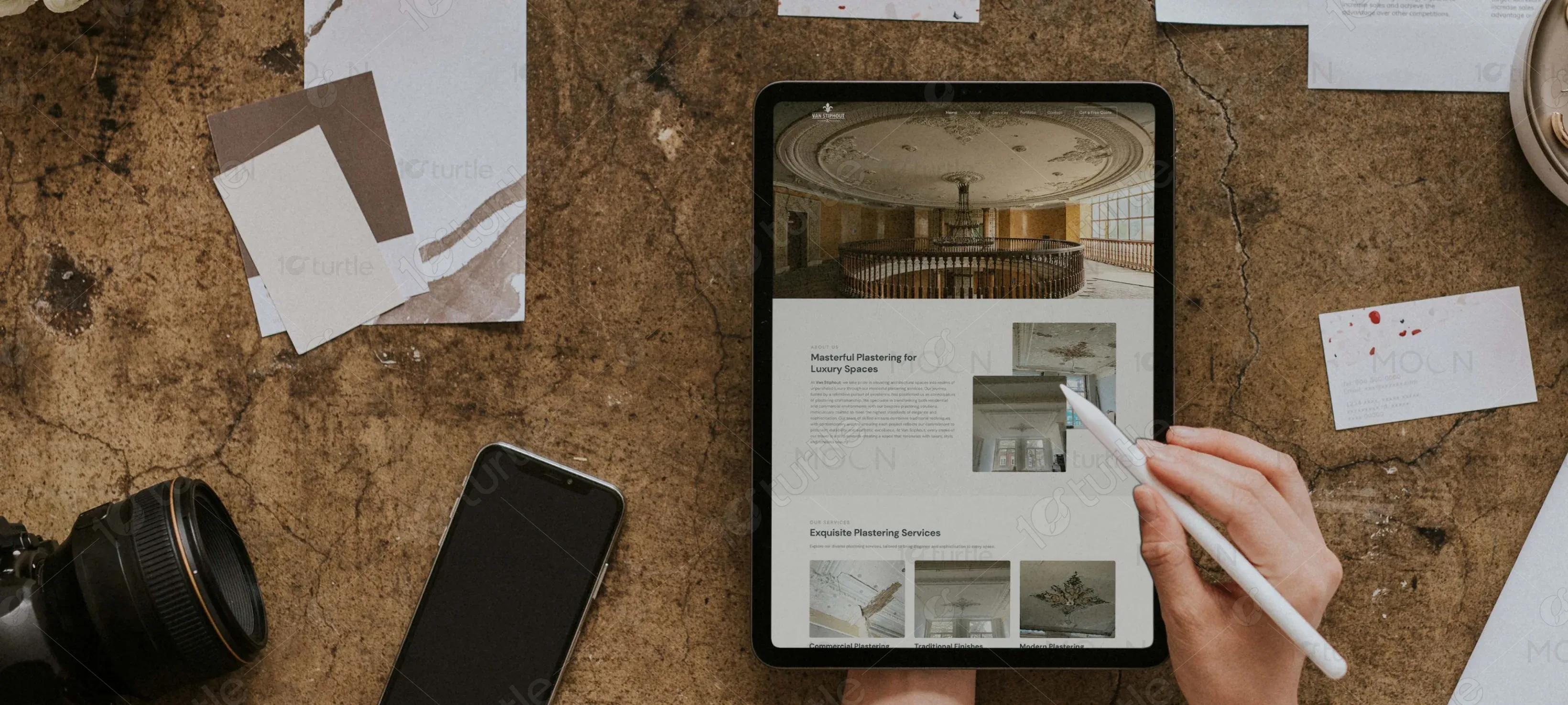
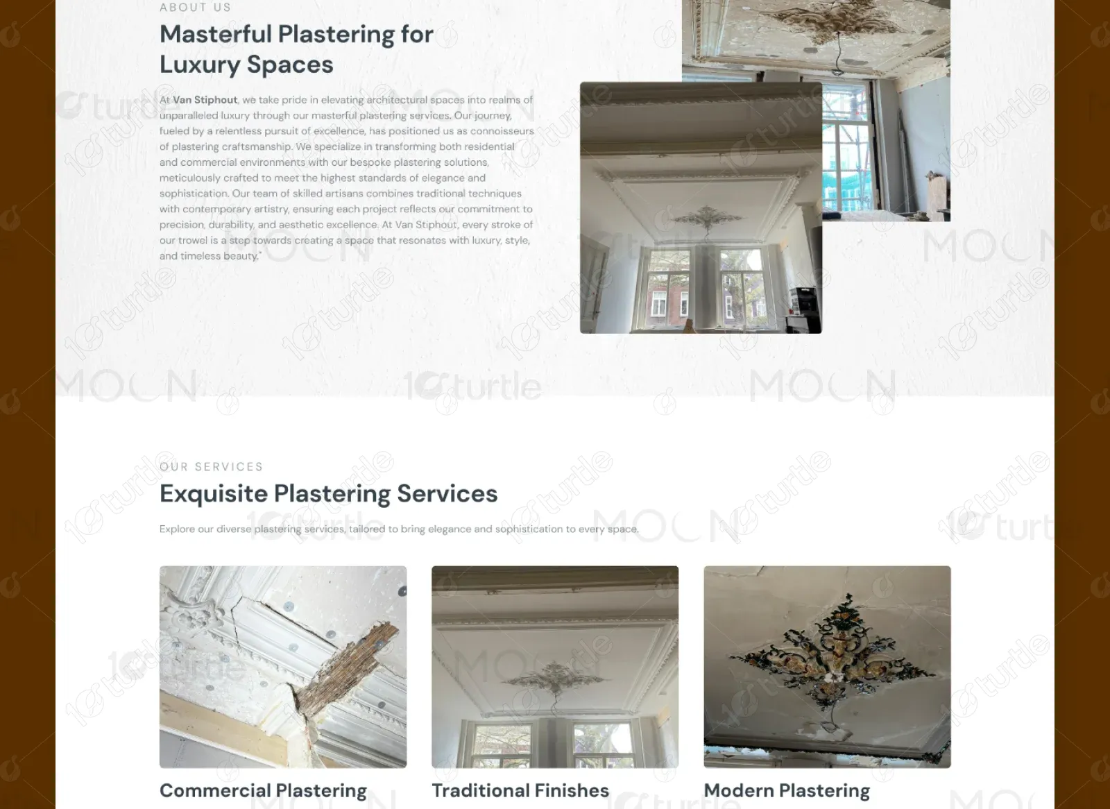
We crafted a refined and modern website design that captures the brand’s essence—elegant, artistic, and timeless. A visually commanding hero section was introduced, along with clearly structured service highlights and immersive imagery. The layout emphasizes reuse of design elements for consistency, while clean typography and intuitive navigation ensure a smooth, upscale browsing experience that aligns with the client’s goals and future scalability.
The website optimizes user experience through fast load speeds and high accessibility scores, ensuring visitors stay engaged and can easily interact with the page. With strong SEO performance, the design boosts visibility, leading to higher organic traffic. Overall, the improvements contribute to a smoother user journey and greater interaction with the site.
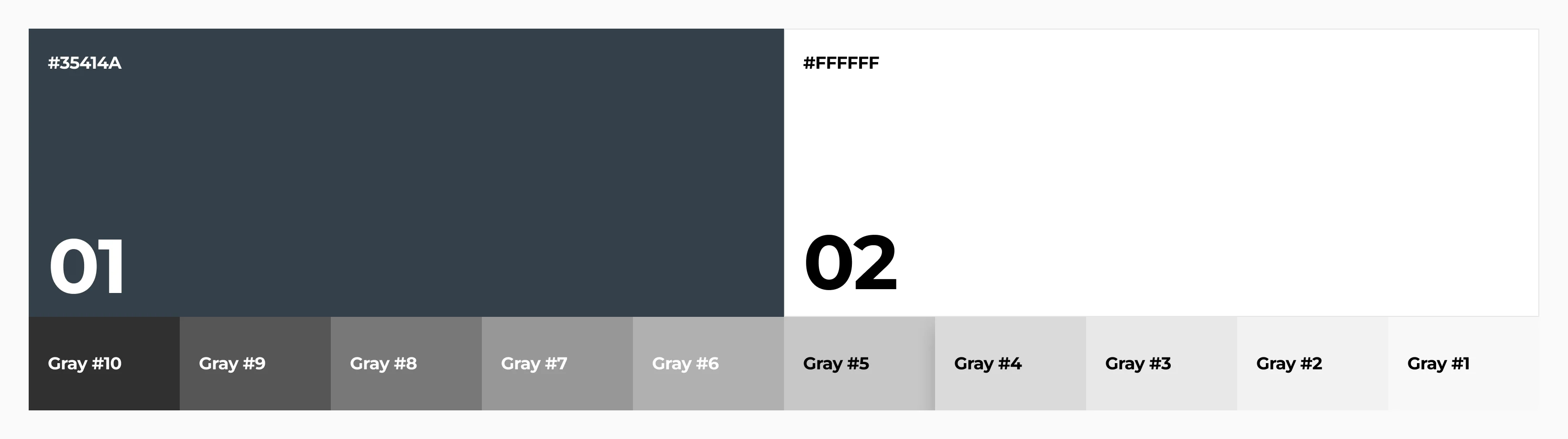
The vision for Kiaschaar Landing was to create a luxurious yet minimalist design that reflects the brand’s dedication to fine plaster craftsmanship. The client sought a clean layout with reusable design elements to ensure scalability. A restrained color palette, elegant typography, and high-impact imagery were used to evoke timeless beauty and architectural sophistication laying the groundwork for a brand presence that feels both premium and enduring.
The Kiaschaar logo reflects tradition and elegance, symbolizing the brand’s commitment to timeless craftsmanship. Its bold, classic form ensures strong recognition across all mediums.
The primary color palette includes Soft Pink (#CF6F8C) for warmth and femininity, White (#FFFFFF) for a clean, light feel, and Dark Maroon (#55011A) for heading titles. The secondary color, Soft pink (#F4D4DD), evokes relaxation and tranquility. These colors work together to create a calming and welcoming atmosphere, reflecting the soothing services of Leia Beauty.
Low-fidelity wireframes were created to define structure, layout, and content hierarchy before diving into visual design. This helped ensure clarity, consistency, and reusability across the website while aligning with the client’s goals from the start.