Affordable innovation for every home. Dotcom Product is an online store dedicated to providing high-quality, functional, and affordable lifestyle and home security products. With a customer-first approach, the brand focuses on making smart solutions accessible to everyone.
Landing Page Optimization
UX Design
UI Design
Industry
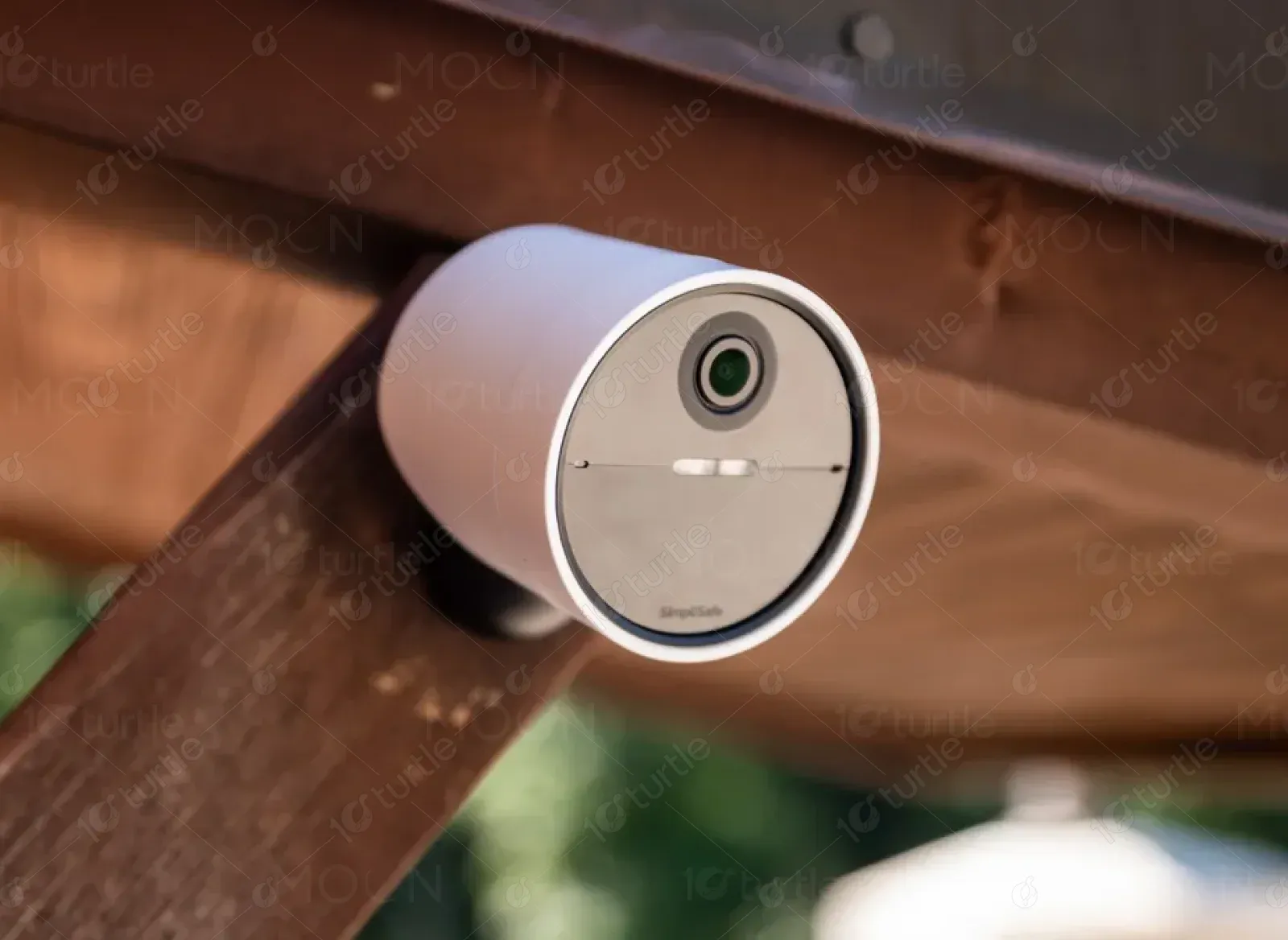
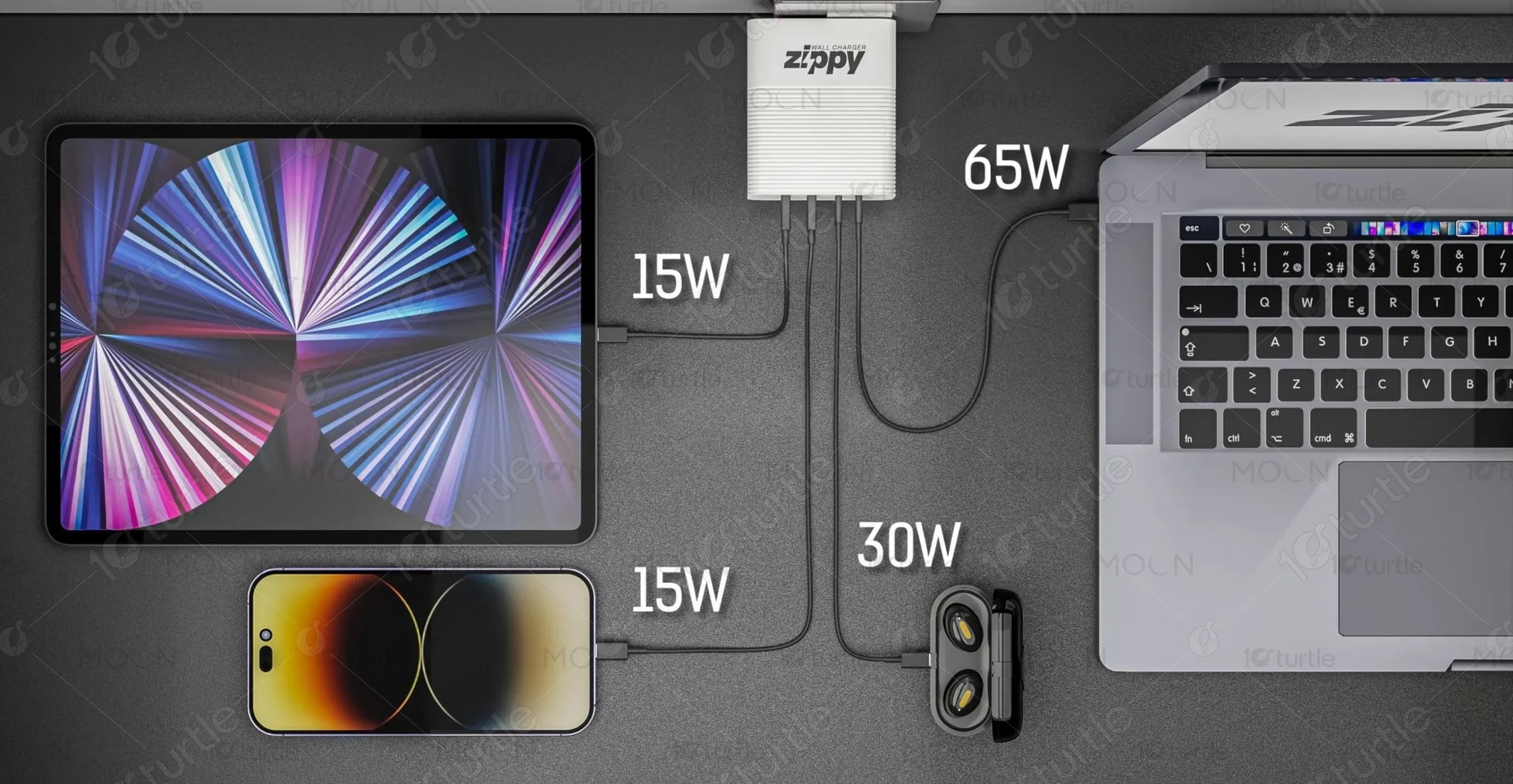
E-commerce & Consumer Electronics
Tools we used

Project Completion
2024
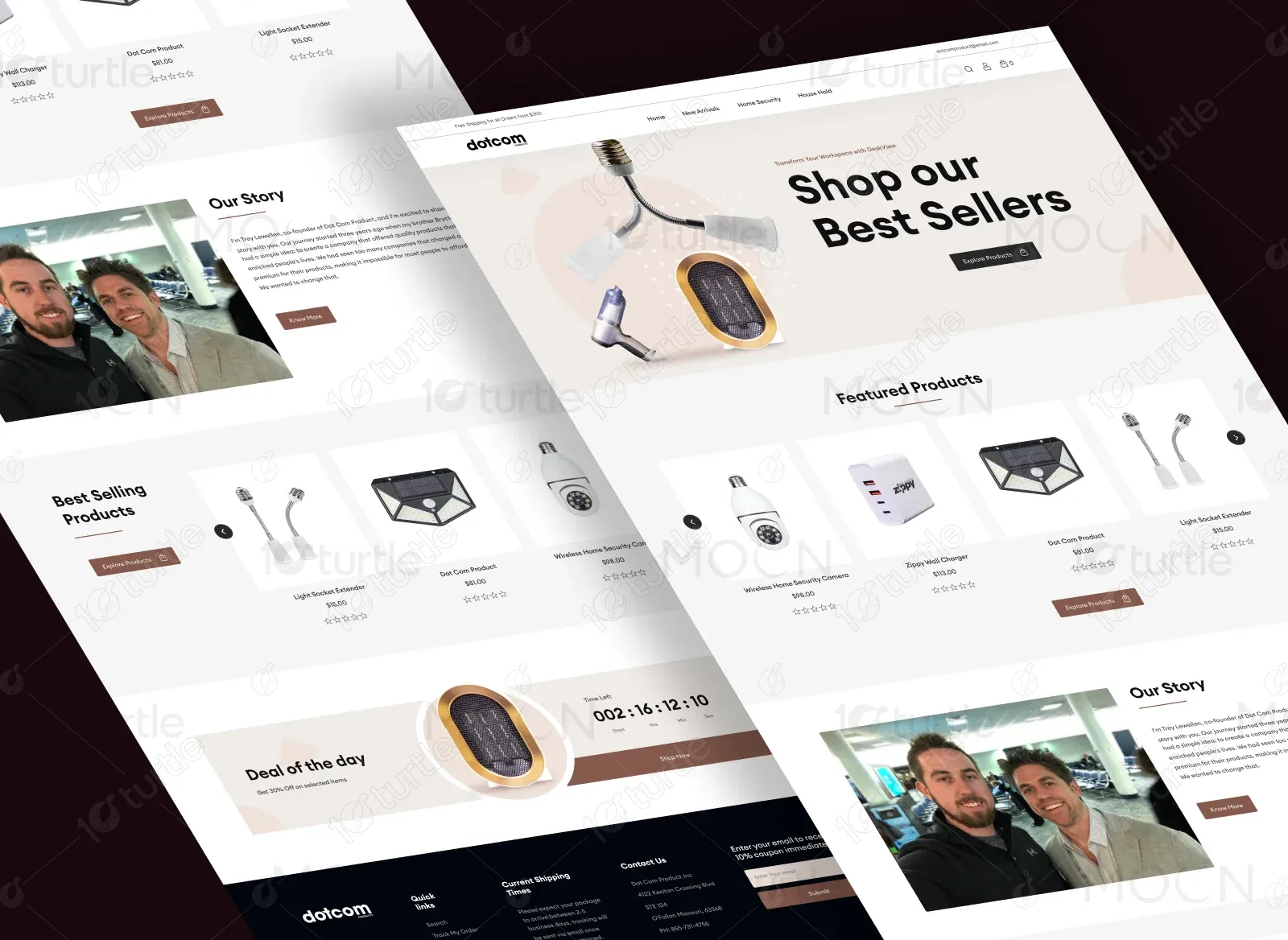
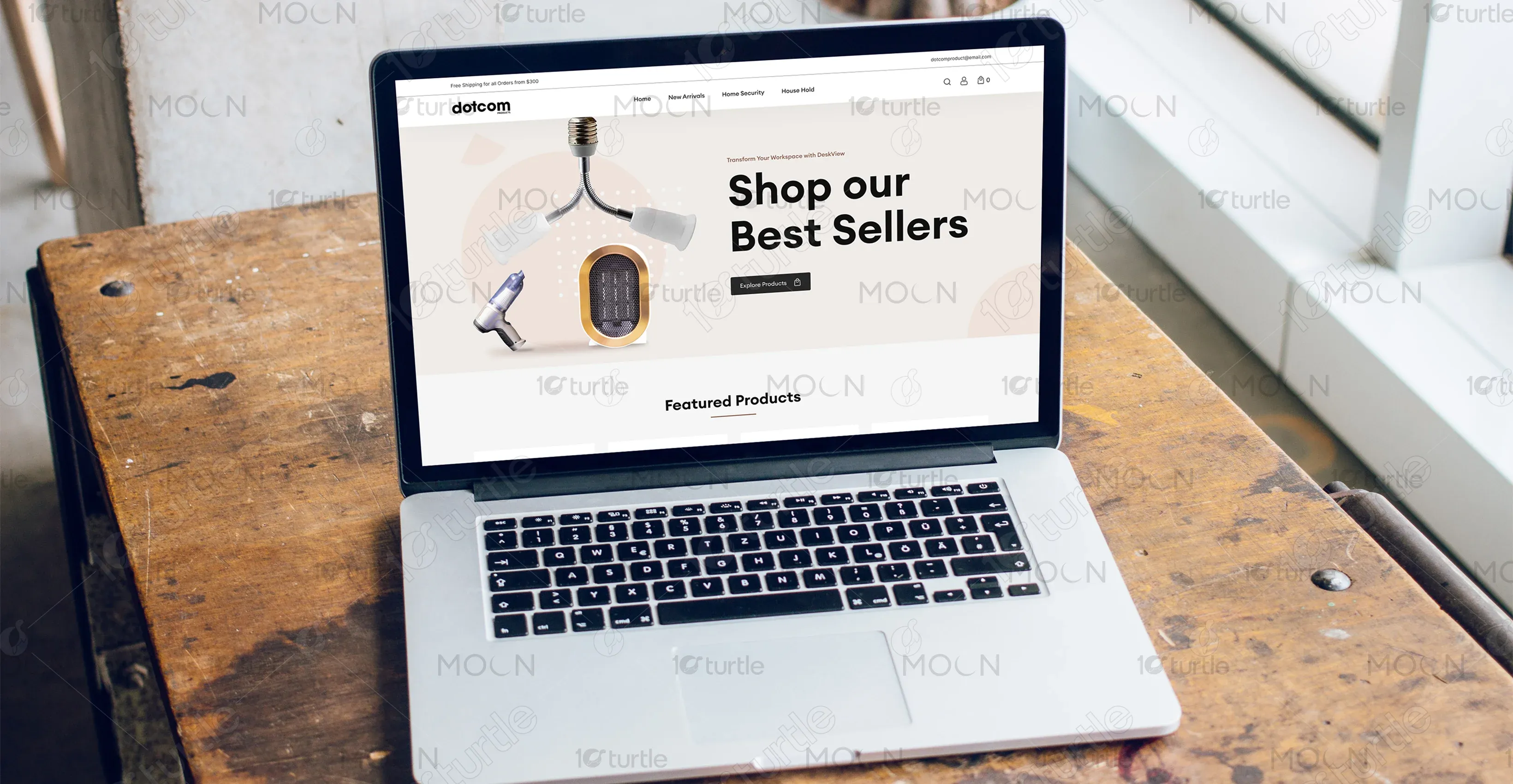
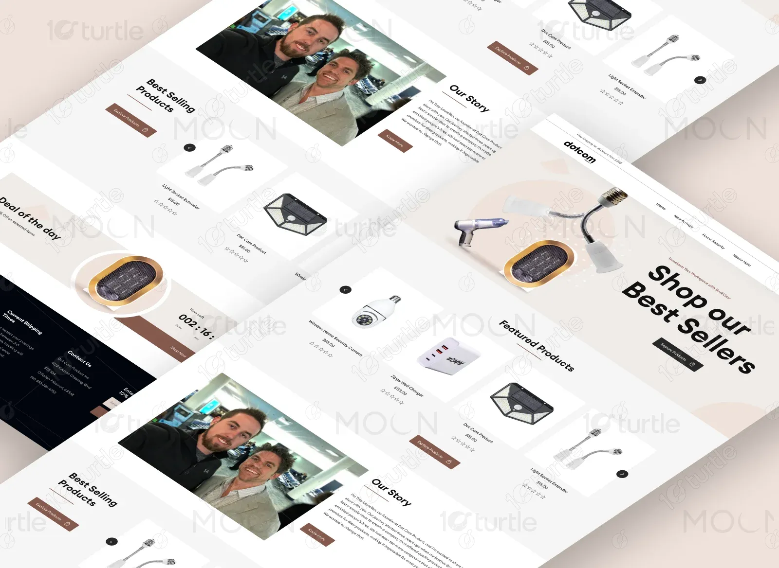
The goal of the project was to design a clean, conversion-focused landing page that highlighted best sellers, featured products, and brand storytelling in a visually appealing way. The client wanted a design that not only showcased their products but also built trust through storytelling, highlighted deals, and encouraged quick purchase decisions with urgency-driven elements like countdown timers.
Industry
E-commerce & Consumer ElectronicsWhat we did
User ResearchUI UX DesigningPlatform
-The client’s challenge was that their existing online presence did not effectively showcase their products in a structured and engaging way. Customers had difficulty identifying top-selling items, and there was little emphasis on urgency, trust, or the brand’s backstory. The absence of a strong visual identity and user flow was limiting their ability to convert casual visitors into paying customers.
The new landing page was designed with a clear visual hierarchy, highlighting best sellers and featured products at the top to capture attention quickly. A storytelling section was added to humanize the brand and build trust, while a “Deal of the Day” section with countdown timers introduced urgency and motivated faster conversions. The design focused on simplicity, easy navigation, and strategic product placement, ensuring an optimal balance between brand credibility and sales-driven performance.
client envisioned a modern, minimalistic e-commerce design that placed products at the center of attention. Their design preferences leaned toward clean layouts, bold typography for clarity, and a focus on usability. The inspiration came from top e-commerce platforms that prioritize trust, simplicity, and a frictionless buying journey.

The “dotcom” logo uses a minimal, lowercase wordmark with a bold font weight. Its simplicity ensures instant recognition and reflects the brand’s commitment to accessibility, clarity, and modernity in the digital shopping space.
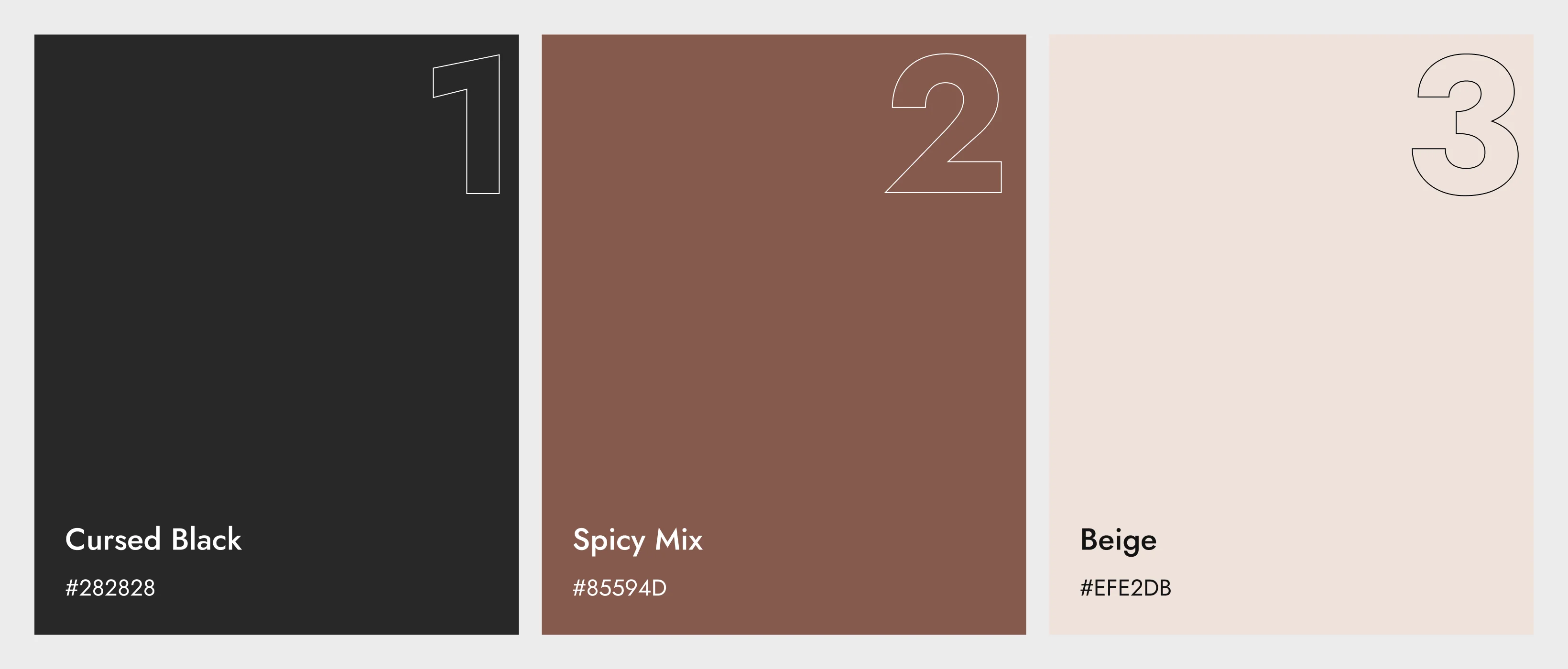
The primary palette combines black (#000000), white (#FFFFFF), and earthy browns (#6B4B3E) with subtle neutral accents like light beige (#F6F2EF) and warm gray (#D9D6D2). Black conveys trust and sophistication, white ensures clarity and spaciousness, while earthy brown tones add warmth and approachability. The beige and gray neutrals soften the palette, balancing professionalism with a welcoming, consumer-friendly appeal.
The wireframes emphasized a straightforward shopping flow: hero section with strong CTA, product highlights, trust-building story section, urgency-driven promotion block, and a solid footer with contact and subscription options. This structure was designed to maximize conversions while keeping the layout intuitive.