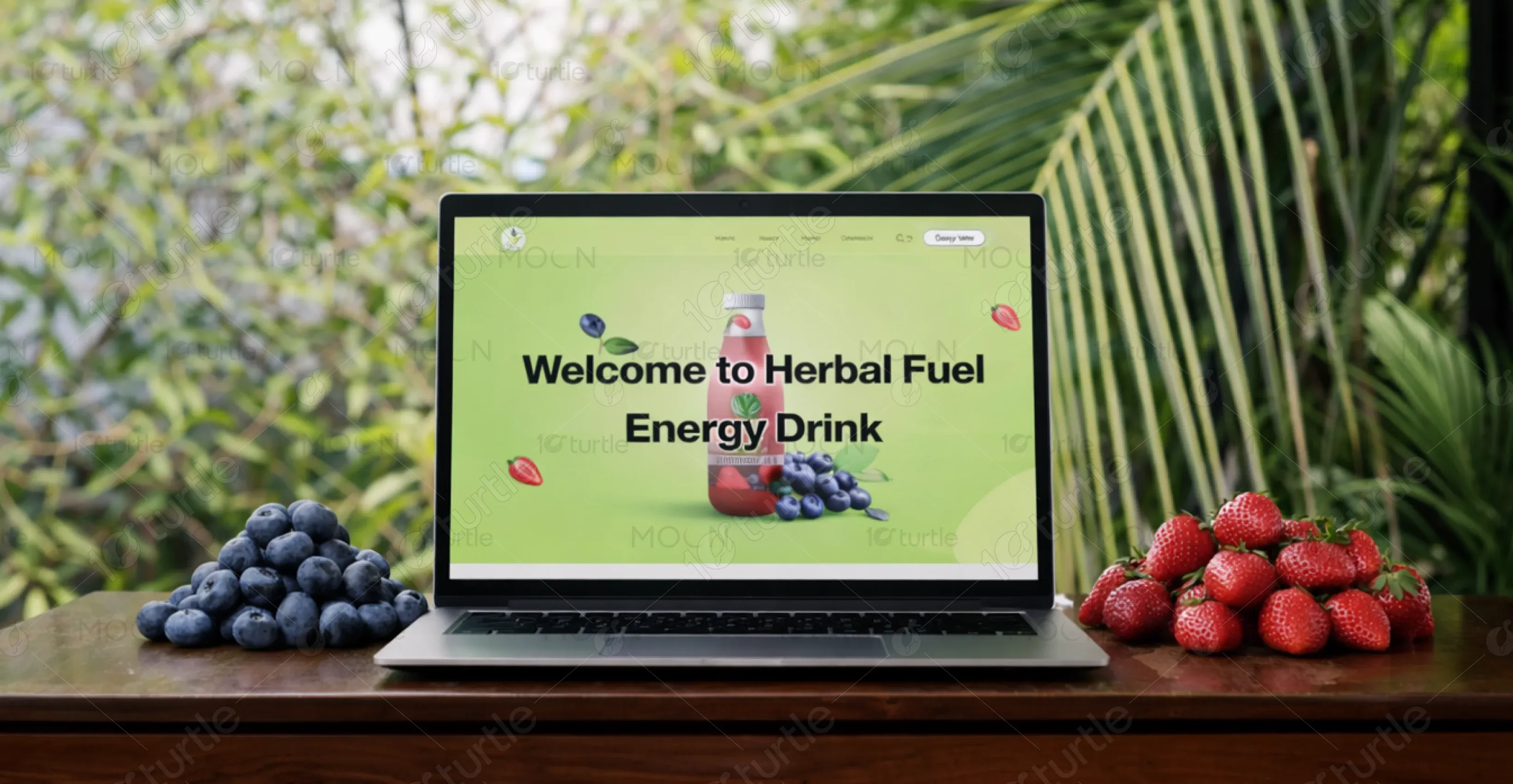
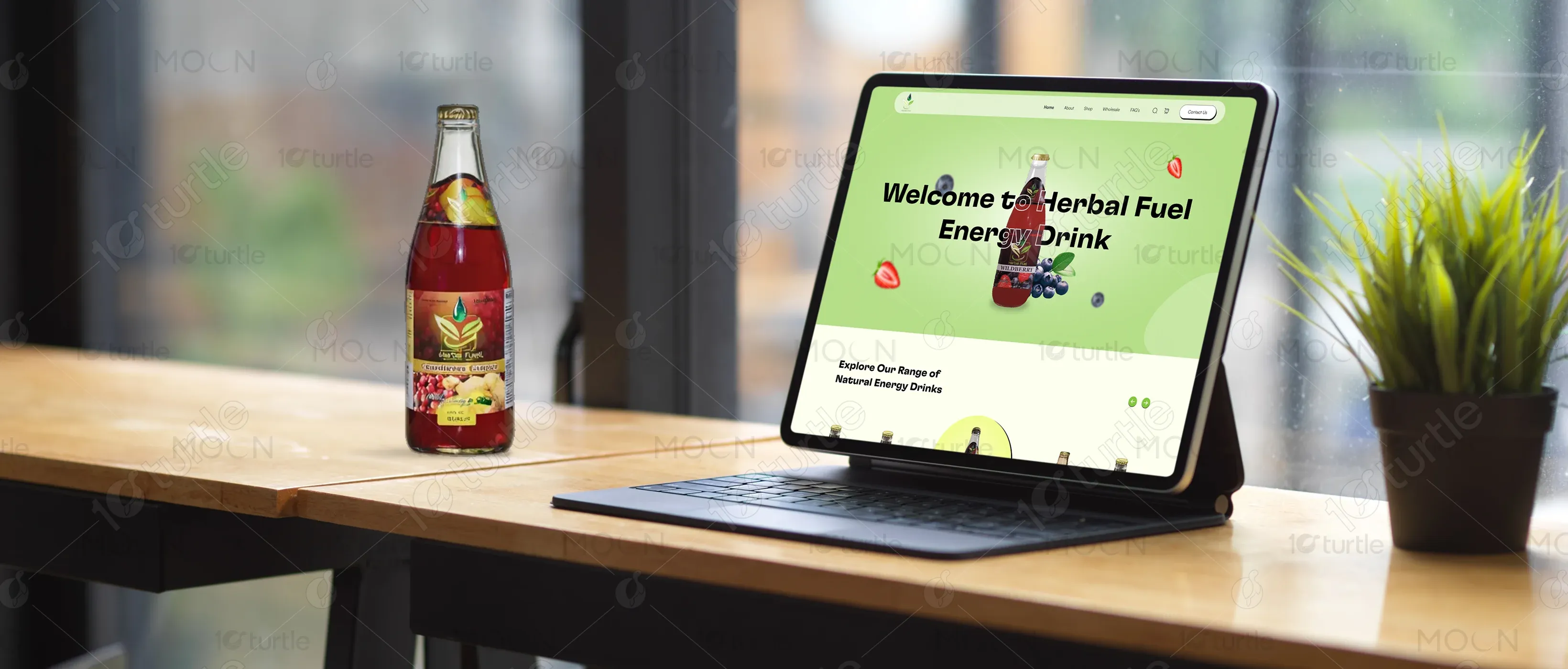
Herbal Fuel showcases a vibrant, youthful, and modern design, aligning with the brand’s focus on natural energy drinks. It incorporates playful visuals, smooth animations, and a fresh color palette to create an inviting and energetic experience. The user-friendly design focuses on clear product information and easy navigation.
UX Design
UI Design
Research
Industry
Food, Beverage & Hospitality
Tools we used


Project Completion
2023
The design features a clean, dynamic layout with bold headings, bright accents, and an interactive feel. The website uses natural, earthy colors to align with the brand’s focus on herbal ingredients. Fun icons and illustrations accompany the product descriptions, creating a friendly and approachable vibe while encouraging customers to explore the range.
Industry
Food, Beverage & HospitalityWhat we did
User ResearchUI UX DesigningPlatform
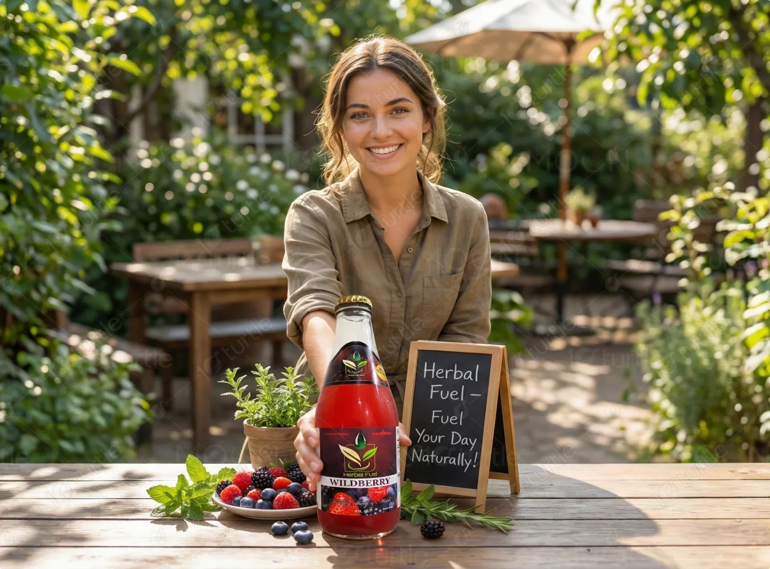
-The brand wanted to establish itself as a fun, natural, and health-conscious energy drink provider in a competitive market.
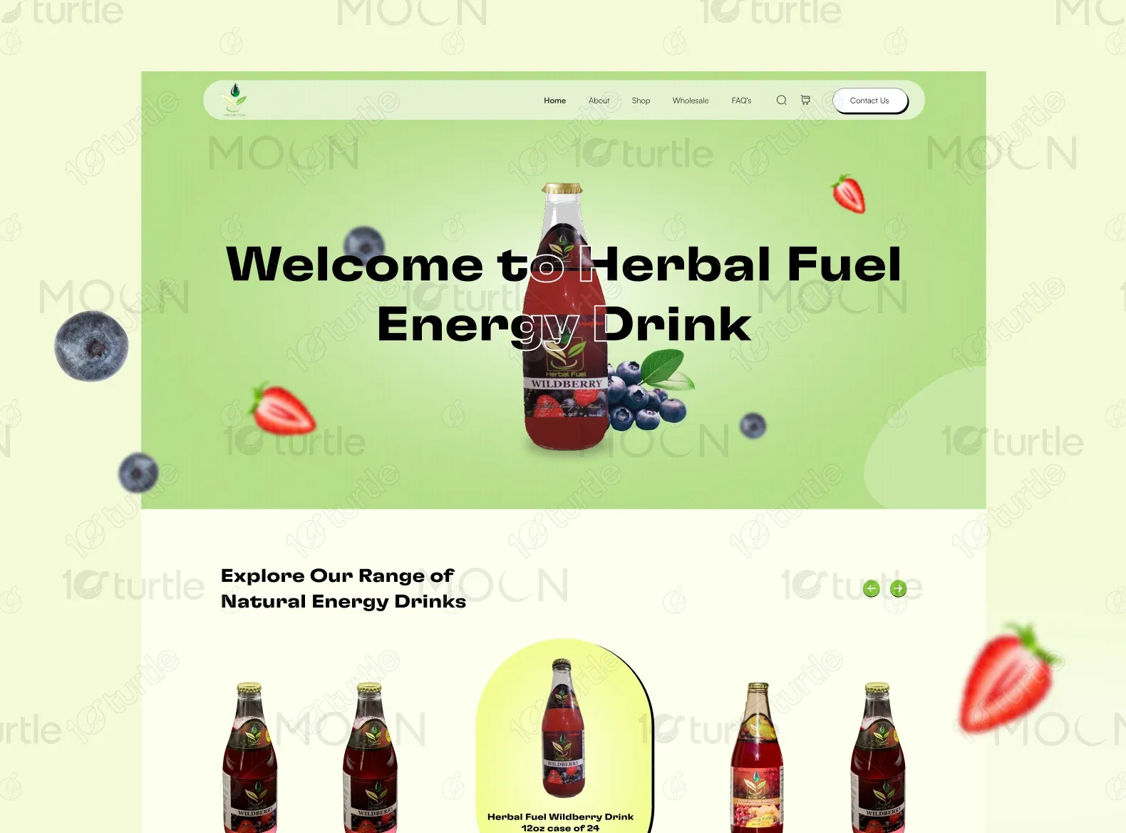
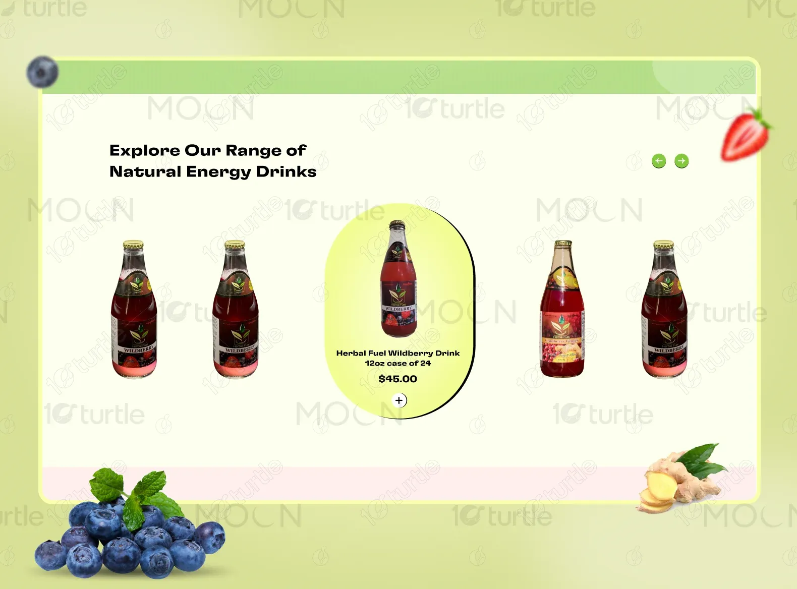
The design uses vibrant colors and playful icons to engage users, emphasizing the natural ingredients and the energetic benefits of the drinks. Easy-to-read sections for ingredients and FAQs encourage customer trust while the clear calls-to-action drive conversions.
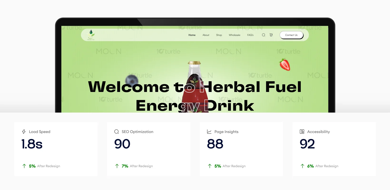
The improvements in load speed, SEO optimization, page insights, and accessibility contribute significantly to the user experience. Faster load times, better SEO, and a more accessible design enhance the site’s performance, resulting in higher engagement and conversion rates. These design improvements have created a smoother, more effective browsing experience.
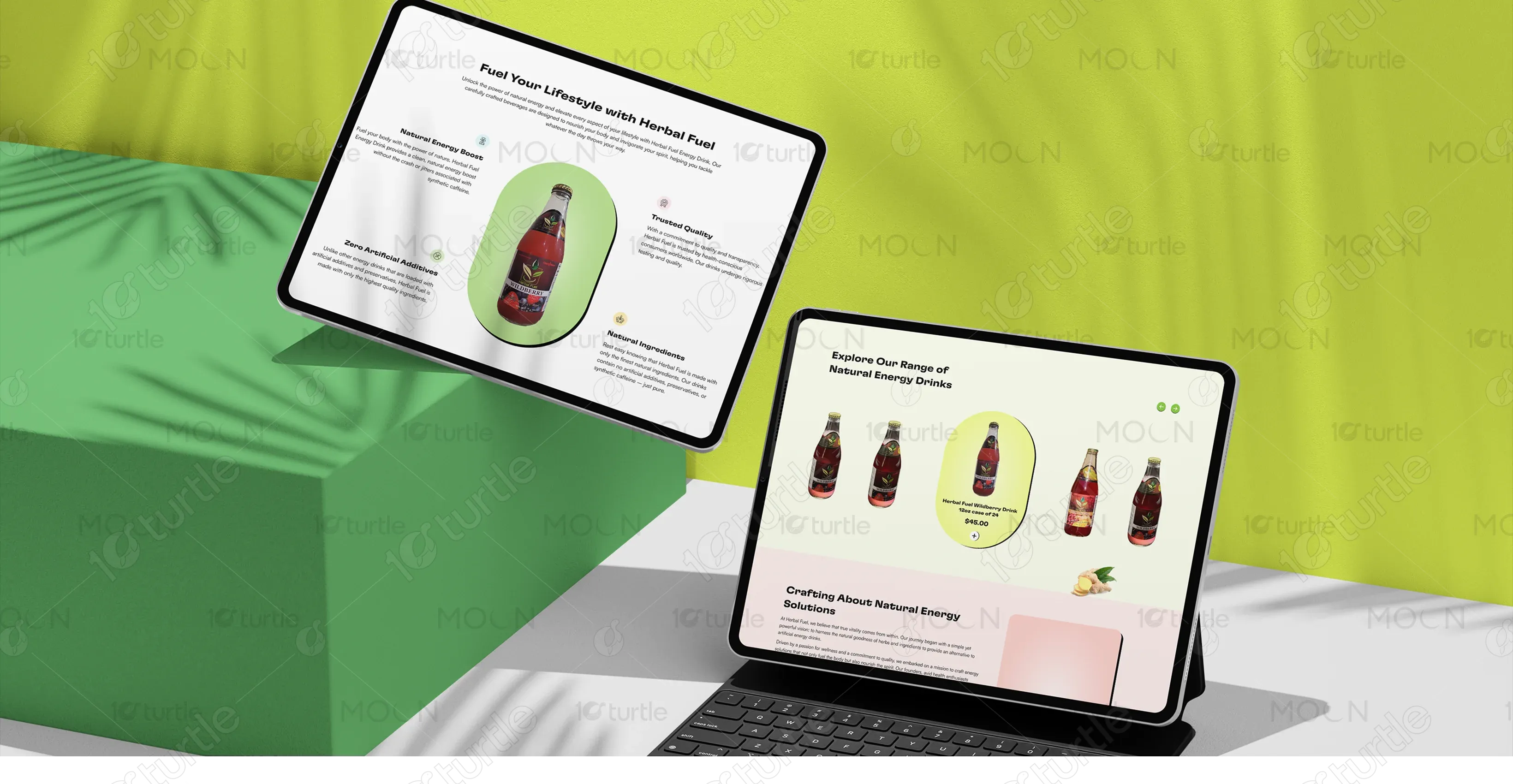
By providing clean, easy-to-read product descriptions, clear benefits, and highlighting key features with bold icons. The use of a well-structured FAQ section and distinct calls to action ensures that users can quickly find the information they need and make informed decisions.
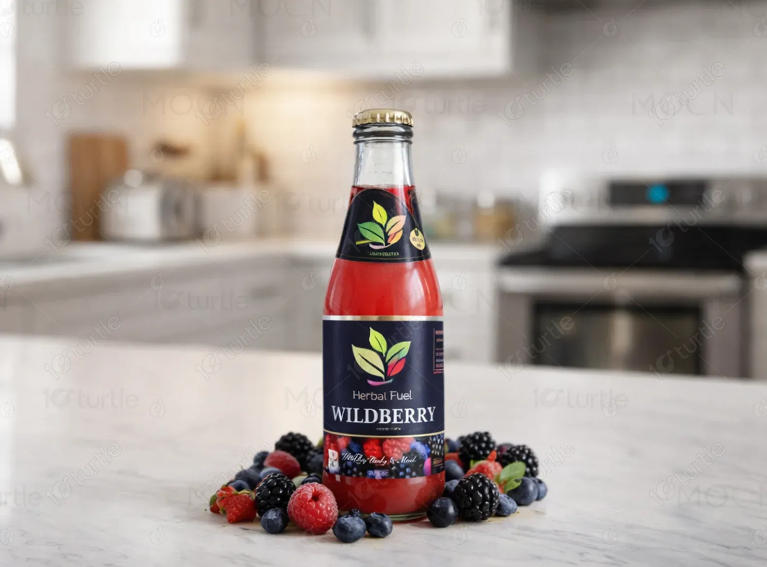
The Herbal Fuel logo features a modern, minimalist design that uses a stylized leaf element to symbolize the brand's natural ingredients. The simple typography and green color emphasize the eco-friendly, health-conscious values of the product. It represents vitality and energy in a clean and professional manner.

The color palette consists of vibrant greens, soft yellows, and subtle blues, reflecting the natural and energetic nature of the brand. Green signifies health and freshness, while the other colors bring a playful, uplifting vibe to the design. These colors evoke trust and vitality, aligning with the herbal drink’s positioning.

The wireframe follows a simple, user-centric structure with a clear hierarchy. The homepage features a bold hero section, followed by product grids, benefits, and FAQs. A prominent call-to-action button is placed strategically throughout the layout, ensuring a smooth and intuitive user journey that guides visitors from discovery to purchase.