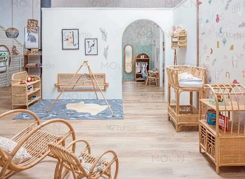
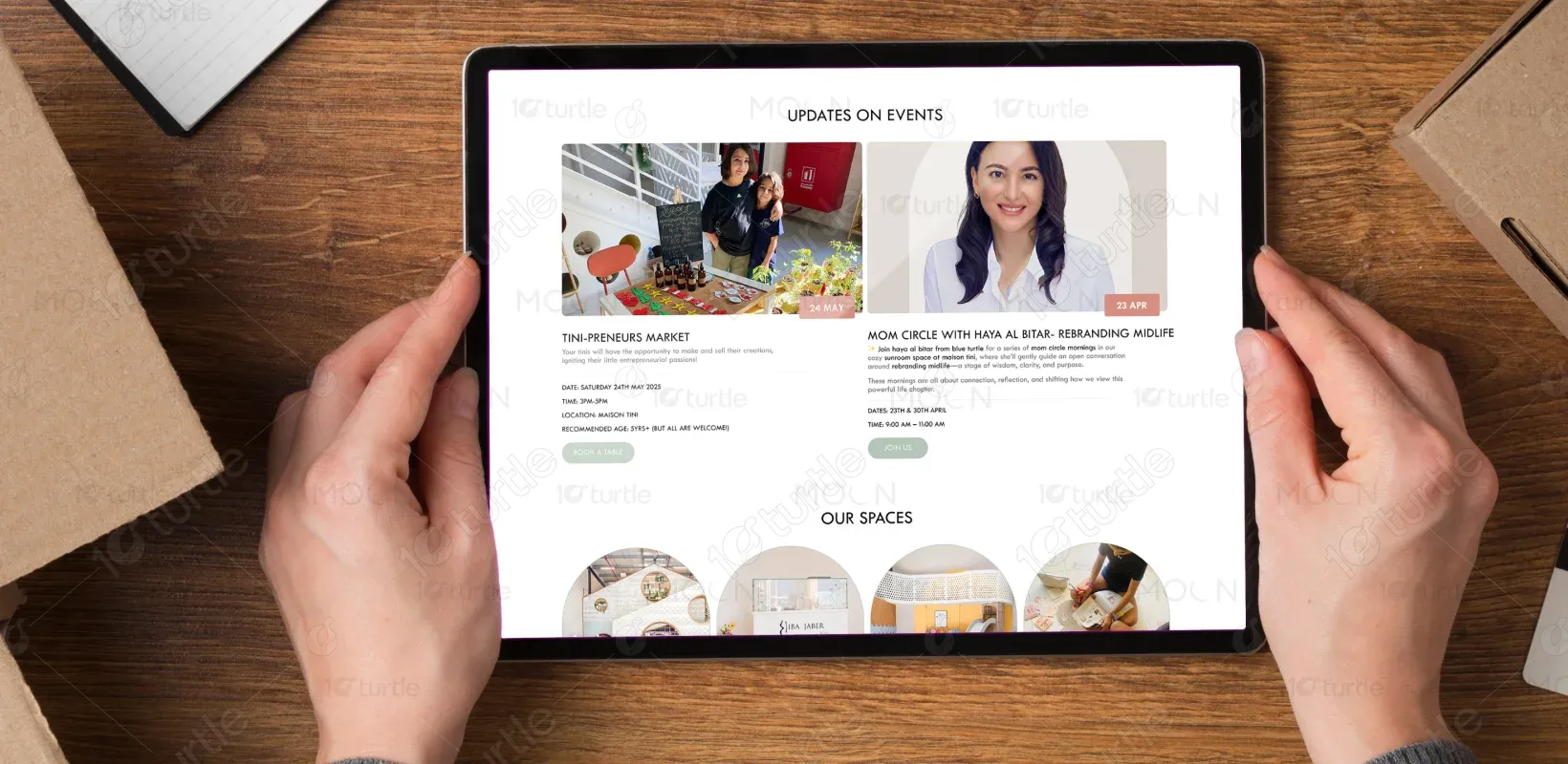
The design blends softness and sophistication to reflect Maison Tini’s family-friendly yet premium positioning. Gentle pastel tones, rounded imagery, and clean layouts create an inviting experience. The interface highlights events, spaces, and bookings clearly, encouraging interaction while maintaining a warm, community-centered atmosphere that resonates with parents and families.
Brand Identity & Emotional Design
Market Research
Landing page Design
Industry
Art , Culture & Entertainment
Tools we used


Project Completion
2025
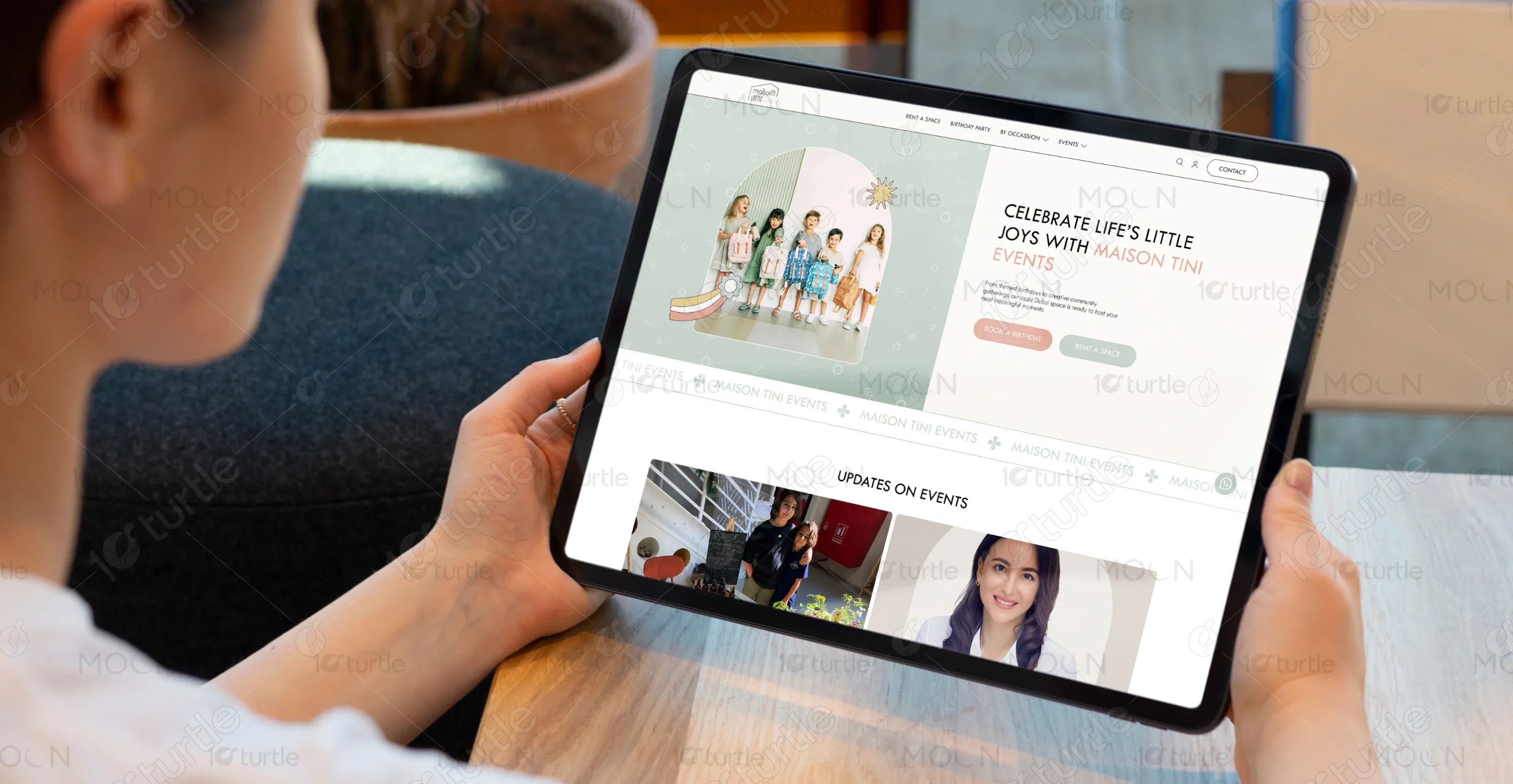
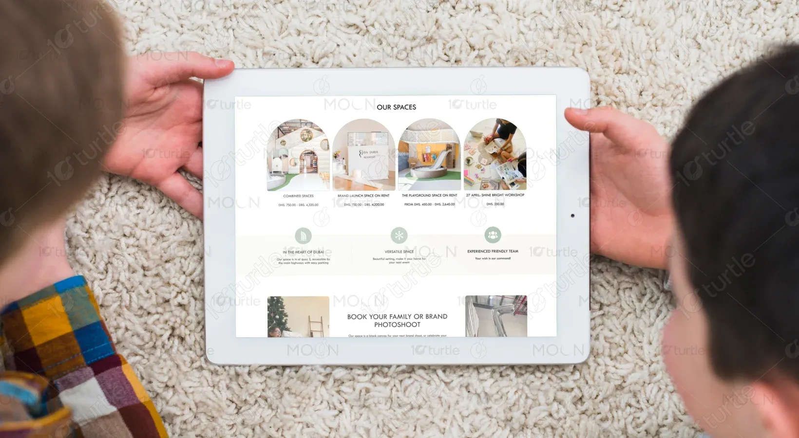
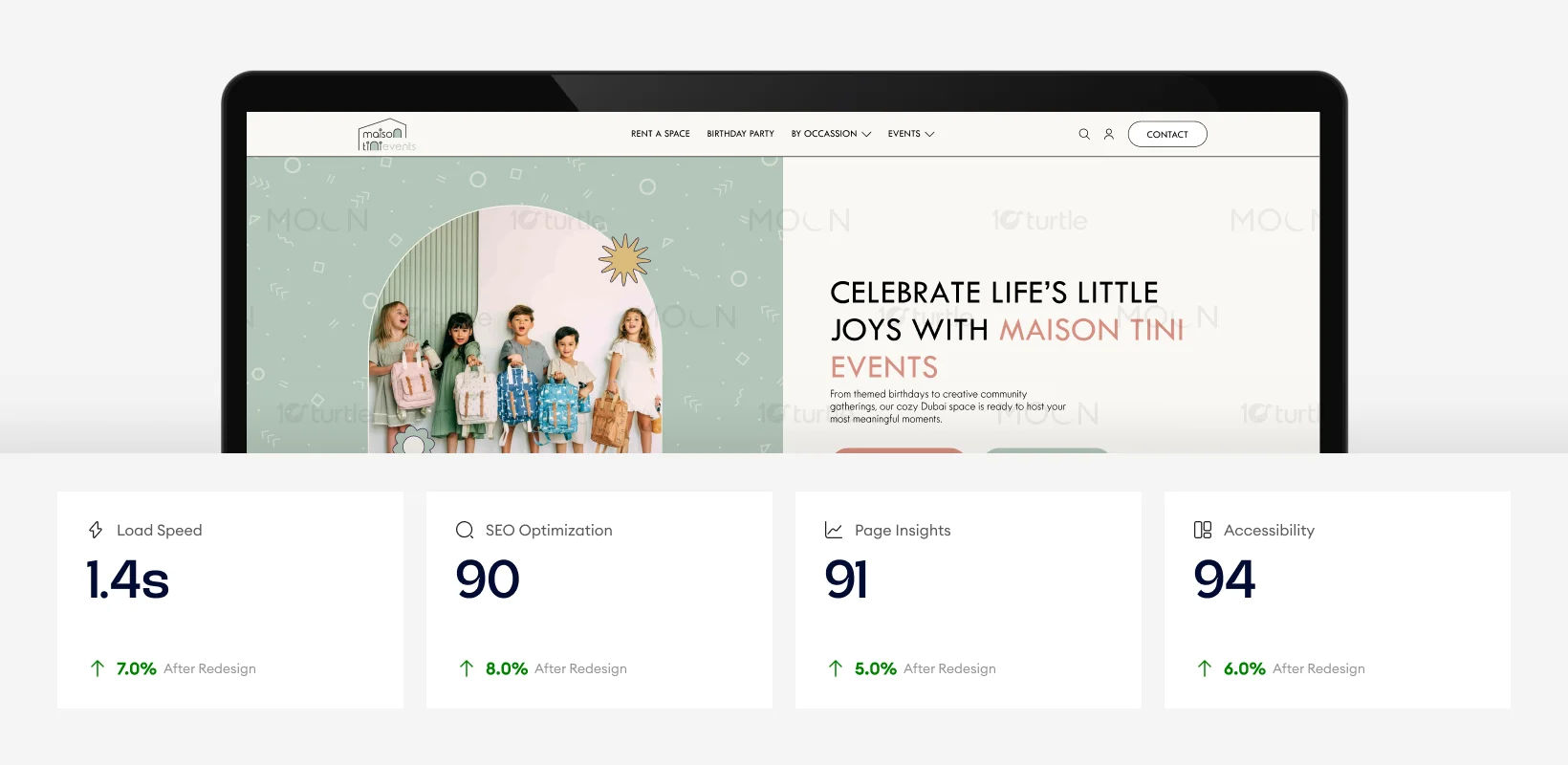
This website combines playful visuals with structured layouts to balance creativity and clarity. Rounded images, soft backgrounds, and airy spacing create a welcoming tone. Clear call-to-action buttons, organized event updates, and booking sections enhance usability while reinforcing Maison Tini’s identity as a joyful, curated events destination.
Industry
Art , Culture & EntertainmentWhat we did
User ResearchUI UX DesigningPlatform
-The previous structure lacked emotional storytelling and clear booking pathways, making it difficult for users to quickly understand event offerings and space rentals. Information was scattered, and the brand’s playful yet premium personality was not fully expressed, reducing engagement and conversion potential.
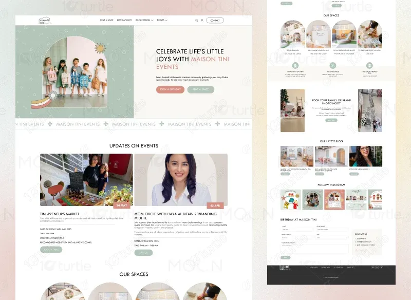
The redesign introduces structured sections, strong visual hierarchy, and prominent booking CTAs. Event updates, spaces, blog content, and forms are clearly organized. Soft branding elements enhance emotional connection, while intuitive navigation improves user flow, making it easier for families to explore offerings and book confidently.
With a 1.4-second load time and strong SEO score of 90, the website ensures faster access and improved search visibility. High page insights and accessibility scores enhance usability and inclusivity. These performance upgrades create a smoother browsing experience, increase engagement, and support higher booking conversions.
We balanced soft pastel colors, rounded imagery, and friendly iconography with clean typography and structured layouts. This combination maintains a playful visual tone without sacrificing clarity. Parents experience trust and professionalism, while children feel the warmth and creativity reflected through visuals and subtle design elements.
The Maison Tini logo uses a minimal house-shaped frame combined with elegant typography, symbolizing warmth, safety, and celebration. Its clean structure reflects professionalism, while its subtle softness communicates a child-friendly atmosphere. The logo reinforces brand trust while visually aligning with the family-oriented event concept.
The palette features muted greens, soft blush tones, warm beige, and light neutrals. These colors create calmness and sophistication while maintaining a child-friendly atmosphere. Accent buttons in complementary shades guide user attention. The palette strengthens emotional warmth and supports the brand’s welcoming identity.

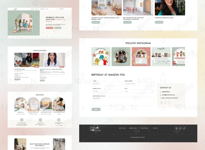
The wireframe follows a structured vertical flow: hero banner with dual CTA, event updates grid, spaces showcase, booking promotion, blog section, Instagram feed, and contact form. Clear section separation improves readability. Strategic whitespace ensures scannability while guiding users toward booking and inquiry actions.