Trendy Treats is the vibrant candy brand reimagining snacking with playful freeze-dried creations. Their mission is to bring excitement and nostalgia to candy lovers through crunchy, airy textures and unique flavors. This project aimed to build a colorful, energetic website experience that captures the brand’s joy and curiosity.
UX Design
UI Design
Research
Websites Design
Industry
Food, Beverage & Hospitality
Tools we used

Project Completion
2024
The goal was to develop a digital storefront that felt like a celebration of candy—bright, approachable, and easy to shop. The client needed a site that showcased the range of products, educated consumers on freeze drying, and boosted. The project spanned strategy, visual design, and development.
Industry
Food, Beverage & HospitalityWhat we did
User ResearchUI UX DesigningResponsive ExperiencePlatform
-The existing online presence lacked a cohesive visual identity and did not communicate the unique qualities of freeze-dried candy effectively. Customers found it difficult to understand the textures and benefits, while the shop layout felt generic and uninspired, limiting engagement.
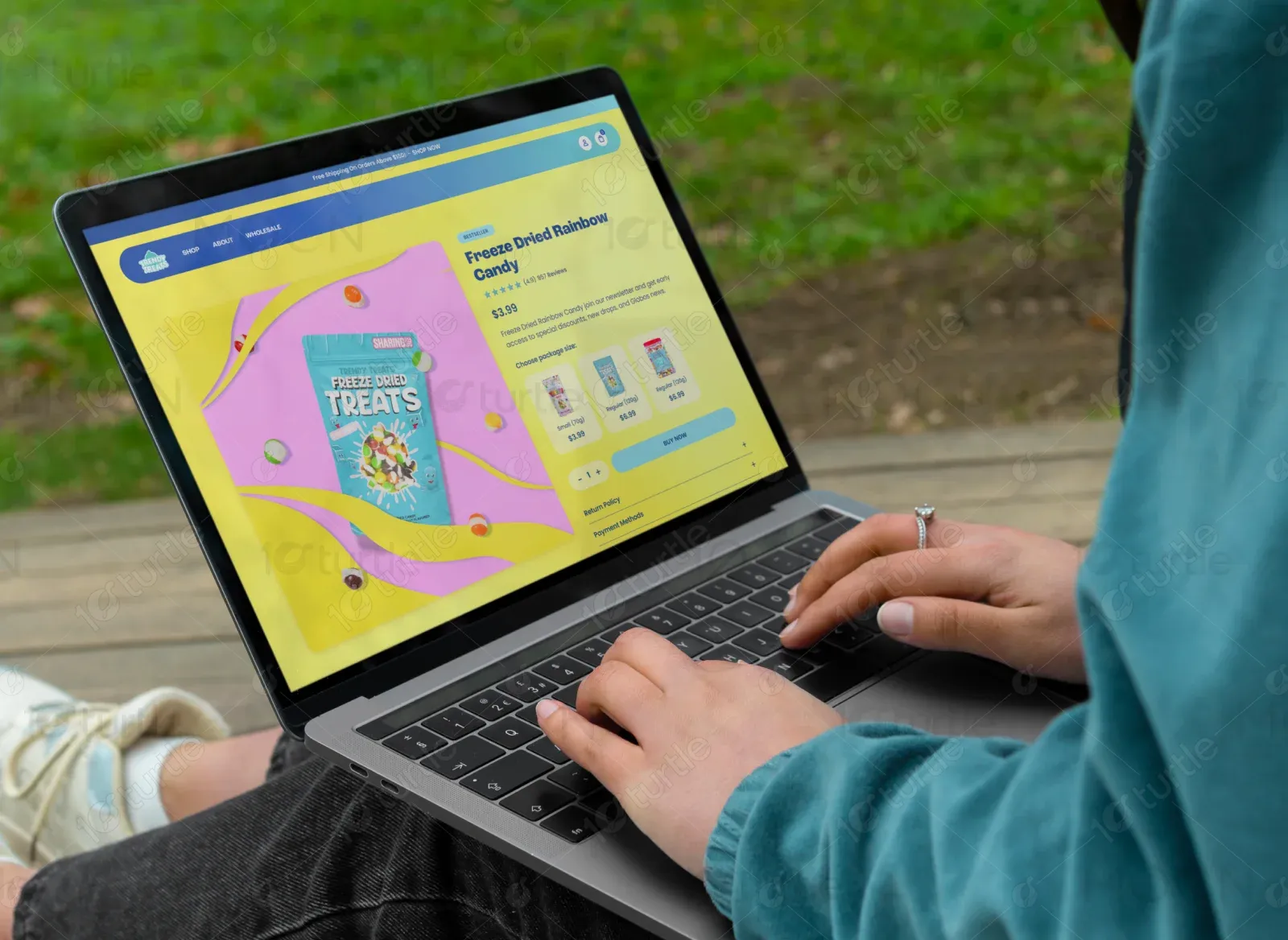
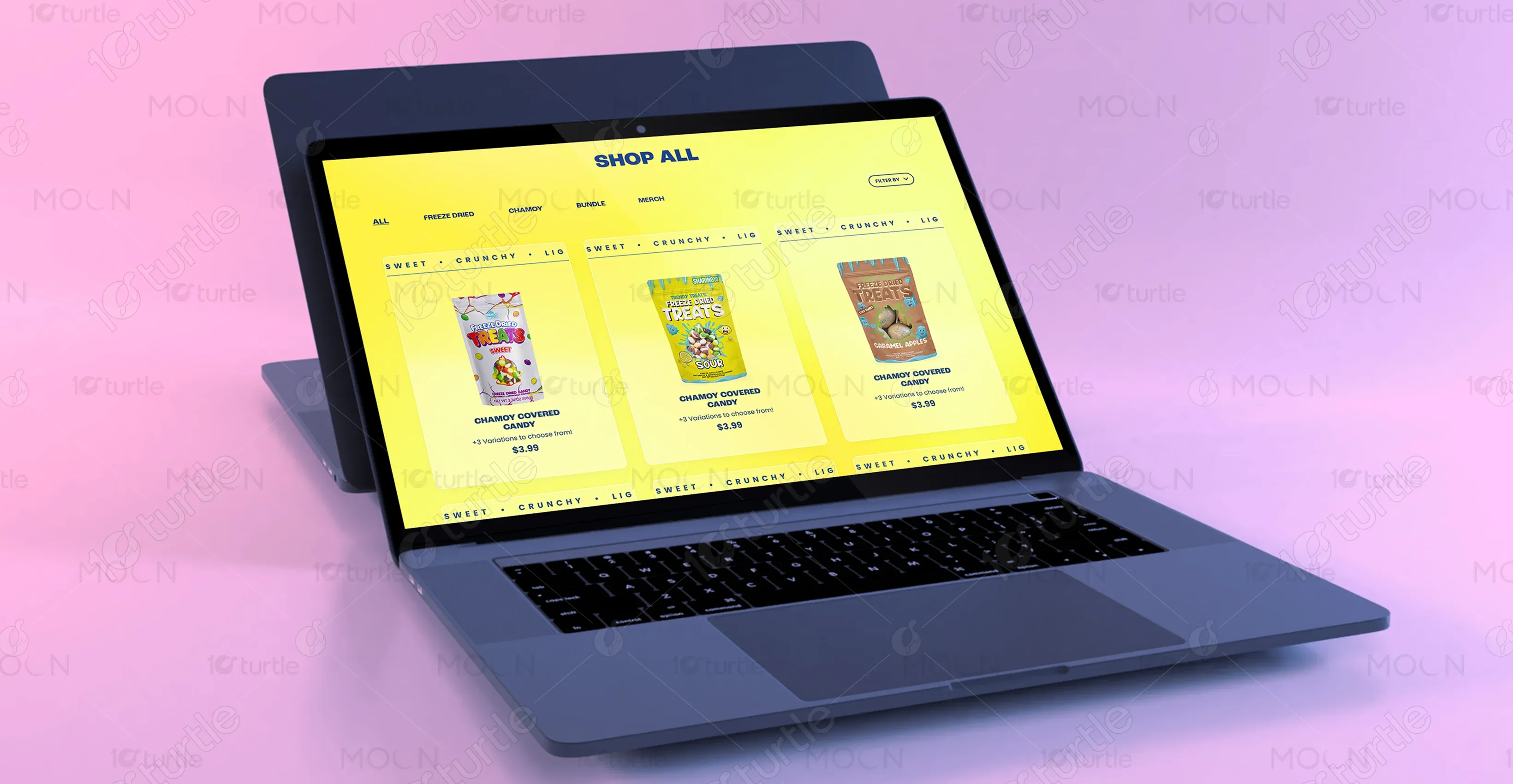
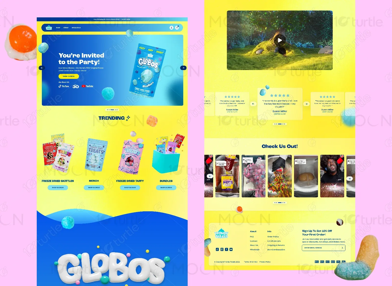
We created an immersive, candy-colored website with dynamic visuals and clear product storytelling. Interactive elements, such as animations and product carousels, were used to convey the light, crunchy textures. A bright palette, bold typography, and playful iconography reinforced the fun, modern brand personality.
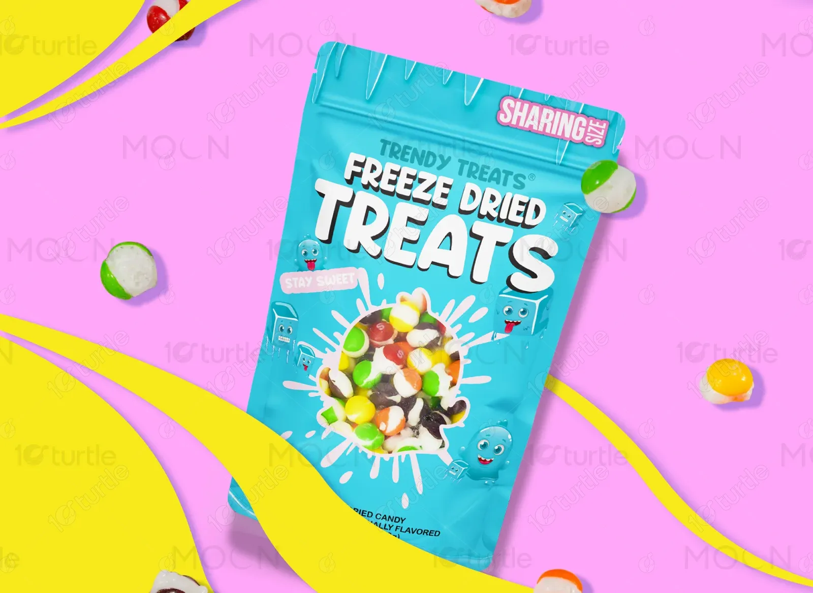
The client envisioned a bold, eye-catching design inspired by retro sweets packaging and the feel of a kid-friendly candy aisle. They requested bright gradients, whimsical shapes, and high-contrast text for maximum clarity. Inspiration came from brands like Sour Patch Kids and nostalgic 90s snack ads.
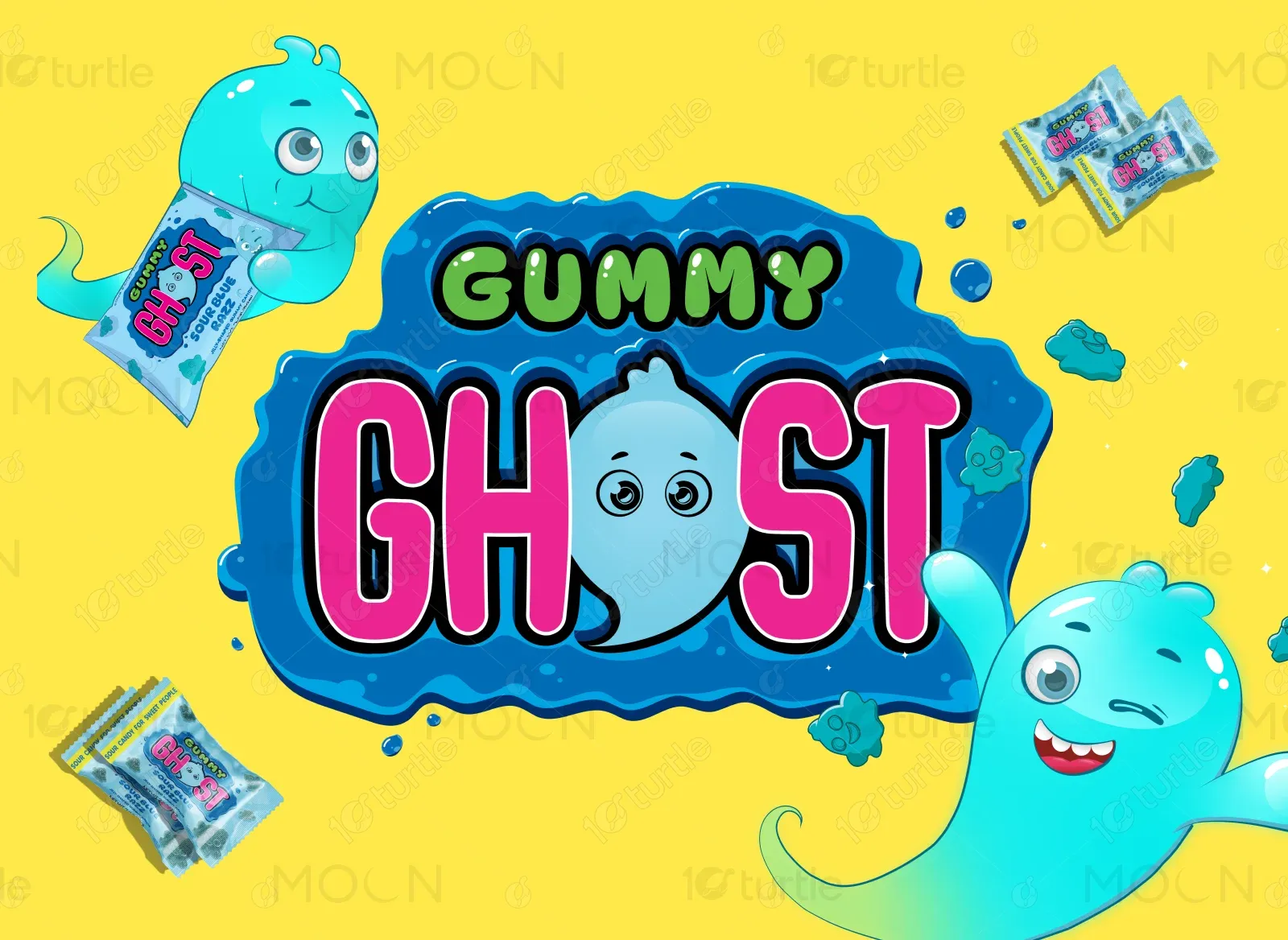
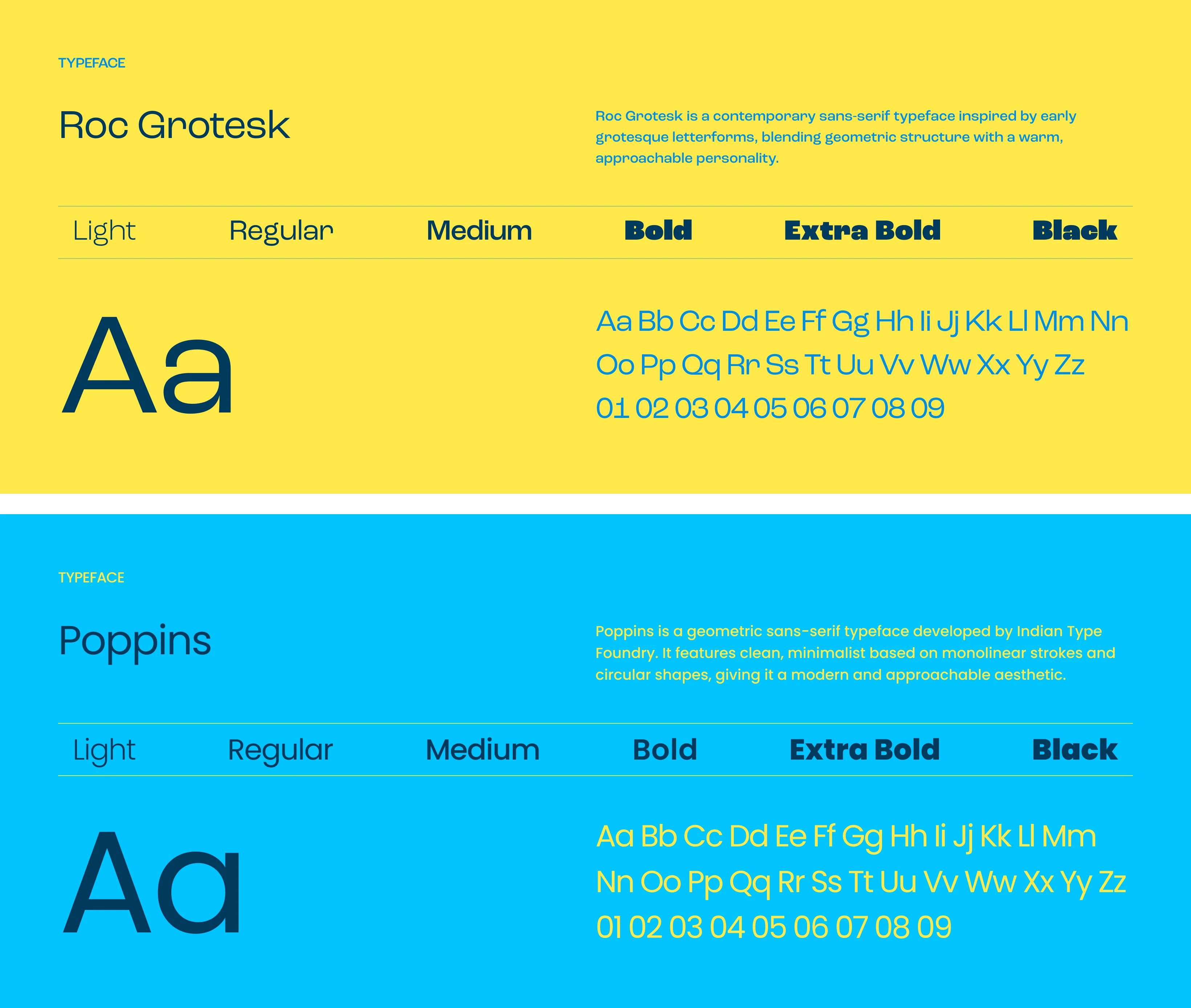
The Trendy Treats logo features a playful, rounded wordmark with a candy splash icon. This combination reflects the brand’s cheerful energy and instantly signals fun, sweet products.
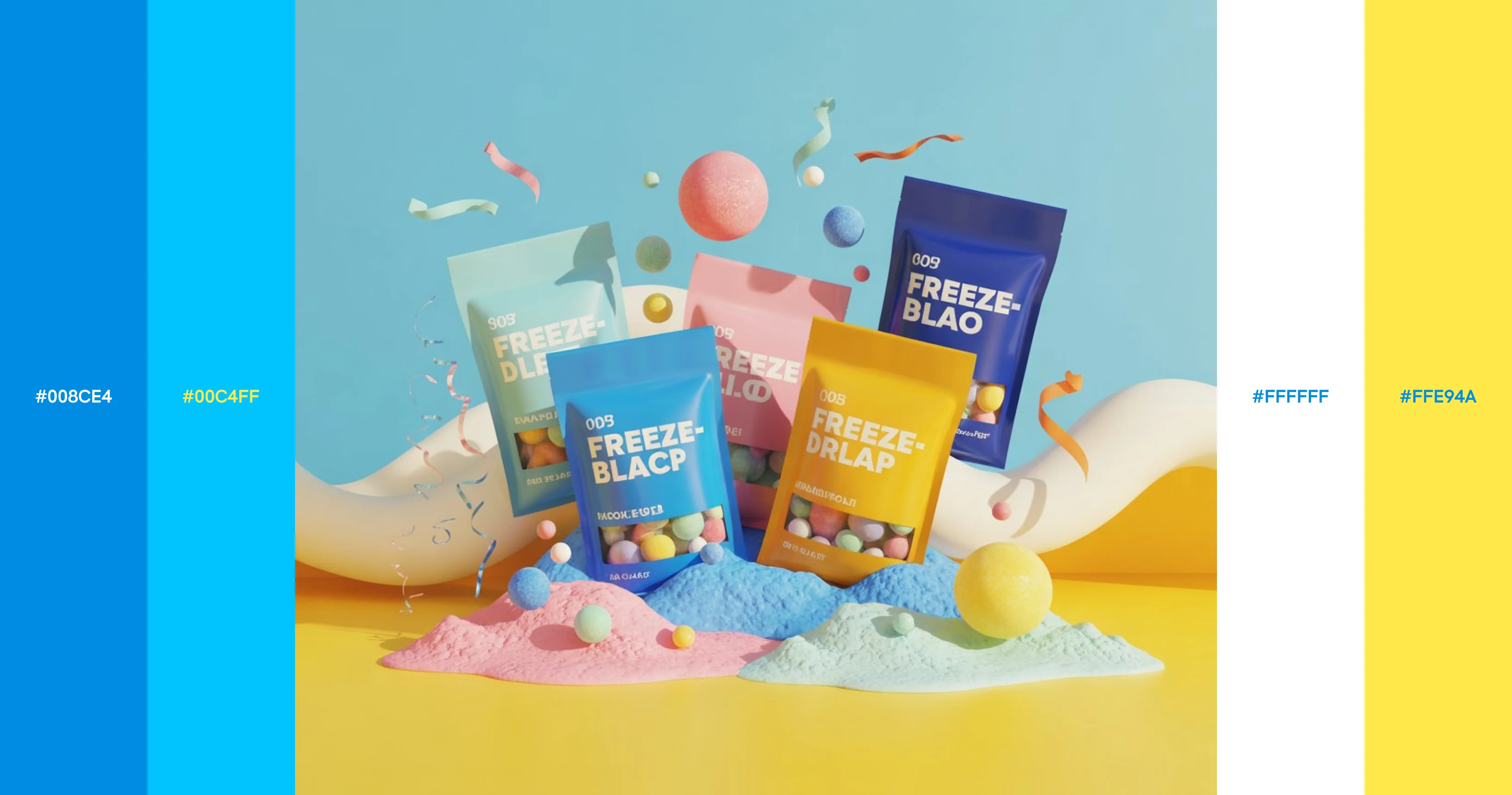
The primary colors are electric blue and bright yellow, evoking feelings of happiness, excitement, and positivity. Secondary accents include bubblegum pinks, neon greens, and soft pastels to highlight the candy theme and appeal to all ages.
Initial wireframes focused on a modular grid layout to showcase product variety and create visual hierarchy. We prioritized large product imagery, clear category navigation, and prominent calls to action to guide users toward conversion.