STEAP - NATURALLY CRAFTED TEAS FOR CALM, CLARITY, AND RESTFUL SLEEP
UX Design
UI Design
Research
Homepage Design
Industry
Healthcare & Wellness
Tools we used

Project Completion
2025
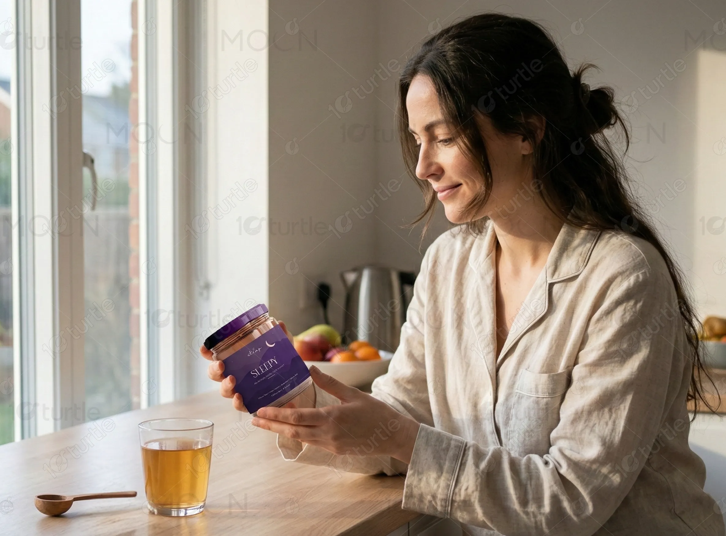
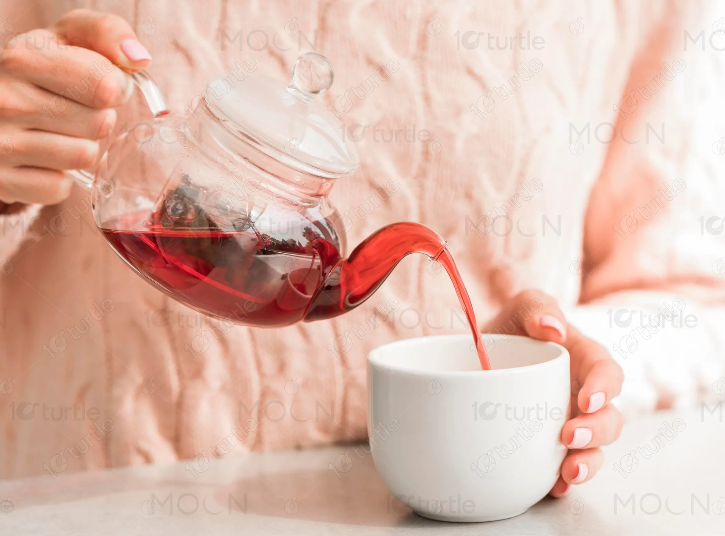
Steap offers a line of wellness teas designed to promote calmness, mental clarity, and restful sleep. Their signature blends are made from natural ingredients and are marketed as both a calming ritual and an effective remedy. The website aims to convey the brand’s core values of natural wellness and relaxation, while making it easy for visitors to learn about and purchase their products online.
Industry
Healthcare & WellnessWhat we did
User ResearchUI UX DesigningResponsive ExperiencePlatform
-The client’s website lacked a cohesive identity and failed to communicate their focus on natural wellness. Users struggled to understand product benefits, and the purchasing process was not seamless. They wanted a site that conveys the calming, premium nature of their teas.
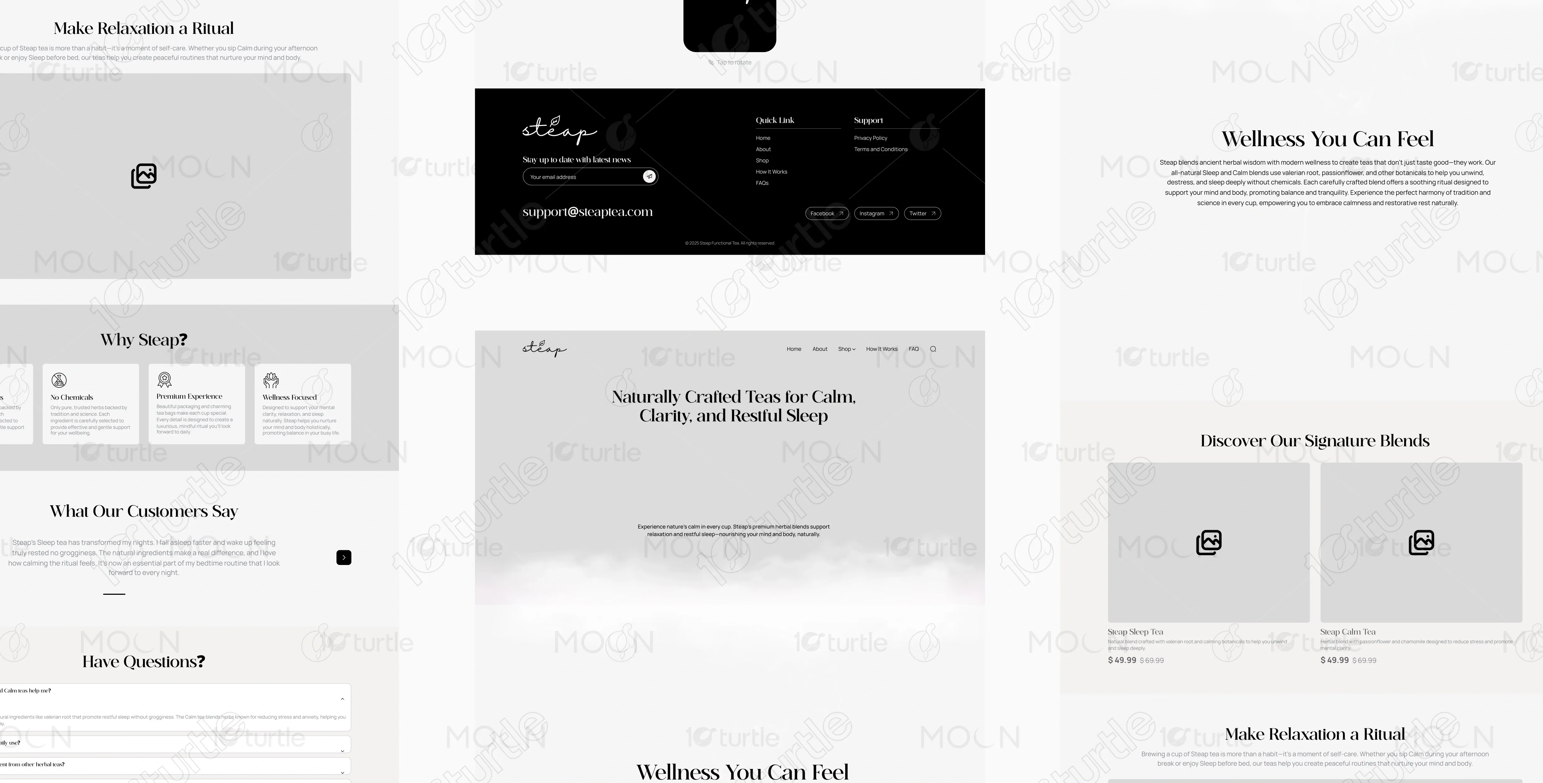
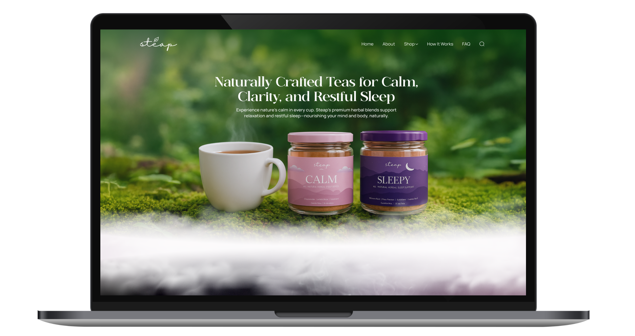
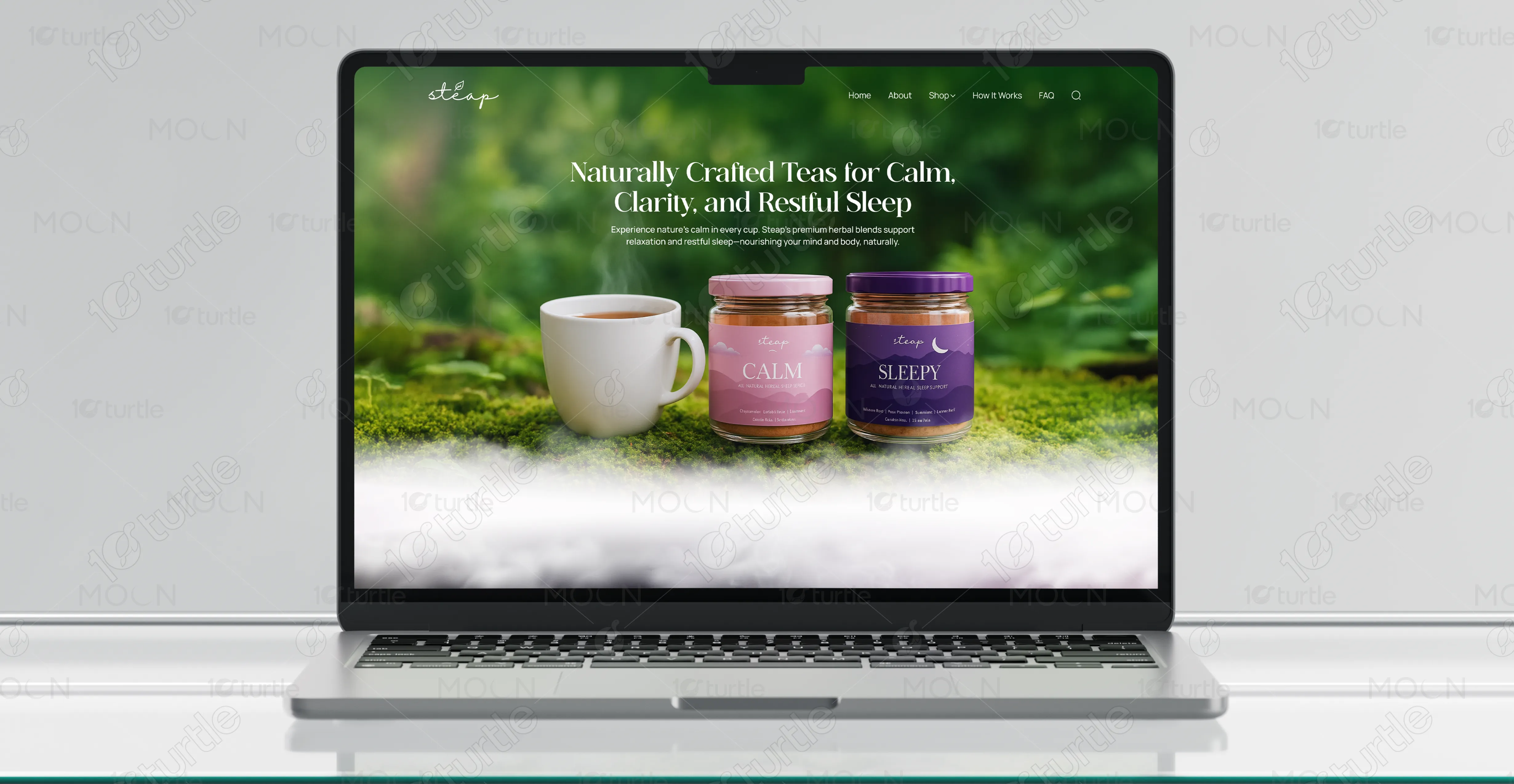
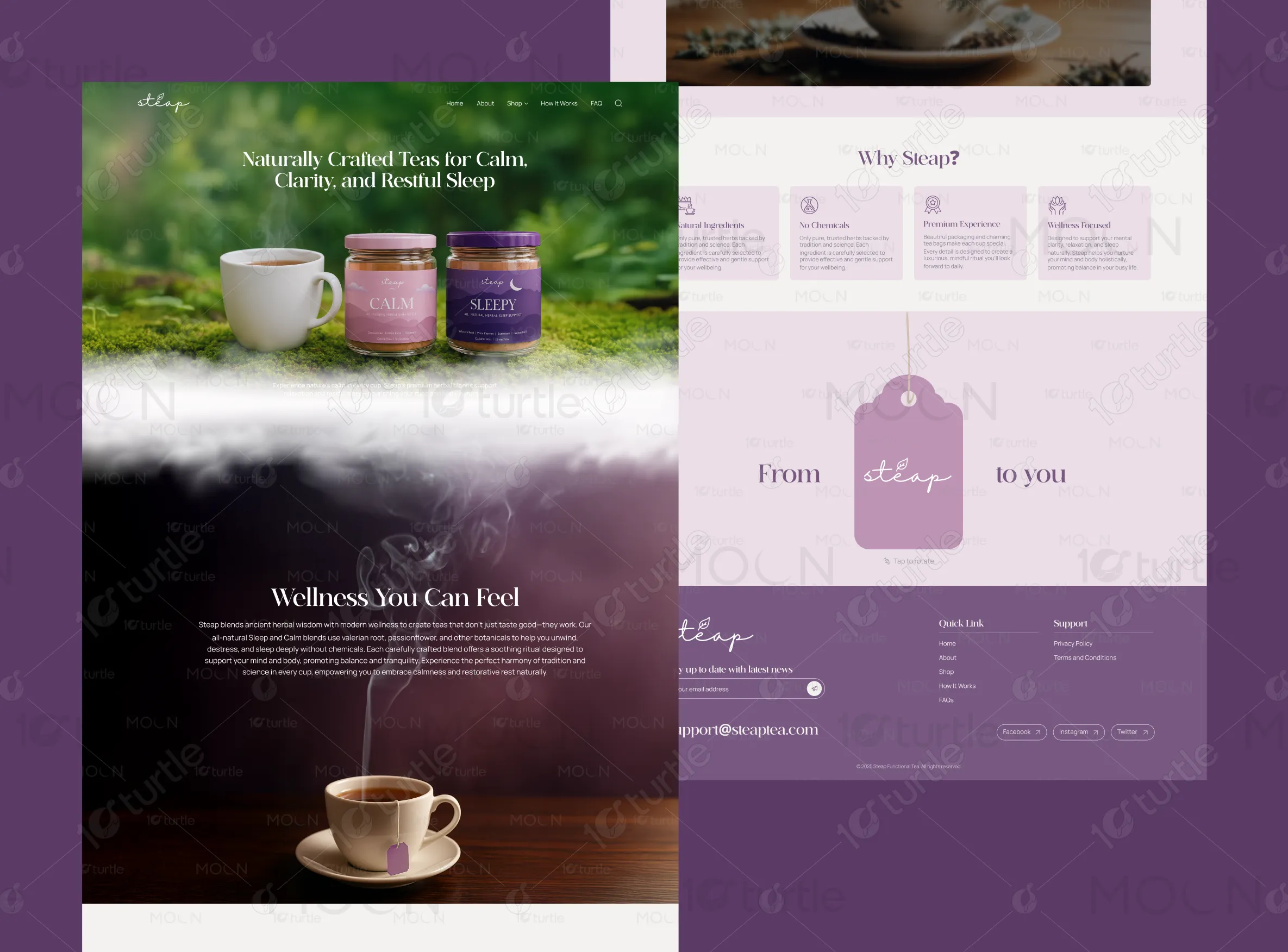
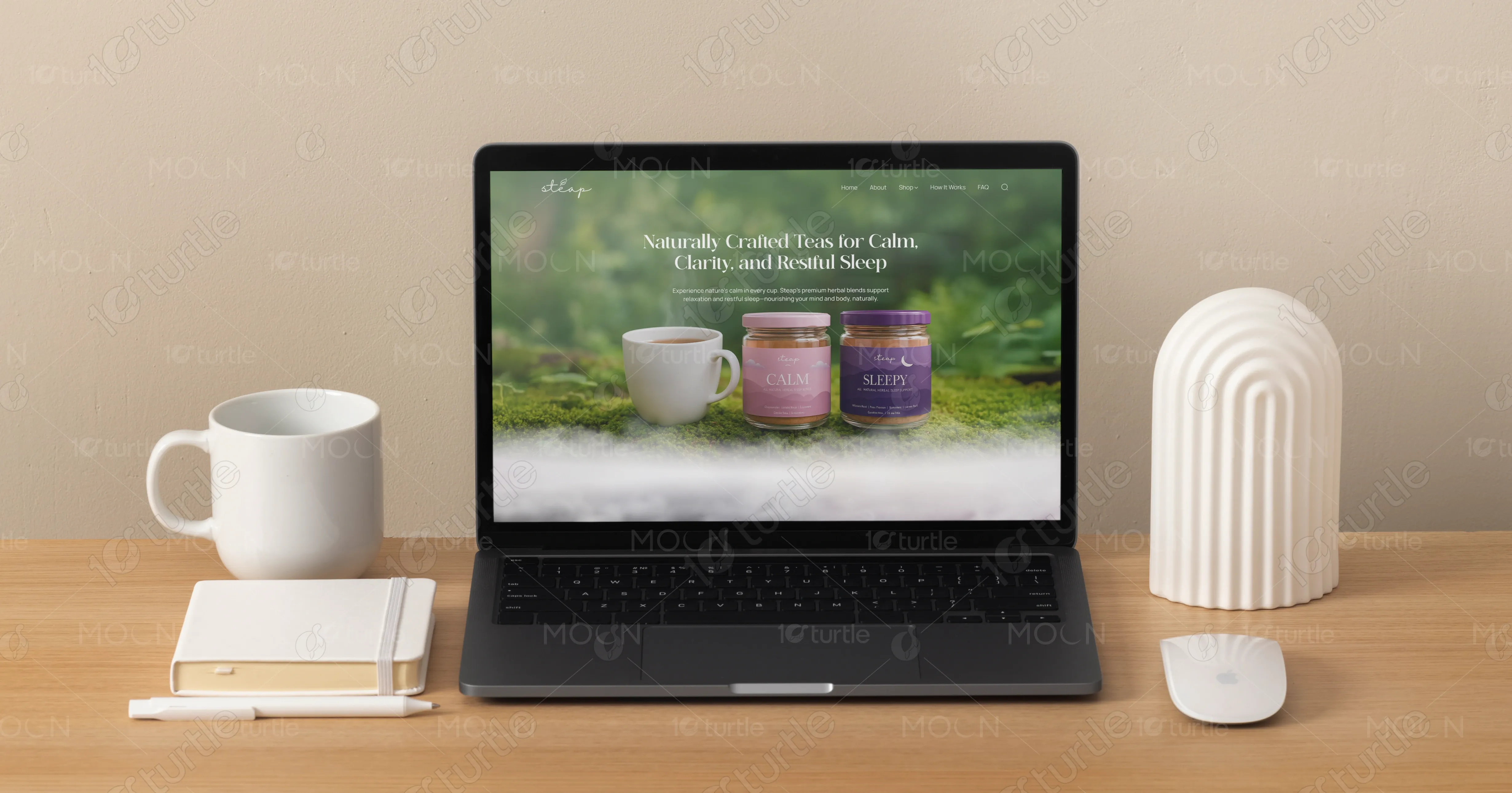
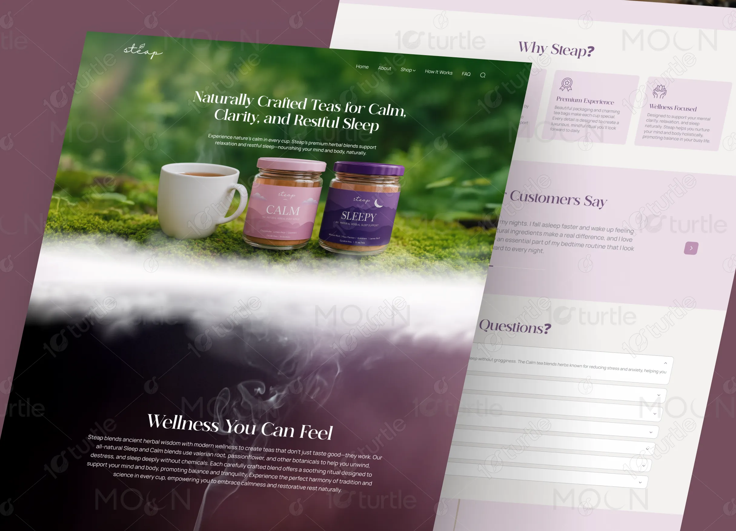
We created a soothing website with natural colors, elegant typography, and clear product displays. The homepage showcases high-quality tea blend images and straightforward messaging about benefits, engaging visitors and encouraging exploration and purchases.
Optimized imagery and structured content improve load efficiency and browsing smoothness. Enhanced semantic structure boosts search visibility, while accessibility refinements expand usability. These technical improvements reduce friction, support faster decision-making, and strengthen trust, resulting in a more engaging shopping journey and higher conversion potential across devices.
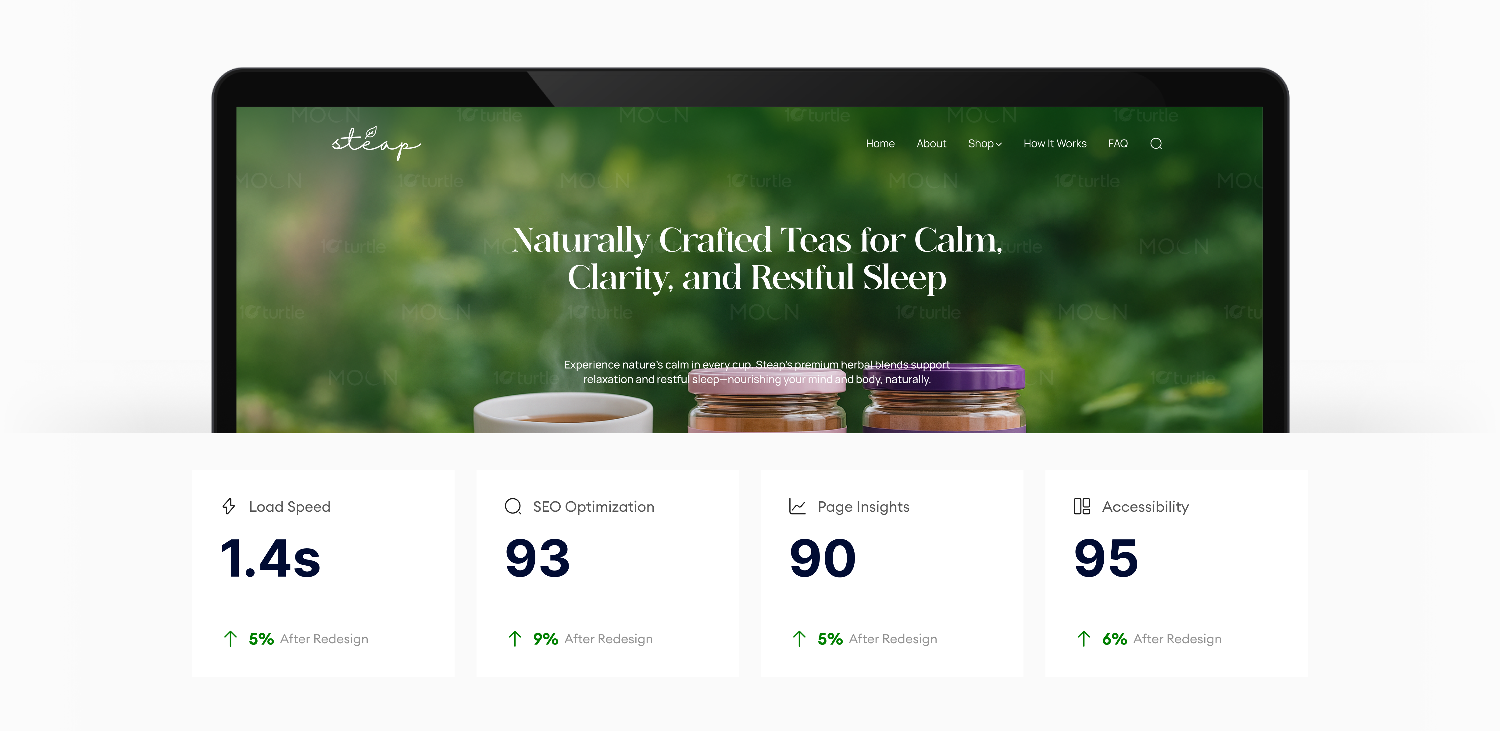
The vision was to design a website that feels soothing and premium, with natural, calming visuals to reflect the wellness aspect of the brand. The website needed to highlight the product offerings clearly, provide information on the benefits of the teas, and feature user testimonials to build trust and credibility.
The logo features a minimalist design that emphasizes elegance. Clean lines evoke calm, ideal for a yoga class website. The graphic symbol with "one" communicates unity and mindfulness—core yoga principles. The organic feel reflects balance and tranquility, while the monochromatic palette keeps it refined. This logo reinforces peace and well-being, making it memorable for a yoga brand.
The palette includes soft purples, light pinks, and muted grays, evoking calm and elegance. The deeper purple adds richness, while lighter lavender tones create a soothing ambiance. Neutral grays provide balance, ensuring a modern feel. The light background offers spaciousness, creating an inviting and graceful aesthetic.
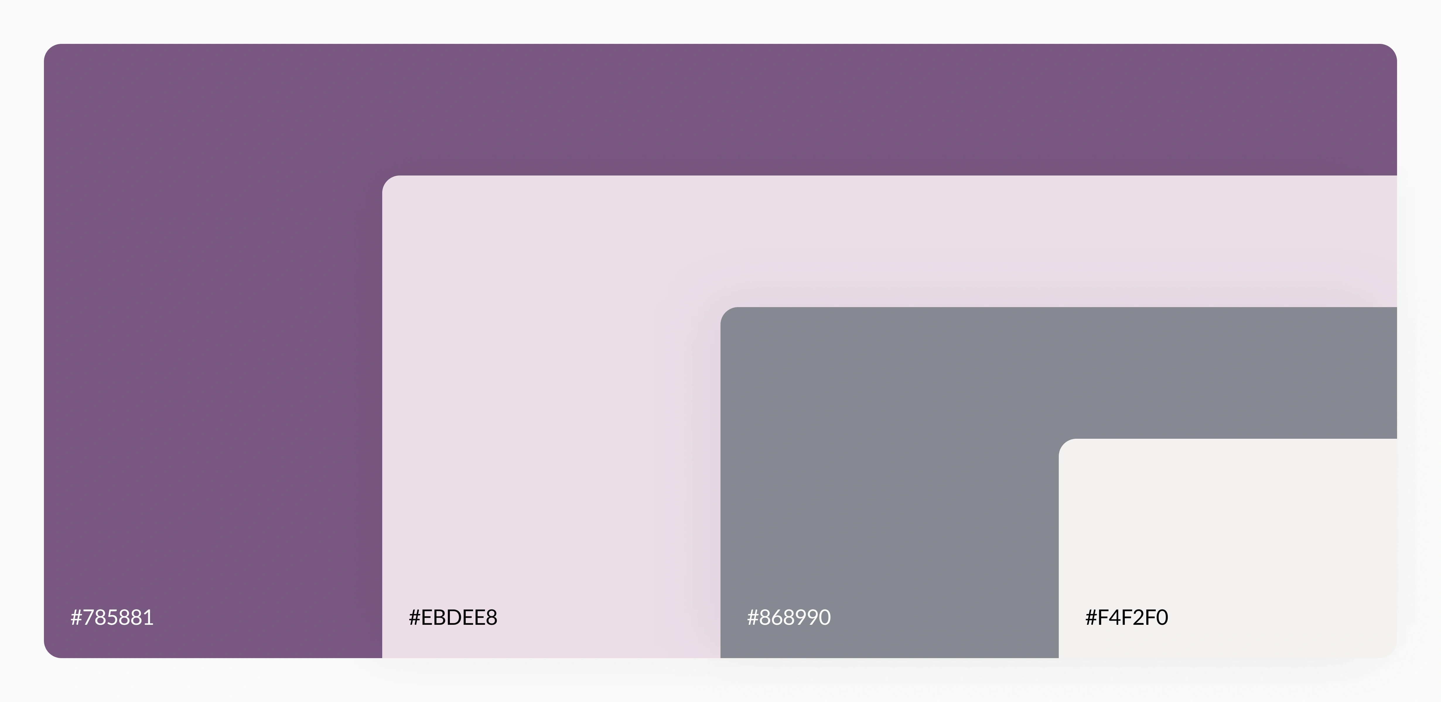
The palette includes soft purples, light pinks, and muted grays, evoking calm and elegance. The deeper purple adds richness, while lighter lavender tones create a soothing ambiance. Neutral grays provide balance, ensuring a modern feel. The light background offers spaciousness, creating an inviting and graceful aesthetic.