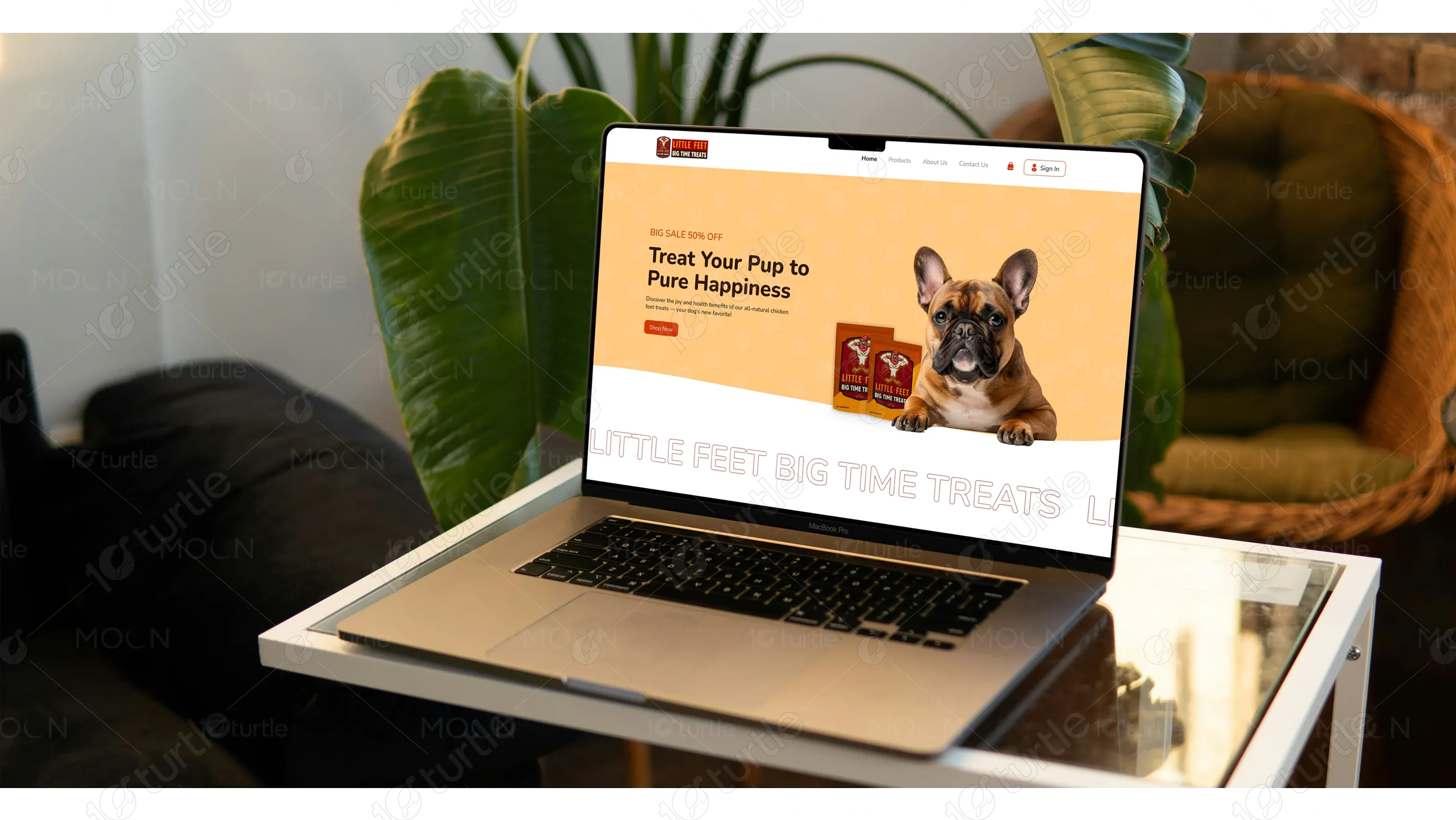
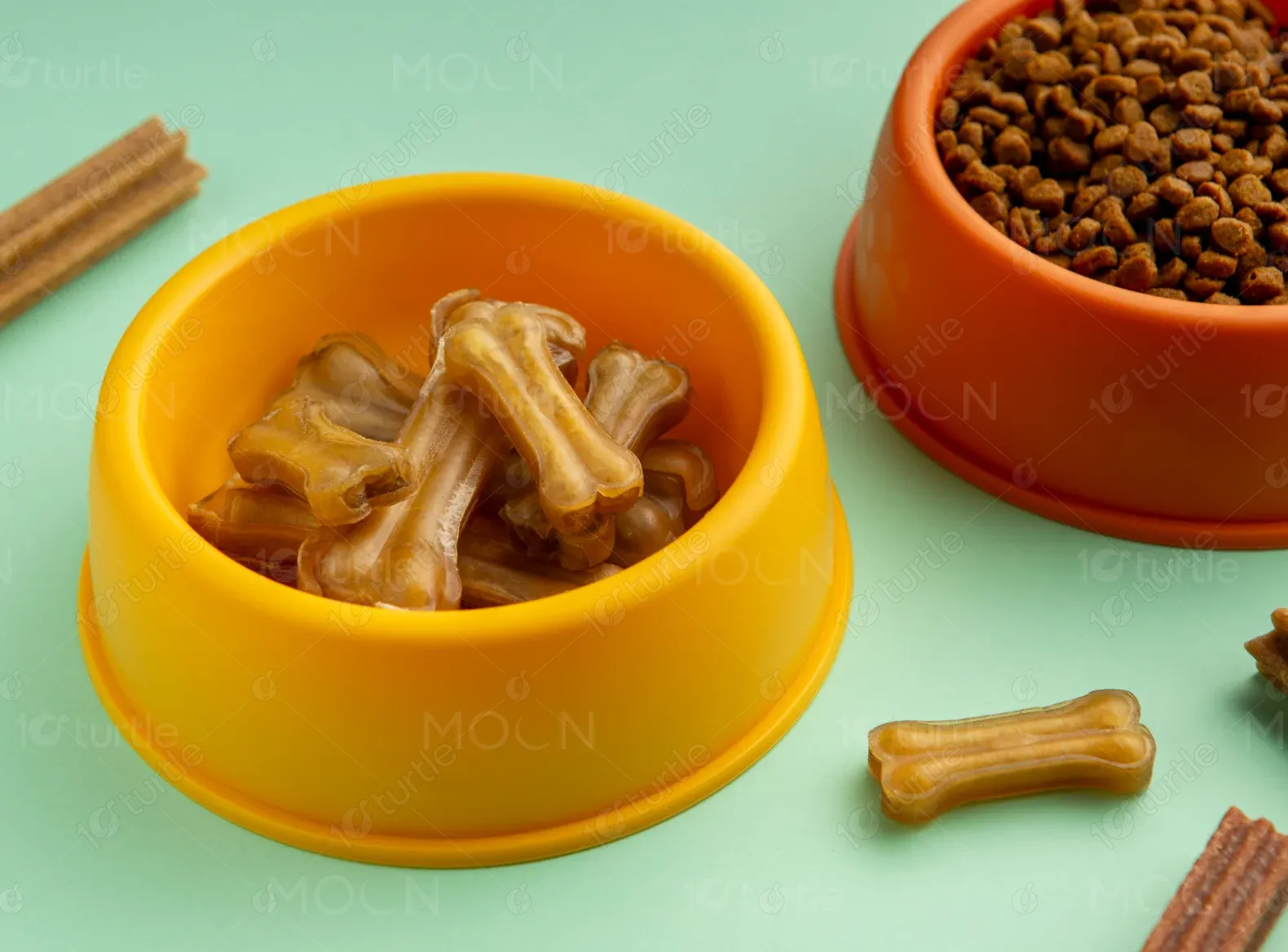
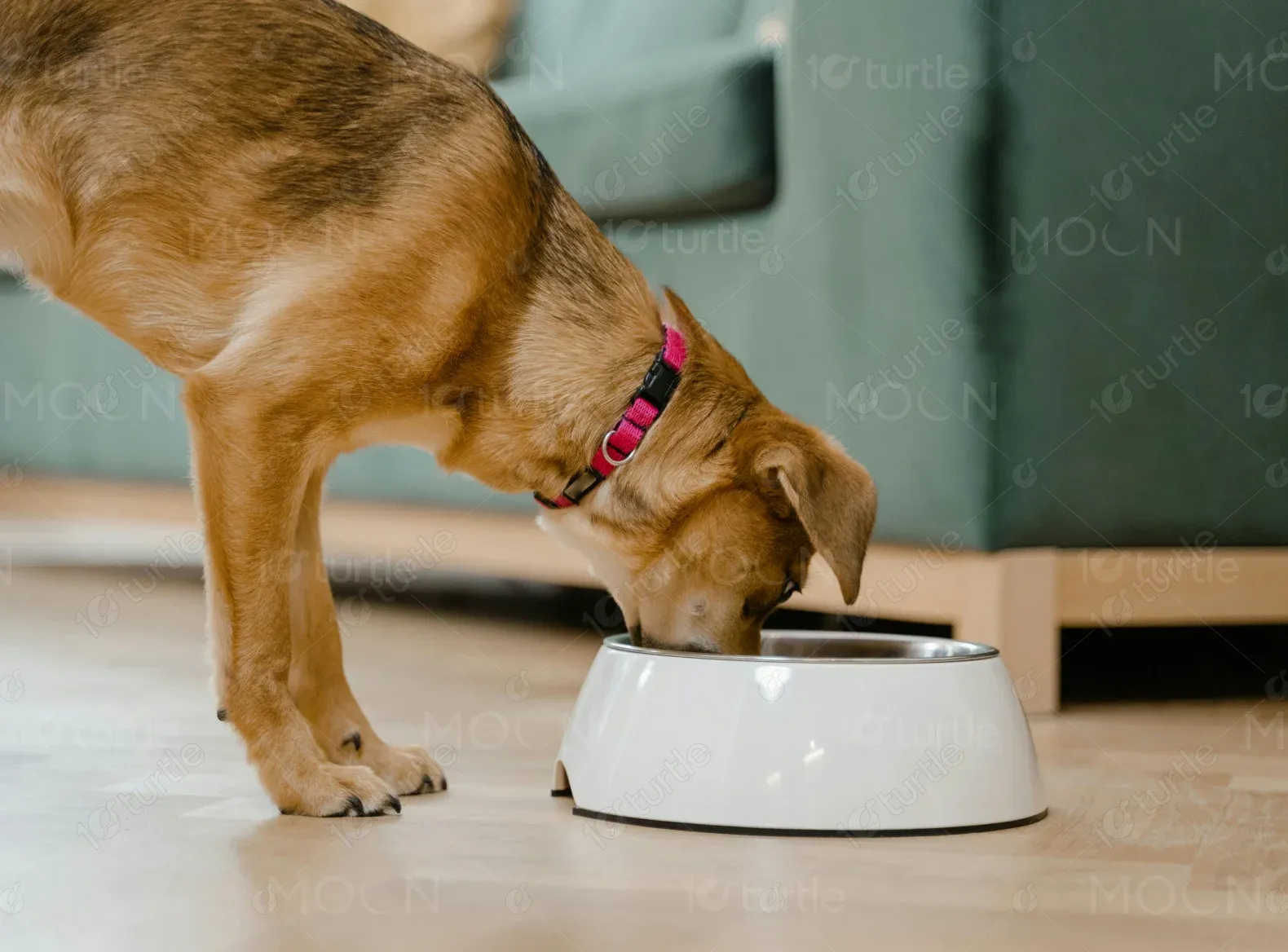
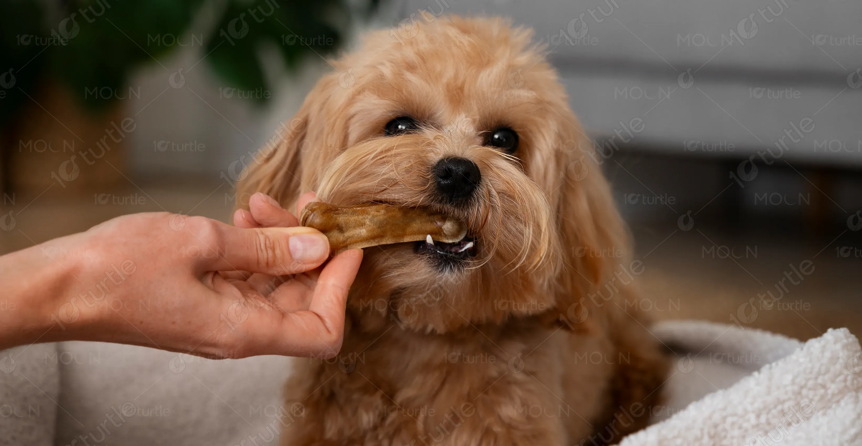
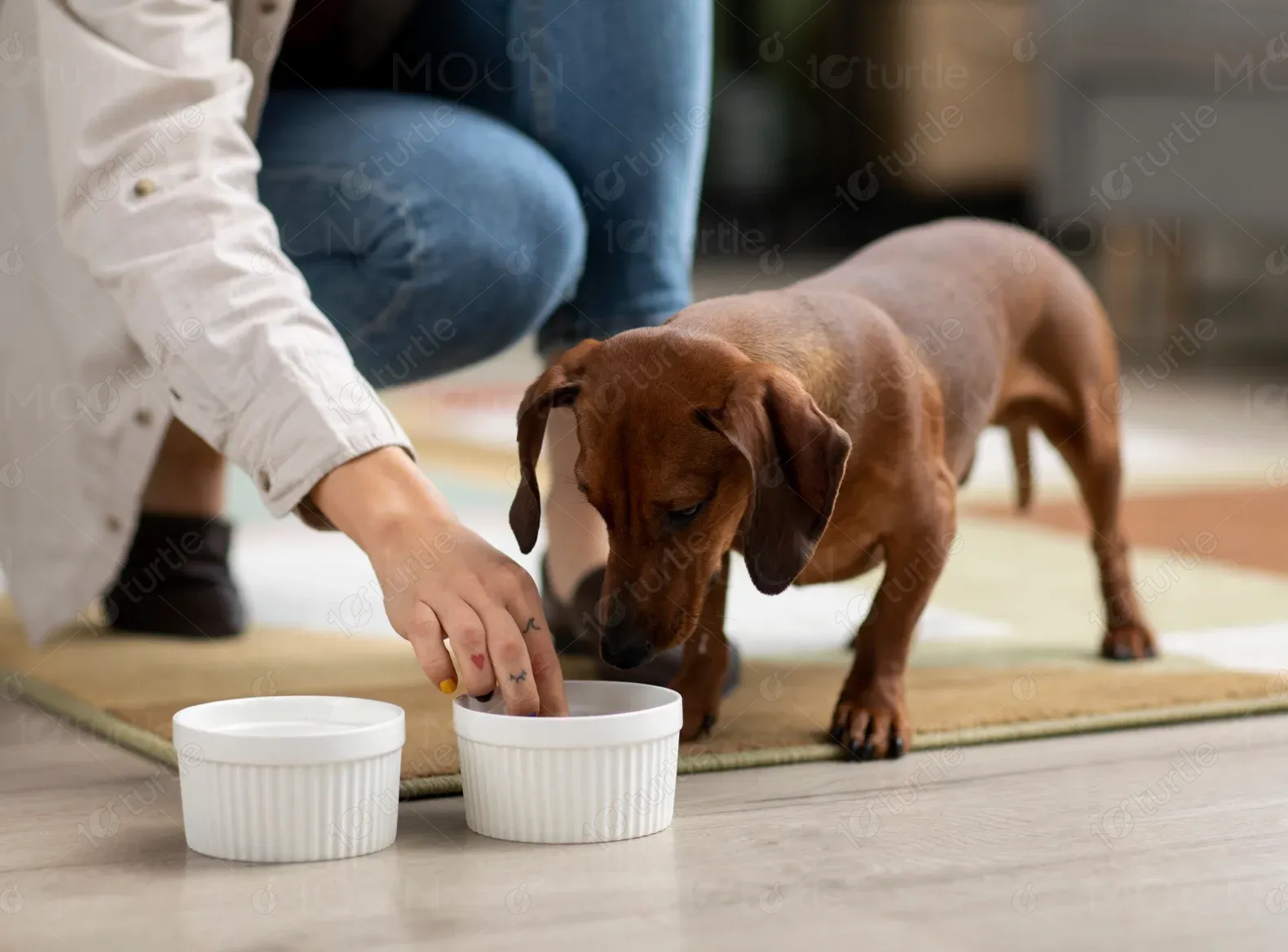
Little Feet Big Time Treats is dedicated to providing all-natural chicken feet treats for dogs, promoting health benefits through simple, high-quality ingredients. Their mission is to deliver tasty, healthy snacks that contribute to overall dog wellness.
UX Design
UI Design
Websites Design
Industry
E-Commerce
Tools we used

Project Completion
2024
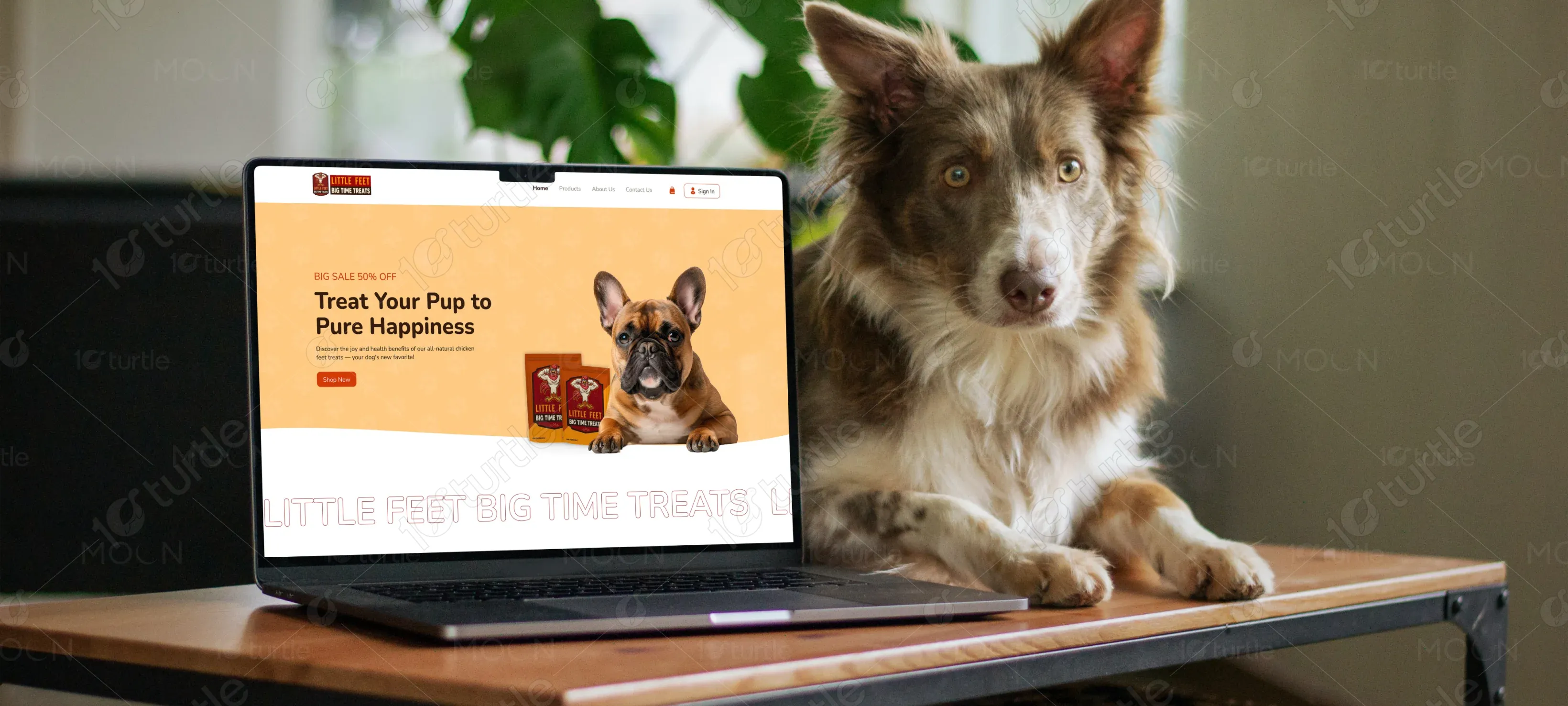
The goal was to design an engaging and emotionally resonant website that clearly communicates the benefits of the brand's product while creating a seamless experience for users. The client needed a clean, pet-friendly aesthetic that merges modern UI practices with heartfelt storytelling. Packed with collagen and protein, these treats promote joint health, dental care, and overall well-being in dogs.
Industry
E-CommerceWhat we did
User ResearchUI UX DesigningPlatform
-The brand lacked an online presence that reflected the quality of its product. There was a disconnect between their mission and how it was visually represented. Moreover, they needed a scalable and easy-to-navigate platform for both first-time visitors and returning customers.
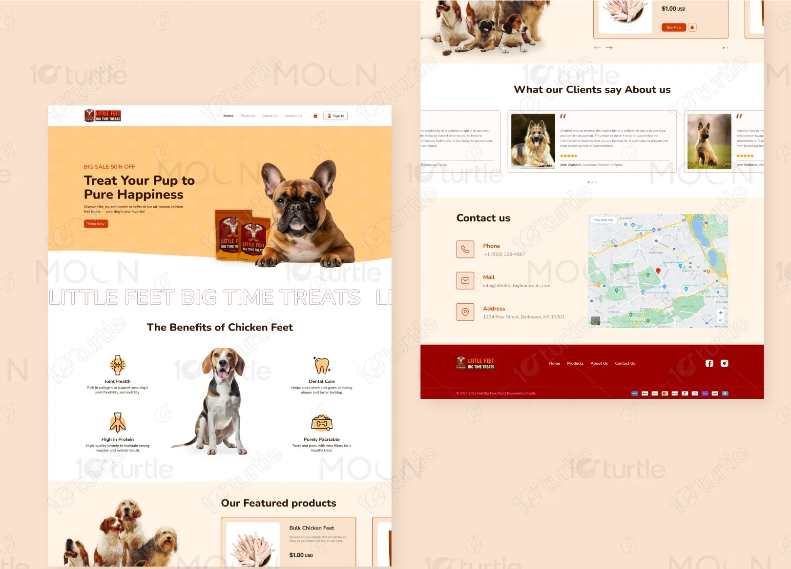
We crafted a visually inviting and informative landing page that instantly communicates product value while emphasizing the brand's lovable tone. With an emphasis on pet imagery, clean UI blocks, and benefit-driven messaging, the homepage was designed to lead users naturally from awareness to conversion. A lightweight product section and contact-friendly footer supported usability.
The client requested a cheerful, clean, and easy-to-browse site that reflects both product benefits and their deep love for dogs. They were inspired by modern pet brands like Bocce’s Bakery, Farm Hounds, and Chippin, looking for minimal layouts, natural tones, and soft illustrations. The design needed to balance playfulness with credibility.
The logo features a playful illustration of a dog holding a treat, paired with bold, easy-to-read type. It reflects trust, joy, and friendliness — aligning with the brand's values and audience expectations.
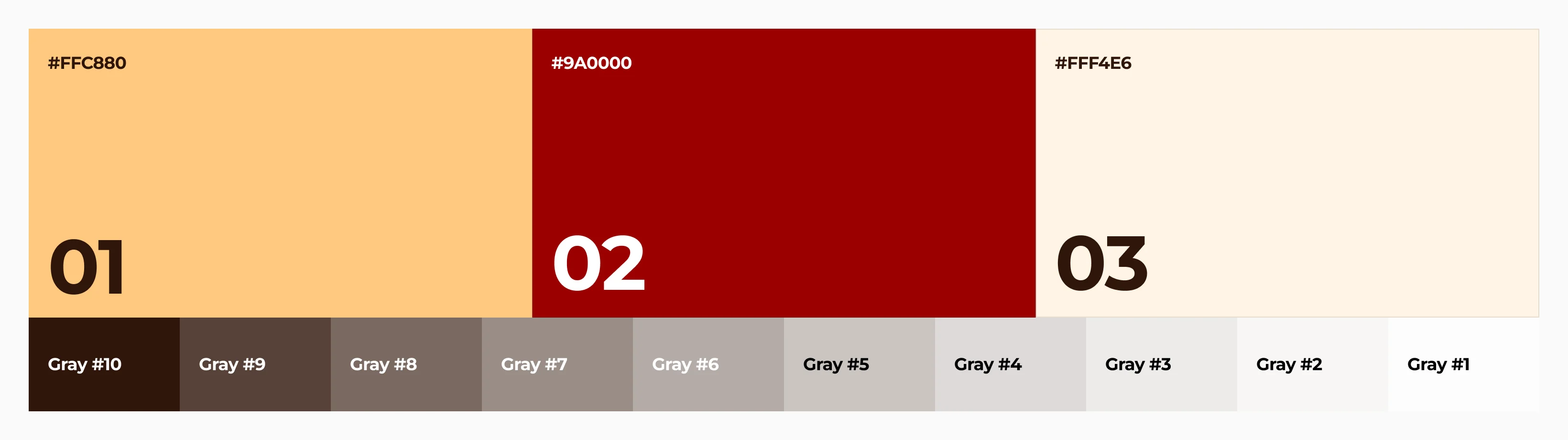
The color palette features warm orange (#F6A742) for joyful, eye-catching accents and deep brown (#4A2D1F) for grounded, trustworthy text. Soft tones like cream beige (#FFF3E4) and pawprint peach (#FCE6CA) create a clean, calming background. Together, these colors evoke a natural, pet-friendly vibe that feels both playful and reliable.
The initial wireframe followed a clear top-down structure: a hero with a call to action, followed by product benefits, featured products, testimonials, and contact info with a map. This layout ensures smooth content flow and keeps users engaged through intuitive, story-driven navigation.