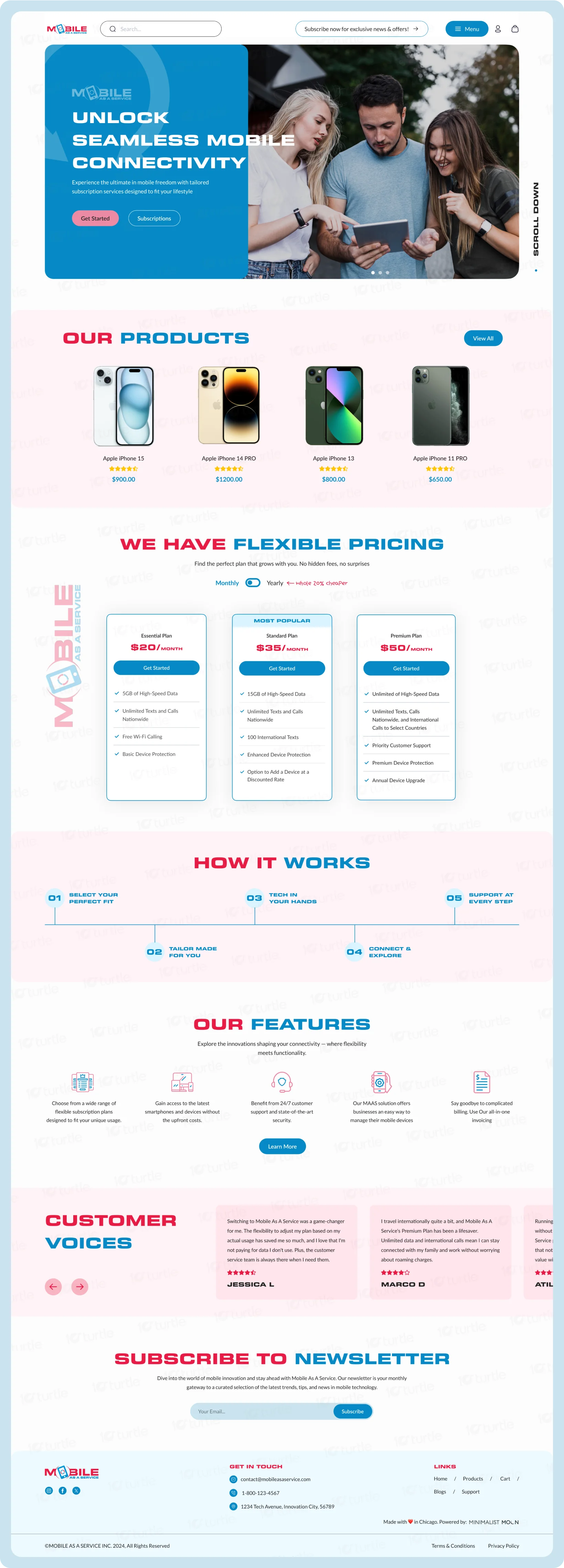
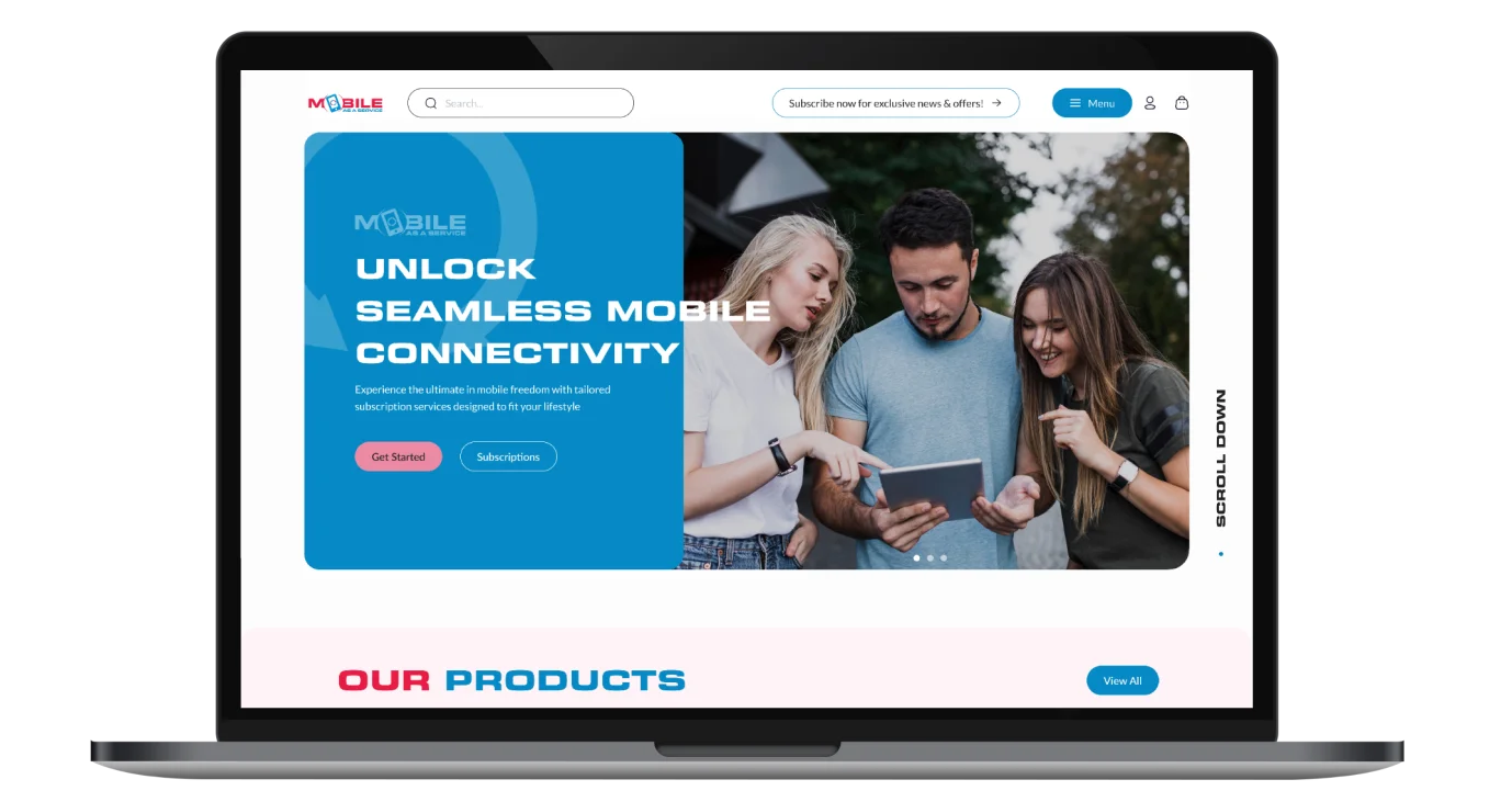
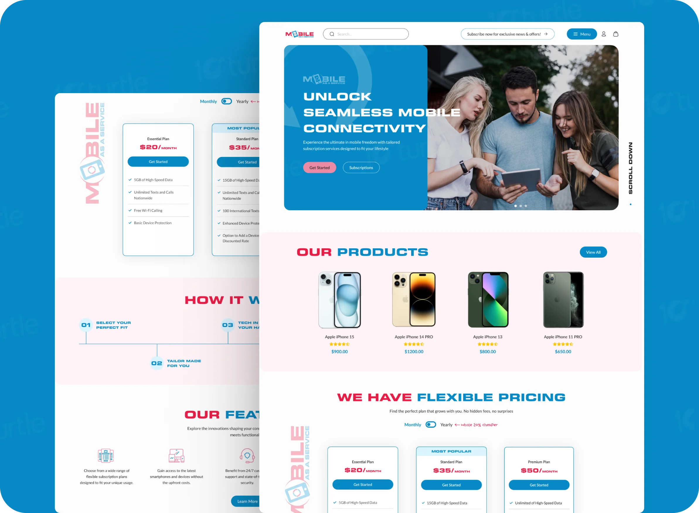
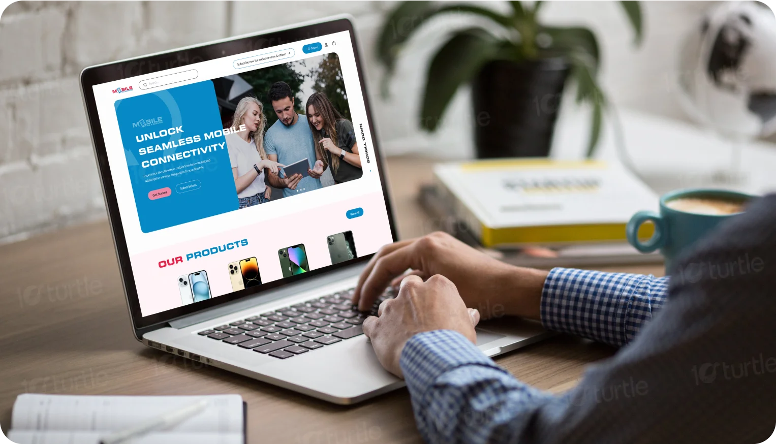
The redesigned Mobile As A Service website delivers an intuitive and visually striking interface, redefining how users interact with mobile connectivity solutions. With a focus on modern aesthetics and functionality, this redesign ensures effortless navigation and a memorable user experience.
UX Design
UI Design
Research
Website design
Industry
Mobile Services
Tools we used

Project Completion
2024
The goal of the redesign was to align the website with the brand’s innovative and user-friendly approach to mobile solutions. By introducing a clean layout, bold typography, and vibrant colors, the updated design ensures that users can easily discover products, explore flexible pricing, and engage with the brand’s offerings.
Industry
Mobile ServicesWhat we did
User ResearchUI UX DesigningCustomer Experience designVisual StrategyPlatform
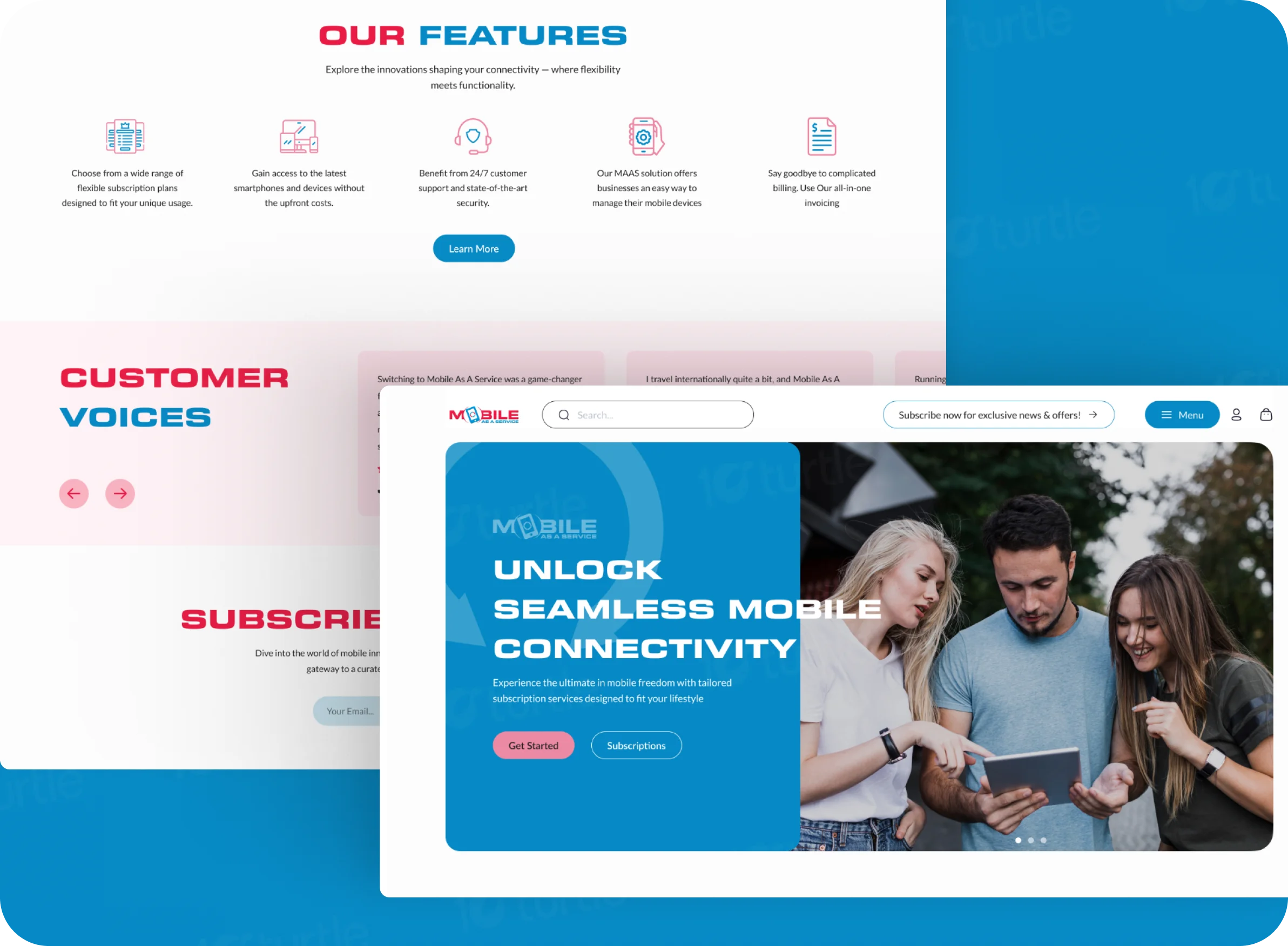
Mobile ServicesThe original website presented significant usability challenges, with cluttered layouts, limited visual appeal, and a lack of intuitive navigation. Users struggled to access critical information, such as product features and subscription options, leading to lower engagement and conversions.
To address the issues, the redesign introduced a structured and visually engaging interface. Key changes included streamlined navigation, clear content sections, and an enhanced focus on CTAs. The result is a user-centric platform that balances functionality and aesthetics, improving accessibility and driving engagement.
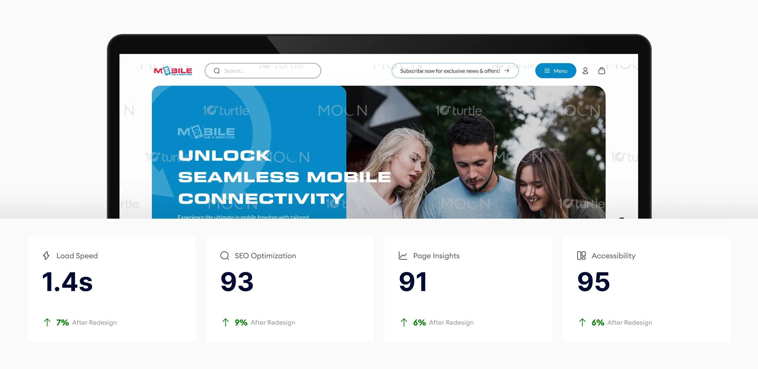
Optimized image assets, streamlined code, and structured content improved performance and search visibility. Faster load speed reduces bounce rates, while higher SEO and Page Insights scores increase discoverability and engagement. Enhanced accessibility ensures broader usability, strengthening trust and supporting higher subscription conversions through smoother user experience.
The website seamlessly communicates the brand’s core values of innovation, simplicity, and flexibility. The redesign focuses on creating an interface that not only showcases services but also fosters trust and engagement through striking visuals and a user-friendly design language. With a focus on clarity and modern aesthetics, the design enhances user experience, making navigation intuitive and interactions effortless. The goal is to create a platform that resonates with users, encouraging them to explore and connect with the brand.

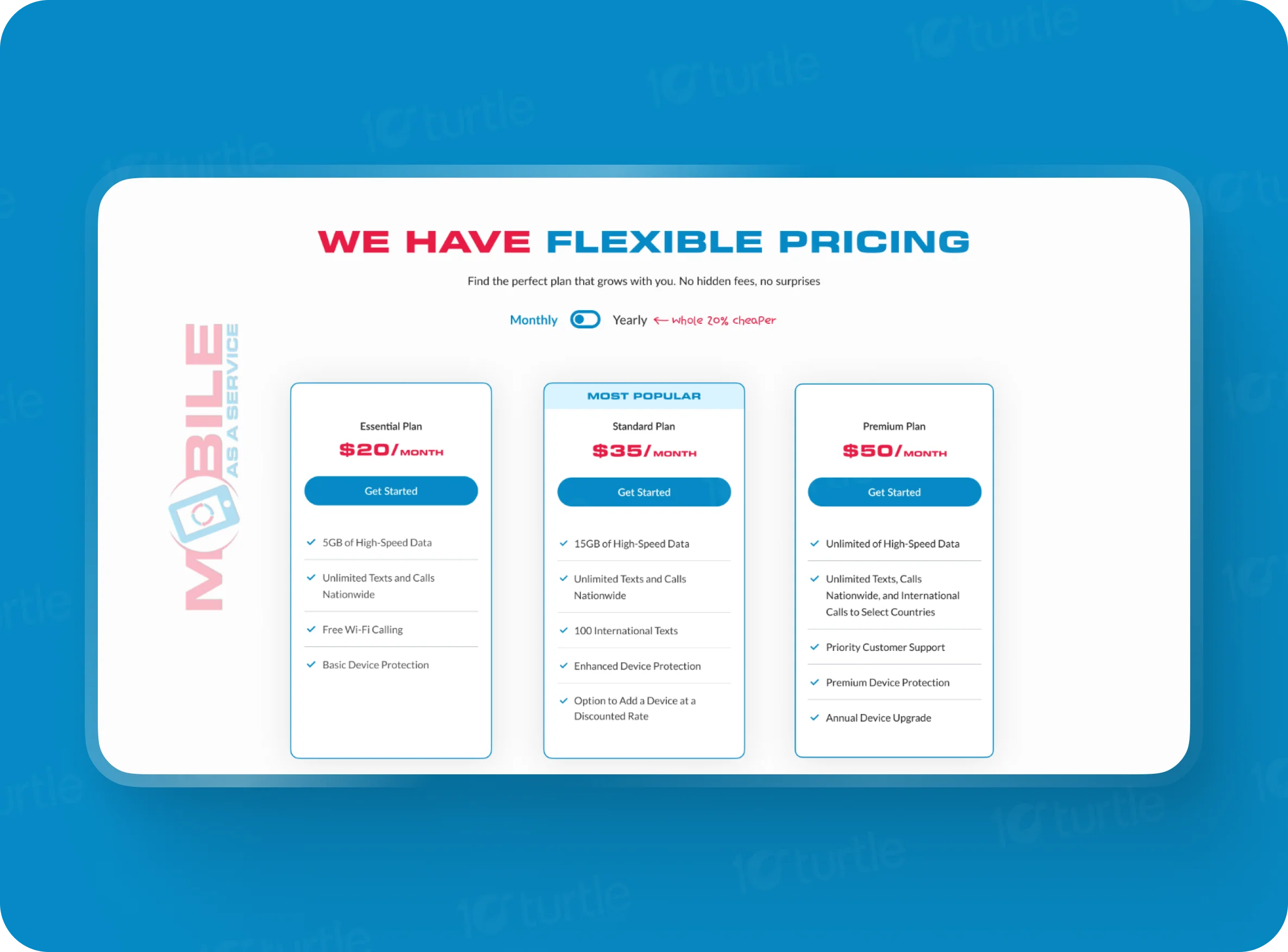
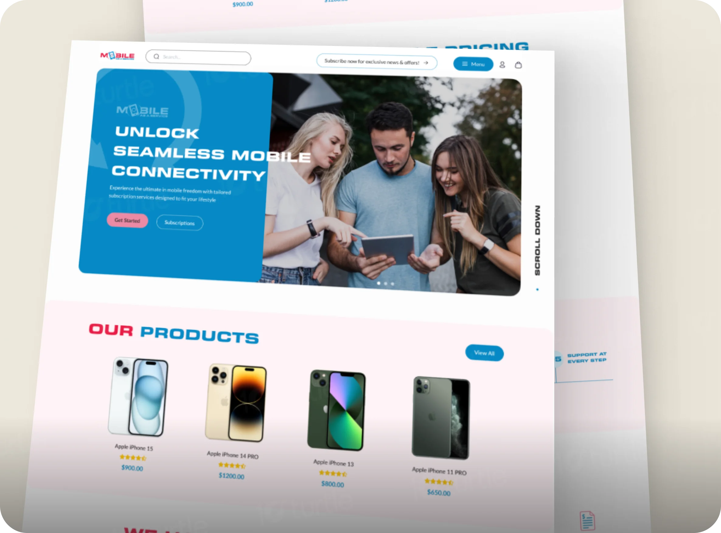
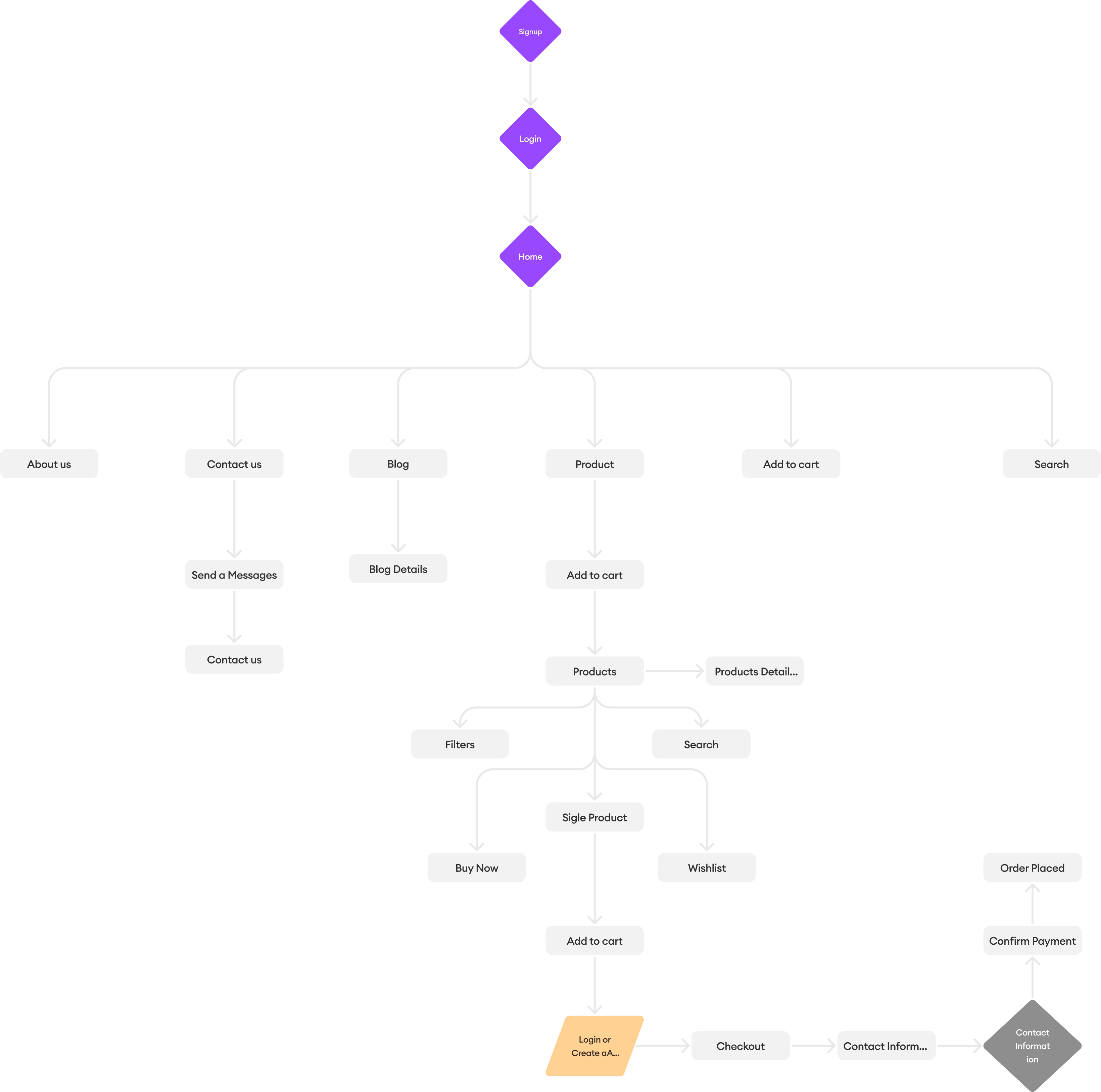
The redesigned user flow ensures that users can navigate the website effortlessly. Starting with a compelling homepage, users are guided to explore products, compare flexible pricing plans, and understand the subscription process step-by-step. Additional sections, like testimonials and features, reinforce trust and highlight the value of the services.
The Mobile As A Service logo embodies innovation and simplicity, featuring a bold, modern design. The vibrant red and blue colors represent energy, trust, and connectivity, aligning with the brand’s mission to deliver seamless mobile solutions. The inclusion of a phone icon reinforces the core service, creating a memorable and relevant visual identity.

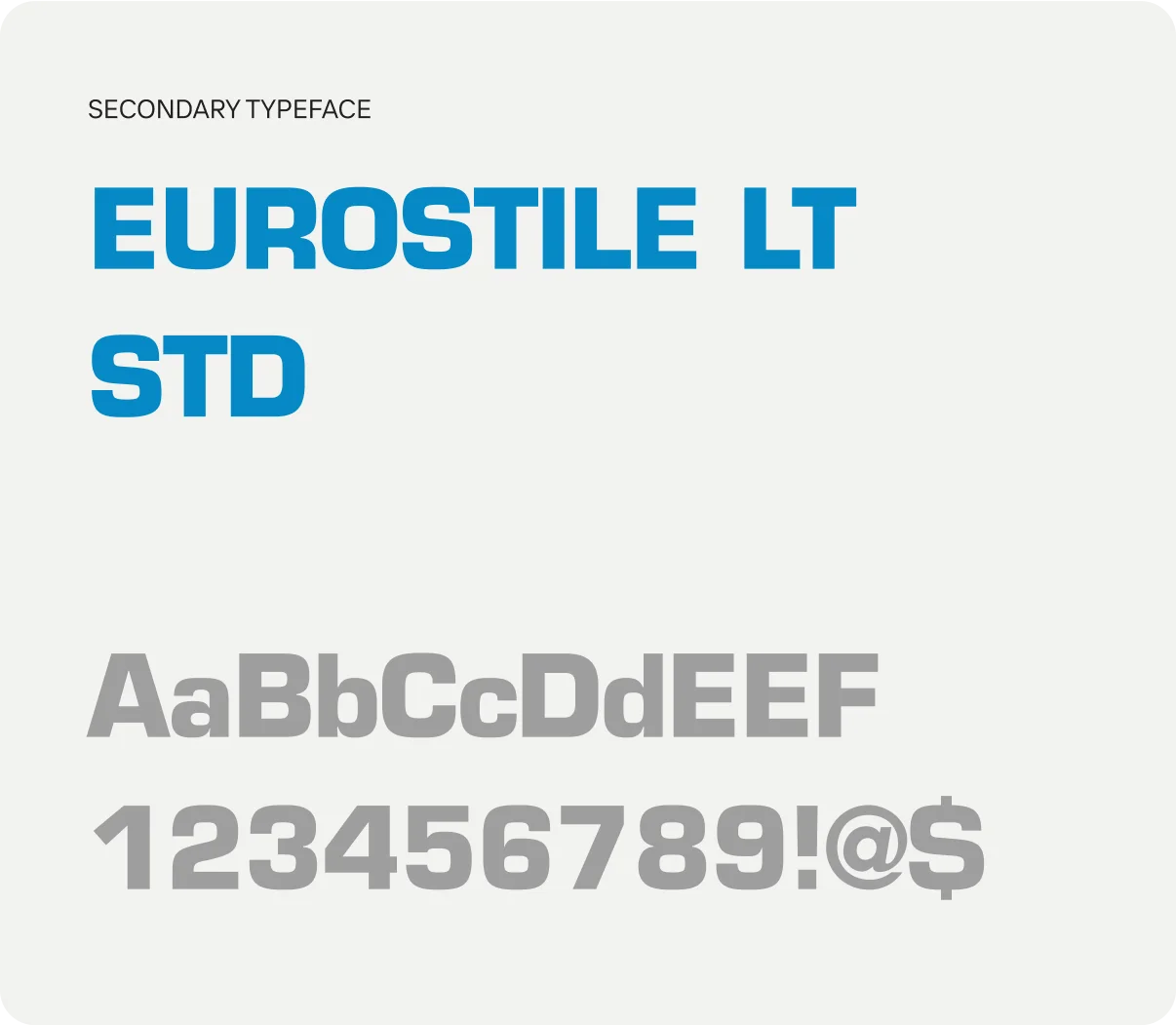
The website redesign uses Eurostile Unicase LT W04, a font that embodies modernity and professionalism. Its clean and geometric structure complements the tech-forward vision of the brand, ensuring clarity and readability across all devices.

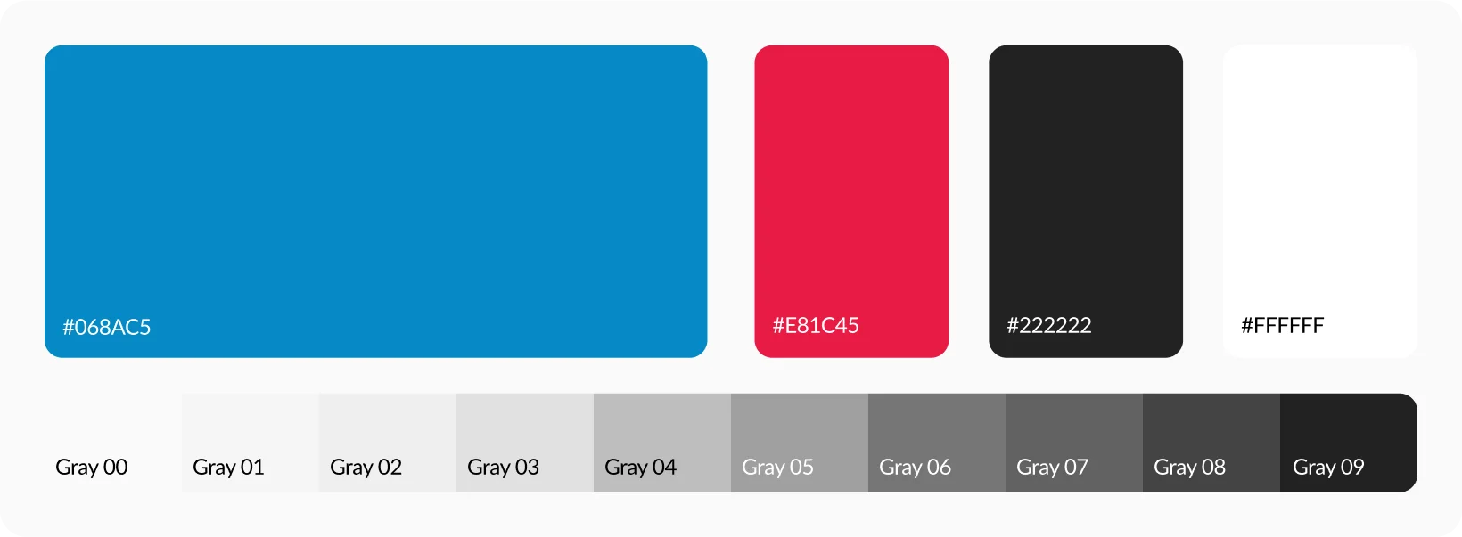
The website’s color palette combines #068AC5 (Blue) for trust and reliability, #E81C45 (Pink) for vibrant accents, #222222 (Deep Gray) for clear text contrast, and #FFFFFF (White) for a clean and modern background. Together, these colors create a professional, engaging, and visually appealing experience.
The wireframe structured the website into logical sections to ensure clarity and ease of navigation. From the header with CTAs and search options to sections showcasing products, pricing, and user testimonials, the layout emphasizes a streamlined journey while keeping the design visually engaging.