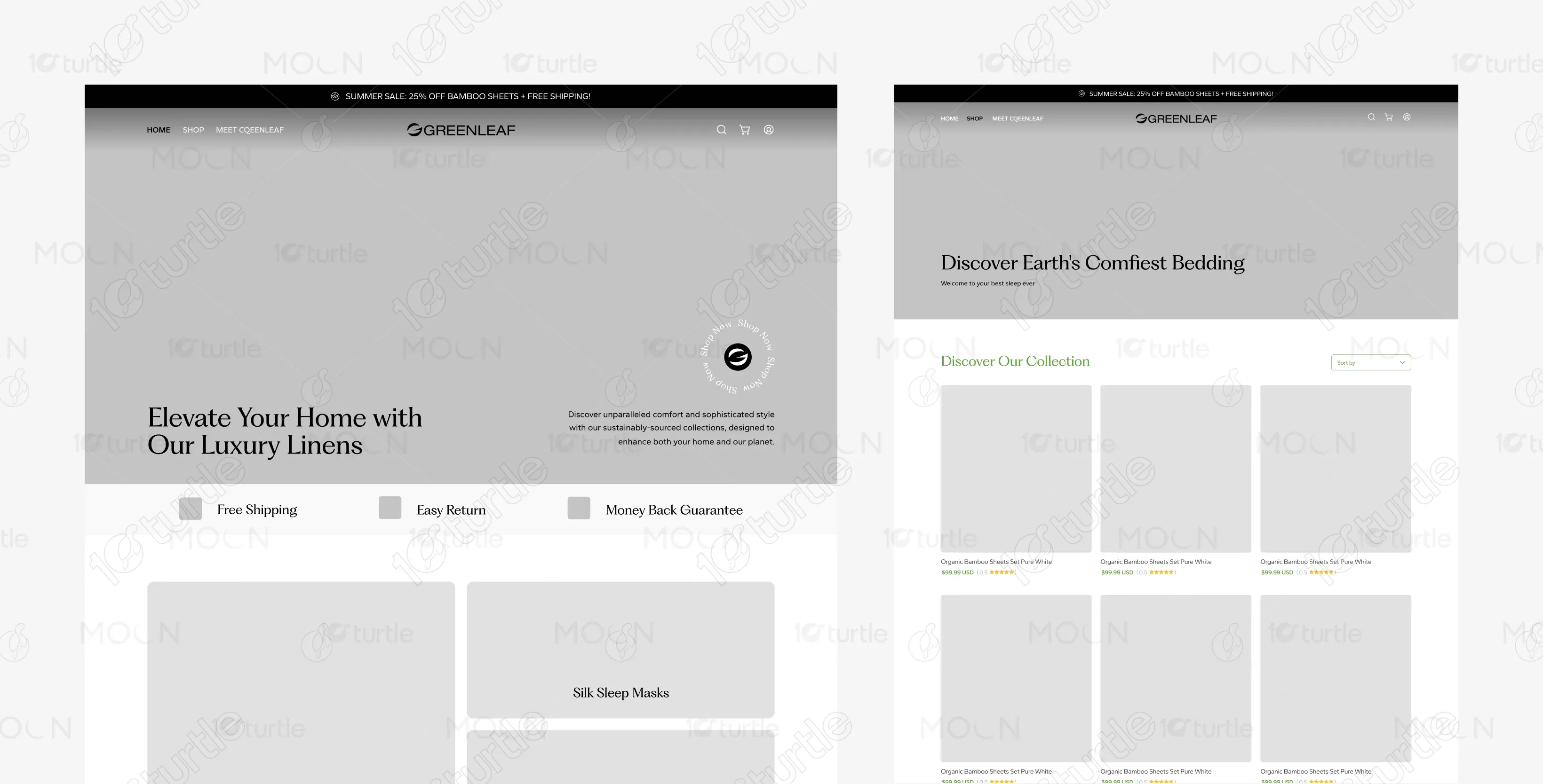
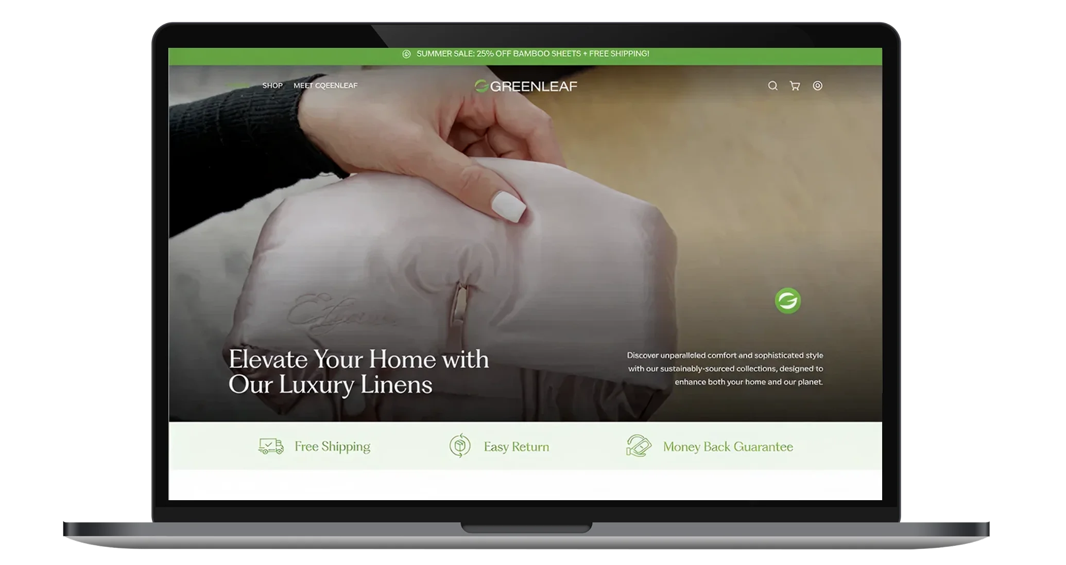
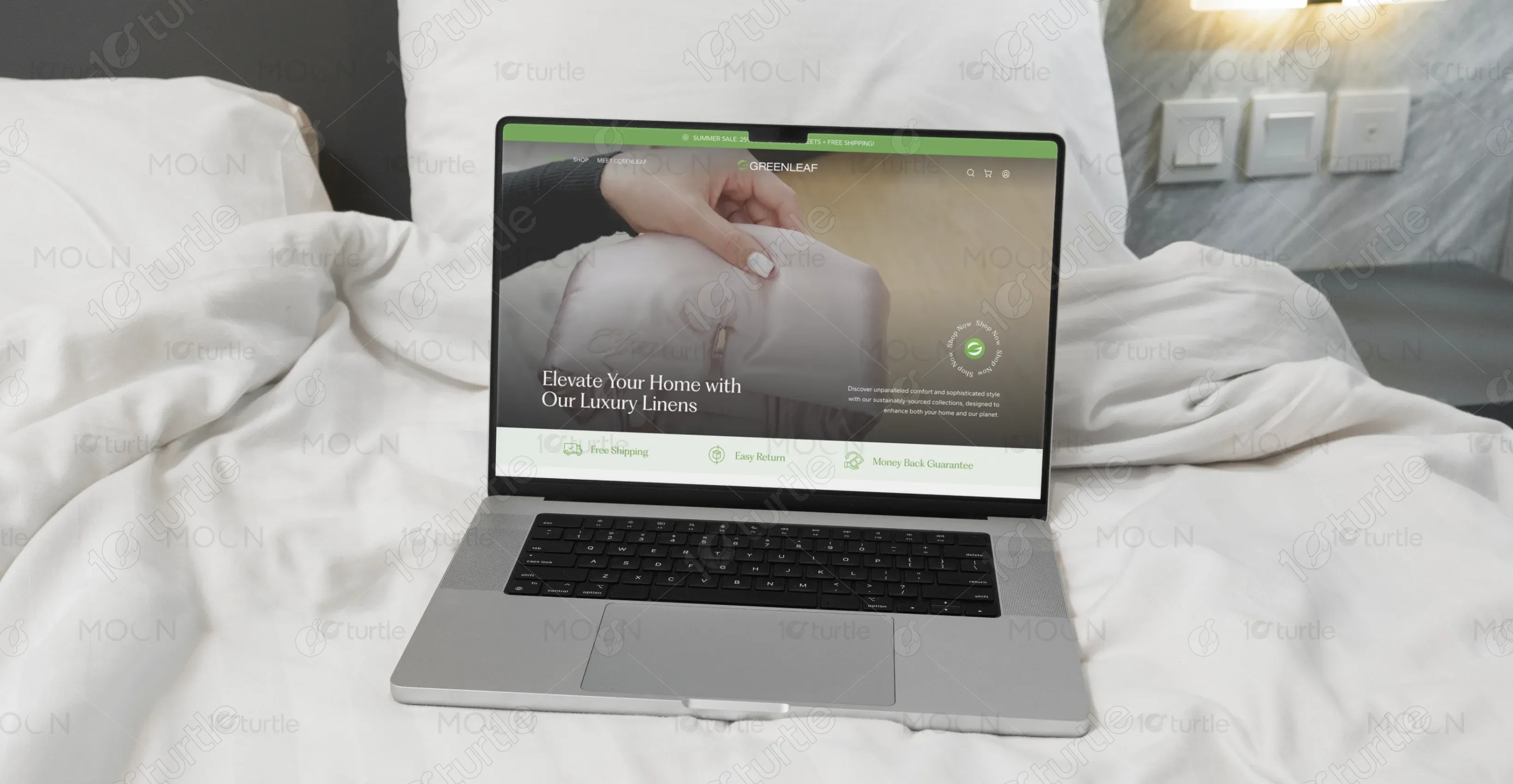
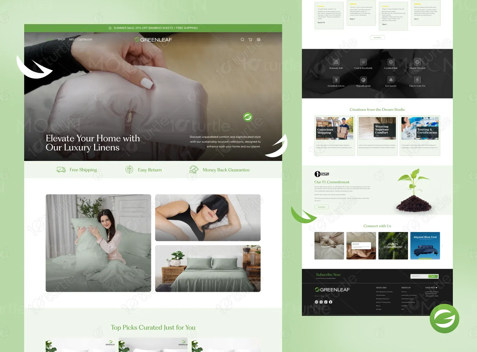
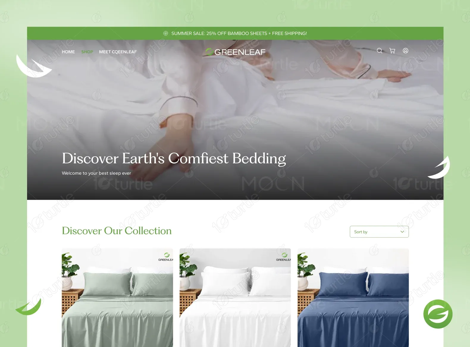
Greenleaf showcases a clean, calming, and eco-conscious design. The brand focuses on organic bamboo sheets and luxury sleep products, ensuring a serene browsing experience that aligns with its sustainable, high-quality offerings. The design is intuitive and customer-centric, guiding users seamlessly through the product catalog and checkout process.
UX Design
UI Design
Research
Websites Design
Industry
E-Commerce
Tools we used


Project Completion
2024
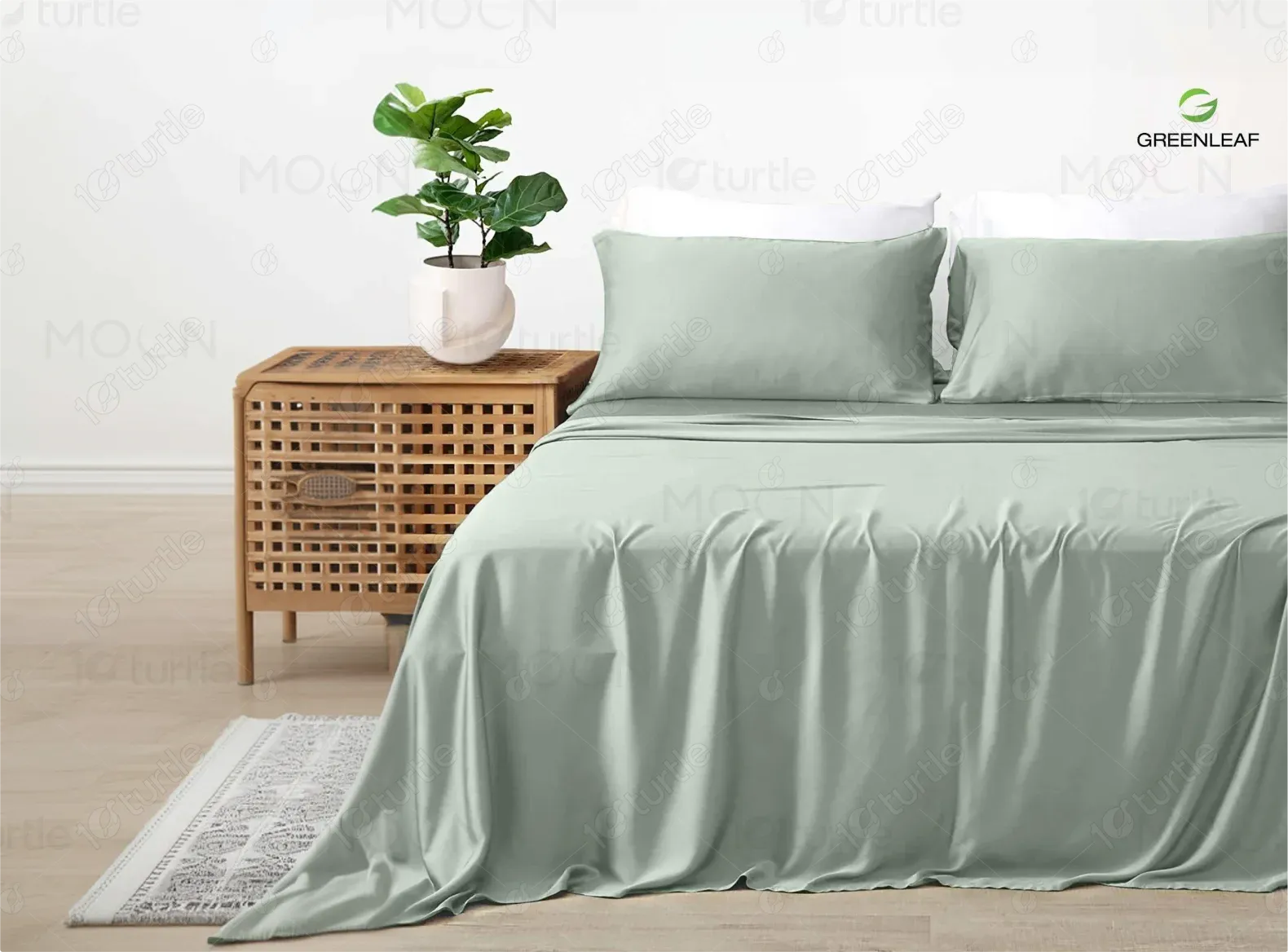
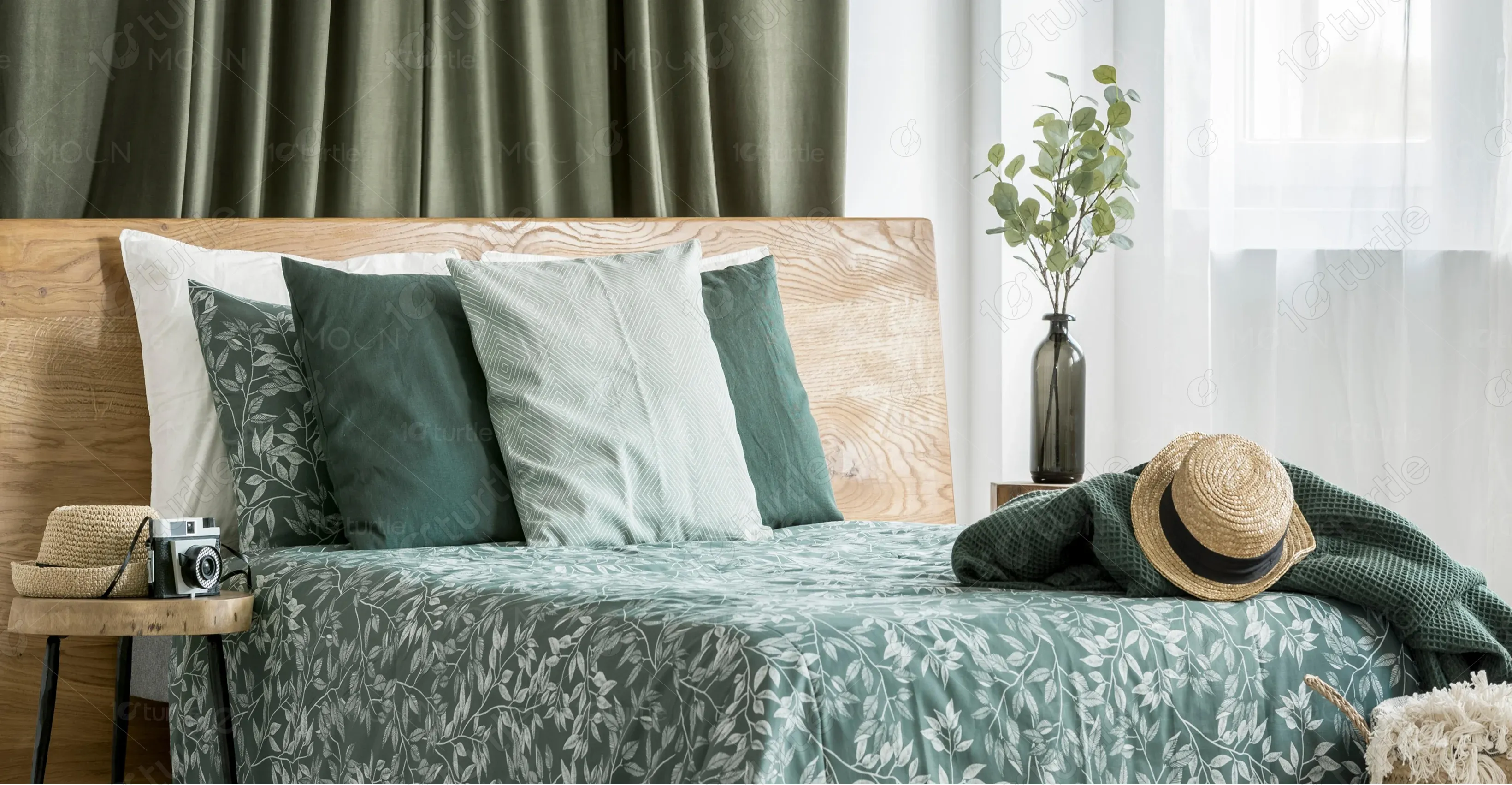
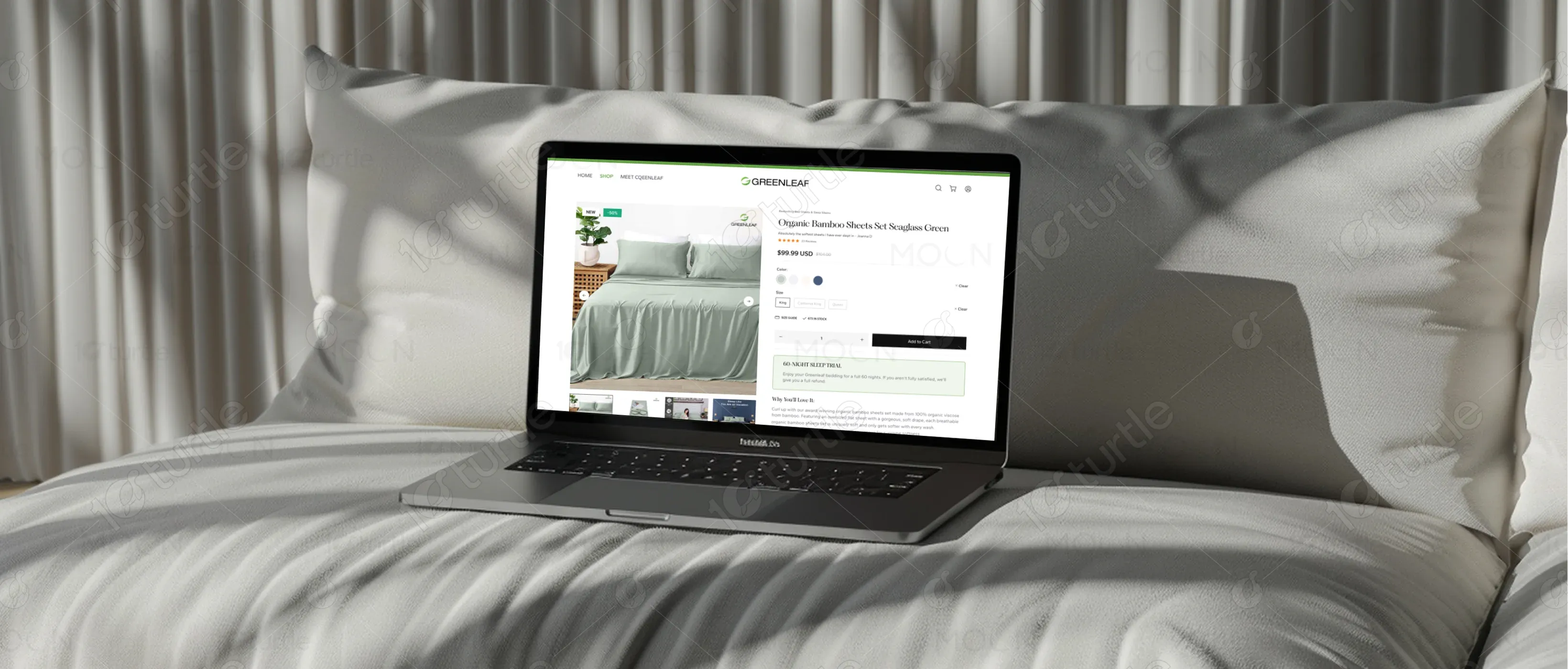
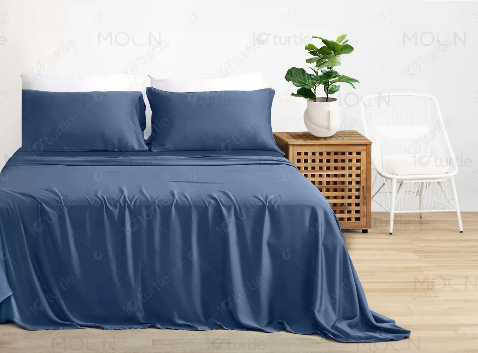
The design embraces a minimalist aesthetic with ample white space and natural tones, reflecting Greenleaf's commitment to organic, high-quality products. Key elements include user-friendly navigation, large product images, and detailed descriptions, while subtle green accents tie into the eco-friendly theme. The responsive design ensures a seamless experience across devices.
Industry
E-CommerceWhat we did
User ResearchUI UX DesigningPlatform
-Greenleaf wanted to create a premium shopping experience for customers looking for luxury bedding that was also environmentally friendly.
A clean and calming design was implemented to reflect the brand's eco-conscious values, enhancing the online shopping experience by providing customers with clear product details, easy navigation, and reassuring content like customer reviews and satisfaction guarantees.
By emphasizing the brand's commitment to eco-friendly products, incorporating customer reviews, showcasing the benefits of bamboo, and adding clear calls to action. The combination of transparent product information and trust signals such as free shipping and easy returns enhances credibility and encourages purchases.
The Greenleaf logo features a simple and modern design that emphasizes nature with clean typography and an abstract leaf icon. The use of green reflects sustainability and the natural origins of the products, reinforcing the brand’s identity as an eco-conscious company offering luxurious bedding.
The color palette is dominated by soft greens, whites, and neutral tones, creating a calming and organic feel. Green is used strategically to highlight important elements, such as calls to action and product features, reinforcing the brand's connection to nature. The minimalist colors are soothing and encourage a restful browsing experience.

The wireframe follows a clean, grid-based layout with ample whitespace to allow the product images and content to shine. Key sections include a prominent hero section, product grids, customer testimonials, and calls to action. This layout is optimized for both desktop and mobile views, ensuring consistency across devices.